Bluetext is honored to announce that Creative Director and Co-Founder Jason Siegel has been named a Judge for The FWA website awards, one of the oldest and most prestigious awards programs for website design in the industry. First launched in 2000 as the Favourite Website Awards in the UK, FWA has grown into the global leader in identifying and recognizing the best in website design. FWA remains an independent voice in the world of website design and build, recognizing the top talent across the globe and highlighting the trends and technologies that are driving website experience and results.
FWA’s Judges represent the top of the industry and come from more than 35 countries. As FWA explains on its website, “FWA is where you go to experience cutting-edge innovation in digital design and development. It’s a space that encourages the digital industry to push the boundaries of technology, to show people what is possible.”
For Bluetext’s clients, Jason being a part of the FWA Global Judge Panel means more access to the most cutting-edge designs and talent in desktop and mobile websites, mobile apps, virtual and augmented reality projects, and any creative work that pushes the boundaries.
Q&A
Why is website and UX design so important to brands and other organizations as part of their tools to build engagement with customers and other audiences?
JS: Website design and UX design is so important because it’s the #1 brand touchpoint for the customer. If done well, the digital channel, whether a responsive website, an app or an installation, can create the greatest upside with the customer and be a voracious capture-agent for user data.
What do you look for in websites that you are evaluating?
JS: In my role, I am looking for pixel-perfect execution and production consistently throughout the whole UX. I am looking for superb in-browser performance, mixed with lite-weight code, mixed with fantastical motion effects.
How should website designers weigh the look of a website versus its ability to convert visitors to customers? In other words, how do you balance style versus effectiveness?
JS: When brands live and die by their short-term conversion rates, it does allow them to stay alive and thrive while building a customer base. However, once a brand establishes itself and the many channels the brand lives on drive revenue and stabilize the brand for the long-term, it starts to get more interesting. We then look at richer experiences, more higher-level positioning, and deeper brand engagement. While this often doesn’t convert faster in the short term, it does position the brand in new pricing categories, more accurate market positioning, and greater revenues and market share overall.
Leading brands often turn to Bluetext to achieve their branding and marketing goals, helping them to increase sales, reach new target audiences, and grow beyond their expectations. In many cases, the goal is a successful acquisition, rewarding investors and other stakeholders for their support while putting them in the position for continued growth. That’s why challenger brands often partner with a leading marketing agency, like Bluetext, to put them in the position for a rewarding acquisition or merger.
The latest M&A success story involves KnightPoint and Perspecta, two companies Bluetext helped when they both needed a new brand and a new website. When Vencore and KeyPoint merged to form Perspecta, a government services provider with 14,000 employees and pro-forma revenues of $4.2 billion, they turned to Bluetext to develop and launch the company’s website under its new vibrant brand. With a new look, feel, and website, Perspecta was ready to take on something big. In early August, it was announced that Perspecta would acquire KnightPoint, another former Bluetext client who provided comprehensive managed services and solutions and specialized in modernizing IT, for $250 million. Needless to say, we are incredibly proud of both Perspecta and KnightPoint.
We have also had the pleasure of working with other brands who have seen recent success in the M&A arena and thought that this would be a good time to recognize many of those success stories. More importantly, it demonstrates the range of services that can help drive a growth strategy that leads to a rewarding acquisition. Here’s just a sampling of clients who have reached their M&A goals:
Cigital: As an extremely successful security consulting company, Cigital built a strong business helping companies drive best practices in building security into their applications and software. As the company was looking to expand both globally and to a broader audience of companies who need to understand the importance of application security testing earlier in their development life-cycle, Cigital turned to Bluetext to completely rebrand the company. As a result, publicly-traded Synopsys agreed to acquired Cigital in 2016.
Acentia: When the new CEO of IT Solutions – a roll-up of nine IT government contracting firms – was brought on board by its private equity owners, he turned to Bluetext to position this new company for growth, visibility, and a successful sale. Following a thorough discovery process, Bluetext proposed the name Acentia and launched the new brand identity, with a powerful website to better represent its mission supporting customers on programs of National Significance. Bluetext worked closely with the entire Acentia management team, employees and customers to overhaul its messaging, establish a new name, create its brand, design and develop a new responsive website, and re-launch the company to the public. In the end, Acentia was acquired by Reston-based Maximus Inc. for $300 million.
Force3: Force3 is one of the fastest-growing network security services and solutions company servicing the Federal Government with revenues of more than one billion dollars annually. When its brand, messaging and website needed an update, it turned to Bluetext. Shortly after help from Bluetext, Force3 was acquired by Sirius Computer Solutions as a way to better service customers in the Mid-Atlantic region.
Altimeter: The Altimeter Group, based in Silicon Valley, is one of the hottest research, analyst and consulting firms in the digital market. It turned to Bluetext for a makeover of its brand. Bluetext designed a new approach to the market, including how it presents its name, its image and all of its digital and physical assets. Consequentially, Altimeter was acquired by consulting powerhouse Prophet.
Sourcefire: A $2.7 billion Cisco acquisition is the culmination of a Sourcefire’s journey from startup to a global leader. Bluetext was there the entire way, with a partnership over 8 years and 2 global rebrands.
BroadSoft: BroadSoft was a leading global provider of software that enables service providers to deliver unified communications services to their customers. In early 2014, realizing that they needed to up their visual identity and brand, BroadSoft turned to Bluetext. The effort resulted in a global brand designed that enabled the company to target new customers and new markets and drive new solutions into the market. In the end, Broadsoft’s new brand and CVI helped them get acquired by Cisco.
Progressive marketing organizations are continually evaluating their approach to their brand & logo to ensure they are viewed as forward-looking and ahead of their markets. Halfway into 2019, there are a number of trends that have been making headway when it comes to this important creative and design work. Courtesy of the folks at Logo Lounge, a repository for designers to post and share their work, we have a sense of what changes are making their way into the market. As Logo Lounge is quick to remind us, when a client makes its logo selection from a typical range of five options, that also means that it has rejected the other four.
Here are four trends getting attention by logo and brand designers:
Adding motion through “spot drag.” Spot dragging uses circular dots with tails to add a touch of motion to a logo. They give the impression of immediacy as if this logo just happened, and the ink is still drying.
The Period makes a stand. A refinement of the recent punctuation trend, using the period in a logo gives it a little more power. Especially when it’s is used to signify something altogether different (like completing a different letter), a period makes room and draws the eyes in.
Quarters make a play. One trend that can be seen everywhere is the use of “quarters” in logos – not the coin, but the geometric shape, which is simple and distinctive. It has balance and is being used with vibrant, solid colors. Sometimes used alone, other times with other geometric shapes, these add a purity of form that underlines the value of the brand.
More layers. While simplicity works with many established brands, adding more layers and details is making a push into 2019 logo trends. The advantage of this approach is to invite viewers to look more closely and engage with the logo to understand what it’s trying to convey. Just don’t go overboard – two layers works, more than that can just look messy.
Finding the right top branding agency for your organization is not an easy task. In fact, it can be quite stressful. One thing we’ve learned as a top branding firm is our clients are often hesitant to bring on an outside agency in the first place. Do they need a new or refreshed brand, and do they have budget set aside for the project? And do they have the energy and commitment it takes to undertake a brand refresh? Justifying the ROI to the executive team can be a heavy lift.
Once they’ve crossed that hurdle, agreeing on the right firm is a major decision. Shifting work on something as integral to an organization as its brand brings with it the fear of losing control to an outside agency that’s not part of the family. Key to making the case for a top branding agency is recognizing that a firm with the right experience and creativity will help your business grow, and can be one of the most important investments you make.
To make it less stressful, and to make sure every organization is getting what they need in a top branding agency, we’ve crafted our top five criteria for selecting the best partner for a new brand:
Check Out the Creative. Make sure you take a close look at the creative examples on the agency’s website. First, do you like them? Second, are they good? Third, can you envision any of them working well with your brand? And fourth, do they show a wide variety of creative styles and approaches? If the answer is yes to each of these, it might be the right fit.
Consistency. A top branding agency recognizes the importance of consistency to your brand. Make sure you see examples of client work beyond the mood board or website. Look at the collateral, signage, typography, social media, and even email templates to see if the work is consistent in both quality and tone.
Brand Management. A top branding agency isn’t valuable only on the one project but will be with you for the long-term. That means that as your brand grows and evolves, it lessens the risk of diluting it as new ideas are explored and boundaries pushed. Ask the agency to see examples of brand style guides it has produced, and ask their creative director to discuss the strategy for launching the brand internally and enforcing it across a large organization.
Industry Insights. Top branding agencies work across a variety of industries and keep on top of trends and styles across many verticals. Don’t be shy in asking for their industry insights to make sure they are current with what’s happening in the market.
Creating a Vision and Sticking to it. A top branding agency has the expertise and creativity needed to develop a comprehensive brand that is consistent and tells a compelling story. It takes lots of work to develop that skill and requires significant know-how and ability to both see the vision and execute on that vision. The right firm recognizes the intricacies of taking a brand from concept to completion at different stages in their client’s business life-cycle. That skill – to see the big picture of your organization and help you bring your brand to life – is critical and valuable. Ask for their vision of the big picture specific to your organization. It doesn’t have to be identical to what you want, but it should be in-depth and give you the confidence that you’ve found the right partner
B2G public relations is a difficult challenge under the best of circumstances. Both technology companies for which the government is an important vertical and those that are solely focused on government agencies struggle to find customers who are willing or able to participate in media outreach on behalf of their vendor. In many cases, the programs themselves may be confidential or classified, while in other situations, program officials are reluctant to be seen as endorsing a specific contractor.
At Bluetext, we’ve found B2G public relations workarounds for our clients who sell to agencies at the Federal, state, and local level: Talk about the government customer as a hero and innovator rather than pitching a story about the contractor’s solution. While agencies might not want to talk publicly about a contractor’s software or cybersecurity platform, they are much more willing to talk about how their own team members have found innovative ways to solve agency problems.
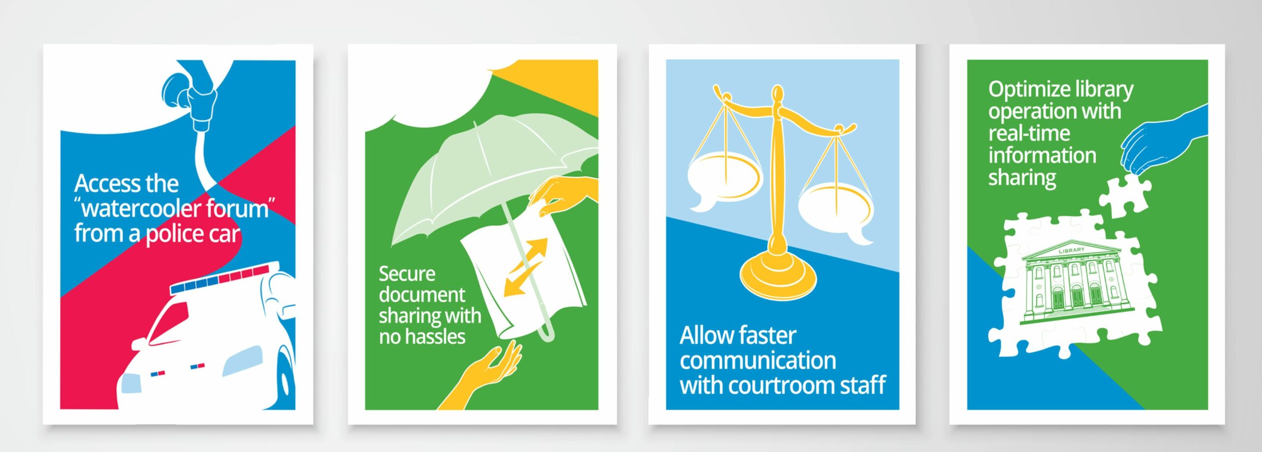
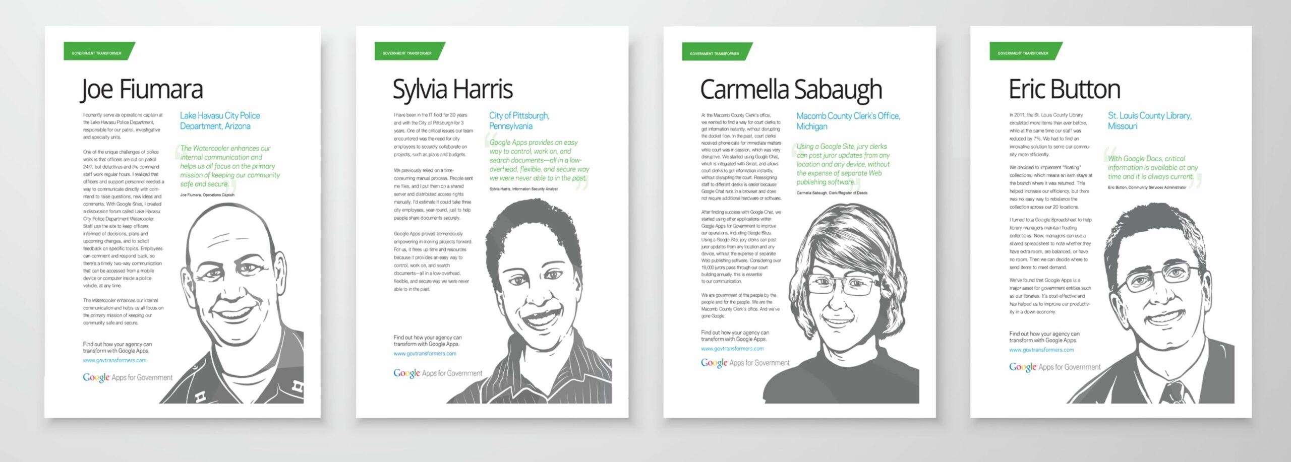
This was exactly the challenge – and solution – Google’s public sector team was facing when it wanted to broaden its base of federal, state, and local business. Bluetext created a comprehensive “Gov Transformers” program that identified program managers at all levels across the United States who were solving technology and program problems with state-of-the-art technologies, “transforming” the way their agencies were doing business.
Our first step was to design a series of promotional “cards” that could be both physical for trade shows and digital for online marketing campaigns. Each card displayed a provocative statement on the front and included a stylized image of the individual on the back together with a description of the challenge and solution. The stylized image was a visual treatment that rendered photographs into a similar type to attract attention and – more importantly – to “standardize” the images in order to compensate for different cameras and quality of each image.
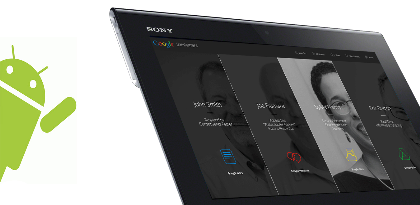
The next step in our approach was to create a microsite repository of customer “hero” stories in the form of a lead-generating campaign with several interactive features. Each case study was tagged by type of solution and location so that searching was easy and intuitive. We sent our professional photographers to capture each individual with a more formal approach and made those images the homepage of the website:
The website was not only used for driving leads among government customers, but it was also pushed out to media as a bank of customer case studies that were packaged together and ready to go. The Gov Transformers campaign achieved several important goals. First, it presented a way to get the Google technology story out without violating any restrictions. Second, it made the government customers feel proud about they had achieved, and gave them the recognition they most often never get. And third, it built up a bank of media-ready customer case studies to power B2G public relations activities.
Bluetext, a leader in association marketing, is proud to announce that it has been selected by the Plastics Industry Association (PLASTICS) as its design, marketing, and brand agency-of-record for NPE2021: The Plastics Show. NPE2021 is the industry’s largest and most influential plastics trade event and is held every three years in Orlando. Bluetext is designing the show’s logo, brand look and feel, website, and collateral, and is creating and executing the go-to-market campaigns to attract exhibitors and attendees to the event. It will also manage public and media relations as well as both organic and paid social media.
“We selected Bluetext because of its team’s strong creative and strategic vision that can help move the industry forward,” said Susan Krys, PLASTICS VP of Tradeshows and Marketing. “We’re off to a great start.”
NPE2021 will take place at the Orlando County Convention Center in Orlando, Florida May 17-21, 2021.
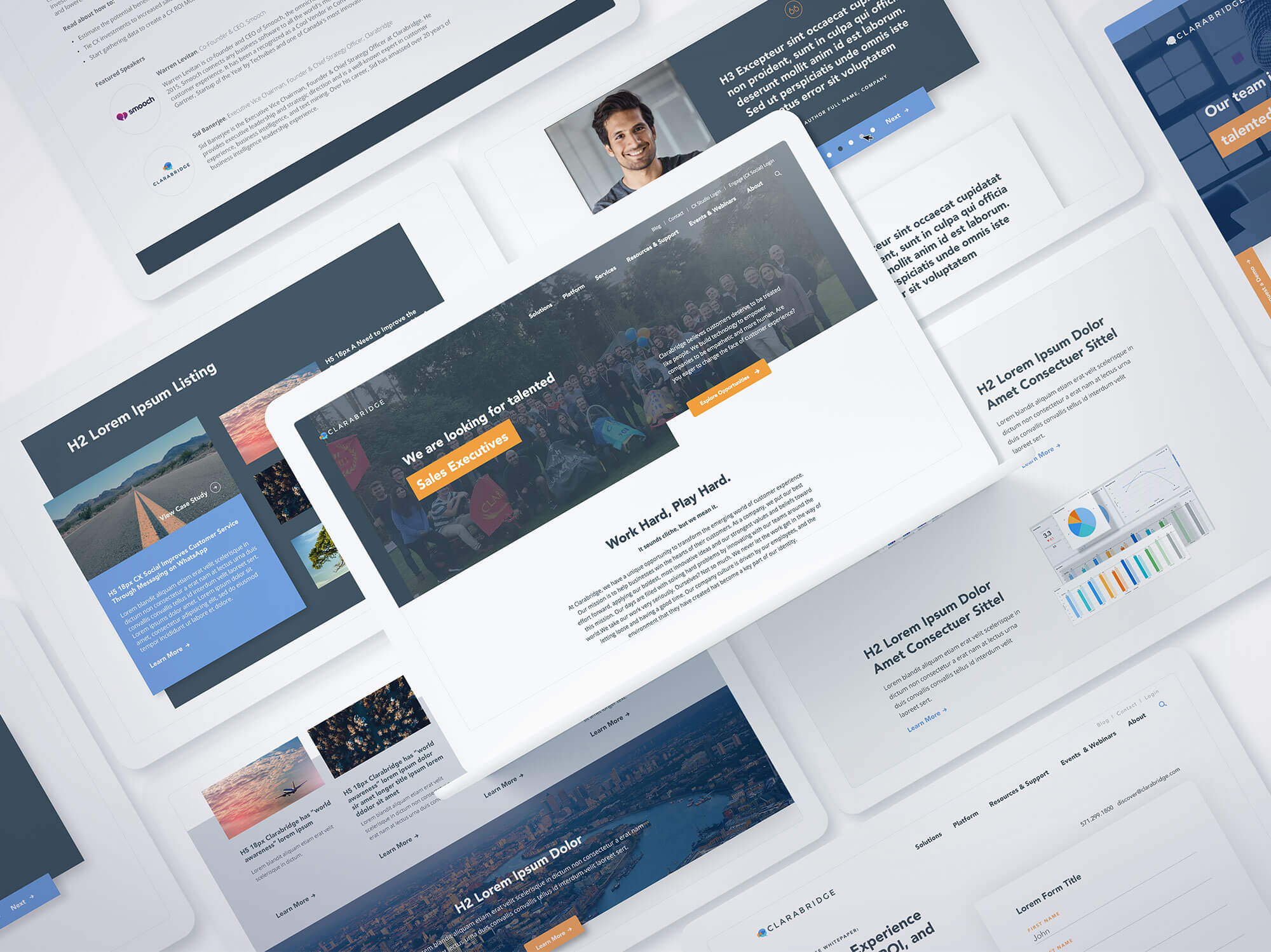
Creating a successful digital web design can mean the difference between growing your customers and losing them on your website doorstep. For Clarabridge, which delivers a better customer relationship platform for its clients by leveraging artificial intelligence to sort through complex data, providing clarity with its website was critical. It turned to Bluetext to unify its various website platforms into a single customer experience.
Clarabridge’s challenge was fairly straightforward: Its clients’ own customers constantly provide feedback through a wide range of information channels, from direct contact to social media and everything in between. Yet, that same explosion of these channels and the sheer volume of data creates significant challenges on how to make sense of it all. Telling that story on Claribridge’s digital platforms had been confusing. It needed a better way to tell its story.
To address the digital web design, Bluetext used digital storytelling, brand extension, a sophisticated user experience, and aggressive search engine optimization to deliver a new website that does what Clarabridge promises for its customers – turning complexity into clarity. You can view the website live here.
Clarabridge’s messaging was a key component of the digital web design: “Every call, every chat, every tweet, every post, every comment, every conversation, every sentence. EVERY WORD. Every customer interaction presents an opportunity; don’t miss a single one.”
We designed a creative approach to transform the intangible brilliance of Clarabridge’s software into a tangible experience for target audiences. It was something they could see, and seemingly touch and feel, to carry that message throughout the website and convey the value it could bring to every brand’s customer engagement.
The digital website design begins at the top of the home page, with an engaging animation that represents the massive amounts of customer data and feedback flooding into their clients’ systems. Flowing down the page, moving through a funnel that sorts and selects the right information at the right time, the graphic turns the data into actionable snippets of intelligence that can be fed to executives, product managers, contact center teams, and frontline staff to better serve their customers.
The creative style of the digital web design pushes the boundaries to enable Clarabridge to stand out in a crowded industry, while the linear path of the video animation delivers the product messaging in a creative way that gets attention while taking audiences through the sales funnel. To see the design in action, visit our Bluetext Hall of Fame.
“Bluetext should be at the top of your list if you are in the market for a redesign.”
We’ll let our client speak for the project results:
“When we started our journey to build a next-generation digital platform we challenged BlueText to create a unique, engaging user experience that tells the Clarabridge story in an impactful way. Bluetext knocked it out of the park! It created a modern site design that breaks through the clutter in our crowded industry; an A/B homepage that greets new visitors with a video narrative providing a concise understanding of what Clarabridge does while recurring visitors receive a streamlined, mobile-optimized view of the site.
Beyond that, the custom backend CMS is beyond easy to understand, creating significant efficiencies for the Clarabridge team. Lastly, where they truly excelled and what I will miss most, is working with such a top-notch team of experts. Their customer service and ‘deep in the trenches’ support during the project was critical. This was hands down the smoothest site launch I have participated in. BlueText should be at the top of your list if you are in the market for a redesign.”
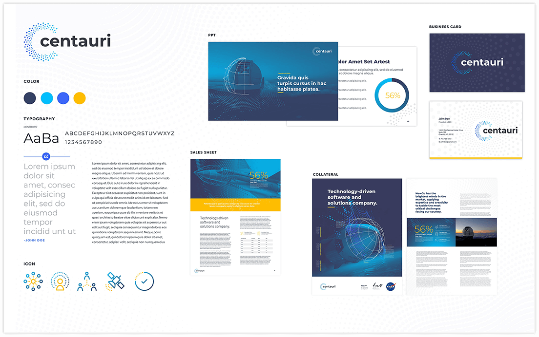
When the stars fall smartly into alignment with a new brand, it can elevate the organization to new heights. For Integrity Applications, a government contractor comprised of three of the leading companies in space, intelligence, cyber, the stars became a main focus of the rebrand. It turned to Bluetext to develop a new name, messaging, and brand that would represent the value that it brings to its U.S. government customers in the intelligence and national security community.
The company had several significant challenges that needed to be overcome, the first of which is that it works primarily in a sector where the programs are very sensitive and highly classified. Second, a primary goal for the brand is recruiting a talented team with advanced skills in software engineering as well as all elements of STEM. And third, it needed to stand out as a prime contractor in a crowded field of competitors.
Bluetext employed an extensive discovery and research process that included In-Depth-Interviews (IDIs) with top experts and executives across the company to define the specific attributes that make the organization unique. Our goal was to define what ties together the missions that the company supports. After interviewing senior executives across the organization, we conducted a separate set of IDIs with newly hired recruits to understand what made them choose the company for their careers. The focus on space became a key component in our process. We also talked to a number of veteran employees to understand what made them stay and what was important to their longer-term careers, a crucial component of the new brand story and recruiting materials. Using the results of these interviews together with competitive analyses and additional research, we created a messaging platform that recognizes its strong commitment to space as a key part of its legacy as well as its biggest opportunity for growth.
Employee engagement was a critical element in the process, especially given the competition to attract the best candidates with the technical skills and security clearances required by government customers. Once the new brand was approved, team members across the company were asked to participate in the brand launch through parties, branded clothing, contests, and a variety of other engaging activities. We also created a “Brand Essence” video to help tell the story.
Because of its interest in and focus on space, we also wanted to capture the hopes and vision that space exploration suggests. The result was the new brand Centauri. Centauri, from the star system Alpha Centauri, is the closest star system to Earth. And, like the company, it is composed of the brightest stars in the sky. It also has always been used as a navigation guide throughout history. We believed that because of these associations, Centauri was a great fit for the brand.
Once the name was approved, we turned to the corporate visual identity. Bluetext designed a cutting-edge look and feel for Centauri that sets it apart from the competition. Written in a custom lowercase typeface, the Centauri logo is modern and approachable with a unique icon representing the stars that make up the Centauri constellation. The star pattern around the logo became the basis for texture and patterns across collateral and the website.
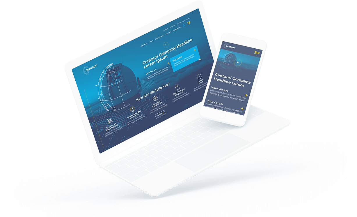
We then turned to the website. Centauri’s new website incorporates all of the brand’s new elements, ensuring consistent brand identity and a strong web presence. Bluetext designed a site and user experience that prioritizes recruitment.
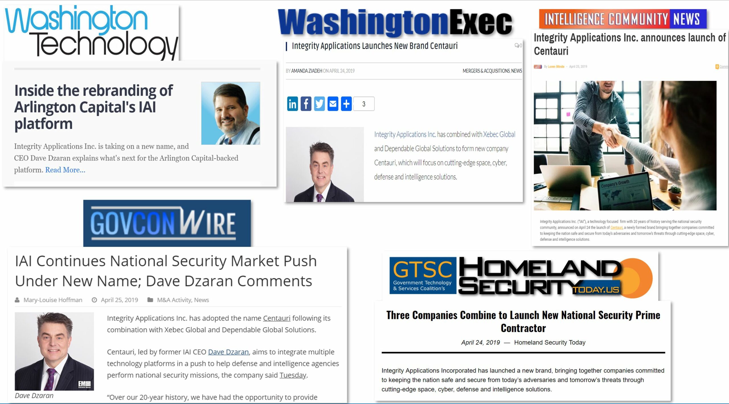
With the brand in place and the website launched, we introduced Centauri to the market through a series of media interviews with key vertical trade publications. Offering details and interviews with CEO Dave Dzaran in advance to key target outlets under an embargo agreement, we were able to shape the initial launch coverage to focus on Centauri’s growth strategy as it continues to acquire new capabilities for its customers.
For Centauri, with the help of Bluetext, the stars aligned for a bright new brand and a successful launch.
Many trade and membership organizations face a unique branding challenge with no easy solution: How do you brand association products and events in order to effectively tie the name of the association together with the offering> It’s not an easy question, especially when the event – typically a large annual trade show – has a long history and generates an important source of revenue for the organization. It’s even more difficult when the association’s asset is a product as opposed to a conference, such as a valuable industry certification. In a competitive market, the further the event or product is from the association, the more that brand equity is being lost.
Marketing trade associations is never easy, especially considering that the competitive landscape has never been more crowded. Not only are there more organizations chasing new members, but there are also more for-profit companies offering competing services. As a result, whether you are with a trade association whose members include large corporations, or a membership association with thousands of individuals enjoying your services and offerings, it takes a strong brand strategy and a sophisticated outreach plan to efficiently and effectively attract new members, retain existing members, and drive attendees to your conferences and events.
Having to reconcile the association brand with the brand of its products and events is not uncommon. It can often happen when the organization itself rebrands and updates its name without progressing the brand of its assets. Even among some of the largest and most established trade groups, this brand reconciliation can be a significant challenge.
What’s now known as the Consumer Technology Association holds its annual Consumer Electronics Show (CES) in Las Vegas in early January every year. CES is one of the largest and perhaps the most famous trade show in the U.S., primarily because electronics manufacturers annually launch their newest smart TVs, VR devices, and other cool technology at the show – guaranteeing media coverage from reports who want to showcase the future of innovation. For decades, the trade group was called the Consumer Electronics Association. So when it evolved to its new name in 2015, it had to decide what to do about its trade show CES. The answer was to leave it alone because its name had become much better known than the association that sponsors it every year. That wasn’t an easy decision, and the CES brand is prominently displayed on the Association website.
But when the trade show or other product becomes much better known than association itself, that creates significant challenges. For one, it makes selling memberships to the association more difficult because the connection between the association and the product gets lost. In one example, a long-established membership association that was feeling the increased competition realized through market surveys that its brand awareness had been flat or declining over the past several years. It turned to Bluetext for help in overcoming this downturn.
With more competing organizations offering similar services, the client recognized one of the reasons for this decline: It had spent years branding its products and events separately from the association itself. This divide can present a significant challenge for organizations which offer a wide range of services which have each been branded individually. As new membership prospects are entering the market, they may know the products – in this case, the professional certifications – but they don’t know the association itself. Our solution was a multi-tiered, integrated approach that combined programmatic online media campaigns, fresh and compelling themes and creative, and a separate set of campaigns for the branded products themselves. We tied all of this together with new messaging and gave the campaign the simple yet measurable goal of increasing brand awareness and engagement with the association.
For another large association that has been around longer than any other competitor in its vertical, one of the challenges had been a result of its age – its brand was getting stale. Our approach was to develop a fresh look for its annual conference that brings in most of their annual revenue. For this client, our focus was on a bold new creative design that took the brand color palette and re-imagined it in dynamic, contrasting tones that pop from a distance, with 3-D shapes that both fit the brand and stand out at a large trade show environment.
For trade association marketing, there is no one solution when rethinking the brand. But having a strong brand strategy is a critical first step.
Internet challenges can go viral, for better or for worse. For better, think of the Ice Bucket Challenge of several summers ago that raised millions of dollars for ALS research. For worse, the list is, unfortunately, a lot longer. There’s the Tide Pod Challenge, which has sent dozens of college kids to the emergency room, and more recently there was the Momo Challenge, which scared the wits of countless children who came across it on the internet.
YouTube has scrubbed ALL real video clips of the Tide Pod Challenge
What’s common to all of these is the relationship of the challenges to the brands that have been associated with the viral responses, especially when, like with the Tide Pod dares, it’s not safe and it certainly isn’t supported by Tide! As a result, company marketing and communications teams are struggling with how to respond to these dangerous challenges and encourage their quick cessation. Questions are being raised, in the meantime, about the responsibility of the digital platforms that allow the more dangerous challenges to take hold and the role of digital influencers who are becoming so important to brands in promoting them.
PRWeek’s Chris Daniels recently wrote a front-page article about the topic, “Beyond Momo: Why brands need to get ready for digital hoaxes.” In preparing the article, Chris interviewed Bluetext Creative Director and Co-founder Jason Siegel for insight on how agencies like ours counsel their clients on this dangerous trend.
As Jason told Chris, “When a hoax interacts passively with influencers, dangerous sharing at mass scale occurs.” Jason explained that influencers get deluged with so much information these days that the sheer volume means they may not be taking the time to research the origins of every trend. It is unreasonable to expect them to act as fact-checkers to understand what’s behind every viral moment – especially if it’s a challenge that’s getting traction.
In the PRWeek article, Chris focuses on the Momo challenge, which encouraged kids to do dangerous activities, and he discusses the responsibility of platforms like Google and Facebook.
“Brands need to think about the risk in terms of influencers they engage with and having the hoax interwoven in a paid influencers stream that is shared by many folks,” Jason told Chris.
At the very least, brands need to take a close look at their influencer relationships. They also need to have an “escalation” plan in case a viral challenge takes off, for better for worse.