
Brand Evolution
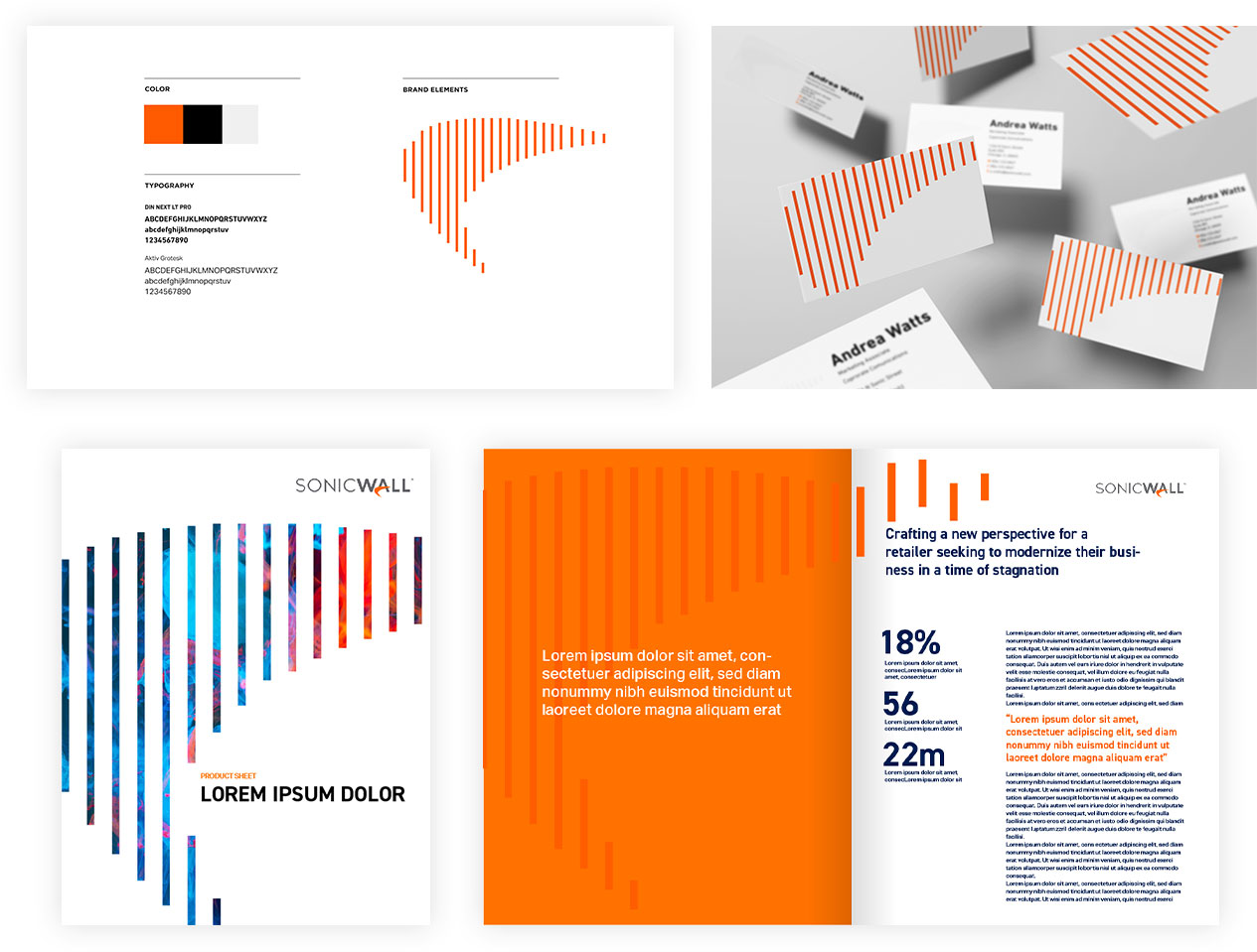
Amidst improving the website consistency, SonicWall saw an opportunity to refresh the brand with new energy and consistency. Preserving the integrity of the recognizable SonicWall “swoosh” element, Bluetext delivered a more cohesive and consistent CVI that still honored the original logo. New and improved brand guidelines, key art, and animation effects gave the brand a much-needed evolution, rather than revolution.

User Experience Overhaul
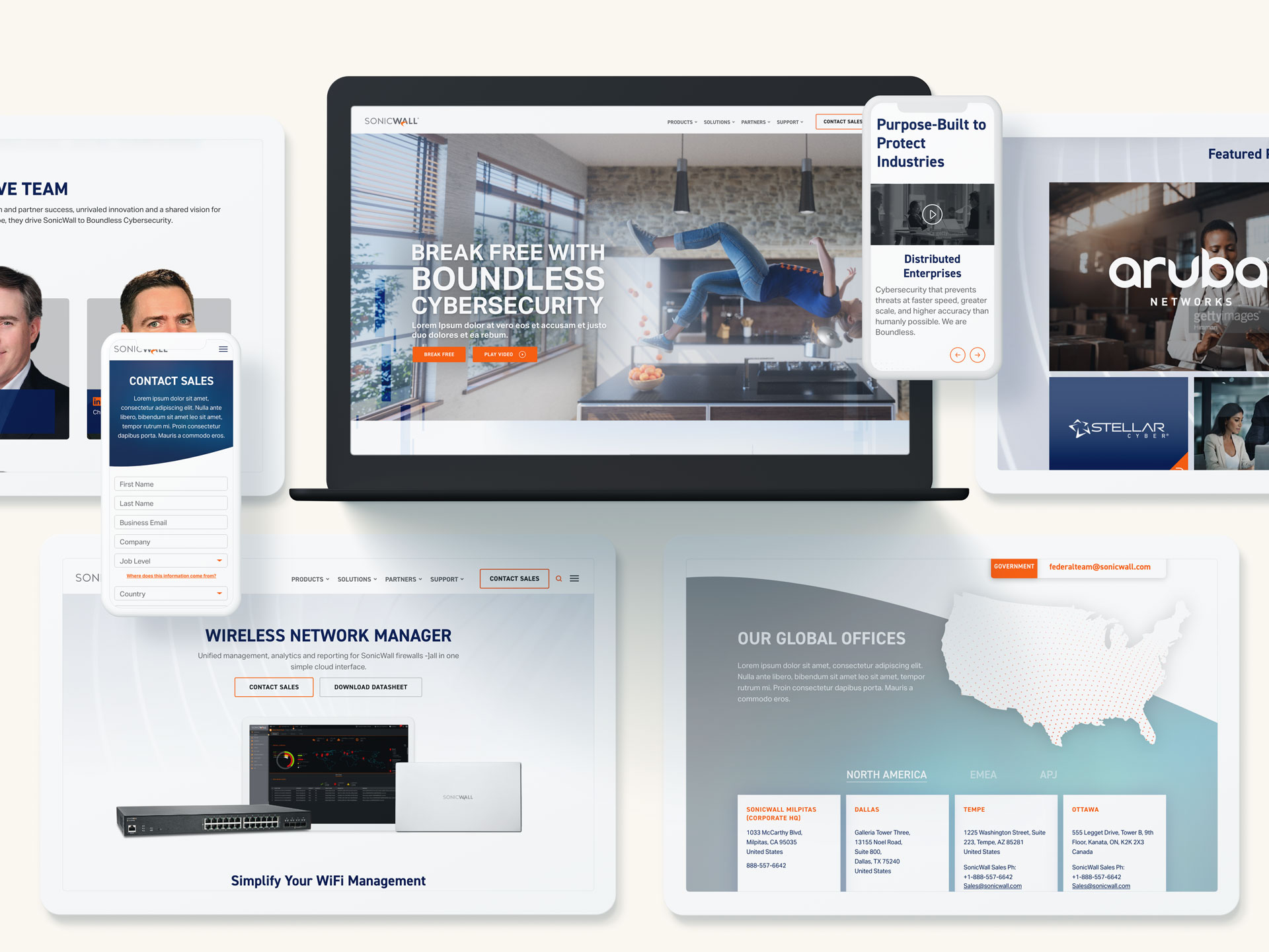
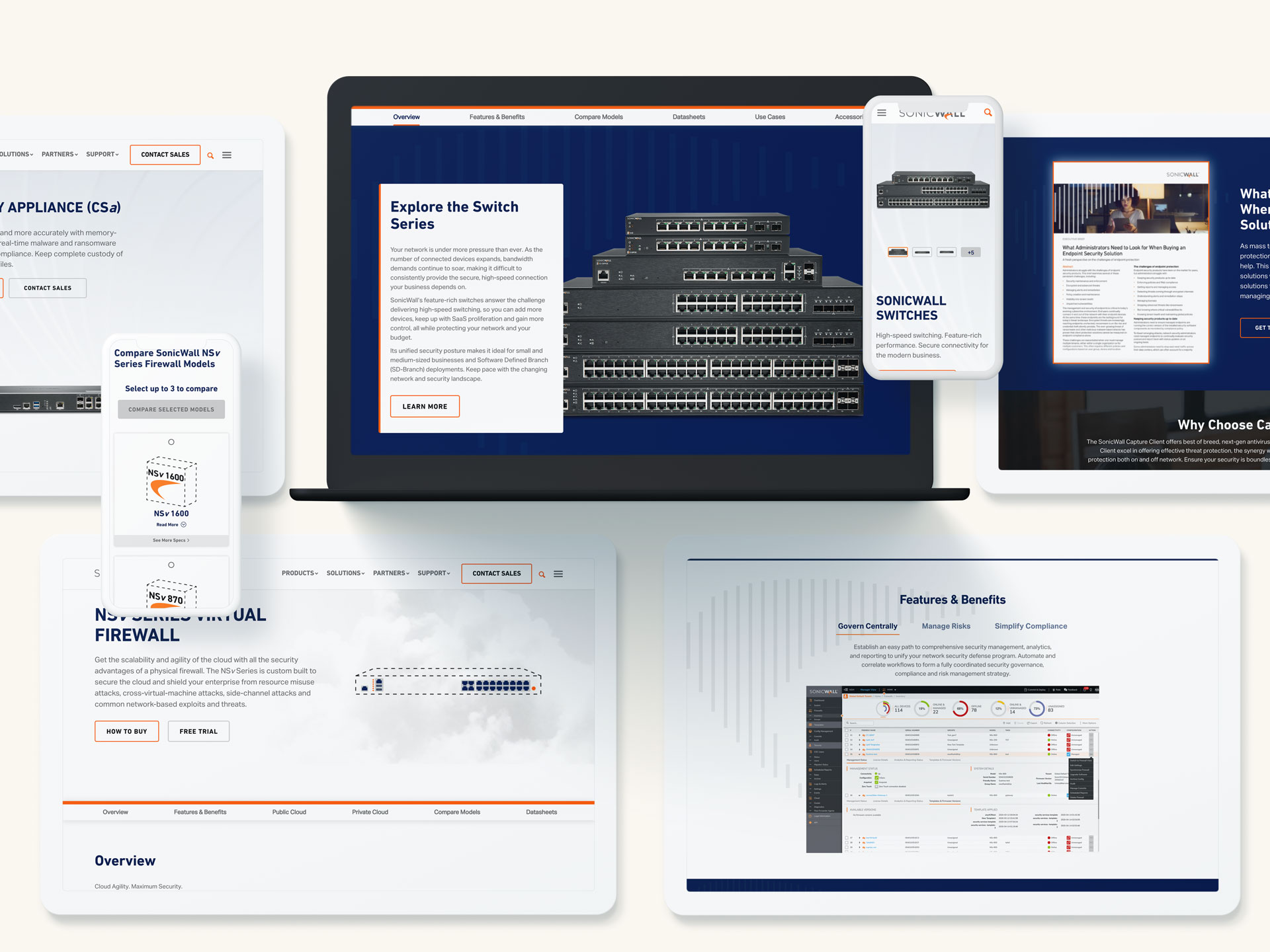
While well-known for its legacy products, an abundance of product information, overused animation, and imagery caused pages to suffer from slow site speed and poor user experience. SonicWall needed a new website experience to showcase an expanded product portfolio, streamline navigation and prioritize critical CTAs. Bluetext used proven UX expertise to simplify page animations, clean up code, and highlight CTAs for improved site speed and conversions.

Custom Website Integrations
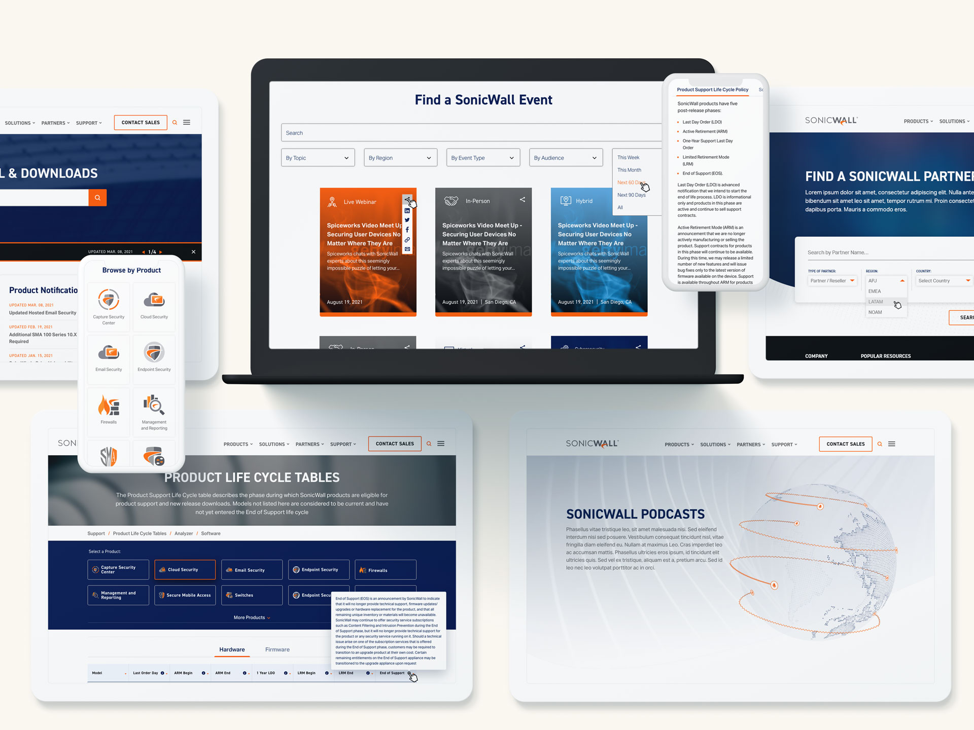
To create a frictionless user experience across the entirety of the site, Bluetext has integrated many custom functionality features. A robust Support Portal was created to house robust library of guides, how-tos and video resources for customers. Third-party integrations were implemented to enable a global partner locator, list externally hosted events, webinars and podcasts.

Creative Campaign Projects
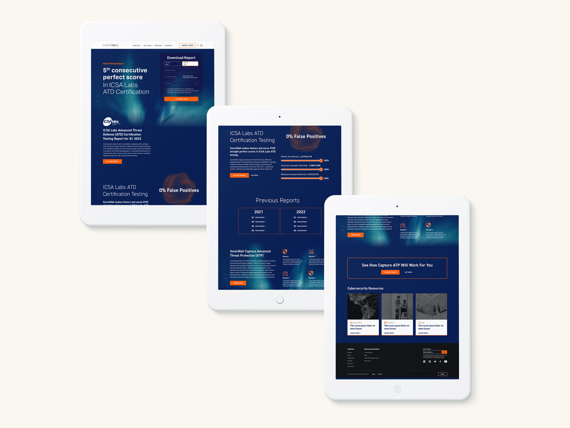
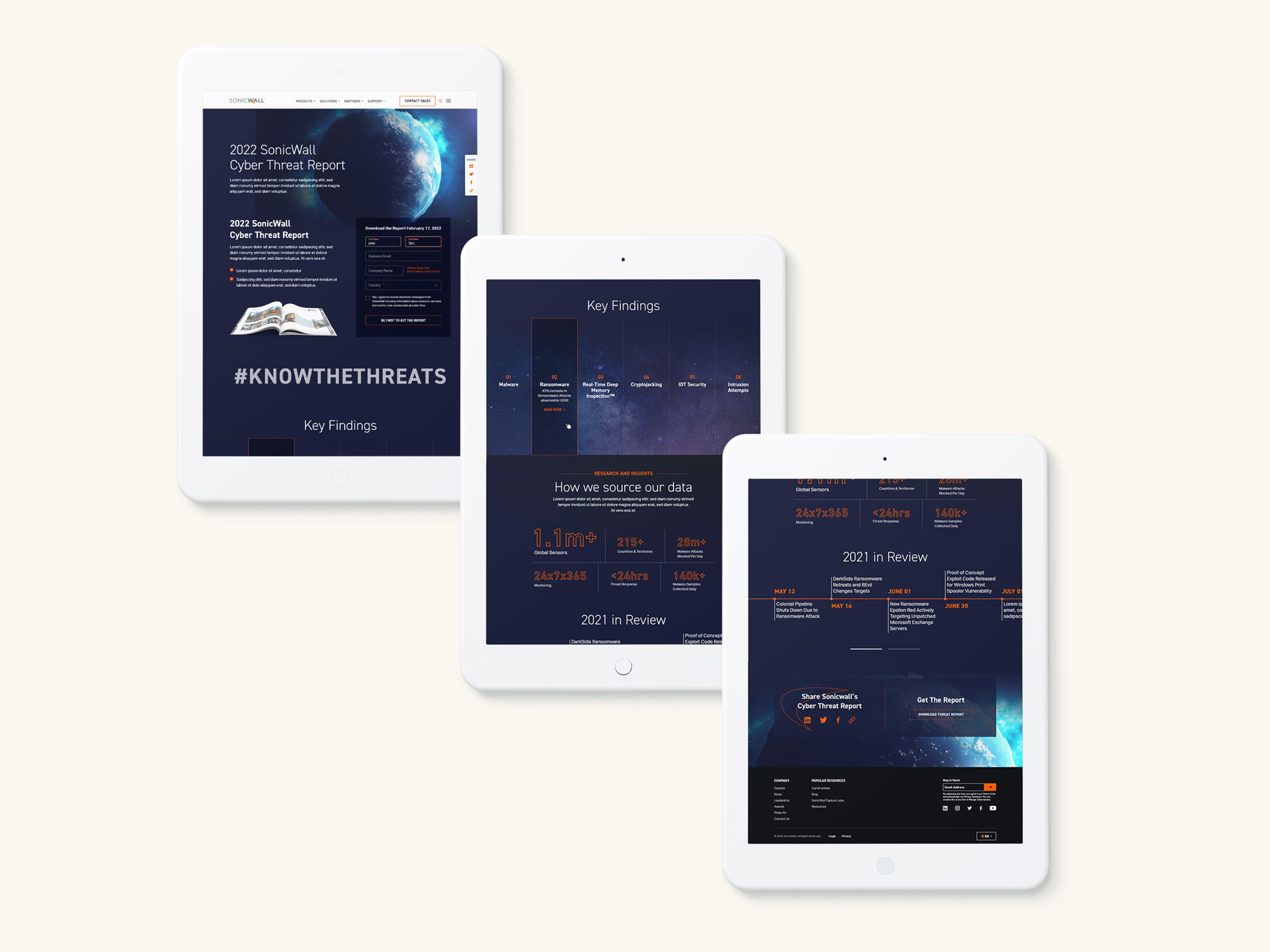
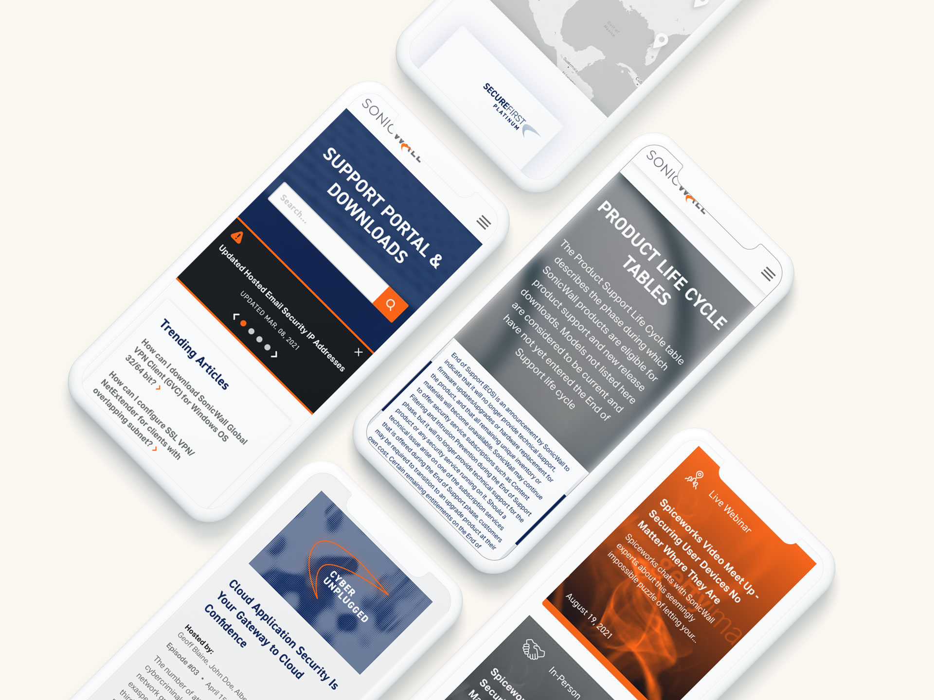
Aside from product and partner-focused sections of the site, Bluetext supports a number of miscellaneous campaigns and creative projects. From SonicWall's annual Threat Report campaign landing pages to an interactive phishing quiz, Bluetext creative services and UX expertise is leveraged.
