Cancel
Branding, Digital Marketing, Logo Design

The Role of Simplified Logos in Corporate Rebranding

by Jason SiegelSeptember 7, 2026
Share

In the competitive world of corporate branding, a logo serves as the visual cornerstone of a company’s identity. As markets evolve and digital platforms become more prevalent, many companies are opting to simplify their logos as part of a rebranding strategy. This trend is not merely about aesthetics; it’s about creating a logo that resonates with contemporary audiences and enhances brand recognition. For marketing leaders, understanding the role of simplified logos is crucial for driving successful corporate rebranding initiatives.

Why Simplify a Logo?

The movement towards simplified logos is driven by the need for clarity and adaptability. In an age where logos are displayed across diverse digital channels and devices, a complex design can become a hindrance. Simplifying a logo ensures that it remains legible and impactful, whether viewed on a smartphone screen or a billboard. This approach aligns with the minimalist design trend, which emphasizes function and clarity over ornate detail.

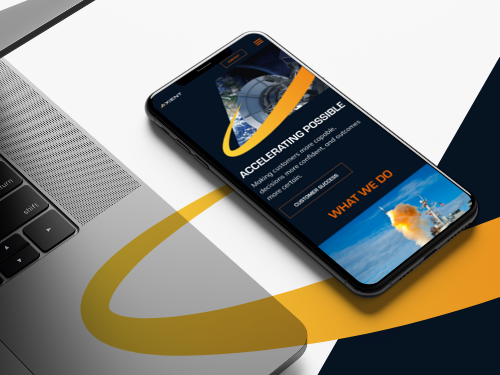
First impressions shape valuations. Discover how our logo redesign gave Axient an unmistakable visual edge in a crowded market.

Enhancing Brand Recognition

One of the primary goals of a logo is to be easily recognized and remembered. Simplified logos often achieve this by focusing on core elements that define a brand’s essence. By stripping away unnecessary details, these logos can distill the brand message into a powerful visual cue. This not only aids in brand recognition but also in differentiating the company in a crowded marketplace.

Adapting to Digital Environments

As digital platforms continue to dominate the marketing landscape, logos must be versatile enough to function effectively across various media. Simplified logos are inherently more adaptable, offering consistent quality and appearance regardless of the platform. This adaptability is crucial for maintaining brand integrity in digital marketing campaigns, as seen in successful projects by leading digital design agencies.

Great marks simplify complex visual noise. Step inside our strategic design process for Trawick’s new logo to build instant audience recall.

Case Studies: Successful Simplifications

Several high-profile companies have successfully implemented simplified logos as part of their rebranding efforts. For instance, major tech firms have adopted minimalist designs to convey innovation and forward-thinking. These changes have not only refreshed their brand image but also aligned their visual identity with their strategic goals. At Bluetext, we have observed that such transformations often result in increased consumer engagement and loyalty.

The Role of Color and Typography

In simplified logo design, the choice of color and typography plays a pivotal role. A limited color palette can make a logo more memorable and versatile, while typography can convey a brand’s personality and tone. Selecting the right combination is crucial for creating a logo that not only looks appealing but also communicates the desired brand message effectively. This process often involves collaboration with expert logo design agencies who understand the nuances of visual communication.

Challenges in Simplifying Logos

While the benefits of simplifying a logo are clear, the process is not without challenges. Companies must ensure that the new design remains true to the brand’s heritage and values. This requires a deep understanding of the brand’s history and future direction. Additionally, gaining internal buy-in can be difficult, as stakeholders may be attached to the existing design. However, with a well-articulated strategy and clear objectives, these challenges can be effectively managed.

For organizations considering a logo simplification as part of their rebranding strategy, partnering with a leading brand strategy agency can be invaluable. At Bluetext, we specialize in crafting logos that not only simplify but also amplify brand identity. Contact us today to learn how we can support your rebranding efforts and drive your brand forward.

Frequently Asked Questions (FAQ)

What does simplifying a logo actually involve?

Simplifying a logo means distilling it down to the essential shapes, colors, and typography that carry your brand’s equity. It often includes removing fine details, gradients, and visual effects that don’t scale well, while refining proportions and spacing for clarity. You may also create a streamlined system of marks—like a primary lockup, a wordmark, and a compact icon—that perform across different contexts. The goal is a cleaner, more memorable mark that remains unmistakably yours.

How does a simplified logo improve brand recognition?

Simpler forms are easier for the brain to process and recall, which helps your brand stand out in crowded feeds and fast-scrolling environments. A strong silhouette, clear contrast, and minimal elements become a quick visual cue that people can recognize at a glance. This clarity also reduces confusion with competitors who may share similar visual features. Over time, the consistent, distilled mark builds familiarity and trust.

Will simplifying our logo risk losing brand heritage?

A well-executed simplification preserves your brand equity by keeping iconic elements—such as core colors, distinctive shapes, or characterful letterforms—while refining details for modern use. Start with an audit of what audiences already associate with your brand and make those elements non‑negotiable. Evolve rather than reinvent, validating changes with research and controlled A/B tests. The result feels both familiar and fresher, honoring legacy without looking dated.

Why are simplified logos better for digital and small screens?

On phones, watches, and social avatars, tiny canvases and varying screen qualities can obliterate fine detail. Simplified marks maintain legibility at small sizes, render crisply in dark and light modes, and compress efficiently for faster load times. They also adapt well as favicons, app icons, and watermarks without visual noise. This consistency protects brand integrity across every digital touchpoint.

How should we approach color and typography when simplifying a logo?

Use a tight palette with one or two primary colors plus neutrals to maximize versatility and contrast accessibility. Choose typography that reflects your brand’s personality but remains legible across sizes; customized letterforms can add distinctiveness without clutter. Test combinations in real environments—on screens, print, dark mode, and motion—to ensure reliable performance. Keep stroke weights and spacing robust so the mark stays clear in any medium.

What metrics show that a simplified logo is working?

Track aided and unaided recall, recognition speed, and distinctiveness in brand studies before and after launch. Monitor digital KPIs where the logo is prominent—social engagement rates, ad click‑through, and on-site conversions—for signs of improved clarity and trust. Watch for operational gains too, like fewer misapplications and faster asset production. Qualitative feedback from customers and employees can validate the quantitative lift.

How can we get internal buy-in for a logo simplification?

Begin with a clear, insight‑driven brief that ties design changes to business goals like recognition, accessibility, and digital performance. Involve stakeholders early with workshops, competitive audits, and iterative prototypes so they see how equity is being protected. Pilot the new mark in low‑risk channels to gather real-world feedback and reduce anxiety. Establish governance and rollout plans so adoption feels structured, not abrupt.

Are there examples of brands benefiting from simplified logos, and what can we learn?

Leading tech and consumer brands have embraced minimalist marks to signal innovation, improve screen legibility, and unify complex product ecosystems. These refreshes typically streamline shapes, reduce color complexity, and create responsive logo systems that flex by context. Agencies like Bluetext have observed that such shifts often correlate with clearer storytelling and stronger engagement. The key lesson: simplify with intent—protect equity, prioritize usability, and align visuals to strategy.