As businesses navigate a complex and ever-evolving market landscape, the significance of a strong brand identity has never been more critical. At the heart of this identity lies the logo, a powerful visual emblem that represents a brand’s essence. In recent years, the trend in logo design has shifted towards minimalism, embracing the “less is more” philosophy. This approach not only enhances brand recognition but also aligns with the modern consumer’s preference for simplicity and clarity. For marketing leaders, understanding this trend is essential for crafting a compelling and enduring brand presence.
Why Simplify Logos?
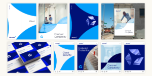
The shift towards simplified logos is driven by several factors. Firstly, in an age of digital saturation, consumers are inundated with information. A clean, simple logo cuts through the noise, making it easier for audiences to recognize and remember a brand. Moreover, simplified logos are versatile, ensuring they look great across various mediums—from business cards to digital screens—without losing impact. This adaptability is crucial for maintaining a consistent brand image in diverse settings, as seen in the work done by Bluetext’s logo design team.
The Role of Technology in Logo Design
Advancements in technology have also influenced the trend towards minimalism. With the rise of digital platforms, logos must be adaptable to different screen sizes and resolutions. Simplified designs are inherently more scalable, ensuring they remain clear and effective on any device. This is particularly important as brands engage in omnichannel marketing strategies. Additionally, the evolution of design software allows for greater experimentation and iteration, enabling designers to refine and perfect minimalist logos with precision.
Psychological Impact of Minimalist Logos
Minimalist logos are not just aesthetically pleasing; they also resonate on a psychological level. Research suggests that simplicity in design can evoke feelings of trust and reliability. A straightforward logo communicates transparency and honesty, attributes that are highly valued by today’s consumers. This psychological impact can be a decisive factor in brand loyalty, especially in competitive markets like aerospace technology and healthcare, where trust is paramount.
Successful Simplifications
Many iconic brands have successfully transitioned to simplified logos, enhancing their market presence. Consider how Google and Apple have embraced minimalism, reinforcing their identities as innovative and forward-thinking. These brands demonstrate how strategic logo simplification can lead to greater brand recognition and consumer engagement. Bluetext has also executed similar strategies for clients, leveraging the power of simplicity to create impactful brand identities in sectors ranging from technology to digital marketing.
Implementing a Simplified Logo Strategy
For executives considering a logo redesign, a thoughtful approach is crucial. Begin with a comprehensive audit of your current brand identity and assess how a simplified logo could align with your strategic goals. Engage with experienced designers who understand the nuances of minimalism and can translate your brand’s core values into a streamlined visual identity. This process should be iterative, allowing for feedback and refinement to ensure the final design resonates with your target audience.
Embracing Simplicity with Bluetext
The future of logo design is undeniably leaning towards simplicity. By embracing the “less is more” approach, brands can achieve greater clarity, adaptability, and emotional connection with their audiences. As a leader in B2B and B2G marketing, Bluetext is poised to help you navigate this trend, ensuring your brand stands out with a powerful, minimalist logo. Contact us today to explore how our expert team can support your branding and marketing strategies.
Recent Posts
The Impact of B2B Branding Agencies on Emerging Markets
Unlocking the Future of Search: How Answer Engine Optimization is Transforming B2B and B2G Strategies
Top Cybersecurity Marketing Trends to Watch in 2027
Bluetext’s Recent Work