A business’ marketing content is crucial in informing and educating prospects and customers about the company. It helps communicate the company’s story, credibility, leadership in the industry, as well as specific solutions and challenges they can solve. It not only represents your business but also your value proposition. It determines what sets you apart from your competition. Content marketing helps to educate and guide customers on authentic and trustworthy experiences, ultimately leading to conversions for your business.
There is no shortage of marketing resources available. From infographics to whitepapers, to case studies and blogs, marketing content exists in all shapes and sizes. The variance helps open your resources to a wide range of audiences while also keeping content fresh and modern. But what is the best way to showcase all your resources together in one organized, concise place?
Rise of the Resource Centers
The popularity of businesses creating online Resource Centers/Hubs on their websites is through the roof. Resource Centers consist of pages and pages of content marketing assets. End users typically can preview the type of content, a short description, and maybe even a thumbnail image. Resource Centers can often become extremely overwhelming for a user, driving away conversions. The user journey is important to keep top-of-mind when designing your Resource Center.
One of the best ways to improve the user experience while browsing content marketing is to aid them in finding exactly what would cater to their needs. Taxonomy tags are the most efficient way to categorize content by type, category, or keyword. Users should be able to easily search or filter between taxonomies, to view results relevant to them as a click of a button. Resource Center listing pages can even pre-filter content and allow the user to view specific collateral types, topics, or more upon landing.
Industry Examples
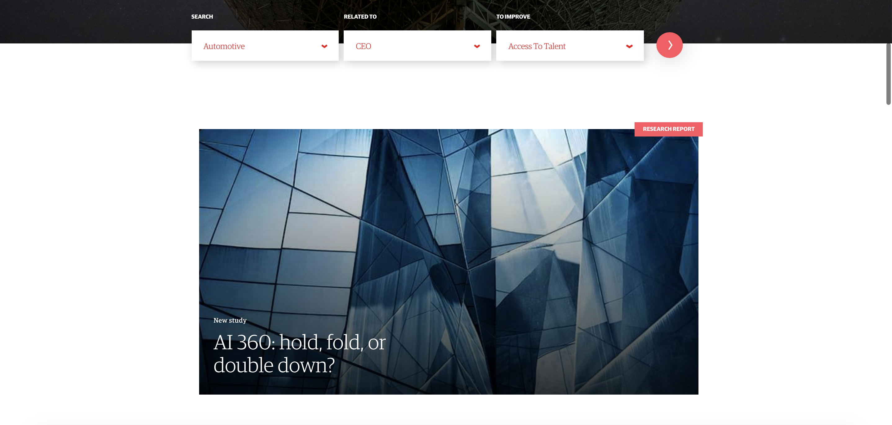
For example, Genpact exemplifies a simple user journey on their Resource Center. The first thing a user sees landing on their “Insights” page is the ability to search for content related to a specific industry, function, or even to improve a strategic goal. By establishing obvious and easy to use personalization options, users feel catered to and confident they will find exactly what they are looking for. And even without a specific intent in mind, users can pre-filter options to simply browse by industry, function, or goal-relevant to them. Users can even combine all three filtering options to view even more tailored results.
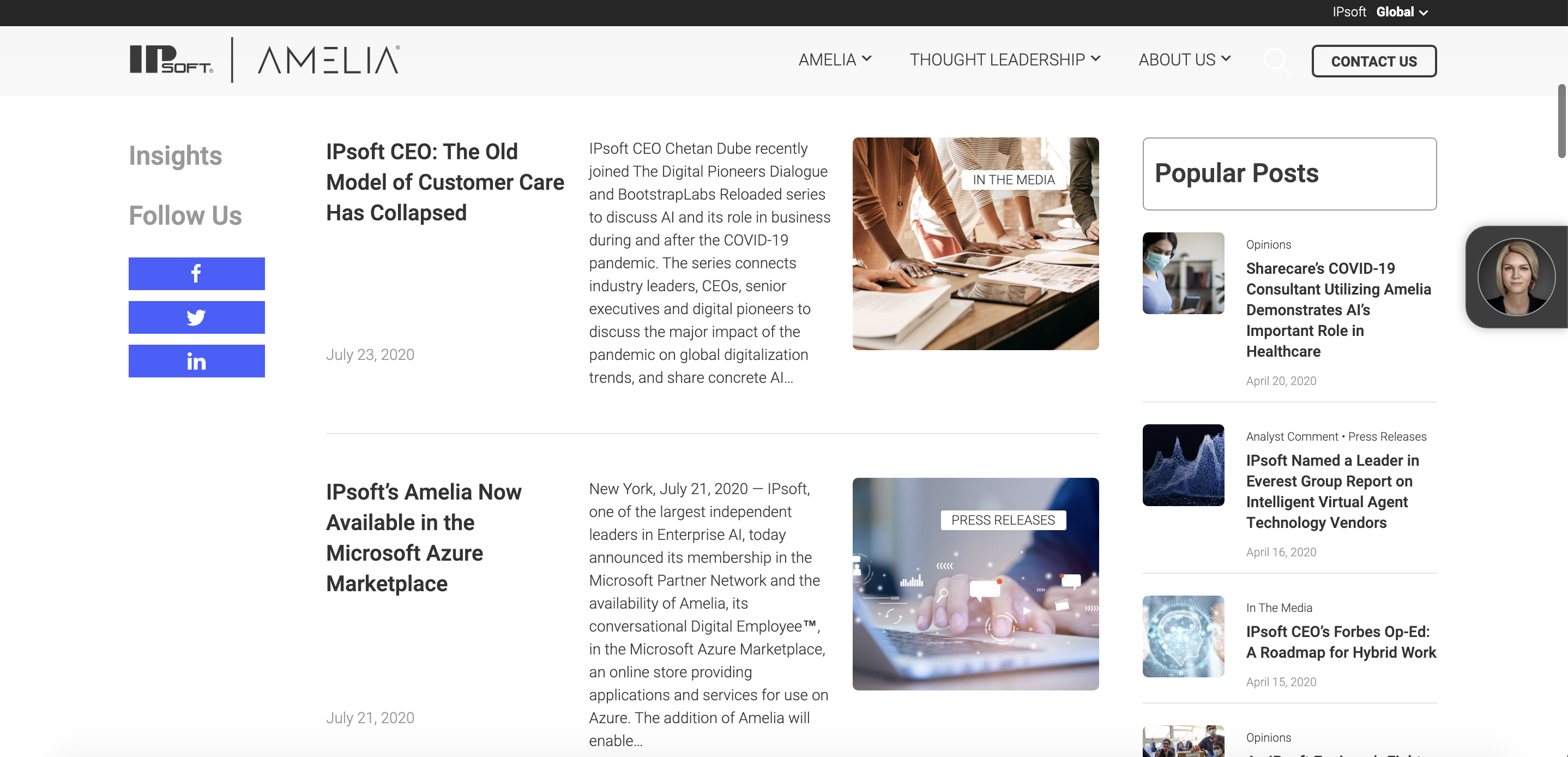
Another great example of pre-filtered content in a Resource Center is IPsoft. IPsoft filters all content by types, such as Press Releases, Opinions or blogs, or educational resources such as whitepapers and videos. For users browsing the newsroom, all content is sorted chronologically and categorized by large, recognizable tags. In addition, popular posts constantly follow the user in the right-hand column while social media share buttons are easily accessible in the left-hand column.
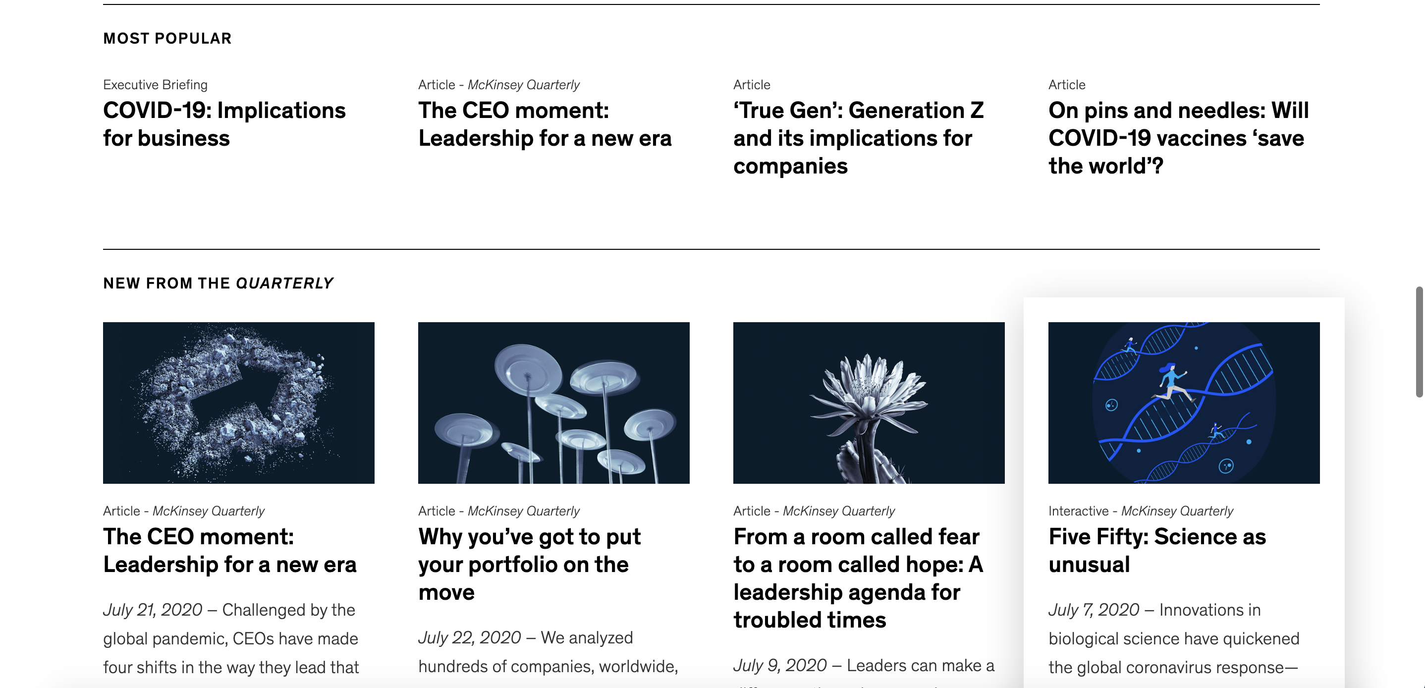
McKinsey takes a unique approach in its Resource Center by showcasing its range of content marketing and news types in nugget-sized promotional banners. With this approach, a user is introduced to a wealth of resources and content types, without being overwhelmed. With only one to four resources shown per type, the page is easily scannable. This not only caters to the simplified user journey for the user who knows what they want they’re looking for, but also for the user who wants to explore and browse content. McKinsey sorts by popular posts, magazine insights, global institute insights, and podcasts and videos into one streamlined interface, much like a magazine stand. This further cements the credibility of the company as well by highlighting various company publications.
Along with pre-filtering content for your audience, creating a unique and well-designed Resource Center is key for standing out amongst your competitors and bringing in potential conversions. It’s crucial you recognize the goal for your Resource Center – is it to highlight outstanding thought leadership? Or is it to showcase your wide range of insights? Once you have your goal in mind, focus on user experience, and strategic branding to achieve your goals and watch the conversions come in.
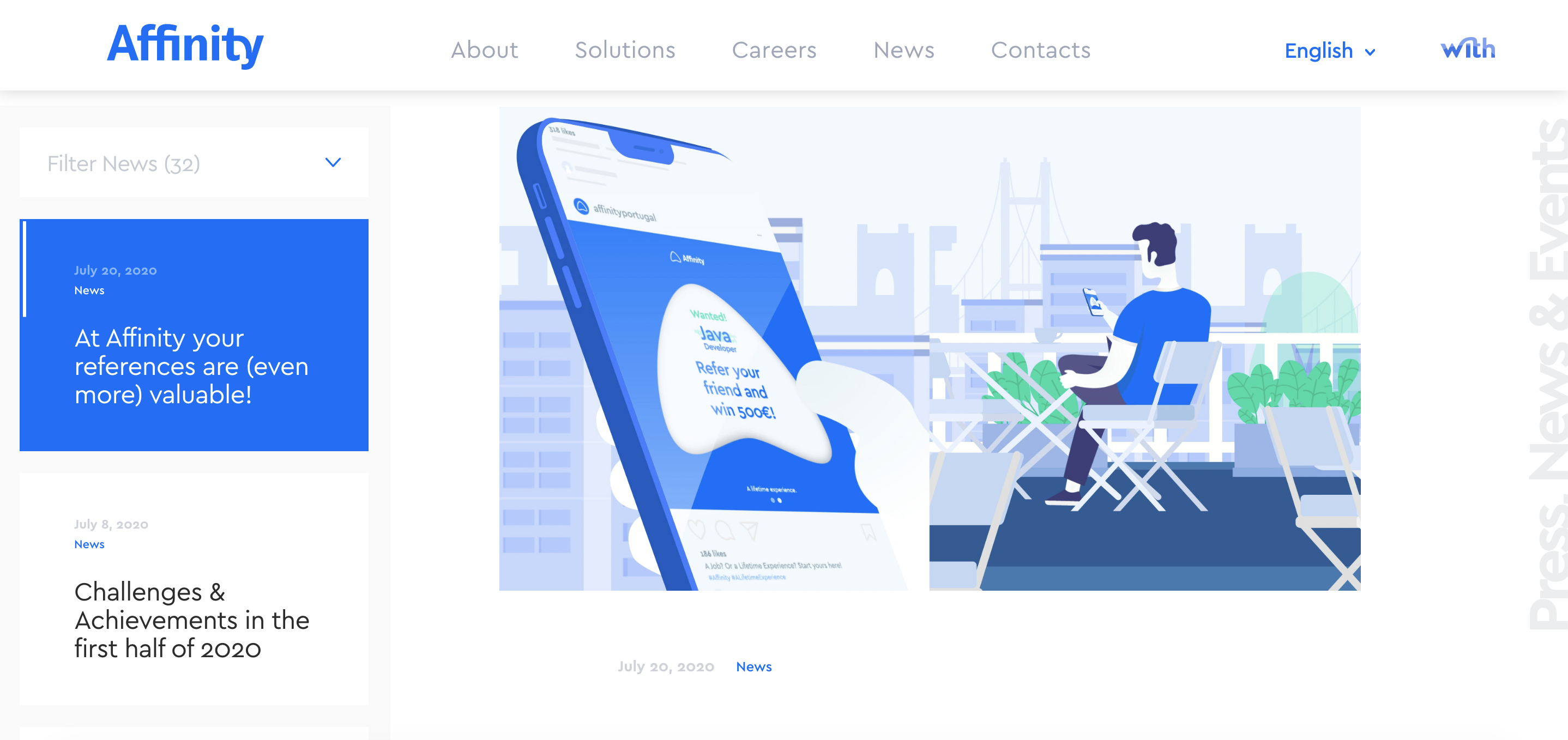
Affinity is a prime example of using unique branding to frame their content marketing as interesting and valuable. Affinity is focused on showcasing a breadth of content and has created a unique design to accomplish this goal. When you land on the News, you immediately view the most recent article, ready for your users to read. While prioritizing the most up to date content, the left-hand column allows users to scroll through other posts or resource types with the ability to filter by categories. It gets a user hooked on the breaking headline, but not without showing off the greatest hits.
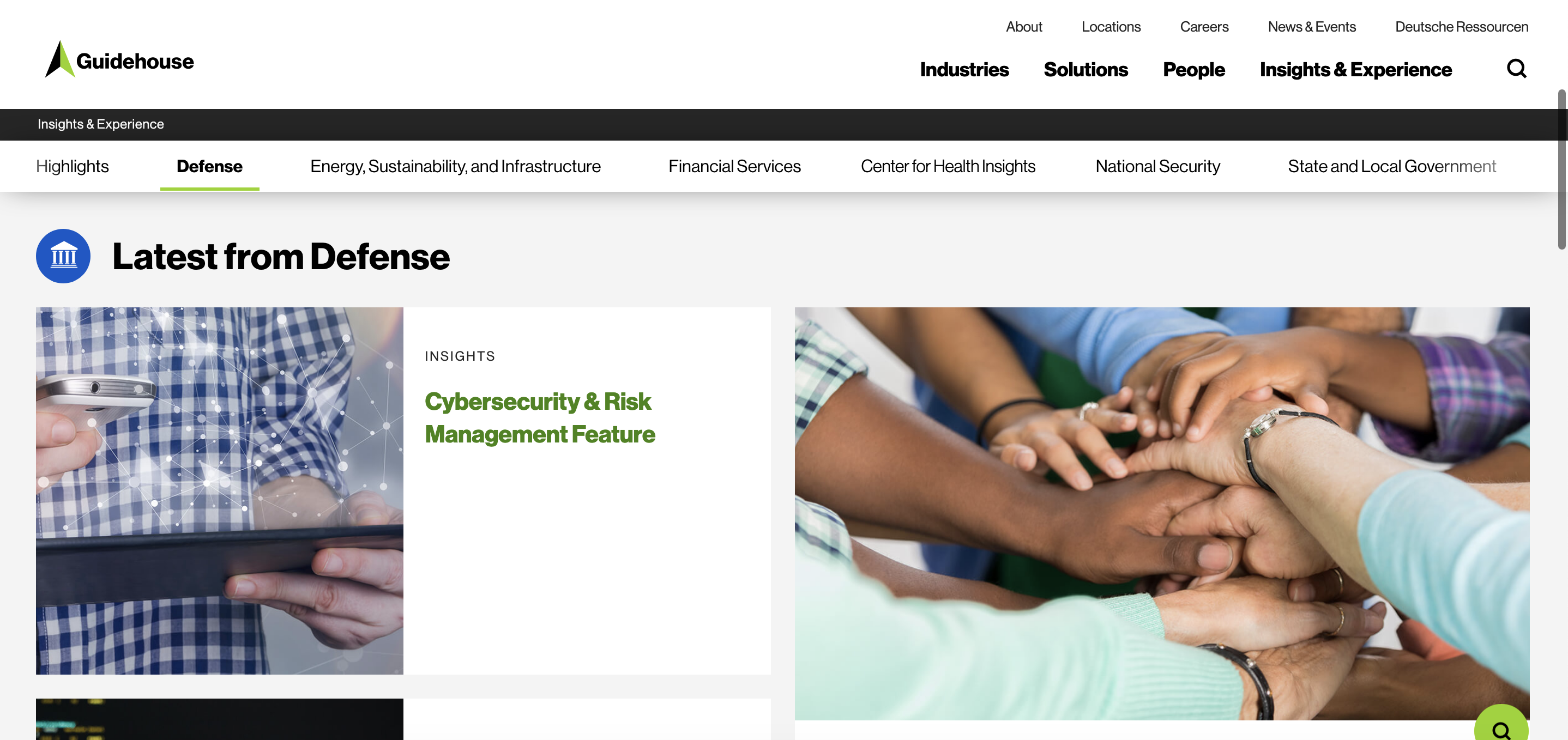
Another great example of a unique Resource Center is Guidehouse. Guidehouse has a large number of insights, thus utilizes sticky navigation. Sticky navigation follows a user as they scroll up and down on a page so that a menu of alternate pages or sections are always in view. Their sticky navigation showcases pre-filtered content in a variety of industries. This highlights their range of abilities, while also ensuring users never feel lost in an unfamiliar industry.
We all want to be thought leaders, but your company has to look the part. Don’t underestimate the power of your marketing content. Utilize your content and drive conversions for business and reputational success!
Considering amping up your Resource Center? Trust Bluetext with all your digital marketing and design needs!