As the world becomes increasingly digital, having a professional, user-friendly website is now more important than ever. With countless options for building or overhauling a website, picking the right content management system or DC digital web design agency can seem overwhelming. Don’t panic, Bluetext is here to provide expert advice to all decisions that go into building your digital ecosystem. As a top DC digital web design agency, with teams of Drupal and WordPress development experts, Bluetext has worked with countless client’s to build high-quality, easy-to-navigate websites. Our teams of user experience and user interface specialists take many things into consideration when building a website; however, navigation is always a top priority. 94% of web users report easy navigation is the most important feature when evaluating a website. As an experienced DC digital web design agency, we’ve been able to test why and how logical website navigation is critical. Here are four ways to make sure your website is as intuitive as possible.
1. Keep Things Orderly
In creating a new website, the order of information on a page can make or break the user experience. People tend to best recall the first and last items in a series and forget the information in the middle – this is known as the primacy and recency effect. For this reason, the most important information should be included in the hero zone of a website. The hero zone, in other words, can be best equated to an elevator pitch – a short description of your idea, product, or company that briefly explains your concept in such a way that any viewer can quickly understand it.

2. Remain Consistent
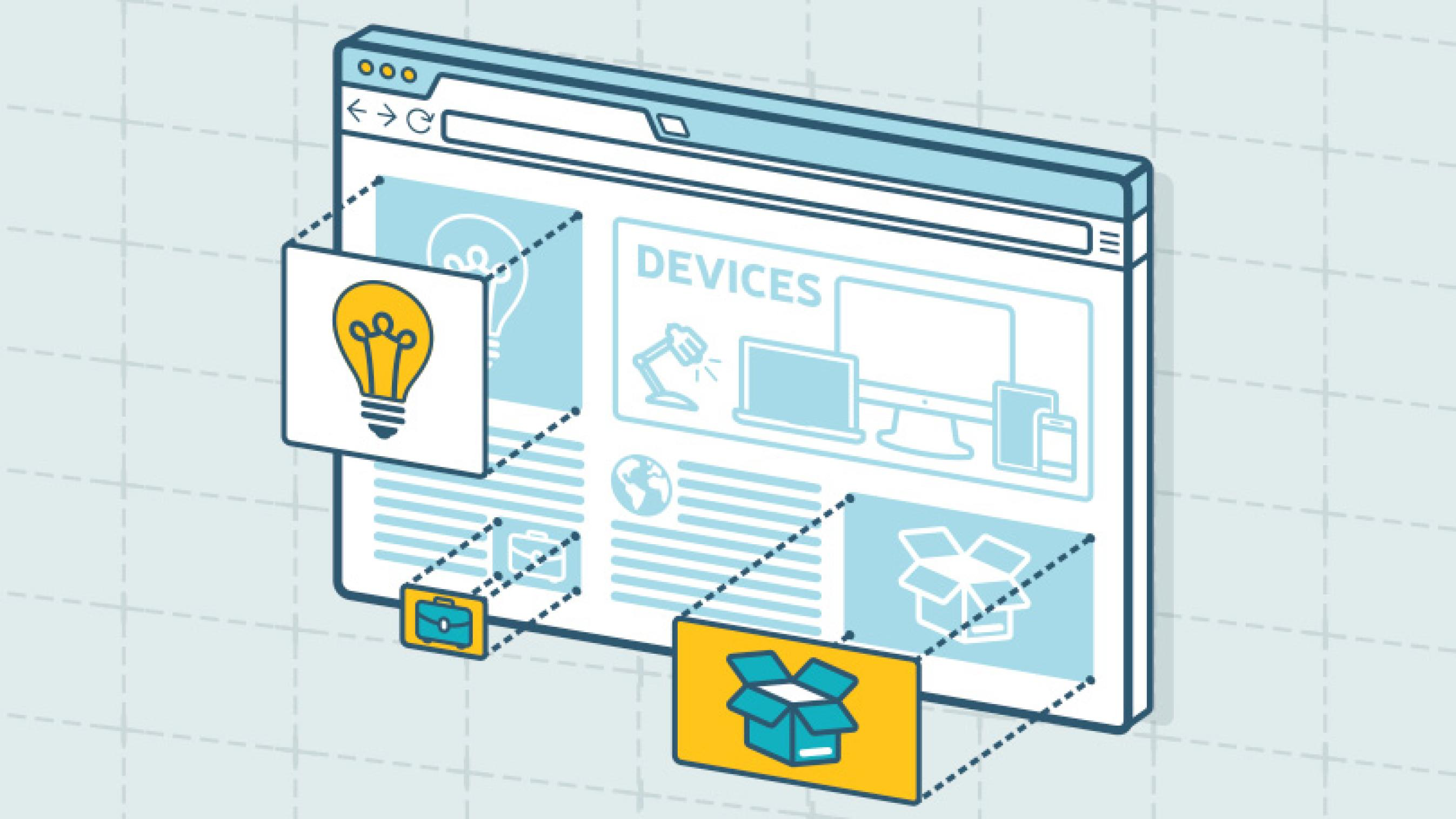
By 2027, there will be more than 41 billion IoT devices around the world. The increased volume of IoT devices means more individuals around the world will be accessing the web through a wider range of devices. As a DC digital web design agency, we’ve seen the increased importance of creating responsive websites that automatically scale to device type but remain consistent in general structure. Menu systems often become crowded and confusing as screen widths decrease to tablet and mobile devices. Digital design agencies can help overcome this obstacle by recognizing the critical breakpoints in your site’s design and implementing menu structures optimized for tablet and mobile screens of all generations. By keeping this consistency in structure and navigation across devices, users will become more familiar with and loyal to your website and brand.
3. Limit Menu Items
To ensure a website is easy-to-use and navigate, the structure is essential. For example, listing each page separately in a navigation header creates an overwhelming and near impossible user journey. Your sitemap should act as a foundation, with the most important items laying the building blocks for secondary pages. By systematically creating a logical sitemap utilizing primary and secondary navigation, you can create a fluid user experience that allows users to find exactly what they need with ease. As a DC digital web design agency, we have access to and frequently use site map testing tools, such as Treejack, to evaluate the findability of topics on a website. Not to mention, creating a logical, hierarchical sitemap makes it much easier to produce an XML sitemap, which is pivotal for SEO.
4. Test. Test. Test.
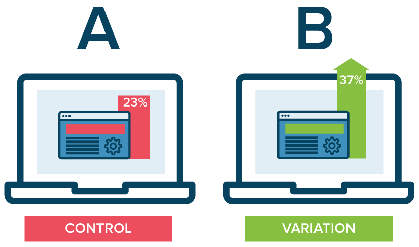
A/B testing website navigation is the only way to truly take the guesswork out of website optimization. As a DC digital web design agency, our Drupal and WordPress development experts have seen first hand the benefits of A/B testing. With proper testing, website navigation changes can be data-driven. Conversations surrounding those changes then shift from “I think” to “I know.” Although A/B testing can be employed to answer one-off questions, it should be continually used to improve metrics, such as conversion rate, over time.

In building or redoing a website, intuitive navigation design should always be a top priority to ensure users don’t require instruction or trial and error to move around the site. By using the navigation best practices mentioned above, you’ll have taken a great first step towards better engagement and higher conversion rates on your website by enhancing overall user experience. To learn more about our processes and to see our work, check out our case studies.