Trade associations that represent the interests of and provide services for their members, be they large companies and organizations or individuals, all face the challenge of retaining their current members every year, growing their member base and reaching non-members who may be involved in the policy or business arenas. Competition among associations is fierce. Even without competitive pressures, it’s not always easy to convince individuals, organizations, small business or large corporations to devote resources and pay fees to an industry association year-after-year. They not only have to see the value, they need to feel part of the group and believe that it is looking out for their interests and providing them the services they want.
With industry associations as with other organizations, the website is the hub of activity for members and others who want to know about the group and its issues. Too often, the hub is ignored because it’s not viewed as central to the mission of the group. We think a strong website is essential, because that is the first place that any target audience is going to look for information. Bluetext has helped dozens of industry and membership organizations leverage their web presence to better recruit and retain their members, grow their revenues and maintain a close relationship with their constituents. Here are our top five tips:
Make It Engaging. Compelling website design and graphics are extremely important to reach those key audiences and to keep them interacting with the site. First impressions are important, and if the design doesn’t resonate, the visitor may leave quickly without engaging. A tired or out-of-date design signals that the association may not have the resources or digital savvy to have a modern and fresh look and feel. The design should also allow the visitor to find a wide range of information that spans their interests. Visitors come to association sites not to purchase a specific product, but to learn about a variety of topics, policy issues, and services that are relevant to them. Burying that information under layers of tabs may lose the target audience. A responsive design is a must, as more and more individuals are accessing the sites through mobile and tablet devices. We also recommend longer scrolls as visitors swipe to navigate the screen, rather than waiting for a new page to refresh as they move about the site.
Make It Personal. This should be fairly obvious, but it is surprising how many membership organizations and trade groups fail to highlight their own members. Why is this important? Because individuals need to be able to relate to the other people in the organization, to understand the types of people who are also part of the group and what value they get from their dues. Not only does this draw in new members, but it also serves to “humanize” the organization by putting faces and stories on what otherwise might seem like a faceless group.
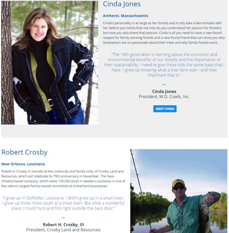
We recommend setting up a section on the website that is full of videos and scrapbook-type photos of members and their families. For Forest America, which represents the nation’s private forest owners, we set up a section called “Caretakers” on its website, with profiles of dozens of landowners and their families who are part of the organization. To capture the footage, we take a video crew to their annual meetings and film them during breaks telling their stories—with other family members at their side. We add in photos that they send us and any other materials that help tell a personal story. The Caretakers section serves three important functions:
1) It shows visitors to the site, including policymakers and other organizations, the human faces that comprise the organization;
2) It helps with recruitment, as other private forest landowners see that they can be part of the team; and
3) It energizes current members, who love to see their colleagues and friends—and their own families—in a scrapbook setting.
Give Them The Tools They Need. Members are busy, so any shortcuts that make their lives easier are welcome. For the Society of Human Resource Management, a membership organization that includes thousands of human resources executives, retention was suffering due to the economic downturn. HR directors needed an easy way to convince their CEOs that membership in SHRM paid valuable dividends in training and resources for their annual fees. Rather than their typical request for approval, which might be shuffled to the bottom of the in-box, we built a tool for members that with just a little bit of information would create a compelling brief presentation to be send to their top executives. The deck, which explains the value of joining or renewing their membership, was far more likely to get the attention and approval of the boss. After launching the new tool, SHRM saw its renewals increase dramatically.
Make It Easy. Not only do members appreciate better tools, they need easy ways to take action and interact with the organization. Having persistent Calls-To-Action across every page of the site is essential to get the type of engagement that demonstrates value for the organization. In some cases, those Calls-To-Action can be as simple as “Join Now.” But for advocacy sites, having a sophisticated application built-in that can send a tailored email or letter to a Member of Congress or a regulatory agency serves many purposes.
First and foremost, individuals will contact policymakers only if it’s a relatively simple process. Most do not have the time to write a note to their Congressmen, nor do they know the issues well-enough. In addition, they might have no idea how to find the right policy-maker and obtain their email or physical address. We have installed a number of effective applications for associations that take the burden off of the member. By filling out, for example, their zip code, these tools can auto-populate a letter with the correct Member of Congress and address, and offer a “Mad Lib” draft where certain fields can easily be completed.
Build In Engagement. There are excellent new tools to engage visitors to the site. The first is obvious: Make social sharing persistent on every page and section of the site. Whenever a visitor sees anything they like—a position paper, an infographic, a video or a blog post—encourage them to push that around to their larger network.
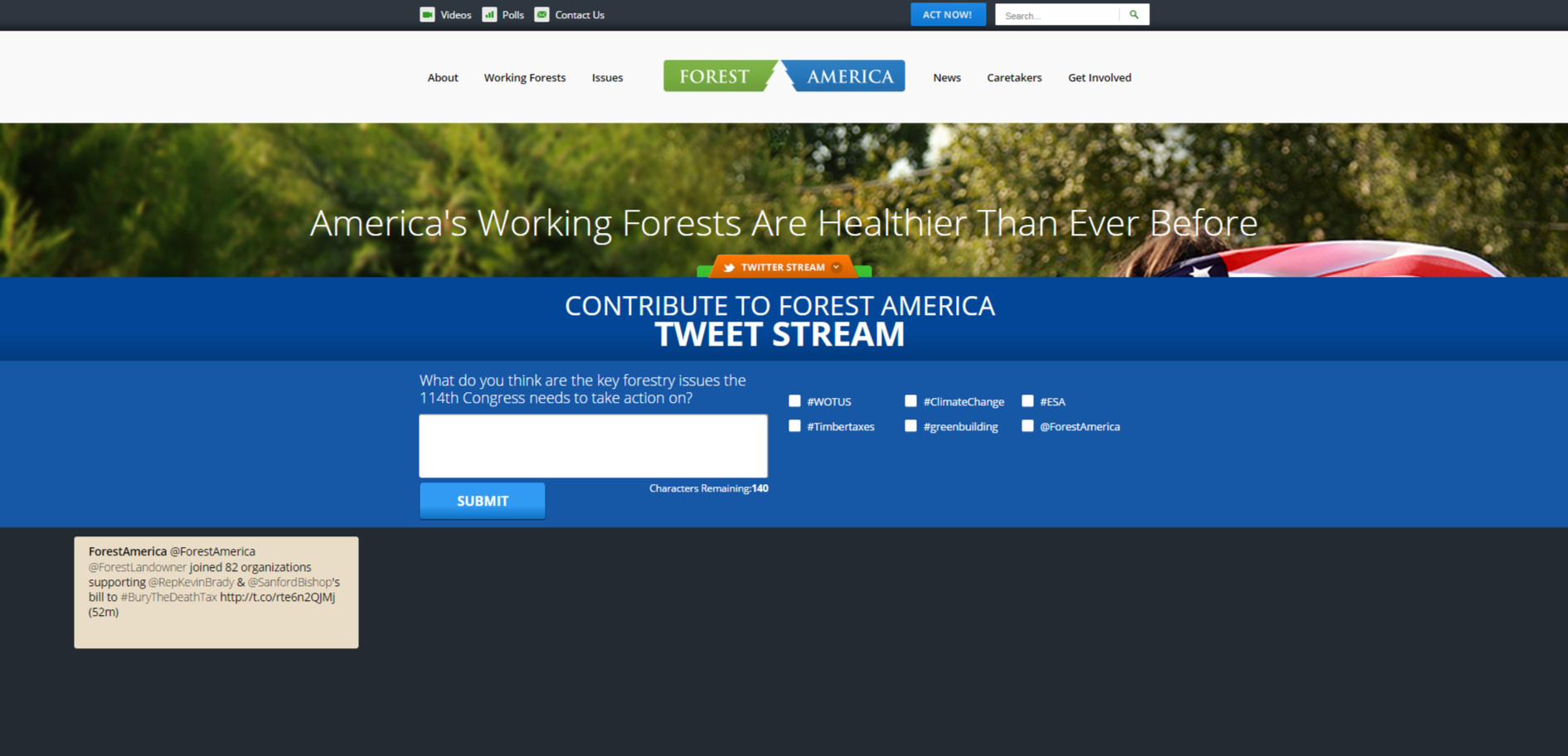
Another tool that we have implemented in a number of sites is a Tweet-Builder—a tool that poses a topic and then invites the visit to complete a tweet, with recommended hashtags that can be included. That tweet then goes in real-time into the associations Twitter Stream.
The benefits of this tool are that it encourages the visitor to participate while helping to populate the social media arena. It also gives an incentive for that person to follow the group on social media, and to broadcast posts out to their larger community.
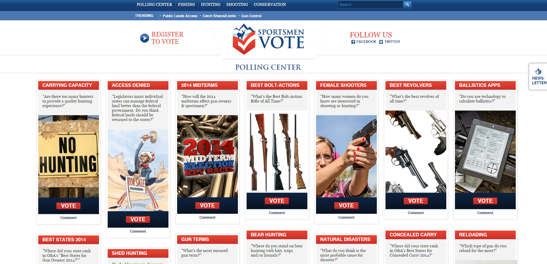
A third tool that we implemented is a polling functionality—that poses questions on the site in the form of polling questions, and then displays the results on that same page. Designed to resemble a Pinterest Page, polling tools invite participation and give the visitor a reason to keep coming back to the site. This is one that we built for a media company that publishes a variety of sportsmen-focused magazines.


