Web designers are constantly looking for new ways to keep the attention of their users. An innovative way to do so is through what is referred to as “hidden interactions.” These subtle website design elements allow users to click or hover, revealing additional content or micro animations. In an effort to keep interactions simple and easy, here are Bluetext’s tips and resources to enhance a user’s experience on your website.
What are Hidden Interactions?
Hidden interactions open up a world of possibilities online. When implemented correctly, they empower users to uncover additional visuals, animations, actions, or content. A simple hover, mouse movement, click, or swipe can initiate a pleasant, yet unexpected, feature to your webpage. Some discrete interactions have become so common that users begin to consider them second nature. For instance, when you need to delete an email on your phone, what is the first step you do? Swipe right and it moves to trash. But notice, there is no explicit instruction to direct that action. As users, we have just become accustomed to these implied functionalities. These subtle features take place across a number of digital platforms, from desktops to mobile apps. These animations can determine how fondly users will remember their experience on your site and lead to increased conversions and sales.
When to Use Them?
When deciding where to implement micro-animations, first put yourself in the user’s shoes. It is important to then consider the function of the animation and how it enhances the user experience. While your hidden interaction should be somewhat intuitive, it’s important to recognize that not every user may uncover these hidden gems. Pivotal points and calls to action should continue to use traditional placements, but interesting “nice to know” or animations can be reserved for these interactive elements.
Finding a creative way to entertain your audience is a way to gain a competitive edge and ensure your webpage is as memorable as possible. Users are going to associate a positive experience with your brand, and a spark of joy can set the foundation for a long-lasting emotional connection.
Where to Find Hidden Interactions
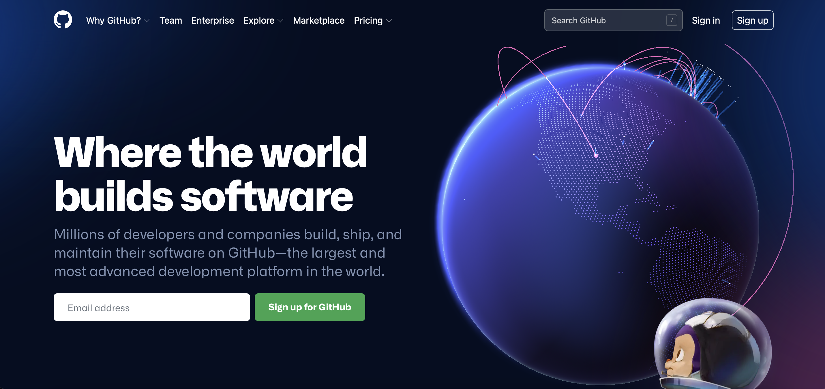
GitHub, for example, uses animation and interactive hidden elements in their hero zone. The spokes on the globe animate as the user enters the site, but if one were to click and move the cursor the globe pivots. The core animation, which conveys connections between the global reach of GitHub users, still plays but the user is empowered to pivot the globe to their desired location.

Another great example is Pitch, which has multiple elements on their homepage that parallax to match the user’s on mouseover. Other components play videos or change visuals on hover, adding a nice little nudge to users considering clicking on different calls to action.
Bluetext client, SonicWall, has implemented hidden interactions on their homepage. As the user’s mouse hovers over the hero scene, the foreground floating objects subtly shift to mirror mouse movement. The beauty of this “hidden” interaction is that every user must naturally mouse over the hero zone to interact with any content on the homepage. Therefore, every user will get to experience this hidden “easter egg” animation.
In an age when users are faced with hundreds of websites to peruse per day, the challenge of standing out is getting steeper and steeper. Implementing subtle interactive elements and micro animations can significantly enhance the user experience and leave your audience with a positive impression of your brand. Interest, attention, and delight create a holy trinity of website user experience and will set brands that implement ahead of the pack. Be sure to contact Bluetext to learn more about how our design team can help you enhance any website with hidden interactions.