Cancel
Trends

Data Visualization Goes Mainstream

by Jason SiegelFebruary 10, 2011
Share

1.jpg


There has never been a more exciting time in the world of digital media and interactive marketing. To that end, I am going to develop a series of blog posts on the 10 most important emerging digital marketing trends. As I re-invigorate my blogging efforts I would love to hear from you. What do you agree with? What am I missing? How is your organization or agency pushing the envelope?


Trend #1 – Data Visualization Goes Mainstream


As more data becomes a common part of our lives, brands are using data visualization to make information easier to understand to draw powerful conclusions. Data plays a critical role in the decisions brands make everyday. Understanding complex data through engaging interactive graphical presentations offers audiences the opportunity to interpret that data, make business decisions on that data and share the experience. Additionally, it offers the opportunity for brands to fight content from growing stale and increases the shelf life and storyline of data as it grows and evolves.


(Client Example: A Data Visualization for Intel’s Federal division, entitled – DC Represents Security Tweets)intel_data_visualization_dc_represents.jpg.scaled1000.jpg


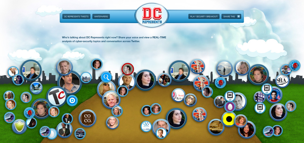
Defined by David McCandless as simply the act of making ephemeral data, ideas, or conceptual notions into an image in which anyone can see a more revealing pattern or a shape, using graphic design or sometimes using computational techniques.


I find these artistic renderings to be cool – it’s exciting to see them hit the mainstream in pop culture.


Below you will find what I have found online as some of the most engaging data visualizations.


data_visualization_fedex.jpg.scaled1000.jpg


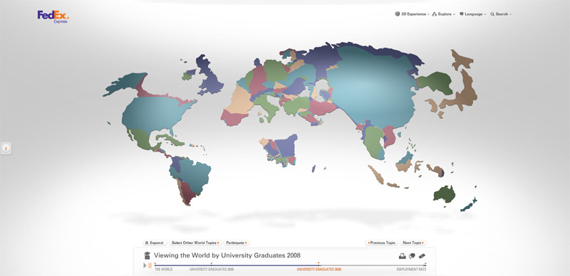
Fedex – http://experience.fedex.com


wtm4-final.png.scaled1000.png


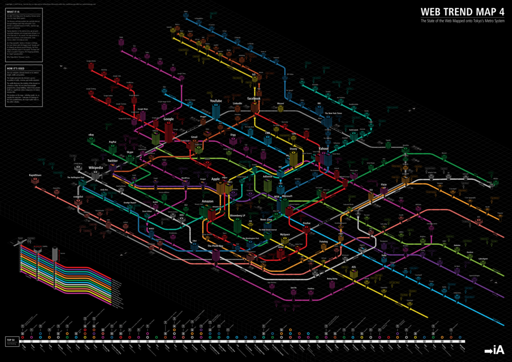
http://www.informationarchitects.jp/en/wtm4

Frequently Asked Questions (FAQ)

Why is data visualization becoming core to brand storytelling?

Audiences face information overload, and visuals make patterns instantly graspable. Interactive graphics invite exploration, which deepens understanding and time-on-page. Visuals also extend the shelf life of data as updates keep the story alive. Done well, they turn complex analytics into shareable insights.

What makes an effective data visualization for business audiences?

It starts with a clear question and the minimum chart type needed to answer it. Annotations and context explain why the pattern matters for decisions. Interactivity should serve the narrative rather than distract from it. Accuracy, accessibility, and performance are non-negotiable.

How can brands keep visualizations from going stale?

Design them to refresh as data streams update, whether daily or quarterly. Build modular components so new slices can be added without a redesign. Pair each update with a short analysis that reframes the takeaway. This creates a living asset that compounds value.

What role does curation play when showcasing third-party examples?

Curating best-in-class visuals educates stakeholders on possibilities and standards. Examples set a bar for clarity, beauty, and performance that internal teams can emulate. They also help sell concepts to executives by making outcomes tangible. A shared gallery accelerates alignment on quality.

How should we attribute and source external visualizations?

Always credit the creators and link to original contexts to preserve nuance. This respect builds goodwill and helps audiences verify the data. It also encourages collaboration with creators who may elevate your next project. Transparency strengthens trust in your own content.

What KPIs indicate a visualization is working?

Look for increased engagement time, higher share rates, and relevant backlinks. Monitor whether decision-makers reference the asset in meetings or decks. Track conversions from embedded CTAs that invite deeper actions. These signals show the piece is both persuasive and useful.