In the past few years, the option for “dark mode” has become increasingly popular as our time spent on-screen steadily climbs. Dark mode is a display setting on a computer, tablet, or mobile device that allows the user to view their content with a predominantly dark theme, compared to the typical white background we find on most websites and apps. So what is the purpose of this change? UX research shows that dark backgrounds enhance page contrast, making visuals pop and easier for the user to focus on.
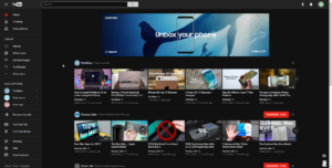
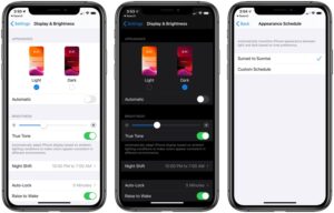
Early adopters of dark mode will remember when it was only a one-off feature, offered exclusively within certain mobile apps. Slowly, as time passed and more software updates were revealed, operating systems like iOS 13 and Android 10 offered a dark mode option that applied device-wide; making the switch for all of your default apps (i.e. your notepad, weather, and more). Now that dark mode is more widely available on our top visited apps like Instagram, Twitter and soon Facebook, many website designers and developers are wondering if a dark mode option is right for their site.
Is Dark Mode for Me?
There are a number of factors to consider before adding a dark mode setting option on your site. The trendiness vs. the more concrete usability points is the main question to ask yourself. What is the goal of your site? If the focus is on the style and design, it makes a better case for a dark mode implementation. There is evidence that users viewing content in dark mode are able to more easily focus on the visuals on screen, over the content. Dark mode is ideal for distinct CVIs or attractive product imagery. If brand awareness or e-commerce is your site’s main focus, dark mode may improve page performance. If a KPI is more content driven, focusing on conversions and leads, dark mode might not be a critical feature.
Web developers should also be aware of the time needed to implement a dark mode option—both initially and to factor it in with future updates. If the project is already on a timeline with a quick turn around, it could be better to revisit the integration as a post-launch add-on item.
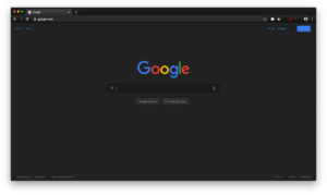
Consider Your Users:
Two key end-user benefits stand out when considering dark mode for your site:
- The highly convincing argument that it may be easier on the eyes. This is pretty self-explanatory. Users are becoming more aware of daily screen time and actively seeking out ways to maintain a healthy balance with technology. For instance, Apple recently released Screen Time, allowing users to track the amount of time spent on their devices. Though it is not the responsibility of web designers and developers to look out for users’ natural light-dark cycles and circadian rhythms, it serves as an added bonus to offer your site visitors a dark mode option. Think of it this way: the easier on the eyes, the longer your visitors will stay on the site.
- It can improve device battery life. That’s right—some developers claim that dark mode consumes only a fraction of the percentage that using a site or application takes from your battery, saving your users time between charges.
With the rise of digital personalization and online interactions, it’s important that your users feel your brand has their best interest in mind. Especially when attracting new users, these subtle enhancements to their experience can make all the difference. Ultimately, dark mode is largely an aesthetic decision, so you’ll want to think through how to integrate this with current branding.
Recommendations for How to Use
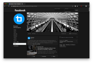
If you decide to include a version of a dark mode integration in your site or app, here are some additional recommendations to use as a guideline. Start by establishing an alternate dark mode color palette for your brand. Since your users will be more drawn to the visual aspects of the site while viewing a darker background, make sure that none of the brand colors you’re using are too saturated or too bright in contrast to the dark background.
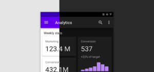
The development team should explore the options for adding additional theming options to your site using custom CSS classes on existing code. Decide whether you will allow your site’s visitors to choose their display options, revealing a dark mode theme, or if it will be automatically based on their browser settings, and even other in-app indicated preferences if designing for a mobile app. The best option being that whatever you decide for the user’s interaction with it, it should closely resemble other display settings and theme updates available on your site. If these are not present, recognizable icons, like a light bulb or sunshine (for light mode) and the moon (for dark mode) are acceptable for a quick turn-on turn-off functionality.
As the popularity of user-end site personalization options increases, rely on these helpful tools to help the decision-makers on your team in their choice to join the dark mode movement.