There’s no doubt that the past five months have looked quite different from what we’re used to. Each day, we log onto our computers, join video conferencing lines, and do our best to make this new virtual work-from-home experience feel as in-person as possible. Day to day social situations may have been put on pause, but business certainly has not. Happy hours with coworkers? Via Zoom. Pivotal presentations with clients? Via WebEx. In-person large events and seminars? We have a solution for you.
Just two short months ago, Citrix turned to Bluetext to help bring one of their networking events into a completely virtual space. The Citrix team had one goal: create a seamless virtual experience that provided the same quality of content and connectivity as an in-person event.
With only six short weeks to build a fully custom microsite complete with new, event-specific branding, Bluetext hit the ground running.
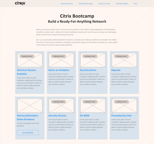
First, came the wireframes. In order to fully understand the user journey, the Bluetext UX and design team worked closely with Citrix to understand their virtual event goals, which included providing a seamless user journey and navigation. Just as each in-person event has a lobby, there needed to be a ‘home dashboard’ where users could easily access all relevant sessions on the day of the event. With a maximum of eight general sessions, we explored a few different possibilities for displaying the session information.
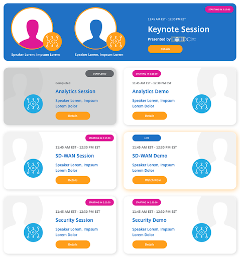
 Ultimately, we landed on our two-column grid with a featured keynote session. This enabled us to include as many relevant details as possible, including a countdown clock that would show a user how much time was remaining until a certain virtual event session begins. Think of an in-person event: any attendee would have been provided an agenda of events, along with locations and maps. The same guidance and resources need to be readily accessible in a virtual event. Through the selected UX, the homepage of Citrix Boot Camp could provide a high-level overview of the event’s itinerary. We explored a grayed-out ‘completed’ state for each session, which gave users the signal that the session has completed.
 Not only was it important to create simple and seamless UI and UX that would provide all registrants an intuitive experience, but it was just as important to make the event feel as lively as possible. With no physical event staff to welcome, direct, or answer questions, the website had to serve any and all personal touches one would expect. Bluetext designed a pair of pre- and post-event thumbnails to display before and after the live video play to transform the event microsite into an exciting and lively virtual space for all registrants.
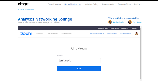
Once we had a beautiful site ready for build, our team began to work through a major development goal of the site: the live-video playback. Our team leveraged the Zoom integration to provide live Q&A sessions for registrants to engage directly with Citrix representatives. This gave users the traditionally intimate networking experience that is generally lost when transitioning events into the digital world.
Read Part 2 of our Behind the Scenes of Citrix Boot Camp here.

Looking to reinvent your company’s event experience? Bluetext can help. Contact us today.