There’s no denying it. Our society is more digital now than ever. You, me, your neighbor, your neighbor’s neighbor… we are all online. Most importantly, your prospective clients are online and are ready to consume high-quality digital content.
Now is the time to invest in your website and make it more user-friendly for your audience. There is a lot of low-hanging fruit to improve your site, ranging from basic content updates like changing imagery and posting blog posts. Or investing in more impactful measures such as consulting top digital marketing agencies to understand the most cost-effective way to improve your website.
So what exactly will make your website user-friendly for today’s content consumers? Many UX designers will tell you that you should either keep your users either scrolling or clicking from one page to another within your site. So which is the better user experience? To scroll or not to scroll?
Keep reading (and scrolling) to understand why scrolling on a website is OKAY and why it is actually expected from the vast majority of online users.
Social Media
Today’s world is used to scrolling. Why? The never-ending social media feed.
Social media sites are designed with one thing in mind: to get users to consume as much content as possible. The best way to do this is to get them to continue to scroll so that they can consume infinite amounts of new content. Most social media platforms are best used on mobile devices, which are easy to use for scrolling through as the flick of a finger takes very little effort.
The Computer Mouse & Track Pad
Okay, so this may be a given… but you know that little roller ball on your mouse? Okay, wait. That may be a little archaic… Do you know that trackpad on your laptop? Well, that lovely thing is used to invite the user to scroll down a page. We know that webpages are going to be lengthy, so much so that the actual hardware we use to “surf the web” has adapted to allow us to do so.
Okay, pause. Those two reasons are only related to how the physical interface prompts a user to scroll. You may be asking, “What are the different types of scrolling that you can include on my website?”
1. The Subtle Scroll
Design the page so that it appears as though you are scrolling through one long piece of content. Maybe the background color stays the same, maybe it slowly changes color, as shown on Palantir’s About Page. Perhaps you’re experiencing parallax scrolling – which in and of itself invites the user to fixate on one piece of the webpage at a time. With this effect, the user barely notices the page length, as the seamless design shift keeps them engaged and focused on the story.
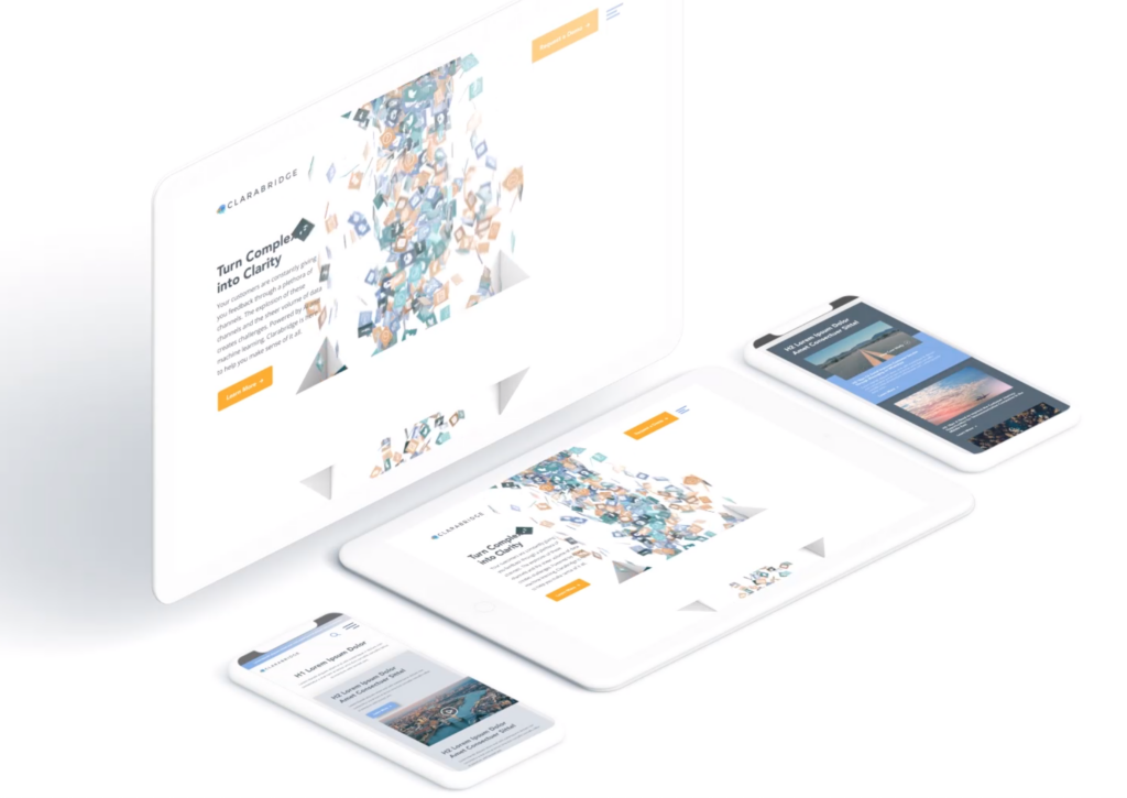
Check out how Bluetext implemented this type of scrolling on the homepage of the Clarabridge website. We designed a seamless animation that invited the user to continue scrolling through the homepage to better explain the technical and analytical power behind the Clarabridge platform.
2. Fixed Long-Scrolling
Instead of having the whole page scroll, fixed long-scrolling allows for specific aspects of the content to remain static while the rest of the content scrolls around it. You can also set up the scrolling to shift to a new section when the user reaches a certain point.
This is ideal if your website has important content or CTAs that should always be accessible to the user. For example, a sticky call to action button is often used to keep key conversion points always present and top of mind.
3. Infinite Scroll
This is most similar to the type of scrolling shown in social media. Is your website a news site? Do you have blog content that you want your users to explore? Consider implementing infinite scroll on your listing pages, allowing posts to continue to load so that the page gives the appearance of infinite content. Of course, this can often be overwhelming for a user who is attempting to find something specific, so we invite you to consider including intuitive filtering so that users can self-select the types of content they are looking for.
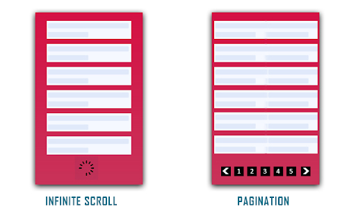
(Photo Credit: knowband.com)
4. Parallax Scrolling
Parallax scrolling is different from the previous three types of scrolling as it invites the user to see new pieces of content and animations with every scroll. Check out how Bewegen invites the user to scroll through their home page and explore their main product. For a personal favorite, give a scroll through Albino Tonnina’s personal website.

Now that you have four great design options to incorporate into your website, it’s time for you to choose the right design for the content on your website. Top web design agencies like Bluetext are great resources for you to turn to in order to gain expert insights on what is best for you.
Looking to begin your next website project? Contact Bluetext today for a consultation.
Trends in website design are ever-evolving. It’s a fast-paced industry, but any business with a digital marketing presence should take efforts to stay informed and keep up with best practices. Just as you would ensure employees are helpful and informative to customers in a physical store, your users expect the same experience online. Here are three user experience trends that you should consider for your business’ website in 2020:
Design as a part of your business strategy.
A few years ago, chief executives might have excluded themselves from having a say in website design or functionality to focus on the bottom line. That being said, more and more companies have come to recognize the critical importance of a strong online presence. With the world participating in the digital-first movement, your website says a lot about the health of your business.
The future of the company often lies in the hands of top executives, as they typically establish the company culture and the goals with investors or the board of directors. Including top stakeholders in the design process is critical to get initial sign off and ensure their vision is incorporated. It is important to involve diverse perspectives into any web design, especially the ones writing the checks. These stakeholders offer a unique perspective in the current state and future aspirations of the company. Website strategists and UX designers should always include the top decision-makers in the room to make sure the website they are designing today aligns with the business strategy of the future.
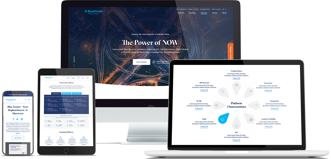
When Bluetext recently partnered with Blue Yonder (formerly JDA), the #1 supply chain management software company in the world, we made sure to include top decision-makers from the initial discovery session, all the way through to launch of their brand new website. You can view our work with Blue Yonder here.
Thumb-friendly design.
With over 50% of website traffic coming from mobile devices, responsive website design has become a top priority. Menu navigation and intuitive user journey has been and always will be a top design consideration, but recently there has been a shift in attention towards mobile menu design.
How do top UX design agencies optimize for user comfort as we design for mobile? We think about adding content and important elements to the “thumb-zone”.
The “thumb-zone” includes the area at the bottom of a mobile device and on the side opposite the thumb. Test it yourself by holding your mobile device. Where does your thumb naturally fall? User studies say that about 75% of user interactions are thumb-driven, so including navigational items and important content in this zone creates a simplified and more natural user experience. In 2020, you will likely notice a lot of websites start to move away from hamburger navigation on the left side of the screen. These are often replaced by navigation bars at the bottom of the screen, aka the thumb’s natural setting.
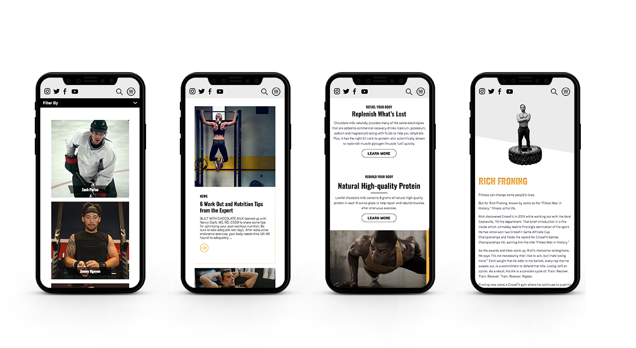
Bluetext designed a mobile-first website for Built With Chocolate Milk, an organization that promotes the benefits of chocolate milk as a natural recovery drink. Bluetext enhanced the user experience and overall engagement through a website redesign that emphasizes the science-backed benefits of chocolate milk and showcases Built With Chocolate Milk’s impressive partnerships with world-class athletes such as Klay Thompson of the Golden State Warriors.
Accessibility.
With the internet being a critical part of daily life and the rise of user-centric design, it is no surprise to see accessibility on the list. When thinking through how a user gets from point A to point B, UX designers should be inclusive of those people who may have a disability and use assistive technology.
One way of keeping accessibility top of mind is to develop separate personas for users that may have low vision, deafness, or other disabilities. Persona creation is a common exercise for top digital marketing agencies when beginning a website project. But thinking beyond the expected customer personas can open insight into a more inclusive and realistic set of potential web users. Having empathy for these personas while designing will help ensure little tweaks are made that allow them to equally experience your content. For example, ensuring text is large enough for users with low vision and inclusion of space for video transcripts are all UI elements that make the website more accessible to all. With the rise of imagery- and animation-heavy sites, adding alt text to all website imagery will allow screen readers to provide context to visually impaired users. Plus, this step will kill two birds with one stone by improving your site’s SEO ranking with keyword-rich descriptions.
Added bonus: Google prioritizes websites that are more accessible to more users, so if you want to boost your SEO rankings, keep accessibility top of mind.
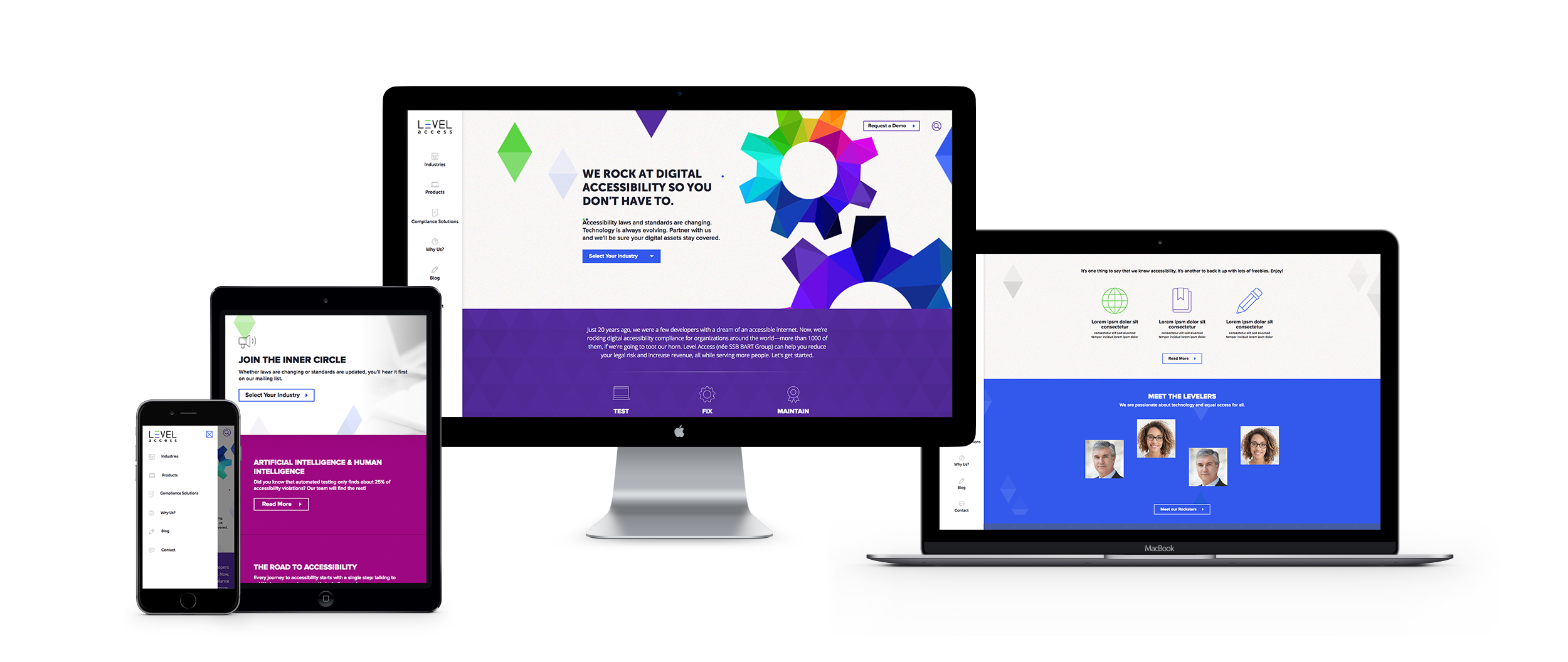
When the SSB Bart Group, the leading provider of accessibility solutions and software, needed a new brand to increase its market share and continue on its growth trajectory, it chose Bluetext to deliver a new name, brand, and website that would focus on its people and expertise. After a thorough discovery process, competitive review and market analysis, Bluetext proposed Level Access to simplify the brand and its promise to the industry. The new look and feel and how it is presented on the website reflects Level Access’ mission “to create a world where digital systems can be made readily accessible to users with disabilities—enabling digital technology to become a profound empowering force in their lives.”
Looking for more information about the state of web design and where we’re headed? Check out some more of our case studies.
Interactive content is here to stay. Just take a look at the 96% completion rate on BuzzFeed quizzes. Even more, a 2016 Content Marketing Institute (CMI) study found that just over 80% of marketers say that interactive content is more effective than static content when it comes to grabbing consumers’ attention.
Well, what even is interactive content, anyway? Interactive content is “content that requires the participants’ active engagement — more than simply reading or watching. In return for that engagement, participants receive real-time, hyper-relevant results they care about.”
Digital branding agencies, such as Bluetext, will ensure you are leveraging all that interactive content has to offer. Here are the top 3 types of interactive content to look out for in 2020.
Quizzes and Assessments
Quizzes and assessments are pieces of interactive content in which the user provides answers to a few questions in order to receive insights based on them. They are fun for the user to complete, and if the results are what they were looking for, they will help you build trust with your audience.
This type of interactive content doesn’t only boost engagement — they also help you get to know your audience. So when you plan to incorporate quizzes or assessments into your content plan, seek out a brand strategy agency to help you develop your content and ask yourself: What do I want to know about my audience? You may discover something new and gain some essential insights that can help you tailor your marketing efforts to be more effective.
Bluetext, a leading branding company, worked with the Graduate Management Admissions Council (GMAC) to develop a microsite to invite top-of-funnel business school candidates to learn about what is available to them in the world of graduate business schools. The introduction page on the website is an interactive quiz that helps direct users to content specifically geared toward them based on where they fall in the business school process.
Polls
Polls are the easiest and simplest way to introduce interactive content to your marketing plan. They provide a quick way to get in touch with your audience and allow you to build a genuine connection with your followers.
The most straightforward way to use polls is to ask your audience for opinions on your content, service, or product. This not only helps you drive engagement online but gives you great insight into how your audience is feeling about your brand.
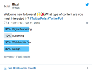
You can also invite your audience to interact with your profile by asking fun, light-hearted questions that invite them into learning more about what your company has to offer.

Contests
According to the CMI report, marketers believe that contests are the most effective type of interactive content you can use, especially in the early stage of the buyer’s journey.
Contests can include traditional raffles or giveaways. They can offer the chance to win a prize if they refer a friend to your company’s offerings. You can even introduce photos or hashtag contests where you invite your audience to submit their own user-generated content.
We have seen a rise in these types of hashtag contests and challenges across all social media platforms, especially on TikTok. The platform allows companies to leverage a hashtag to promote their brand, and users are eating it up.
Guess was the first brand in the US to release a marketing campaign as an official partner with TikTok. They ensured that every time a TikTok user opened the app, they were directed to the #InMyDenim hashtag challenge. Since its launch, videos with the hashtag have garnered over 38 million views and introduced the Guess brand to young Millenials and Generation Z.

Contests are great at bringing out people’s natural curiosity and competitive spirit, so encourage them to participate by providing an engaging contest.
Interactive content that is engaging and personalized provides your audience with a new way to engage with your brand and can build trust with your audience. Learn how Bluetext can help you leverage interactive content in your content marketing plan here.
When it comes to building or remodeling your company’s website, partnering with a top website design firm is essential. By hiring a leading website design firm, you get to work directly with experts, maximize the utility of your team’s resources, get access to the latest technology, and so much more. Having a professional, user-friendly website can make all the difference when it comes to acquiring new clients and retaining old ones. Prospective customers will appreciate an enhanced user experience and will be reassured by the legitimacy of your company. Read Bluetext’s top 4 reasons to work with an expert website design firm.
1. Make a Lasting First Impression
At Bluetext, each website we build or remodel goes through a strict quality assurance process to ensure every page functions properly and looks perfect. Our team of coders, developers, and designers evaluate both the UI and UX of the site, validate all links and forms within the site, and ensure that each page follows brand guidelines – but that’s just to name a few of the steps in our process.
When it comes to your website, we know that first impressions are incredibly important. In fact, it only takes users 50 milliseconds to form an opinion on your website and decide if they will stay or leave. Not to mention, over 35% of users will leave a website if they find it unattractive. With a leading web agency, you can rest assured that your website will not only look good but is also easy to use.

2. Optimize Your Website’s Loading Speed
One of the most essential ways to make a positive first impression on users is by having a website that loads quickly. As a website design firm, our team of web analysts will assist with file compression and code optimization, enhance time to first byte, evaluate HTTP requests, and everything else in between, ensuring that your site loads as fast as possible.
About half of web users expect websites to load in less than two seconds and will leave if a website takes any longer than three. If your website drives $100,000 in revenue per day, increasing your loading speed by one second could help increase your daily revenue by 7%. A leading web agency will ensure that no potential customers are lost due to site speed.
3. Ensure Your Site’s Accessibility
At Bluetext, all engagements go through our team of accessibility experts to ensure you are publishing in compliance with the newest WCAG AAA standards. With well over half of the world on the internet, it’s vital to ensure that there are no barriers to access your website for individuals with any disability.
4. Create a Successful Campaign
Through different channels such as social media, mobile applications, search engines, and display networks, businesses can get their names in front of countless users. Meeting the ever-changing requirements of those channels, however, has become increasingly difficult. Not to mention, most every country has different advertising requirements, adding another layer of complication for those interested in advertising outside of the United States.
A website design firm, like Bluetext, can not only help you run global ad campaigns but can help you build the perfect landing page for users to see when they click on your ads.

If you’re looking to hire a leading web agency, see what Bluetext can do for you.
Content marketing is a consistently invaluable tool to increase conversions by educating your leads and customers. As we welcome a new year as well as a new decade, it’s important to understand the emerging content marketing trends that will dominate 2020. How should you change your digital content marketing strategy to keep pace with the ever-evolving nature of content marketing?
In this blog post, we take a look at 5 content marketing trends that will keep you ahead of the curve in 2020 and beyond.
Data-Driven Content
How are you, as a brand, determining what content is useful and relevant for your audience? That’s where data comes in. By harnessing the lessons of previously successful content marketing initiatives, companies are able to reverse engineer the data and identify KPIs that preceded the success. Once those KPI’s have been established, it is easier to create content in that same strain and capitalize on the proven success. A DC-based digital branding agency like Bluetext can assist you in determining successful KPI’s and creating the rich content your audience wants to read.
Smart Device-Centric Content
Although smart devices have been a key consideration in B2C content marketing for quite some time, this year, more focus will be placed on specific functions of smart devices such as voice search. Voice search is becoming such an integral mobile tool, 48% of consumers are using voice for “general web searches.” Companies looking to stay ahead of the curve should look to optimize their content specifically for voice search purposes. Understanding how users search via their voice will help you tailor your existing content for voice-SEO and create more effective headlines for future content initiatives. A DC digital web design agency like Bluetext can help by conducting an analysis of your audience’s voice searches and recommend changes to your existing content and future content to maximize the return on your investment.
Conversational Marketing is King
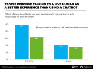
In the digital era which champions online shopping, consumers are looking to establish trust and connection through more personalized, authentic shopping experiences. Conversational marketing can aid your company in engaging with your audience in a more genuine way. By engaging in a conversation, your company gains access to more personalized data about your consumers such as their specific needs and future goals. Investing in tools such as chatbots or real human-to-human experiences can make all the difference in your competitive industry. As we progress through 2020, chatbots and other AI tools will continue to improve and positively impact lead generation.
2020: The Year of the Snippet
As we know, Google dominates the search engine market share worldwide, with a resounding 92.71% of the market. When considering a user’s search intent, Google will display what they call a “snippet” at the top of the page, which provides consumers with key points within a piece of content, allowing them to receive the information they’re looking for faster. As such, it’s becoming more commonplace for consumers to enter a longtail keyword into Google, knowing that they will receive the information they’re looking for via a snippet, without clicking any page links whatsoever.
In order to win that highly coveted snippet spot, companies should look to hire an interactive web agency such as Bluetext. Bluetext’s SEO analysts can conduct an audit of your current content and pinpoint exactly where changes need to be made in order to signify to Google crawlers that your content is important. Optimizing your content for snippets will greatly enhance user experience, as users will be able to find the information they are searching for concisely and quickly. Not only will an interactive web agency audit and enhance current site content, but they will also create a content strategy and editorial calendar so your brand can continually publish content your users are searching for.
The Popularity of Podcasts
According to a recent study, 51% of the entire US population has listened to a podcast in 2019. That figure is up by 7% from the previous year. As we look ahead to 2020, podcasts will continue to dominate, as that number is expected to keep rising. Although it may seem like everyone has a podcast these days, there are still opportunities for brands to get ahead of the curve and start their own podcasts.
That being said, if you see a clear demand for audio content within your market, ensure that you create a podcast the right way. Podcasts should have clearly defined KPI’s, a regular posting schedule, and content your audience will actually care to listen to. A Virginia internet & inbound marketing agency like Bluetext can partner with your company to assess the need for a podcast in your industry and among your competitors, help you create valuable content and even develop a paid advertisement plan to spread awareness via other podcasts your audience is listening to.
2020 is already well underway and in order to achieve success, companies need to get ahead of this year’s trends with a thorough and achievable marketing strategy and plan of action. A DC digital branding agency such as Bluetext can audit your current digital content marketing strategy and suggest recommendations to help improve your current trajectory. To learn more about Bluetext and how we can help you, check out our work here.
Top digital marketing agencies are quickly learning that mobile retargeting is now a key element in any successful campaign. But moving our clients to this strategy is not always an easy sell, as the many challenges that mobile presents can be intimidating. In spite of the roadblocks, mobile retargeting can increase reach and engagement far beyond other channels. Here are Bluetext’s six top tips for getting started with a mobile strategy:
- Unsure on how to reach target audiences on their mobile devices? Think social media platforms. Today’s target audiences are more likely to browse their social media apps on their mobile than search websites. Take advantage of the tools that Facebook, LinkedIn and Twitter offer for their ad campaigns.
- Want to increase mobile traffic to your site? Optimize your website for mobile to fully take advantage of this platform. That means a design that is responsive for all devices, and features simple and concise headlines, titles and other text. More importantly, make sure that images are sufficiently compressed, reduce the number of redirects (nobody wants to wait for a new screen to load), and minimize code to maintain a high-performing experience.
- Not sure how to design for mobile? Think like a visitor to your brand would, accessing your site via a mobile device. That means simplified designs and copy, but also calls-to-action that are clear about where the visitor will land if they click on that button. Viewers don’t want to leave the screen they are on unless they know there they are going.
- Need to improve your reach on mobile? Safari is the leading browser for mobile devices, but leveraging Apple’s tool is not so easy. One simple trick: Make sure you are enabling Safari, which typically blocks third-party cookies in its default setting. Find a provider that is skilled at accessing Safari’s massive number of users.
- Still not seeing the conversions you expect? It could be your landing page. Try to simplify the actions on the landing page to make sure there is no confusion or abandonment from that conversion point.
- Want to get hyper-specific with your targeting? Try geo-fencing for conferences, events, shows and other gatherings of target audiences. Sophisticated new geo-locating tools allow geo-fencing to specific blocks around convention centers, hotels and other venues. Serving ads at the right time and place can pay big rewards.
Any marketing campaign can be much more effective with a mobile component, as long as it’s well-executed.
If you want to learn more or need help with your campaigns, Bluetext can help.
As every top branding agency knows, the brand style guide is a key component in a brand’s visual identity. It sets out how brand elements, including color palette, imagery, iconography, and layout should be incorporated into every piece of collateral or content that represents the brand. In essence, it’s the brand bible for every designer and marketer in the organization.
Yet, for a typical top branding agency, it’s often an afterthought. Only after the new brand elements are designed, options are provided to the client, the visual identity is applied to the website, collateral templates, and signage, and all is approved, does the team turn to the style guide. And even then, it is often lacking in the type of detail and content that will make it useful for more than a brief period. It needs to be thorough and future-proof.
Let’s face it: The brand style guide isn’t the sexy or fun part of the project. Oftentimes, it’s delivered as a thinly printed document and other times as a PDF with limited detail. We understand that digging through a lengthy document to find out precisely how to use the logo, fonts, and imagery can be frustrating. Here, then, is the Bluetext guide to a good – and useful – brand style guide.
- Make sure the style guide is comprehensive. The goal of the guide is consistency, in how the brand is represented regardless of platform, outlet or venue. It will be used by a wide variety of people, ranging from employees to partners to media. This doesn’t mean it has to cover every random or infrequent scenario, but more detail works in your company’s favor.
- Go deep in coverage. Even the term “brand guide” is sometimes misleading. While it is important to include details on the specific usage of a creative asset, such as how much white space needs to pad a logo or how a logo should play out depending on the background color, this should be only a part of the what the guide includes. Don’t neglect core brand-building guidelines, such as what the organization’s tone and voice need to be in different contexts, or how employees should use branded imagery on social media. Provide enough detail so that anyone reading the brand guide from cover to cover will feel like an expert on every aspect of the brand.
- Update the guide on a regular basis. With the prevalence of eBooks, articles, and infographics, brands are experiencing a faster rate of evolution than ever before. That means it is important to do a regular review of the guide to keep it up to date.
- Make it easy to find, share, and update. Many style guides look great in a printed, bound volume. But those are hard to find, hard to distribute, and really hard to keep updated. And if the brand guide requires time and money to update, executives will be reluctant to refresh the guide to match their evolving brand until they absolutely have to.
Our recommendations as a top branding agency: Make the style guide a dynamic window to your brand. Include intangible elements that come from the brand’s core message platform, like tone, voice and the types of language to use. Use a digital platform that is easy to share and easy to update. Make it comprehensive. And make sure you review it at least once a year.
Style Guide Examples:
Learn How Bluetext Can Help With All of Your Branding Needs!
The year was 2014. The new Apple Watch was all the rage; selfies weren’t annoying the bloody hell out of everyone yet; and The Ice Bucket Challenge had everyone soaking themselves for a good cause. It was also the year I examined some of the most innovative B2G marketing and PR strategies that were helping government contractors and IT providers stand out from the crowd and grow their public sector revenues.
This past February, I put together a brief update on B2G digital marketing ideas for 2017, looking at the emergence of B2G virtual reality initiatives, innovative go-to-market campaigns, as well as 3-D interactive experiences for lead generation. But as we approach 2018, the time is right for anyone selling technology products and services to the government to think about what will move the needle in sales, branding and market leadership next year. Yes, white papers, webinars, as well as traditional public relations and advertising all play a valuable role if executed properly, but it requires more to become top-of-mind with government decision makers – and to stay there.
Here are 5 innovative B2G marketing strategies to consider for 2018:
Geo-Fencing
Geo-fencing is location-based digital technology that allows you to select a geographic point using latitude and longitude and then to create a virtual “fence” around that point of a given radius in which your ads can be served up.
For contractors and Federal IT providers, there are multiple ways that geo-fencing can be utilized to reach government decision makers. If you are seeking to do business with a specific agency, you could pinpoint a single DC Metro station in proximity to the agency office, then deliver a targeted ad to anyone who comes within a 1-block radius of that location. Ads delivered through geo-fencing typically yield higher conversions and better ROI for marketers since they’re highly contextual.
Geo-fencing can also make an impact reaching prospective buyers at key industry and government conferences. Geo-fencing at conferences:
- Uses GPS or Wi-Fi information
- Create a barrier around a location and target everyone within that location
- Usually a tight radius (around an event or storefront)
- Deliver display, audio, video ads or mobile app notifications
Bluetext recently completed a project for client ARQ at the International Association of Chiefs of Police (IACP) Conference. The police body cam and digital evidence market is crowded with products that frustrate their users. So when a new player with a better, complete approach wanted to enter the market with a solution far ahead of the competition, it turned to Bluetext for a name, brand, corporate identity and website that would get attention and convey its value to law enforcement agencies. For the official launch, Bluetext executed a sophisticated outreach campaign including mobile geo-fencing to drive attendance to ARQ’s booth at IACP that included interactive product demo’s, and a comprehensive retargeting campaign pre and post show.
Mobile Retargeting
The government decision makers you need to reach – as well as government workforces if you are employing bottom-up marketing initiatives – are on mobile devices…a lot. Frost & Sullivan found that almost three-fourths of government organizations issue smartphones to at least some employees and more than half deploy tablets. Consumers overall spend 5 hours per day on mobile devices, so the bottom line is that if you want to reach government decision makers, mobile has to be a big part of the equation.
Mobile retargeting is now a key element in most any successful government-focused campaign seeking to increase reach and engagement far beyond other channels. There are six key strategies to get started with mobile retargeting:
- Unsure on how to reach target audiences on their mobile devices? Think social media platforms. Today’s target audiences are more likely to browse their social media apps on their mobile than search websites. Take advantage of the tools that Facebook, LinkedIn and Twitter offer for their ad campaigns.
- Want to increase mobile traffic to your site? Optimize your website for mobile to fully take advantage of this platform. That means a design that is responsive for all devices, and features simple and concise headlines, titles and other text. More importantly, make sure that images are sufficiently compressed, reduce the number of redirects (nobody wants to wait for a new screen to load), and minimize code to maintain a high-performing experience.
- Not sure how to design for mobile? Think like a government decision maker visiting your website via a mobile device. That means simplified designs and copy, but also calls-to-action that are clear about where the visitor will land if they click on that button. Viewers don’t want to leave the screen they are on unless they know there they are going.
- Need to improve your reach on mobile? Safari is the leading browser for mobile devices, but leveraging Apple’s tool is not so easy. One simple trick: Make sure you are enabling Safari, which typically blocks third-party cookies in its default setting. Find a provider that is skilled at accessing Safari’s massive number of users.
- Still not seeing the conversions you expect? It could be your landing page. Try to simplify the actions on the landing page to make sure there is no confusion or abandonment from that conversion point.
- Want to get hyper-specific with your targeting? Try geo-fencing for conferences, events, shows and other gatherings of target audiences. Sophisticated new geo-locating tools allow geo-fencing to specific blocks around convention centers, hotels and other venues. Serving ads at the right time and place can pay big rewards.
Bluetext does mobile retargeting for many of its engagements, including:
- For a leading satellite networking services provider, Bluetext surrounded the perimeter of a major trade show to drive traffic to its booth
- For a leading cybersecurity company, Bluetext surrounded the perimeter of the RSA conference to drive traffic traffic to their booth featuring a cool virtual reality experience
- For a leading healthcare company, Bluetext coordinated with their sales team and surrounded medical centers where their prospects work to drive brand visibility when they walked into work everyday on their personal cell phones.
Account Based Marketing (ABM)
If you are an old-timer like myself who still buys clothes at actual physical stores, you know that the sales racks are filled right now with unsold summer inventory, probably the same summer clothes you paid double for just a few months ago. But no matter how enticing the sale, we often bypass the out-of-season sale items in favor of what we will wear in the here and now.
This comes to mind as I started thinking about how businesses market their products and services to the public sector. You not only have to hit prospective new customers you want to convert and existing customers you want to upsell with the right message, but it has to be the right message at the right time. The right time, as is the case with summer clothes on sale as the weather turns colder, often comes down to when prospects and customers are in the frame of mind to be thinking about your product or service. Catch them too early and they will get distracted and move on; catch them too late and, well, that’s self-explanatory I suppose.
This challenge becomes more difficult for marketers trying to blanket a large number of customers and prospects. The ability to personalize the message and the timing is why more marketers are increasingly intrigued by Account-based marketing (ABM). With ABM you concentrate efforts on a very defined set of target accounts – a single Agency or even units within an Agency – and then utilize campaigns personalized down to the single account level.
Marketing automation leaders are also looking at ABM to round out their services portfolio. Recently inbound marketing and sales leader HubSpot invested in ABM startup Terminus as part of a $10.3 million Series B round. In its blog explaining motivation for the investment, HubSpot talks about the fact that while inbound marketing is valuable for targeting an individual throughout the purchase process and beyond, ABM is useful when there is a need to build a relationship with multiple stakeholders at once. When done right HubSpot notes, ABM is about “precision and personalization not brute force.”
Embrace the Inhumanity of Content Marketing
For government marketers, it can be incredibly frustrating to create a compelling white paper or develop a webinar you know will be of value to agencies, but see that content sit untapped or underappreciated. The fact is that prospective customers may want your white paper or webinar but…they may not know they want it. You might have to sweeten the pot.
Cards against humanity, the self-described, “party game for horrible people,” has gone from kickstarter campaign to global phenomenon. It is also an example of how you can utilize the concept of game cards to incentivize key prospects to download and access marketing content – ideally using a more sanitized version of the game.
Think about your buyer persona. What is their typical age range, gender, title, geographic location, etc.? This can inform a creative content marketing campaign in terms of theme (Game of Thrones, professional sports trading card sets, or a variation of Cards Against Humanity like ‘Cards Against IT Complexity’ that could feature various challenges that Agencies face with their IT systems and available only to prospects who download an ebook or whitepaper, or participate in a webinar.
Virtual Reality and 3-D Interactive Design
Virtual reality can lead to real government contracts. For all of the noise surrounding virtual reality in the consumer market, it has emerged as an effective platform for storytelling with technology companies targeting decision makers in the government and enterprise markets. For a Bluetext virtual reality project with client Varonis, we enabled their marketing team to navigate a complex customer landscape and to share the Varonis story and product to a wider audience using innovative technology. The Varonis Digital Briefing Center launched at a major conference that many of their existing and prospective customers attended, and enabled Varonis to scale their demos concurrently by 6x, differentiate in a global trade show, and drive traffic to their booth.
To drive user engagement and leads, forward-thinking B2G companies are looking beyond white papers and webinars and towards immersive user experiences. Bluetext client NJVC was looking for a powerful new message as well as an immersive experience to engage and inform its global audience. Bluetext delivered a cutting-edge user experience that merged 3-D interactive design with thought leadership content marketing.
With 1,300 IT professionals deployed globally supporting 200+ sites on six continents, NJVC is the partner of choice for federal agencies, commercial clients and large and small businesses. The NJVC experience is integrated into a responsive Mission CrITical campaign microsite designed to enable users to easily access the content that best aligns with their needs. Bluetext also recently collaborated with XO Communications to develop a 3D “Etherverse” experience placed prominently in the site to drive user engagement and leads.
Are you interested in taking your marketing strategy to the next level. Contact us
Last week Bluetext served as a sponsor for the 2017 GAIN government marketing conference, and it was great to connect with and hear from some of the DC region’s leading government marketers – including some of our own clients.
As part of her presentation on effective thought leadership, Rita Walston, immixGroup Senior Director, Marketing Programs, quoted a government Chief Technology Officer as saying the following: “If you wait until you’re in front of me to tell me how your company can help me, you’re way too late. I’ve already made up your mind.”
Thought leadership is a core piece of the b2g, b2b and b2c public relations and content marketing programs we develop and executive for clients. But often we are asked by clients to about the value of thought leadership (byline articles, blog posts, conference panels) relative to more traditional media coverage around customer deployments, product launches, and trend stories. This is due to the fact that with byline articles, the content cannot be self promotional.
But the government agency CTO comment underscores why thought leadership is a critical top-of-funnel piece to the buyer’s journey. Government decision makers ingest information from several sources prior to any sales meeting. Without exposure to your brand, an understanding of your expertise and clarity on your capabilities, the opportunity might be lost before your sales team even walks in the meeting.
Thought leadership can support your B2G sales efforts in several ways:
Communicate your core competencies
If your government sales team walks into a meeting and the decision maker doesn’t already: 1) believe you understand their pain points; 2) understand how your solutions can address these pain points; and 3) have a sense of why your company is uniquely qualified to solve their pain points, chances of winning the business go down considerably.
Thought leadership in the form of byline articles and blog posts present an opportunity to lay the foundation for this part of the buyer’s journey by demonstrating your expertise across core competencies, whether it’s cloud computing, mobility, cybersecurity, data analytics, or some combination of the above. While this content doesn’t directly address how your products and solutions deliver capabilities in these areas, it communicates you are players in the space.
Establish brand awareness
If you are a large or established vendor in the government market, brand awareness may not be a problem. But perhaps you have brand penetration with certain agencies and not others, or a recent acquisition has added capabilities that agencies are not yet aware of. Advertising can accomplish this, but it can be expensive and must be sustained over an extended period of time.
Byline articles position your brand with government decision makers hungry for content that offers actionable intelligence on how to address pain points they face every day. Vendors and contractors can associate their brand with current and emerging trends, while reaching decision makers in a targeted fashion, whether it’s civilian, DoD, or specific branches of the military.
Fill momentum gaps
Marketing to government agencies requires a steady drumbeat of activity. Not every vendor has the budget for a sustained advertising campaign, and there won’t necessarily be announcements and opportunities for media coverage on a weekly or even monthly basis. Thought leadership can fill these gaps to ensure brand momentum throughout the year.
Lets your sellers ‘sell’
Circling back to the agency CTO comment referenced earlier in the article, the ability for your b2g sales team to enter a meeting able to focus squarely on closing the sale is vital. If the agency decision maker enters the meeting with limited awareness of your brand or competencies, his/her buyer’s journey may be too far along to make an impact.
Let’s discuss government marketing communications and how it impacts your business. Contact us!
If your digital marketing agency team doesn’t have a SMAC roadmap, you may find your company drifting off-course in 2017 and beyond. Here’s brief refresher course on SMAC.
Social Media
Social Media continues to evolve. Platforms rise and fall by the year vs the decades of old. Some new trends we see emerging that we see potentially continuing to gain momentum.
1. Snap’s Evolution Will Result in Interesting New Opportunities.
2. Twitter Fatigue Will Worsen.
3. Users Will Crave More Vicarious Experiences.
4. New Areas of Communication Will Emerge.
Mobile
Mobile devices are the cornerstone of how new business is being built and legacy businesses are reinventing themselves. Mobile devices allow users to constantly update their profile, stay aware of deals and promotions, and track locations and buying habits by virtue of connecting to various wireless signals and near-field communication (NFC) devices.
Some new trends we see emerging that we see potentially continuing to gain momentum.
1. Consumers redefine purchase boundaries; mobile marketing, brand partnerships deepen
2. Department stores, mobile marketing partners tackle the ‘Amazon Effect’
3. Programmatic accelerates: brands, tech, marketing continue to invest
4. Next-generation creative, video redefine mobile engagements
Analytics
As databases have grown larger and processors and memory have become capable of chewing through hundreds of millions of records in a short time, we have begun to see how analytics can do more than just track clicks. Analytics can establish links between entities and make intelligent predictions about customer behavior based on knowledge a system has about a customer — knowledge that has been informed by social networking.
To keep up with the explosion in Big Data, companies and corporations are beginning to invest in BI projects and more and more sophisticated analytics infrastructure. Some new trends we see emerging that we see potentially continuing to gain momentum.
1. Multi-channel Attribution
2. Focus on ‘Return on Analytics Investment
3. Monetization of Data
4. Exciting new players in the MarTech arena to complement the core analytic platforms
Cloud
The cloud element of SMAC refers to the capability a business has to spin up vast amounts of capacity that are paid for by the minute or hour. Businesses do not need to spend millions of dollars building another data warehouse – they simply rent it from a cloud provider, do their work and turn it off. When the business environment changes, they simply spin up another cluster in the cloud, pay another few hundred dollars and continue building insights.
Some new trends we see emerging that we see potentially continuing to gain momentum.
1. Artificial intelligence (AI) will make personalization a reality in 2017.
2. Self-service will be the new normal.
3. Enhancing the Buyer Journey
4. Google Tag Manager and other granular analytics modules being the norm
With buyer sophistication growing daily, marketers need to deliver increasingly smarter strategies and campaigns. Are you taking the time to measure how your efforts are working and think about how you might enhance your efforts, or do you find yourself quickly moving from one campaign to the next?
