Your website acts as an essential business tool — used across every industry for a diverse number of functions. B2B companies rely on their websites to generate leads, phone calls, or physical location visits. No matter what function your website serves, there is one universal goal every business wants to accomplish with its website: leveraging it to create more growth.
There are several ways to increase your leads, sales, and revenue without investing in a complete redesign and rebuild. A great website will enable your team to work smarter, not harder. Here are tips that you should consider trying — while simple, they can help your business grow significantly.
1. Responsive Design
Mobile accounts for over half of global website traffic; if your site isn’t mobile-friendly, you may be losing valuable leads. In the coming years this number will only increase, and ensuring a mobile-friendly design may be crucial to your future success. A responsive website design (RWD) adapts to fit any screen in a way that makes all pages, features, and actions accessible to users. Making sure that your website can support traffic on any browsing device ensures that users are not dropping off your site because they cannot access what they’re looking for.
2. Simplify Your Navigation
In order to increase conversions, you need to keep users on your website. When a user lands on your website, they should be able to quickly and intuitively navigate to relevant content, allowing them to find the information they need without losing interest. The first step to keeping a user on your site is maintaining a simple and intuitive navigation. Too many options will likely overwhelm your user; it is important to have a clear path for users to the action you would like them to take as well as the information they are looking for. Otherwise, they may look elsewhere.
3. Avoid Clutter and Complex Noise
While incorporating animation and motion on your website adds visual interest for users and helps your site stand out, it’s important to be aware of the balance between unique design and overly-complex noise. Too much movement can be overwhelming for your user and may detract from what they originally came to your website to achieve. A complex design can also negatively impact your site speed, potentially increasing bounce rate and affecting your SEO score. While finding a middle-ground between these two extremes can be difficult, it’s important to ask if new design elements will add value to the end-user.
4. Don’t Go Crazy With Your Fonts
While fonts are an easy way to enhance your CVI and bring visual interest to your website, they may also be difficult to read for some users or on some devices. Using a Sans Serif font for your website’s body copy and making sure the font size and color meet accessibility standards is crucial in getting your message across to users. If they are not able to read the content on your site, they definitely won’t be converting.
User experience is crucial to effective website design, but so is your internal team! Here are some tips to streamline the digital sales process for end-users and internal teams. A positive user experience will directly translate into increased conversions.
Use Call Tracking
If driving users to make a phone call is one of the main goals of your website, it is important to know which page has prompted the user to make the call. You can easily track this information by using unique phone numbers on different pages, allowing you to determine which page is driving the most traffic to your call center. These numbers can easily be configured to route to your main phone line, meaning there won’t be any disruption to the way you’re currently handling phone leads.
Install Live Chat
While live chat may not seem immediately relevant to your business, every website can benefit from this simple tool. Live chat functions to facilitate interactions with your users and enables them to quickly get the answers they’re looking for without spending too much time hunting around the site. Many chat services will also integrate with mobile phones, allowing your business to easily monitor traffic.
To learn more about driving leads via a responsive UX design and how Bluetext can help you increase conversion rates, contact us today.
As the world becomes increasingly digital, having a professional, user-friendly website is now more important than ever. With countless options for building or overhauling a website, picking the right content management system or DC digital web design agency can seem overwhelming. Don’t panic, Bluetext is here to provide expert advice to all decisions that go into building your digital ecosystem. As a top DC digital web design agency, with teams of Drupal and WordPress development experts, Bluetext has worked with countless client’s to build high-quality, easy-to-navigate websites. Our teams of user experience and user interface specialists take many things into consideration when building a website; however, navigation is always a top priority. 94% of web users report easy navigation is the most important feature when evaluating a website. As an experienced DC digital web design agency, we’ve been able to test why and how logical website navigation is critical. Here are four ways to make sure your website is as intuitive as possible.
1. Keep Things Orderly
In creating a new website, the order of information on a page can make or break the user experience. People tend to best recall the first and last items in a series and forget the information in the middle – this is known as the primacy and recency effect. For this reason, the most important information should be included in the hero zone of a website. The hero zone, in other words, can be best equated to an elevator pitch – a short description of your idea, product, or company that briefly explains your concept in such a way that any viewer can quickly understand it.
2. Remain Consistent
By 2027, there will be more than 41 billion IoT devices around the world. The increased volume of IoT devices means more individuals around the world will be accessing the web through a wider range of devices. As a DC digital web design agency, we’ve seen the increased importance of creating responsive websites that automatically scale to device type but remain consistent in general structure. Menu systems often become crowded and confusing as screen widths decrease to tablet and mobile devices. Digital design agencies can help overcome this obstacle by recognizing the critical breakpoints in your site’s design and implementing menu structures optimized for tablet and mobile screens of all generations. By keeping this consistency in structure and navigation across devices, users will become more familiar with and loyal to your website and brand.
3. Limit Menu Items
To ensure a website is easy-to-use and navigate, the structure is essential. For example, listing each page separately in a navigation header creates an overwhelming and near impossible user journey. Your sitemap should act as a foundation, with the most important items laying the building blocks for secondary pages. By systematically creating a logical sitemap utilizing primary and secondary navigation, you can create a fluid user experience that allows users to find exactly what they need with ease. As a DC digital web design agency, we have access to and frequently use site map testing tools, such as Treejack, to evaluate the findability of topics on a website. Not to mention, creating a logical, hierarchical sitemap makes it much easier to produce an XML sitemap, which is pivotal for SEO.
4. Test. Test. Test.
A/B testing website navigation is the only way to truly take the guesswork out of website optimization. As a DC digital web design agency, our Drupal and WordPress development experts have seen first hand the benefits of A/B testing. With proper testing, website navigation changes can be data-driven. Conversations surrounding those changes then shift from “I think” to “I know.” Although A/B testing can be employed to answer one-off questions, it should be continually used to improve metrics, such as conversion rate, over time.
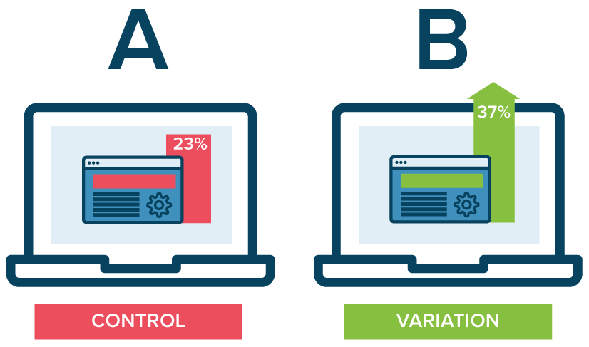
In building or redoing a website, intuitive navigation design should always be a top priority to ensure users don’t require instruction or trial and error to move around the site. By using the navigation best practices mentioned above, you’ll have taken a great first step towards better engagement and higher conversion rates on your website by enhancing overall user experience. To learn more about our processes and to see our work, check out our case studies.
If you’re looking to hire a DC digital web design agency with Drupal and WordPress development experts, see what Bluetext can do for you.
Trends in website design are ever-evolving. It’s a fast-paced industry, but any business with a digital marketing presence should take efforts to stay informed and keep up with best practices. Just as you would ensure employees are helpful and informative to customers in a physical store, your users expect the same experience online. Here are three user experience trends that you should consider for your business’ website in 2020:
Design as a part of your business strategy.
A few years ago, chief executives might have excluded themselves from having a say in website design or functionality to focus on the bottom line. That being said, more and more companies have come to recognize the critical importance of a strong online presence. With the world participating in the digital-first movement, your website says a lot about the health of your business.
The future of the company often lies in the hands of top executives, as they typically establish the company culture and the goals with investors or the board of directors. Including top stakeholders in the design process is critical to get initial sign off and ensure their vision is incorporated. It is important to involve diverse perspectives into any web design, especially the ones writing the checks. These stakeholders offer a unique perspective in the current state and future aspirations of the company. Website strategists and UX designers should always include the top decision-makers in the room to make sure the website they are designing today aligns with the business strategy of the future.
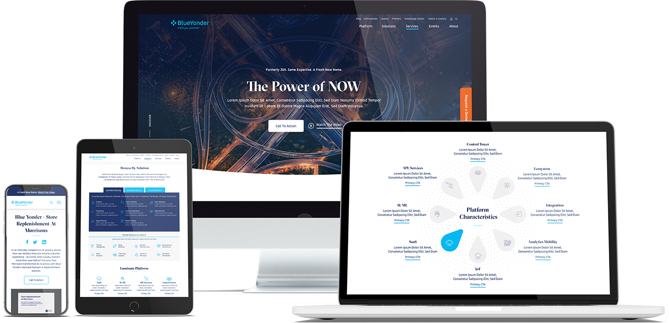
When Bluetext recently partnered with Blue Yonder (formerly JDA), the #1 supply chain management software company in the world, we made sure to include top decision-makers from the initial discovery session, all the way through to launch of their brand new website. You can view our work with Blue Yonder here.
Thumb-friendly design.
With over 50% of website traffic coming from mobile devices, responsive website design has become a top priority. Menu navigation and intuitive user journey has been and always will be a top design consideration, but recently there has been a shift in attention towards mobile menu design.
How do top UX design agencies optimize for user comfort as we design for mobile? We think about adding content and important elements to the “thumb-zone”.
The “thumb-zone” includes the area at the bottom of a mobile device and on the side opposite the thumb. Test it yourself by holding your mobile device. Where does your thumb naturally fall? User studies say that about 75% of user interactions are thumb-driven, so including navigational items and important content in this zone creates a simplified and more natural user experience. In 2020, you will likely notice a lot of websites start to move away from hamburger navigation on the left side of the screen. These are often replaced by navigation bars at the bottom of the screen, aka the thumb’s natural setting.
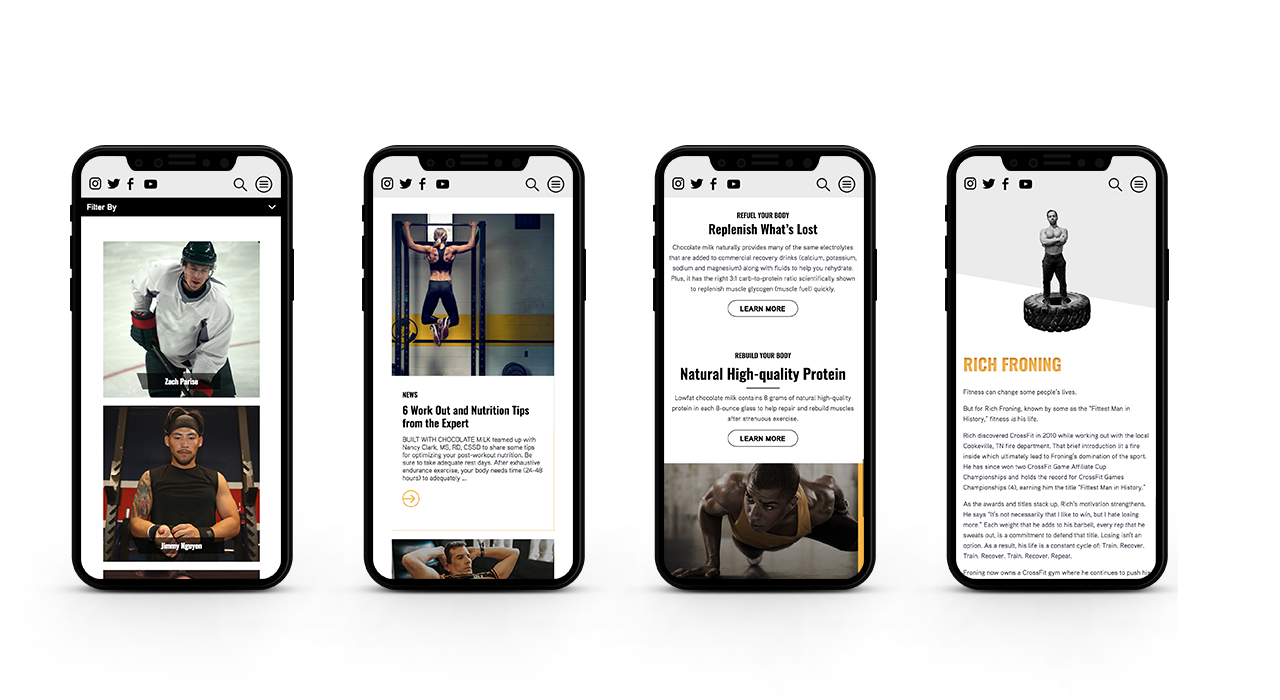
Bluetext designed a mobile-first website for Built With Chocolate Milk, an organization that promotes the benefits of chocolate milk as a natural recovery drink. Bluetext enhanced the user experience and overall engagement through a website redesign that emphasizes the science-backed benefits of chocolate milk and showcases Built With Chocolate Milk’s impressive partnerships with world-class athletes such as Klay Thompson of the Golden State Warriors.
Accessibility.
With the internet being a critical part of daily life and the rise of user-centric design, it is no surprise to see accessibility on the list. When thinking through how a user gets from point A to point B, UX designers should be inclusive of those people who may have a disability and use assistive technology.
One way of keeping accessibility top of mind is to develop separate personas for users that may have low vision, deafness, or other disabilities. Persona creation is a common exercise for top digital marketing agencies when beginning a website project. But thinking beyond the expected customer personas can open insight into a more inclusive and realistic set of potential web users. Having empathy for these personas while designing will help ensure little tweaks are made that allow them to equally experience your content. For example, ensuring text is large enough for users with low vision and inclusion of space for video transcripts are all UI elements that make the website more accessible to all. With the rise of imagery- and animation-heavy sites, adding alt text to all website imagery will allow screen readers to provide context to visually impaired users. Plus, this step will kill two birds with one stone by improving your site’s SEO ranking with keyword-rich descriptions.
Added bonus: Google prioritizes websites that are more accessible to more users, so if you want to boost your SEO rankings, keep accessibility top of mind.
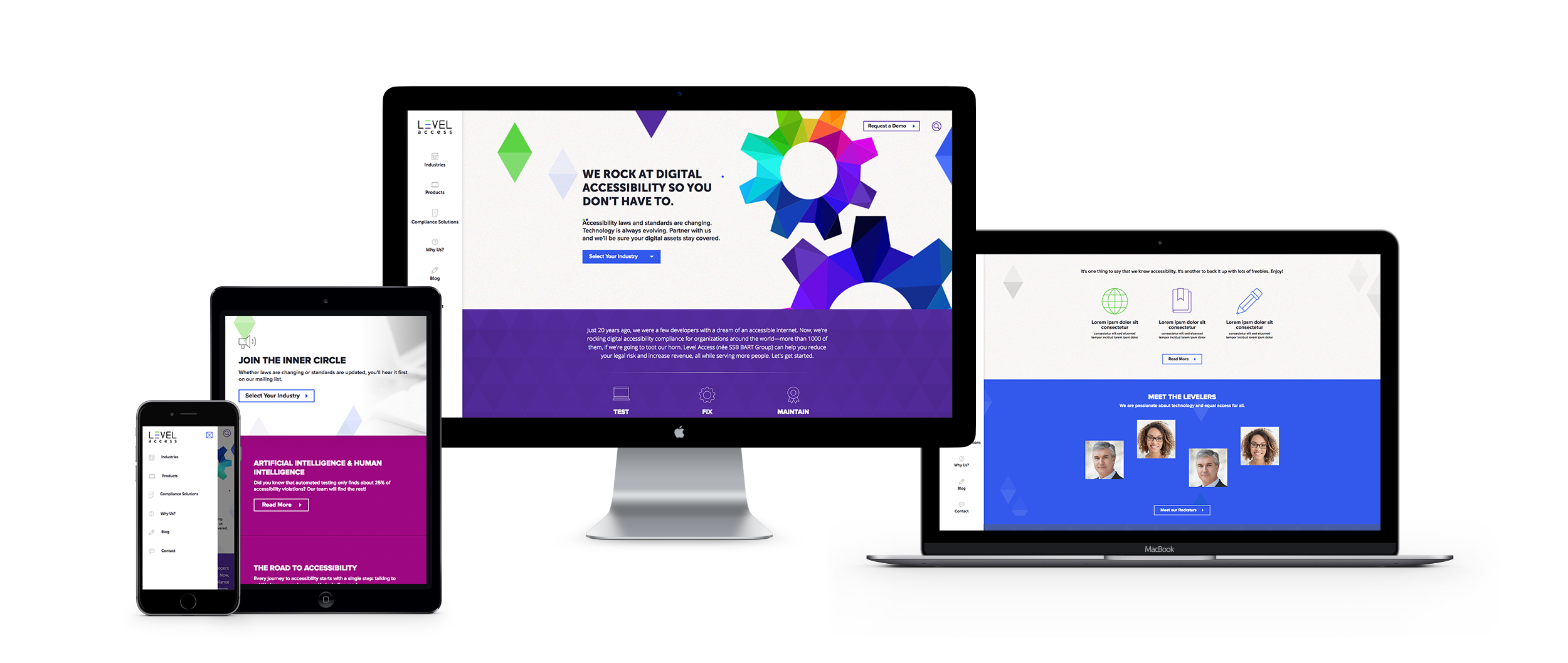
When the SSB Bart Group, the leading provider of accessibility solutions and software, needed a new brand to increase its market share and continue on its growth trajectory, it chose Bluetext to deliver a new name, brand, and website that would focus on its people and expertise. After a thorough discovery process, competitive review and market analysis, Bluetext proposed Level Access to simplify the brand and its promise to the industry. The new look and feel and how it is presented on the website reflects Level Access’ mission “to create a world where digital systems can be made readily accessible to users with disabilities—enabling digital technology to become a profound empowering force in their lives.”
Looking for more information about the state of web design and where we’re headed? Check out some more of our case studies.
A Google search of “cyber security companies” will return well over 700 million results. As a business becomes increasingly digital and transitions more operations into cloud-based tools, the data of both the business and its customers become increasingly vulnerable to cyber attacks. Cyber security companies are cropping up in response to growing demand across industries, but even the cyber security companies have to worry about protection, especially when it comes to their websites. As its digital storefront, any website is a critical place to ensure proper security measures are in place.
Here are the top five steps that cyber security companies themselves are taking to keep their websites protected.
1. Ensure CMS Security
The most cost-efficient way to build and manage a website is to leverage a popular content management system, but on their own these systems are often prone to attacks. To mitigate vulnerability, cyber security companies install a series of security plugins or modules, such as Securi for WordPress and Security Kit or Paranoia for Drupal.
Important Note: Simple installing the plugin or module is not sufficient. To protect your website and its data, webmasters must update and configure new releases in a timely manner. Website design and development agencies, such as Bluetext, can ensure your site security is always up to date.
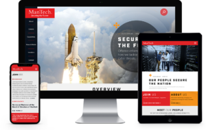
When Bluetext partnered with ManTech to completely redesign their website, CMS security was a major concern. ManTech is a multi-billion-dollar public company that provides subcontracted technological services to the US Government. We outfitted their new Drupal website with the latest and greatest security plugins to ensure adequate CMS security.
2. Leverage Two-Factor Authentication
The content management system supporting a website needs to be easy-to-use, but not easy-to-access. Top cyber security companies (and the cyber security marketing firms who design and build their sites) ensure that only entrusted individuals can manage content on their sites by implementing two-factor authentication. When a content editor attempts to login in to update a page, they must validate their identity through a secondary step, such as a text message, phone call, or email. We often recommend Duo from Cisco, which integrates easily with most content management systems.
When CyberArk, a Goldman Sachs-backed, global cybersecurity technology company turned to Bluetext to redesign its brand comprehensively, we also launched a new responsive digital platform, complete with two-factor authentication. The new website addressed the needs of CyberArk’s global enterprise customer base.

3. Setup (BIG) Form Security
Web forms are valuable tools to digital marketers — and hackers! The potential for attacks initiated via a web form is BIG, hence they need big security. Cyber security companies, like many other industries, use web forms as a key lead-generation tool, but they know these forms are not something to be taken lightly. Any element on your site that allows for (and actively seeks) user input is susceptible to SQL injections or spam bots. (The tl;dr for those links: you do not want your website to suffer either fate.) The key IT stakeholder for any website should make form security a top priority, and work with the website development agency to select and implement the right technical measures.
When Finite State, an IoT-based cybersecurity company, came to Bluetext to expand its industry presence through a full website development and rebrand, we made sure that form security was paramount to the fully customized WordPress content management system platform.
4. Don’t Skimp on Hosting
While GoDaddy allows a company to save money, cyber security companies know that those savings come at an even higher cost in terms of security vulnerabilities. Though secure hosting providers come with a higher monthly bill, the long-term peace of mind in security far outweighs the short-term costs. These providers offer SSL certificates, CDNs, firewalls and more to ensure that websites can withstand malicious malware and attacks. Some of the top secure hosting providers recommended by top website development agencies include WP Engine and HostPapa.
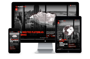
Hosting security was top of mind for our client, PlanetRisk. When PlanetRisk, an enterprise risk analytics company, hired Bluetext to lead a comprehensive rebrand and new digital user experience and re-platform their content management system, we made sure that their updated website was fully secure, hosting-wise.
5. Take a Proactive Stance
Too often, website security measures are only implemented as a reactionary step following an attack. Cyber security companies know better. If a malicious attacker penetrates the website, they could irreversibly tarnish the brand. Cyber security companies make sure that the steps above are covered before an attack by configuring them before the website launches. Proactive protection can be a challenge if you don’t know what to expect, so be sure to consult an experienced website development agency to ensure your bases are covered with the most up to date security measures.
If you model your website security initiatives after the experts, you’ll be best set up to withstand attacks. Learn from the experience of a cyber security marketing agency—don’t skip these important steps!
When it comes to building or remodeling your company’s website, partnering with a top website design firm is essential. By hiring a leading website design firm, you get to work directly with experts, maximize the utility of your team’s resources, get access to the latest technology, and so much more. Having a professional, user-friendly website can make all the difference when it comes to acquiring new clients and retaining old ones. Prospective customers will appreciate an enhanced user experience and will be reassured by the legitimacy of your company. Read Bluetext’s top 4 reasons to work with an expert website design firm.
1. Make a Lasting First Impression
At Bluetext, each website we build or remodel goes through a strict quality assurance process to ensure every page functions properly and looks perfect. Our team of coders, developers, and designers evaluate both the UI and UX of the site, validate all links and forms within the site, and ensure that each page follows brand guidelines – but that’s just to name a few of the steps in our process.
When it comes to your website, we know that first impressions are incredibly important. In fact, it only takes users 50 milliseconds to form an opinion on your website and decide if they will stay or leave. Not to mention, over 35% of users will leave a website if they find it unattractive. With a leading web agency, you can rest assured that your website will not only look good but is also easy to use.

2. Optimize Your Website’s Loading Speed
One of the most essential ways to make a positive first impression on users is by having a website that loads quickly. As a website design firm, our team of web analysts will assist with file compression and code optimization, enhance time to first byte, evaluate HTTP requests, and everything else in between, ensuring that your site loads as fast as possible.
About half of web users expect websites to load in less than two seconds and will leave if a website takes any longer than three. If your website drives $100,000 in revenue per day, increasing your loading speed by one second could help increase your daily revenue by 7%. A leading web agency will ensure that no potential customers are lost due to site speed.
3. Ensure Your Site’s Accessibility
At Bluetext, all engagements go through our team of accessibility experts to ensure you are publishing in compliance with the newest WCAG AAA standards. With well over half of the world on the internet, it’s vital to ensure that there are no barriers to access your website for individuals with any disability.
4. Create a Successful Campaign
Through different channels such as social media, mobile applications, search engines, and display networks, businesses can get their names in front of countless users. Meeting the ever-changing requirements of those channels, however, has become increasingly difficult. Not to mention, most every country has different advertising requirements, adding another layer of complication for those interested in advertising outside of the United States.
A website design firm, like Bluetext, can not only help you run global ad campaigns but can help you build the perfect landing page for users to see when they click on your ads.

If you’re looking to hire a leading web agency, see what Bluetext can do for you.
According to a recent study, 48% of people believe website design is the leading factor in a company’s credibility. Based on this assumption, it’s clear that having a professional website is incredibly important. With content management systems like WordPress and Drupal, it can seem like hiring a leading web agency is unnecessary. However, agencies like Bluetext offer the expertise of top drupal consultants, WordPress design experts, and countless other web specialists to create a seamless, designed to spec, website. Needless to say, hiring a leading web agency is essential to your website development journey. Read our top 5 reasons to hire a web agency:
No Training Required
By hiring an agency, the added stress of finding, hiring, and onboarding new employees is eliminated. Often times, companies invest countless time, money, and energy to help train new employees, just to have them leave within a few years. By hiring a leading web agency, clients get a qualified and accomplished team ready to start working from day one and for years to come.
Work Directly with Experts
Agencies bring talent who have extensive knowledge and experience in different areas of web design. Unlike many businesses, agencies have access to a wide array of specialists like SEO experts, designers, researchers, and everyone in between. These experts can use their in-depth knowledge to help generate and report on results, guaranteeing the success of any website design and development project.
Get Access to the Latest Technology
Analytics and web development tools are costly to use for large and small businesses alike. With so many possibilities on the market, training employees to use these tools adds an unnecessary cost to any business. Working with a leading web agency can help increase efficiency and performance by gaining access to the latest tools, services, and software in the industry.
Outside Perspective
Employees within a company often find it hard to bring completely new ideas or concepts to the table. By hiring a leading web agency to help with web design, businesses get a fresh set of eyes and a unique perspective. Not to mention, agencies bring experience and data-driven results that show what works and what doesn’t to help meet the goals of businesses in any industry.
Positive Results
Agencies are constantly building and maintaining many different types of websites. From prior experience, a leading web agency will know from the very start what a website requires to generate quality results. Additionally, an agency can continue to update websites to ensure the best tools and assets are in place for long-term growth and success.
Hiring a web agency has many benefits for any business. It’s important to hire an agency that can help you meet all of your goals so your business can work more efficiently. Whether it’s to save time and money or to take advantage of the latest tricks and tools, there are countless reasons to hire a leading web agency.
If you’re looking to hire a leading web agency, see what Bluetext can do for you today. To learn more about our processes and to see our work, check out our website.
As we near the end of 2019, choosing the right technology implementation partner has never been more important. According to a recent Gartner study, through 2021, 90 percent of global organizations will rely on system integrators (SIs), UX design agencies and channel partners to design, build and implement their digital experience strategies.
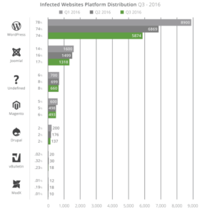
Before deciding on the right implementation partner, it’s integral to choose the right technology for that partner to implement. Drupal, an open-source technology option, is known for being the top choice for creating large, complex websites. Given today’s increasingly complex threat environment, Drupal is also a great technology option because of its built-in security protocols. According to a recent report, Drupal sites are some of the least hacked sites on the web. For large, security-conscious organizations, federal agencies and government institutions, look no further than Drupal.
Once you’ve made the decision to implement a Drupal site, the next question to ask yourself is who you should trust to design, build and implement your new site. That’s where a top DC UX design agency like Bluetext comes in.
Here are our top 5 tips for finding the right Drupal development agency:
Look for a Partner Who Thinks Beyond the Implementation
Having a partner who focuses on the big picture of your project is integral to the success of your initiative. These days, any developer with a laptop and an internet connection can set up a website, but having a partner with a perspective on how that website fits into the broader marketing ecosystem and vision for your company’s future growth is paramount. A Drupal development company like Bluetext, with full-service capabilities, can be that partner. Bluetext, leveraging experience as a top DC UX design agency, will assess the project from a wider viewpoint and offer tried and tested solutions to positively impact your revenue streams and improve overall customer loyalty.
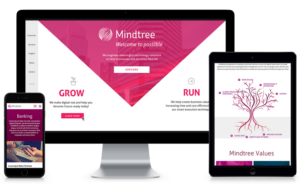
For example, Bluetext partnered with Mindtree to develop the new Mindtree.com, which includes an intuitive, fully responsive user experience and leverages personalization to serve relevant content to each user. Powered by Drupal 8, the new website provides the flexibility and scalability a large enterprise needs to support its digital marketing efforts.
Is Your Team Ready for the Partner’s Style?
When working on a project, chemistry is everything. Your chosen partner might be the best in the business, but if they don’t wrap their processes around your needs, the entire engagement will be negatively affected on both sides of the table. Deadlines won’t be met, communication will feel forced and restricted, and overall, the project will suffer. Bluetext, one of the best DC UX design agencies, works closely with each client we partner with, making sure we understand internal processes, all design and functional requirements, and priorities for the given timeframe. Bluetext adapts our processes to operate how our clients work best, employing different applications and modes of communication to ensure every client is happy and the end-product achieves set goals.
Make Sure Your Teams Fully Understand Their Roles
The key to any project’s success is communication. It is never wise to assume a member of the team fully understands the objectives they are tasked to manage and deliver. An open-source application such as Drupal can be a challenging system to get used to. Having a leading web agency like Bluetext on your side can make any project run smoothly. From week one, Bluetext makes sure every member of the team, on both sides of the engagement, has a clear understanding of their role. This means putting in the effort to define clear project objectives per phase, roles and responsibilities, a communication structure and even informal expectations. Put the work in at the beginning of an engagement, and you will reap the benefits as you toast the launch of your new website.
A Higher Price Doesn’t Necessarily Mean a Higher Quality
When choosing the right technology implementation partner, the cost of the implementation is important. Understanding how and where your budget will be spent before making your choice will lower the chance of setbacks as the project moves from start to finish. The higher-priced implementation partner will often spend longer amount of time on a project and will bring too many unnecessary team members to meetings. Contrarily, the cheaper implementation partners often lack the skill to produce consistent, quality work.
At Bluetext, a leading web agency, we understand how ambiguous pricing may seem when it comes to implementing a new website. Bluetext is unique in our approach to pricing out technological implementations. Most digital web design agencies will conduct their business via an hourly billing budget. Bluetext ultimately views this process as inefficient and a hindrance to the client-agency relationship. Instead, we bill per deliverable, making our inefficiencies our problem. It doesn’t matter how many members of our team we bring to a client meeting or how many rounds of revisions a design takes to get right. The client always comes first and the work isn’t done until you are satisfied.
Past Track Record Counts
A company’s decision on which technology implementation partner to choose comes down to that partner’s previous experience. This makes sense, given that clients often look to case studies featuring previously executed work an example of what they can expect to receive at the end of the engagement. They also look to the reputation of agencies within their industry, so they know that that agency has knowledge of their industry and can get up to speed quickly. Bluetext, being a top UX & interface design company, has plenty of experience developing stunning, industry-leading, Drupal-based sites and has delivered on some of the most complex implementations to date.
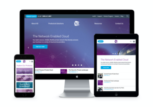
For example, Bluetext partnered with XO on an enterprise-level Drupal 8 website deployment. Bluetext engineered a next-generation CMS re-platforming that included a first-time responsive website user-experience design. As XO’s SEO agency of record, Bluetext delivered a comprehensive SEO overlay as we dealt with the complexities of re-platforming, leveraging the Drupal content management capabilities to make XO.com an organic SEO over-achiever.
For more information on why Bluetext is one of the top DC digital web design agencies, check out our website, packed with examples of our work harnessing the power of Drupal.
As we recently wrote, Bluetext has been selected as a finalist for the 2018 Acquia Engage Awards in the category of “Lightning in a Bottle”. The Acquia Engage Awards recognize the world-class digital experiences that organizations are building with the Acquia Platform.
More than 100 submissions were received from Acquia customers and partners, from which 43 were selected as finalists. Nominations that demonstrated an advanced level functionality, integration, performance (results and key performance indicators), and overall user experience advanced to the finalist round, where an outside panel of experts will select the winning projects.
A sneak peak of the project:
As a leader in technology services and digital transformation, Mindtree must not only provide a website as a sales tool, but also act as a testament to the brand and its mission. In April 2017, Mindtree approached Bluetext with the goal of reimagining, redesigning, and re-platforming its self-hosted Drupal 7 website, with 10 unique page templates, 1800+ pages, and 700+ blogs in under six months. Mindtree, in partnership with Bluetext and Acquia, was able to achieve a complete digital transformation and launch a scalable digital platform in less than 6 months through the strategic partnership.
The Acquia Platform provided tremendous value for operationalizing the development workflow to gain efficiencies. When paired with Acquia’s Build and Launch Tool and Acquia Lightning, it takes the time savings to a new level. Acquia Lightning provides a starter kit that is geared towards content editing and workflow.
More information about the Awards:
Winners will be announced on October 24, 2018, ahead of this year’s Acquia Engage Conference, which will be held in Austin, Texas, from November 7-9, 2018.
“Acquia partners and customers are tackling the biggest challenges facing marketers, developers, and digital teams,” said Joe Wykes, senior vice president, global channels and commerce at Acquia. “This year’s Acquia Engage Award nominees show what’s possible when open technology and boundless ambition come together to create elegant, world-class customer experiences. They’re making every customer interaction more meaningful with powerful, personalized experiences that span the web, mobile devices, voice assistants, and more. Their work is inspiring, and we’re proud to recognize their accomplishments.”
The Acquia Experience Platform offers a suite of technologies for easily building digital experiences at scale, across the web, mobile sites, native applications, voice assistants and more. The platform allows businesses to manage the deployment and iteration of those experiences in the cloud, and intelligently optimize how they are tailored for specific audiences using machine learning.
The full list of finalists for the 2018 Acquia Engage Awards are posted to Acquia’s website.
About Mindtree
Mindtree is a leader in technology services and digital transformation. Mindtree delivers digital transformation and technology services from ideation to execution, enabling Global 2000 clients to outperform the competition. “Born digital,” Mindtree takes an agile, collaborative approach to creating customized solutions across the digital value chain. To learn more, visit mindtree.com
About Acquia
Acquia is the open source digital experience company. Acquia provides the world’s most ambitious brands with technology that allows them to embrace innovation and create customer moments that matter. Acquia believes in the power of community – giving their customers the freedom to build tomorrow on their terms. To learn more, visit acquia.com.
Learn How Bluetext Can Help Your Brand with a Great Platform Experience.
Acquia, the leading hosting and support company for Drupal open-source content management systems, has named Bluetext as a finalist in its 2018 awards for best digital marketing firms and website design. Acquia chose Bluetext for its work with Mindtree.com, one of the global leaders in digital transformation and technology services. Bluetext created a revitalized digital brand, a new website user experience, and a state-of-the-art Drupal content management platform for Mindtree.
Acquia considered more than 100 submissions from top digital marketing firms for its annual award. Among the factors it evaluated for for its best digital marketing companies and websites were client projects that demonstrated an advanced level functionality, integration, and performance, including the results and key performance indicators for each site. Acquia also evaluated overall user experience for each website. Acquia called the breadth of submissions “inspiring… and continues to affirm that Acquia’s partners and customers are setting the precedent for exceptional digital experiences.”
For the new Mindtree.com, Bluetext developed an intuitive, fully responsive user-experience that leverages personalization to serve relevant content to each user. The site was built on a Drupal 8 CMS platform to provide the flexibility and scalability that a large enterprise needs to support its digital marketing initiatives. Best of all, the web design reflects the vibrancy of the brand and its employees, a specific goal of the brand.
Bluetext and the website will be featured during Acquia’s annual Engage conference, where the best digital marketing companies and the foremost leaders in digital will take center stage to share their insights, revelations, and lessons learned in the quest to deliver best-in-class customer experiences.
Learn how Bluetext can deliver a great user-experience for your brand.
WordPress and Drupal have been the leading open-source content management systems for the past 8+ years. During this time, both platforms have created strong reputations for themselves.
WordPress has been viewed as a user-friendly content management platform, built for bloggers who need to get their information out quickly and easily without having to worry about learning how to code. This made the barrier to entry onto the platform extremely small, resulting in the landscape we have today with more than 25 percent of all websites built in WordPress.
Drupal comes from the other side of the spectrum, designed for developers as a developers platform. With this developer-first mentality, Drupal offers many more features than WordPress to provide flexibility, scale-ability, and maintainability. While the learning curve for Drupal is significantly higher than that of WordPress – reducing the adoption rate by non-technical users – this did make Drupal stand out in the enterprise by catering to larger applications with a more robust set of requirements. Yet, in the meantime, it acquired a reputation as a developers CMS that’s not as friendly for general users.
Drupal 8 changes the game for Drupal and highlights several core strategic initiatives to help break down the barriers and remove the developer-first stigma that the platform has acquired over the years. In this blog post, we will take a look at some of these core initiatives.
Fast-forward to today, with Drupal 8 in its prime
Drupal 8 opens up a new world for users. This is backed up by the fact that 5 out of 7 active strategic core initiatives for Drupal 8 relate to improving the content management experience. The goals of these initiatives are simple:
- Reduce the barriers of entry for non-technical users (Out-of-the-Box#, Outside-In#)
- Provide site builders with the tools they need without having to write code (Out-of-the-Box#, Layout#)
- Provide content managers the tools they need to be successful (Workflow#, Media#, Outside-In#)
Out-of-the-Box# Out-of-the-Box# is a strategic core initiative for Drupal 8 which focuses on improving Drupal 8’s OOTB capabilities to provide a fully-featured CMS. Phase 1 of this initiative is to provide a fully baked example site into a core destination website for Food Network Magazine. The example will provide a rich and beautiful experience for users as they navigate through the website.
This example profile will also provide a framework for other developers to do the same thing and begin creating pre-packaged site templates, similar to what WordPress does, as a way of providing a near-plug-and-play experience.
Outside-In# The Outside-In initiative is one which strives to improve the in-line editing experience in Drupal 8. With today’s landscape of website building platforms, it only makes sense for Drupal to push for this. A key benefit to this type of editing experience is that it keeps content managers in-context of the work they are doing. Content managers are coming to expect these types of slick editing interfaces which are offered by other CMS platforms and website builders such as WordPress, WIX, and Shopify.
Drupal 8 now ships with basic inline-editing experiences across its core features. The foundation is available and the “contrib” space is catching up. Many of the “contrib” add-ons support the in-line editing experience, while Drupal is adding more every day.
Layout# The Layout initiative is one which is focused more on the site-builders and power-users. The goal for layouts is to provide cookie-cutter like shells where users can drag and drop content and blocks to meet their content needs.
Workflow# The Workflow initiative is focused on improving the workflow, preview and staging capabilities for content in Drupal. Every organization has slightly different requirements when it comes to publishing content to the web. The Workflow initiative helps to strengthen the core functionality of Drupal to allow for these varied requirements by providing configurable workflows on a per-content-type basis.
Content staging is extremely important to large organizations. Being able to preview a new version of a page before publishing is significant.
Media# Drupal 8 has long struggled with reusable media assets. The objective of Phase 1 of the media initiative is to provide a simple media solution to make Drupal 8 easy to use for basic use cases. There is a focus on strengthening this feature and integrating it into the core components of Image Fields & WYSIWYG.
While Drupal 8 may not set the highest bar for a great content management experience, it is making significant strides to catch up to its competitors. This combined with the areas at which Drupal already excels, including Performance, Security, and Maintainability, make it an obvious choice for enterprise-level CMS implementations.
Looking to see how you can transform the way you manage your website? See how Bluetext can help!