There was a time not so long ago when organizations could navigate the ebb and flow of the 24/7 news cycle to maximize how and when they shared important corporate developments. Much of the traditional news cycle ended in March 2020, as COVID-19 took over the news like nothing we have ever seen before. And rightfully so, as it’s affecting millions of people around the world in myriad ways.
For B2B technology firms – a market category Bluetext frequently works with – a status quo media relations strategy will not cut it. Between the pandemic and the media domination of the Trump Administration, one could argue we’ve operated in a relentless “breaking news” cycle for the past 4+ years – creating an unprecedented challenge for B2B brands to get their message in front of the right audience at the right time.
Here are 4 considerations for your B2B PR strategy during the pandemic:
Find your story, but don’t chase it
Ambulance chasing is never the right PR strategy. But throughout the pandemic, many B2B firms are playing a role in protecting citizens and workforces – or helping businesses and consumers adapt to the world we now live in.
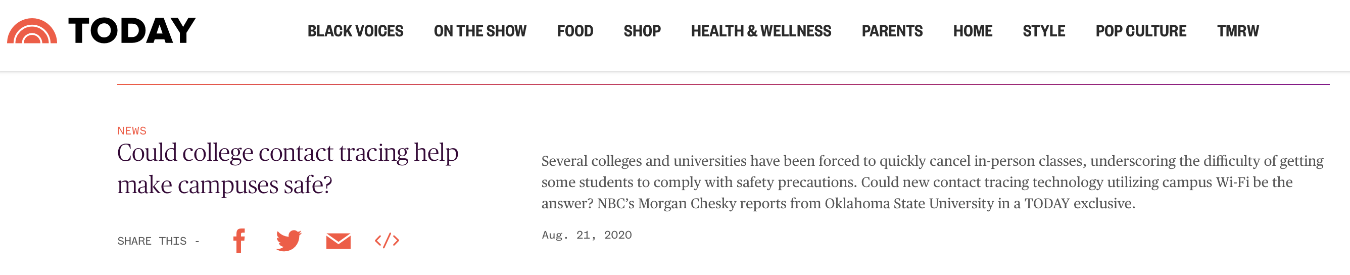
Whether your work involves efforts to deliver advanced data analytics being used to inform health and economic decisions, technology to improve contact tracing efforts, or cybersecurity solutions to protect the ever-expanding attack surface brought on by near-full remote work, there are stories to be told and people who want to hear them. So, find your story; but don’t chase it. Your voice during extended crisis events like the pandemic must be authentic and focus efforts on contributing to the conversation, not the bottom line.
Don’t wait long for news cycle gaps
If you are waiting for the news cycle to slow, give it up man. The pandemic will remain the prevailing narrative for months to come. Stay committed to your PR strategy, but depending on the nature of each news announcement, ensure the messaging is relevant to the current environment businesses, workforces and consumers face. Even in today’s news cycle, there is room for stories that are about things other than COVID. Product launches, funding news, survey data, and company milestones will all continue to be covered––and it’s possible to share this news without being tone-deaf to the economic realities of today. While it may not receive the broad coverage typically expected before the pandemic, if it’s a good story and important to your business it’s likely that there is a publication that’s open to writing about your news. This leads us to the next tip…
Know your beats and boundaries
Journalists have been dealing with the same work and life challenges as the rest of us. With so many working remotely, some PR flacks are blurring the lines between business and personal communications profiles. If you find yourself dialing a reporter’s cell phone number to pitch them on your client’s new product, first ask yourself which reaction is more likely: will they answer the phone “Hi so and so, great to hear from you” or will the retort be “how in the heck did you get this number?” And if it’s the latter, don’t say you lifted it from a 2015 RSA pre-registered media list. Hitting them up on social media? Maybe. Again, it depends on the nature of your relationship with the reporter and the type of social network communication.
The pandemic has also undeniably shifted newsroom structures and beats. Some reporters have shifted partially or fully to cover various aspects of the pandemic. This requires keeping your finger on the pulse of what reporters are covering – as these shifts may create new challenges and opportunities.

[Almost] Always Be Closing
Within B2B tech yes, reporters still want to hear about groundbreaking technologies. But there is also an awareness by journalists of the broader challenges that organizations face achieving growth, positive company culture, and workforce productivity in a pandemic. In other words, reporters also want to cover the human side of business.
Don’t be afraid to look for stories in new places. Are there employee stories you can highlight? How about the way in which you are keeping employees connected virtually or new ways that work is getting done? These stories may not drive sales but they can help with positive brand awareness and talent acquisition.
Want to find your story? Get in touch with Bluetext.
Due to the global pandemic, the rise in virtual events over the past year has created a new element of accessibility to gathering. The past year has exposed previously unacknowledged limitations to in-person events, where only a limited number of attendees could be a part of the action. However, the advantages of event accessibility can bring implications to traditional registration strategies that previously relied on limited availability and exclusivity.
Recorded webinars, streaming services, and many other on-demand materials can remove the sense of urgency from common event marketing tactics. If an audience member knows they will have access to an event at any point in time, they may feel less inclined to participate in, or even join an event in real-time.
At Bluetext, we have found a way to help our clients capture interest and create urgency around virtual events. Leveraging the best industry tools available and reliable systems to create a realistic and professional virtual event experience allows you to open your virtual event to a wider audience, without sacrificing the emotions and experience of in-person, physical events.

Stay true to your brand
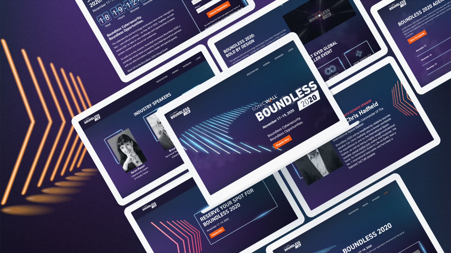
This piece of age-old advice has never been more true. If you get away from your core values and try to create a virtual event setting that would be unfamiliar to your typical target audience, potential attendees and customers may not come away with the right message. A virtual event is an opportunity to get creative with event-specific branding, but make sure that there are still remnants of the brand your users know and love. Take SonicWall’s Boundless 2020 event for example. Bluetext created a specific EVI (event visual identity) inspired by their Boundless campaign, new product dark mode features, and existing brand identity.
Drum up your attendance
The old goal for larger event attendees was to get people in the room. Now, a successful campaign will convert registrations into live viewers. Everyone wants more eyes on the screen and ultimately your brand.
Everything comes down to how you plan and offer an event. One way to create urgency includes making sure that people know it will only be a one-time opportunity. The novelty of exclusive and experiential experiences very much still exists in the virtual world—it is just a question of making sure the audience knows what to expect and what they could miss out on if they don’t attend.
Play the long game
Many experts are hinting that even after the pandemic recedes, aspects of virtual events may be here to stay. The success story of the virtual event is twofold. Some companies have noticed an increasing number of event attendees due to the ease of people signing on from home, and a hybrid option of partially virtual, partially in-person events will allow non-local attendees from around the world to participate in events they may not have otherwise due to the hard cost and opportunity cost of travel. It is now more important than ever that your company is prepared to comply with today’s event regulations by going virtual but also invest in a sustainable digital marketing strategy for future events, campaigns, and more.
Watch Bluetext founder, Jason Siegel, discuss how to create and maintain urgency in event marketing with Travelocity Founder and keynote speaker Terry Jones in this week’s Virtual Marketing Minute.
The COVID pandemic has put a pause on many personal and business practices, with one stand-out exception. In the midst of COVID, digital transformation hasn’t slowed; instead, it’s actively accelerated as we try to keep up with today’s digital customers. “Digital transformation” has become a powerful buzz-word that has executives signing checks left and right. Many companies are investing heavily in digital, and while these investments continue to grow, the expected results often fail to materialize. But why? Technology and unsuccessful efforts to scale are often the first things we look to blame, but the real issue may be more deeply rooted.
Digital Transformation Requires a Culture Shift
In order to successfully execute a digital transformation, change must be driven from the top down. Beginning with management, the company as a whole must not only understand the goals and reasons for changing, but also the urgency for doing so to successfully prepare for a more digital future.
Companies are getting 50% more business and leads online than ever before, and this number will only continue to grow. To capture this ever-expanding market, it’s important to understand that the tactics and processes that got you to this point need to be an ongoing initiative. Digital transformation is often not one and done, it will not be sustainable without the future introduction of more digital practices.
![]()
How Can You Avoid Digital Transformation Failure?
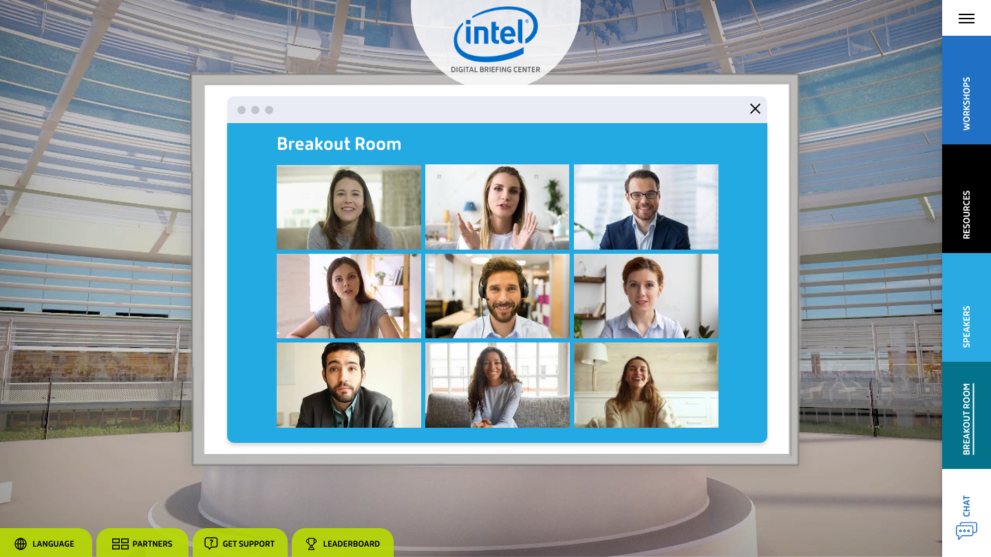
You can start by making sure your team is on the same page regarding what tactics and strategies will make your business successful in the digital age. One method many companies are using to enter the digital space is through digital briefing centers and virtual events. Engaging the entire leadership team as well as your customers in the virtual space is a great way to lead a digital transformation in a world where fewer interactions are in person. Digital briefing centers also have the ability to be available at any time of day, allowing prospects to access your content at their convenience, not yours.
In today’s virtual world, differentiation through digital engagement is critical. Take a look at Bluetext’s work in the Digital Briefing Center space and find out how you can recreate the in-person experience.
Watch Bluetext founder, Jason Siegel, discuss the ways you can avoid digital transformation failure with Travelocity Founder and keynote speaker Terry Jones in this week’s Virtual Marketing Minute.
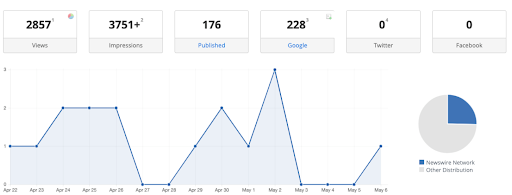
A common question we get from new Public Relations clients and prospects at Bluetext is ultimately the most important one: how do you measure results? Organizations, understandably, seek the same depth and breadth of metrics for public relations that they can achieve with their ad spend, SEO, and other lead generation activities.
If you go back several years, the metrics query is one that would trigger beads of sweat to stream down the foreheads of PR professionals across the world. Why? Because the way marketers want to measure (activity spend — sales) doesn’t always fit neatly with how public relations works.
If a B2B, B2G, and B2C technology firm decision-maker reads an article referencing your company and then three weeks later decides to visit your website or reach out to a sales contact, it is very difficult to track that back to the initial PR hit as you would if the lead clicks on a digital ad or trackable piece of content. Top of funnel PR to build brand awareness and leads also holds significant value (clients won’t buy your services if they don’t know who you are and what you do), but again these are not always activities that will result in a prospect immediately rushing to your website or sales team.
The good news is that PR measurement tools have become increasingly sophisticated, which empowers forward-looking agencies to make leaps in using innovative technologies and approaches to demonstrate how PR spend connects to tangible results such as leads, sales, increased brand awareness, and growth. The days of relying on archaic and misguided measures such as the number of media hits (with no regard for their quality or impact), Ad Equivalency Value (AEV), or website impressions are long gone, and businesses should demand more from their agencies.
If your brand is thinking about better ways to measure PR internally or through an agency relationship, there are promising new tools and metrics to consider.
-
Traditional PR Metrics Are Not Enough
When showing clients coverage volume, PR agencies often also highlight an outlet’s impressions, or unique visitors per month (UVPM), to emphasize the impact of a coverage placement. The more prominent the media outlet, the higher the impression count. While interview opportunities and coverage placements are tangible results that can be counted and used as a benchmark for internal success, the value of impressions has always been difficult to articulate to clients.
UVPM tracks an outlet’s audience size. It offers a number of potential individuals that may read or watch the story, but cannot drill down to the specific total. Those impressions numbers also cannot determine how a media placement directly impacts a company’s business goals, audience reach, or brand sentiment.
With the need for more robust reporting metrics that go beyond the total number of coverage hits, an outlet’s circulation, and AEV, agencies are increasingly turning to newer metrics such as referral traffic, social media conversation monitoring, and, even more recently, Share of Voice and Power of Voice.
-
Expand Your PR Measurement Horizons
“Public Relations” is a broad umbrella term that can mean different things to different organizations – which complicates measurement. Maybe your objective is to elevate your brand to page 1 on Google Organic Search results through earned media coverage to capture more high-quality prospects. It might be to increase mindshare through thought leadership around key practice areas or market categories. More likely, you have multiple objectives that need to be tracked.
One way to measure this is through referral traffic. Having links in story placements that directly feed readers back to an organization’s website can help generate increased site traffic. Social media-driven traffic is an additional way to track website visitors from social channels so it is important to ensure you can measure and track social media conversations and activity as well.
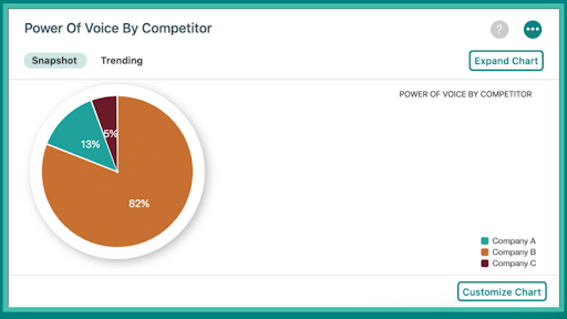
Over the past few years, Share of Voice (SOV) has been a core metric used by PR agencies and in-house communications teams. Search Engine Journal has a tidy roundup of how SOV works and why it is worth measuring. In a nutshell, Share of Voice measures an organization’s “share” of the media conversation compared to competitors. For example, an Endpoint Detection & Response (EDR) cybersecurity vendor that is frustrated after being left out of key articles it knows customers and prospects read, and which features its competitors, would want to increase its Share of Voice in these articles. If that vendor engages with a new Tech PR agency or continues with its existing firm, it may want to track growth in Share of Voice over time as a way to measure PR results.
In the end, the strongest metric tools combine social monitoring, audience insights, and traditional volume measurements to provide the most complete portrait of coverage in the media, which is why a growing number of Tech PR agencies and professionals are evaluating Power of Voice.
-
The Sum of All Parts: Power of Voice
Power of Voice differs from traditional reporting measures as it holistically accounts for both the quantity and quality of coverage hits. This new technology combines an article’s tone, sentiment, relevance, and social amplification into a single competitive metric.
Through Power of Voice, PR professionals also can more easily identify which reporters would most align with their pitch and storyline, eliminating hours of cultivating expansive media lists.
Most importantly, Power of Voice enables agencies to track brand sentiment over time to garner a better understanding of how a specific organization’s perception changed relative to a specific event. This creates a meaningful visual of how a press release, media placement, or contributed byline directly impacted the client’s company.
-
Don’t Be Afraid to Try Different Reporting Tools
B2B, B2G, and B2C technology firms are right to seek deeper and more meaningful metrics to evaluate their PR spend. If your organization is evaluating Tech PR agencies – or simply seeking more from your existing agency – ask about the tools and methods they use to measure PR results.
Ultimately, effective PR measurement boils down to clearly established Key Performance Indicators (KPIs) at the onset of the engagement. With both agency and client in sync on PR KPIs, it is far more likely you will be measuring the metrics that matter – and that makes an impact.
Interested in learning more about how we measure PR results for clients? Get in touch with Bluetext.
You’ve crafted your brand message, settled on a new visual strategy, or launched your new product. So what’s next? You probably have the urge to shout your new message from the rooftops. But in 2021, you may need a more modern digital media strategy. Paid media is essential to put that message in front of your target audience. While earned media (i.e. public relations, email, organic search, organic social) is also an important part of GTM, paid media can both expand your brand’s current reach and reel in interested parties, and convert them into customers.
A Full-Funnel Approach Drives both Awareness and Acquisition
As a top digital marketing & design agency, we know that the funnel is everything when talking about paid media. Online user behavior is very rarely linear or systematic. Consider how you browse the web. Do you click on the first link you see and immediately start a purchase online? If you’re like most people, you click around, do an informed search, and learn more before making a purchasing decision.
Awareness Builds the Top of the Funnel
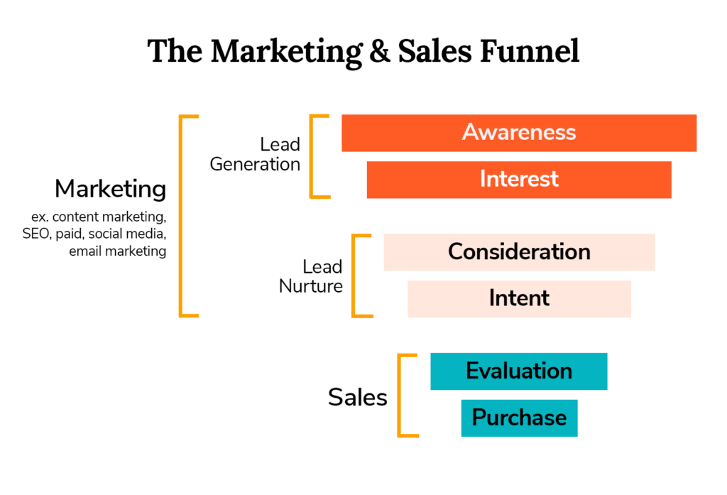
When crafting a digital media strategy, we account for user behavior by focusing on the overall user journey. That journey can be broken up into two main parts: awareness and acquisition. Each category has an ideal mix of channels and tactics that accomplish specific key performance indicators (KPIs). At the top of the funnel is awareness: a user’s understanding of your business or specific product. The KPIs for awareness are typically impressions or site visits – really just eyeballs on ads and on your site content.
Channels that we typically include in awareness campaigns include programmatic media (which includes display, native and video ads), paid social, and other advertising (billboards, podcasts, etc.). These ads are meant to capture a broad audience and expand the awareness of the business to new – and potentially lucrative- audiences. Within these channels, we also use tactics that will increase impressions and site visits. Third-party targeting (showing kitchen tool ads to someone marked as interested in cooking) is particularly helpful, as is contextual targeting (showing kitchen tool ads to someone browsing a recipe site).
As a top digital marketing & design agency, we craft awareness ads that grab user attention and build an informed target audience. Our client, Appgate, urgently needed to drive brand awareness traffic to the website, recently redesigned by Bluetext. To do so, our brand creative captured user attention with eye-catching motion and sustained interest with useful and digestible information. It is key your ads give just enough information to be helpful, but also entice someone to click the ad and learn more. Within one month, Appgate’s campaign had increased sessions to the landing page by 17% and drove a 25% increase in site engagement.
Acquisition Tactics Convert Qualified Audiences
While all businesses need to start with an awareness campaign, some also want to focus on the acquisition with lower-funnel tactics and conversion-focused KPIs. KPIs for this part of the campaign include engagements on the site (form fills, content downloads, subscriptions, etc.), conversion rate, and cost per acquisition (CPA).
There are many channels that can be used for acquisition campaigns, but one of the most common is paid search. Others include programmatic channels (display, native, video) and paid social. Account-based marketing – which targets specific businesses – is also more of an acquisition-focused tactic. Within these channels, the tactics that optimize toward acquisition are different. Retargeting (showing specialized ads to users that have visited or engaged with your site) is a commonly used acquisition tactic. All tactics and channels in an acquisition campaign rely on strong brand awareness. Paid search success, for example, regularly relies on traffic searching for a certain business or brand name. In addition, retargeting doesn’t build a new audience – it just converts the audience that has already interacted with your site.
Creative for acquisition campaigns are typically more urgent and action-based. Instead of “Learn More”, CTAs focus on specific actions (downloading a demo, registering for a webinar, etc.). Consider, for example, EXL. For this acquisition campaign, Bluetext focused on highlighting certain webinars and speakers, resulting in a 5% increase in ad click-through rate on programmatic display and a 185% increase on paid LinkedIn.
Upcoming Trends in Paid Media for GTM
All top paid media & content marketing agencies to know what’s ahead for GTM tactics and strategies. One major change on the horizon for paid media is the trend away from cookies and pixels. Though many companies have done internal media campaigns based on retargeting and third party targeting they’ve collected in the past, those tactics will become obsolete by the end of the year.
Privacy laws are becoming more prevalent and Internet browsers are moving away from collecting cookies – retargeting is becoming a thing of the past. In its place are solutions such as Google’s Federated Learning of Cohorts (FLoC), among others. Need help navigating the new media landscape? Contact the experts at Bluetext for all of your awareness and acquisition needs.
Here at Bluetext, as a top brand development agency, we see clients invest a lot of time and money into a rebrand. We’ve already talked about why a Go-to-Market Strategy is necessary after a rebrand, but what are some channel tactics that help make a GTM campaign successful? One of the biggest digital channels to utilize during a GTM campaign is email marketing.
We all have a love-hate relationship with email. We get too many of them and we don’t want to be endlessly bombarded with them – yet, we can’t stop checking our emails. We’re addicted, and we know it. So let’s capitalize on it!
Benefits of Email Marketing
There are a lot of benefits in using email marketing as part of your GTM strategy. First off, it’s already ingrained in most users’ lifestyles, and users usually expect some sort of email communication after opting in. Pro tip – stay away from purchasing lists. List buying typically leads to unqualified leads which can end up hurting domain reputation which ultimately hurts your deliverability score. Most email and marketing automation platforms like Marketo, Hubspot, Mailchimp, Constant Contact, and Eloqua, among others, make it easy to set up the basic lists for a smart email marketing strategy, especially when beginning lead generation and nurture flows. It’s important to keep in mind it often takes time to build out effective email campaign mailing lists. Especially when starting from scratch, do not sacrifice quality for quantity. Trust a digital & email marketing agency to help drive your lead generation tactics across your website, resources, or social media.
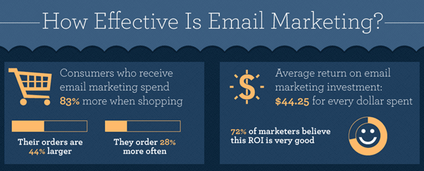
One of the biggest benefits of leveraging email marketing for a GTM campaign is lead generation and lead nurture. Email is one of the most effective channels to cultivate and convert leads. In fact, research shows that 48% of marketers believe that email is the most effective channel for generating leads online.

Lead Gen Tactics
As part of your go-to-market strategy, you’re likely using a mix of paid search, paid display, organic social, and paid social to build awareness for your new brand and drive traffic to your site. And following our GTM brand launch recommendations, you want to ensure your advertising spend is smart and reaching the intended audiences by targeting specific demographics. With this strategic approach, the audience that your GTM campaign is reaching is already targeting ideal leads. But how do you actually capture those leads? It’s all about opt-in opportunities. But how do you get users to take that extra step and opt-in? It must be a convenient and frictionless experience. A few ways to get opt-ins quickly and easily include:
- Adding an email signup pop-up form on the homepage (more common for b2c and some b2b)
- Always have a contact form or subscribe form in the footer
- Gated content
Now that you’re collecting the emails of potential leads, it’s time to nurture them…
How to create a compelling lead nurture email campaign
The set-up of a lead nurture campaign looks different depending on your email marketing platform and if you’re a b2c, b2b, or b2g company, but it has the same goals and results: to nurture leads and ultimately convert them into customers.
The first step is to develop a Leads Email Program, AKA a drip campaign designed to get leads to convert into customers. This is an automated email program that essentially acts as digital sales outreach. It’s a series of emails automatically sent to a specific audience after they take a particular action. For example, when a lead downloads a specific product brochure, if that product brochure was gated and the user submitted a form to receive it, they could be placed in a drip campaign that shares related content. Each email in the series should have a clear action for the user to take, and with each email sent, the action should become more focused and closer to conversion. For example, the first email in the drip campaign is usually more informational and welcoming. The goal is to get the user to consume more content and build an interest/trust with the brand. The second and third emails usually zone in more and have CTAs that resemble a conversionable action, like contacting a sales rep.
The frequency and number of the emails sent, the timing, even the design and level of personalization within each email is dependent on the industry you’re in, but there are some basic things to keep always keep in mind:
- Lead scoring
- Compelling subject lines
- Relevant content and strong CTAs – think about what you want users to accomplish after opening the email – does the content in the email seem compelling enough for the user to take that action? What else could you do to incentivise them to take that action? As one of the leading DC content & brand marketing firms, we know email content has to be relevant and engaging with a clear benefit for the user. The easier you provide that benefit, the more likely you’ll see a higher conversion rate.
- Metrics: check in on performance, look at opens, click-throughs, and unsubscribe rates.
- A/B test – not sure what is most compelling to get leads to convert? Try different approaches through AB testing.
- Keep the engagement going. So they’ve converted from a lead to a customer – what now? Funnel them into an automated Welcome Program. Keep delivering relevant content that clearly demonstrates the benefits to the user.
Looking to maximize your digital strategy through marketing automation? Get in touch with the experts at Bluetext.
Website trends come and go. From dark modes, to microinteractions and maxed out whitespace, it seems every browsing experience uncovers a new design or UX trend. But that’s the issue with trends: it is by definition a current style or preference. It’s inevitable new trends will emerge, while old trends may fade. So when considering your website design, it can be a challenge to determine what trends are worth investing in. While every company wants the latest and greatest in design in 2021, your website should be able to withstand the test of time with proven best practices. As a website design and user experience agency, Bluetext has some insider knowledge on what design and UX trends are here to stay and which will future-proof your site.
1.Design with your target audience in mind.
Virtually every online experience is personalized to keep users engaged and your website should be no different. Everything including the navigation, UX functionality, and the color palette should be carefully curated to meet the needs and behavior of the end-user.
2. A website’s visual design may initially grab the user’s attention, but the content is key to maintaining it.
At the end of the day, users are coming to your site to seek information and a website that lacks substance or relevance will fall short no matter how eye-catching it may be.
3. The path to information should be accessible and intuitive.
Having a clear and concise navigation reduces the amount of clicks it takes to reach the right content and drastically improves the user experience. The approach to web design should always be user-first, so think about what they are looking to gain from their experience on your website and make it as easy as possible for them to get it.
4. In a world where everyone is using a mobile device, websites must incorporate responsive design.
Creating a frictionless experience on mobile is just as important as desktop and testing to make sure it displays across platforms and devices is imperative. Rather than simply implementing a desktop design on mobile, the mobile design should be tailored to how users interact with that particular device.
5. Flexibility and adaptability are key ingredients to a website that aims to stand the test of time.
When it comes to predicting trends, the only certainty is that change will come eventually – website trends are no exception. Positioning yourself and your website to be adaptable to the needs of your users and their behavior will create the best website experience. User feedback is the best tool to leverage in the long term.
6. Give content room to breathe.
Using a minimal style is not only an aesthetic choice but also a functional one that lends itself to user behavior. As people are constantly consuming content, they aren’t likely to give their time and undivided attention to a long block of website text. Incorporating negative space can help make even the most overwhelming content more digestible.
7. Use motion and dynamic elements to create an interactive site.
Custom UX functionality can elevate a website and foster a more engaging experience. Even the most subtle movement can add interest and interactivity to the page.

Are you ready to future-proof your website design? Get in touch with Bluetext.
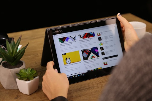
It’s no secret that mobile internet use has seen significant growth in the past few years. Over half of all web traffic now comes from mobile users, a majority of which are those using their smartphones to surf the internet.
However, with an installed base of over 190 million devices in the United States and counting, there’s a high likelihood that some of the mobile users visiting your site are doing so from a tablet device as well. It’s just as crucial for your website to look good and function properly on these devices as it is on laptops and smartphones, because in order to be relevant on the web today, your site must perform on all the devices that use the web.

Thinking beyond the desktop
Unfortunately, standard desktop sites don’t have the best track record for working seamlessly on tablets on default. Even websites designed to be responsive in the transition from desktop to mobile face complications on unique tablet sizes. Oftentimes, a site may register a tablet as a mobile device, causing the font and buttons to be too small and intended for a small phone screen. On the contrary, if a site still displays the desktop version, the content becomes too close together, and many of the interactive functionalities just don’t work. While desktop sites are a great starting point, intentional design tweaks are needed to make your website tablet-friendly. Because, no matter what device your visitors are using, the goal is to give them all the best possible user experience on your site.
Luckily as a top website design agency, Bluetext has picked up several techniques over the years that make your user experience goals possible. Whether you’re starting to build a new effective tablet site or are looking to improve your current tablet user experience, here are 5 tips for tablet-friendly website design.
-
Increase font size, line height, and margins for legibility
Let’s be honest, we all know how annoying it is to have to consistently double tap or pinch your screen in order to read the content on a page. Avoid making tablet users do this on your site by bumping the font size up a few pixels, or to at least 16px, and use a line height of 1.5 for some extra breathing room between lines on text-heavy pages. To improve legibility even more, try increasing margins on pages and content blocks to add white space and reduce overall visual complexity, so your website’s content is easier for users to read and consume.
-
Improve finger-friendliness
Unfortunately, human fingers tend to be much less deliberate and a whole lot clumsier than the tiny point of a computer cursor. This means that anything you want a user to click on a tablet, whether that be buttons, menu items, or form fields, needs to be appropriately spaced and sized to allow room for our fingertips. Based on the average width of the index finger for most adults, a touch target of at least 44 pixels should allow a user’s finger to fit comfortably within the target. Additionally, increasing padding around touch targets by 5-10 pixels will improve user accuracy and reduce the frustration that often comes with unintended button-clicking and navigation.

-
…and make touch targets obvious
Not only should there be ample room to click on touch targets, but it should be very clear where and what those touch targets are. All buttons, CTAs, clickable links or elements should be large, bold, and stand out from the rest of their surrounding content. Hover states do not exist on a tablet, so styling with contrasting colors, underlines or shadows helps these touch targets to look tap-able. The more obvious CTAs are to your visitors, the more they’ll be able to navigate intentionally and with confidence.
-
Make people tap-happy
You don’t want to just design a website that’s easy to use, but one that’s pleasant and satisfying to explore! Keep in mind that a lot of your tablet visitors use that same device for personal entertainment and are used to clicking, swiping, sliding, and pinching their way through various apps. Creating visually enticing opportunities for tablet users to tap and engage with your site via unique interactive components like sliders, carousels, or accordions could not only help increase the amount of time they spend on your site, but make it more enjoyable.

-
Design & test on the most appropriate tablets
Lastly, it’s important to keep in mind where most of your visitors are coming from when designing and testing your tablet sites. There are dozens of different tablet makes and models out there today, with screen sizes anywhere from 7 to 12 inches wide. Unfortunately, it isn’t possible to test your website on every single one. This is where your website’s analytics come in handy; using tools like Google Analytics can help you determine which devices and browsers are most frequently accessing your website, so you can narrow your efforts on the tablets that make up a majority of your traffic and optimize for the greatest number of users.

Taking these steps and making these small changes can make a huge difference in the experience tablet users have on your website. Making it easy for them to read, navigate, click, and enjoy finding content or information on your site from all of their devices is crucial to keep visitors engaged and coming back for more.
Interested in tablet-proofing your website? Get in touch with Bluetext to see what our top visual designers can do for you.
For many websites, organic traffic represents over half of their visitor volume. What’s scary, however, is that any company could lose the value of months (or even years) of consistent and diligent SEO work in mere seconds. The main culprit? Not resolving SEO issues in a timely manner. As companies and web traffic grow, it’s easy to ignore small SEO issues and add them to the ‘to-do’ list. Those SEO ‘to-dos,’ however, add up and can cause skyrocketing bounce rates and free-falling traffic. As a marketing data analytics firm, we’ve assisted countless companies with their SEO issues, helping to prevent ranking, conversion, and sales losses.
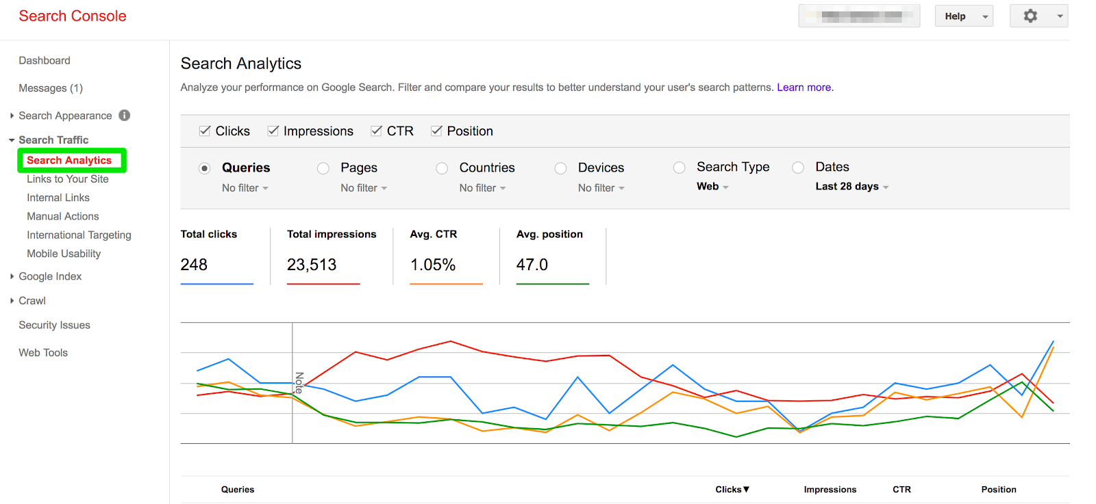
Google Search Console
As a content marketing analytics company, we rely heavily on Google Search Console, as it reveals so much of what’s going on with your site’s traffic. Given that it is such an incredibly powerful tool, it can be overwhelming to know what to look for without help from a marketing data analytics firm. Here are a few things you can find in Google Search Console that are invaluable for troubleshooting your organic search traffic:
- Site errors and warnings
- Search queries that help your site appear in search results
- A list of internal and external pages that link to your website
- Crawl rate and when Google accesses your site
Although not comprehensive, these metrics are a fantastic first step to properly diagnosing any organic search issues you might be having. If your car breaks down, the first place you would look is under the hood. If your organic traffic begins to break down, the first place you should look is Google Search Console.
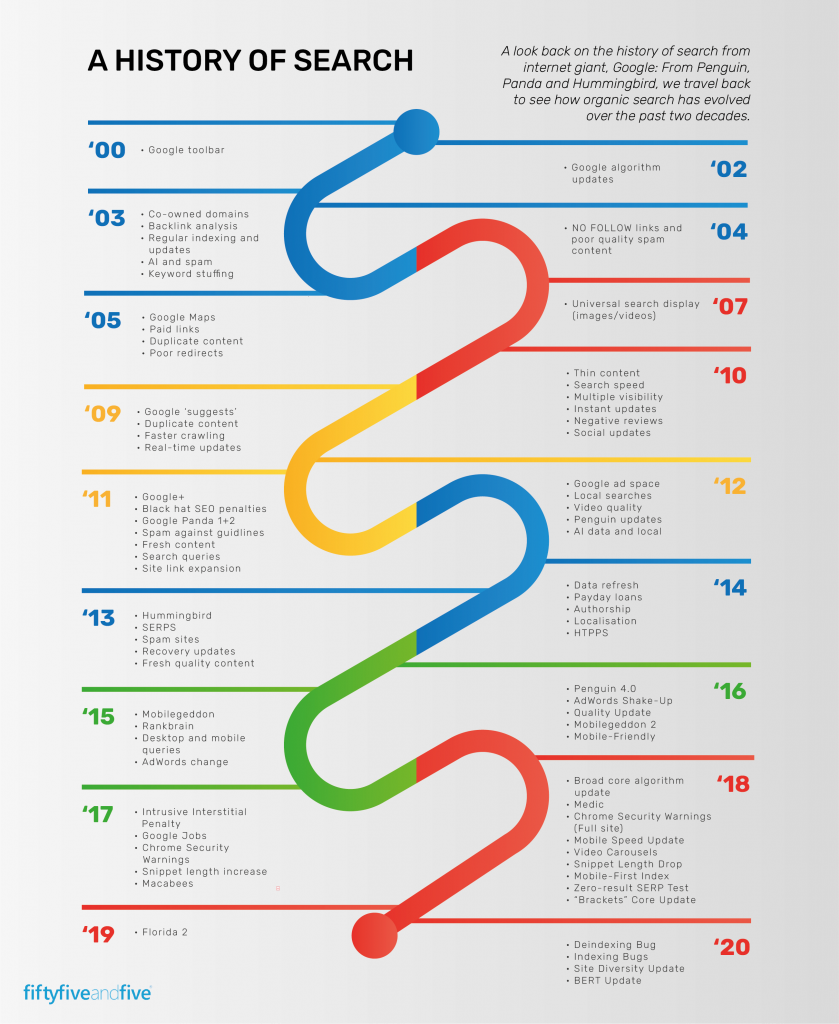
Algorithm Changes
Every year, Google changes its algorithm over 600 times. Needless to say, it can be difficult to keep track of every change. As a marketing data analytics firm, we understand how important it is to keep track of each and every iteration, as it makes it possible to determine what changes you need to make and when. There are plenty of resources – like Moz, Search Engine Journal, and more – you can use to learn how changes will impact what Google is penalizing, why Google is making changes, and how you can stay on Google’s good side. If you begin to see a decline in your search traffic, you should review these resources to ensure your website is compliant with Google’s policies.

Quality of Content
As a key focal point for Google’s algorithm, they have worked to prevent low-quality and thin content from appearing in search results. In short, search engines work to provide the results that best match the search intent of a user. If you want to rank highly, you have to convince search engines you’re answering the questions of users. With that, we live by a simple principle when it comes to organic search traffic: Content Is King. Ensure the content you are posting answers prospect’s questions, utilizes strong H1s and H2s, leverages strong supporting imagery (don’t forget alt. text!), and isn’t stuffed with unnecessary keywords.
Inbound Linking
Having inbound links is one of the most valuable ways to signal to Google that your website is high-quality and authoritative. In short, an inbound link is a link from another website to yours. Although highly valued in Google’s organic search algorithm, the tricky part about inbound links is that you have very little direct control over them. Should you see a decline in your organic and/or referral traffic, using link checkers like Smallseotools and majestic is a great way to determine if there has been an inbound link decline for your website. If this is the case, a couple of ways you can strengthen your inbound linking strategy is by writing guest posts on websites and creating valuable original content that other writers can use.
Sudden drops in any traffic channel are scary. Given that organic traffic is composed of high-intent users, it can be even more concerning, as it means fewer conversions and revenue. Should this ever happen to you, avoid panicking. At the end of the day, it’ll likely be something easily identifiable and can be remedied quickly in-house or with the help of a marketing data analytics firm.
Interested in working with a content marketing analytics company to help troubleshoot your organic search traffic? Contact Us!
2020 was quite the year, to say the least. In hindsight, 12 months ago, none of us would have believed in just one year the world would go through such a drastic lifestyle and workforce transition to cope with the global pandemic. 2020 was filled with many unexpected obstacles, quick pivots, and innovative solution finding, many of which are here to stay and evolve even further.
The pandemic only accelerated the digital transformation we sensed coming. It exposed an ugly truth that some business practices were flawed or outdated—and consequently unfit for the challenges of the 21st century. This resulted in the rise of new digital platforms, virtual events, and interactions. While 2020 may have been the year of perseverance, 2021 will be the year of ingenuity. The past year will be earmarked in history as an era of uncertainty and adaptation, but this upcoming year will be an opportunity to refine and enhance the solutions sought in time of need. Digital agencies such as Bluetext will continue to seek new solutions, new practices, and new experiences. The digital trends of 2021 will be focused on carving a path to a digitally-focused future durable enough to withstand an immediate continuation of remote interactions and a hybrid future that sustains virtual successes when companies return to the office.

Independent Interactions
The first digital marketing trend of 2021 is not new but will grow exponentially in importance in the future. Websites and platforms have grown over the past few years to lay the groundwork for an explosion of digital interactions this year. The key thing to keep in mind when considering interactive content is ease and engagement. With a majority of employees working from home, critical business meetings, sales pitches, and prospecting must occur online as well. Keep in mind your users will be interacting independently, without anyone to walk through it or focus their attention. Additionally, with users spending countless hours in front of their screens, it is harder than ever to capture attention and create memorable interactions.
Impressive interactions are rooted in design and user experience. The two complement one another, but should never be considered a substitute. A beautifully designed website may be eye-catching at first glance, but if the site is stuck on static elements or has poor user experience (UX) you can’t expect your user’s attention to last. Now more than ever, end users are suffering from screen fatigue and begin to notice a certain sameness caused by templated digital design commonly found by using website design and development companies like Squarespace and Wix. Organizations must reconsider design, content, audience and the interaction between all three to inject greater excitement, joy, and curiosity into screen experiences.

With remote work, companies now require new solutions to deliver experiences away from the physical spaces where sales teams, clients, and brands previously interacted. To steepen the challenge further, these interactions need to be intuitive and user friendly enough to empower independent users. Schedules and “office hours” have become more fluid than ever with a remote workforce. Your customers or clients will seek to find information at any hour of the day and will expect to be able to view demos, materials, or tutorials independently on their own time. To empower users to make important independent browsing, Bluetext recommends the following website enhancements.
- Detailed copy: Don’t underestimate the power of the written (or typed) word! It is time to invest in a thorough and detailed copy that will equip people with the critical information they need to make a decision.
- ChatBots: Even though we are behind a screen, we are still human. Humans ask questions, may need extra explanations, or get lost sometimes. Especially if your product or solution is complex, you cannot rely on a sales manager to verbally explain and answer questions. Consider adding a chatbot to your website to help remedy any challenges in finding information.
- Animations: Adding some motion to your webpages is a small step that makes miles of impact. A favorite motion trend Bluetext has seen within the tech and B2B industries are the animation of software screenshots to act as a mini demo to play on a loop.
People want to be inspired by what they see on their screens, and brands can step up to meet this demand. Brands that break free from industry norms and traditional design templates can achieve this differentiation. With the right content delivered through great design, an audience can find an on-screen experience just as compelling as a real-world experience.
Popular Platforms

In the new year, organizations will continue to seek new ways to communicate with people and deliver brand experiences from a distance. Online briefing centers gained many top agencies’ attention last year and will continue to grow in popularity and importance. What exactly is an executive briefing center? It is a virtual platform that surrounds your prospects with thought leadership, rich content, and interactive UX and recreates the in-person premium briefing experience. Compatible with a variety of well-known conferencing software, such as WebEx, Zoom, and Skype, a digital briefing center can support sales consultations, conferences, webinars, and so much more. The successful transition of the sales and proposal process from in-person to online is what will separate top companies from their competitors.
In 2021, virtual experience agencies forecast that virtual platforms will only grow in importance and popularity. Platforms will be re-engineered to support the growth of interactive content and solve pressing problems. Custom platforms like a digital briefing center or app may be a wise choice for corporations with a lot of content to communicate, but smaller firms can benefit just as much from widely adopted and available platforms. So which is the right choice for you? Consider the content. If you need to hold private sales consultations, training videos, or materials intended for select private audiences a briefing center may be the best fit to gate proprietary information. If you have valuable content of interest to wide audiences and with the goal of gaining brand awareness and thought leadership, consider using social media platforms in unique ways. This could include custom infographics and illustrations, interactive quizzes and games, promotional videos, and much more.
With the growth in free time and use of social media comes a growth of advertising and targeting opportunities. These platforms offer something critical to businesses: a way to easily create content and reach a lot of potential customers. Interesting and engaging content can become key drivers for lead generation, not just brand awareness. In 2021 Bluetext predicts social platforms will continue to emerge as places for people to monetize their creativity and reach wider audiences than ever before.
Virtual Events
Over the past year, many of us mourned the personal and professional rituals we once enjoyed. Whether that was happy hours with friends, traveling to annual trade shows and conferences, or attending annual corporate events, sacrifices were made to preserve public health. These events didn’t just support a business goal or networking opportunity, they represented a sociological ceremony and routine that binds people to their colleagues, communities, and wider society. Luckily, digital experience agencies, such as Bluetext, saw and empathized with this obstacle which resulted in the rise of virtual events.
Virtual events started out of necessity, but are here to stay because of ROI and accessibility. “In the face of the COVID pandemic, events became virtual out of necessity. As we move into 2021 and beyond, many events will stay virtual not only because of continued safety concerns, but also as a result of lessons learned in 2020.” says Forbes.
Virtual events and experiences are no longer a sub-par substitute to in-person events, but the smarter solution for both a business’ bottom line and attendees. Hosting a virtual event provides the opportunity to reach a wider audience without the time and budgetary constraints of traveling. Attendees can selectively tune in to view the sessions most relevant to them, which frees up more time in their daily schedule. Unlike in-person events where employees are out of the office for days at a time, they are only out for a few short hours. The reduced time sacrifice allows for much higher attendance, and consequently more participation and overall event success.
How can they participate from behind a screen? Virtual event marketing agencies, such as Bluetext, are designing and developing engaging interactive web platforms that allow for two-way communication and audience participation. From “lobby hall” homepages, to interactive sponsor “booths” and live video and chat functionalities there are many ways to help recreate the in-person experience of a live, in-person event. The key is to get creative and drive engagement through great speakers, rich content, and impressive UX. A virtual event offers the opportunity to reach new audiences, promote a sense of community and morale within existing audiences, and distribute valuable information in an attractive and interactive way. Added bonus? Companies that go the faux-live route with pre-recorded sessions and video content eliminate the risk of mistakes or stumbles.
So what can we expect in 2021? As a society, we have learned to expect the unexpected, but as digital marketers, we can expect to see a surge in digital platforms, interactive content, and the virtual recreation of past rituals. As an industry, digital marketing agencies have observed many organizations fully embracing a digital transformation in their marketing efforts. Technology that has revolutionized remote experience and enhanced team collaboration has taken root and will only continue to grow. Companies that take advantage of and invest in digital marketing early can gain a competitive edge.
So what are you waiting for? Contact Bluetext to learn how we can propel your digital strategy into 2021.