Marketing moves fast. And while brand identities are created in the safe, static space of a style board, they must survive in a high-stakes environment of attention. They need to keep up. They need to animate. We experience brands across so many channels – as an interactive app, a 6-second bumper video, a tradeshow booth, a virtual reality space, a hover state button, or even the way a webpage loads. Without even realizing it, however, the biggest impression brands make on us is often in the way they sound.
Yes, you heard that correctly – we’re asking what your brand sounds like.
Enter sonic branding, the acoustic brand identity that is subliminally making a massive impact in today’s cluttered ad landscape. In particular, the audio logo, a brief melody or branded sound design that often plays at the beginning or end of a video or audio spot. For audio-only mediums, like radio or podcasts, sonic branding is especially crucial for awareness in the absence of any visuals.
Even as you read them here, the melodies of sonic branding champions like Aflac, Duracell, This is Sportcenter, Tacobell, Old Spice, Intel, Playstation, or T-Mobile are echoing in your head.
Every Friday night, the hallways of apartment buildings around the world turn into a cacophony of audio logos, as streaming apps like Netflix, HBO, Prime, and Hulu boot up for a night in.
In one of the most competitive marketing arenas, insurance brands battle through sound. Can you picture the visual logo of Nationwide, State Farm, Farmers, or Liberty Mutual right now? Probably not. But can you sing each of their brand tunes? Most definitely.
These audio brand dynasties are evidence of audio’s effectiveness within the brand zeitgeist. There are even brands that have infiltrated your attention in subliminal ways without you even seeing their logo. Take for example the boot-up of a Macbook, the thump of a Volkswagon door closing, the scritch-scratch of a Sharpie moving on paper, the pop of a Snapple lid, an idle Harley Davidson, or even the lack of sound when spraying a Method household cleaner. This is all very intentional (and industrially expensive) sonic branding.
As digital habits evolve, we can’t rely on eyeballs on screens in order to communicate our message. For a brand to be remembered, it can’t just be seen, it must be heard. It must be felt.
Harvard Business Review’s What Does Your Brand Sound Like? states “With our increasingly audio-enabled media environment, the strategic use of sound can play an important role in positively differentiating a product or service, enhancing recall, creating preference, building trust, and even increasing sales. Cognitive studies show that relevant sounds and musical cues can truly influence people in ways marketers want.”
Now, you may have some jingles coming to mind as well. Examples like Mcdonalds’ “I’m Lovin’ It”, Kit Kat’s “Give Me a Break!”, Folgers Coffee, Chili’s, Kay Jewelers, or Lucky Charms. People can recall the Meow Mix brand whether or not they have a cat. Even Jim Gaffigan pokes fun at the Hot Pocket marketing team when he jokes “I do love that jingle. Do you think they worked hard on that song?”.
Brand jingles are the epitome of sonic branding. Some of those brand earworms we just mentioned are decades old but still stuck in your head right this very instant. Yet these are all established brands, with existing brand awareness, and deep pockets to design (Mcdonald’s had over 3,700 final mixes of “I’m Lovin’ It”), test, and translate their jingle before pushing it out to market with a massive media spend. For brands that are just trying to gain momentum organically or with short-form video, a sonic logo can still do wonders.
The reason is that hearing is innate. We internalize sound quickly. An audio logo stays with you after you experience it. You may not be able to remember what a logo looks like, but you’ll remember what it sounds like and the longevity of the recall is powerful.
Further, sonic branding adds another level of brand storytelling into the mix, connecting with the viewer audibly and visually. In the case of an audio logo, this emotional connection happens in a few short seconds. The audience doesn’t have to follow a story or listen to an explanation – they just absorb the brand. Since this subliminal brand narrative is experienced with two senses simultaneously, the brain stores that experience twice as much as it would if it was only seen.
One of the most cunning tactics is incorporating an iconic sound into the audio logo that isn’t even unique to that business. Take Southwest Airlines’ “You Are Now Free to Move About the Country” example, with a seatbelt fastening click and overhead ping used in every airline are now tied directly to a specific brand. People who recall the Southwest brand would do so even when using Southwest’s competitor airlines. What about Verizon’s “Can You Hear Me Now?” that makes you think of them when you have a bad signal, and therefore remind you to switch to their service for a more reliable connection? Sneaky, sneaky. If you can capture the distinct sound of your industry and distill it into a mnemonic within your sonic branding strategy, not only will you be memorable – you’ll be unforgettable.
Whether B2C, B2B, or B2G it’s all about attracting and connecting with your audience through as many senses as possible. Maybe that’s through a blockbuster TV ad, a podcast, the tangible sound of your product in use, or even a quick, organic social snackable. There are countless ways to embed sonic branding across your landscape, so listen up! It’s time to make sure your brand feels like something. Let our animators, audio designers, and creative minds help you tell your sonic brand story in a way that is rewarding for your business in years to come. Get in touch with Bluetext, and give our soundtrack of super sonic brands a listen!
But here at Bluetext, our feet were getting a little chilly. For more than 11 years, Bluetext has designed amazing brands and websites for world-class clients across all industries. Our team has helped more than 50 clients get acquired within two years of starting an engagement with us. We are performing at top levels for our clients, helping raise enterprise value and brand visibility.
A few months ago, we pulled up our website and felt it was time to treat ourselves like a client. We put our heads together to reimagine our brand and our position.
We have re-launched the Bluetext brand and website with 150+ success stories and 1000+ thought leadership pieces to provide a sense of what we could do for your organization. This debut goes a step beyond showcasing what we can do, but truly exemplifies who we are. Our team has evolved significantly since our founding, reaching unimagined heights, and, simply put, outgrowing the previous brand. From positioning to branding to websites to go-to-market lead generation campaigns, our team is eager to tackle any challenge across any industry for any size organization. Our services are wide and varying, but our mission remains focused: push creative boundaries, deliver real results, and most importantly enjoy every moment of it.
Bluetext is more diverse, nimble, and passionate than ever, and reenergized with our latest brand, logo, and website evolution. Stay tuned for our case study series on the creative process behind the Bluetext brand.
When we talk about motion in branding, we’re talking about a wide variety of creative approaches. From subtle homepage loading flourishes to complex, eye-catching 3D advertisements, animation can breathe new life into your brand. Today Bluetext will explore why motion design for logos is on the rise, when it’s best applied, and some of our favorite examples.
The digital landscape is crowded, to say the least. The average American spends a little over seven hours a day on the internet, and much of that time is spent surrounded by thousands of brands and advertisements. A well-done animation can help your brand stand out from the crowd and add essential layers of personality to your marketing collateral.
Whether your brand is neat and polished or playful and young, animation can reinforce those core characteristics without a single word. Picture the old Nickelodeon “splat” logo, for example. In 2009, a handful of disparate channels (TeenNick, Nick at Nite, etc.) were rolled into the Nickelodeon brand, and a new logo was unveiled to go along with the consolidation. The older logo’s animation had a younger, scrappier feel, while the current logo is much more refined, and gets at the large-scale, premium approach of Nickelodeon’s parent company, Paramount. These approaches are vastly different from one another, but there’s not one “right” answer when it comes to logo motion. Both animation styles are integral parts of the brand’s history and tell the story of a brand’s evolution. I’ve said it before and I’ll say it again: If a picture is worth a thousand words, an animation is worth a million.
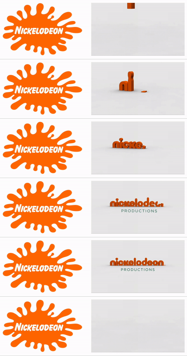
Virtually any digital platform is an option when it comes to displaying an animated logo, but as they say, moderation is key. Instead of applying motion “just because,” it’s important to have intention behind the choice to display a static or animated logo. Here are a few of our favorite intentional applications of motion design in logos.
Use an animated logo when your space and time are limited
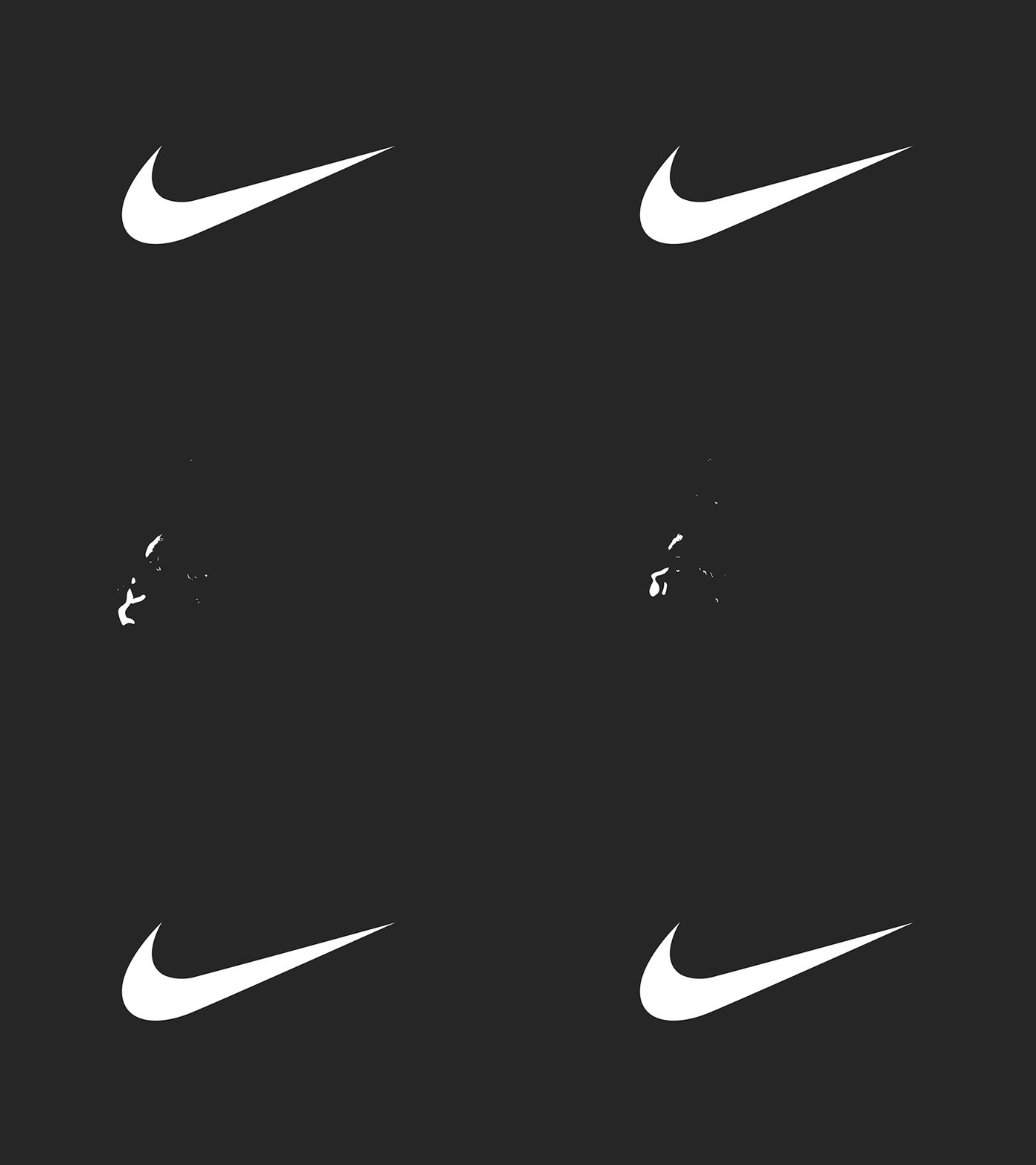
In cases where viewers may only see one or two components of an ad (scrolling quickly through a social feed, for example), you can convey more with an animated logo than you can with a static one. The key in these instances is to take up about the same amount of space and time as a static logo. This means your animation should be quick and to the point, like the example below from Nike. An added feature of Nike’s animation style is that they apply a different animation style depending on the audience and product, so each motion graphic feels uniquely suited to its context.
Amp up your site’s intro screen with logo motion
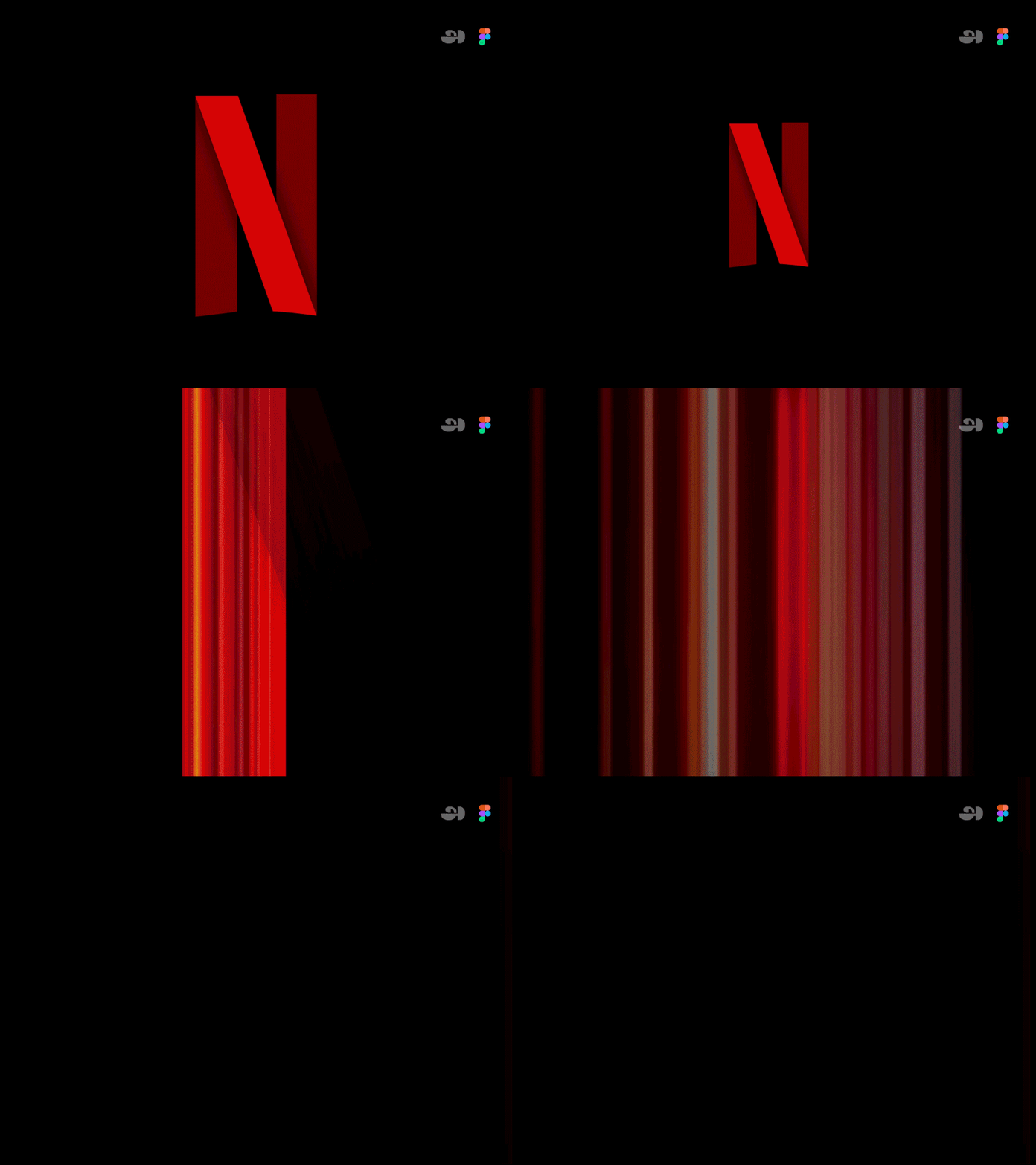
Along with the now-iconic “ta-dum” sound, Netflix’s loading visual is well-known and well-loved. Because the animation doubles as a loading screen, it doesn’t feel intrusive or overdone. It’s reminiscent of classic film grain, and it ensures that the Netflix visual identity is central to the viewer experience, regardless of whether the program is a Netflix original or not.
Animate your logo as part of a brand pattern
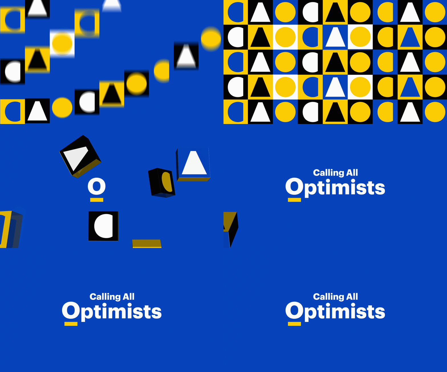
For Calling All Optimists, a GMAC brand, we developed an animated brand pattern using elements pulled directly from the brand’s logo. This is a handy asset in any brand’s toolbox, because it’s a custom element that can be used in place of stock imagery or generic graphics, and it can be front-and-center or fade into the background. You can explore our case study for Calling All Optimists here.
Tell a story about your brand using animation
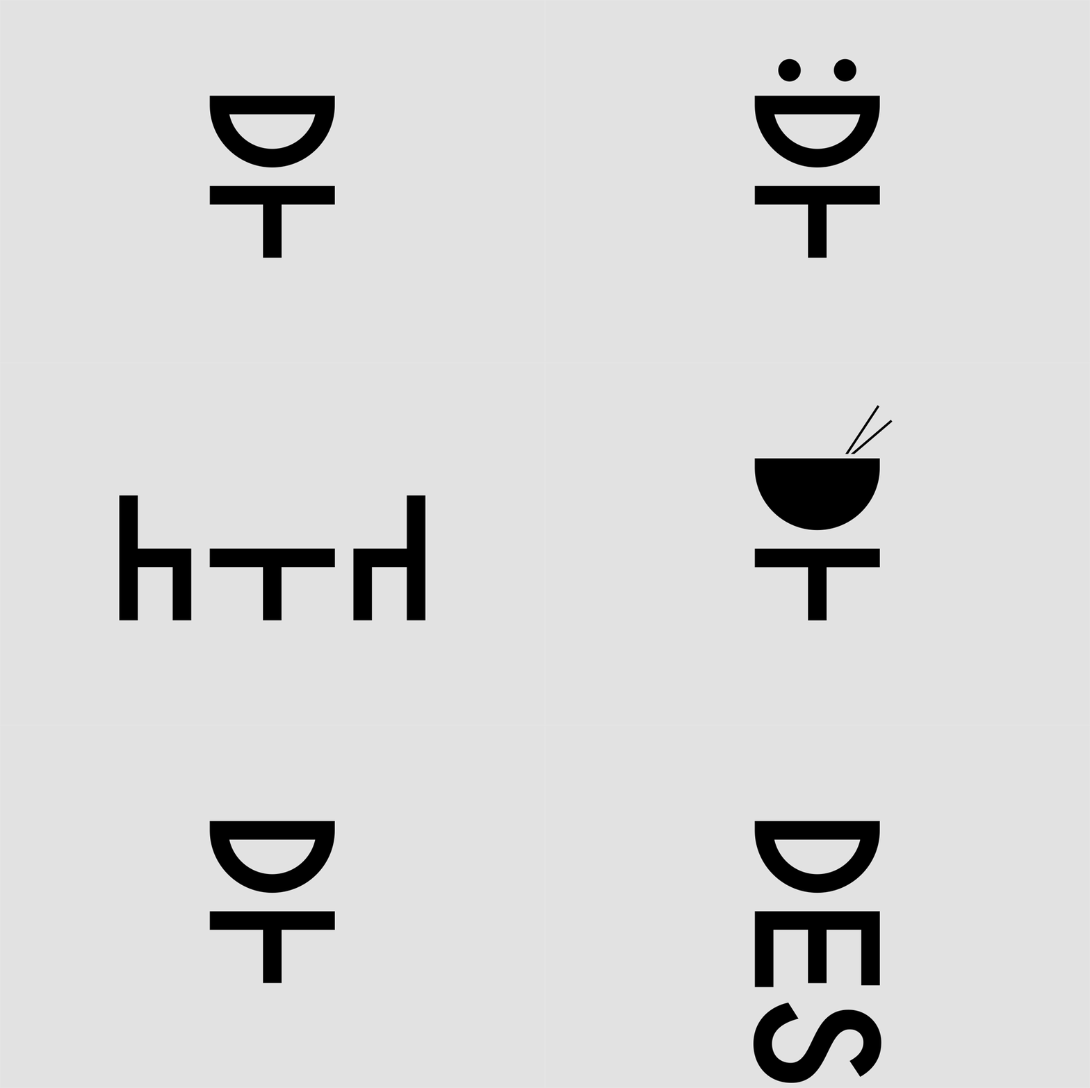
Designtorget is a Swedish design house that sells all kinds of homewares, and their logo animation helps convey their line of business to unfamiliar customers. Using the “D” and “T” figures from their logo, shifting them around with other simple lines to portray things like a table and chairs and an abstract smiling person. This animation demonstrates the brand’s actual offerings while also presenting a playful, modern brand identity.
 Ready to explore how logo motion can boost your brand? Contact Bluetext to learn about our dynamic branding and motion design services.
The XXIV Olympic Winter Games have come and gone, in what felt like the blink of an eye. Even though the Games span only two weeks following the Opening Ceremony, there are years—and sometimes decades—put into their planning. A key piece of that planning is setting the visual identity of the Games, which is no small task. We all know the iconic five-ring emblem that symbolizes the union of international athletes, but each host city gets the opportunity to create its own unique logo. Olympic logos of the past have varied widely in color, type, and style, and each new logo is put to the test to tell a story not only about an Olympic season but about the host country itself.
A quick glance at all the different Olympic logos of the past makes it clear that there’s no clear-cut formula for an Olympic Games’ brand system (except the inclusion of the Olympic rings, according to the Olympic Charter). We’re going to take a look at the Olympic logos of yore and dissect our favorites and not-so-favorites through superlative-style judgment.
Best Abstract Use of the Olympic Rings — Atlanta 1996
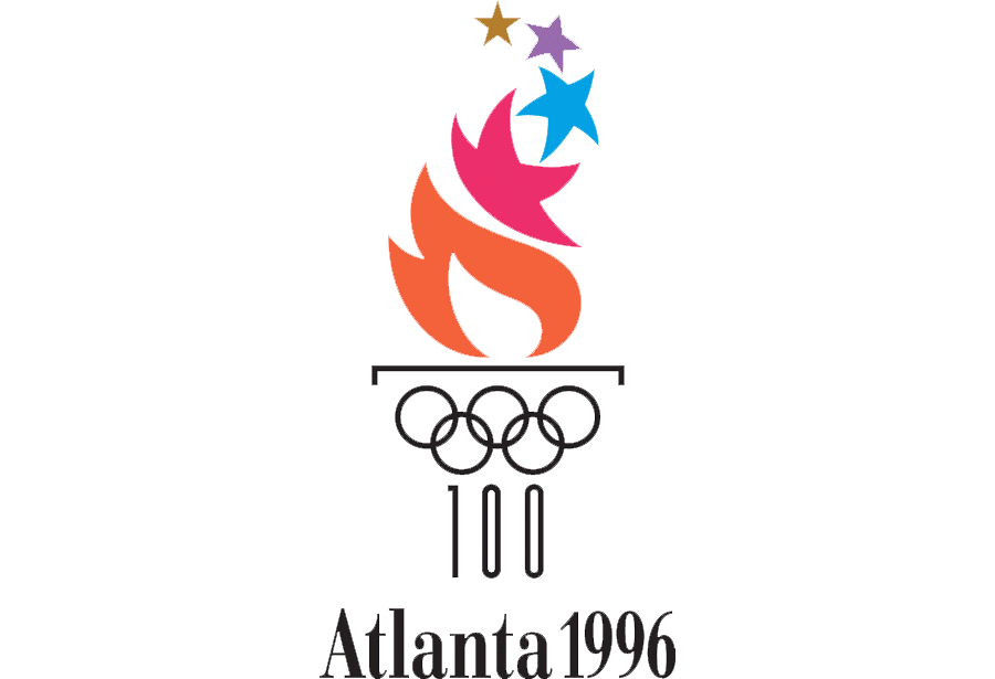
Incorporating the Olympic rings is a requisite part of all Olympic logos, but that might get a little repetitive after over 50 Games. We appreciate the Atlanta 1996 logo’s integration of the rings with the column—the mark hints at the Olympics’ Grecian beginnings, the Olympic torch, and even manages to squeeze in the number ‘100,’ celebrating the centennial of the games.
Best Direct Use of the Olympic Rings — Innsbruck 1964
There’s something to be said for a simple, classic logomark like the Innsbruck 1964 logo. Using the coat of arms of the City of Innsbruck as a starting point, this logo features the rings prominently and uses an elegant typeface for the host city and year. We can’t think of a more classic, straightforward Olympic logo.
Best Out-of-the-Box Typeface — Rio de Janeiro 2016
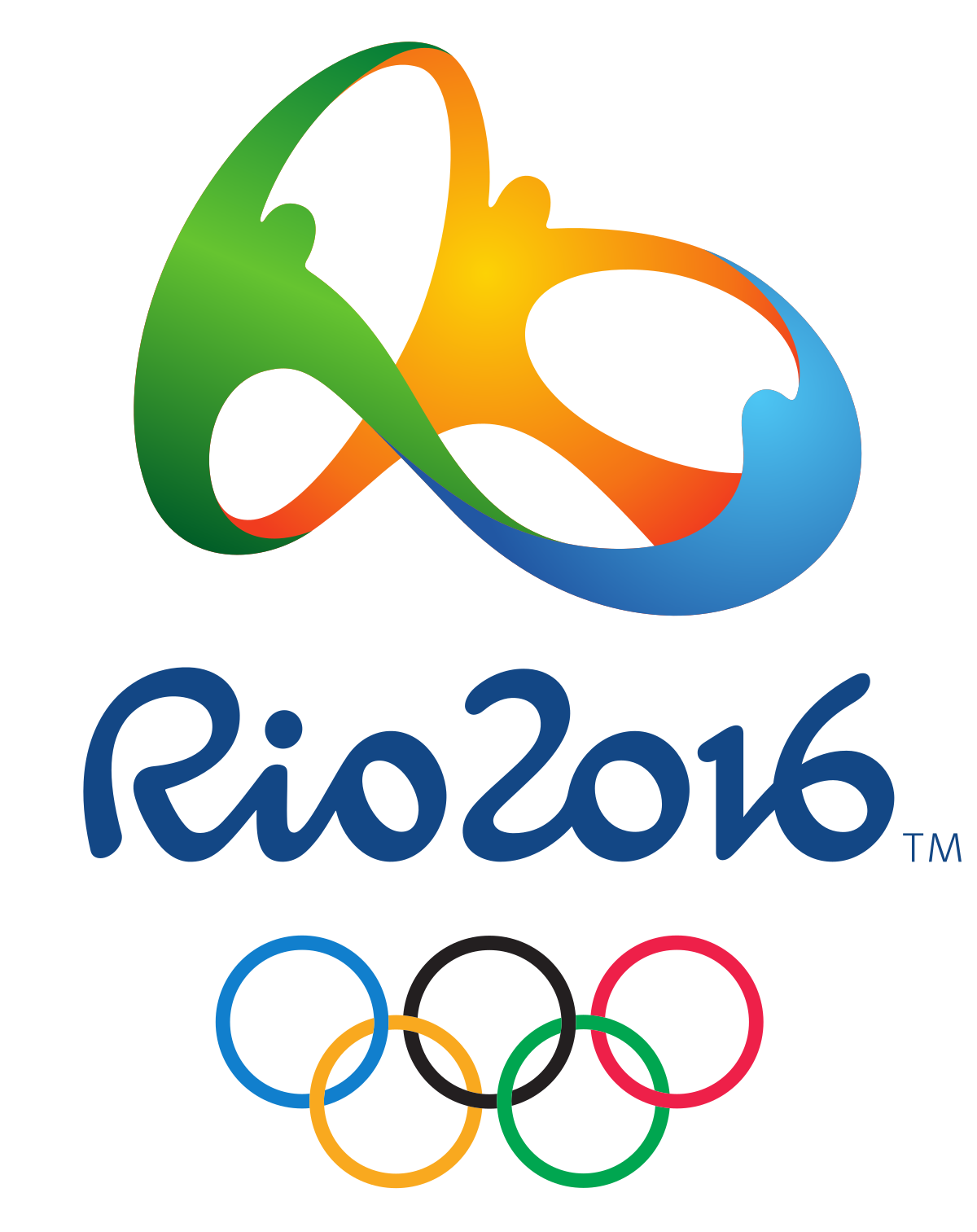
The logo for the 2016 Rio de Janeiro Games feels like a celebration, exactly as its designers intended. This mark took inspiration from Carnival and uses organic forms and lettering to convey the energy of both Rio and the Olympic Games. This approach brilliantly tells a story while standing out from the crowd.
Best Out-of-the-Box Color — Sarajevo 1984
Working with the Olympic rings may feel constricting color-wise since there are already five colors to contend within a design. That didn’t stop the designers of the Sarajevo 1984 logo, who washed the whole logo in orange for the primary mark. This approach is particularly interesting because the logo was permitted to appear in any color so long as the entire mark appeared in a single color.
We’d be remiss to close this category without giving a nod to the London 2012 logo which, while controversial, was striking in its use of hot pink. They can’t all be winners, but we appreciate the bold approach.
Best Use of a Human Figure — Nagano 1998
In the Nagano 1998 logo, seven abstract human forms make up the petals of a flower, nicknamed the Snowflower. We like this mark not only because it defied expectations for a snowflake or other wintery symbol, but because it was the starting point of an environmentally-focused Olympic identity.
Best Minimal Logo — Tokyo 1964
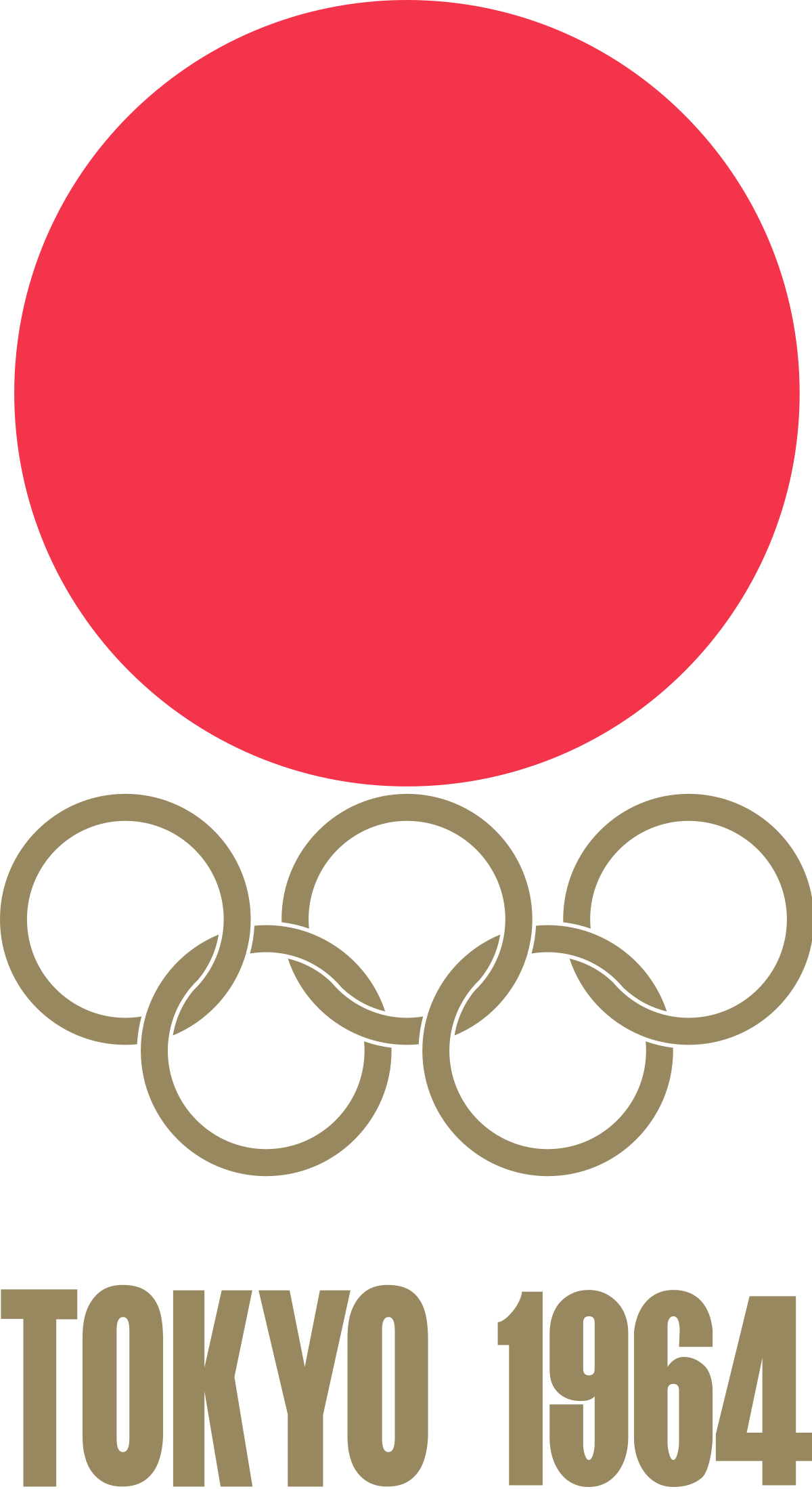
Stunning in its simplicity and symbolism, the Tokyo 1964 logo is heralded as one of the all-time greats in Olympic logos. With the Olympic rings set in gold beneath a version of the Japanese national flag, this mark features traditional Japanese colors signifying peace and prosperity. Despite its minimalism, this logo manages to acknowledge the host country, the traditional Olympic identity, and the moral foundation of the Games.
Best Maximal Logo — Rome 1960
Poised between two relatively simple Olympic identities (Squaw Valley 1960 and Innsbruck 1964), this maximalist logo was an obvious pick in this category. In a departure from ‘60s graphic design trends, this mark harkens back to classical Roman motifs and styling. While it may not be everyone’s cup of tea, we admire the dedication to national legend.
Best in Show: Summer — Mexico 1968
Our winner for Summer Games logos has to be Mexico 1968. Not only does the logo incorporate the rings creatively, but it’s also reminiscent of athletic uniforms and traditional Huichol art. This mark is the basis of a fascinating brand identity—for starters, the official Olympic poster looks like album art. Sure, this logo may be a little busy, but what it lacks in refinement, it makes up for in energy.
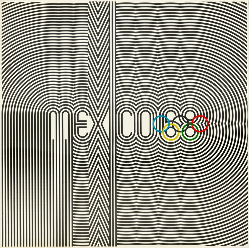
Best in Show: Winter — Sapporo 1972
We love the Sapporo 1972 logo because it’s unlike any other Olympic identity, and it was perfect for its time. With a Bauhaus feel, this mark features the rising sun symbol from the Japanese flag, a stylized snowflake, the Olympic rings, and a single line of text. Despite including only basic elements, the unique stacking and coloring of these elements make this logo one of our favorites.
Best Iconography — Tokyo 2020
The iconography that’s developed alongside Olympic identities changes with the logo, and we wanted to honor an icon system that we think was particularly elegant. The icon set for the Tokyo 2020 games included icons (or pictograms) for each sport, including the five new sports introduced to the Olympics that year. Each icon is skillfully-made and coincides beautifully with the 2020 Olympic logo.
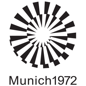
Judge’s Favorite — Munich 1972
A personal favorite that didn’t get identified in any of the above categories, the Munich 1972 logo’s name says it all—”Radiant Munich.” The abstract sunbeams are eye-catching, and the overall brand identity feels both joyful and serene.
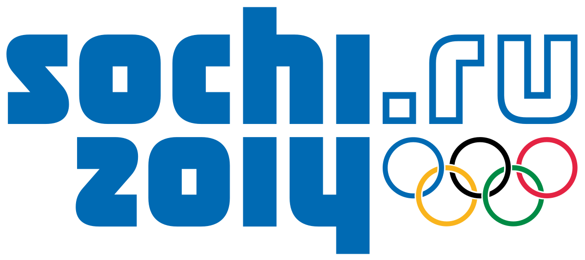
Judge’s Least Favorite — Sochi 2014
While this logo was meant to convey sentiments of modernity and the coming digital age, it misses the mark. Suffice to say, there’s a reason that no Olympic logos in the 8 years since have included a URL.
There you have it—our take on some of the best and worst Olympic logos to date. We encourage you to explore all of these logos yourself on the Olympic website, and to explore other opinions like Milton Glaser’s for AIGA.
The logos for the Paris 2022, Milano Cortina 2024, and LA 2028 Games have all been unveiled, but given the controversy over and subsequent redesign of the Tokyo 2020 logo, we’ll wait to grade those logos until their respective Games pass. In the meantime, if you’re in search of a new logo or brand identity, get in touch with the team at Bluetext to learn how we can team up and go for the gold.
Whether you’re creating your first logo, editing an existing logo, or totally redesigning an outdated logo for your business, you’ve been tasked with representing your brand and everything it stands for within a small graphic icon. A logo design project requires extensive knowledge of what your business stands for, what your current competitors are doing, and how design principles can be applied to capture attention and promote memorability. To increase the likelihood of a successful logo design, many companies turn to digital agencies like Bluetext who understand the competitive landscape and get to know each business in depth before designing a logo that accurately reflects the company and helps them stand out among the competition. The following 4 principles are integral considerations for the logo designing process at Bluetext, and they should be utilized by any company looking to create a timeless, impactful visual identity for their brand.
1. Color
More often than not, color lays the foundation of a brand. Color is the first thing that catches the eye, and in an age of diminishing attention and quick digital scans can make or break a strong brand. With the power to improve brand awareness by more than 75%, color psychology is an essential consideration. Digital marketing & branding agencies advise considering the perspectives of two important players: the end-user and the industry. Below are three critical questions to ponder before any branding objective:
- How do you want to be perceived by these audiences?
- What emotions should your brand evoke from end-users?
- How do I want to compare to industry standards? ‘Zig’ (run with the pack) or ‘zag’ (go against the grain)?
Certain colors tend to dominate different industries. Ever wonder why almost all fast food brand logos use the colors red and yellow? Red elicits passion and energy, while yellow stimulates hunger, which leads to subconscious food cravings. In comparison, the government contracting industry tends to use the colors red, white, and blue to invoke a sense of patriotism. Understanding the emotional impact behind your color choices can help your brand resonate with users and prospects. However, while some colors are tried and true, you should also weigh the costs and benefits of choosing the colors commonly found within your industry. Your ultimate goal should be to stand out amongst the competition, rather than blending into it. Whether or not color palette is the avenue to differentiate is a question that an expert brand agency would be able to consult on. While it may be tempting to utilize numerous color combinations, within your brand and logo, keep in mind the second most important quality of a logo: keeping it simple.
2. Simplicity
Visuals can communicate information 60 thousand times faster than text, a simple visual can be more impactful—and memorable—than a complicated or wordy design. Especially with the rise of mobile users and smaller screens, reducibility is a critical factor. Your logo should be comprehensible across multiple sizes—from a banner ad to a website favicon. Complex, detailed logos often have legibility challenges on small devices, therefore limiting your opportunities to show off even the most stunning designs. When there are too many competing elements of a logo, a viewer’s attention is divided between them, which detracts from their ability to recall the logo as a whole. It’s much more effective to choose just a few key elements of your logo to highlight your brand offerings. A good logo communicates your company’s strengths, whether it’s a rich history, creative thinking, or literal products featured in the design. The devil is in the details, which is why leading brand agencies advise a simple, yet scenic, route to logo success.
3. Adaptability
Another important aspect of your logo is that it must hold up to the test of time. A brand as a whole can be updated and refreshed every now and then, but replacing an outdated logo can be a large undertaking. A timeless logo is one that can be implemented across different formats, from horizontal, vertical, square, black and white, full color, etc. These format variations allow the same logo to be adapted to different contexts as the opportunity arises, whether that be print materials, branded merchandise, and new online formats. Anticipating new ways to use your logo will keep users engaged with your brand as you expand across different platforms. Your brand’s style guide is an important resource for explaining how your logo and brand identity can be communicated through different channels.
4. Relevance
The previous 3 qualities of your logo tie into one overarching factor: relevance. Before considering a logo redesign, you should talk extensively with target consumers to better understand how they perceive your current logo and overall brand. Creating a logo that reflects your brand identity is one thing—making sure that customers actually receive and understand your message and the brand behind your logo is an entirely different challenge. A digital marketing agency can be a powerful partner to compiling market research and getting a third-party perspective on your logo’s effectiveness. To learn more about how to stay in tune with your customers to make sure your branding conveys the value you actually offer, check out an interview with Bluetext’s Jason Siegel and Travelocity’s Terry Jones on avoiding brand regret.
Keeping up-to-date with design trends is one way of reading the market at a broad level to see which logo design techniques are resonating with audiences. However, accurately representing your brand is more important than being trendy. In the cyber-security space, for example, the challenge of selling an abstract concept has led many companies into the trap of using stereotypical imagery or design to try to communicate that they work with computers, coding, and hackers in hoodies. However, following those trends has led many companies to fall into the clutter of the category—a space where they’re practically indistinguishable from competitors. In order to avoid these common mistakes and stand out as strong competitors within your industry, consult a brand & marketing agency for your logo design.
Contact Bluetext to take the first step in setting your brand (& logo) up for long-term success.
Catch the highlights and additional insights in the podcast edition of this post. Just hit play below!
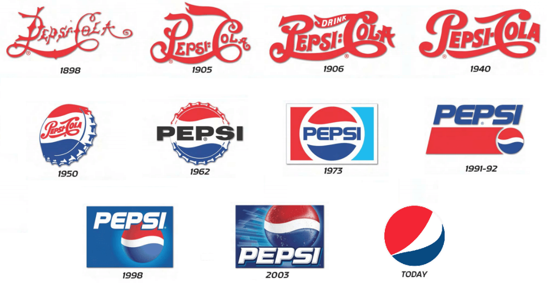
Simplification is one of the strongest trends we’ve seen as a top design agency in recent years. With such growing popularity, it shows no sign of stopping. So why are brands dialing back on designs for a more minimalistic logo? Top graphic design and rebrand experts at Bluetext are debunking this design trend to explain why it’s a wise choice. For one, minimalist logo designs are easily recognizable and memorable, which is key to successful branding. This is why many up and coming companies prefer simplification over other artistic techniques. Similarly, established brands are stripping their logos of excessive details to add more weight to the brand promise. Uber, Yahoo, and Mailchimp have all recently released logos with cleaner, rounded lines to feel more approachable and user friendly.
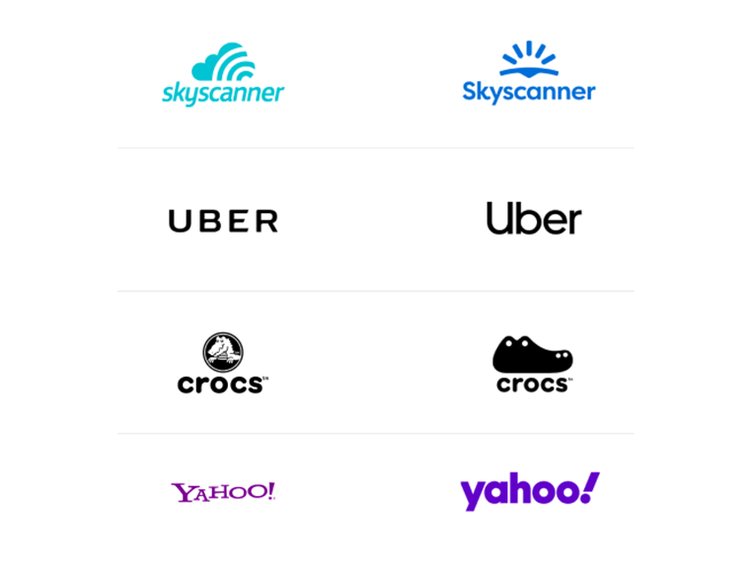 Why are these well-known logos going back to basics? We consulted our top graphics designers here at Bluetext, to get their take on the trend. Below are some of the most popular reasons for logo redesigns:
Complex and Cluttered Digital Environments
With nearly all companies moving to some sort of digital presence, users are constantly bombarded and overwhelmed with content to digest. Embellished logos only add to that already exhausted attention span, requiring time and concentration that people simply don’t have to spare. Cluttered online environments have trained us to scan, filter, and repeat — leaving little bandwidth to notice or appreciate fine detail.
User Consideration
Especially when coupled with features like dark mode, we are seeing brands designing more and more with user experience and comfort in mind. Darker screens and simplified details are easier on the eyes. Reduced eye strain and saved battery life is an added benefit that shows users you care, especially in a pandemic environment where almost all interactions have become virtual and vastly increased average screen time.
Mixed Mediums
Another key consideration for any brand is where your logo will be applied. On your website for sure, but what about printed materials? Perhaps corporate giveaways, like coffee mugs or canvas totes. Logo designs need to accommodate all of these possibilities and easily adapt to any medium. Thus, to save time and resources, companies opt for a clean and crisp logo that they are confident will crisply stand out on any medium and in any size.
Shrinking Screens
It seems every few months or so Apple unveils smaller and smaller iPhone models. And this product design trend isn’t limited to just mobile devices! Laptops, tablets, and even desktops have been consistently shrinking in size as users opt for more streamlined and portable devices. To future proof your brand or website it’s important to consider small screens and how your logo will display. If your design is riddled with lines and textures it may compromise readability on these devices. Instead of reverse engineering your logo to accommodate unique layouts and breakpoints, it’s far more efficient to begin with a simplified, and digitally conscious design.
Botox for B2B
Why do people get Botox? To smooth out those fine lines and wrinkles and look younger! The same principle applies to mature and established brands. In order to get a digital facelift and appear fresh and modern, experienced brands are smoothing out the details of their logos and brand graphics. Simplification of logos gives your company a rejuvenated update, while still preserving the established brand reputation.
Simplicity Inspires Confidence
Less is more. A strong and simpler logo exudes an air of confidence that your brand knows what it’s doing, and lets the reputation speak for itself. Brands should consider a logo as a signature, rather than the story. Your logo should be a quick snapshot of your brand that triggers a memory of your product or service, not an attempt to illustrate your offerings. A simplified logo, especially in a wordmark format amplifies your brand and creates a distinctive presence.
The Verdict
The verdict on logo simplification? Cleaning up design elements not only offers immense brand value and memorability but also has numerous digital benefits. As a top digital marketing and user experience agency, we encourage clients of any industry to always be thinking about the future first. With an inevitable shift toward more digital-based lifestyles, smaller screen sizes, and user considerations it is a wise investment to reinvigorate your brand with a timeless logo design.
Considering simplifying your company’s logo? Trust Bluetext for all of your digital marketing and design needs.
Welcome to 2020, a year of new normals, routines, and best of all, new logos! The logo design trends in 2020 thus far have been an intriguing remix of new and old. Logos have taken a trip back in time to a variety of eras, while also remixing modern styles. We’ve seen the gamut of design trends; from neon 80’s juxtaposed against inky, to futuristic 3D gradients and custom animation.
The key theme of 2020 logo design has been a digital-first focus. Many brands have modernized their logos for optimal web and mobile displays. For example, the popular gradient trend has evolved and merged with 3D design —a perfect fit for our smartphone society.
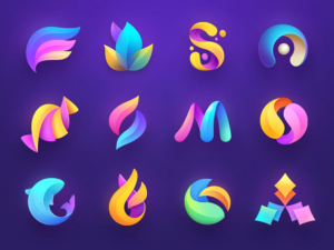
3D Gradients
Gradients are a unique way to blend any group of colors into a dynamic spectrum that exudes life and energy. Gone are the stark striped color transitions, as some brands have opted for a more subtle and gradual shift. This year, designers will give rise to the newest evolution of gradients creating depth and 3D effects in logos. Other top branding agencies are experimenting with new trends such as tapered gradients—ones that come to a central point and actually emphasize the contrast between their colors.
80’s Retro
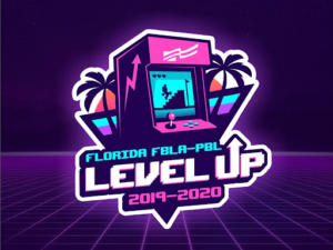
Don’t thrift away your 80’s style just yet, because some fads never go out of fashion. Enough time has finally passed for all things 80’s to be cool again: video games, pop music, and the rebel attitude associated with them. In 2020, logo design agencies expect to see a resurgence of throwback logos accented with chrome, neon, and a lot of digital pixels. These styles give a nod to the old-school tech that preceded the glowing iPhone and laptop screens our eyes are glued to today. Nostalgic marketing has made a huge comeback in recent years, necessitating a cool, retro logo to accompany any throwback campaign. Throwback logos are popular because they capitalize on consumers’ nostalgia of old-school 80s tech, which is widely known to be retro, cool, and most importantly, collectible. Some logos reference nostalgic 80’s items by literally depicting the old school cassette tapes, arcade games, etc. Others embrace this trend with 80’s typography and design trends, like GV’s logo for LI Mowz.
Ultra Thin Lines
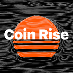
In 2020, high definition is leaving its mark on logo design. Designers push the envelope with extremely delicate lines, creating effects that can only work in the digital media. With extremely detailed linear patterns, logos began to feel ethereal and surreal — much like the original perception of radio and transmission media. With the new ability (and COVID necessity) for some brands to exist exclusively online, previous print limitations are eliminated. In an age of high-resolution screens and defined displays, complex line design makes classic logos seem elementary and easily reproducible.
Multi-Layered
2020 has been all about complexity! Logos are going deeper than ever before using artfully layered color systems. Especially with new digital affordances, designers are reverting flat and semi-flat designs to build depth through color layering. While shapes and colors remain simple, their relationship has intensified. By adding additional layers, designers create complex logos with highlights, shadows, and overlapping colors to communicate the brand brands. Especially on digital screens, the ability to create three-dimensional effects creates a unique, almost tactile experience.

Animated Logos
Top design agencies have been producing logo animation for some time now, but in 2020 we’ve seen more detailed and innovative plays on animation. Previous logos have been limited to simple movement, but over the years technology has allowed for more intricate and purposeful movement. Especially with a growing digital audience, animated logos can be more eye-catching and practical to the brand story. A popular 2020 logo design trend has been the blending of 2D and 3D animation or logos with multiple moving parts. These complex logo animations aim to take the viewer on a journey and tell a story. With lots of details to look at, the viewer looks at these logos longer than they’d look at a more simple logo animation and can potentially find something new they like about it every time they see it again.
The move toward animated logos comes from a similar place as the tapered gradient logos trend: when you’re designing for screens, there’s a whole lot more you can do as opposed to when you’re designing for print.
The logo design trends for 2020 will continue to build on everything designers have been exploring in the last few years, while also taking the design in directions that are totally new, totally fresh, totally right for an all-new decade. Let’s take a look at the top logo design trends that are already defining 2020.
Progressive marketing organizations are continually evaluating their approach to their brand & logo to ensure they are viewed as forward-looking and ahead of their markets. Halfway into 2019, there are a number of trends that have been making headway when it comes to this important creative and design work. Courtesy of the folks at Logo Lounge, a repository for designers to post and share their work, we have a sense of what changes are making their way into the market. As Logo Lounge is quick to remind us, when a client makes its logo selection from a typical range of five options, that also means that it has rejected the other four.
Here are four trends getting attention by logo and brand designers:
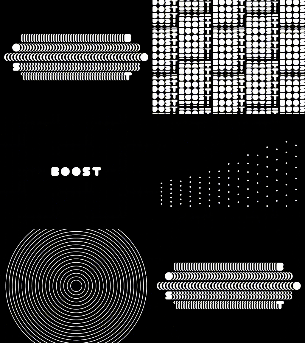
- Adding motion through “spot drag.” Spot dragging uses circular dots with tails to add a touch of motion to a logo. They give the impression of immediacy as if this logo just happened, and the ink is still drying.
- The Period makes a stand. A refinement of the recent punctuation trend, using the period in a logo gives it a little more power. Especially when it’s is used to signify something altogether different (like completing a different letter), a period makes room and draws the eyes in.

- Quarters make a play. One trend that can be seen everywhere is the use of “quarters” in logos – not the coin, but the geometric shape, which is simple and distinctive. It has balance and is being used with vibrant, solid colors. Sometimes used alone, other times with other geometric shapes, these add a purity of form that underlines the value of the brand.
- More layers. While simplicity works with many established brands, adding more layers and details is making a push into 2019 logo trends. The advantage of this approach is to invite viewers to look more closely and engage with the logo to understand what it’s trying to convey. Just don’t go overboard – two layers works, more than that can just look messy.
Learn how Bluetext can help you design a new brand & logo for a greater impact in the market.
What’s the real value of a logo fight? For most emerging brands, that answer is never obvious. Logos are never static designs, and revising it, or changing it all together, is often an option. But what if that logo belongs to one of the top tennis professionals, and he loses control over it because of a contract he signed when he was still an emerging brand, long before his current fame?
That’s exactly what’s happening to Roger Federer, a twenty-time grand slam winner for whom his initials have defined an era of tennis competition around the world. Federer, who is still recognized as one of the best players of all time, is an iconic sports figure around the globe. Because of his fame and success on the courts, his brand is also one of the most valuable in the market for tennis and other apparel and merchandise, and his logo fight makes sense.
Unfortunately, as the sports world is now learning, Federer doesn’t own the rights to his logo, even though it is comprised of his initials, RF! Early in his career—before he had achieved his global notoriety as a tennis phenomenon—he signed a deal with Nike that gave it the rights to his logo. That might have seemed ok at the time—after all, the deal with Nike was worth tens of millions of dollars over his career.
But just recently, he decided to end his 24-year partnership with Nike, and has switched to the Japanese manufacturer Uniqlo. I’m sure they cut him a massive deal, but it didn’t allow him to migrate his famous logo. That belongs to Nike, and that’s where the logo fight now stands. Here’s the history:
In 2003, when Federer was just emerging as a tennis superstar, his wife and her father developed the RF logo specifically for a perfume with his name on it. Federal liked the look of the logo so much that he talked with Nike about creating a marketing strategy around the initials. It made its first appearance on his 2006 Wimbledon blazer. The rest is logo and brand history.
The problem is, Nike is claiming ownership of the logo even with his move to the Uniqlo brand. And legal observers say the claim is solid. Federer is clearly not happy with this development. Here’s what the Swiss superstar told one reporter recently:
“The RF logo is with Nike at the moment, but it will come to me at some point. I hope rather sooner than later that Nike can be nice and helpful in the process to bring it over to me. It’s also something that was very important for me, for the fans really. Look, it’s the process. But the good news is that it will come with me at one point.”
That might be wishful thinking, and he may be trying to play nice in the hope that Nike executives will have pity on him. But I wouldn’t be so sure. Nike has no incentive to help a competitor take revenue from a product line and brand that it invested time and resources to build. The answer may play out in court, just not a tennis court.
The lesson here is pretty simple: Protect your logo and brand trademark from day one. Make sure your company has complete control over its use and its future, and don’t sign that away to a partner. It’s one of any brand’s most valuable assets, and needs to be treated that way.
Want to develop your brand and logo strategy? Find out how Bluetext can help.
Top branding agencies are always looking for new and refreshing approaches to logo designs that resonate with customers. Every designer’s dream is a new logo that is memorable and unique. But customers react to logos that interesting and different, but not too different. If a logo adheres to a style that is out-of-date or too far out of the mainstream, it may stick out from the crowd, but it won’t generate the positive feelings that it would if it were within the boundaries of the top logo trends that are hitting the market. With that in mind, here are six top logo trends that we are seeing both with our clients and across the industry:
- Flat Designs Retain Their Strength. When Microsoft released its latest new logo, the design was flat with no shading or 3-dimensional effects. The result is a logo that is straightforward, maintains its integrity and brand equity, and looks good across all channels and in all sizes. It’s also easy to print and reproduce. A flat design shows off the brand and colors well and shows off the brand in its simplest form.

- Negative Space is Your Friend. Pinterest, Instagram, Toyota and scores of other iconic brands all use negative space – sometimes with hidden shapes and symbols includes. As an article in Lifebuzz.com reveals, the three ellipses in the Toyota logo represent the heart of the automobile, the technology, and the customer. More importantly, negative space can draw attention to the brand in a way that is memorable and different.
- Stacking is Back. For many years, the logo with letters had to be simple initials in a simple design. But as a way to grab attention in a way that stands out and is easy to see and absorb, stacking can be a strong alternative – often with different fonts for each word. This offers a solid way to highlight different fonts to challenge viewers while giving them something they can quickly comprehend. Here’s an example of a recent refresh (minus the different fonts) from the American Library Association.
- Turning a Flat Logo Up a Notch. One recent trend is taking otherwise flat logos and adding a two-tone approach to add depth to the color but also to give it a hint of three-dimensionality. Dividing symmetrical images into two “zones” of shading gives depth and visual interest to a flat design. It can also add a symbolic touch to convey the brand’s core mission and direction. Check out how Pineapple Resorts turned its logo up a notch to make it more distinctive.
- Go Wide. Shapes that elongate from right to left are thought to be more recognizable for humans that narrow, tall images. With online platforms (such as websites and social media) favoring a wide design, strong brands are turning to this approach with their logos. When combined with contemporary fonts and colors, it can also convey a brand that is on the move and ready to dominate its market.