Prefer listening over reading? Check out the podcast version of this blog below and enjoy insights on the go!
Cybersecurity companies operate in one of the most competitive and complex markets in B2B. The stakes are high, the technology is sophisticated, and buyers are increasingly skeptical. While demand for cybersecurity solutions continues to grow, many companies struggle to communicate their value clearly and consistently.
Marketing in this space is fundamentally different from other B2B categories. Success depends on more than lead generation or brand awareness. It requires clarity, credibility, and a deep understanding of how security buyers evaluate risk. For many organizations, working with a specialized cybersecurity marketing agency becomes essential to navigating these challenges effectively.
Why Cybersecurity Marketing Is Uniquely Challenging
Cybersecurity marketing sits at the intersection of technical complexity and business risk. Products are often highly specialized, yet buyers range from deeply technical practitioners to executive decision-makers focused on financial and operational impact.
Adding to the challenge, the market is crowded. New vendors emerge constantly, many using similar language and claims. Buyers are inundated with messaging that promises protection, visibility, or resilience, making it difficult for any single brand to stand out.
Trust also plays an outsized role. In cybersecurity, credibility is not optional. Prospective customers must believe that a vendor understands the threat landscape and can protect critical systems. Marketing that feels exaggerated, vague, or overly promotional can quickly undermine confidence.

Challenge 1: Translating Technical Complexity Into Clear Value
One of the most common pitfalls in cybersecurity marketing is an overemphasis on features and technical capabilities. While accuracy matters, deeply technical messaging often fails to resonate with buyers who are focused on outcomes rather than architecture.
Security leaders care about reducing risk, improving response times, and maintaining compliance. Executives want to understand how a solution protects the business, minimizes disruption, and supports long-term resilience. When messaging does not connect technology to these priorities, it creates friction in the buying process.
This challenge is especially pronounced for early-stage and mid-market cybersecurity companies, where product innovation can outpace marketing maturity.
Overcoming Complexity With Strategic Messaging
Effective cybersecurity marketing starts with a disciplined messaging strategy. This means identifying the core problems the product solves and articulating them in language that resonates with different audiences.
A strong messaging framework speaks to both technical and business stakeholders without oversimplifying or diluting accuracy. It prioritizes clarity, relevance, and consistency across channels. Use cases, real-world scenarios, and proof points help ground abstract capabilities in tangible outcomes.
A cybersecurity marketing agency brings structure to this process. With category experience, they know how to balance precision with accessibility, ensuring that complex offerings are understood and remembered.
Challenge 2: Building Trust in a High-Stakes Market
Trust is the foundation of every cybersecurity purchase. Buyers are evaluating vendors not just on functionality, but on reliability, expertise, and long-term viability. Any perception of risk or uncertainty can derail a deal.
For newer companies, establishing credibility is often the biggest hurdle. For established firms, maintaining trust while evolving the brand or expanding into new markets can be equally challenging.
Marketing missteps, such as overpromising results or relying on buzzwords, can quickly erode confidence. In cybersecurity, buyers expect accuracy, transparency, and depth.
Strategies for Establishing Credibility and Authority
Building trust requires consistency over time. Thought leadership plays a critical role, particularly when it demonstrates genuine understanding of the threat landscape and emerging challenges. Content should educate rather than sell, positioning the company as a knowledgeable and reliable partner.
Brand consistency is equally important. From visual identity to tone of voice, every touchpoint should reinforce professionalism and credibility. Customer proof, analyst recognition, and third-party validation help further reduce perceived risk.
A marketing agency for cybersecurity companies understands how to build authority without exaggeration. They focus on long-term brand equity alongside near-term campaign performance.
Challenge 3: Differentiating in a Saturated Cybersecurity Landscape
Differentiation is one of the most persistent challenges in cybersecurity marketing. Many vendors offer overlapping capabilities, and industry language has become increasingly homogenized.
Claims around visibility, protection, and intelligence are common, making it difficult for buyers to discern meaningful differences. Feature-based differentiation often collapses under scrutiny, especially when competitors make similar claims.
Without clear positioning, marketing efforts risk blending into the background, regardless of product quality.
Creating Differentiation Through Brand Strategy
True differentiation comes from strategic positioning, not feature lists. Effective cybersecurity brands define who they serve, what problems they solve best, and why their approach is distinct.
This requires making deliberate choices. Not every buyer is the right buyer, and not every capability needs equal emphasis. Clear positioning helps focus messaging, guide campaign development, and align sales and marketing teams.
A cybersecurity marketing agency brings an external perspective that helps uncover defensible points of differentiation. By aligning brand strategy with business objectives, companies can cut through noise and communicate value more effectively.

Challenge 4: Reaching Multiple Buyers With Conflicting Priorities
Cybersecurity buying decisions rarely rest with a single individual. Security practitioners, IT leaders, CISOs, and executives all influence the process, often with different priorities and concerns.
Marketing must address technical depth without alienating non-technical stakeholders. Content that resonates with security teams may not land with executive buyers, and vice versa. This complexity makes one-size-fits-all messaging ineffective.
Understanding where and how each audience engages is critical to building effective campaigns.
Campaign Strategies That Drive Engagement and Results
Successful cybersecurity campaigns are integrated and intentional. Brand, content, digital, and demand efforts should work together to support long sales cycles and complex decision-making processes.
Measurement frameworks must reflect these realities. While leads and conversions matter, engagement quality and pipeline influence often provide more meaningful insight. Metrics such as account engagement, content performance, and sales alignment help connect marketing activity to revenue outcomes.
A marketing agency for cybersecurity companies brings experience designing campaigns that balance brand building with performance, ensuring that marketing supports growth at every stage.
Why Specialized Cybersecurity Marketing Expertise Matters
Generalist B2B marketing approaches often fall short in cybersecurity. Without category knowledge, agencies can struggle with messaging accuracy, credibility, and buyer expectations.
A specialized cybersecurity marketing agency understands the nuances of the space, from regulatory considerations to evolving threat narratives. This expertise accelerates strategy development and reduces the risk of missteps that can damage trust.
For many cybersecurity companies, partnering with an experienced agency allows internal teams to focus on product innovation while ensuring marketing execution remains disciplined and effective.
Turning Marketing Challenges Into Competitive Advantage
Cybersecurity marketing challenges are significant, but they are not insurmountable. Companies that invest in clarity, credibility, and strategic alignment are better positioned to stand out in crowded markets.
By addressing complexity through strong messaging, building trust through consistent brand execution, and differentiating through clear positioning, cybersecurity companies can transform marketing into a growth driver.
The right agency partnership can make the difference between blending in and leading the conversation. With the right strategy and execution, marketing becomes a competitive advantage rather than a bottleneck.
Ready to turn complex cybersecurity offerings into clear, compelling marketing?
Bluetext partners with cybersecurity companies to clarify positioning, build trust, and create marketing strategies that support real business growth. If you’re looking for a team that understands the cybersecurity landscape and knows how to translate technical depth into impact, let’s talk.
Prefer listening over reading? Check out the podcast version of this blog below and enjoy insights on the go!
A strong brand does more than look good. It clarifies who you are, why you matter, and why the right customers should choose you. In competitive B2B and technology-driven markets, branding often determines whether a company stands out or blends in.
That makes choosing the right branding partner a critical decision. The agency you select will influence how your business is perceived by buyers, investors, employees, and partners for years to come. Yet many organizations underestimate what true alignment looks like and focus too narrowly on visuals or cost.
Whether you are evaluating a DC branding agency for proximity and market familiarity or searching for a specialized B2B branding agency with deep technical experience, the right partner should understand your vision and know how to translate it into a brand that supports growth.
What Brand Alignment Really Means
Brand alignment goes far beyond agreeing on a color palette or logo style. True alignment means your branding partner understands your business objectives, your market dynamics, and the challenges your audience faces. It shows up in how strategy informs every creative decision, from messaging and naming to visual identity and digital experience.
An aligned agency will ask thoughtful questions early in the process. They will want to understand where your business is headed, not just where it is today. This includes your growth plans, competitive pressures, and how success should be measured after launch.
When alignment is missing, branding efforts often feel disjointed. Messaging becomes vague, design choices lack purpose, and the brand struggles to support sales and marketing efforts. Alignment ensures the brand works as a strategic asset rather than a surface-level refresh.
Key Traits to Look for in a Branding Partner
Not all agencies approach branding with the same level of rigor. As you evaluate potential partners, there are several traits that consistently distinguish effective branding agencies from transactional vendors.
First, look for strategic depth. A strong branding partner understands that branding exists to support business outcomes, not just aesthetics. They should be able to explain how their work will help you differentiate, communicate value, and scale.
Second, experience matters, particularly in complex markets. A B2B branding agency with experience in technology, cybersecurity, or regulated industries will be better equipped to navigate nuanced messaging, long sales cycles, and multiple stakeholders. Similarly, a tech branding agency should be fluent in translating sophisticated offerings into clear, compelling narratives.
Finally, evaluate how the agency collaborates. Branding is rarely successful when it is done in isolation. The best partners are structured, transparent, and adaptable, with processes that invite stakeholder input while maintaining momentum and focus.
Questions to Ask About Brand Strategy
Before reviewing creative work, it is important to understand how an agency approaches strategy. Brand strategy forms the foundation for everything that follows, and weak strategy often leads to underperforming brands.
Ask how the agency defines positioning and differentiation. They should be able to articulate how your brand will occupy a distinct space in the market and why that position is defensible. You should also ask how they incorporate customer insights, competitive analysis, and internal perspectives into their strategy work.
Another important question is how brand strategy supports revenue. A strong branding partner understands how brand decisions affect sales enablement, demand generation, and buyer confidence. Strategy should not live in a vacuum. It should inform messaging, content, digital experiences, and how your teams communicate consistently.
Evaluating Naming Capabilities
Naming is one of the most high-impact branding decisions a company can make, especially for B2B and technology organizations. A name sets expectations, shapes perception, and influences memorability in crowded markets.
When evaluating an agency’s naming capabilities, ask about their process. A thoughtful naming approach balances creativity with practicality and strategic intent. It should account for brand architecture, future offerings, and market expansion, rather than focusing only on what sounds appealing today.
You should also ask how legal and linguistic considerations are handled. While agencies are not legal counsel, experienced branding partners understand how to screen names effectively and collaborate with legal teams to minimize risk. Naming should feel deliberate and future-ready, not rushed or reactive.
What to Look for in Logo Design and Visual Identity
Visual identity is often the most visible expression of a brand, but it should never exist independently of strategy. A logo and visual system should reinforce positioning, support recognition, and scale across channels and use cases.
As you review an agency’s design work, look for clarity and consistency. Strong visual identities are flexible systems, not one-off designs. They work equally well across digital platforms, presentations, trade show environments, and marketing campaigns.
It is also important to assess whether the agency designs with longevity in mind. Trend-driven visuals may look compelling in the short term but can quickly feel dated. A strong branding partner focuses on creating systems that endure and evolve alongside the business.
Understanding the Agency’s Process and Collaboration Model
Process is often overlooked, yet it is one of the clearest indicators of how successful a branding engagement will be. A defined process provides structure, manages risk, and ensures strategy informs execution at every stage.
Ask how the agency structures discovery, strategy, and creative development. You should understand when and how stakeholders will be involved, how feedback is incorporated, and how decisions are ultimately made. Transparency around timelines and responsibilities helps prevent misalignment and frustration.
Collaboration style matters as well. The best branding partners strike a balance between listening closely and providing confident guidance. They are comfortable challenging assumptions when necessary and can explain the rationale behind their recommendations clearly and constructively.
Why Industry Experience Matters, but Perspective Matters More
Industry experience can be a significant advantage, particularly for organizations operating in complex or regulated markets. A DC branding agency, for example, may bring valuable familiarity with government-adjacent audiences, procurement environments, and credibility requirements.
That said, experience alone is not enough. Agencies that rely too heavily on industry templates may struggle to create truly differentiated brands. The most effective partners combine domain expertise with fresh perspective, applying proven frameworks while avoiding formulaic thinking.
When evaluating agencies, look for evidence that they can adapt their approach to your specific context. Case studies should demonstrate strategic thinking, not just surface-level familiarity with similar industries.
Signs You Have Found the Right Branding Partner
Alignment becomes clear when you pay attention to how an agency engages with your team. The right partner will ask insightful questions that challenge your assumptions and clarify priorities. They will demonstrate a clear understanding of your business and articulate your value proposition in ways that resonate.
You should also feel that the agency is invested in your long-term success, not just the immediate project. Strong branding partners think beyond launch and consider how the brand will be activated, governed, and evolved over time.
Ultimately, trust is a key indicator. When strategy, process, and communication align, collaboration feels productive and focused rather than reactive or transactional.
Choosing a Partner That Grows With You
Branding is not a one-time exercise. It is a long-term investment that shapes how your organization is perceived as it grows and changes. Choosing the right branding partner means finding an agency that understands your vision today and can help you adapt tomorrow.
Whether you are seeking a specialized tech branding agency, an experienced B2B branding agency, or a DC branding agency with regional and regulatory insight, alignment should be the deciding factor. The right partner will help you build a brand that not only stands out, but stands the test of time.
If you are evaluating branding partners and want a strategic perspective grounded in business outcomes, Bluetext helps organizations define, design, and activate brands built for growth. Contact us today to learn more.
In the B2B world, engineers and analysts aren’t influenced by flashy campaigns or celebrity endorsements—they respond to credible voices that understand their challenges and speak their language. That’s where micro-influencers come in. These trusted voices can elevate your brand, drive engagement, and build trust with technical decision-makers.
This blog explores how to identify and activate B2B micro-influencers who resonate with engineers, analysts, and other technical audiences, helping your marketing campaigns achieve measurable impact.
What is B2B Influencer Marketing for Technical Audiences?
B2B influencer marketing involves collaborating with individuals who have credibility and authority in your target industry. Unlike B2C campaigns, B2B influencers are valued for their expertise, insights, and practical experience.
For engineers and analysts, a successful influencer is someone who:
- Has deep knowledge of their technical domain
- Shares insights in forums, publications, or social platforms engineers frequent
- Can communicate complex ideas clearly and credibly
Why it matters:
- Engineers and analysts often drive or influence purchasing decisions for technical solutions
- Peer recommendations carry far more weight than traditional advertising
- Micro-influencers help brands reach niche technical audiences authentically

Why Micro-Influencers Work in Technical B2B Marketing
Micro-influencers typically have smaller but highly engaged followings (1,000–50,000 followers) within a specialized niche. For technical audiences:
- Authenticity matters more than reach: Engineers value detailed, accurate, and unbiased insights.
- Engagement is higher: Smaller communities tend to interact more, ask questions, and share content.
- Cost-effective partnerships: Working with multiple micro-influencers can be more impactful than a single large influencer campaign.
Tips for Identifying B2B Micro-Influencers
- Search Niche Communities
- LinkedIn groups, GitHub projects, Stack Overflow, Reddit communities, or technical forums
- Look for individuals who consistently share expertise, answer questions, or provide valuable insights
- Analyze Content Quality and Engagement
- Evaluate how informative, accurate, and clear their posts are
- Check comments and interactions to see if their audience trusts their opinions
- Look for Alignment With Your Brand
- Ensure their technical expertise aligns with your product or solution
- Check tone, values, and communication style for compatibility
- Use Influencer Discovery Tools
- Tools like Traackr, Klear, LinkedIn Sales Navigator, or BuzzSumo can help identify technical influencers by keywords, industry, and engagement metrics

Activating Micro-Influencers for Technical Campaigns
Once you’ve identified the right influencers, consider these activation strategies:
- Collaborative Content
- Co-create technical blog posts, case studies, webinars, or podcasts
- Ensure the content is educational and adds value to their audience
- Product Trials and Reviews
- Offer access to products or solutions for hands-on testing
- Encourage honest reviews that showcase features relevant to engineers and analysts
- Event Participation
- Invite influencers to speak at webinars, panels, or technical conferences
- Leverage their credibility to amplify your brand messaging
- Long-Term Partnerships
- Build ongoing relationships instead of one-off campaigns
- Consistent collaboration strengthens trust and brand recognition within technical communities
Measuring Success in Technical Influencer Campaigns
Unlike consumer campaigns, technical influencer campaigns focus on engagement quality and influence, not just impressions:
- Lead generation: Track inquiries or downloads from content shared by influencers
- Engagement: Evaluate comments, questions, and discussions generated by the content
- Brand authority: Monitor mentions in forums, technical communities, or LinkedIn conversations
- Conversion impact: Assess whether influencer-driven leads move through the decision-making funnel
Iterate based on metrics to refine influencer selection, content strategy, and engagement methods.

Tools and Resources for B2B Influencer Marketing
- Influencer platforms: Traackr, Klear, BuzzSumo, Onalytica
- Social and professional networks: LinkedIn, GitHub, Stack Overflow
- Analytics tools: Google Analytics, HubSpot, LinkedIn Campaign Manager
Use these tools to discover, manage, and track influencer campaigns for maximum impact.
Conclusion & Takeaways
Influencer marketing for engineers and analysts isn’t about flashy campaigns—it’s about credibility, authenticity, and relevance. By identifying the right micro-influencers, activating them thoughtfully, and measuring engagement strategically, you can:
- Build trust with technical decision-makers
- Amplify your brand’s authority in niche technical markets
- Drive measurable business results through B2B influencer partnerships
Start small, prioritize alignment over reach, and focus on building long-term relationships with influencers. Contact Bluetext to develop a tailored influencer marketing strategy that resonates with technical audiences.
In today’s crowded B2B landscape, breaking through the noise at tradeshows and industry events is no small feat. Enterprise buyers—whether they’re CIOs, procurement leaders, or CTOs—are inundated with information. Traditional booths, static signage, and printed brochures often fail to hold their attention. That’s why forward-thinking brands are turning to holograms, augmented reality (AR), and other immersive technologies to redefine experiential marketing.
By weaving futuristic tech into live events, companies can transform how buyers engage with their story. Holograms and AR don’t just create a “wow” factor—they give complex solutions life, provide interactivity at scale, and ensure your brand stands apart in a sea of sameness.
Why Experiential Marketing Matters in B2B
For consumer brands, experiential marketing has long been a staple—from pop-up shops to AR-powered retail experiences. But for B2B marketers, particularly those selling complex technologies or services, the stakes are even higher.
Enterprise buyers are hard to reach and harder to impress. They face long decision cycles, manage risk-averse teams, and often evaluate multiple vendors at once. Experiential marketing bridges that gap by:
- Creating memorable moments that stick long after the event ends.
- Demonstrating solutions in ways a slide deck never could.
- Increasing dwell time at booths and driving qualified conversations.
In fact, studies show that interactive brand experiences can boost recall and preference far more effectively than passive marketing tactics. For brands competing in industries like financial services, SaaS, or healthcare tech, that advantage can mean pipeline acceleration and stronger ROI.
Holograms in B2B Marketing
When most people hear “hologram,” they think of pop culture icons like Tupac’s famous Coachella performance or ABBA’s holographic concert series. But in the B2B world, holograms are rapidly moving from novelty to necessity.

Imagine showcasing an industrial machine too large to transport—or visualizing a SaaS platform’s architecture in 3D. With holograms, marketers can:
- Bring products to life without shipping hardware.
- Stage immersive keynotes featuring remote executives.
- Build larger-than-life experiences that spark curiosity.
The impact is both practical and emotional: prospects understand complex offerings faster, while also walking away with a sense that your brand is forward-thinking and innovative.
AR for Tradeshows & Events
Augmented reality takes interactivity even further by layering digital experiences over the physical world. At tradeshows, AR can empower attendees to:
- Explore virtual overlays on physical product demos.
- Visualize solutions in their own environment—such as simulating software workflows or visualizing a network architecture.
- Participate in gamified experiences, like AR scavenger hunts, interactive quizzes, or guided storytelling journeys.
Beyond engagement, AR allows for scalable personalization. For example, a visitor could scan a QR code and view an AR demo tailored to their industry, role, or business challenge—ensuring the content feels relevant and useful.

The Future of Experiential B2B Marketing
Looking ahead, the convergence of holograms, AR, and AI will further transform tradeshows and customer events. Imagine:
- XR booths where physical and digital seamlessly blend.
- Mixed reality product demos that combine live interaction with holographic overlays.
- AI-driven personalization that adapts immersive experiences in real-time based on attendee behavior.
As generative AI accelerates, these technologies won’t just be eye-catching—they’ll become tools for capturing data, measuring intent, and guiding buyers deeper into the funnel. Experiential marketing will evolve from “brand theater” into a measurable, pipeline-driving engine
Best Practices for Implementing Futuristic Tech
Adopting holograms and AR doesn’t mean chasing trends blindly. To make immersive B2B marketing successful, brands should:
- Align with the buyer journey. Use holograms and AR at touchpoints where they add real value, such as product education or executive engagement.
- Keep it intuitive. Experiences should feel natural and easy, not overwhelming or gimmicky.
- Measure outcomes. Track KPIs like booth traffic, dwell time, and lead quality to quantify ROI.
- Choose the right partners. Execution matters—work with agencies and technology providers who can deliver polished, reliable experiences.
The Future Belongs to the Bold
Enterprise buyers are savvy, skeptical, and selective. To win their attention, B2B brands need to go beyond brochures and digital ads—they need to create experiences that captivate, educate, and inspire.
Holograms and AR represent more than just flashy technology. They’re the future of experiential B2B marketing, offering new ways to stand out, tell your story, and connect with decision-makers on a deeper level.
If your brand is ready to explore holograms, AR, or other next-gen experiential strategies, Bluetext can help you design experiences that engage enterprise buyers and deliver measurable results. Contact us today.
When most marketers think of vertical video, they picture TikTok dances, viral consumer content, and Gen Z scrolling endlessly on their phones. But in 2025, vertical video is no longer just a consumer phenomenon. It’s emerging as one of the most effective tools in the B2B marketer’s toolkit—especially as more professionals consume content on mobile-first platforms like LinkedIn, YouTube Shorts, and Instagram Reels.
For B2B brands, this isn’t about chasing trends for the sake of novelty. Vertical video is about meeting audiences where they are, in the format they prefer, with stories that are designed to be consumed quickly and easily. If your business isn’t exploring vertical video yet, you’re leaving visibility, engagement, and credibility on the table.
Why Vertical Video Works for B2B Audiences
The argument for vertical video in B2B comes down to one simple truth: decision-makers are people, too. They use the same devices, engage on the same platforms, and are shaped by the same digital habits as consumer audiences.
- Mobile-first mindset. More than 80% of B2B buyers now research vendors on their mobile devices at some point in the buying journey. Vertical video feels natural in this environment, eliminating the need to rotate screens or resize windows.
- Higher engagement rates. Industry studies consistently show that vertical video generates higher completion rates and stronger engagement compared to horizontal formats, especially on platforms like LinkedIn and YouTube Shorts.
- Efficient storytelling. In a world where attention spans are shrinking, vertical video’s bite-sized storytelling makes it easy for professionals to get the information they need without sitting through a full webinar or whitepaper.
Vertical video isn’t about stripping away depth; it’s about presenting complex ideas in a format that meets audiences where they are.
Beyond TikTok: Platforms Driving Vertical Video for B2B
TikTok may have pioneered vertical video at scale, but the format has since spread across every major digital channel—many of which are central to B2B marketing strategies.
- LinkedIn: The professional network has leaned heavily into video content, with native vertical videos appearing in feeds and ad placements. Companies use vertical clips to promote events, share thought leadership, and highlight product launches.
- YouTube Shorts: While YouTube is often associated with long-form content, Shorts has become a powerful discovery tool. For B2B, Shorts are ideal for micro-educational content, product teasers, or snippets from longer demos.
- Instagram Reels: Once considered strictly consumer-focused, Reels are now a growing space for B2B employer branding, culture marketing, and thought leadership—especially for firms targeting younger professionals.
- Conferences & webinars: Recorded panels, fireside chats, or training sessions can be repurposed into vertical clips that extend the life of in-person events.
The common thread across all of these platforms? Vertical video feels native, and content that feels native performs better.
How B2B Brands Are Using Vertical Video Effectively
The beauty of vertical video is its flexibility. Forward-thinking B2B brands are finding creative ways to adapt the format across the funnel:
- Customer testimonials: Instead of lengthy case studies, short vertical clips featuring customer soundbites offer authentic, shareable proof of value.
- Thought leadership snippets: Executives and subject matter experts can deliver quick insights in under 30 seconds—perfect for keeping a brand top of mind.
- Behind-the-scenes content: From office tours to day-in-the-life clips, vertical video humanizes even the most technical organizations.
- Product demos: Micro-demos show off specific features or benefits, giving buyers a taste of value before committing to longer content.
- Recruitment campaigns: Highlighting company culture through vertical video helps attract top talent, especially younger generations entering the workforce.
For example, SaaS brands Bluetext partners with have seen success by repurposing long-form demos into vertical cuts, which serve as both awareness drivers and conversion tools. By meeting prospects in their feeds with digestible video, they create more touchpoints without reinventing the wheel.
Best Practices for Vertical Video in B2B Marketing
Getting vertical video right requires more than just cropping existing footage. The most effective brands take a strategic approach:
- Keep it short. Aim for 15–60 seconds. Professionals are more likely to engage when content is quick to consume.
- Design for silent viewing. Up to 80% of social video is watched without sound. Adding captions ensures accessibility and improves engagement.
- Prioritize mobile-first storytelling. Use tight framing, bold visuals, and direct messaging that works on small screens.
- Repurpose long-form content. Don’t start from scratch—turn webinars, whitepapers, and conference presentations into vertical video highlights.
- Measure what matters. Track watch-through rates, engagement, and conversions, not just views. In B2B, quality of engagement beats quantity.
By applying these best practices, vertical video becomes not just another format, but a high-performing piece of an integrated B2B content strategy.
The Future of Vertical Video in B2B
Vertical video’s rise is not a passing trend—it’s a reflection of broader shifts in how professionals consume and share information. Looking ahead, several factors will make vertical video even more central to B2B marketing:
- Generational change. Younger decision-makers who grew up on mobile-first content are moving into leadership roles. Their expectations will shape how B2B brands communicate.
- AI-powered editing. Tools are making it easier to automatically repurpose long-form video into polished vertical snippets at scale.
- Omnichannel integration. Vertical video will no longer live solely on social—it will be embedded in websites, sales enablement platforms, and internal communications.
- Performance-based expectations. As vertical video becomes standard, stakeholders will expect measurable ROI, pushing marketers to refine their strategies even further.
In other words, vertical video is moving from “nice to have” to “must have.” The B2B brands that embrace it now will have a competitive advantage as audiences continue shifting toward mobile-first experiences.
Vertical Video Is the New B2B Standard
Vertical video is not just a TikTok trend. It’s a fundamental shift in how information is shared and consumed across industries. From LinkedIn thought leadership clips to repurposed conference highlights, B2B brands that adopt vertical video are seeing stronger engagement, broader reach, and more meaningful connections with their audiences.
The question isn’t whether vertical video belongs in B2B marketing—it’s how quickly you can integrate it into your strategy.
At Bluetext, we help businesses build content strategies that resonate in the channels and formats that matter most. If you’re ready to explore how vertical video can elevate your B2B marketing, contact us today to start building your vertical-first strategy.
The average enterprise uses over 90 marketing technology tools across departments—and that number is still climbing. From campaign automation and CRMs to chatbots and data enrichment tools, it’s easy to see how even the most sophisticated marketing teams end up with tech stacks that are bloated, redundant, and wildly underutilized.
This growing complexity comes at a cost: disjointed customer experiences, wasted budget, operational inefficiency, and poor alignment with revenue goals.
That’s where a MarTech stack audit comes in.
A strategic audit doesn’t just clean house—it provides clarity. It helps marketing leaders identify which tools to keep, which to cut, and which can be combined to improve performance and simplify operations. If your stack feels more like a junk drawer than a power tool, it’s time to reassess.
The Risks of a Bloated MarTech Stack
Too much tech isn’t just inefficient—it’s actively harmful to your business outcomes. Here’s why:
- Wasted Budget: You’re likely paying for tools that are barely used—or completely unused.
- Data Silos: With multiple platforms collecting customer data, it’s harder to get a unified view of performance or behavior.
- Inefficient Workflows: Teams waste time toggling between platforms, managing duplicate processes, or dealing with misaligned automations.
- Frustrated Teams: When the stack doesn’t work together, Marketing Ops teams carry the burden of patching it all together manually.
If your MarTech stack feels like more of a burden than a benefit, that’s a clear signal it’s time for a comprehensive audit.
What to Keep: Tools That Support Revenue and Scalability
The goal isn’t to slash and burn—it’s to prioritize the platforms that deliver measurable value. When evaluating what to keep, focus on tools that:
- Drive ROI: Are you clearly seeing business impact from this tool (e.g., lead quality, conversion rate, revenue attribution)?
- Are Widely Adopted: If your team isn’t using the tool consistently or effectively, it’s not worth keeping.
- Integrate Well: Is the tool plugged into your data layer, CRM, or automation workflows?
Essential tools that often make the cut include:
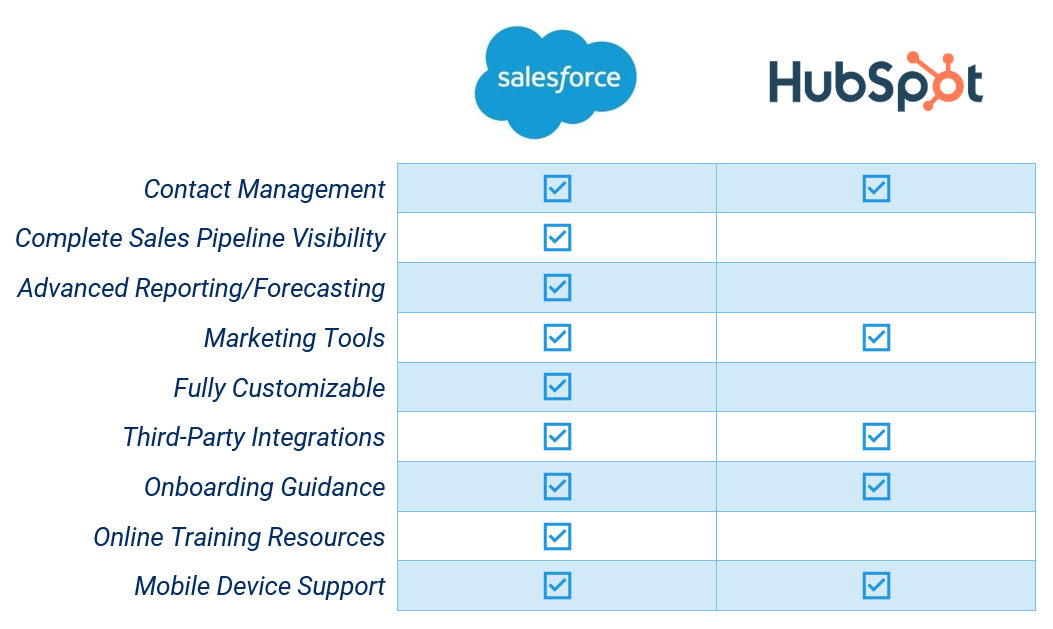
- Customer Relationship Management (CRM) platforms like Salesforce or HubSpot
- Marketing Automation Tools such as Marketo, Pardot, or ActiveCampaign
- Analytics Platforms for performance tracking (Google Analytics, Looker, Tableau)
- Content Management Systems (CMS) with flexibility and personalization features
If the tool clearly supports your funnel—from awareness to revenue—and plays nicely with the rest of your stack, it’s a keeper.
What to Kill: Tools That Drain Resources or Create Friction
Not every tool deserves a place in your stack. Some should be sunset to reduce complexity and cost. Red flags include:
- Redundancy: Are there multiple platforms performing the same function (e.g., two different email marketing platforms or survey tools)?
- Low Usage: Are licenses going unused or is the platform too complex for team adoption?
- Lack of Integration: Tools that operate in silos or require excessive manual workarounds aren’t worth the effort.
- Unclear ROI: If you can’t measure the value, it’s likely not driving results.
Killing tools can be a morale win too—your team will thank you for removing tech debt that slows down progress.
What to Combine: Tools That Overlap in Function
One of the most powerful outcomes of a MarTech audit is consolidation. Many modern platforms now offer multi-functional capabilities that replace the need for multiple point solutions.
Consider:
- All-in-One Marketing Platforms (like HubSpot or Adobe Experience Cloud) that combine CRM, email, automation, and content.
- Customer Data Platforms (CDPs) that centralize user behavior and enable personalization across tools.
- Integrated ABM Suites that unify ad targeting, content personalization, and sales insights.
The goal is to map your workflows and see where platform consolidation can improve speed, reduce costs, and minimize friction between teams.
Best Practices for a Successful MarTech Stack Audit
A thorough audit requires more than just a list of logins. To do it right:
- Interview Stakeholders – Talk to your marketing, sales, ops, and analytics teams. Who’s using what? What’s actually working?
- Audit Usage and Cost – Review licensing data and usage reports. How often is each tool being used, and by whom?
- Map Integrations – Visualize how your tools connect. Where are the gaps or workarounds?
- Score Each Tool – Create an “impact vs. effort” matrix to weigh business value against maintenance cost.
- Align With Strategy – Don’t just audit for efficiency—audit for alignment. Tools should directly support your current and future marketing goals.
This process doesn’t just declutter—it sets the foundation for a smarter, more integrated marketing engine.
How to Future-Proof Your Stack Post-Audit
After your audit, don’t fall back into old habits. Build in long-term governance by:
- Creating Documentation – Ensure tool purpose, owners, and integrations are clearly documented.
- Assigning Ownership – Every tool should have a designated owner responsible for training, performance, and license management.
- Scheduling Regular Re-Audits – A quarterly or annual review helps keep your stack lean and aligned with evolving goals.
- Involving Revenue Teams – Tech decisions should never be made in a marketing silo. Ensure cross-functional alignment with sales, RevOps, and finance.
The best MarTech stacks are intentional, integrated, and iterative—not accidental patchworks of vendor hype.
Looking to Streamline Your Stack Without Sacrificing Strategy?
Bluetext helps marketing leaders cut through the noise and reclaim control of their tech stack. Our MarTech stack audits are designed to uncover hidden inefficiencies, align your tools with revenue goals, and lay the foundation for scalable, data-driven marketing operations.
Contact us to schedule your audit and future-proof your stack.
In today’s B2B landscape, decision-makers aren’t just listening to brands—they’re listening to people. Not celebrities or social media stars, but real experts: engineers, analysts, developers, and operators with deep industry knowledge and the trust of their peers. For marketers, this shift presents a powerful opportunity: activating niche influencers to drive engagement, credibility, and conversions.
Here’s how smart B2B brands are tapping into the power of hyper-relevant voices to lead conversations—and win customers.
The Rise of the B2B Influencer
Influencer marketing is no longer reserved for beauty tutorials and unboxing videos. In the B2B world, influence looks different. It’s a federal cloud architect posting insight on LinkedIn. A cybersecurity analyst sharing zero-day vulnerabilities on X. A logistics manager breaking down efficiency tools on YouTube. These voices may not have millions of followers—but they do have something far more valuable: industry respect and decision-maker attention.
Whether you’re selling enterprise software, aerospace systems, or SaaS solutions for regulated industries, these niche influencers shape perception where it matters most—inside the buying journey.

Who Are B2B Influencers, Really?
Forget the ring lights and sponsored hashtags. The most effective B2B influencers are:
- Subject Matter Experts (SMEs): Engineers, developers, and product leaders who’ve built the solutions others now use.
- Analysts & Advisors: Independent thinkers who interpret market trends and tech shifts.
- Practitioners: Individuals working in the field—public sector tech officers, procurement leads, or operations directors.
- Evangelists: Employees or superfans who naturally share your brand’s vision and value.
They may not be household names, but in their specific communities, they carry serious weight.
How to Identify the Right Influencers
The key to successful B2B influencer marketing is relevance over reach. You’re not looking for a massive audience—you’re looking for the right one. To find them:
- Use tools like SparkToro or Onalytica to surface influencers by topic, keyword, or community.
- Leverage social listening to track who your buyers already follow and engage with.
- Tap into your ecosystem: Look at customers, partners, or internal experts who already have a voice in the market.
Ask: Who is creating content that my buyers trust? Who’s translating complex concepts into accessible insight?

Creative Ways to Activate Niche Voices
Once you’ve identified your influencers, give them a platform—and creative freedom. Some effective tactics include:
- Co-branded thought leadership: Partner on blogs, reports, or social content that blends your brand POV with their credibility.
- Podcasts & webinars: Host niche discussions that invite influencers to share their perspectives with your audience.
- Social media takeovers: Let influencers speak directly to your community from your branded channels.
- Video reviews or demos: Let a trusted voice showcase your product in their own way—particularly effective for technical tools.
Remember: authenticity is everything. Avoid over-scripting or forcing them into your brand voice.
What Makes These Activations Effective?
The best B2B influencer campaigns share a few key traits:
- Authenticity: Let influencers be themselves. It’s their voice that builds trust—not your script.
- Relevance: Niche influencers speak directly to specific buyer segments. That’s what makes them so powerful.
- Consistency: One-off campaigns might raise awareness, but sustained partnerships build loyalty.
Think of influencers not as one-time assets, but as ongoing collaborators who deepen your connection to a target audience.
Measuring Success in B2B Influencer Campaigns
B2B sales cycles are long, complex, and rarely linear—so measuring influencer success goes beyond likes and impressions. Instead, look at:
- Engagement from the right audience segments
- Referral traffic to key landing pages or assets
- Influencer-generated content performance over time
- Assisted conversions and pipeline attribution (via UTM tracking or CRM insights)
- Brand sentiment and earned media mentions
And don’t overlook qualitative feedback: the comments, DMs, or offline conversations that signal credibility is taking root.
Influencer Marketing Is Trust Marketing
At its core, B2B influencer marketing isn’t about going viral. It’s about meeting buyers where they are, with voices they already trust. When executed strategically, it doesn’t just boost awareness—it shapes decisions, accelerates journeys, and positions your brand as a true authority within a niche.
Want to Build Your Own Influencer Ecosystem?
Bluetext helps B2B brands develop influencer strategies tailored to their vertical, audience, and goals. Whether you’re looking to launch a full-scale program or test the waters with a single campaign, we can help you activate the voices that matter.
Contact us to learn how we help brands earn trust, one niche voice at a time.
The digital marketing world is preparing for a major shift: third-party cookies are on their way out. While the writing has been on the wall for some time—thanks to growing privacy concerns, regulatory pressure, and browser-level changes—the final countdown is now in motion. For B2B marketers, this change isn’t just a technical update; it’s a signal to rethink how we connect with audiences, measure success, and build meaningful digital campaigns in a privacy-first landscape.
So what does a cookieless future really mean for B2B marketing teams? And how should companies adapt?
Why the Cookie Is Crumbling
Third-party cookies have long been the backbone of many digital marketing strategies. They’ve enabled advertisers to track user behavior across sites, build robust audience profiles, serve retargeting ads, and measure multi-touch attribution.
But between data privacy regulations (like GDPR and CCPA), increased consumer scrutiny, and decisions by major players (Google, Apple, Mozilla) to block or phase out third-party cookies, marketers can no longer depend on these trackers to deliver precision targeting.
Unlike in B2C, where massive datasets and behavioral signals are more readily available, B2B marketers often work with smaller audiences, longer buying cycles, and more complex decision-making processes. The loss of third-party cookies only heightens the need for thoughtful, compliant, and relationship-based approaches.
What’s at Stake for B2B Marketing Teams
In a post-cookie environment, several key capabilities are at risk:
- Audience targeting precision – Building lookalike or intent-based audiences becomes more difficult without access to third-party behavioral signals.
- Retargeting – Following up with anonymous site visitors through programmatic channels is less reliable or even impossible.
- Attribution tracking – Multi-channel attribution models may break down without the ability to track users across sessions and domains.
- Lead nurturing automation – Third-party data often feeds into segmentation logic for account-based and intent-driven campaigns.
This shift forces B2B marketers to re-examine how data is collected, stored, and activated—and it puts renewed emphasis on first-party data, consent, and creative execution.
Privacy-First Alternatives Built for the Future
The end of third-party cookies doesn’t mean the end of personalization or targeting—it simply requires a smarter, more ethical approach to doing so. Here’s where B2B teams should focus their attention:
1. First-Party Data Strategy
First-party data—information your audience shares directly with you—is now your most valuable asset. This includes:
- Website interactions
- CRM and sales data
- Email engagement
- Event participation
- Content downloads or form fills
Building robust lead capture mechanisms, refining gated content strategy, and aligning marketing automation with sales insights are now critical to campaign success.
2. Contextual Targeting
In a world without cookies, where an ad appears can be just as important as who sees it. Contextual targeting uses the content of a webpage to inform ad placement—think serving cybersecurity messaging on a tech policy news site. While not new, this approach has become more precise with AI and NLP advancements and is making a strong comeback in B2B media buying.
3. Identity Resolution and Clean Rooms
Platforms like LiveRamp, The Trade Desk’s UID2.0, and Google’s PAIR are offering new ways to match audiences using encrypted first-party identifiers. Meanwhile, data clean rooms allow for privacy-safe collaboration between advertisers and publishers by enabling targeting without exposing raw user data.
These solutions require careful vetting and often demand more technical investment, but they provide viable paths to compliant targeting and measurement in B2B environments.
4. Platform-Based Targeting
As third-party cookies disappear, B2B marketers will increasingly lean on platforms that control their own ecosystems—think LinkedIn, Google, Meta, and industry-specific programmatic networks. These walled gardens have deep first-party data pools and increasingly sophisticated ad tools. However, marketers must balance effectiveness with cost and limited visibility into audience behavior outside those platforms.
What B2B Marketers Should Be Doing Now
With the sunset of cookies no longer hypothetical, proactive planning is essential. Here are the immediate steps B2B teams should take:
- Audit your current martech stack to understand where third-party cookies are being used (from ad targeting to analytics).
- Enhance your first-party data strategy by refining lead capture forms, improving CRM hygiene, and investing in customer data platforms (CDPs).
- Test contextual and native campaigns now to build experience with post-cookie tactics.
- Explore identity solutions with your media partners and vendors to determine what options make sense for your business.
- Revisit attribution models and prepare to rely more heavily on direct engagement metrics and source-based lead reporting.
The End of Cookies Is the Start of Better Marketing
The transition away from third-party cookies is less a threat and more an opportunity—an opportunity to build deeper relationships, center strategy around consent and value, and create more resilient marketing ecosystems.
For B2B marketers, this is the time to get ahead. Waiting until third-party cookies are fully deprecated means playing catch-up in a game already in motion. The brands that win in this next phase won’t be the ones that cling to old tactics—they’ll be the ones that adapt, test, and evolve.
Need Help Navigating the Post-Cookie Future?
Bluetext helps B2B brands build smarter, privacy-first targeting strategies—from first-party data activation to media planning and messaging. If you’re ready to rethink your digital campaigns for the cookieless future, let’s talk.
As privacy regulations tighten, precision targeting becomes harder—here’s how to execute effective ABM without crossing data compliance lines.
The New Landscape of ABM and Data Privacy
Account-Based Marketing (ABM) has become a go-to strategy for B2B marketers aiming to deliver personalized, precise campaigns tailored to key accounts. The promise of ABM lies in its ability to engage decision-makers with highly relevant messaging and tightly focused tactics.
However, the growing wave of data privacy regulations—including GDPR in Europe, CCPA and CPRA in California, and others worldwide—is reshaping how marketers can collect, use, and share data. These laws, designed to protect consumer and business privacy, have introduced new challenges for ABM’s reliance on granular data.
In this evolving landscape, the question emerges: How can marketers maintain ABM’s effectiveness while staying fully compliant and respecting privacy? This post explores practical strategies and privacy-friendly approaches to ensure your ABM campaigns continue to deliver results without crossing data compliance lines.
The Impact of Privacy Regulations on ABM
Privacy laws place clear limits on collecting personal data without consent, restricting marketers from using many traditional data sources that ABM once depended on. The decline of third-party cookies, limitations on tracking across devices, and increased user control over data permissions have diminished marketers’ visibility into customer behaviors.
These changes affect ABM in several ways:
- Reduced access to behavioral and intent data from third-party platforms.
- Challenges in tracking individual contacts across multiple touchpoints.
- Necessity to obtain explicit consent before processing certain types of personal data.
Traditional hyper-targeted ads and behavioral retargeting tactics must be reevaluated to comply with these new realities.
Rethinking ABM Strategy for Privacy Compliance
The key to privacy-safe ABM is shifting focus towards first-party data—information collected directly from your audience through interactions they initiate and consent to.
Here are some foundational shifts marketers should make:
- Build trusted data sources: Prioritize collecting data through website forms, gated content, webinars, and events where consent is explicit.
- Consent-based marketing: Ensure all communications are compliant with opt-in and opt-out requirements.
- Quality over quantity: Instead of mass data collection, deepen insights on fewer, high-value accounts with verified data.
- Ethical standards: Embed privacy considerations into your marketing ethos to strengthen trust and brand reputation.
Privacy-Friendly Tactics to Power Effective ABM
1. Intent and Contextual Data Usage
While granular personal data becomes scarcer, marketers can harness intent signals and contextual information that do not rely on invasive tracking. For example, analyzing content engagement patterns on your site or leveraging CRM activity can provide rich insights into account interest without crossing privacy lines.
2. Enhanced CRM and CDP Integration
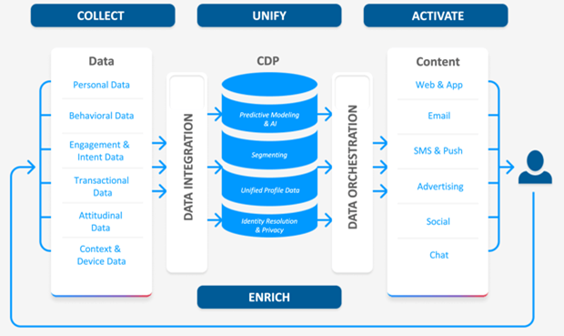
Customer Data Platforms (CDPs) that consolidate and manage first-party data become critical tools. They enable you to securely unify account information, track engagement consent, and enrich profiles based on direct interactions, such as demo requests or content downloads.
3. Account-Based Personalization Without Personal Data Overreach
Use firmographic data—company size, industry, location—and expressed interests to create personalized experiences. Dynamic content and A/B testing can be applied thoughtfully to tailor messaging without needing to overreach into sensitive personal data.
4. Collaboration with Legal and Compliance Teams
Privacy compliance should be a built-in component of ABM campaigns, not an afterthought. Work closely with legal and compliance experts during campaign design and maintain thorough documentation and audits to ensure ongoing adherence to regulations.
Tools and Technologies Supporting Privacy-Conscious ABM
Technology plays a pivotal role in enabling privacy-first ABM. Consider integrating:
- Privacy-first CDPs: Platforms that prioritize consent management and data security.
- Cookieless tracking solutions: Emerging tools designed to measure campaign performance without relying on third-party cookies.
- Consent management platforms (CMPs): Systems that streamline opt-in/opt-out processes and keep audit trails.
Evaluate your technology stack with privacy compliance as a core criterion to avoid risks and foster trust.
Getting Started: Implementing Privacy-Safe ABM Today
Begin your transition to privacy-conscious ABM by:
- Auditing current data collection and campaign practices for compliance gaps.
- Developing a phased roadmap to emphasize first-party data and consent.
- Training marketing and sales teams on privacy regulations and ethical marketing.
- Partnering with agencies and vendors skilled in navigating privacy requirements and agile ABM strategies.
Small, deliberate steps can help your organization adapt without disrupting momentum.
Navigating ABM Success in a Privacy-First World
Privacy regulations are not a passing trend—they represent a fundamental shift in how businesses must approach marketing. ABM remains a powerful strategy, but success now depends on transparency, respect for data, and innovative targeting methods that comply with evolving laws.
By embedding privacy as a core brand value, you not only avoid legal pitfalls but also build deeper trust with your prospects and customers, strengthening long-term relationships.
Ready to navigate ABM in the age of data privacy? Contact Bluetext to develop compliant, effective account-based strategies that drive results while respecting privacy.
When most marketers think of SMS, they picture retail alerts, flash sales, or appointment reminders—tactics firmly planted in the B2C world. But dismissing SMS as irrelevant for B2B is a missed opportunity. In reality, text messaging can be one of the most direct, high-impact tools in your B2B marketing arsenal—if you know when and how to use it.
In an era where inboxes are overloaded and attention spans are shrinking, SMS offers a rare advantage: it gets read. Studies show SMS open rates hover around 98%, and response rates can be as high as 45%. For comparison, email sits around 20% and 6%, respectively. That’s a significant gap—and one B2B marketers can no longer afford to ignore.
Why SMS Is Overlooked in B2B (and Why That’s Changing)
Historically, SMS has been seen as too casual or invasive for the B2B space. Enterprise buyers aren’t browsing for deals via text—they’re making complex, considered decisions. But the idea that professional communication has to be long-form or confined to email is quickly becoming outdated.
As the lines between work and personal life continue to blur, decision-makers are relying more on mobile to stay productive. That means a well-timed, relevant SMS can cut through the noise—especially when it’s part of a thoughtful, omnichannel approach.
Compliance concerns have also contributed to hesitation around SMS, but platforms have evolved. Today’s SMS tools for B2B are built to meet regulatory standards, offering opt-in workflows, tracking, and integrations with your existing CRM.

When SMS Makes Sense in B2B Campaigns
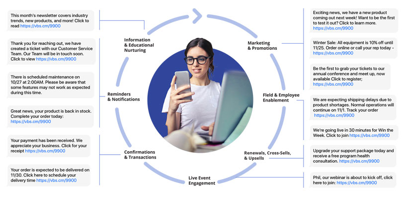
The key to effective B2B SMS marketing is knowing when to use it—and when to hold back. SMS isn’t a channel for every message. But in the right context, it can serve as the perfect nudge.
Here are some strategic use cases:
- High-intent lead follow-up: A quick text to confirm a meeting or thank a prospect for attending a demo can accelerate the sales cycle.
- Event and webinar reminders: SMS ensures higher attendance rates with last-minute nudges, especially for executive-level registrants.
- Account-based marketing (ABM) touchpoints: Personalized messages to high-value accounts help reinforce relationships and drive action.
- Urgent alerts or updates: Whether it’s a product release or contract deadline, time-sensitive information is better received via text than email.
- Post-sale engagement: For customer success teams, SMS can be a valuable tool for onboarding, check-ins, or renewal reminders.
How to Use SMS in B2B the Right Way
Just because you can text your prospects doesn’t mean you should do it without a plan. B2B SMS marketing works best when it’s strategic, respectful, and fully integrated into your broader campaigns.
Here’s how to get it right:
- Obtain explicit consent: Always use opt-in forms and make it easy to opt out. Respect for privacy builds trust.
- Keep it short and useful: SMS isn’t the place for fluff. Messages should be concise, relevant, and action-oriented.
- Personalize your outreach: Use first names, company names, or reference a specific meeting or download to show it’s not a generic blast.
- Integrate with your tech stack: Connect your SMS tool to your CRM and marketing automation platforms to sync messages, track performance, and trigger texts based on user behavior.
- Test and optimize: Run A/B tests on timing, copy, and CTA to learn what resonates—and avoid message fatigue.
SMS as Part of an Omnichannel B2B Strategy
The real power of SMS lies in how it supports and enhances your existing marketing channels. Think of it as the connective tissue between your emails, digital ads, webinars, and sales outreach.
For example:
- Follow up a gated content download with an email, then a personalized text offering a meeting.
- Send an SMS reminder the day before a webinar, with the Zoom link included.
- After a conference, send a thank-you text from the sales rep who spoke with the lead, offering a quick call.
When done right, SMS doesn’t disrupt the buyer journey—it smooths it out.
The Takeaway
SMS is no longer just for B2C brands or retail promotions. In today’s mobile-first world, B2B buyers are just as reachable via text—and often more responsive. The key is using SMS intentionally, at high-value moments, and as part of a cohesive omnichannel strategy.
Whether you’re nurturing leads, boosting event attendance, or keeping key accounts engaged, SMS offers a direct, powerful line of communication that few other channels can match.
Ready to elevate your B2B marketing strategy with SMS?
Let’s build a smarter, more connected campaign—contact Bluetext today to get started.