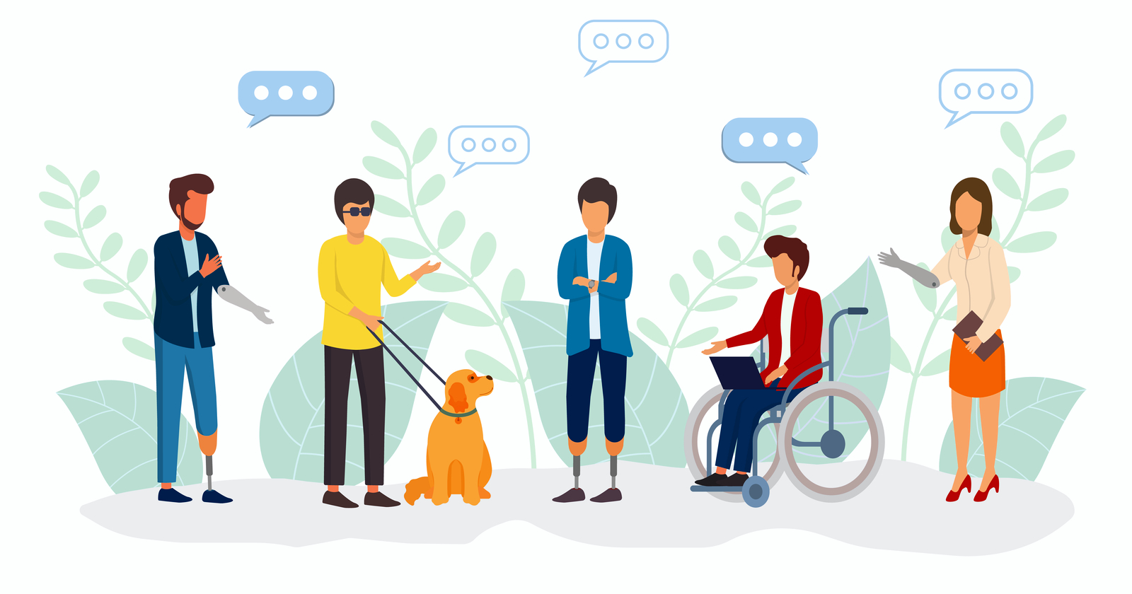
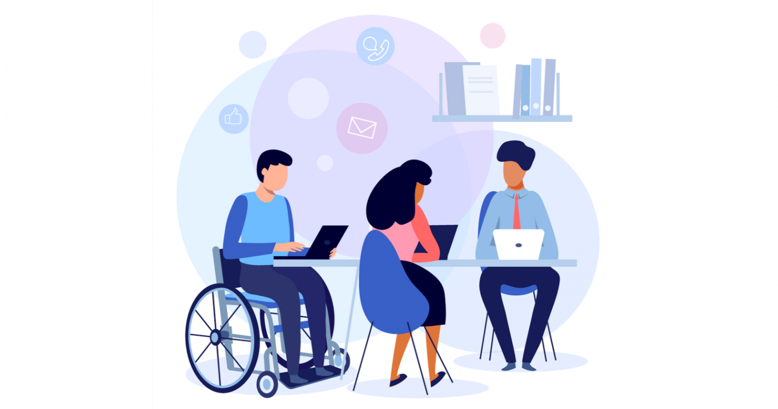
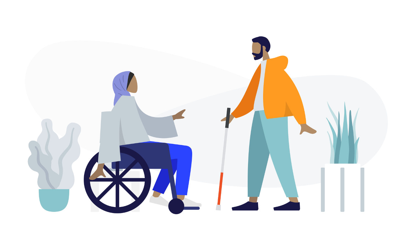
Whenever you add or change a feature on your website, you should consider the impact on the UX, or user experience. When you assess how users will interact with your website, it is important to consider users with differing abilities. Accessibility is a critical component of website design, not only for inclusivity but also because Google search crawlers reward websites that implement accessibility best practices.
Most websites don’t even realize that their content is not accessible to all users and use designs and visuals that create poor accessibility unintentionally. For example, you might like the relaxing feel of muted colors, but there needs to be enough contrast for users with visual impairments to read your content. If you use video content, be sure to include closed captioning to provide users who are deaf and hard of hearing the same access to information.

When thinking about accessibility, it’s also important to remember the universal benefit to every single user of your website. Too often, we think of accessibility as a way to benefit a small subset of users who need accommodations, but making your content more accessible actually helps everyone. If you’ve ever tried to watch a video on the metro, you know the benefit of closed captioning. On that day your mouse broke, you probably learned pretty quickly which websites you could access using a keyboard.
While there are many different ways you can improve accessibility, here are some great ways to start bettering your site.
Check Color Contrast
Run your website through a contrast checking tool (there are many free options online, such as a11y’s color contrast tool). This will help you spot any colors that might be difficult to read or view, so you can update text and CTAs to ensure that all your users interact more easily with your site.
Break Up Long Chunks of Text
While some areas of your site might require a long article when possible try to break up long periods of text with images or different types of components. This will make your content more accessible for neurodiverse users, and it will make important content more digestible for anyone who comes to your website.

Add Alternative Text for Images
Many content management systems will already ask you for alternate text for images, so this is an easy way to immediately make your website more accessible. This text does not need to be a detailed description of every single piece of the image but should be a few descriptive words that capture the main points of the image.
Make Menu Items Unique
Repeated menu items are confusing for everyone. If you have the same item under two different parts of the menu, it is difficult for users to tell which one has the information they need. It becomes more difficult to tell the difference when using a screen reader. Think through your menu, and choose the single most accurate spot for each menu item.

Improve Heading Hierarchy
Headings help you visually separate your content, and using the correct headings will help neurodiverse users and people using screen readers. Most websites use headings from <h1>, being the most visually impactful and important, to <h6>, being the least. As you write your content, think about where it makes sense to group content under a heading and what type of heading should be used. A major section of your page should not be delineated by <h6>, and a short paragraph should not use an <h1>.
Hopefully, these recommendations will help you as you begin creating a more accessible website. Reach out to Bluetext to dive further into accessibility and make sure every user has a great experience on your website.