Best Practices for Conversion Driven UX Design
If your company has a website published in the public domain, chances are, you know a thing or two about conversion goals. Conversion goals help to measure marketing performance, set goals and most importantly, provide conversions for a company. On websites, conversion goals can range from lead generation to sales to even page views. The point is, you must find your conversion goal and optimize your website toward it. There are various design choices that are simple, yet efficient in achieving different types of conversion goals. The goal is to keep it simple – the lesser the cost per conversion, the higher the return-on-investment (ROI).
Hack Your Way to Higher Conversion Rates
Less is More
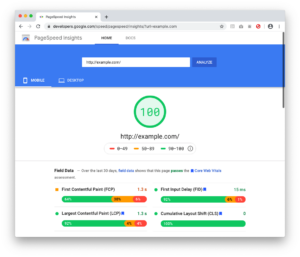
According to CEO of Chartbeat, Tony Haile, “You have just 15 seconds (or less) to convince new visitors to stay through the power of your site’s design alone.” Compared to years ago when web-design trends were over-the-top and animation and flash were all the rage, clean and simple flat designs are what reign supreme today. Market trends indicate today’s consumers appreciate a nice, clean layout. Impress your visitors with your content and offerings. Bombarding them with unnecessary flash and animation not only annoys them, but it also slows down the load time of your website. Whatever you do, don’t mirror your site after this masterpiece. You can always check the speed of your website using Google’s PageSpeed Insights tool. PageSpeed Insights analyzes the content of a web page, then generates suggestions to make that page faster.

Fire Excessive Fonts
When a user lands on a site with various different styles of old and new fonts, it becomes a disjointed and confusing user experience. If you’ve got more than two or three fonts on your homepage, trim them down to create a more modern look. Having two primary fonts keeps your website consistent and organized. While you’re at it, consider increasing your font size for readability. Smashing Magazine reported that “anything less than 16 pixels could impair your site’s readability.” Your website should not only be consistent but also readable.
Give Content a Break
Put yourself in the user’s perspective. Nothing is more intimidating and scary than landing on a page with big blocks of unbroken text. You would bounce too! Large text fields are an immediate red flag that digesting the material will be time-consuming and complex. Mix it up and improve your site’s readability by adding headings, subheadings, bulleted lists and numbered lists to break down content into easily-digested segments.
Improve Your Visuals
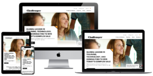
While you’re thinking about breaking up content, consider adding imagery. Customers or prospects may need to literally “see it to believe it” and images can be a powerful tool to help contextualize value. Custom graphics and visuals are a great option that is sure to impress users. Cheesy stock photos can seem generic and off-putting, so consider upgrading to simple tools like Canva and PicMonkey which make it easy to customize your images. In addition, if you’re looking to generate confidence in your service or product, try human photography. According to various studies, images of human faces can have a positive image in driving contact form conversions. Remember, people trust people! Human faces help establish an emotional connection, which in turn makes your website a more personalized experience.
Trust in the Numbers
While imagery and human photography might make a subconscious impact on trust, seal the deal with statistics and testimonials. People inherently trust in data and social proof. Statistics can help rationalize and solidify the decision-making process, especially when compared against competitors. Highlighting elements of social proof is an extremely easy and effective way to drive conversions. Consider positioning this information higher on the page, or perhaps in eye-catching designs, so users can be sure not to miss it.
Always Open the Window
Outbound links are a critical component of the ideal SEO formula, but be sure never to lead users away from your site. Make sure that all external links open in a new window. This ensures not only the best user experience for the user, but your site will stay open and users won’t drop off in search of content elsewhere.
Make it Stick
Add a Contact or Sales call-to action-directly in the main menu. Keeping the main conversion at top of mind (and menu) ensures your users are always enabled to contact you. You would never want a customer or potential lead to finally be ready to convert, only to be lost in the site and unable to contact you. To really make your central call to actions stand out, consider implementing a sticky navigation. This means that the main menu will lock in place above your content, no matter where the user is on the page.
Need to make changes to your website to improve your navigation? Bluetext can help.