
Designing Around Deconstructed Logo
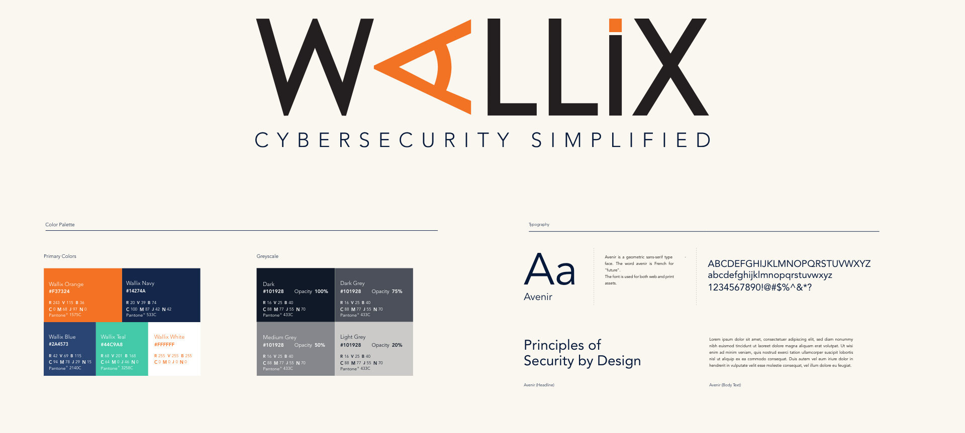
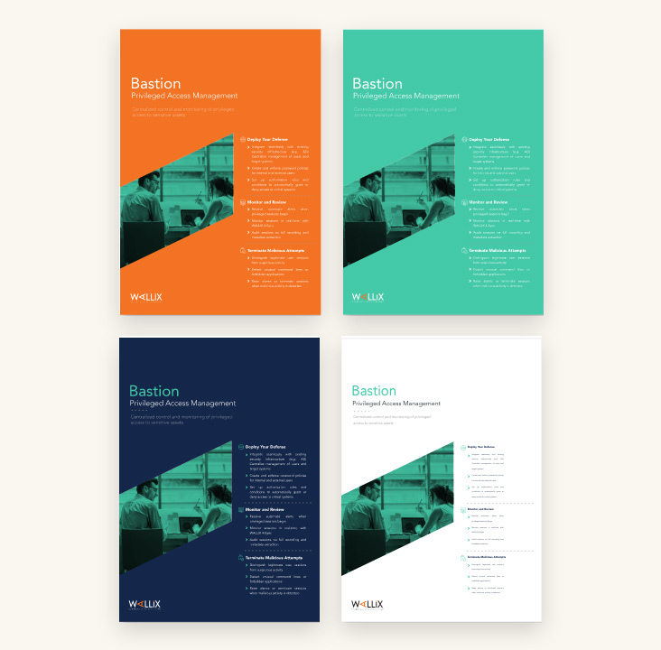
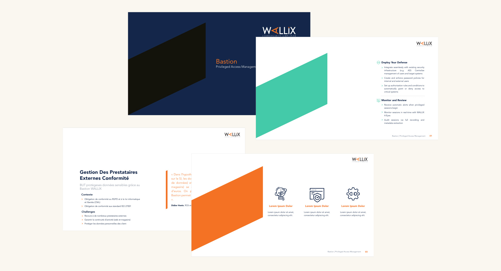
In the redesign prcoess, Bluetext preserved the legacy orange color, but expanded a secondary color palette to include a vibrant teal, deep blue, and rich navy that generate psychological associations with trust, loyalty, energy and confidence. For brand elements, we deconstructed the original Wallix ‘A’ and isolated a sleek slanted angle from the base. This branded element is symbolic of Wallix's ability to lay the foundation of a secure digital future and protect data privacy from all angles. A color overlay has been added to these shapes as a metaphor for Wallix's end-to-end security coverage and afforded visibility into accounts.


Want A Deeper Dive Into The Brand?
See Full Styleboard
Well-Informed Website Content Strategy
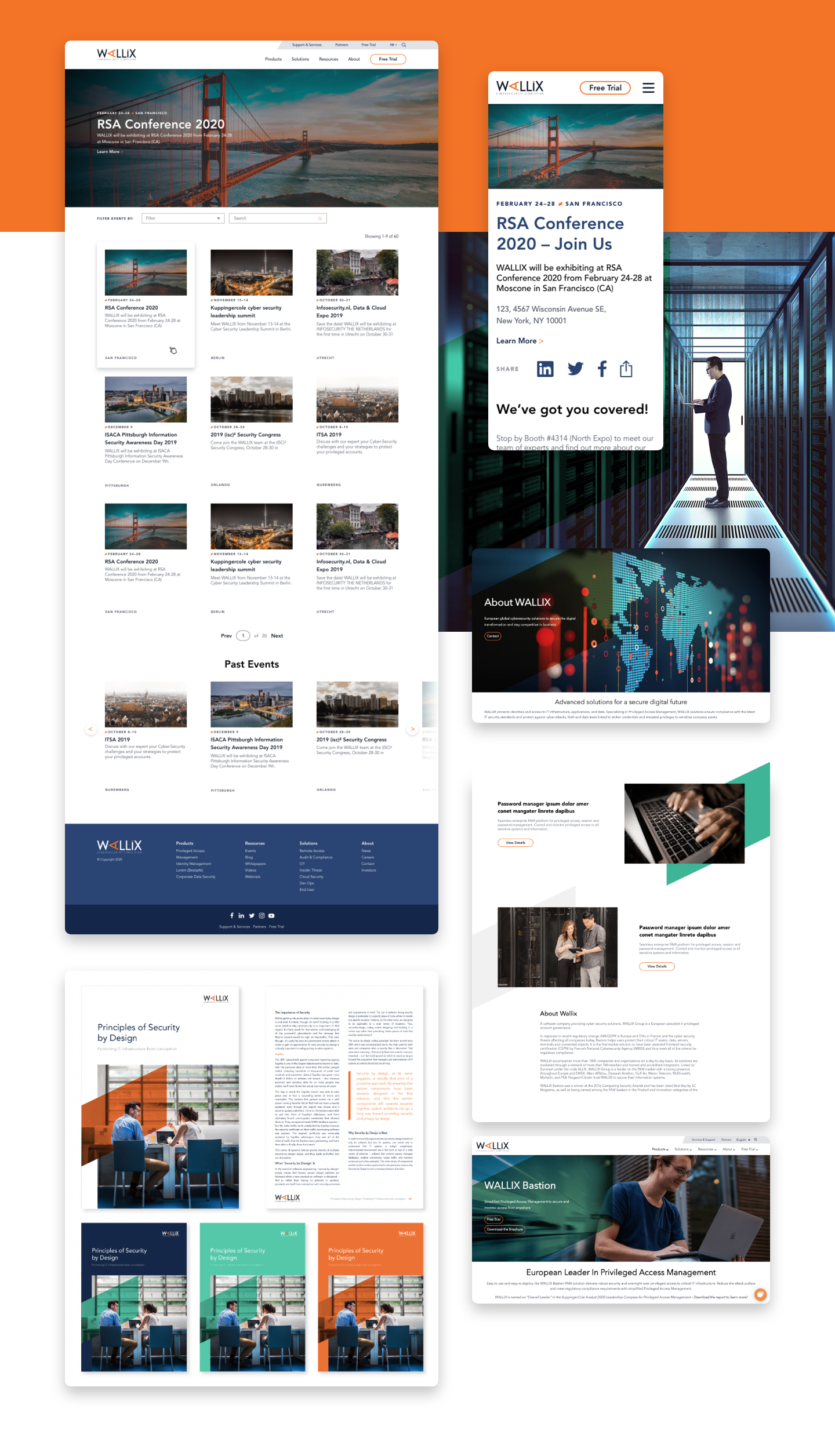
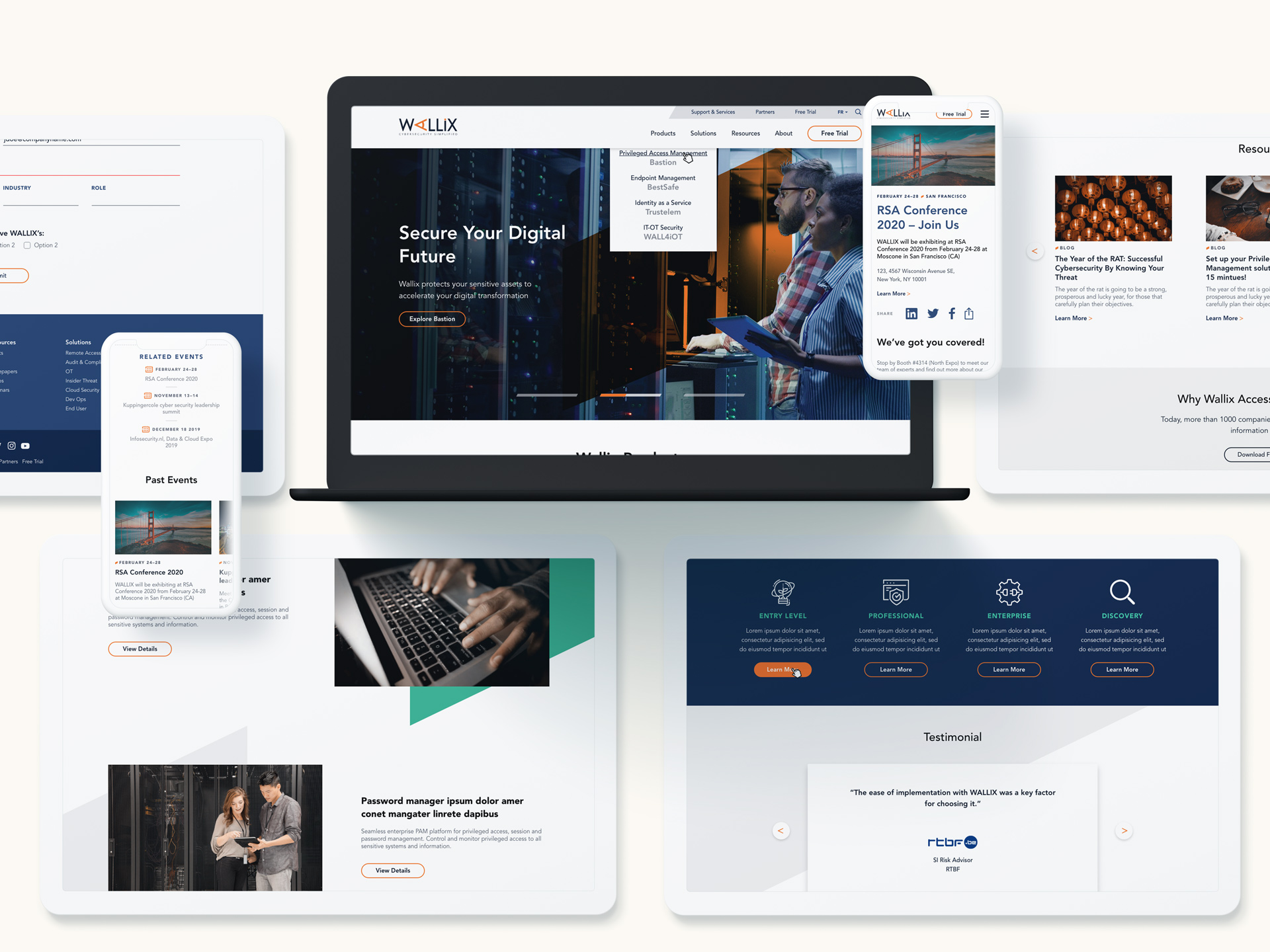
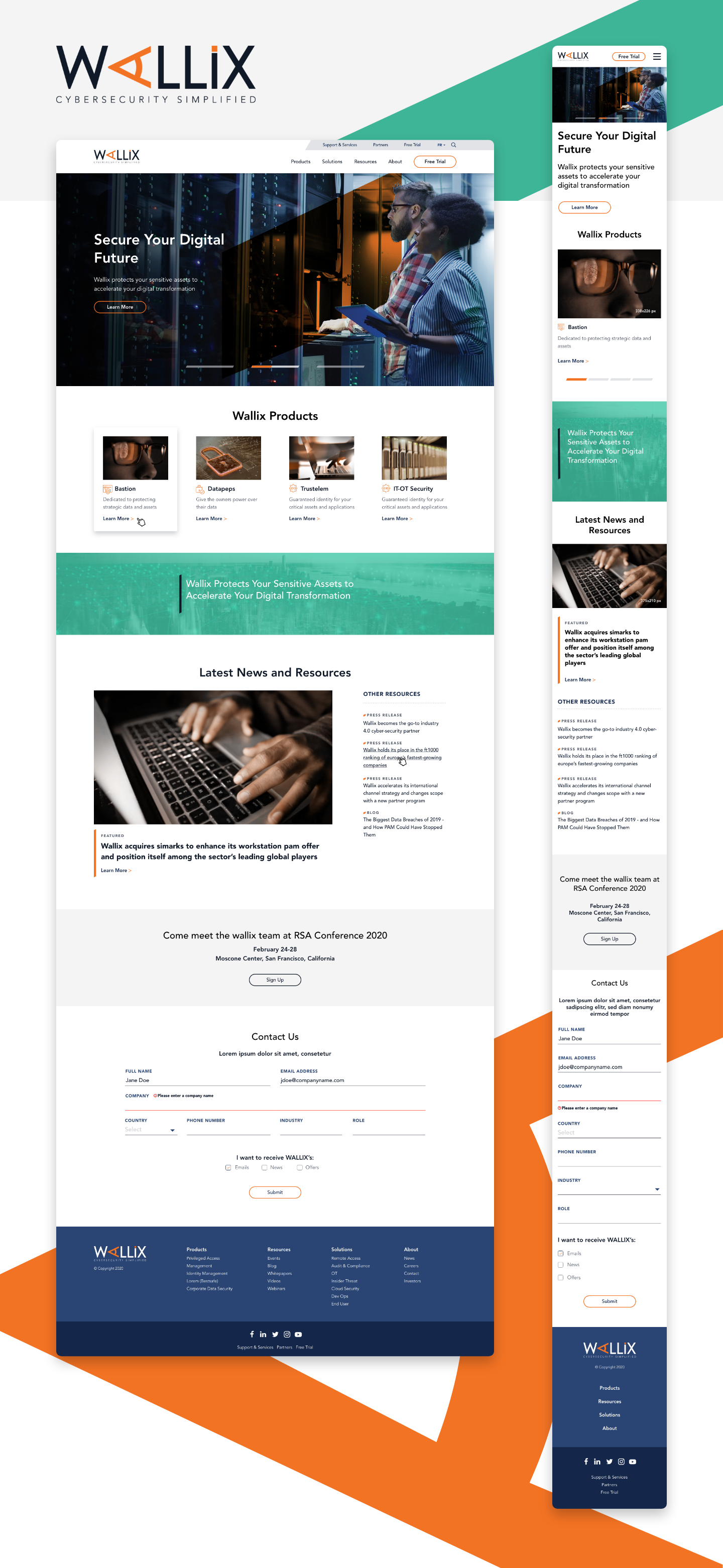
To bring the brand to life, Bluetext fully redesigned and developed the Wallix website with an in-depth user journey mapping. Bluetext conducted a thorough content discovery to recommend a more intuitive navigation structure and on-page crosslinking strategy that ensures new and existing customers could learn about individual product lines and how they could integrate into a security suite.

Functional Taxonomy Filtering
A core requirement for the Wallix website was to showcase its global presence and library of resources. A thoughtfully designed events listing page was developed to allow multi-taxonomy filtering, while a resource center housed a wide breadth of downloadable assets. With a WPML translation, these digital assets are even available in multiple languages for Wallix's global audiences.
