
Setting the Tone for a New Era
There's a version of a campaign video that's basically a logo reveal with music. We didn't make that. The TrendAI campaign video was built to push the boundaries of the visual identity, taking the design system further than any static execution could and turning it into something that genuinely stops you. We used the Spark, the color system, and the kinetic energy of the brand as a foundation, then pushed each element to its limits to create something visually arresting. The goal was to get customers excited about TrendAI, not just informed about it. It's the kind of video you can open a keynote with or run as pre-roll and it actually earns the time. It lives on the website, travels to events, and gives the sales team something worth showing. More than anything, it captures what TrendAI is really about and makes you feel it.


Launching TrendAI to the World
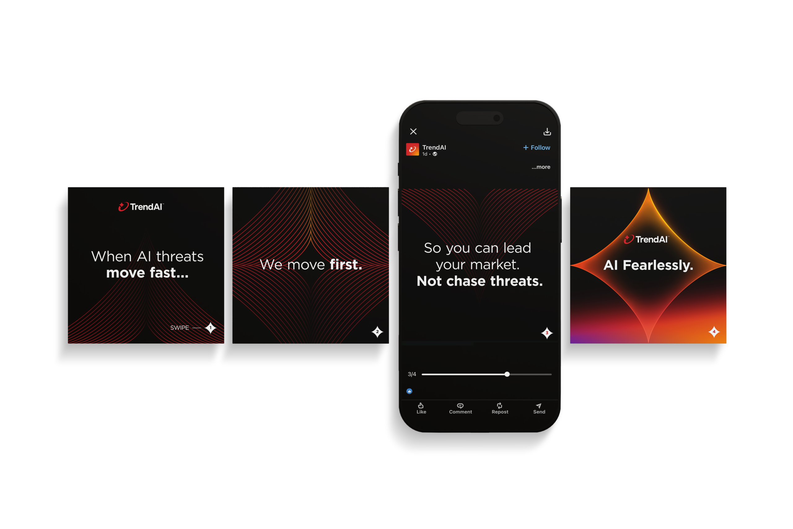
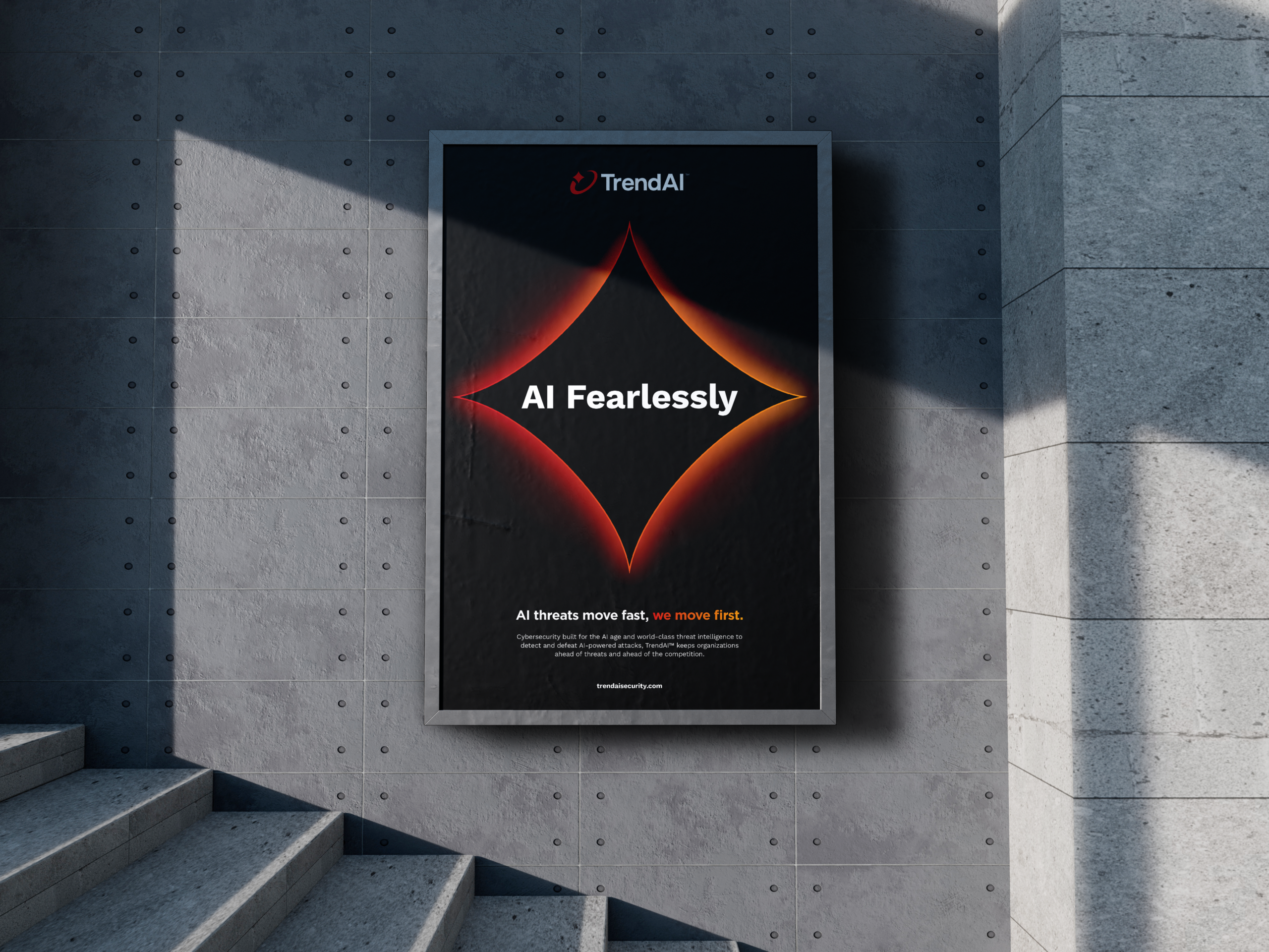
You can do all the right brand work and still have a quiet launch. We made sure that wasn't what happened here. Bluetext developed the full go-to-market creative across LinkedIn, Instagram, out-of-home, and digital display, giving TrendAI a genuine market presence from day one. LinkedIn ads spoke directly to CISOs and security decision-makers with copy that respected their intelligence and cut to the point. Instagram leaned into the visual impact of the new identity, the kind of creative that stops a scroll. OOH put the brand in the physical world at scale. And digital banners extended the reach with consistent, on-brand executions that reinforced the new name wherever the audience was. The campaign wasn't about announcing a rebrand. It was about making TrendAI feel inevitable.

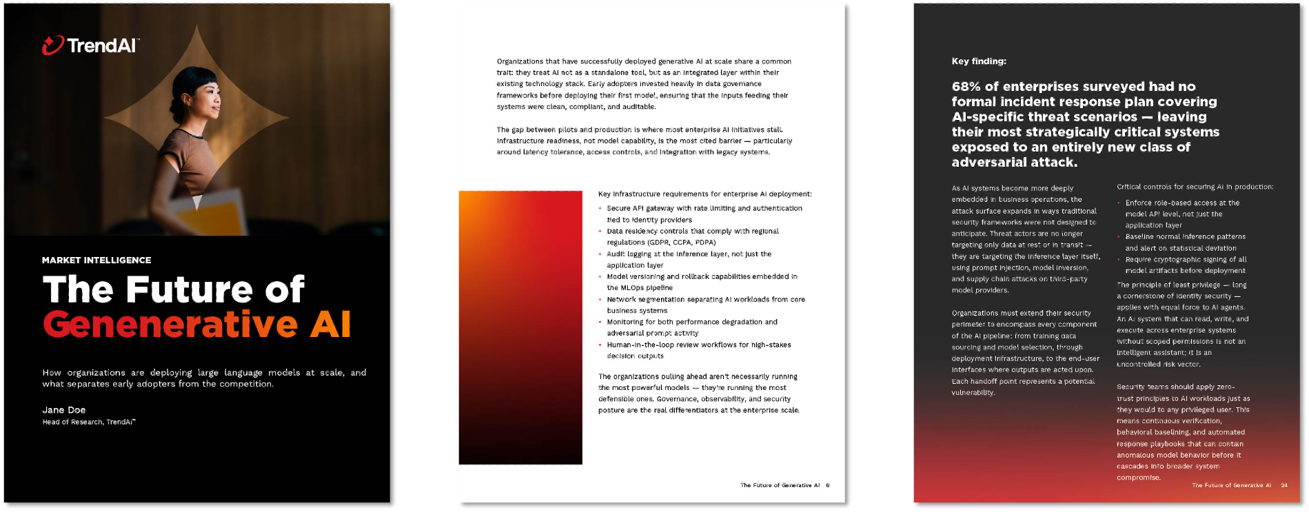
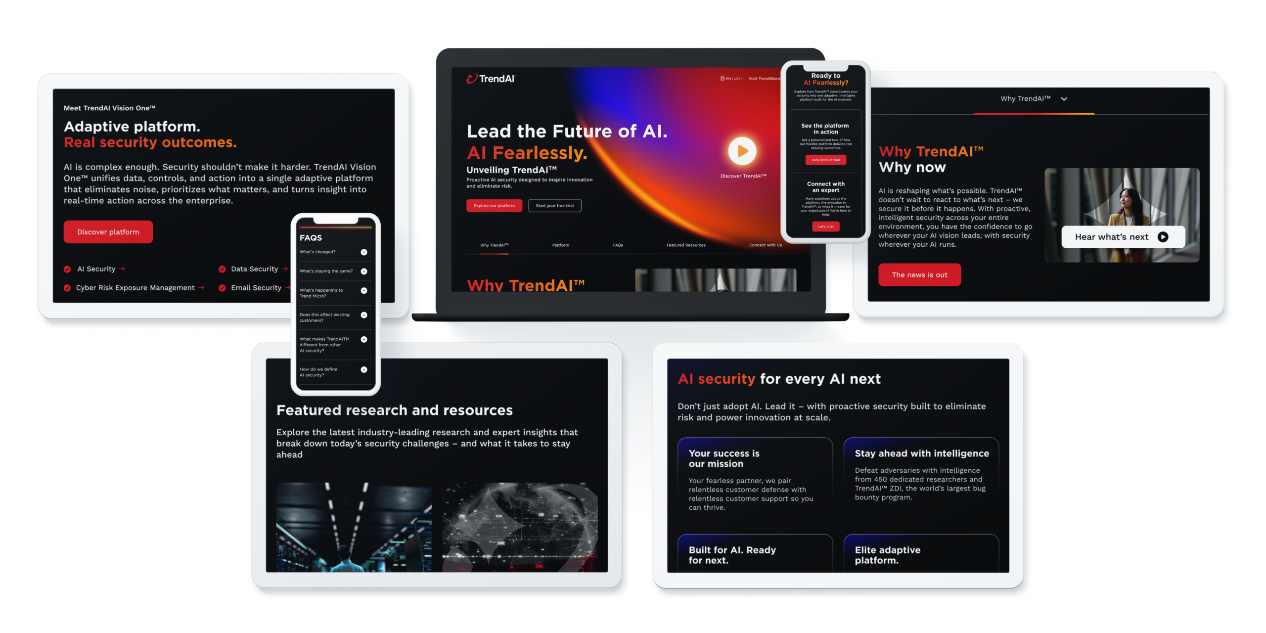
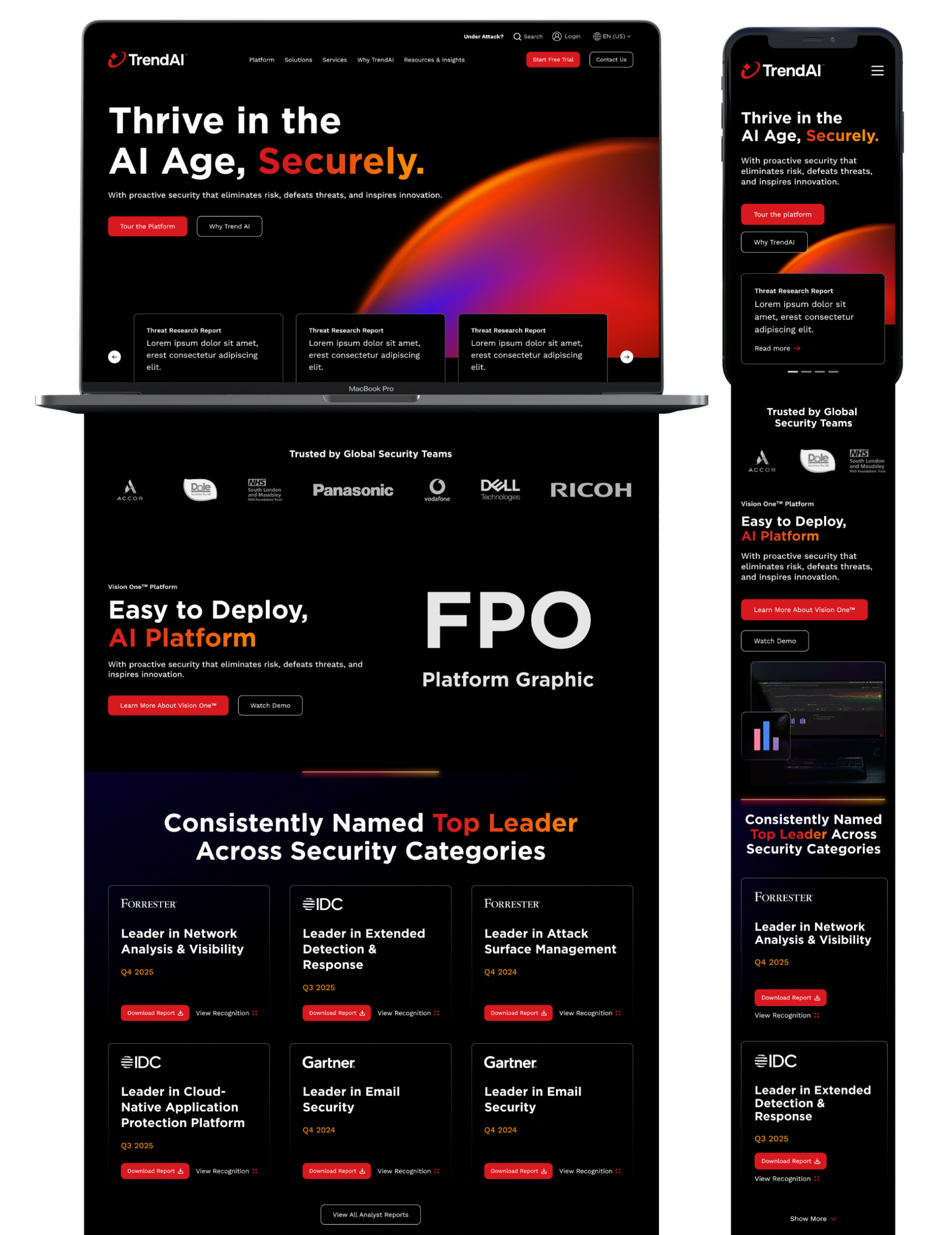
A Website That Sells the Vision
Enterprise buyers are skeptical by nature. They've seen enough rebrands to know that a new name doesn't necessarily mean anything has changed. The TrendAI website was our chance to prove that this one was different. Bluetext designed the experience to be clear and fast, getting visitors to the right information without friction. The visual identity hits immediately, from the hero on down, and the messaging is structured for the specific way security leaders actually make decisions. It's not a brochure site. It's a tool for moving buyers from awareness to belief, with every page designed to do actual work. The Spark, the palette, the typography, the motion all show up where they need to and get out of the way where they don't.
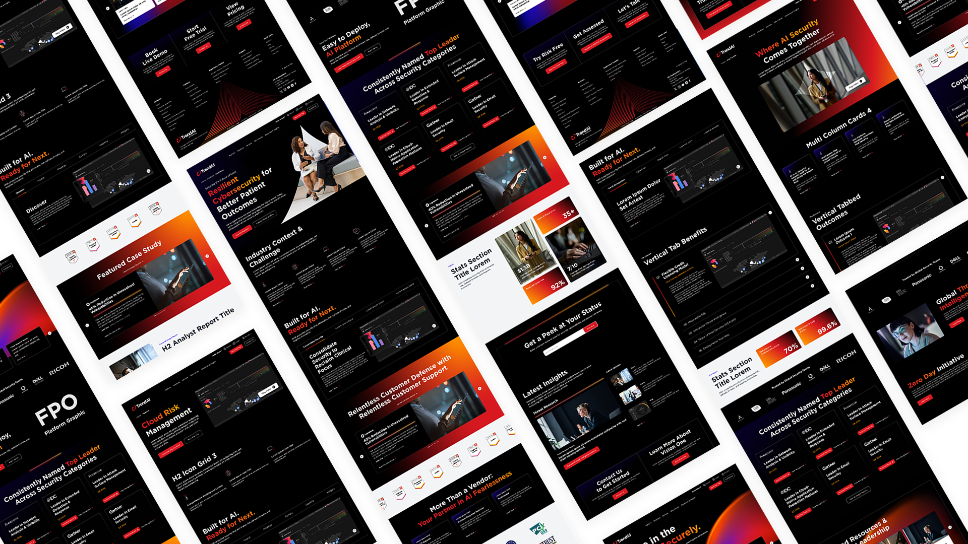
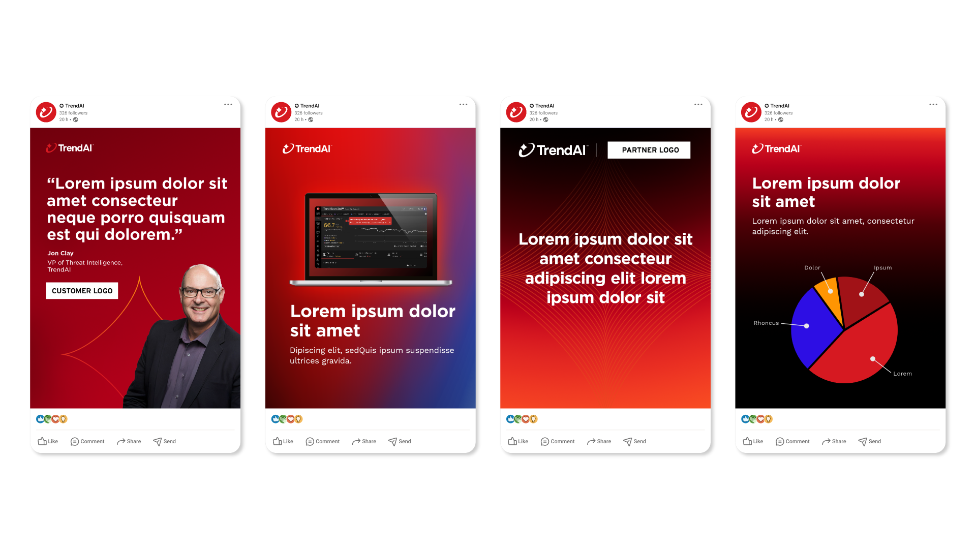
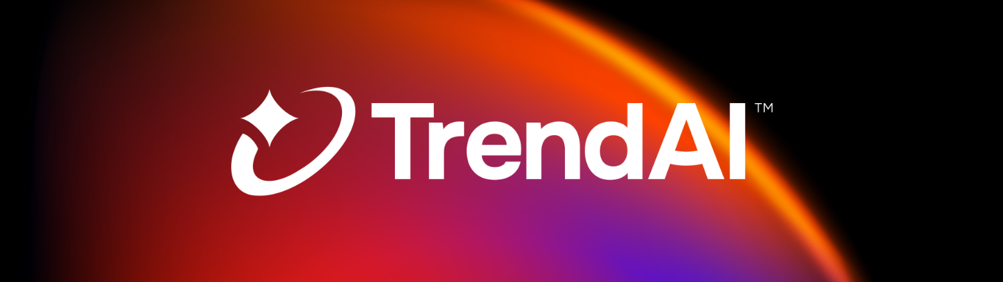
A System Built to Carry the Brand Everywhere
A logo is a starting point. What makes a brand actually function is the system around it. Bluetext built out TrendAI's full visual identity with "AI Fearlessly" as the constant filter for every decision. The color palette is confident without being loud, built around deep backgrounds and sharp, energetic accents that suggest speed and precision. The typography is structured and direct, the kind of typesetting that says we know what we're talking about. Motion cues and texture reference the Spark, so the identity stays coherent whether it's showing up in a sales deck, a trade show booth, or a social post. The goal was a system that any designer on any continent could pick up and use without the brand ever losing its shape. That's what we delivered.