
A Mark Built for the Mission
Every element of Squadra's CVI flows directly from the new logo Bluetext designed. The mark was developed to communicate precision, technical authority, and forward momentum, the qualities that define how Squadra approaches cybersecurity and IT consulting for some of the most demanding clients in the federal and enterprise space.
Building a Brand System Around a Bold New Mark
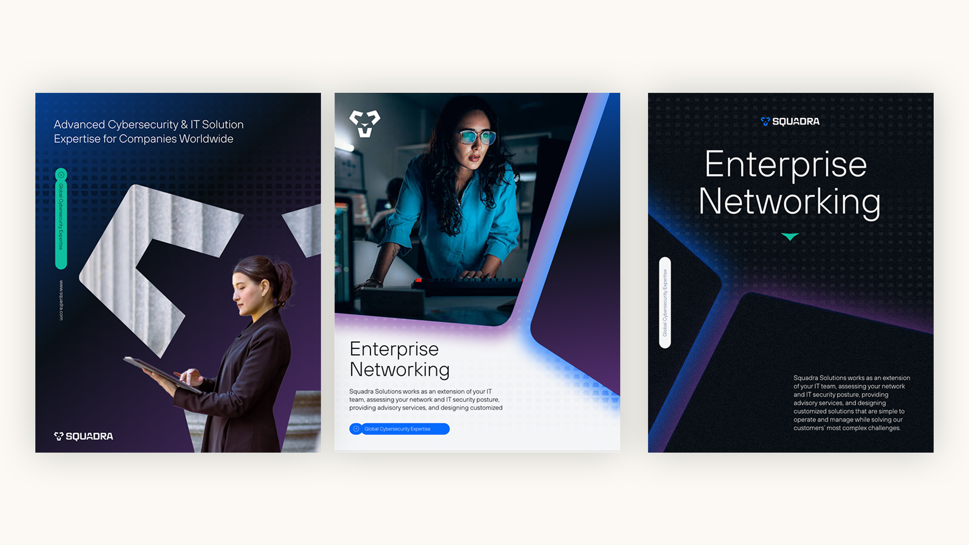
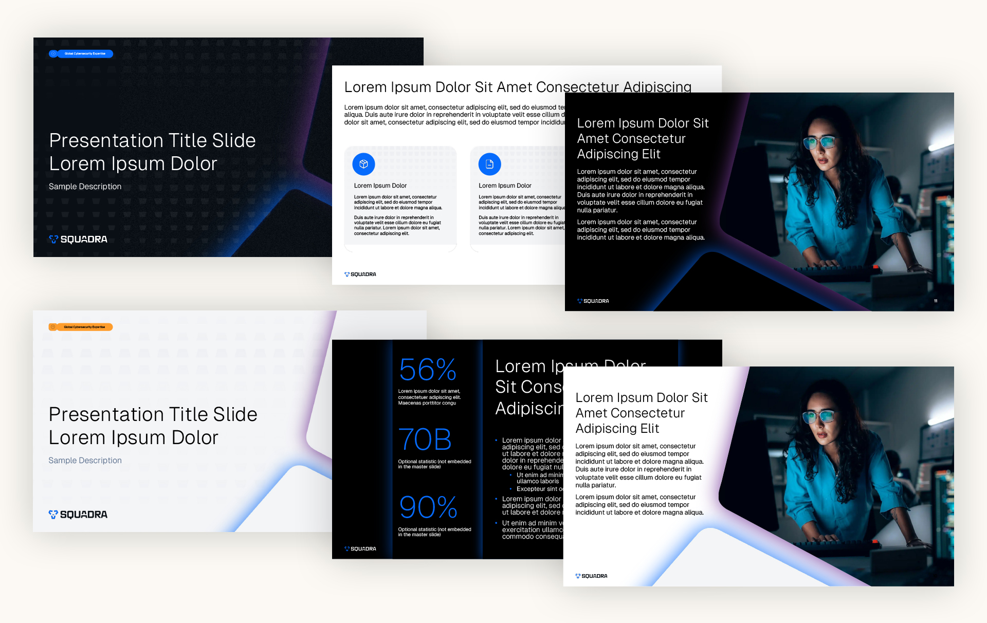
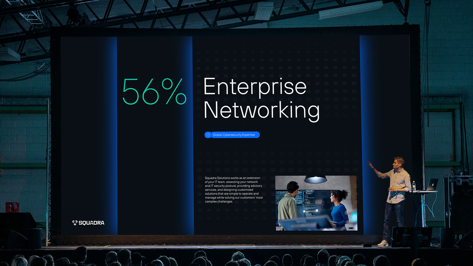
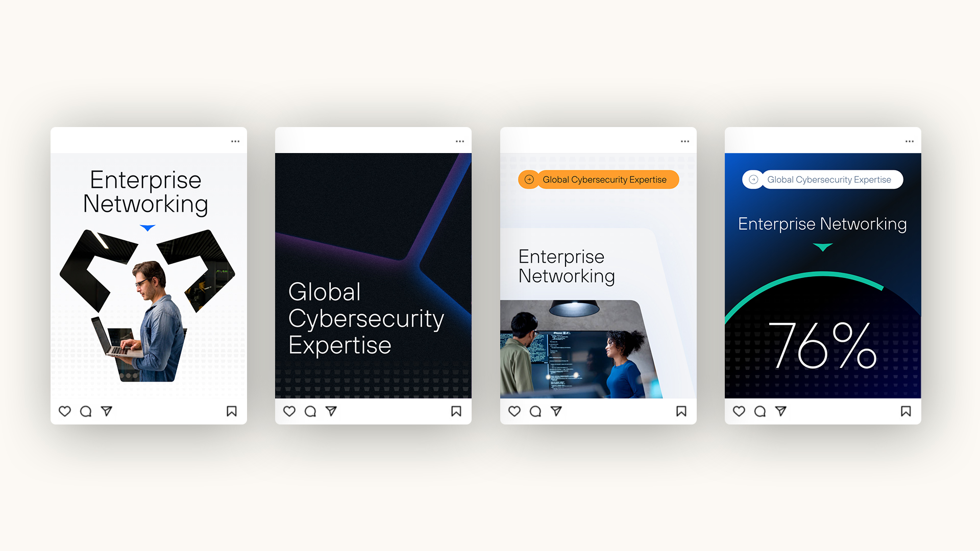
From that foundation, Bluetext built out a full visual identity system covering typography, color palette, iconography, graphic language, and branded collateral. The typography pairs a strong, structured primary face with a clean secondary that keeps technical content readable without sacrificing personality. The color system was built with intention, carrying the energy of the logo mark across every touchpoint while maintaining the kind of visual discipline that enterprise and government clients expect.
One of the defining decisions in the CVI was designing the full system in both a light mode and a dark mode. Rather than treating one as a secondary adaptation of the other, both versions were developed with equal care, ensuring the brand holds its strength whether it lives on a bright, open layout or a deep, high-contrast background. Across pitch decks, one-pagers, trade materials, and digital assets, the Squadra brand system projects consistency and confidence at every turn.


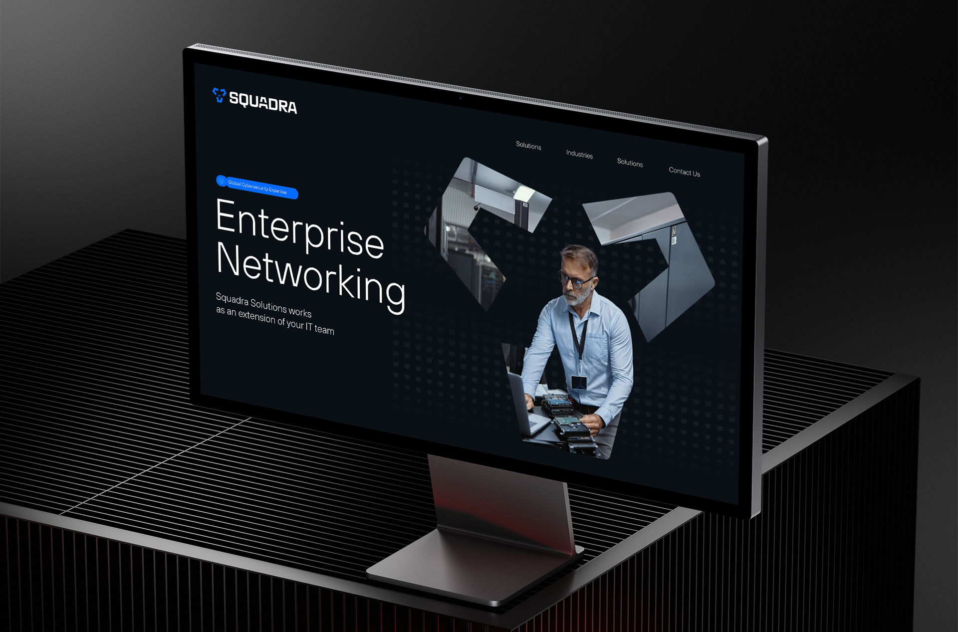
A System Built to Travel
A brand identity is only as strong as its ability to translate across contexts, and the Squadra CVI was built with that in mind from the start. The dual light and dark mode system, the typography, the color palette, and the graphic language were all developed to be flexible enough to live beyond the designed collateral and carry their weight wherever the brand shows up. The website is a natural extension of that, with the visual identity Bluetext created giving Squadra a consistent and recognizable presence online that reinforces the credibility of the brand at every touchpoint.