
Creative to Convey
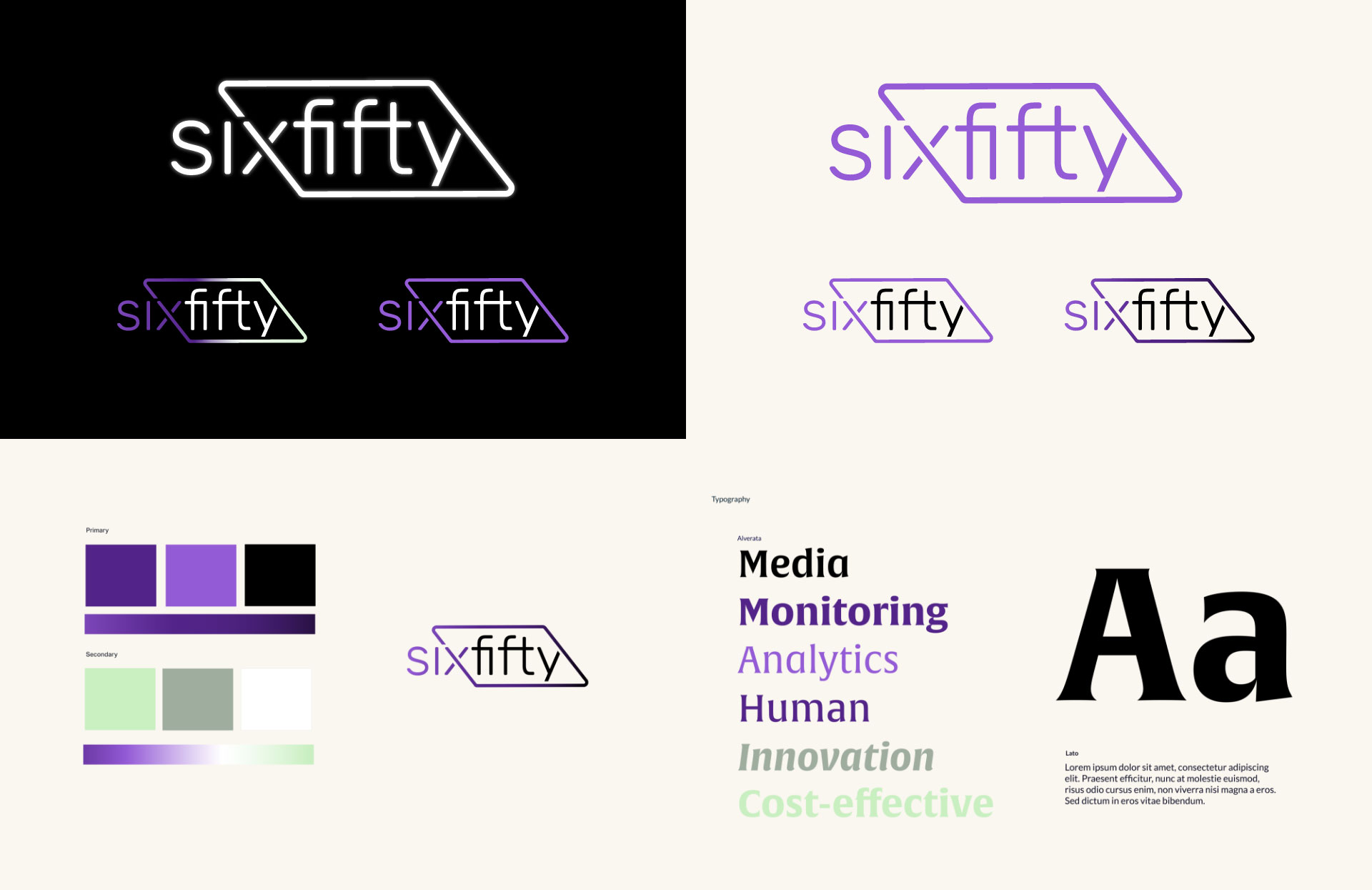
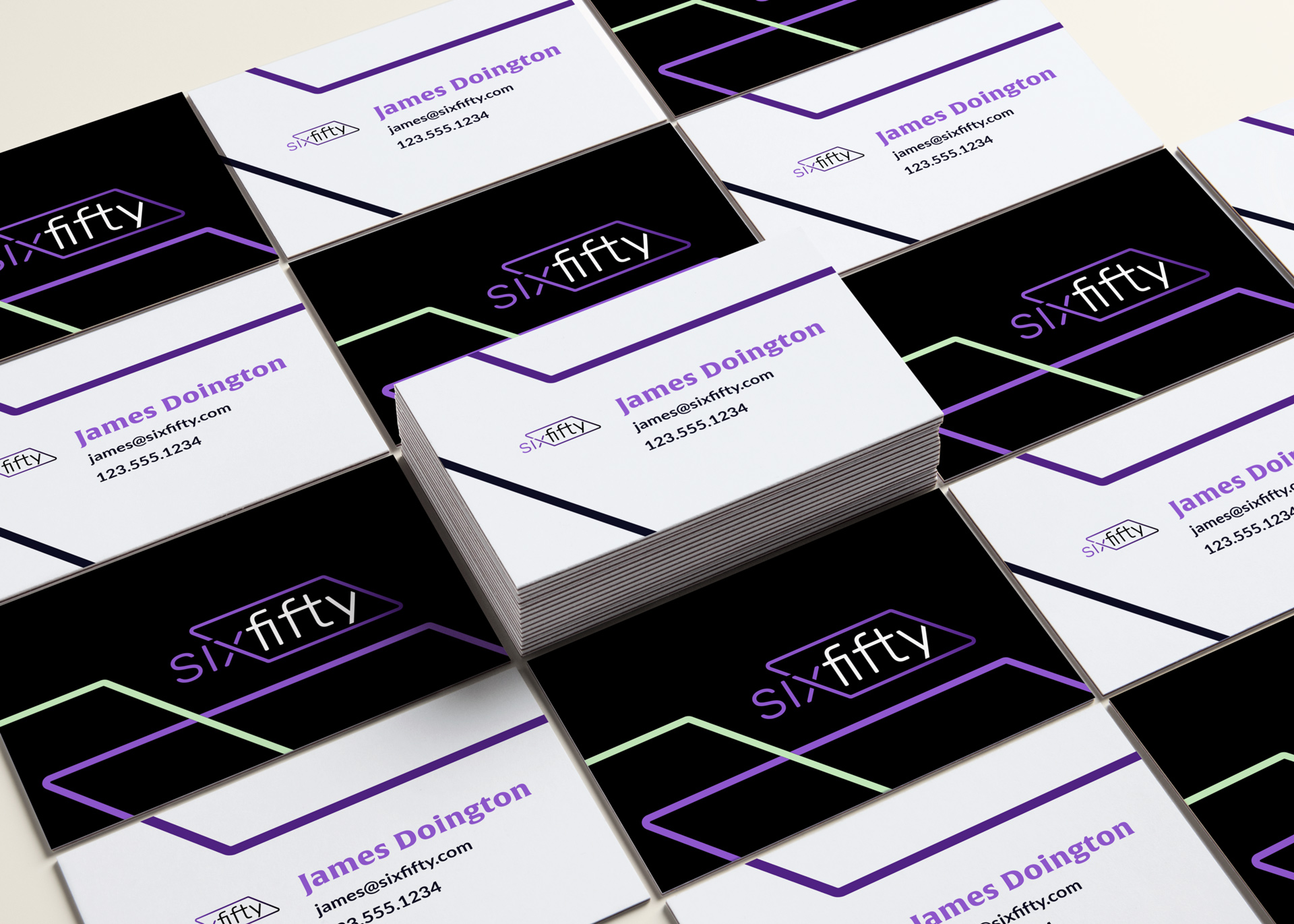
Being known as a technology company was at utmost importance for future growth, so Bluetext developed a sleek and modern logo and brand identity that steered clear of any associations with formal and stuffy law firms. Vibrant purple was selected as the primary brand color, then accented with seafoam green and a variety of mono and duo-tone gradients. The parallelogram brand accent from the logo has been used in multiple ways across marketing collateral and website designs to draw attention to key headlines or imagery.


A Resource Ready Website
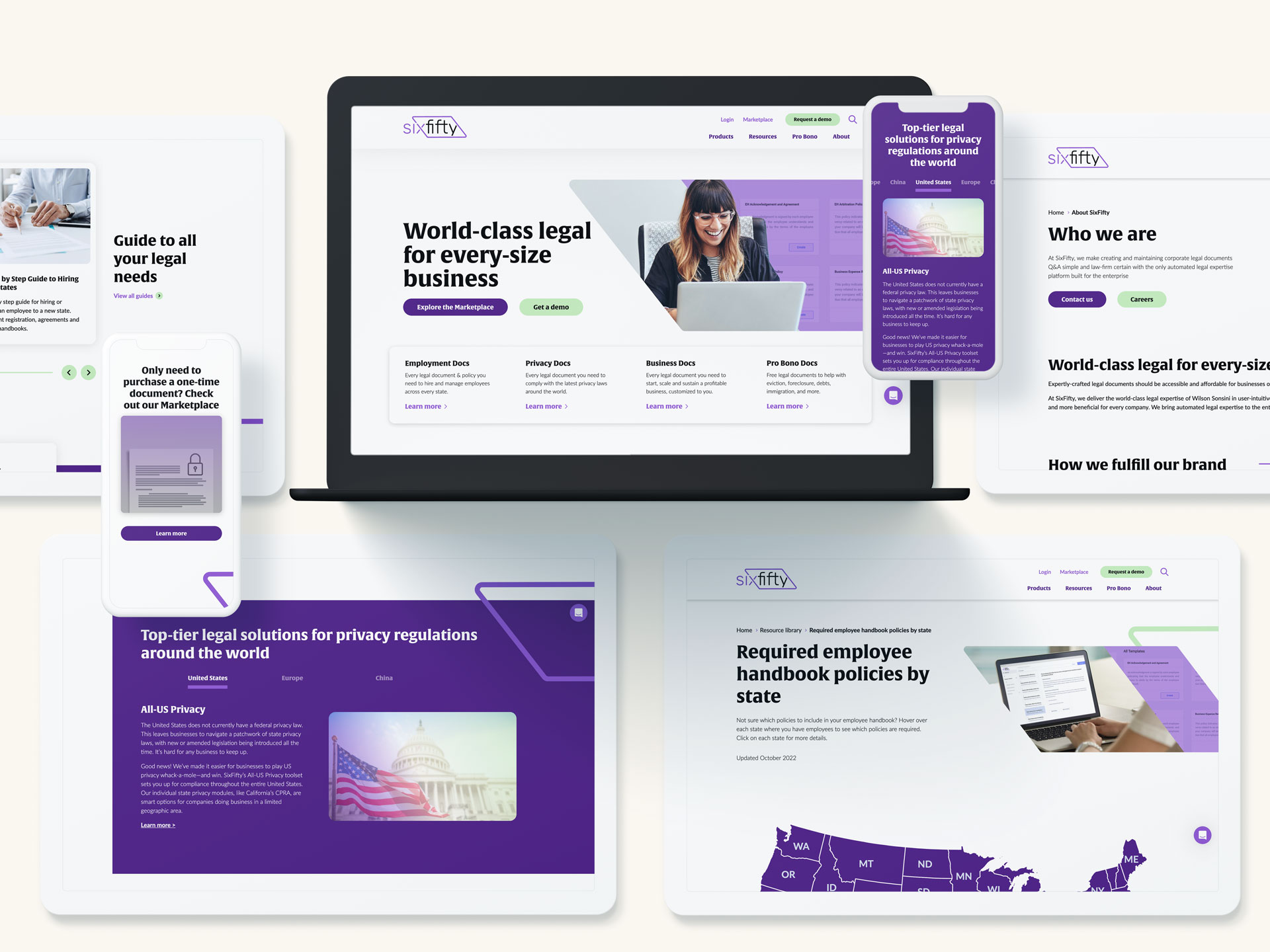
With SixFifty's growing product line and popular webinar series, the new website needed to create a seamless user experience. A robust resource library was designed to curate featured guides, webinars and interactive assessments for a variety of legal topics. A custom Document Marketplace was designed and built to integrate directly with Stripe payment portal for a hassle-free checkout experience for business documents.

Ready for Show
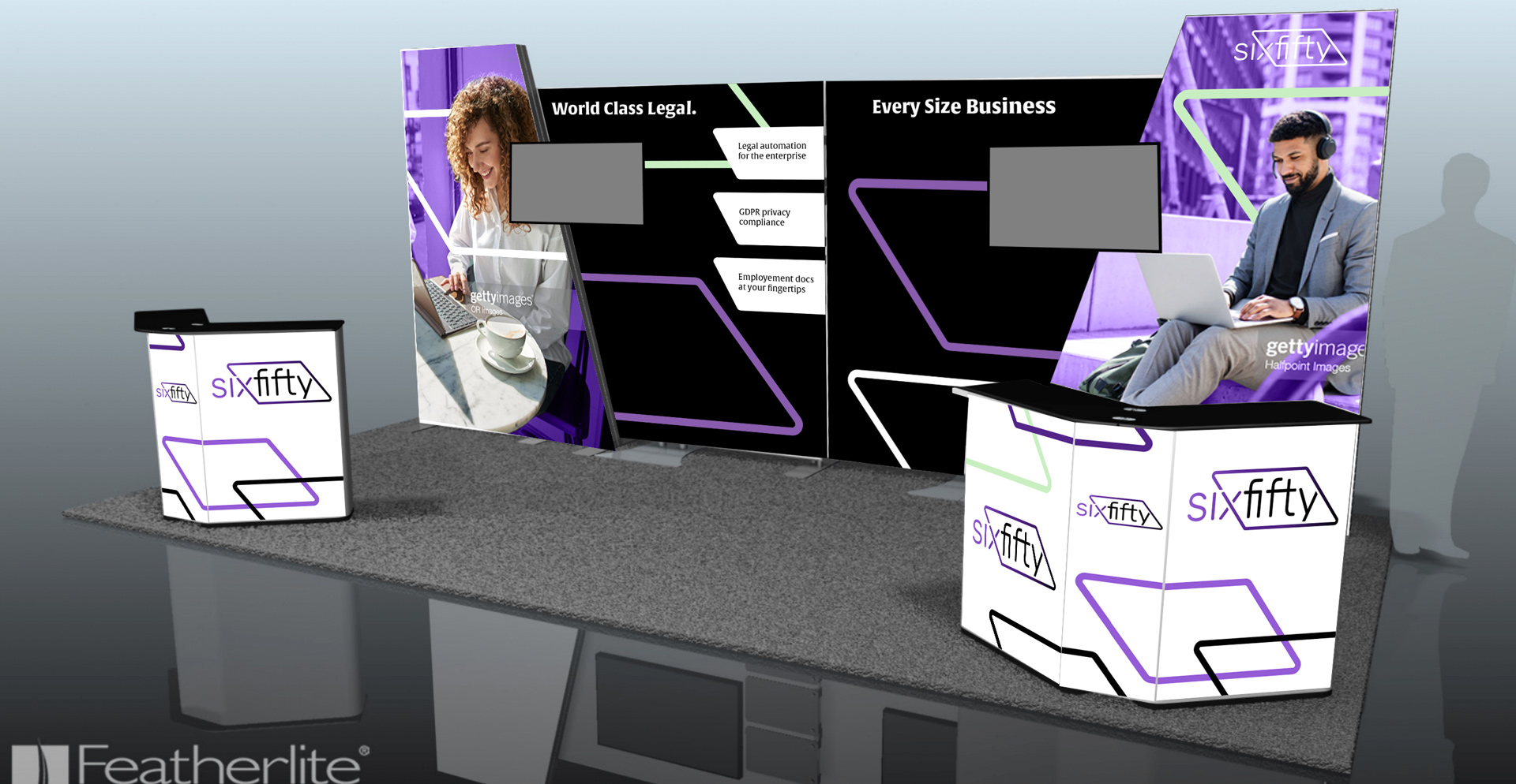
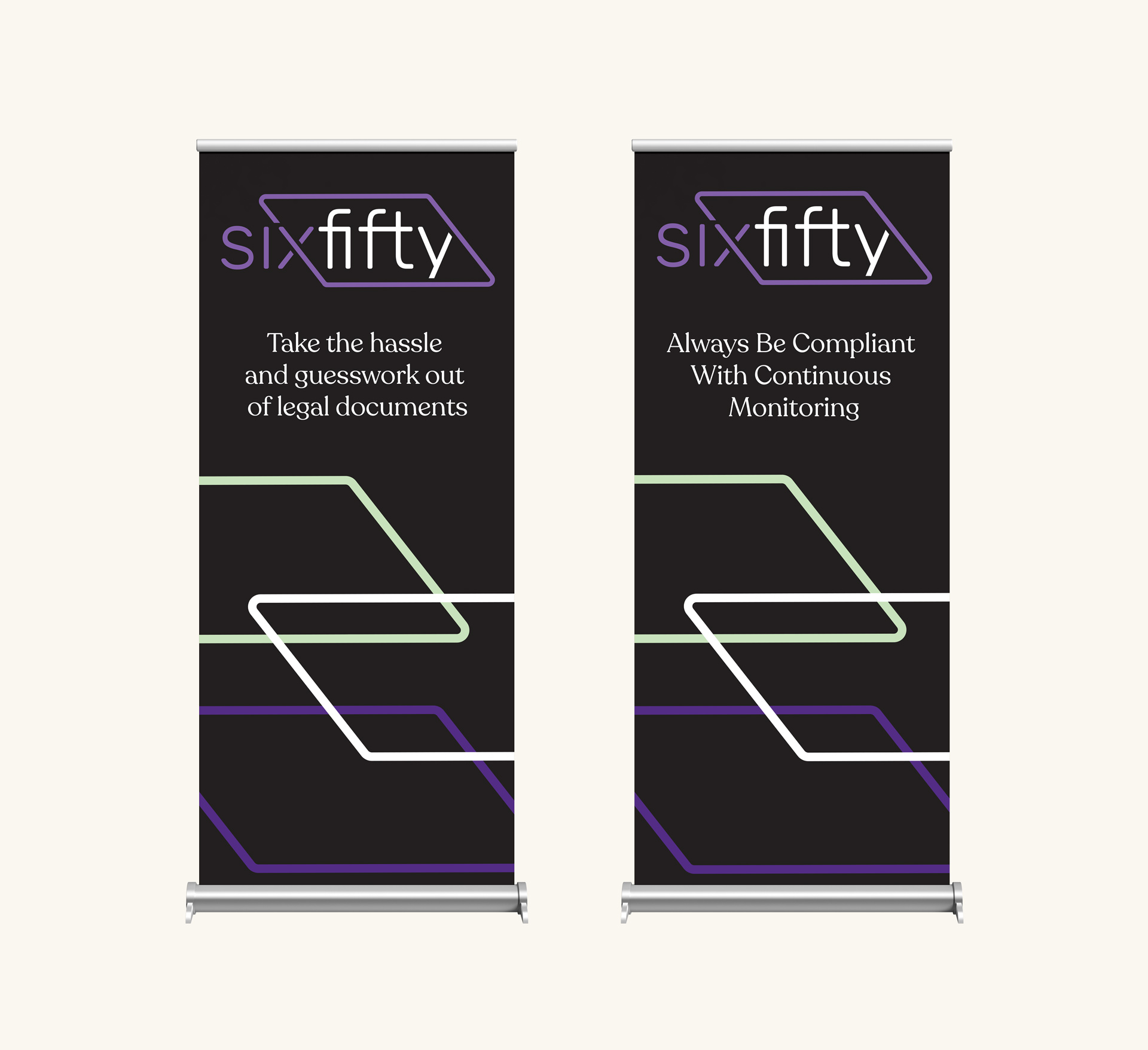
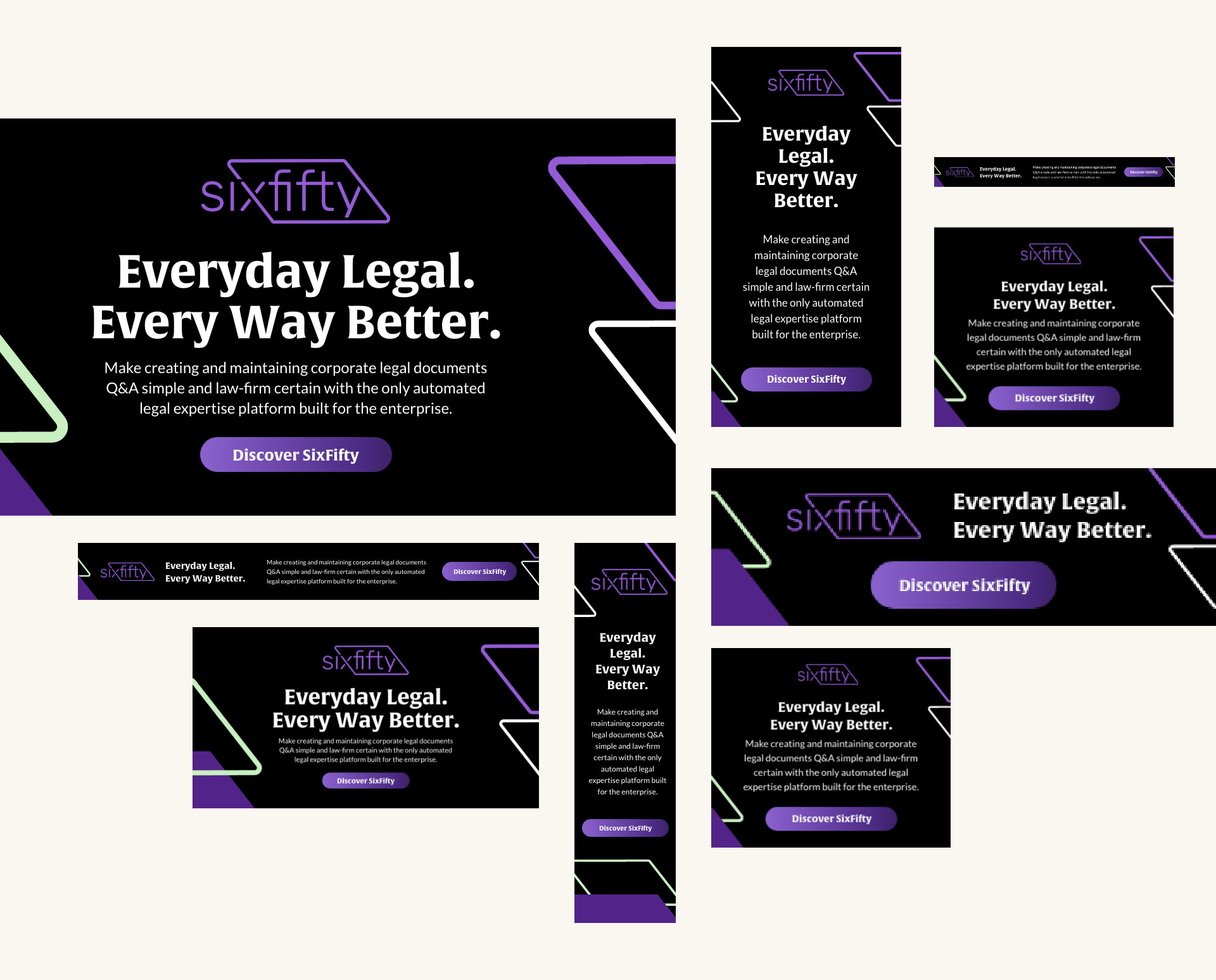
Geared with new branding and website, SixFifty was ready to take the stage at their upcoming trade show season. Bluetext designed a custom trade show booth that allowed for interchangeable messaging on boards that could be used separately or together. Bluetext also designed a series of static and animated display ads to be used for digital campaigns.
