
Rebranding CommerceHub & ChannelAdvisor into Rithum
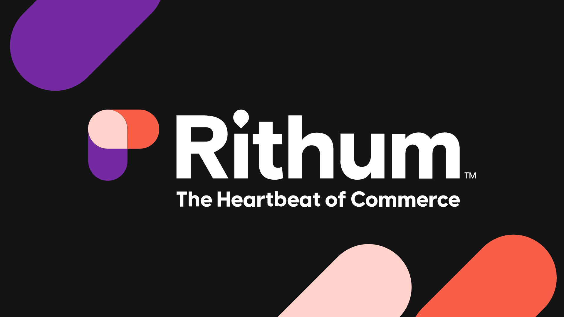
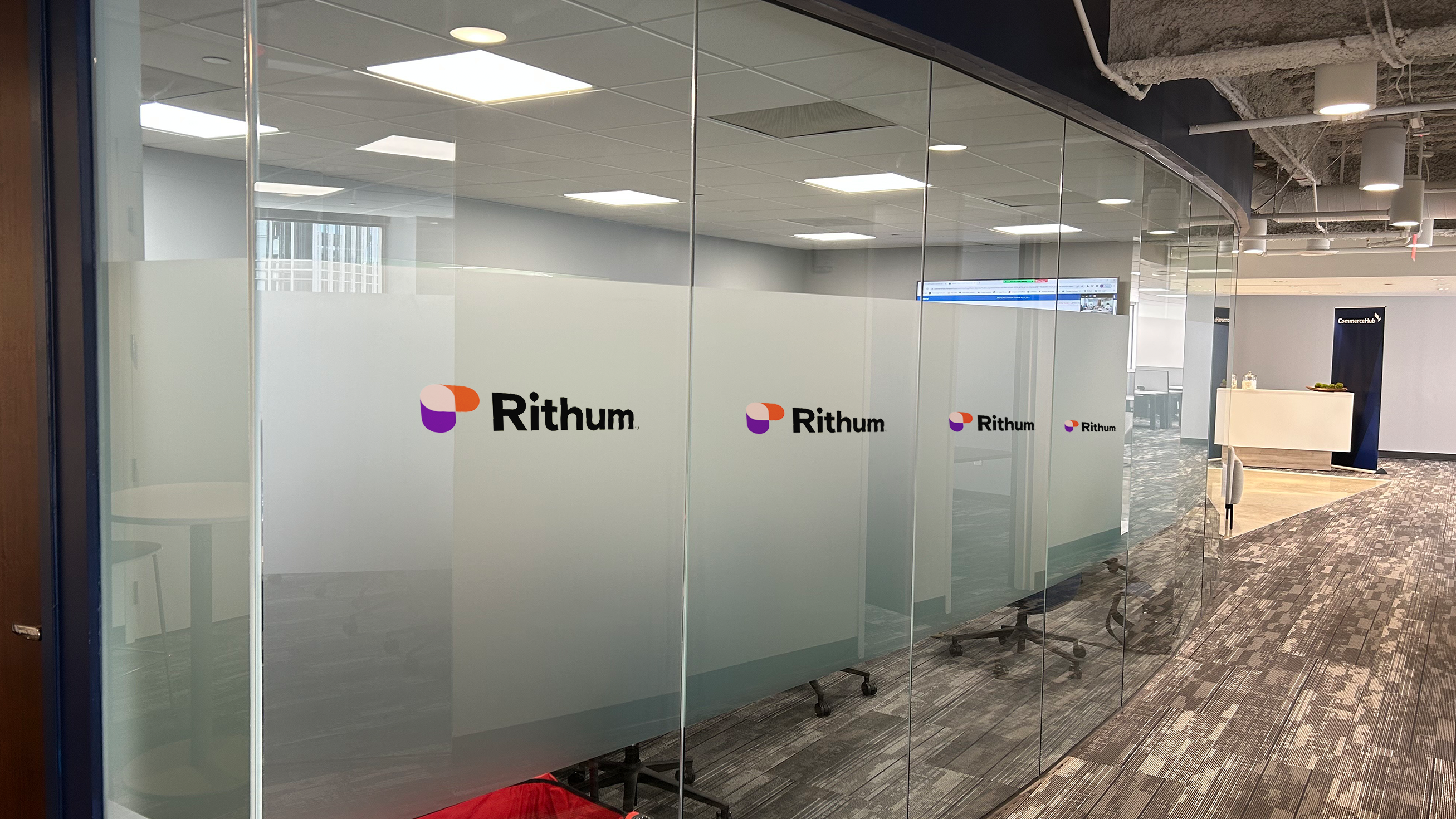
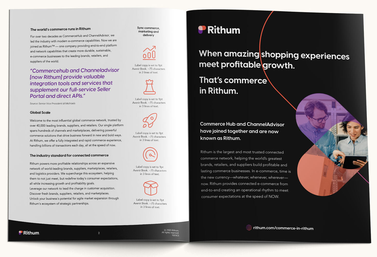
Bluetext established a new corporate visual identity supported by a new logo, color palette, typography, and brand elements that tell the broader brand story. The new logo symbolizes the convergence of brands and retailers through Rithum™, where a stadium shape represents brands and retailers coming together to visualize how the world’s commerce runs in Rithum.




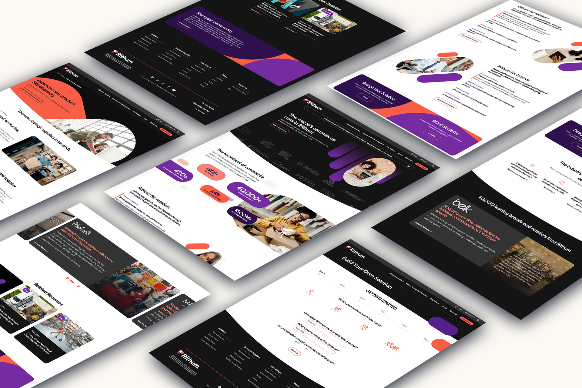
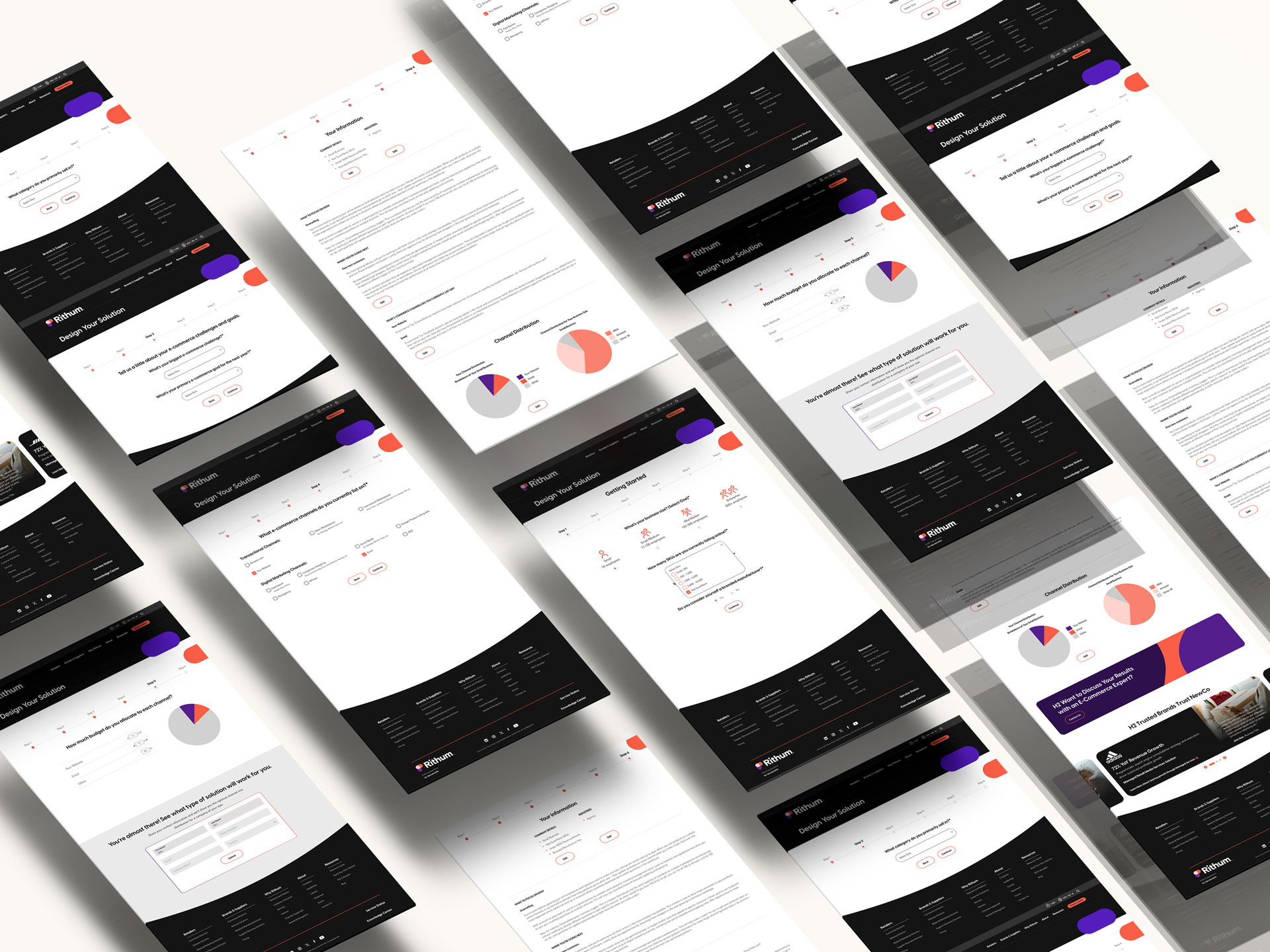
Website Design & Development with Elegant Motion, Interactivity, and Multilingual Configuration.
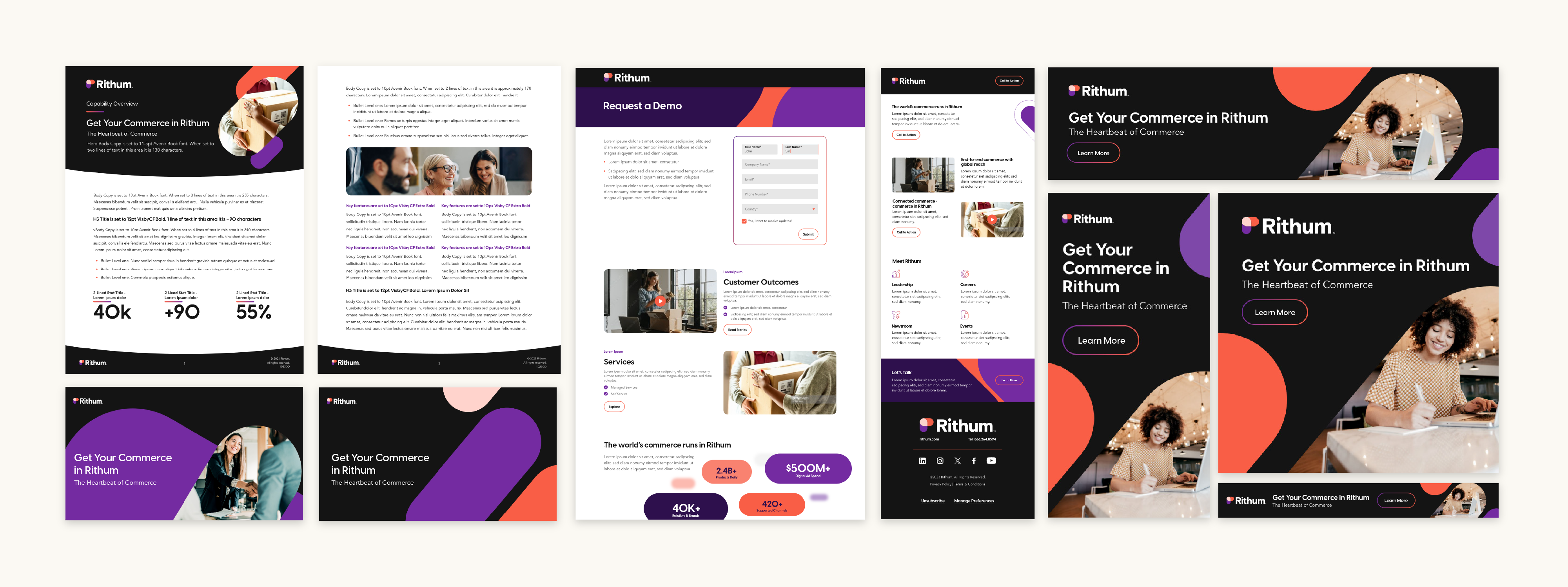
After developing the brand, Bluetext crafted a website information architecture that combined content from the existing websites and addressed both key audiences of retailers and brands.
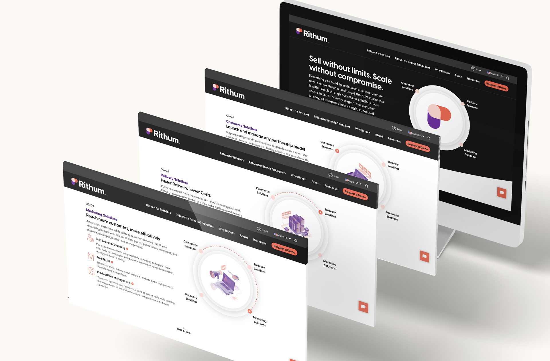
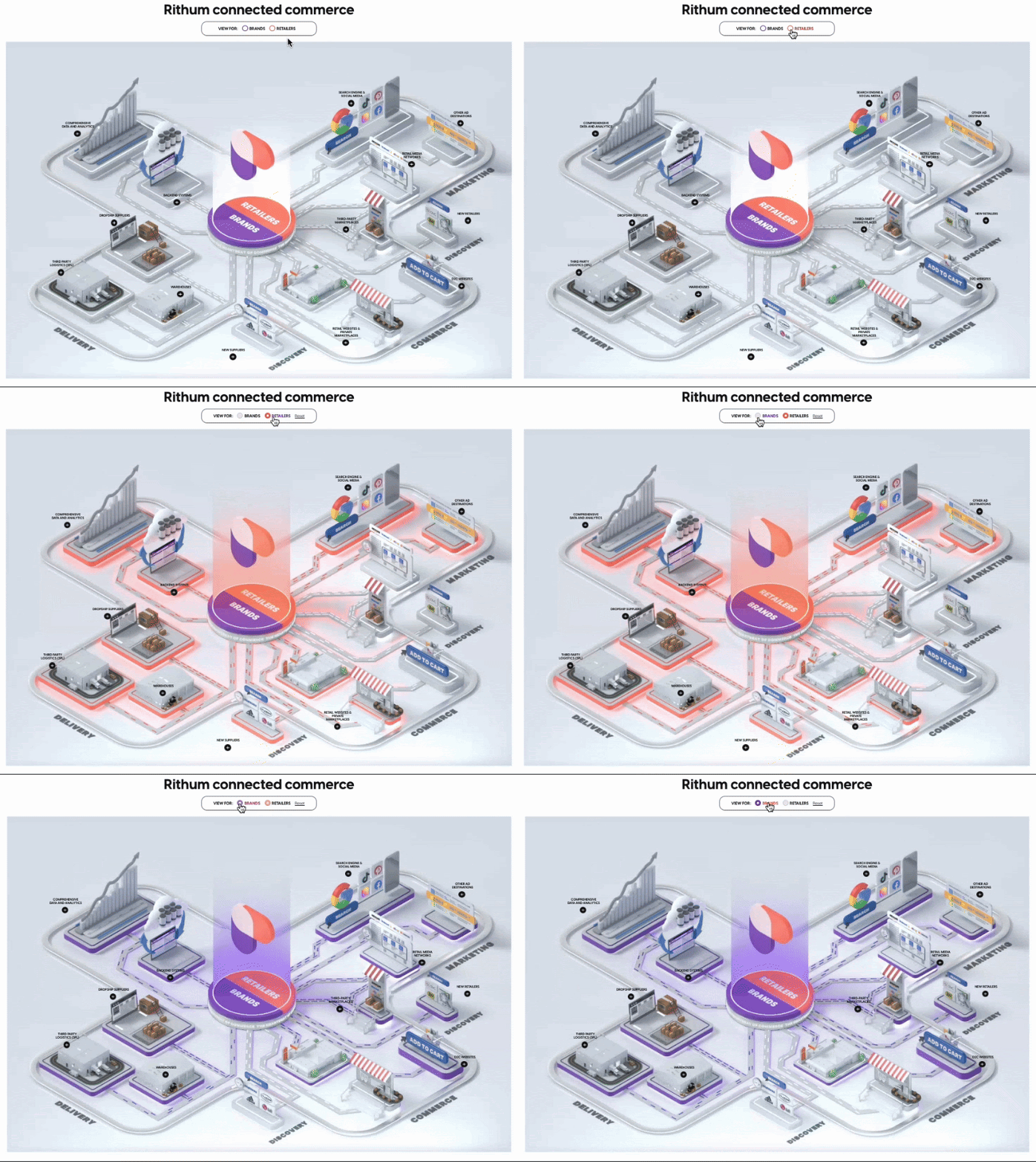
The website design leverages the primary black with pops of bright color in various applications of the “stadium” shape. All templates on the site utilize subtle motion to engage the eye without distracting. Users can interact with areas of the site by ‘designing their own solution’ and exploring the ‘ecosystem’ of solutions.
The site was built in five languages through WPML and is optimized for both technical SEO and a fresh keyword strategy.

Rithum GTM Campaign Comes to Life
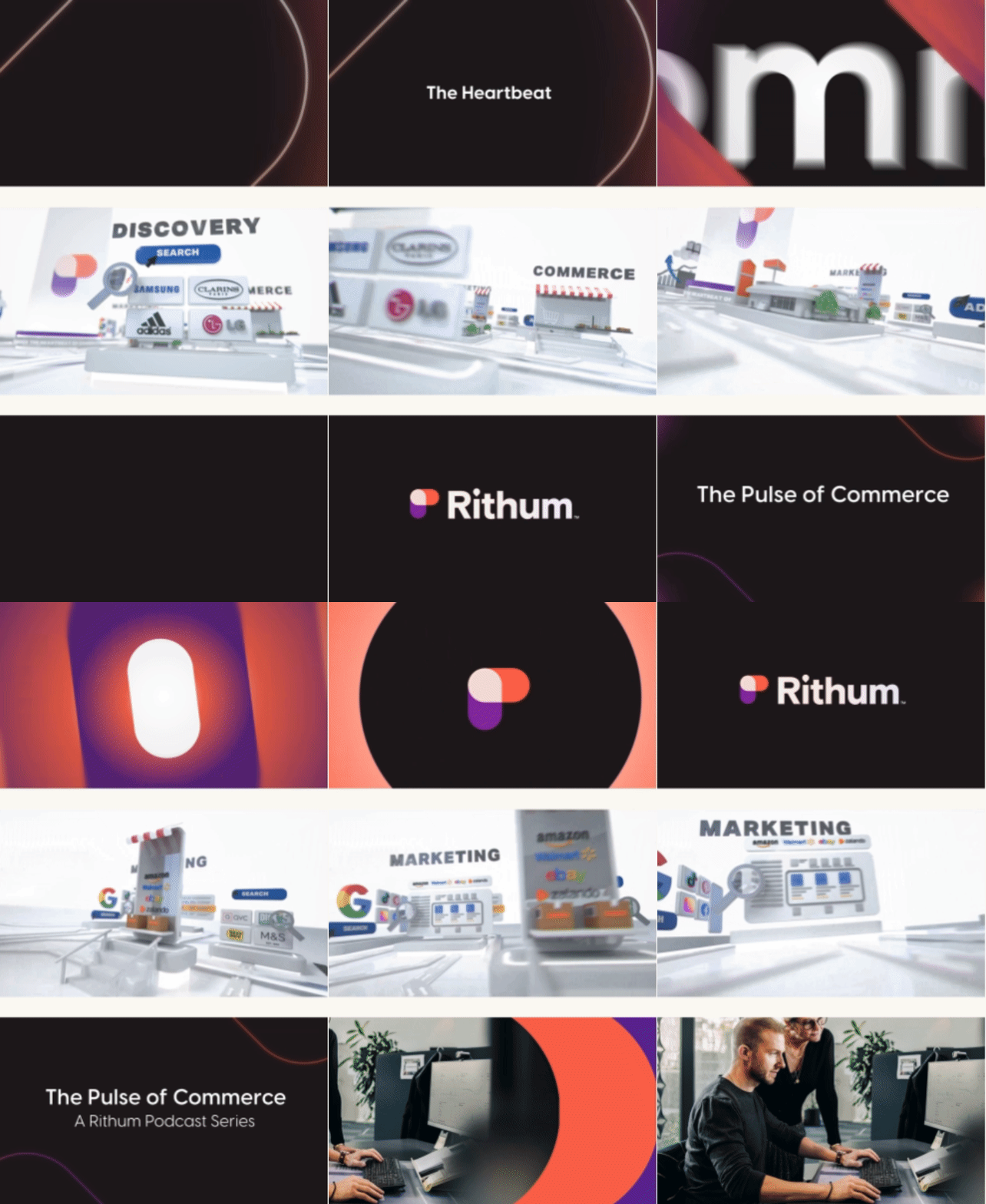
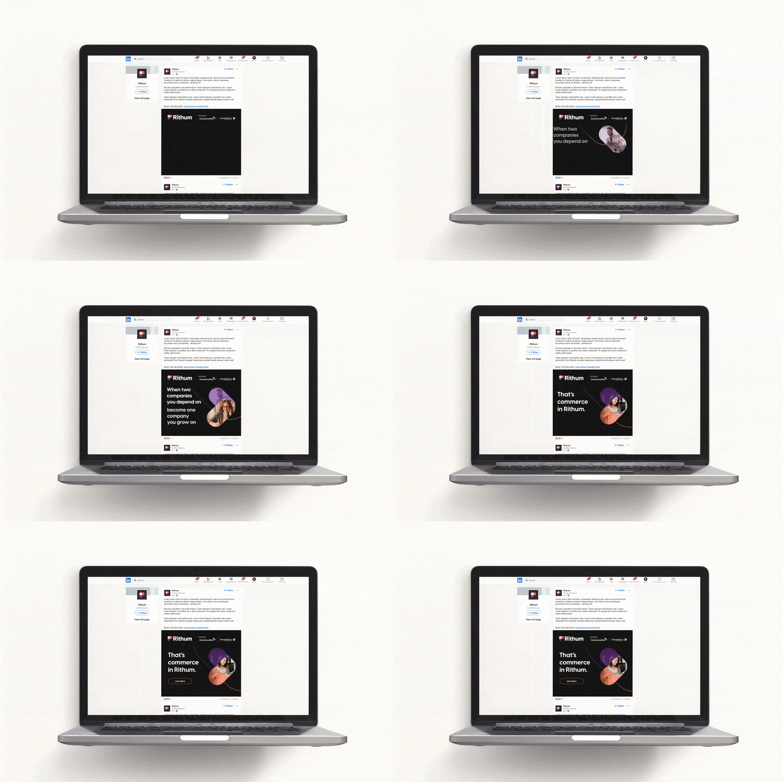
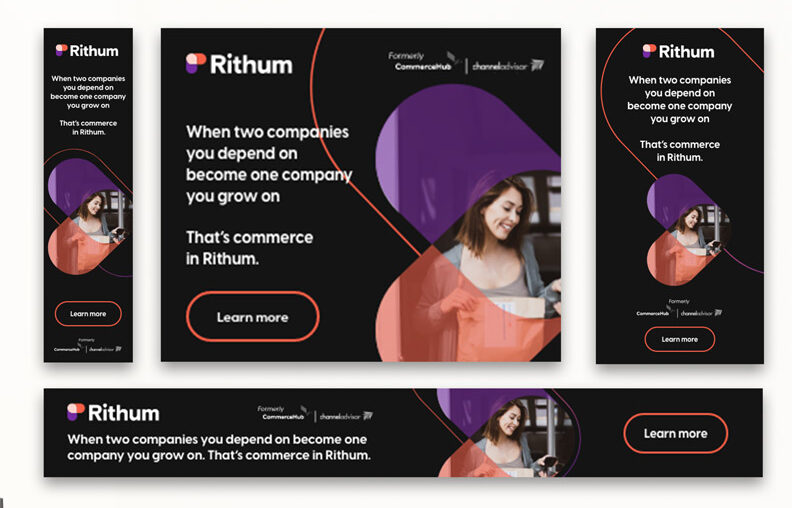
With the launch of the brand and website, a brand announcements campaign was critical to build awareness. The concept of “When X meets Y…” was developed to express the value of two companies coming together. The concept was visually paired with the two logo “stadium” shapes animating to come together, or meeting, forming the final logo icon. The concept is easily scalable to specific audiences and solutions.

Coordinated Digital Orchestration to Improve Marketing Results
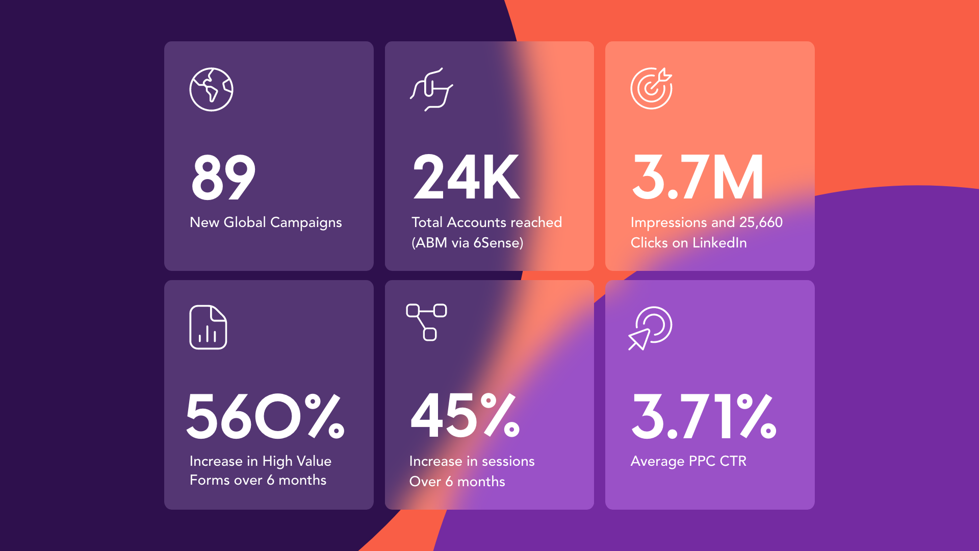
Bluetext took full control of paid media and SEO months prior to the brand launch, allowing us to complete a full analysis and long-term strategy that covered the interim period prior to launch and a post-launch plan for awareness and demand generation tactics, carefully coordinated with PR efforts and high-visibility events.
