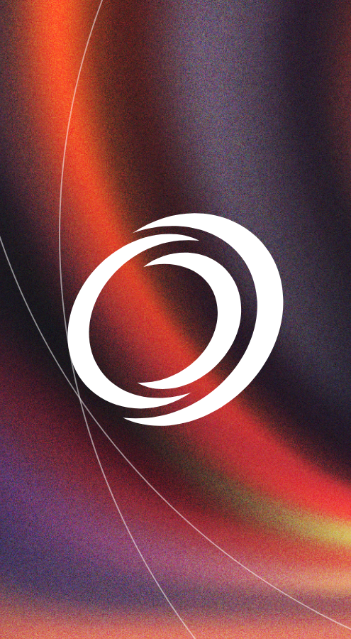
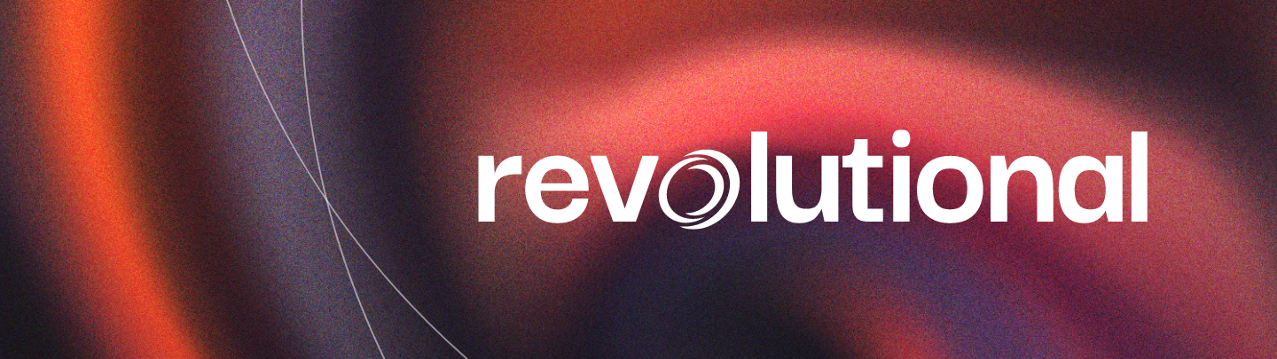

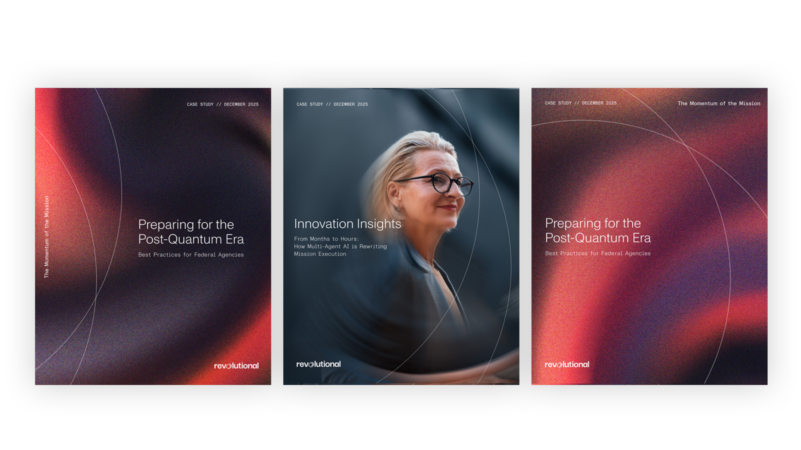
A Name That Says Everything: Introducing Revolutional
Finding the right name for a merged company is one of the harder creative challenges there is. It has to work for the people inside the organization just as much as it does for clients and partners on the outside. Revolutional did both. It captures the energy of two teams coming together with greater speed, greater capability, and a shared commitment to driving results for government missions. The logo was built to match. Clean and confident, it projects the authority of an established player while carrying the forward momentum the new name implies. And anchoring it all is "The Momentum of the Mission," a line that does exactly what good brand messaging should: it says who Revolutional is, what they care about, and why it matters, without wasting a word.

A Website as Dynamic as the Brand
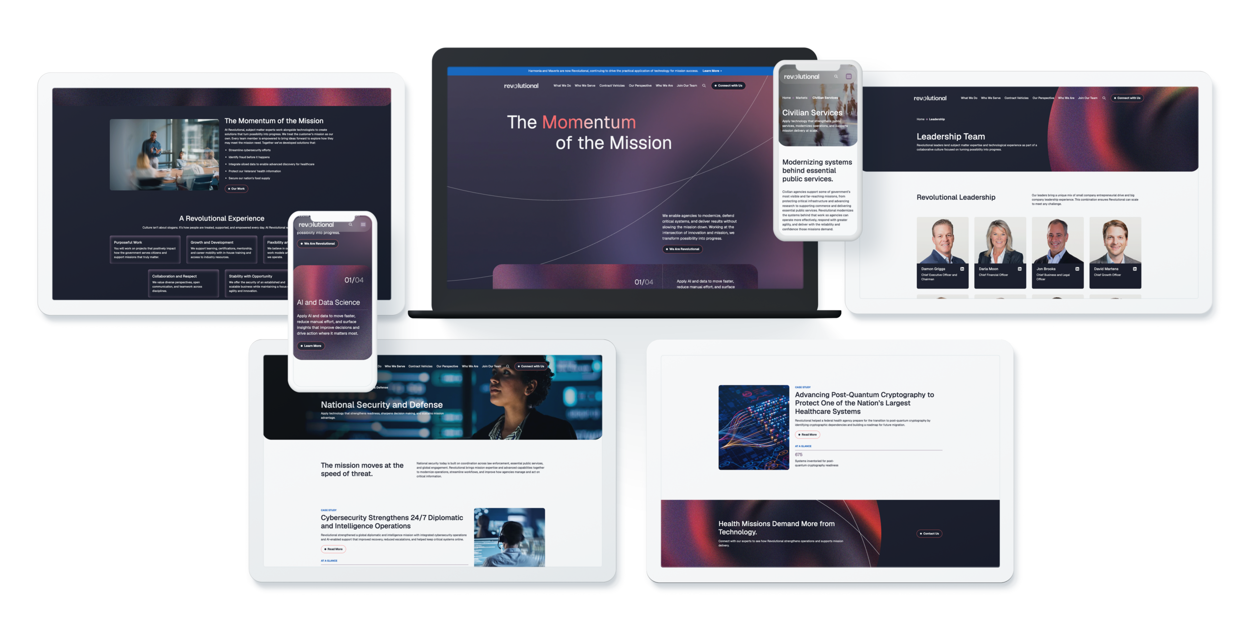
The Revolutional website was designed to feel different from the moment you land on it. In a market where government technology companies often default to safe, static layouts, we took a different approach. The design is bold and structured, built to communicate credibility and capability to a sophisticated federal audience. But what sets it apart is the motion. We introduced subtle animation throughout the experience, not as decoration, but as a deliberate design choice to keep users engaged and guide them through the content. Elements come to life as you scroll, transitions feel intentional, and the overall effect is a site that feels current and considered. It reflects exactly what Revolutional is: a company built on momentum, and a brand that moves.
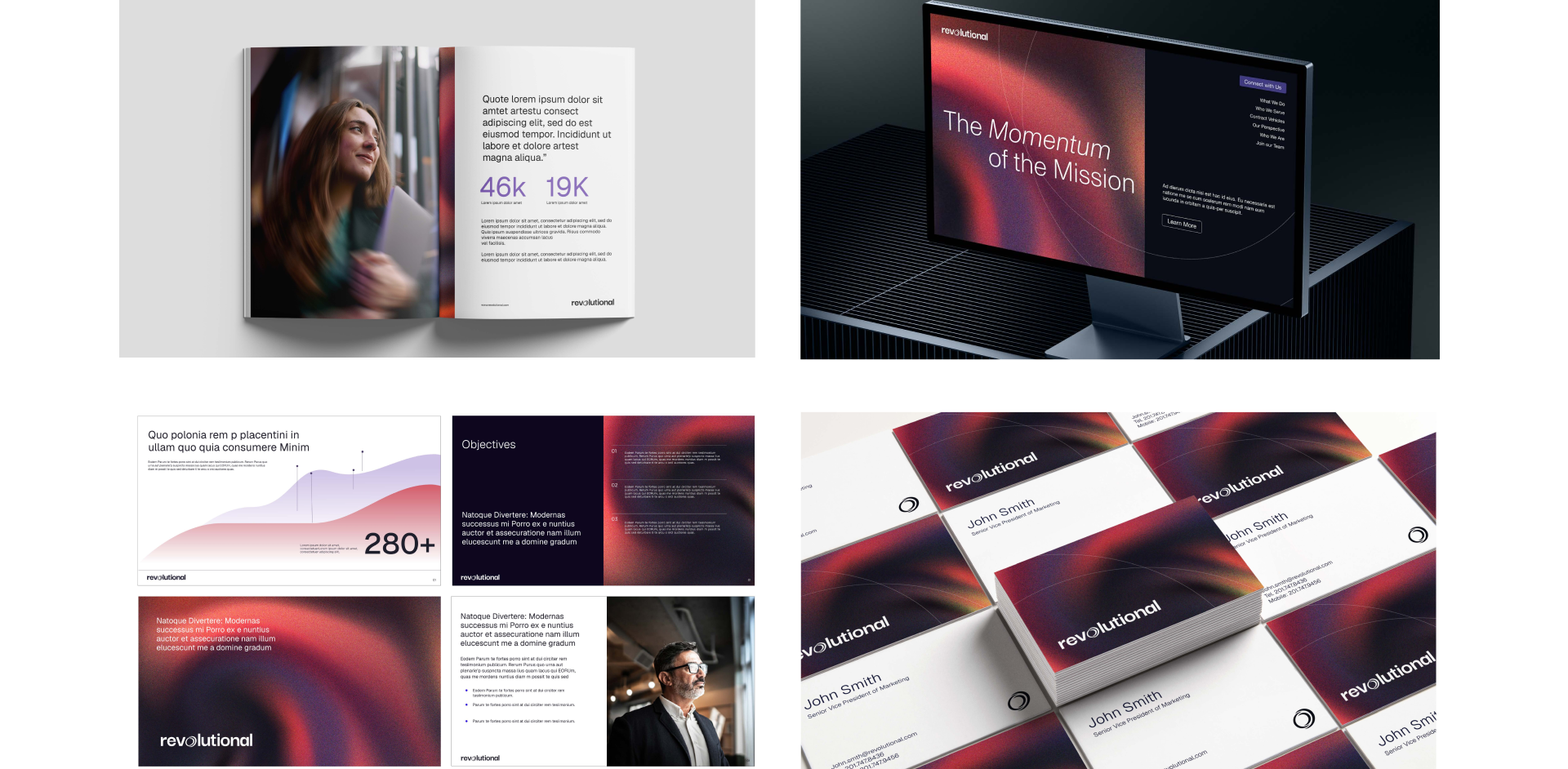
An Identity System Built Around Momentum
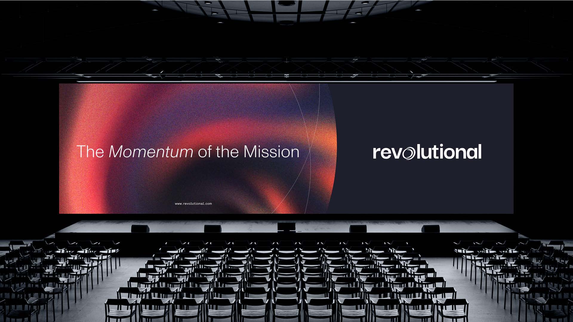
"The Momentum of the Mission" isn't just a tagline. It's a design brief. Every element of the Revolutional visual identity was developed with that idea as the filter. The color palette is grounded and authoritative, the kind of palette that reads immediately as serious without feeling heavy. Typography is strong and direct, reinforcing the sense that this is a company that gets things done. Graphic elements carry a sense of forward motion throughout, pulling the eye and creating energy across every execution. Together, the system gives Revolutional the tools to show up consistently and compellingly across proposals, presentations, digital channels, and beyond. It's an identity built to scale as the company does, and to remind everyone who sees it that Revolutional is always moving forward.
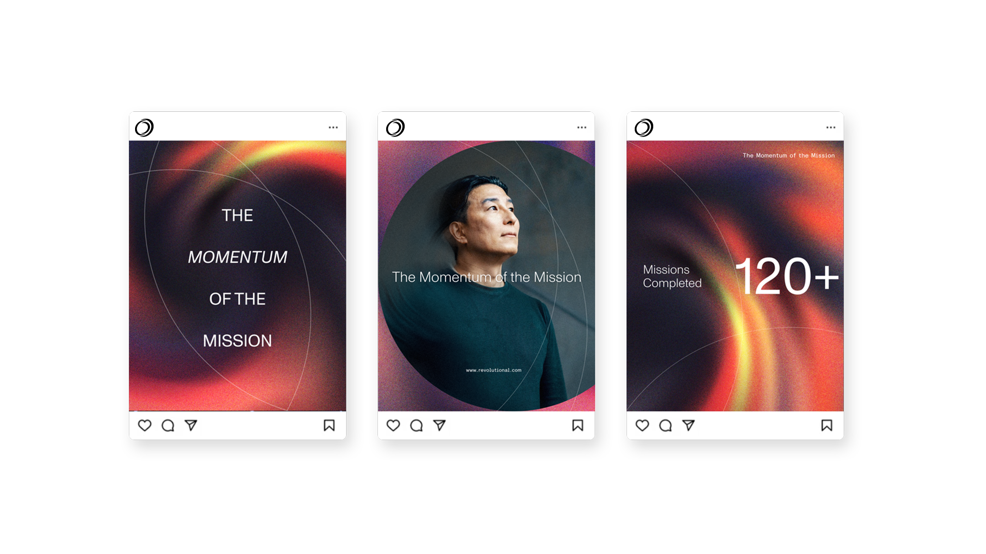
The Brand in Motion
The brand launch video was built to bring "The Momentum of the Mission" off the page and into something you can feel. We took the full visual identity and pushed it into motion, using the color system, typography, and graphic language of the brand to create a film that captures what Revolutional is and where it's going. It's not a company overview. It's a statement. For internal audiences, it gave the combined Harmonia and Maveris teams something to rally around, a shared vision made visible. For the market, it announced that something new had arrived and made clear that Revolutional meant business. The result is a video that works as a launch moment, a sales tool, and a lasting piece of the brand story.