
Cyber Branding & CVI
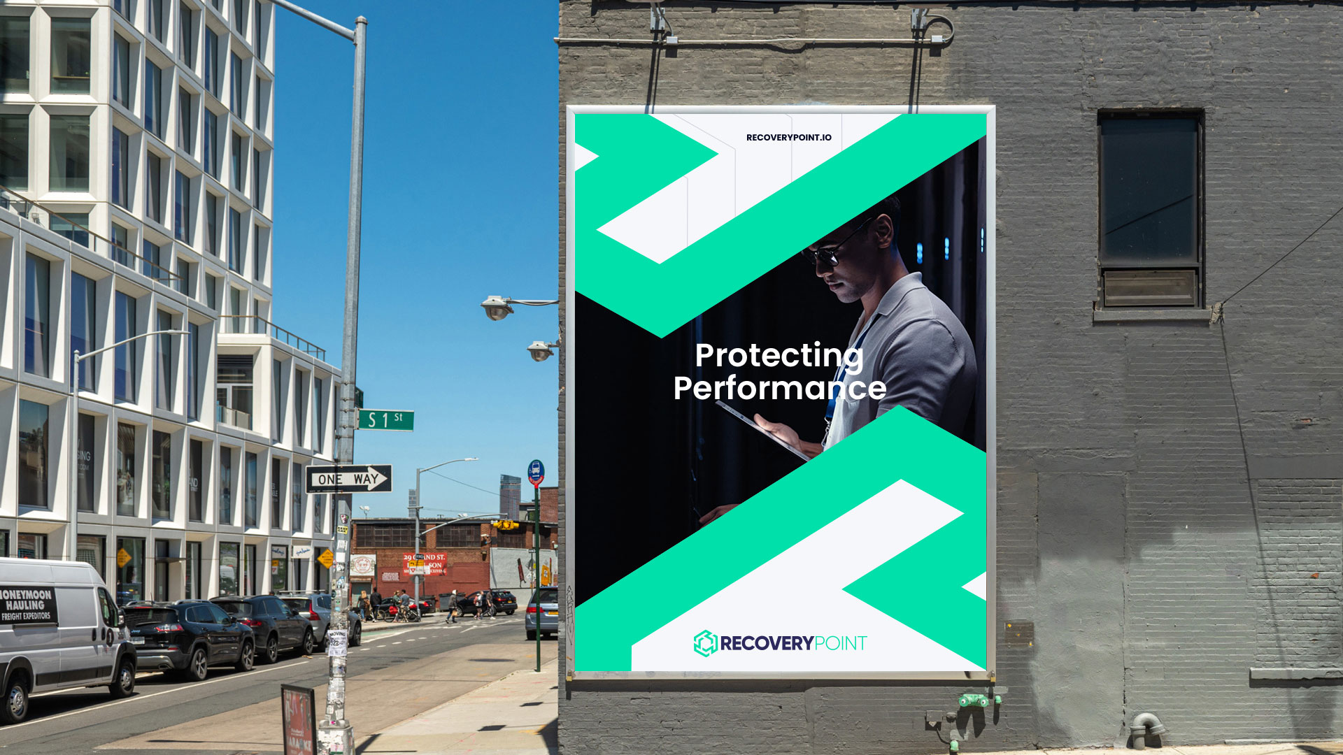
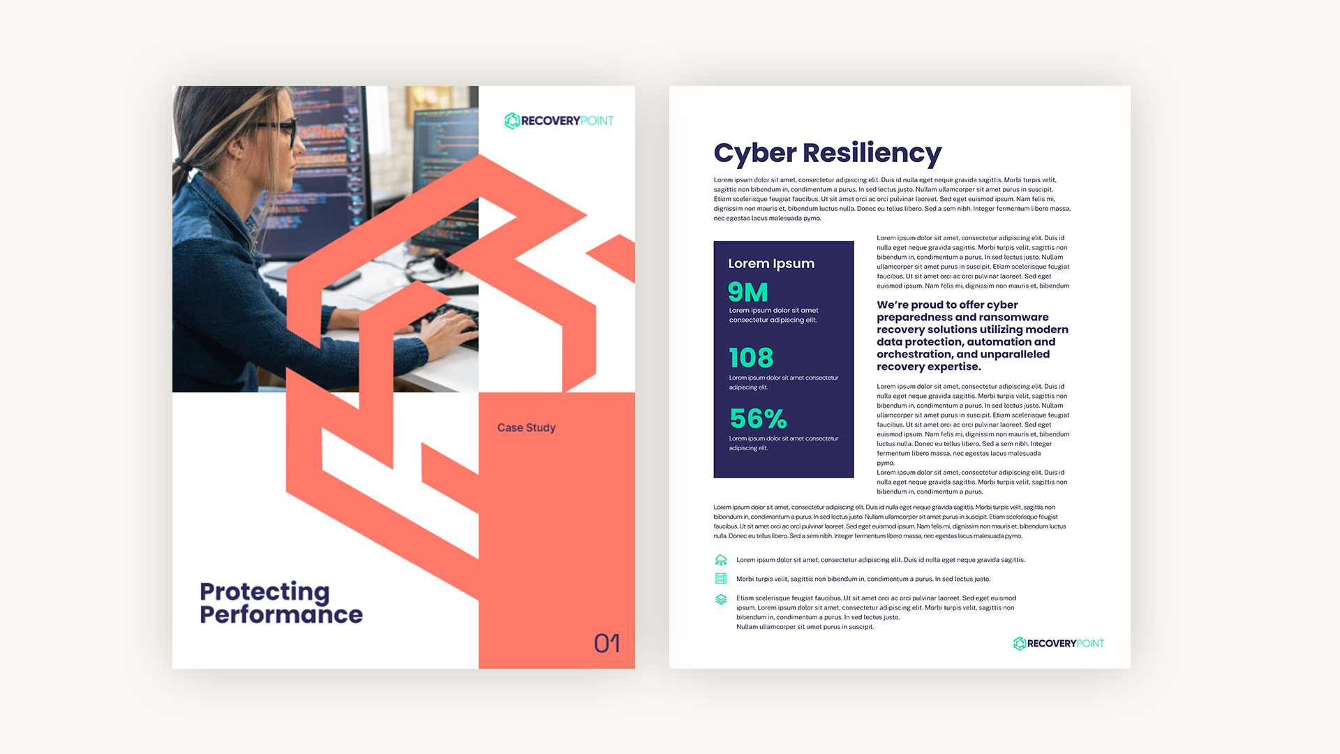
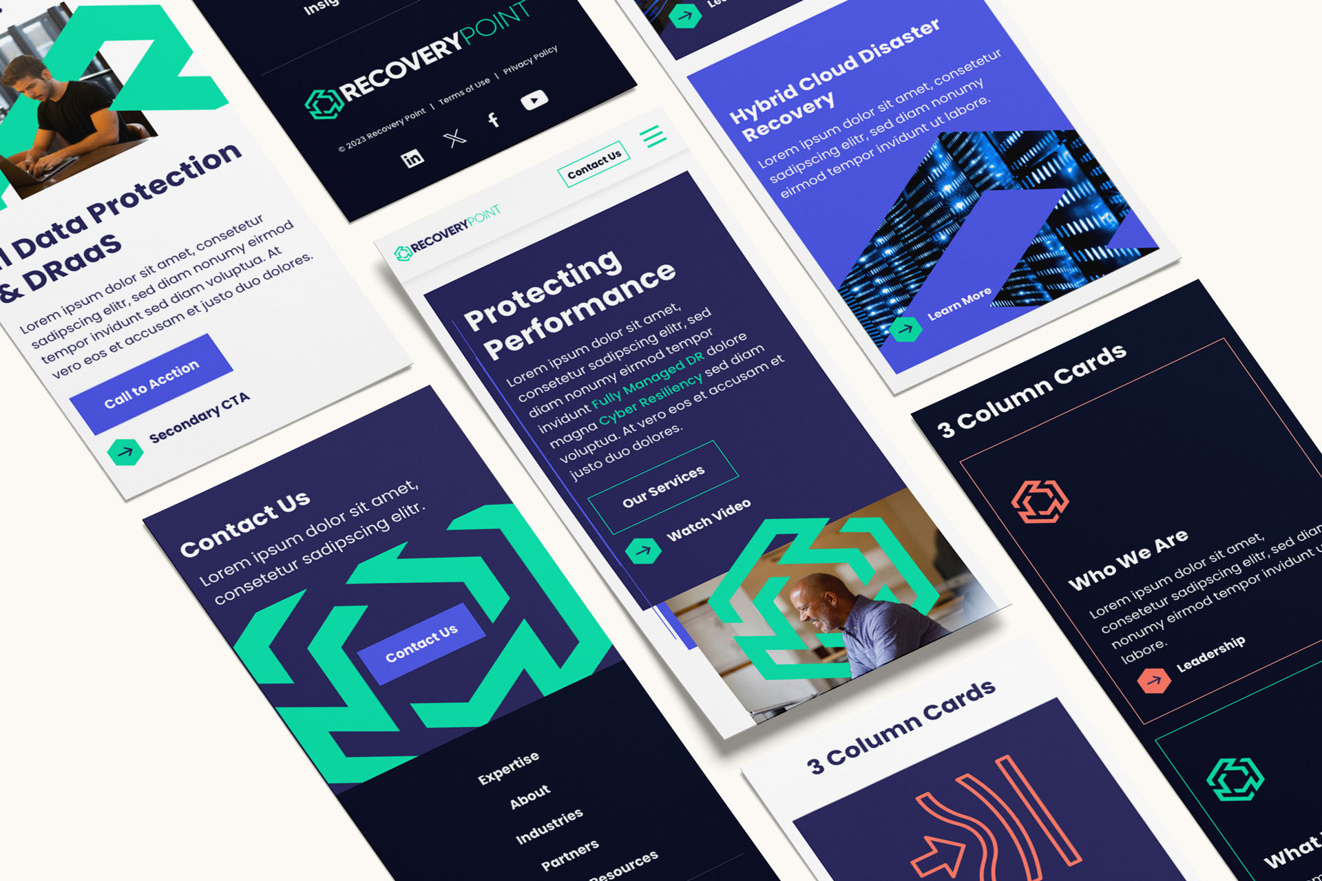
In order to achieve their brand and marketing goals, Recovery Point needed a visual identity refresh to tell the right story to the right audiences. It was crucial that their industry expertise and competence through experience was felt in the brand in a design that is both clean and streamlined without losing the approachability of bright and bold color. Once the logo icon was established, it became a clear and unique opportunity to leverage the shape as a custom brand element in various applications such as masks, overlays and negative space.


Cyber Logo Design
The Recovery Point brand evolution was nothing short of thorough, and the keystone element of that endeavor was the creation of the new logo. Several iterations of ideation and exploration around shapes, typeface, weight and color landed us at the new Recovery Point logo including a brand new icon and type. The transition from a wordmark to a custom icon was the key that unlocked much of the creation of the visual brand down the line and created the foundational element of the CVI.


Responsive Website Design & Development
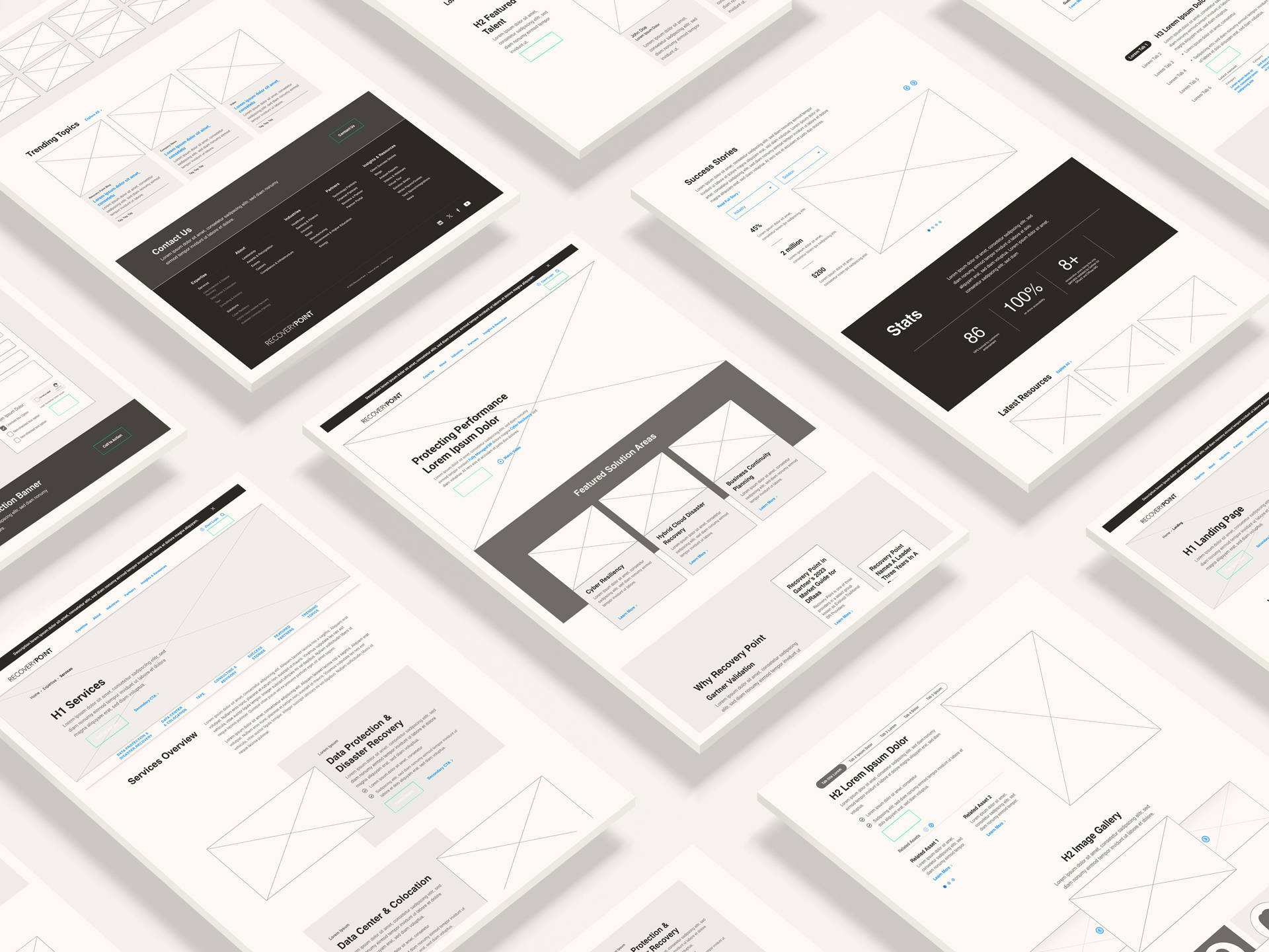
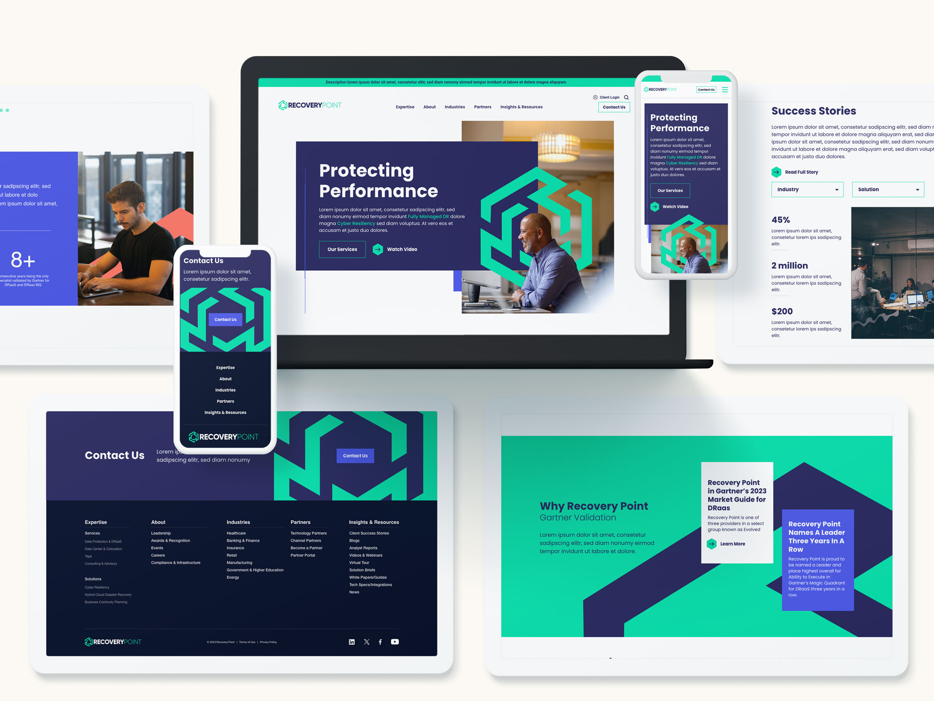
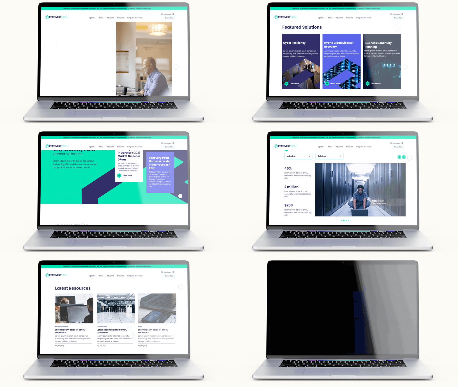
With the new CVI in place, it was time to tackle the website — a crucial touchpoint for all audiences looking to learn about Recovery Point. Leveraging a carefully crafted content strategy, we created wireframes and color comps to design the flow of content and user journeys from page to page. Our team thoughtfully planned requirements around functionality and swiftly moved into development to bring our designs to life. Our team engineered a visually stunning and functional website that continues to tell the brand story through messaging, design and custom animation.


Strategic Content Planning
The key to an effective website is to strike the balance of placing the right amount of informative content in the right place at the right time of the user journey and doing so in a visually beautiful design that stays true to a consistent brand identity. This is no small feat, and the foundation of it is content strategy. Through a thorough ARM analysis, audit of audiences as well as the competitive landscape in tandem with the client's goals, we established a new information architecture for the site navigation and strategically planned the best use of on page component flow to tell the right story and speak to the right audiences.
