


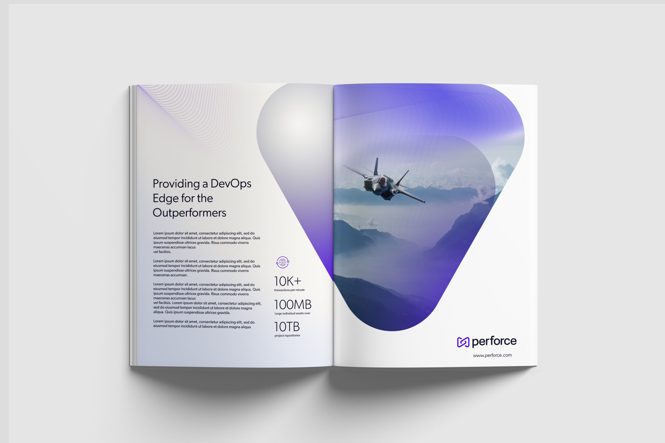
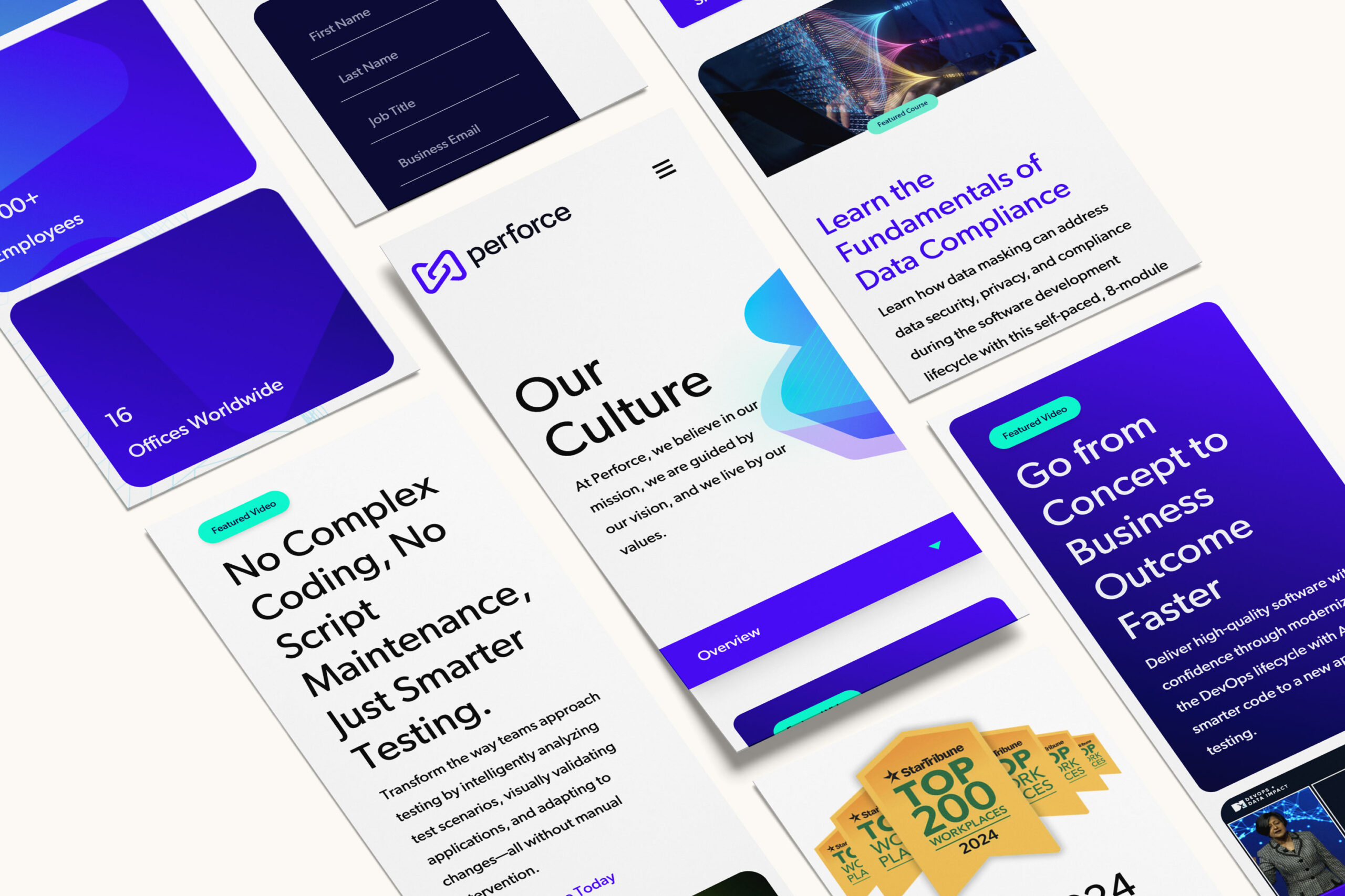
Refined for Relevance: The New Perforce Brand
Bluetext reimagined the Perforce brand to strike the perfect balance between authority and agility. The redesigned logo introduces a streamlined, contemporary mark that reinforces Perforce’s reputation for precision and performance, while the new visual identity introduces a bolder color palette, cleaner typography, and a versatile design system that scales across platforms. Every element of the new brand reflects Perforce’s unique role in helping enterprises manage complexity and move faster.


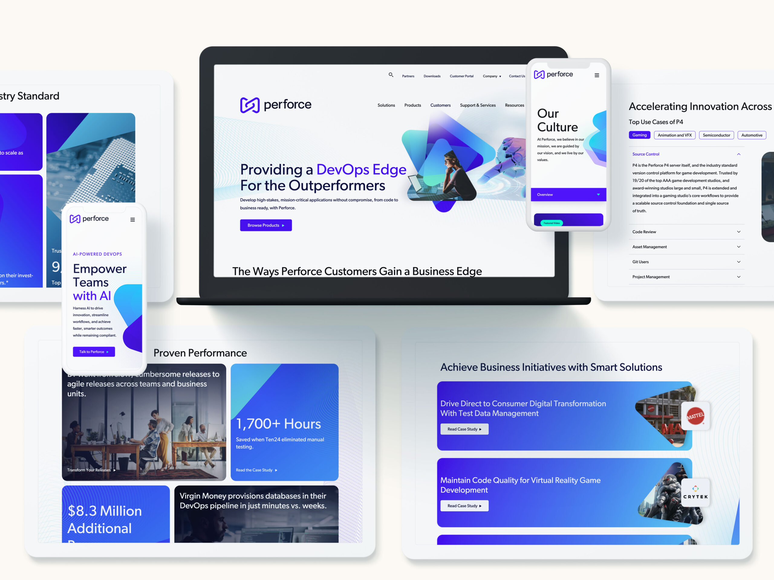
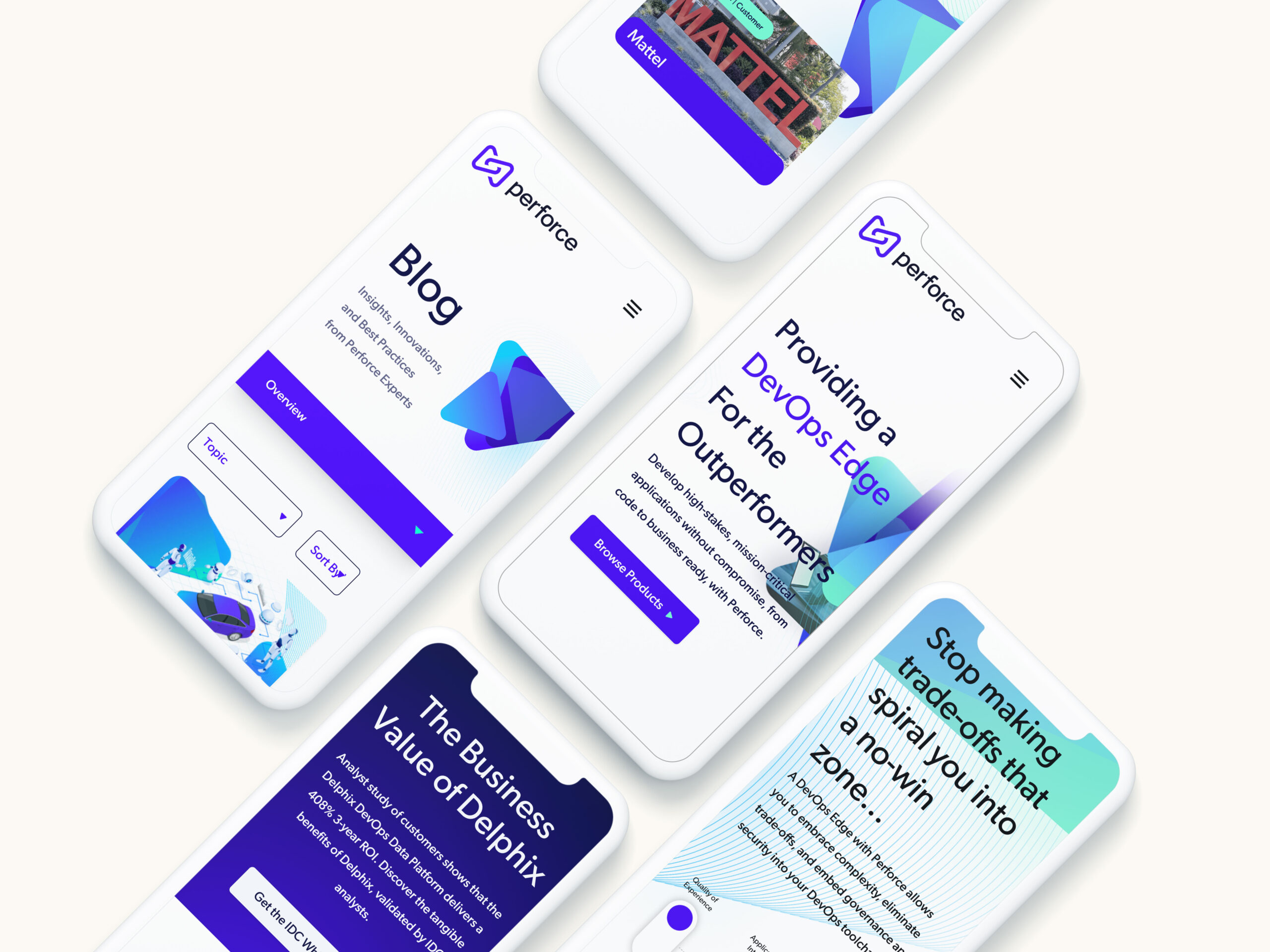
A Website That Speaks to Developers and Decision-Makers
As the digital front door for prospects and partners, the new Perforce website had to deliver clarity, speed, and impact. Bluetext designed a site experience that’s as functional as it is beautiful—built around intuitive navigation, succinct messaging, and high-performance visuals. The site architecture highlights Perforce’s key solutions, while custom animations and design flourishes bring the brand to life. With optimized conversion paths and a flexible CMS, the site is as strategic as it is scalable.
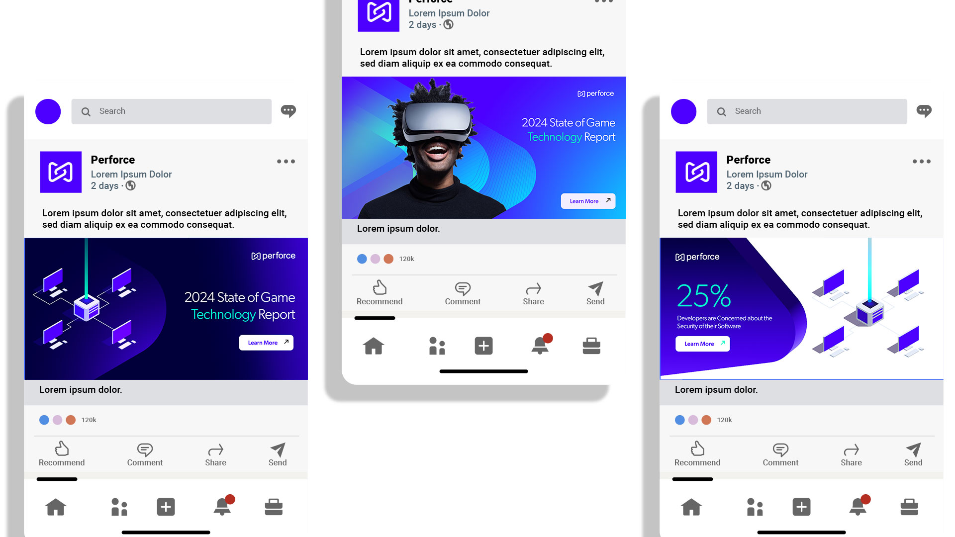
Go to Market, Elevated
Armed with a new brand system, Bluetext developed a comprehensive go-to-market campaign that introduced the new Perforce identity to key audiences via Perforce Intelligence, their platform's new AI layer. This included launch messaging, social and digital assets, campaign creative, and sales enablement collateral designed to energize internal teams and engage external stakeholders. The campaign helped align Perforce’s brand promise with its business goals—amplifying awareness, accelerating adoption, and setting the stage for long-term growth.