
Branded Website Animations
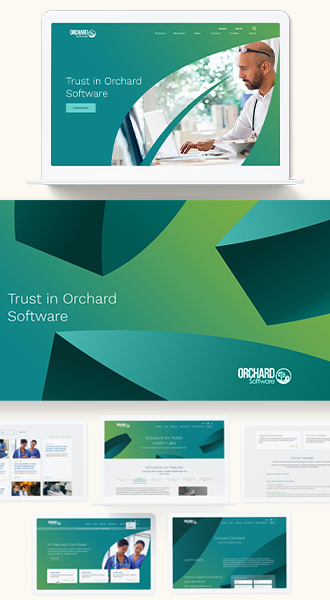
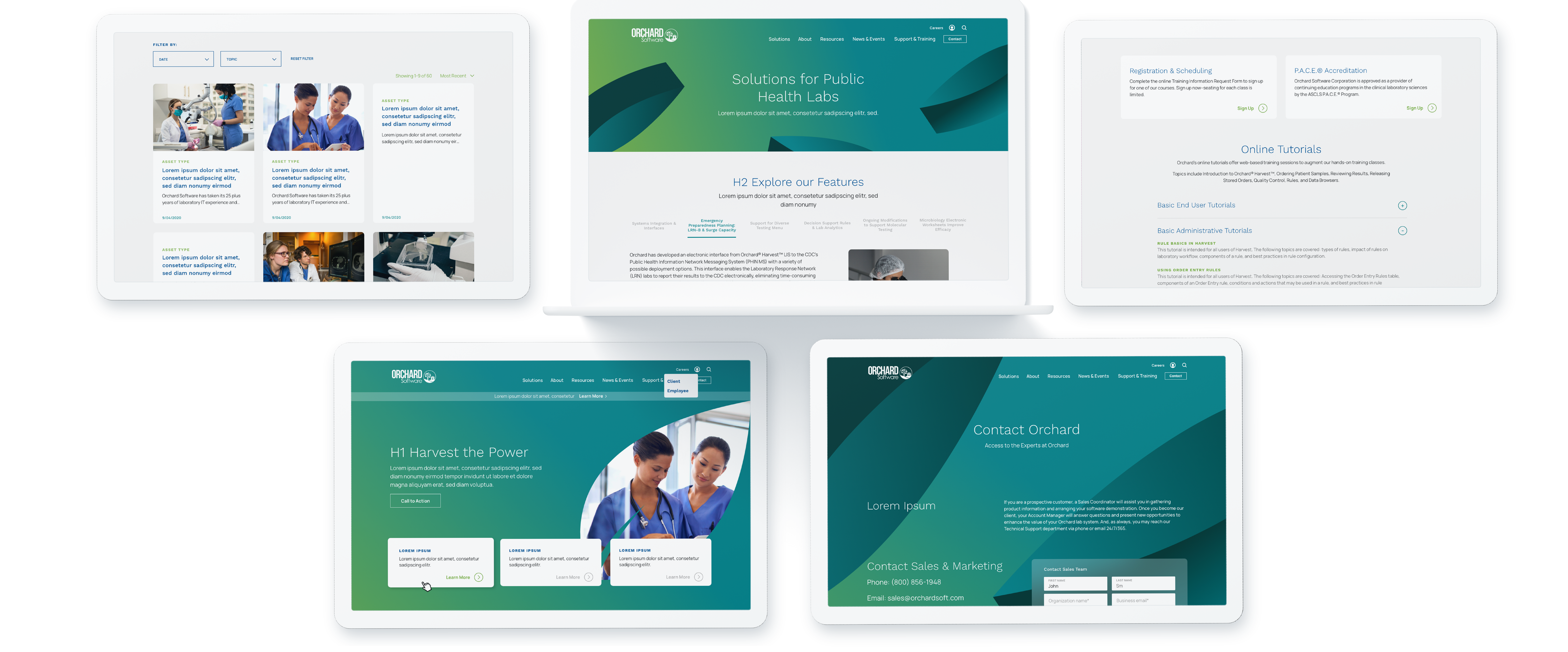
The Orchard Software website showcases sleek animations that enhance the user experience. A stunning hero animation shows the layered leaf shape and featured image coming into view from the right side of the screen, followed by a trickle of falling leaves that urges the user to scroll down to the next component. Clever branded animations like this help to create a smooth, visually engaging journey through the content. Key elements like text and images gracefully animate into view, adding a modern and professional feel to the website. The animations are well-integrated, making the site both aesthetically pleasing and easy to navigate.

Responsive Website Designs for Optimal Mobile Experience
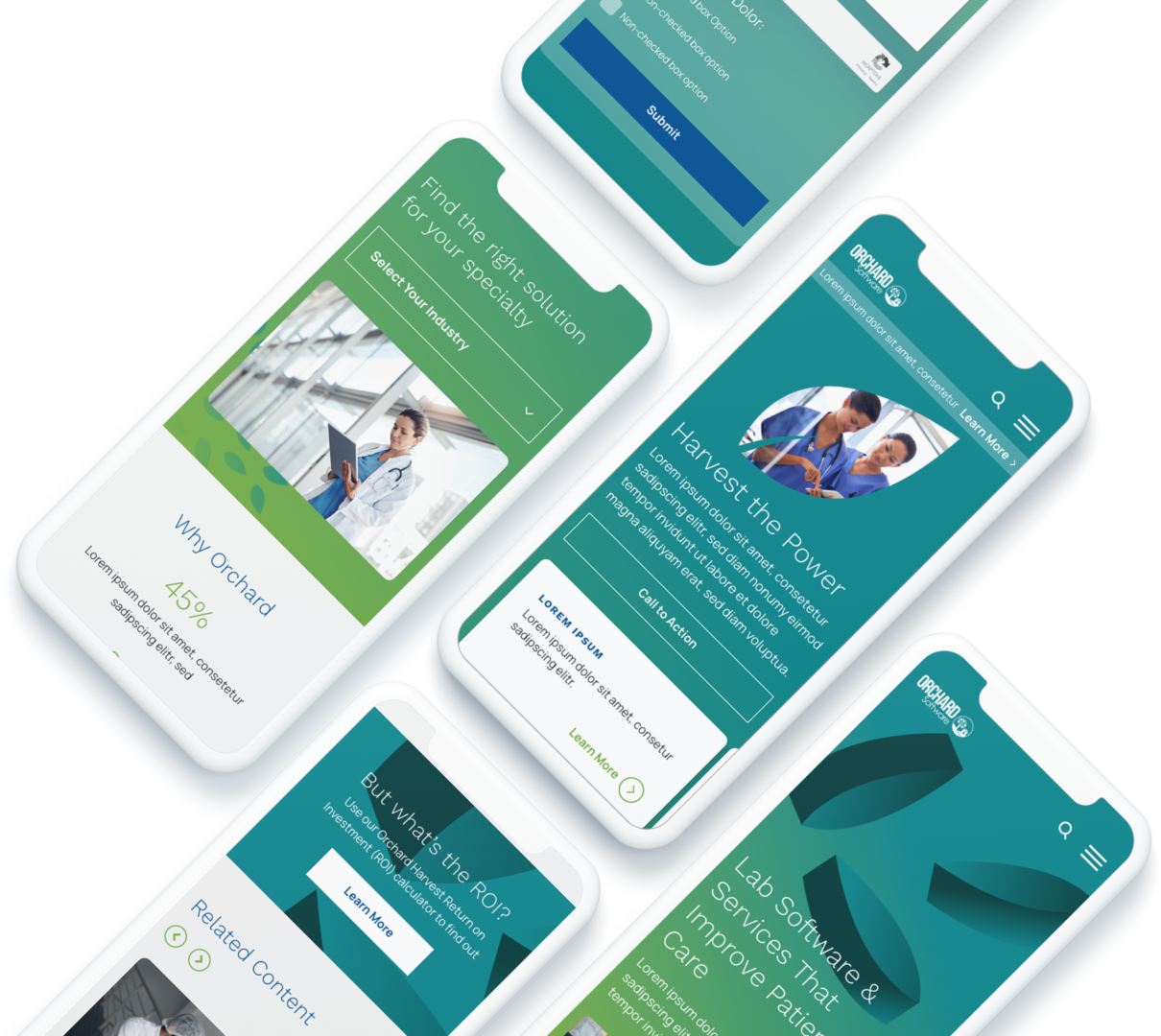
Bluetext created a responsive website design for Orchard Software that seamlessly adapts to mobile devices, enhancing user accessibility and experience. The design process prioritized a fluid grid system and flexible images, ensuring optimal performance across various screen sizes and resolutions. By employing a mobile-first approach, Bluetext ensured that critical functionalities and content were easily accessible on smartphones and tablets. This responsive design not only improved navigation but also boosted engagement and satisfaction for Orchard Software's users on the go.


Brand Elements Built from the Legacy Logo
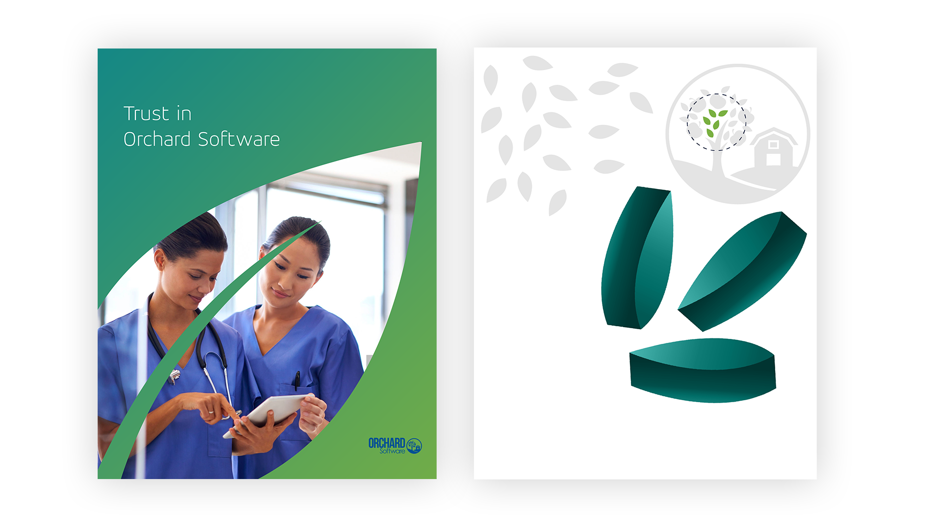
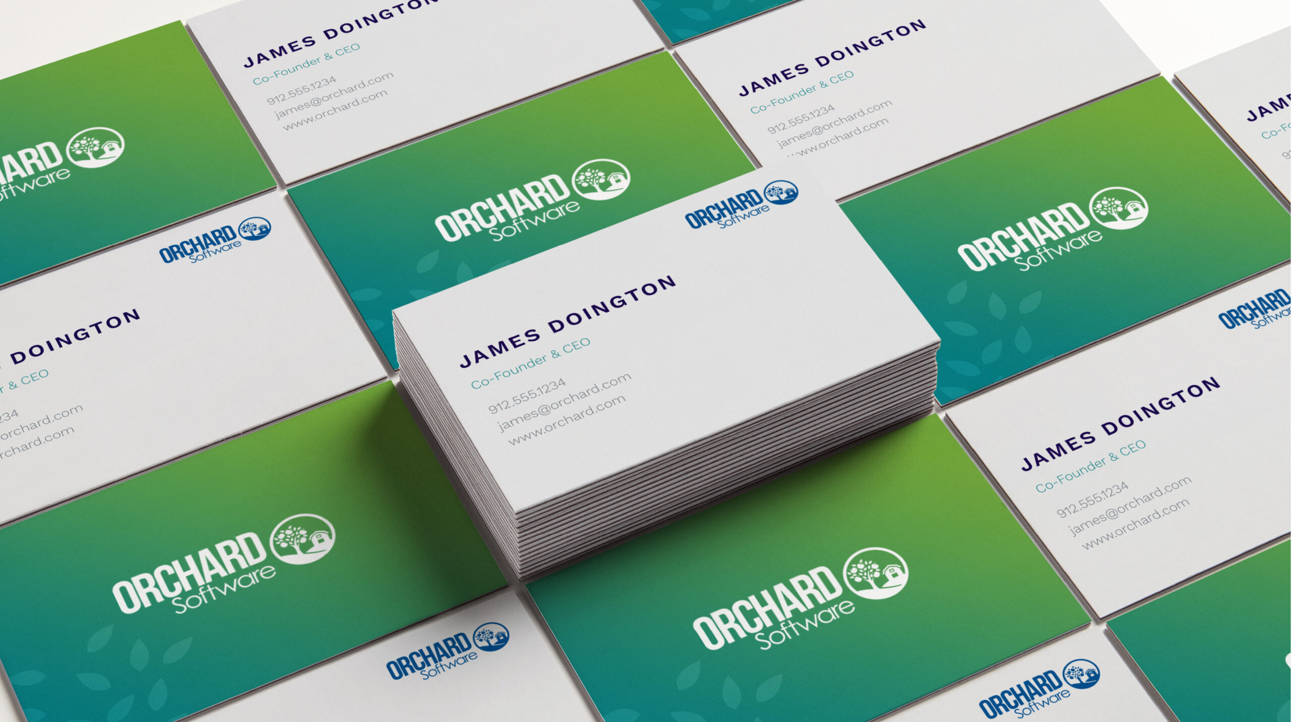
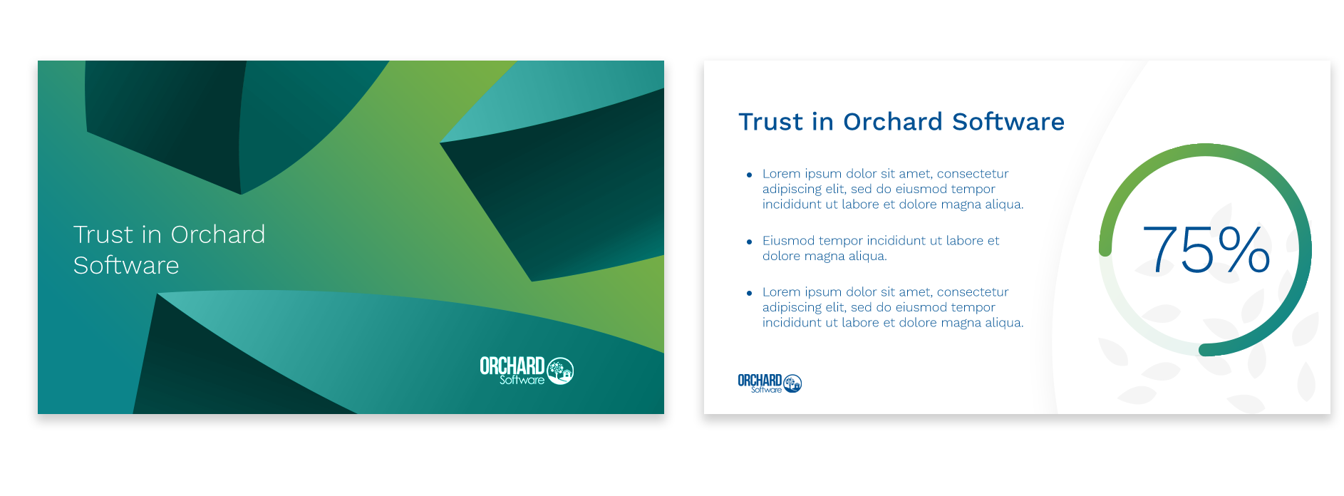
The creative visual identity of the revitalized Orchard Software brand was built from isolated leaf elements shown in the brand's existing logo. To preserve some of the brand legacy, the Bluetext team leaned into these leaf elements to create new graphic visuals that clearly tie back to the current logo. Five leaves from the logo were transformed into a dynamic leaf pattern element, and three of these leaves were brought to life as 3-dimensional shapes that add high impact to the brand visuals and create a polished, professional look and feel.


Positioning Orchard Software for Growth—and Acquisition
Through a refined messaging platform, visual identity refresh, and targeted go-to-market strategy, Bluetext helped Orchard clearly articulate its differentiated value to clinical labs and healthcare networks. These efforts strengthened Orchard’s market position and brand perception—culminating in its acquisition by Clinisys, a global healthcare technology provider expanding its U.S. footprint.

