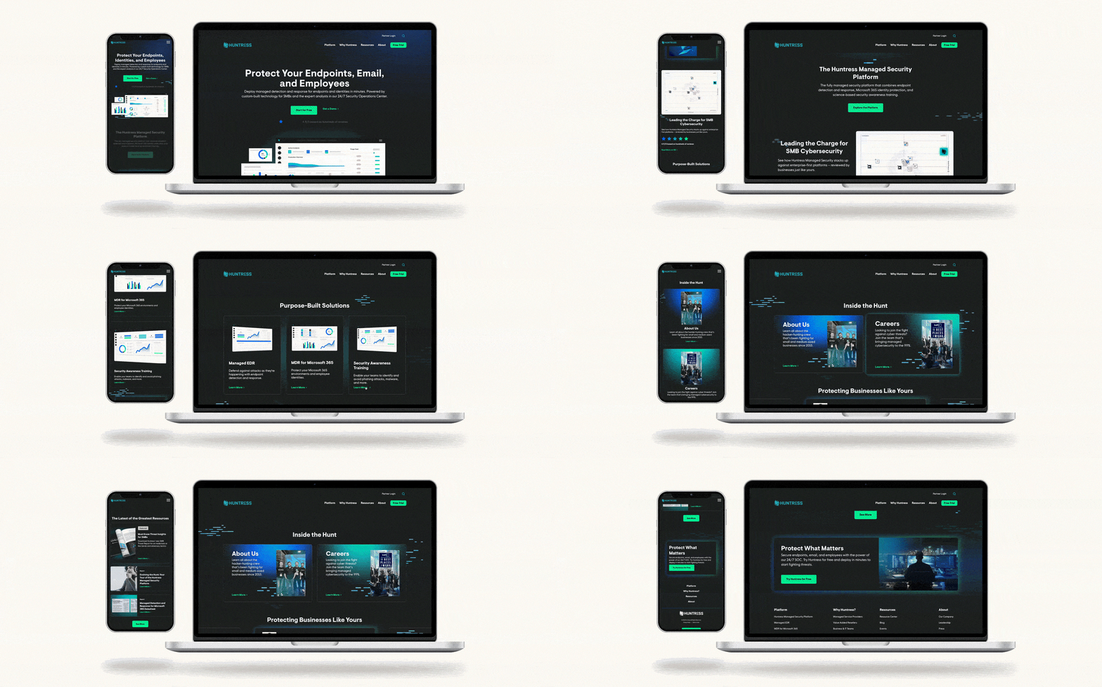

From Wireframes to Color Comps, Full Life Cycle Design Methodology
Through a Webflow CMS, Bluetext developed a website that not only improved Huntress’ content organization, but also achieved their #1 goal: portraying the company’s humanistic and people-first approach. While maintaining the integrity of Huntress’ existing brand system, Bluetext incorporated new elements that could aid in telling the brand story without taking away from its history. The new look and feel needed to convey the toughness yet approachability of the people and platform; in order to do so, Bluetext explored a dark UI with glowing hues of accent colors.
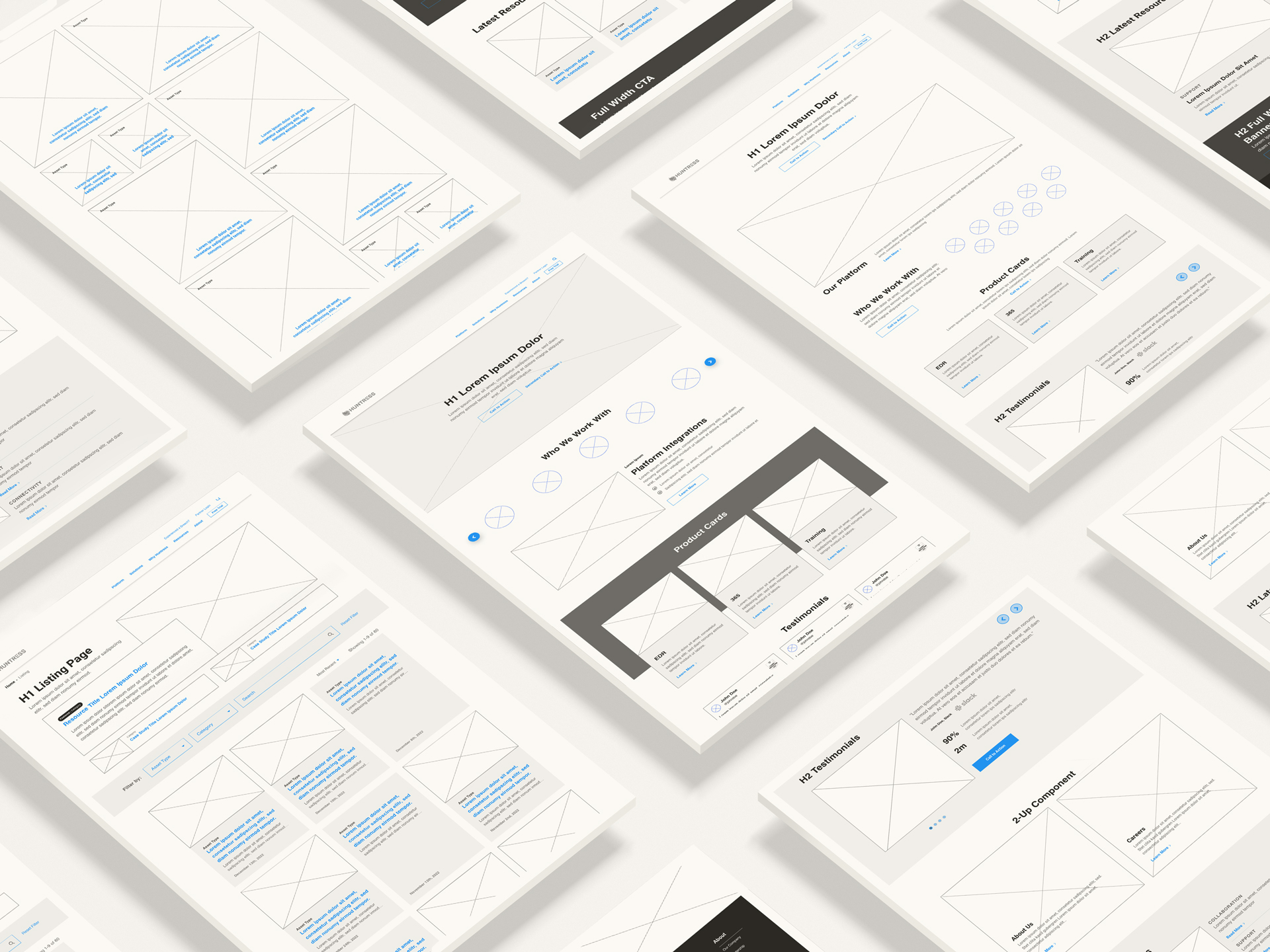
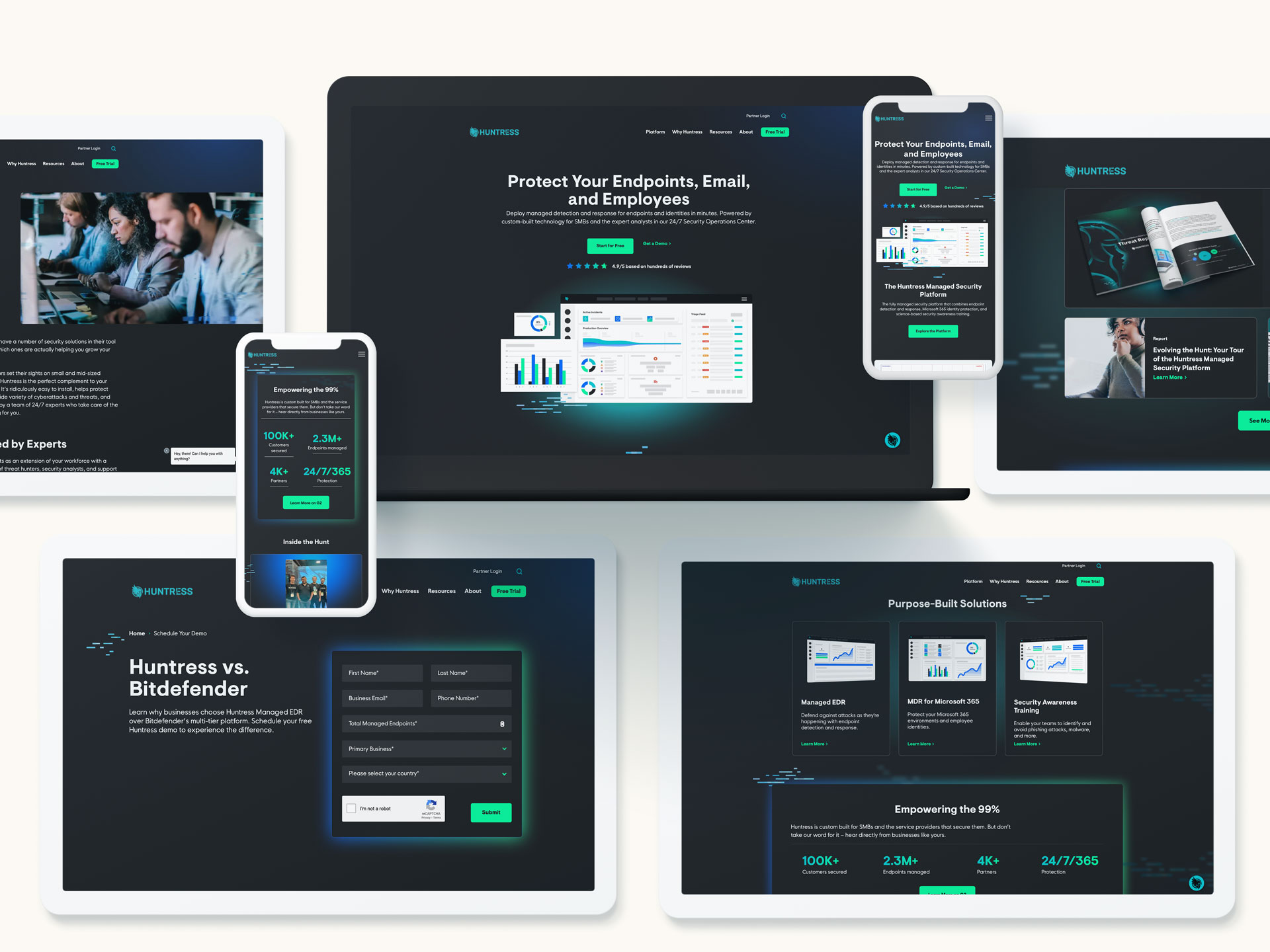

User-Centered Responsive Designs for Mobile
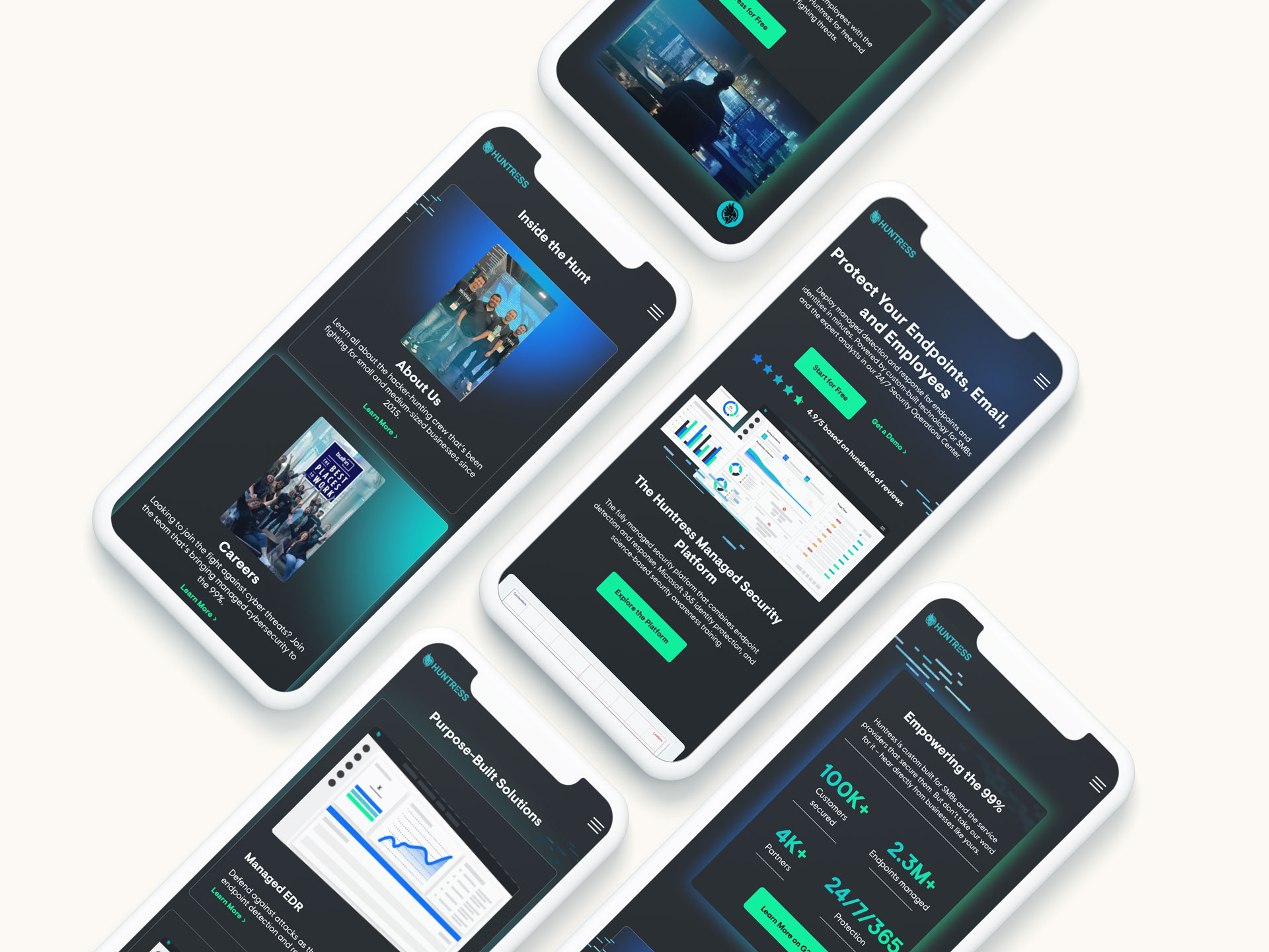
With nearly 40% of their website users coming from mobile devices, it was absolutely vital for the new Huntress site to provide an intuitive and simple experience for mobile users. A responsive design not only adapts seamlessly to different devices but also enhances user engagement by providing a consistent and optimized interface. From wireframes to color comps, accommodating for mobile was a crucial element of the website redesign.

Custom Branded Image Applications
In addition to creating custom branded lo-fi graphics of the Huntress platform, Bluetext also sourced and revamped stock imagery to use throughout the site to portray the new look and feel. Leaning into the Huntress brand “glitch”, the new imagery subtly incorporates a glitch-like pattern that is both haunting and inviting. These images, whether used on the new site, social media, or collateral, act as a cohesive visual language that resonates with the cybersecurity audience.


