
Brand
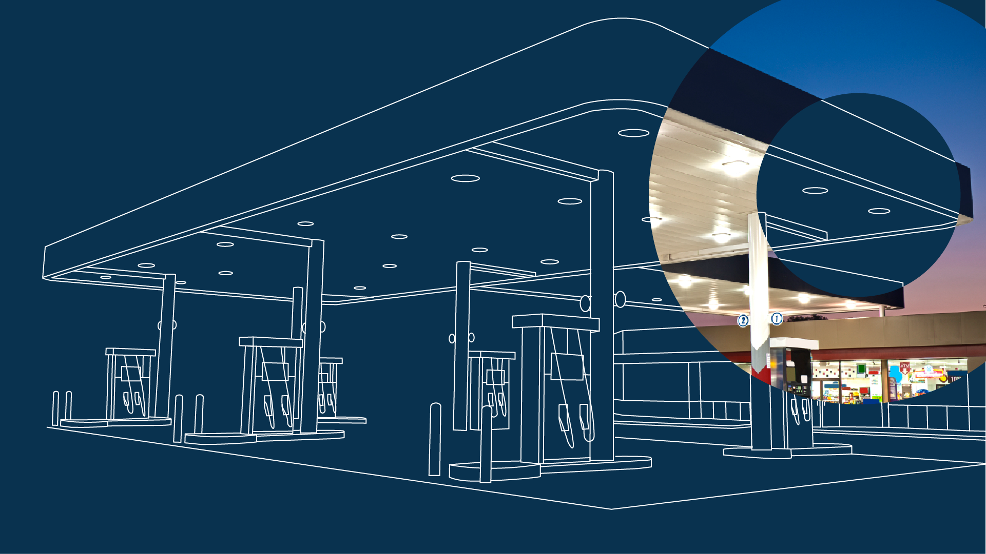
To retain previous brand recognition, the GridPoint logo underwent slight changes to evolve with a new visual identity. Inspired by GridPoint's capabilities, a new brand elements were created to represent the building energy sources and data used to optimize their usage. Dotted orb textures became the symbol of GridPoint's intelligence network, working together to aggregate informed and strategic energy insights.
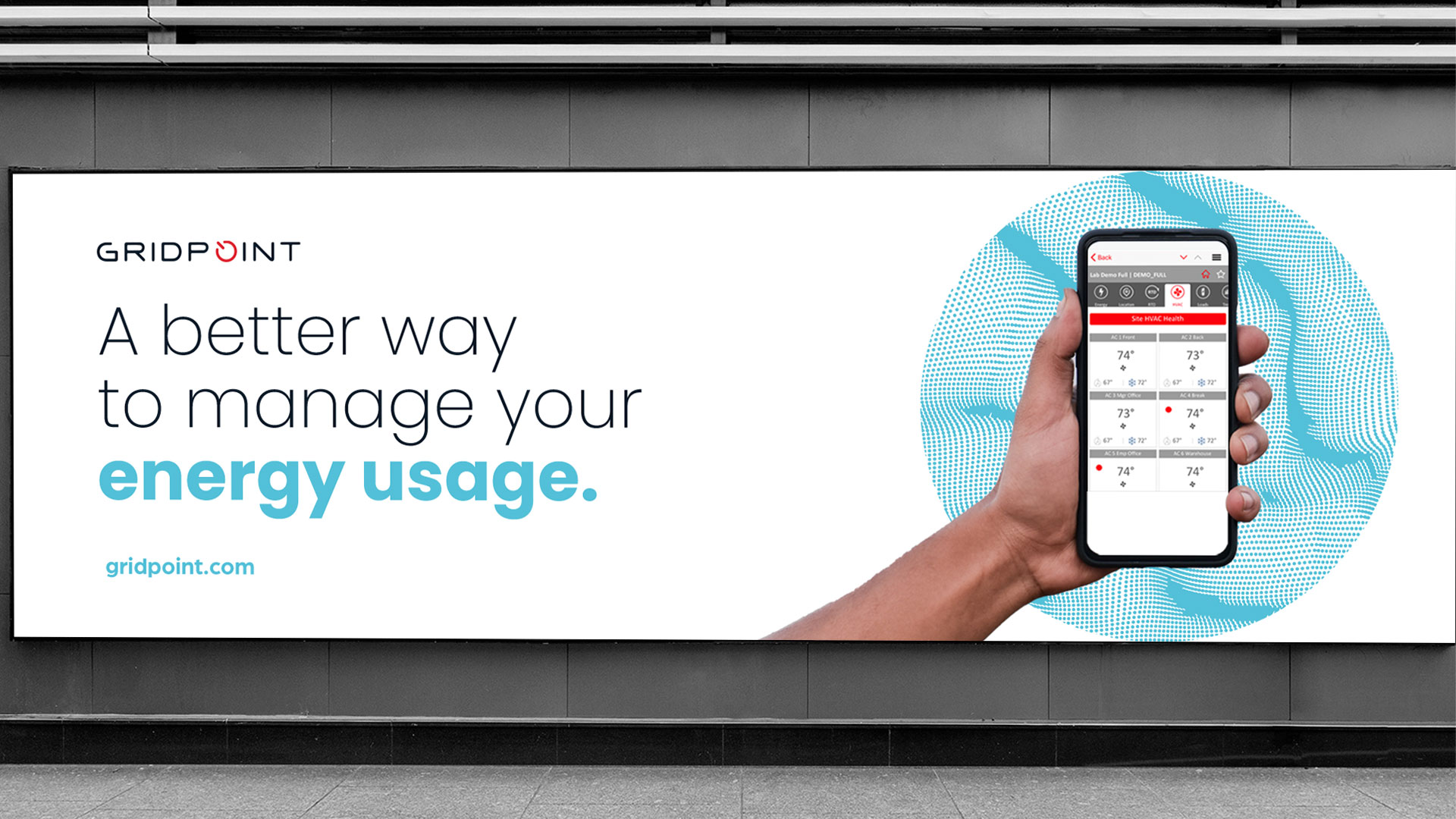
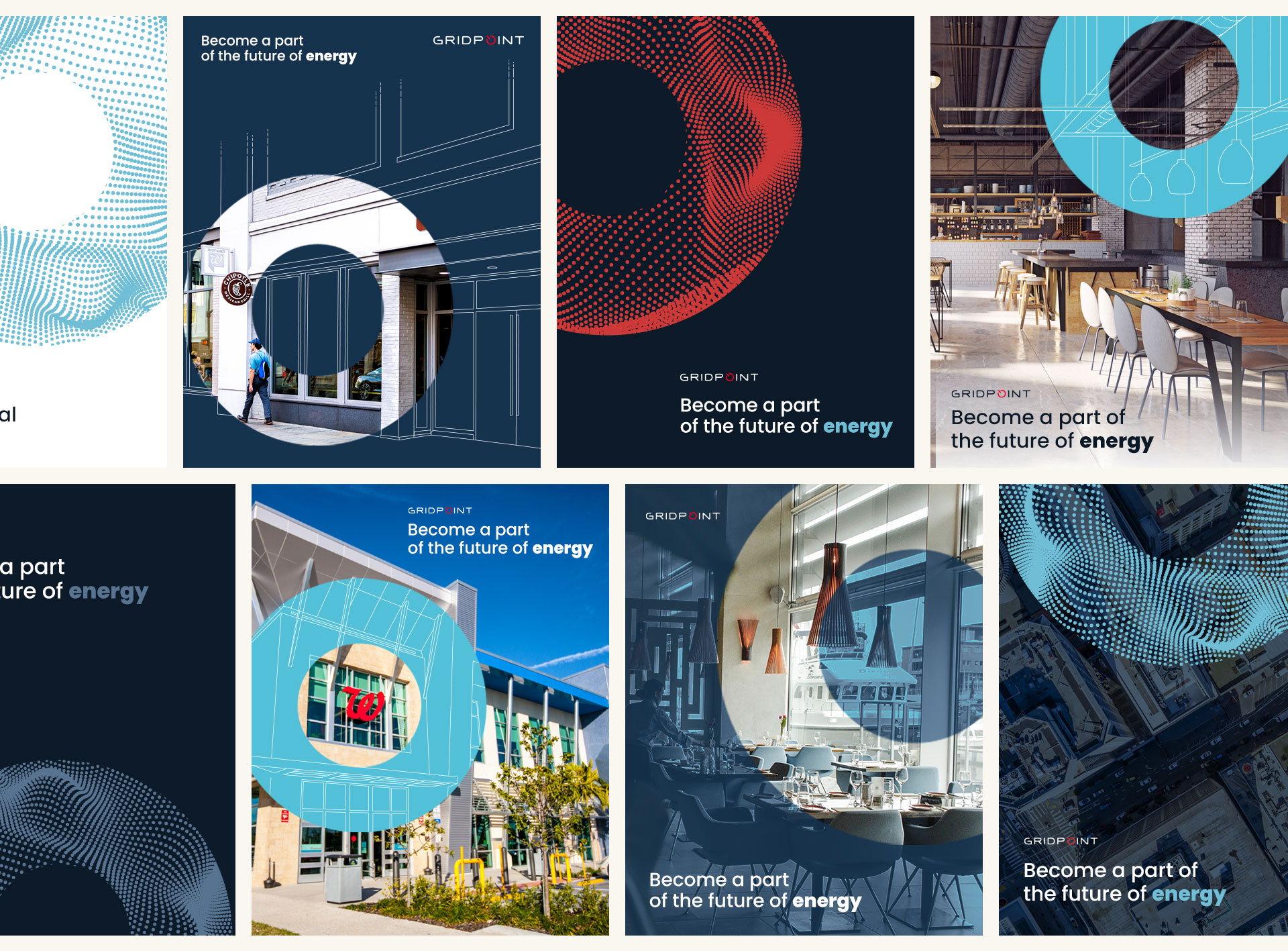
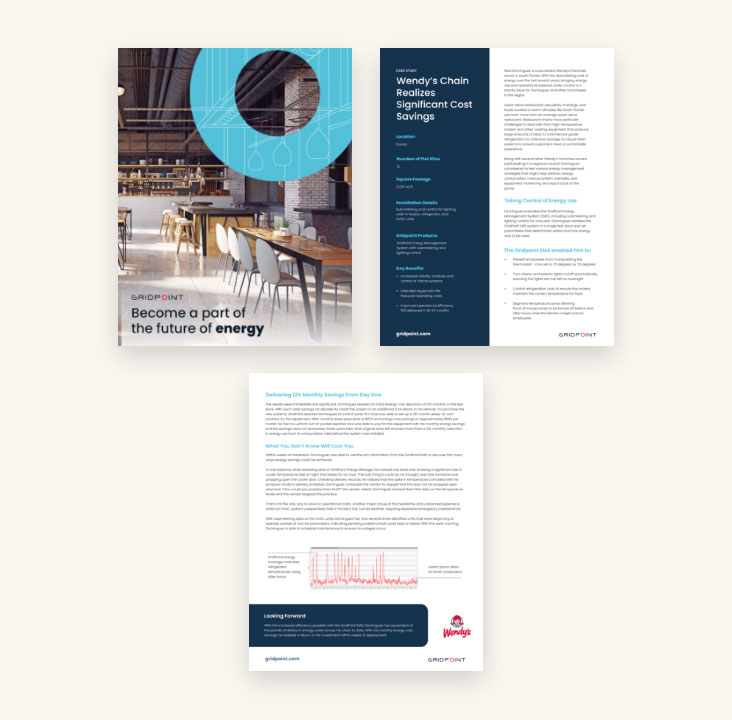
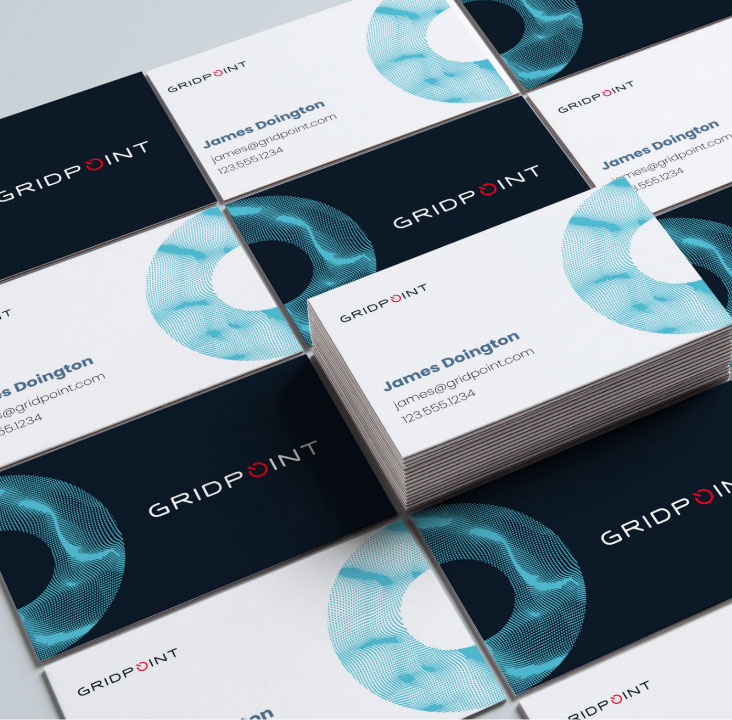
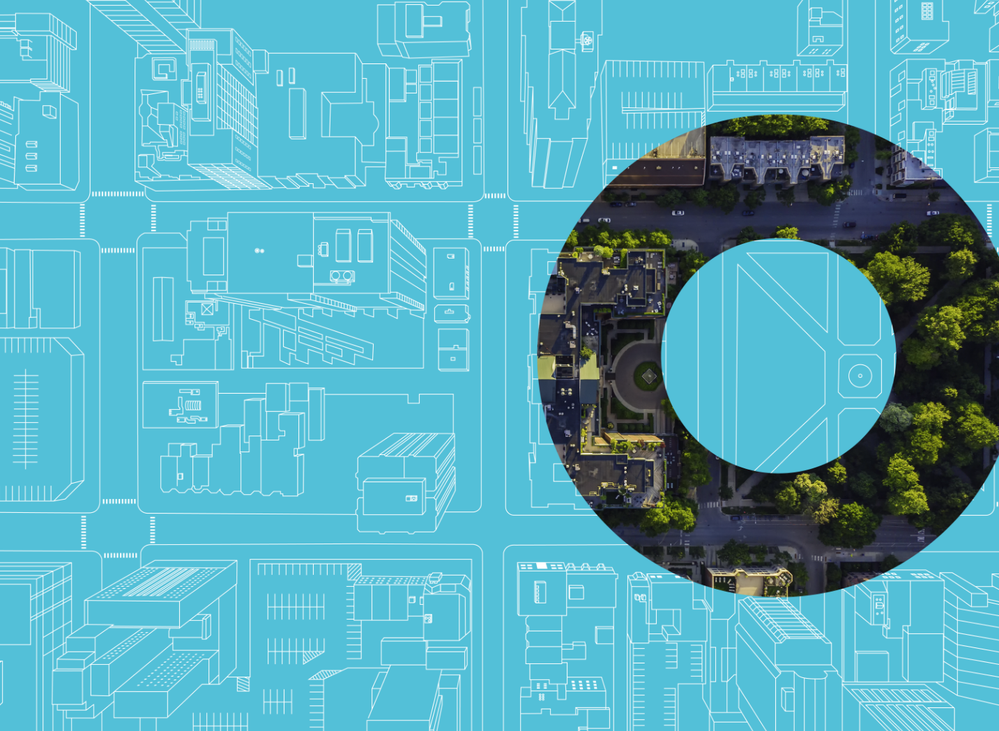
A signature key art style used the circular orb shape to reveal realistic or wireframed depictions of energy sources within GridPoint's customers across industries.
Industrialized Key Art

Website
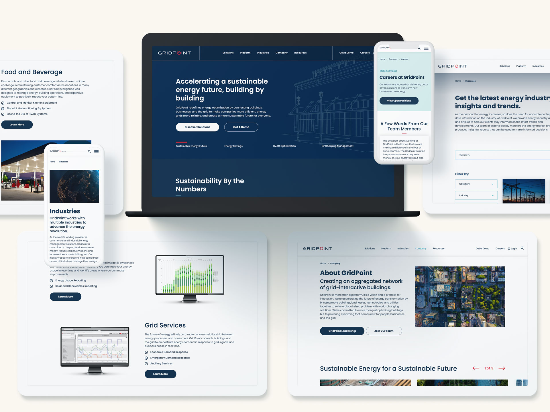
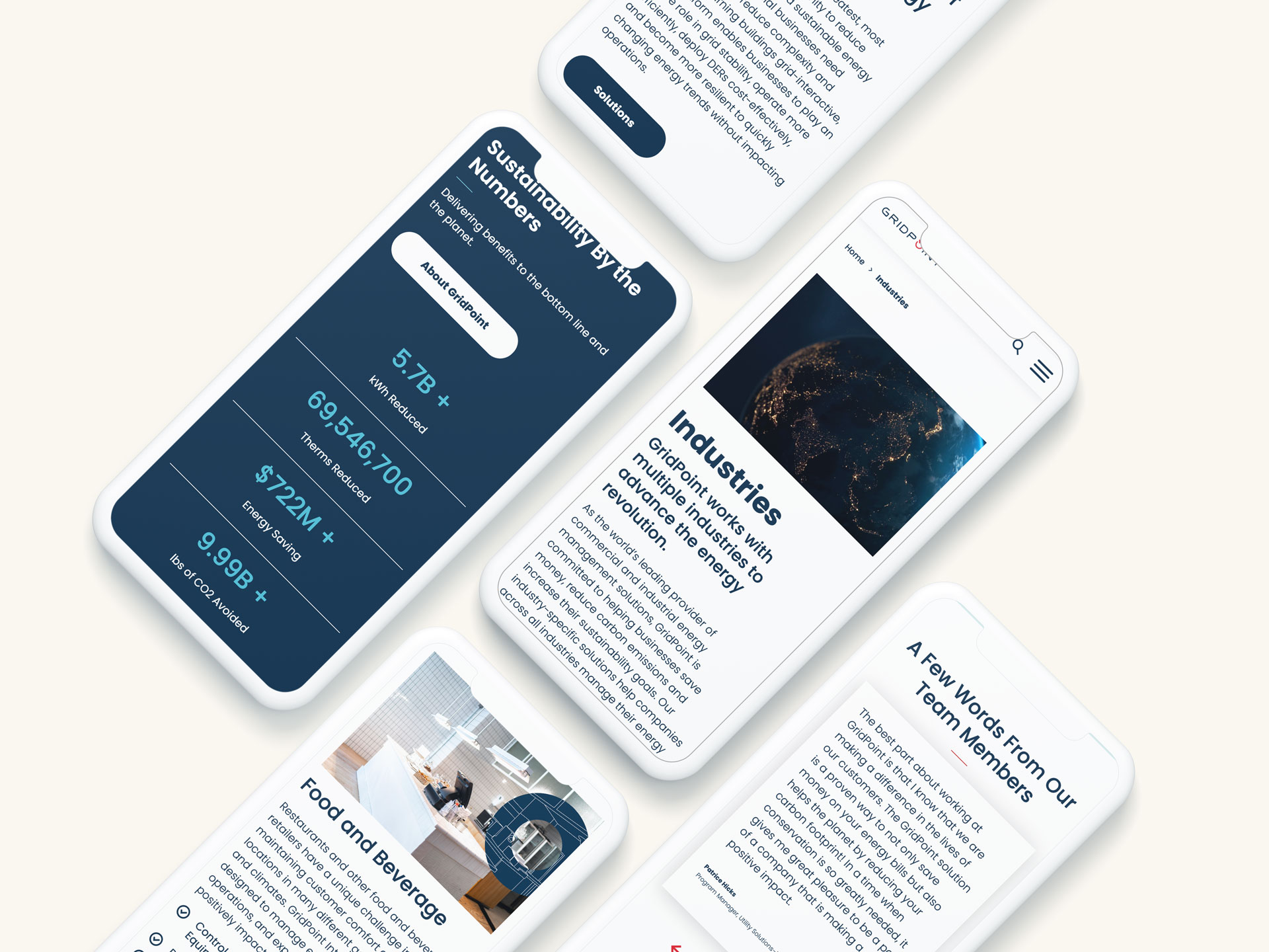
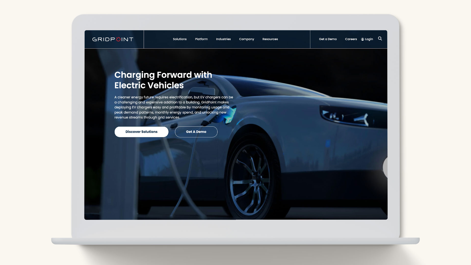
To complete this brand evolution, the website was redesigned and built to become a sales and marketing powerhouse. Prominent CTAs and gated form functionality served as new lead generation sources. An interactive UX was implemented to streamline full platform details into a cleaner format that appeals to technical users and high-level executives alike.
