Enhancing an Established Brand
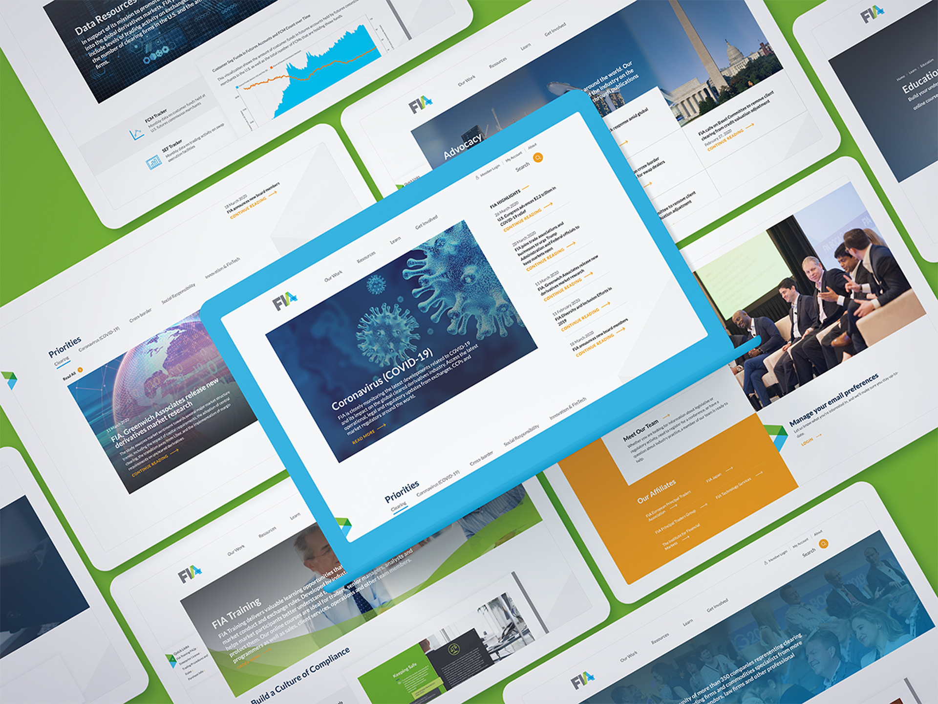
Bluetext enhanced FIA’s existing visual identity for a refreshed digital presence that stays true to the established FIA brand. To strike this balance, Bluetext introduced a deep red, blue, and orange into the secondary color palette while maintaining FIA’s existing vibrant brand colors in the primary palette.


Optimizing User Experience
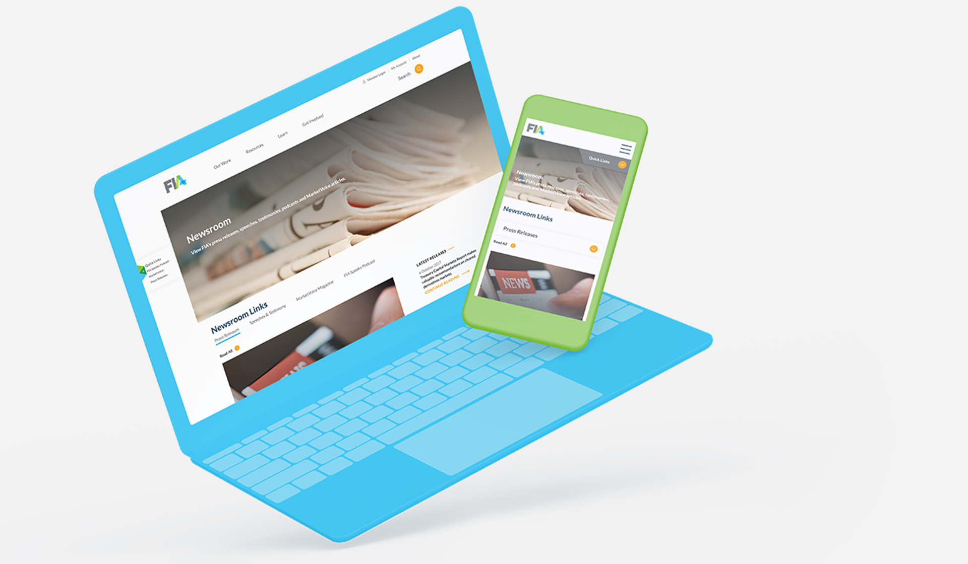
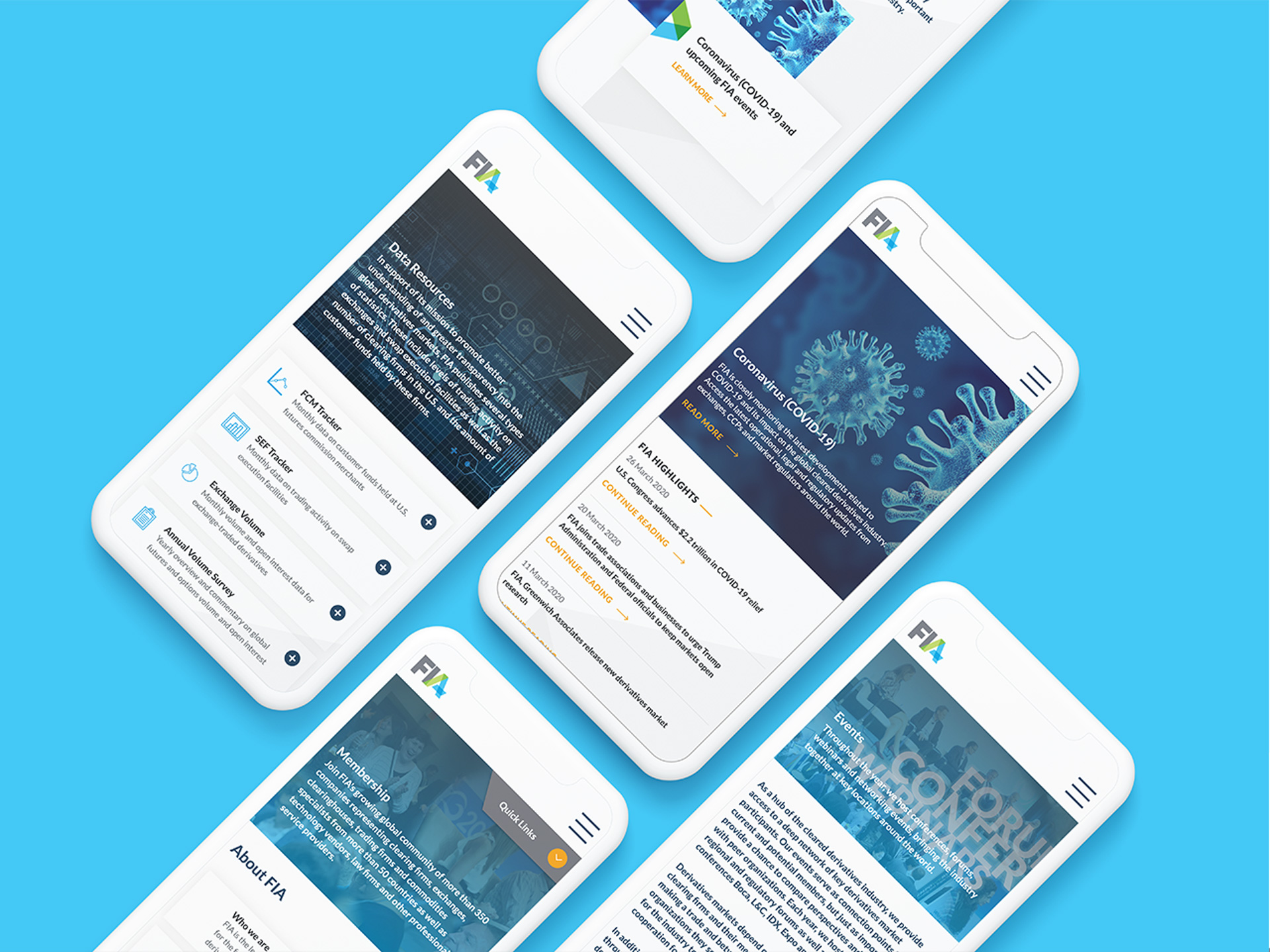
By defining each user group and their respective on-site goals, Bluetext architected a site that invites users to quickly and easily explore content that is most relevant to them.


Simplifying Website Management
Bluetext architected an intuitive content management system, allowing FIA to easily create and manage content on the website. The new user interface offers a more streamlined content management experience, reducing the time and effort required to maintain content across the FIA site.
