
Full Website Design
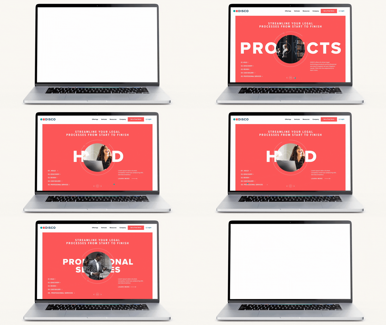
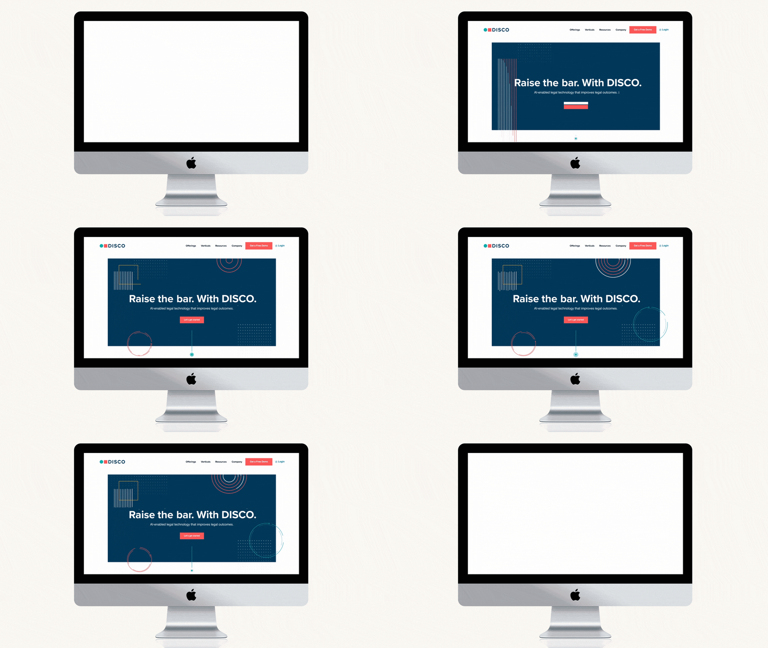
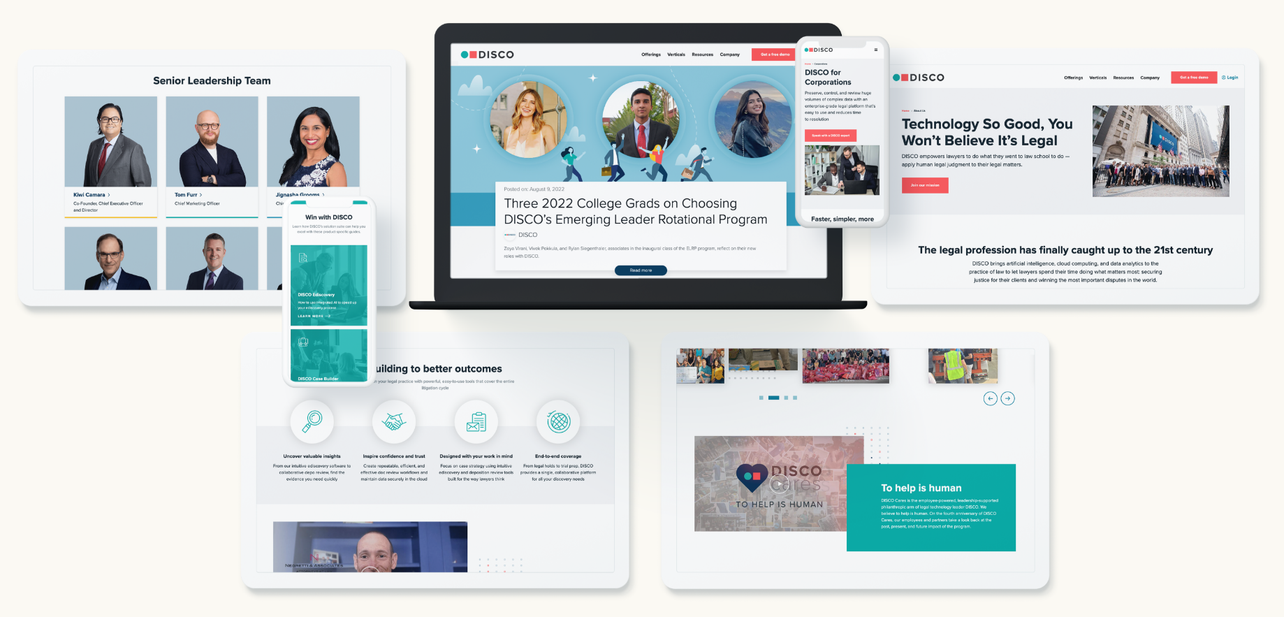
The DISCO team felt their existing website told a strong content story, but were eager to “Raise the Bar” of the website’s visual and UX design. DISCO tasked Bluetext with refreshing the look and feel of their website, creating designs that brought new life to their existing brand system. Keeping DISCO’s visual identity and four fundamental brand attributes of bold, focused, intuitive and unconventional at the core, Bluetext created an elevated website design with unique components and thoughtful motion that prompt an engaging and flawless user experience.

Messaging Framework
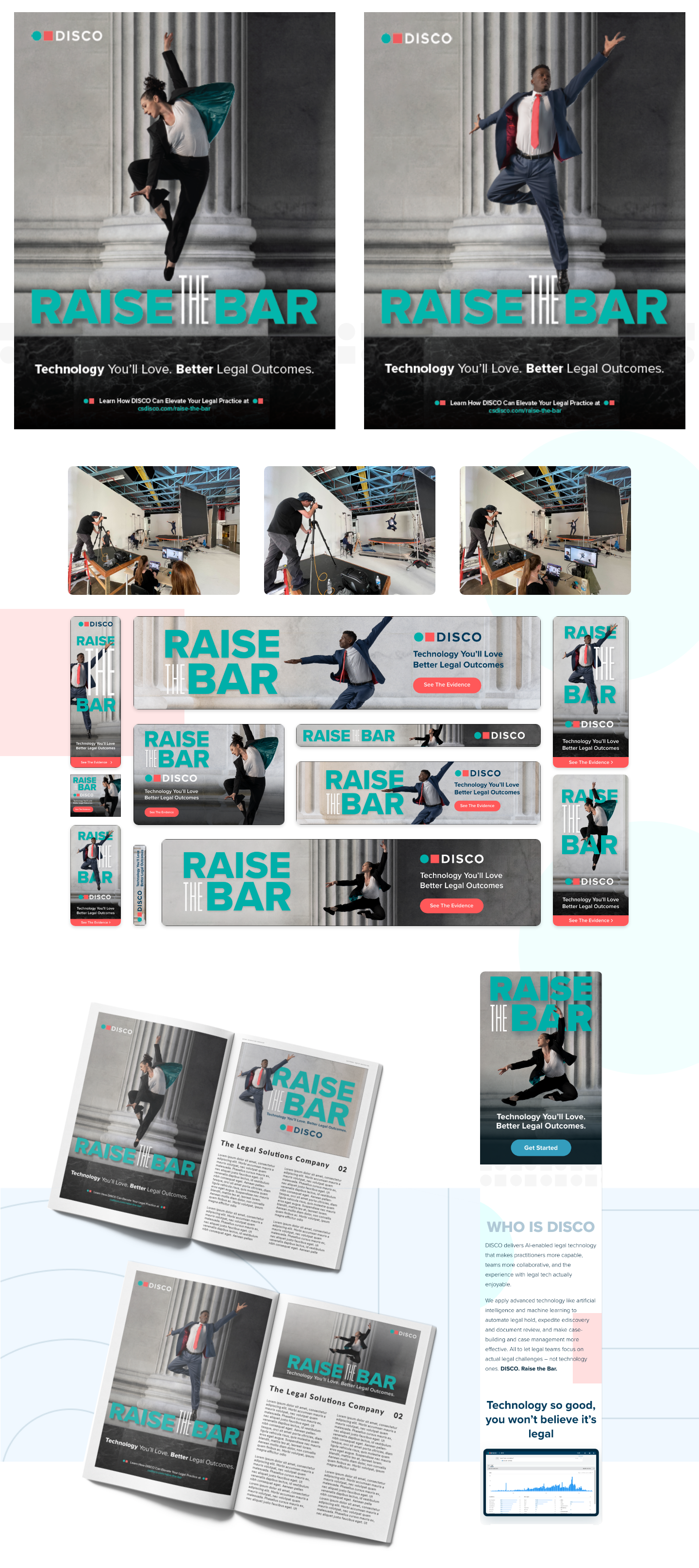
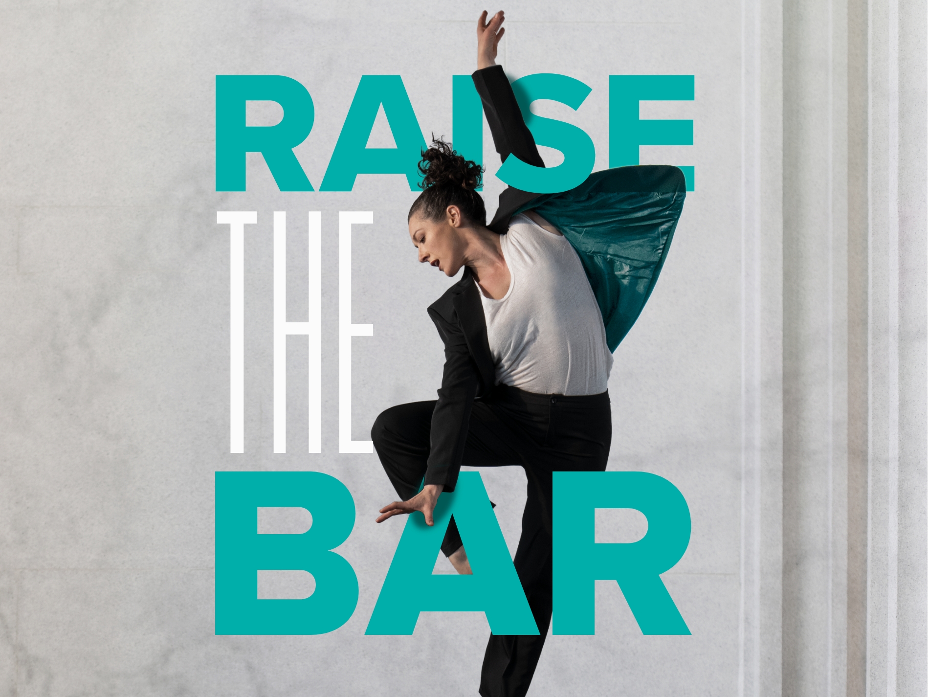
DISCO needed a new messaging framework that would best reflect the quickly growing business. Bluetext worked with DISCO to identify a messaging tagline, “Raise the Bar” that put its customer-centric benefits and lawyer-first approach at the center of the brand.


Legal Technology Go-To-Market Campaign Ads
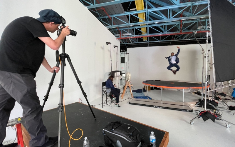
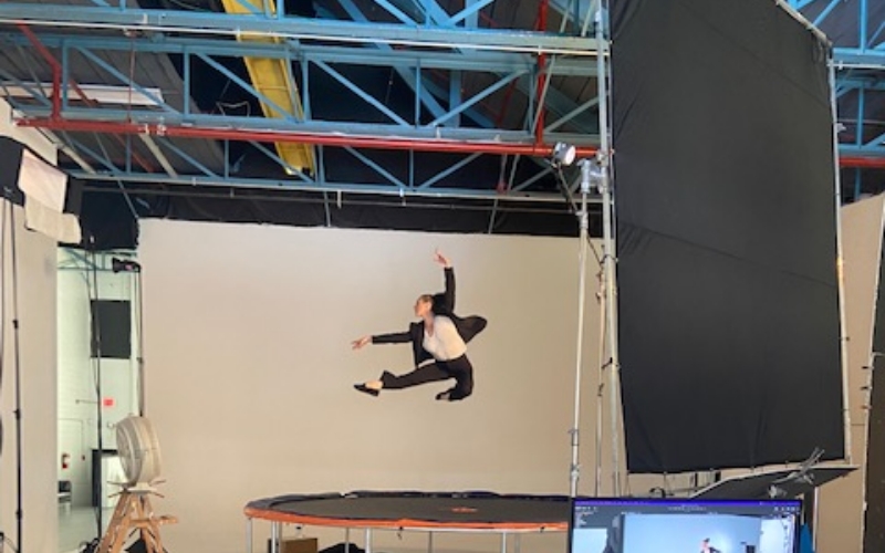
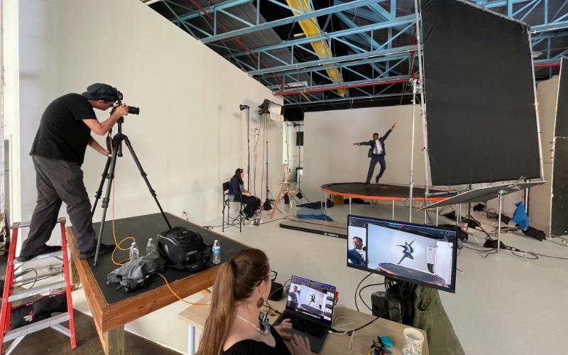
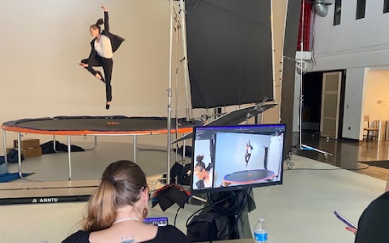
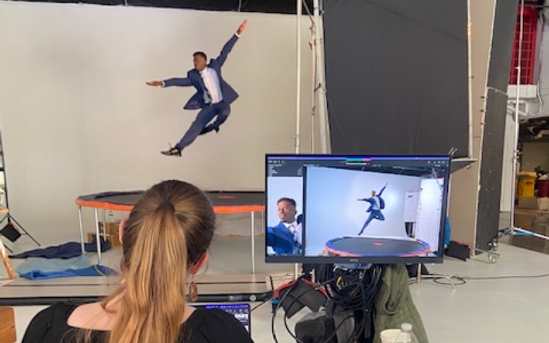
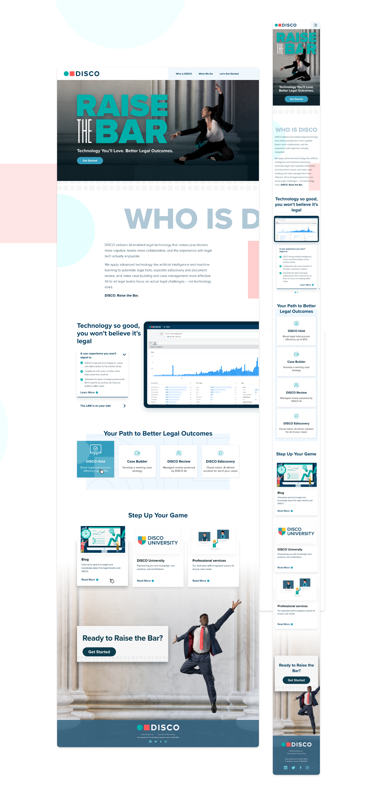
Utilizing the new messaging system, Bluetext designed a comprehensive go-to-market campaign. For this particular campaign, using the “Raise the Bar” messaging brand line, Bluetext recommended a custom photoshoot to help capture unique visuals, incorporating talent dressed as lawyers, striking elegant poses mid-air by using a trampoline. This direction encapsulated what DISCO was going for—powerful story-telling creative.
