
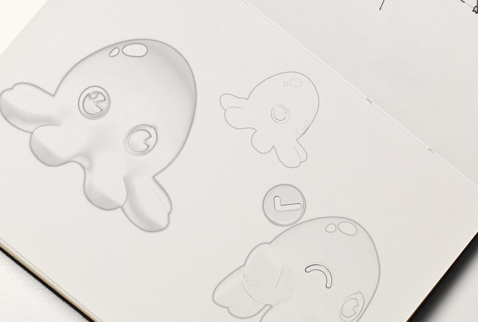
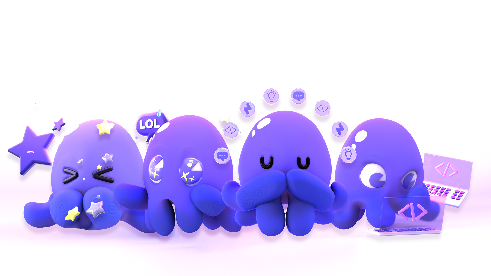
Meet Linky: Developing a Brand Character
When Chainguard first came to Bluetext, the team was hesitant to alter the existing logo, as they knew that people would be up in arms if the beloved octopus icon was reduced or removed from the brand. Bluetext stepped in with a solution to protect the character of the octopus, while modernizing the icon by bringing it to life in 3D design.
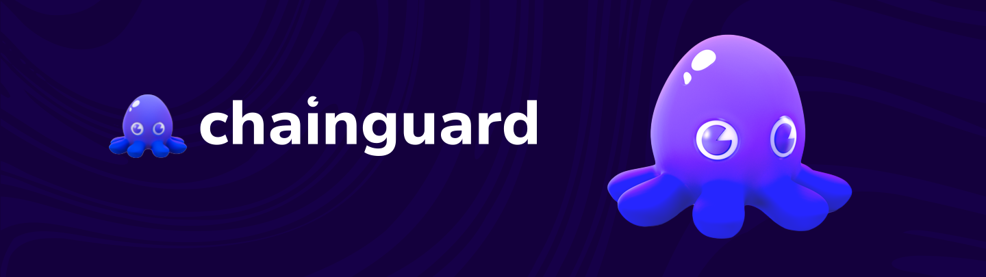
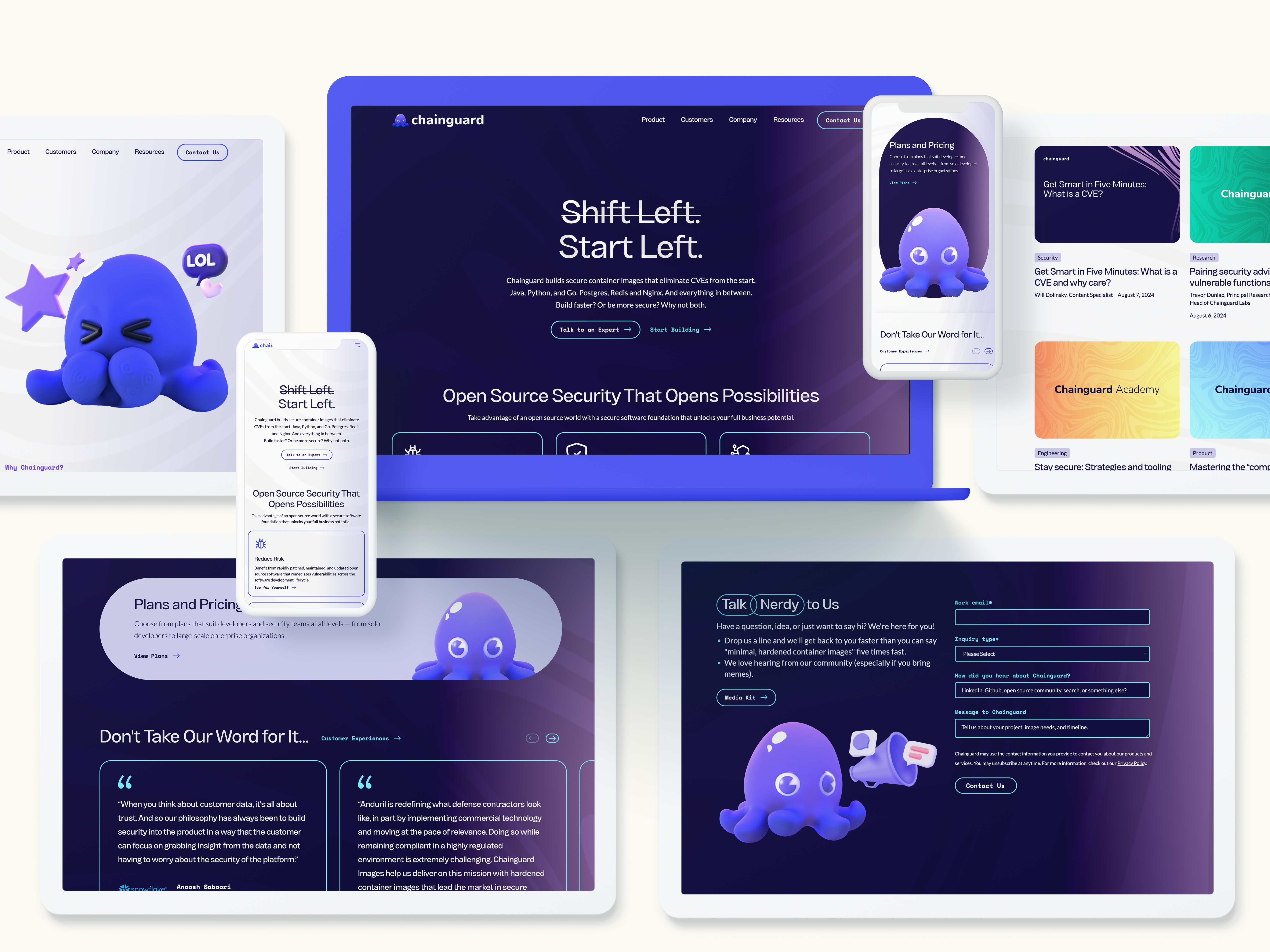
Linky (as the octopus was later named) has come to be the central pillar of the Chainguard brand. Linky shows versatility — using different poses to communicate emotions like awe, determination, and peacefulness. Adding depth to the octopus icon brought an air of sophistication and a contemporary look to the brand. Linky also speaks to the liveliness of the Chainguard team; they take their jobs seriously, without taking themselves too seriously.


Building a Cohesive CVI
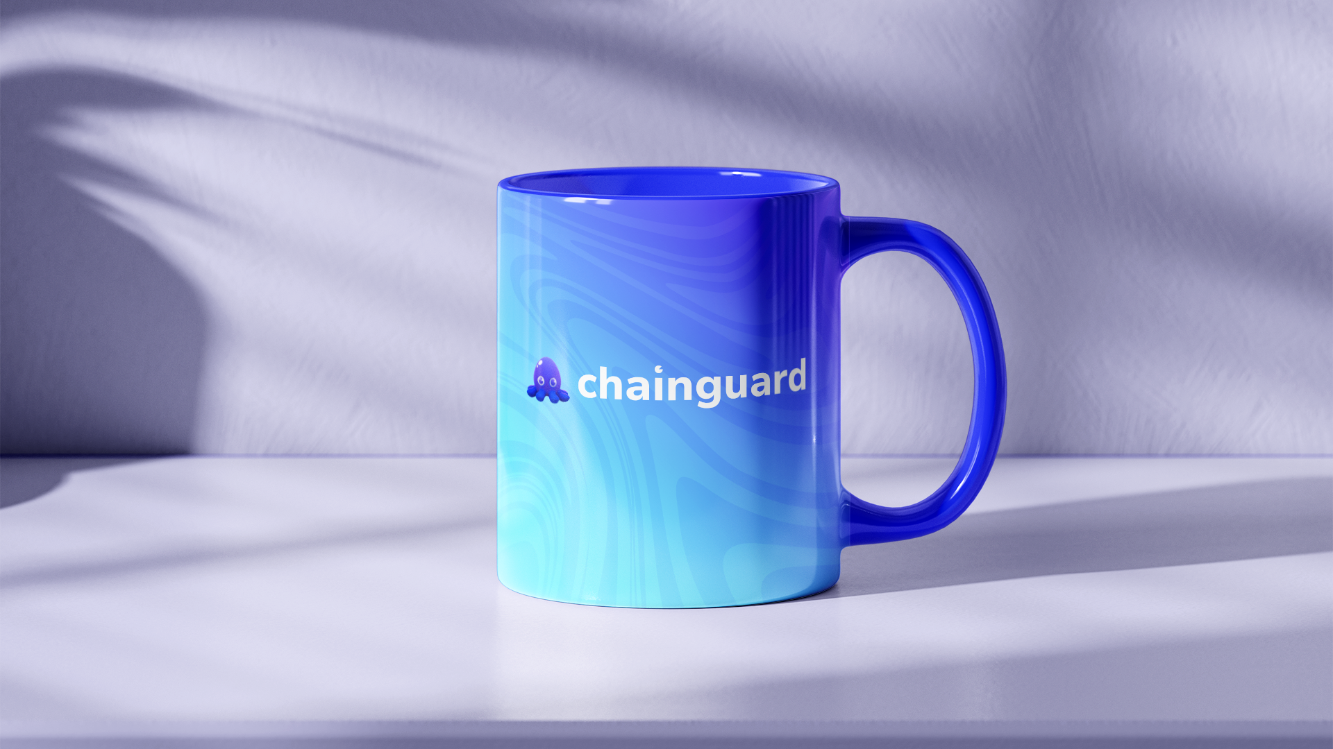
The Chainguard CVI utilizes a uniquely branded pattern inspired by Linky. Knowing that ink is a defensive measure for octopi, Bluetext created a swirling ink pattern that is meant to resemble the appearance of ink in water. The ink element metaphorically ties back to Linky and Chainguard’s offering of security. At the same time, the pattern design lends itself to motion and animation, without overpowering core imagery or visuals in the branding.
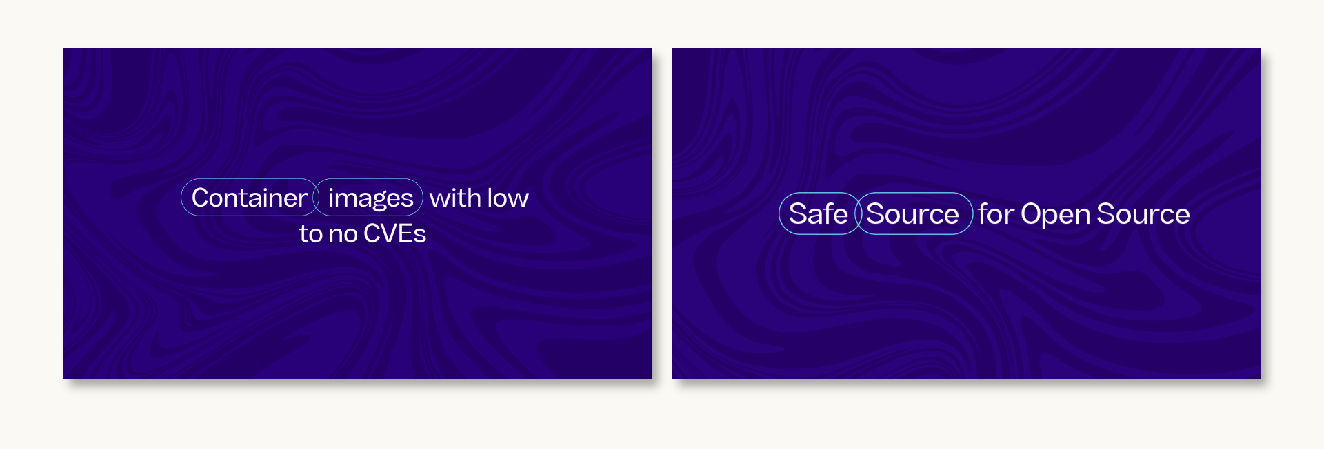
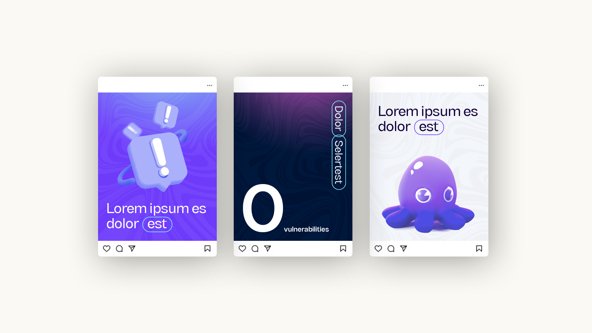
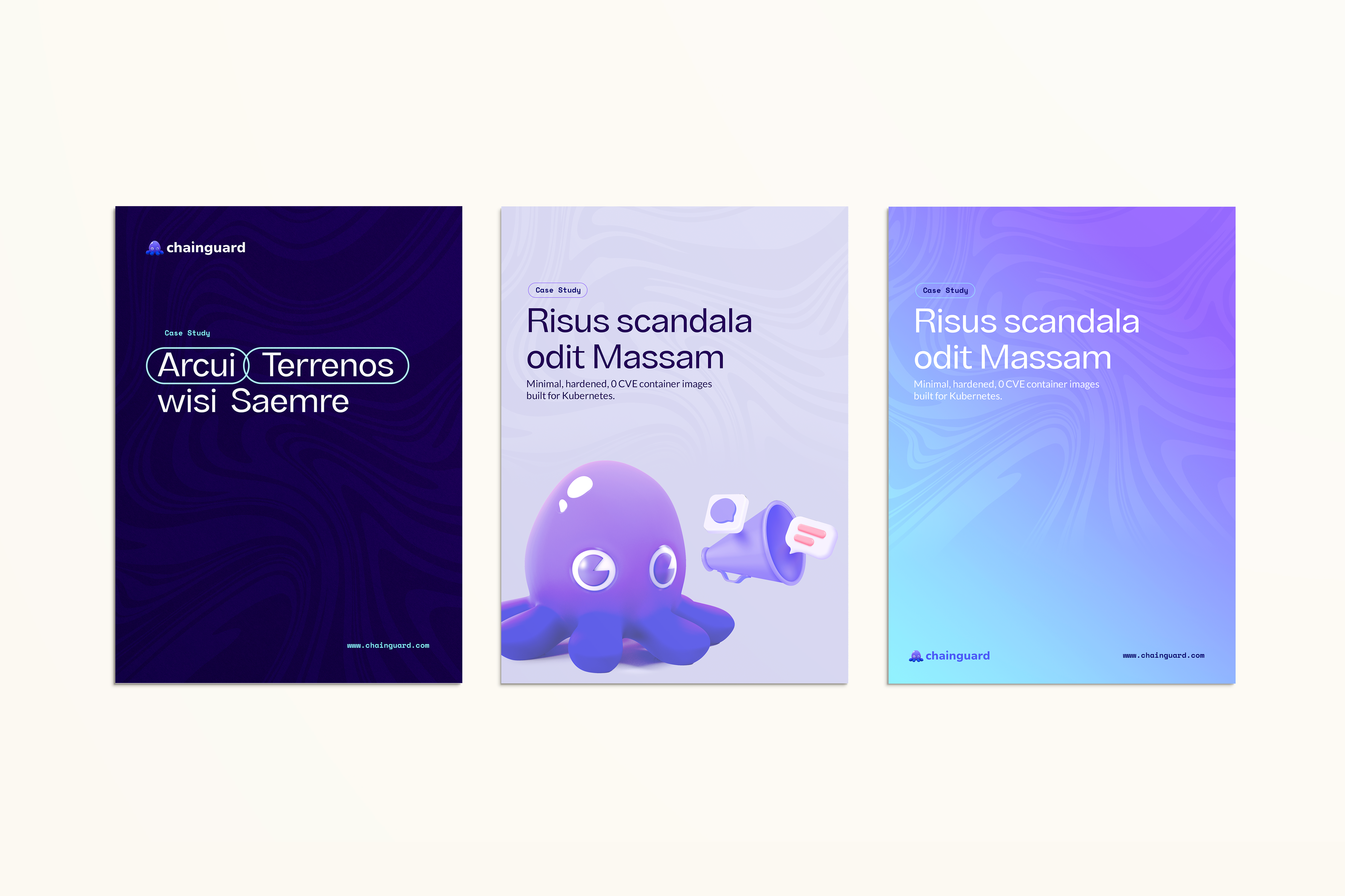
Bluetext also created a unique “chain” type treatment for specialized text callouts. The Chainguard brand uses an interlocking oval shape to highlight two important words that appear side-by-side in copy. The link shape is connected to the “chain” symbol referenced in the Chainguard name, as an allusion to the company’s offering in supply chain security.

Collateral Design
Creating Branded Platform Screenshots
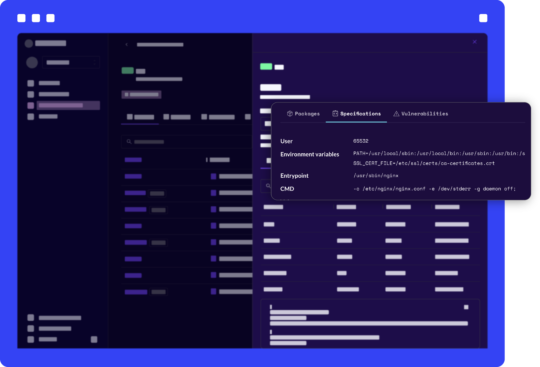
To showcase the Chainguard Images product, Bluetext created a unique border treatment that can be applied to create a cohesive library of images. In addition to the border treatment, Bluetext also designed a lo-fi callout application that can be used to highlight key aspects of platform screenshots. This library of imagery is used in place of generic stock photos throughout the website and creative materials.
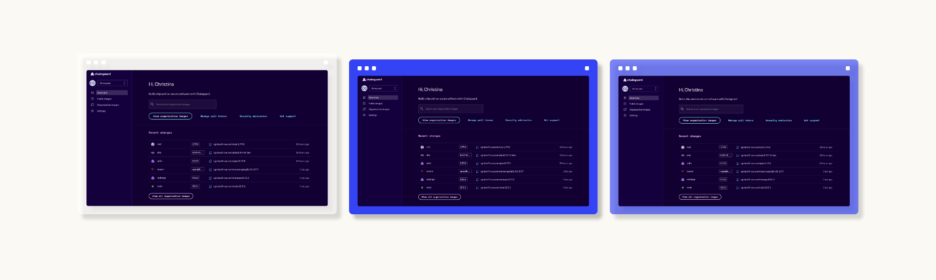
Adapting to Dark Mode and Light Mode Applications
Speaking to both executive and developer audiences was an important goal to keep in mind for the Chainguard brand. While the new brand needed to be bright for some light mode use cases, the team also wanted it to be adaptable to dark mode scenarios that would be preferred by developer audiences. The brand color palette was developed with both dark and light applications in mind, using a deep violet color in place of black for dark mode instances. Bluetext also created a site design that could switch from light mode to dark mode with an easy toggle.
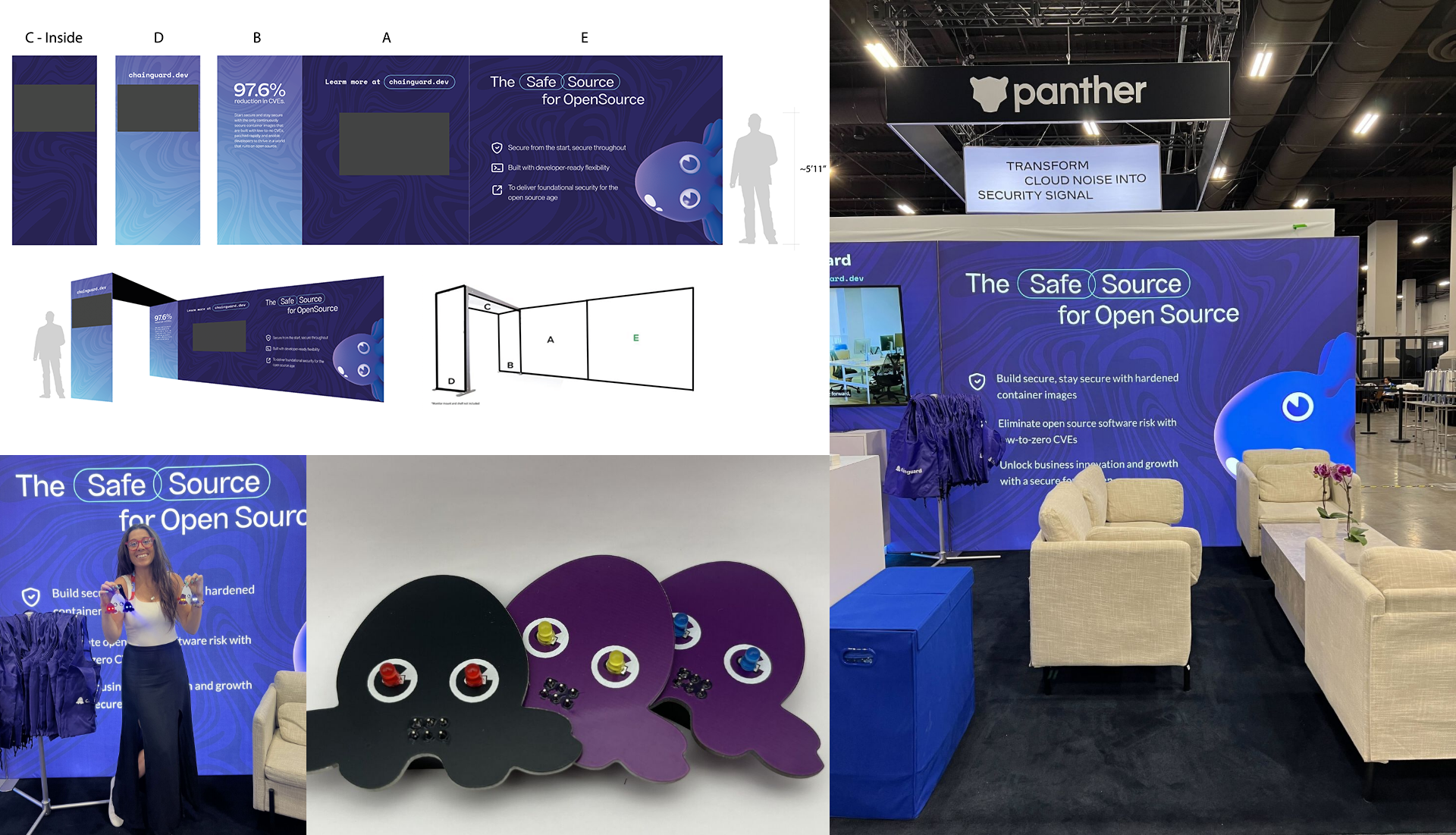
Creating a Powerful Event Presence
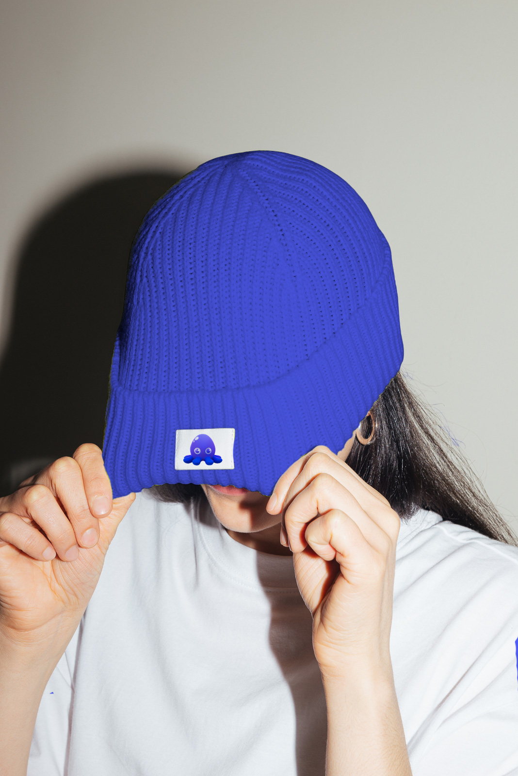
The new Chainguard branding was revealed at the Black Hat 2024 Conference, with a striking event booth that Bluetext created to feature Linky alongside the impactful brand pattern. In addition to the event booth itself, other swag items were created for visitors to take home their own Linky tokens: keychains, poker chips, and tote bags were all branded with the lovable octopus icon.
Designing the New Website
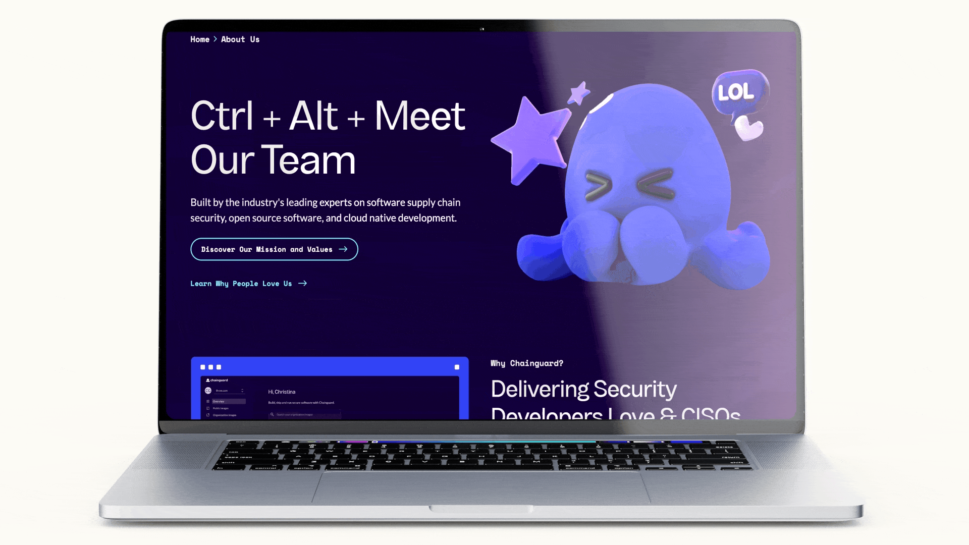
From site architecture and content planning to UX design and brand application, Bluetext worked with Chainguard to create a new site that would bolster the brand and showcase the most important content describing Chainguard’s offerings. The site design incorporates branded hover state interactions, limited appearances of Linky for optimal brand impact, and the large-scale ink pattern as the backdrop for the components.
Branding for Strategic Growth
Bluetext's collaboration with Chainguard was instrumental in positioning the company for its successful $140 million Series C funding round. As Chainguard sought to enhance its presence in the cybersecurity industry, Bluetext partnered with the company to refine its brand identity, messaging, and digital presence. This comprehensive rebranding effort elevated Chainguard's visibility and positioned the company as a leader in securing open-source software and AI workloads, contributing to its successful funding round and subsequent growth.