
Meaningful Brand Identity
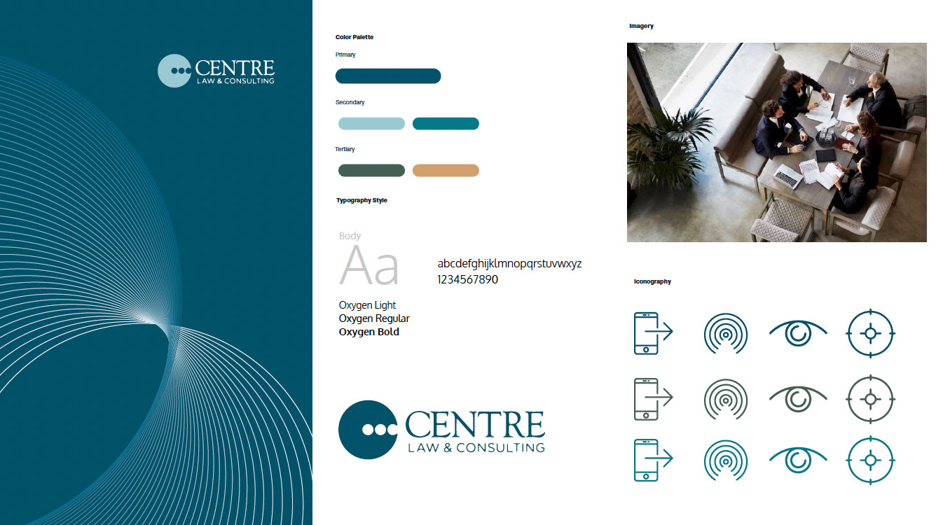
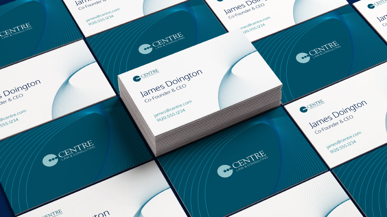
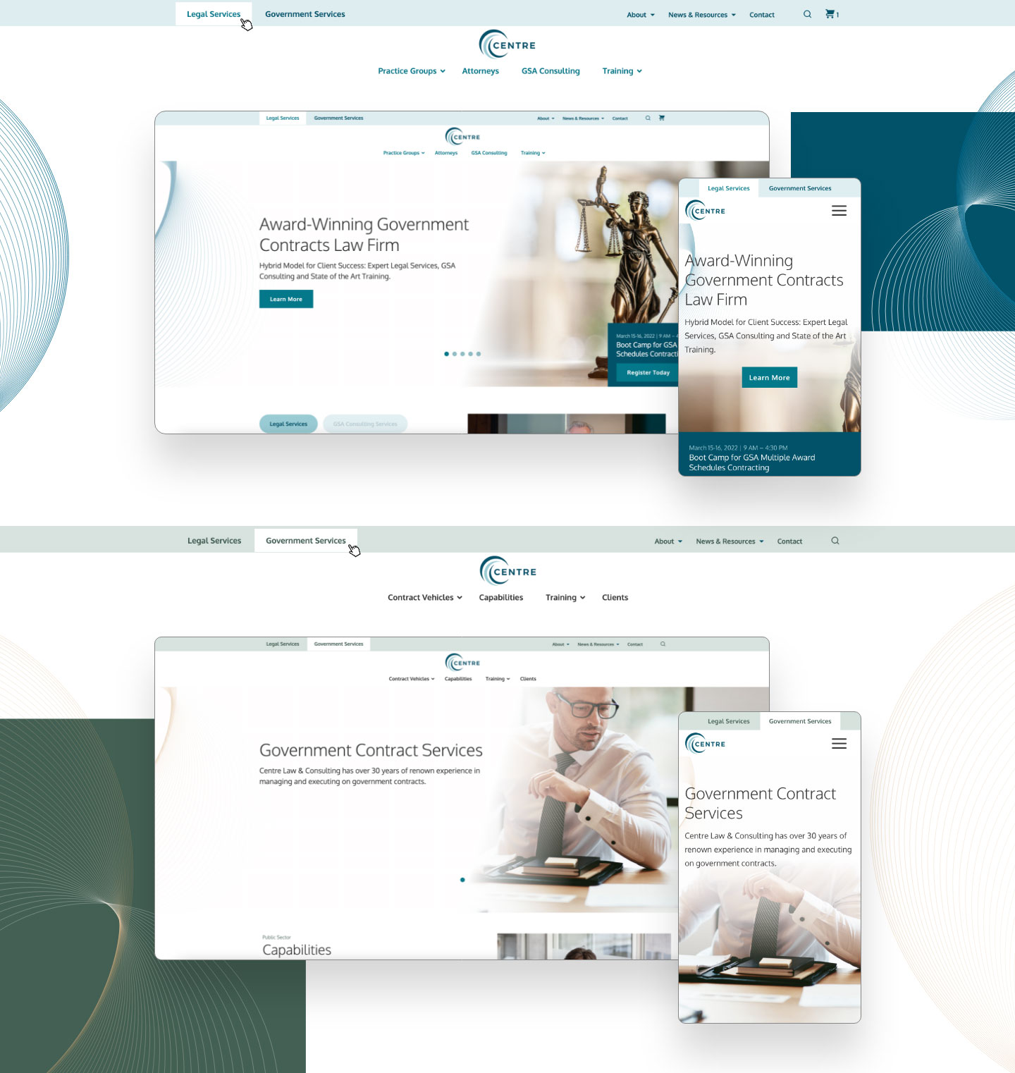
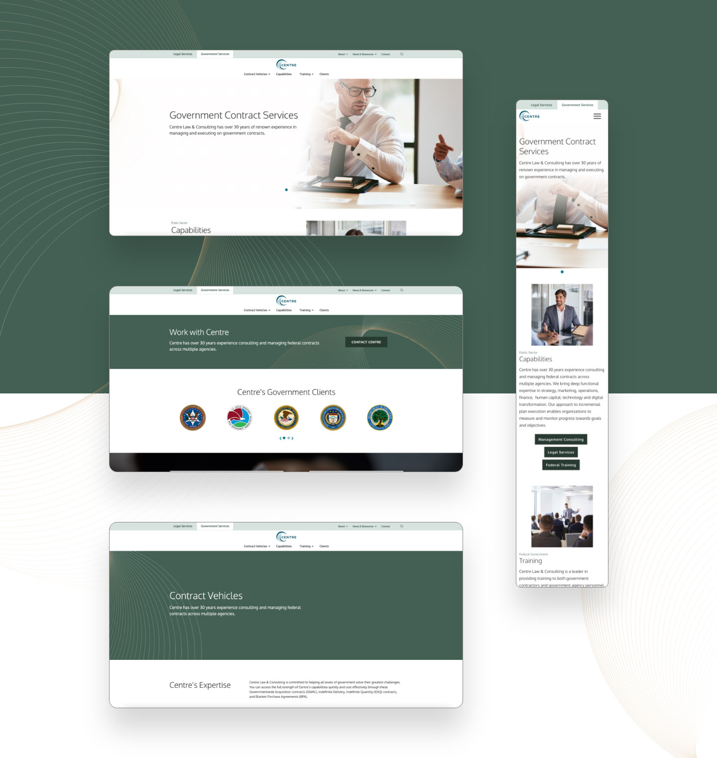
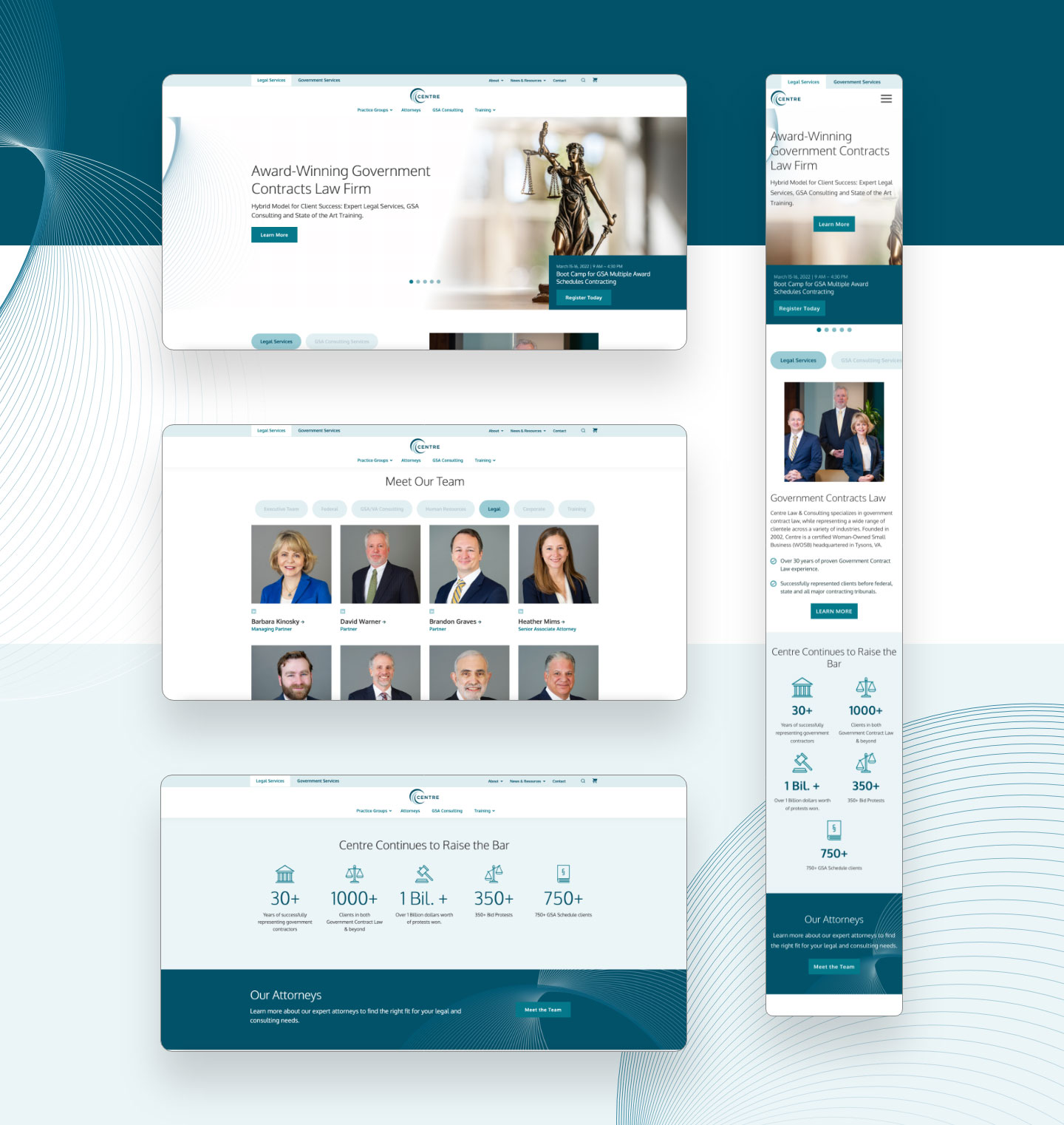
In creating key brand assets and visual identity to be used across the website and marketing collateral, primary and secondary color palettes were utilized to represent the separate but related government and legal service offerings. While the colors are distinctly different from each other, the adjacent cool blue and green shades don’t create a stark contrast between the divisions to allow for a cohesive brand identity.


Thoughtful UX/UI Design For Multi-Site Experience
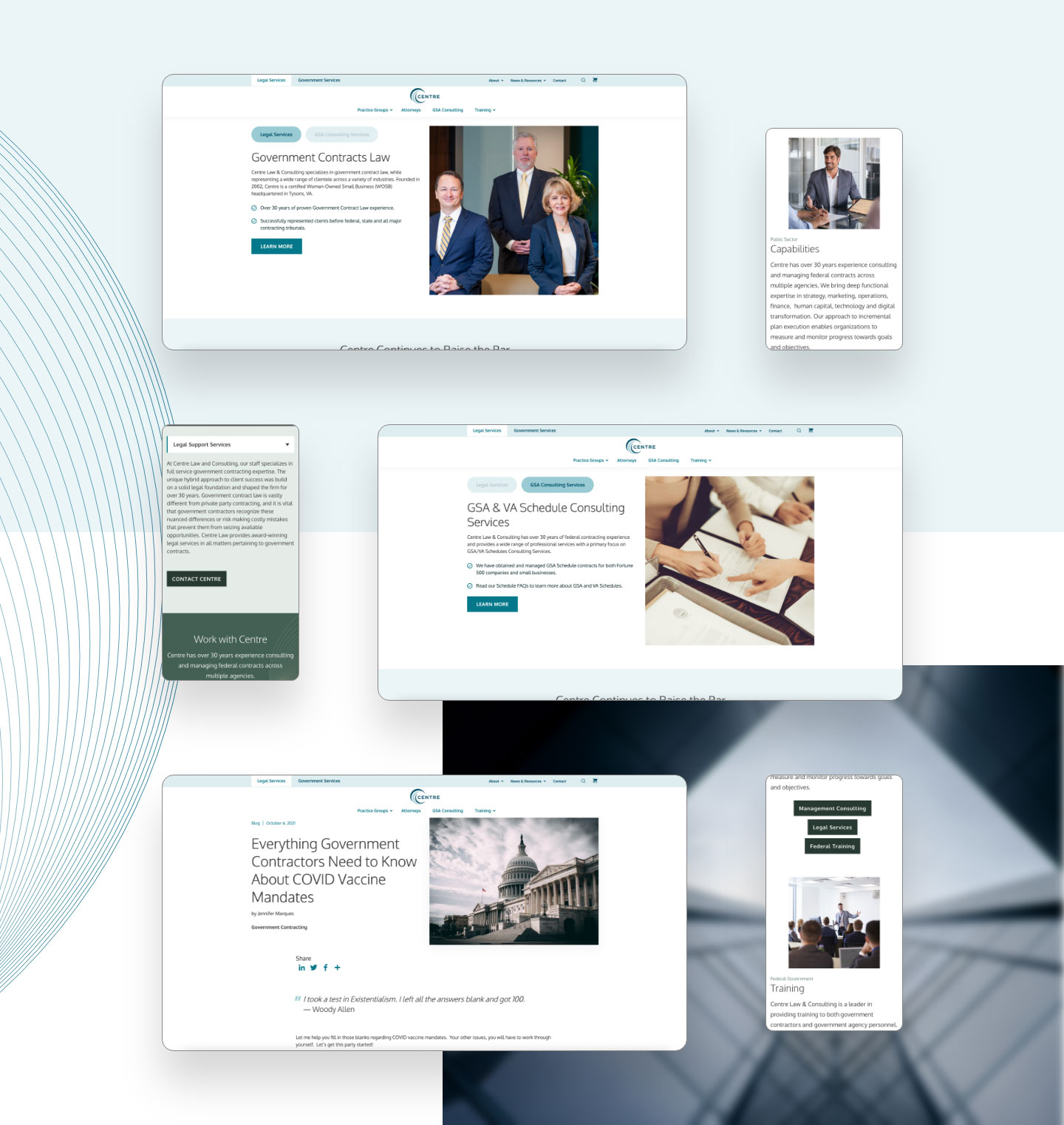
Centre Law & Consulting came to Bluetext to ensure that their new website architecture would reflect both the Legal and Government service offerings. Creative UX design led to the creation of the tabbed site, which allows site traffic to flow seamlessly between the primary domain and subdomain of the website.

E-commerce Configuration
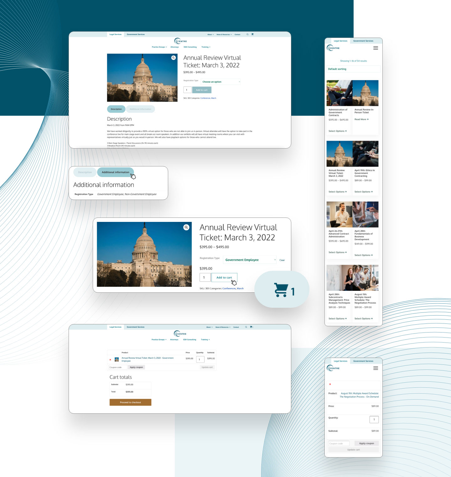
As a special requirement for this site, Bluetext set up ecommerce integration, WooCommerce, that enabled them to sell training courses directly from their site. From the Legal Services tab, users can add courses to their shopping cart, shown in the upper righthand corner of the screen. Since government training courses are not available for purchase directly online, Bluetext developed a separate course listing component for users to navigate and explore course offerings.
