
Simple, Clean Logo Design for BlueAlly
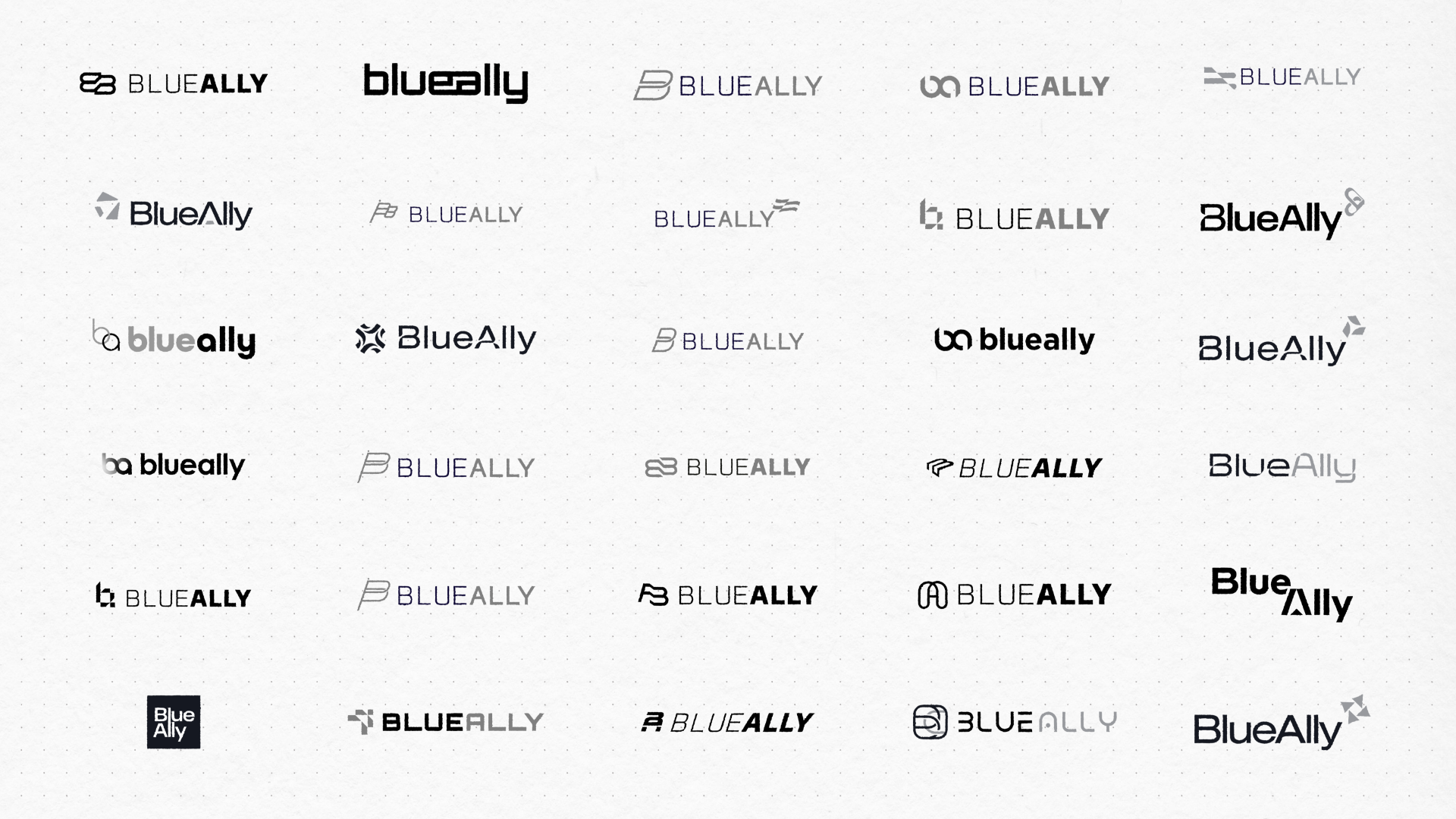
Bluetext was asked to create a logo that would be simple and clear without appearing too "digital" or overly "tech-y." The mark needed to be abstract enough to represent their range of services and to play into their brand story of their recent acquisitions. The chosen design applies a custom font treatment using cutouts in the letter A. The icon is unique and ownable, pulled from the shapes within the font (see the bottom right leg of the A). In addition, the negative space in the icon creates an arrow pointing right, telling the brand story of moving forward and looking to the future, and the repeated shapes in the icon represents collaboration that leads to future innovation and improvement. Overall, the feel of the logo is professional and strong, yet approachable and forward-thinking, just like the brand it represents.


Styled Brand Applications
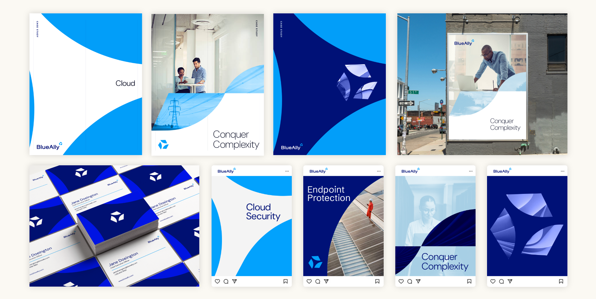
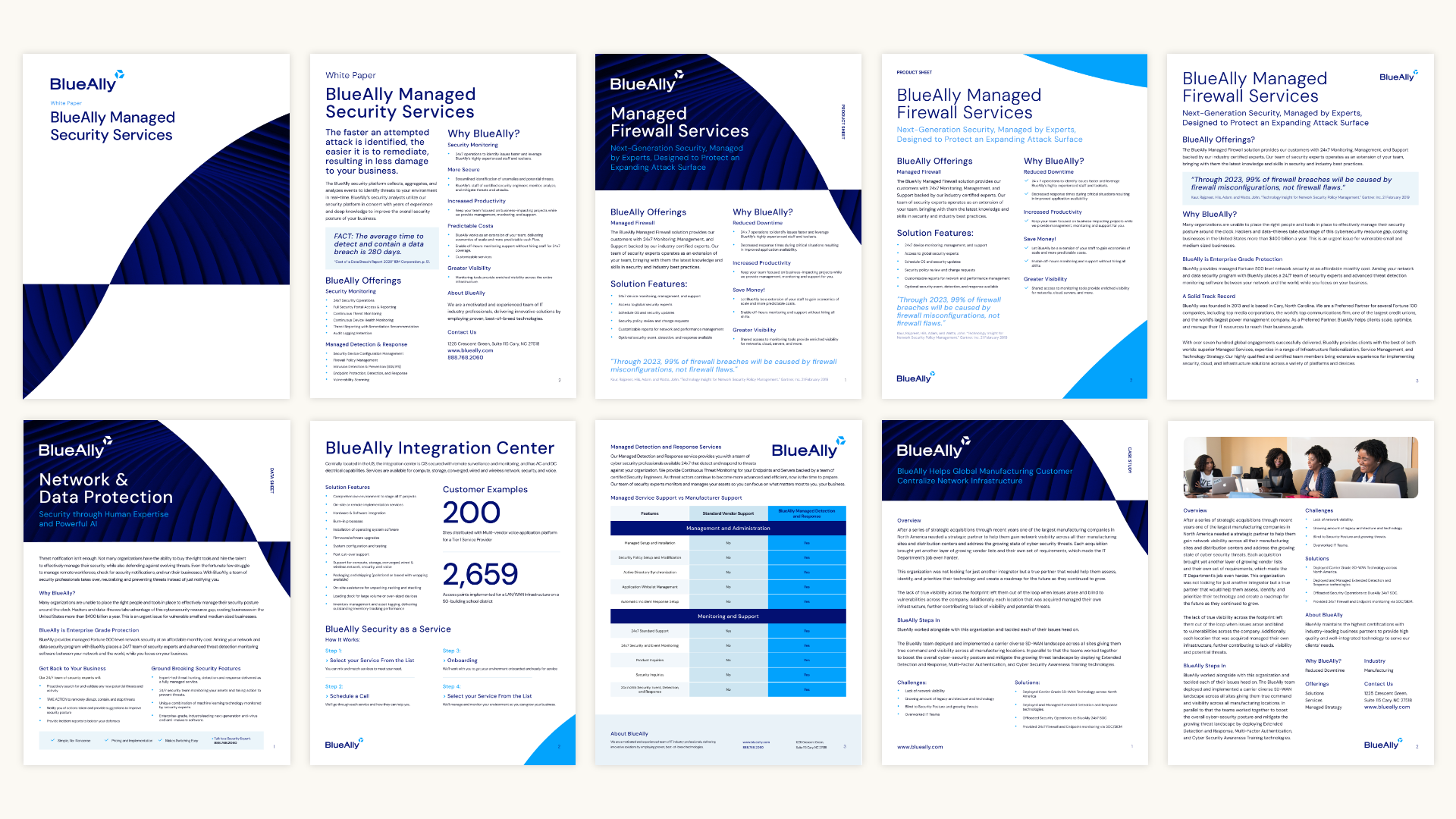
The primary brand element for the BlueAlly CVI is the logo mark. The mark can be scaled-up to use as a mask over imagery or as a background element in components. This allows the negative space created by the logo mark itself to become a brand element, reminding viewers of the forward momentum of the BlueAlly brand.

Brand Essence Custom Video Production
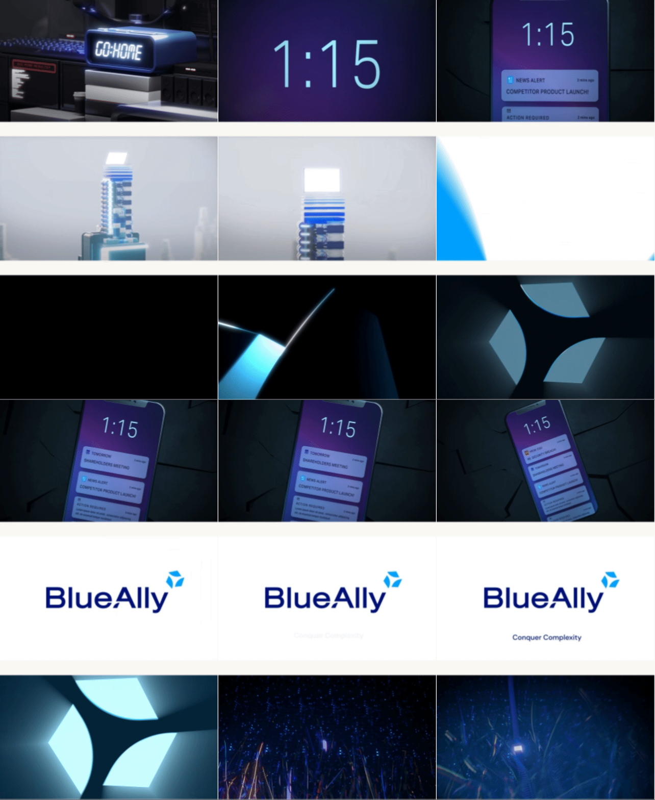
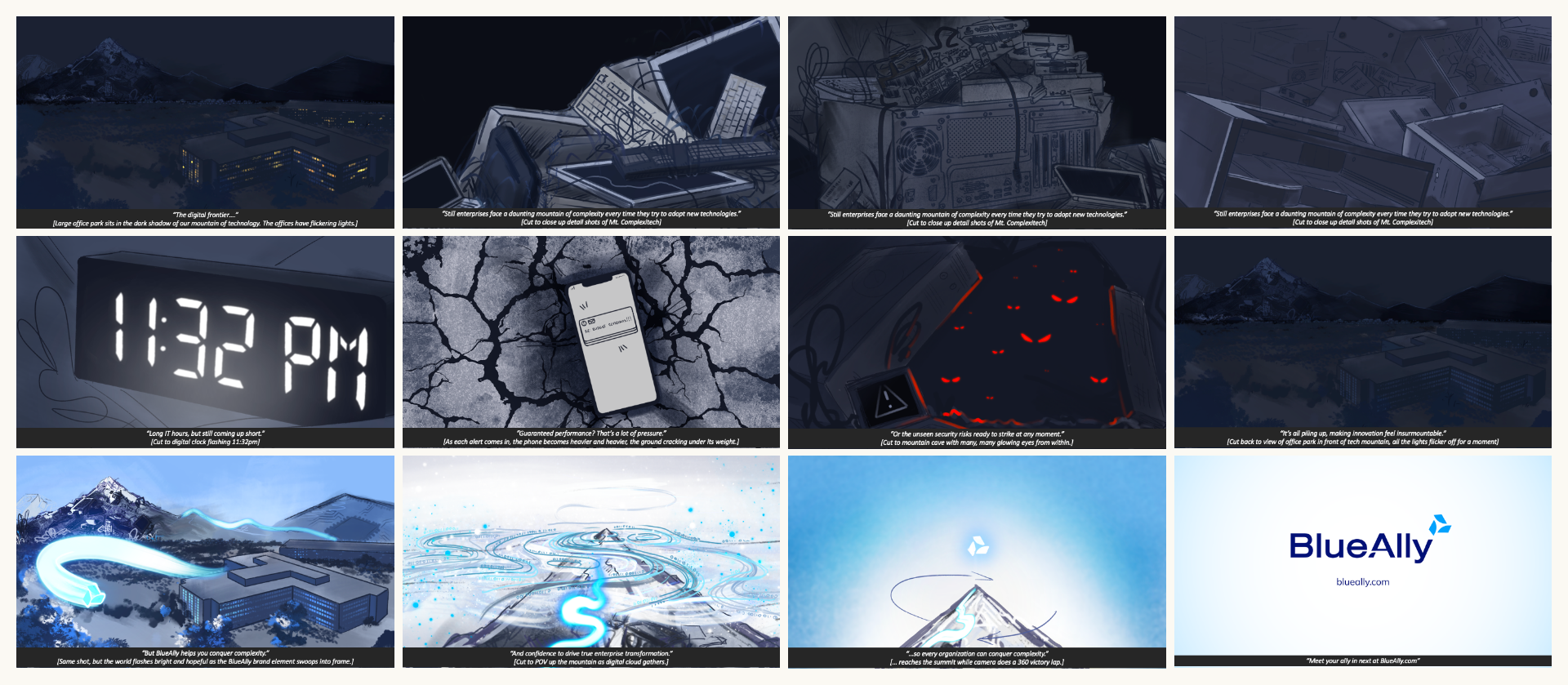
In producing the Brand Essence Video for BlueAlly, the Bluetext team wanted to portray the feeling that enterprises have in trying to conquer IT transformation on their own. The looming, dark mountain of intimidating technologies represents the numerous IT solutions that are available to clients, but this mountain feels impossible to climb without the help of a partner like BlueAlly. With BlueAlly as the guide, the mountain transforms into an integrated, synchronized mass of technological advancement. The video showcases both the newly-formed messaging and updated CVI for a striking representation of the BlueAlly brand.

The Storyboard Behind the Motion Design

Responsive Website Design & Development
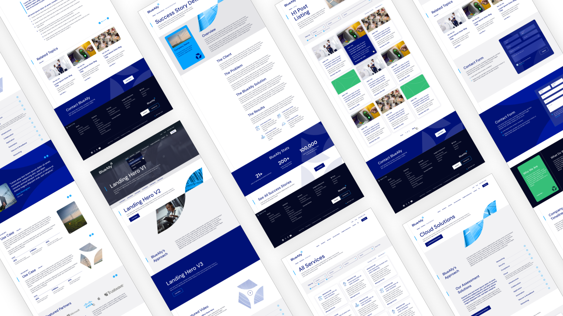
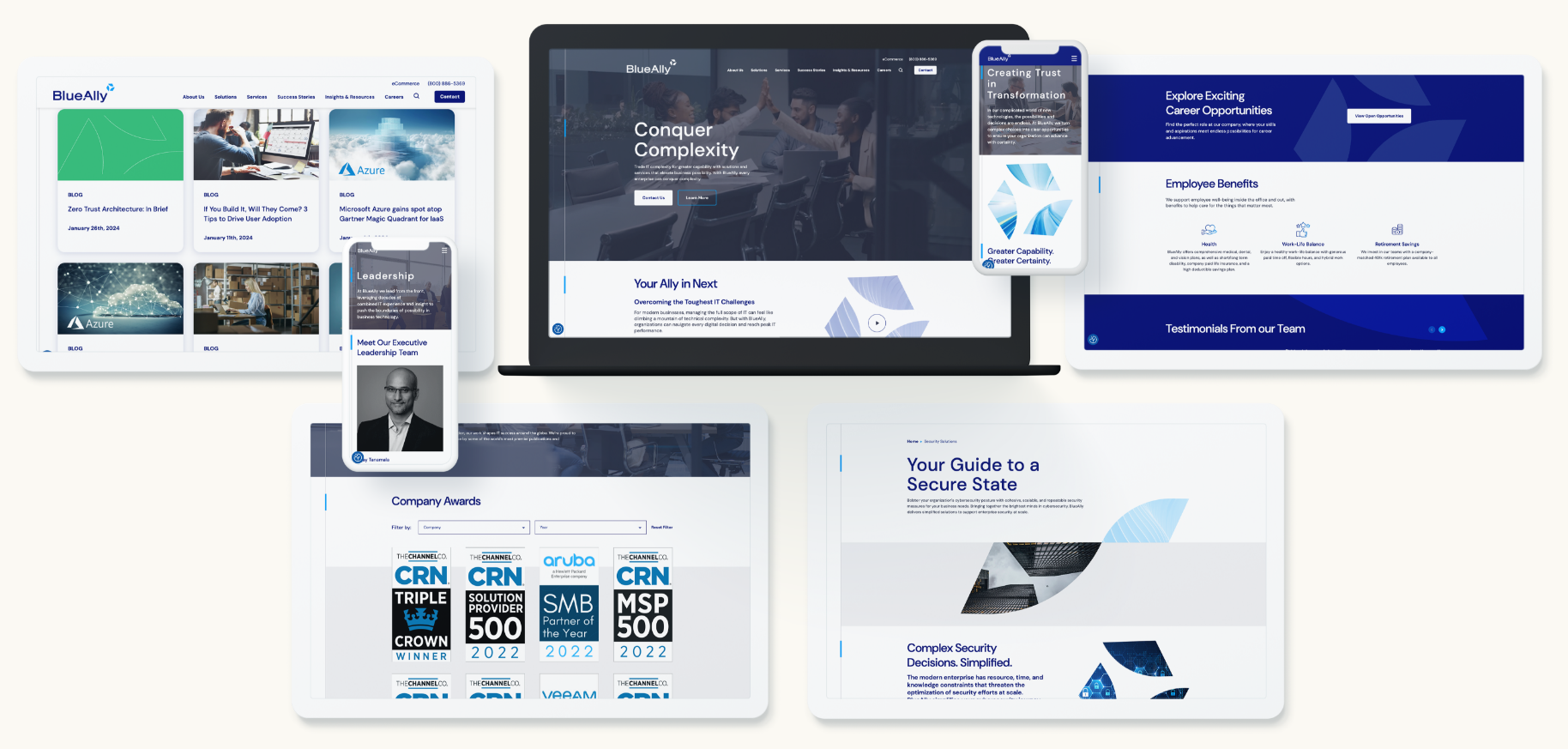
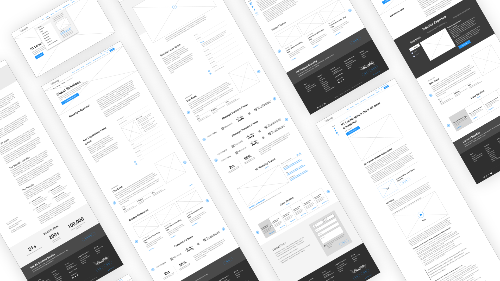
The BlueAlly site was thoughtfully designed for clean, simple, and straightforward user interaction. Tabbed components and listing pages offer users the ability to sort through extensive information about the BlueAlly offerings without overwhelming them with content. Bluetext also designed a unique success story page to showcase the powerful impact that BlueAlly has had in helping their clients to Conquer Complexity. With sleek UX interactions and responsive designs, the site is easily navigable for users from desktop to tablet and mobile experiences.
