
Branding
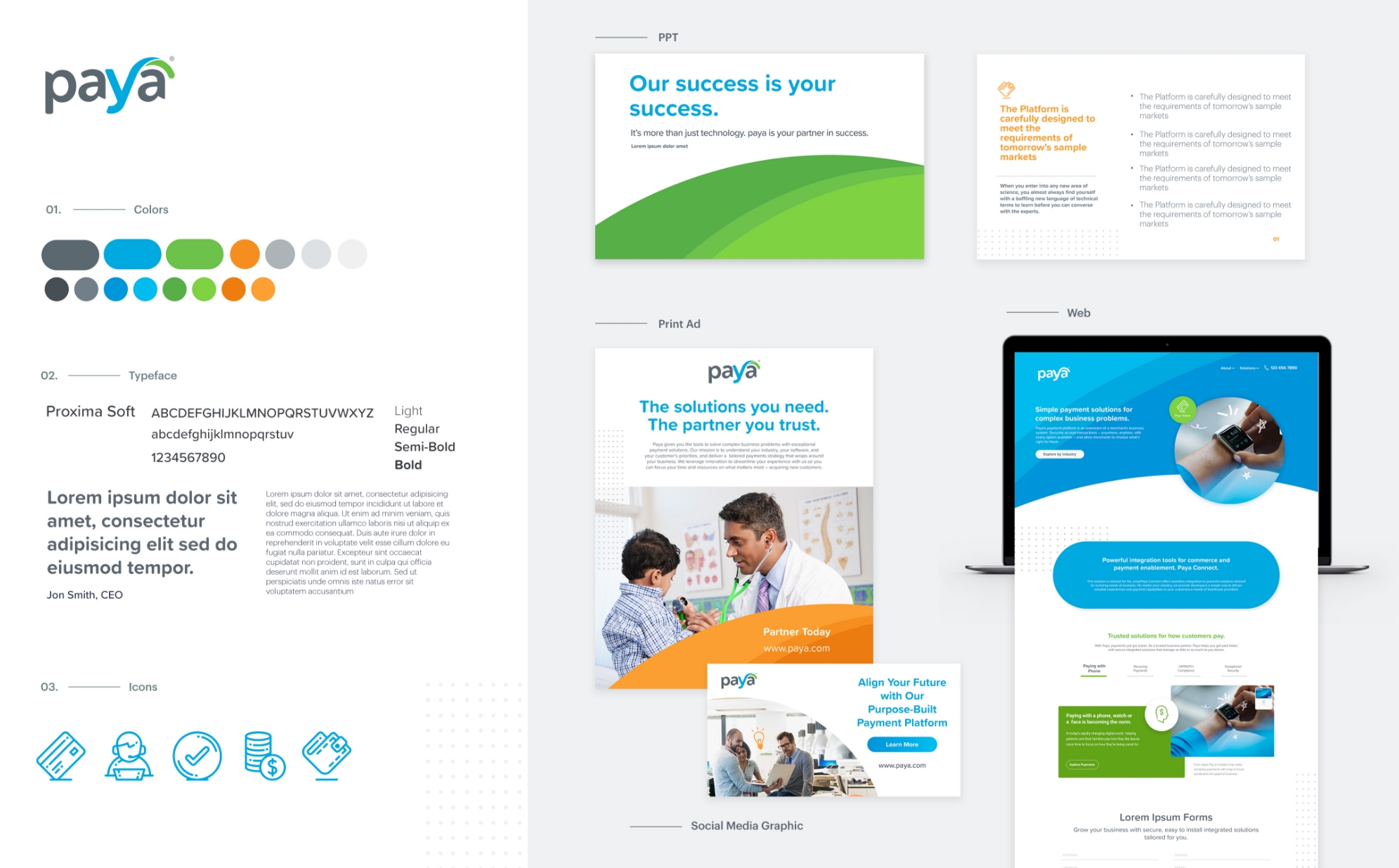
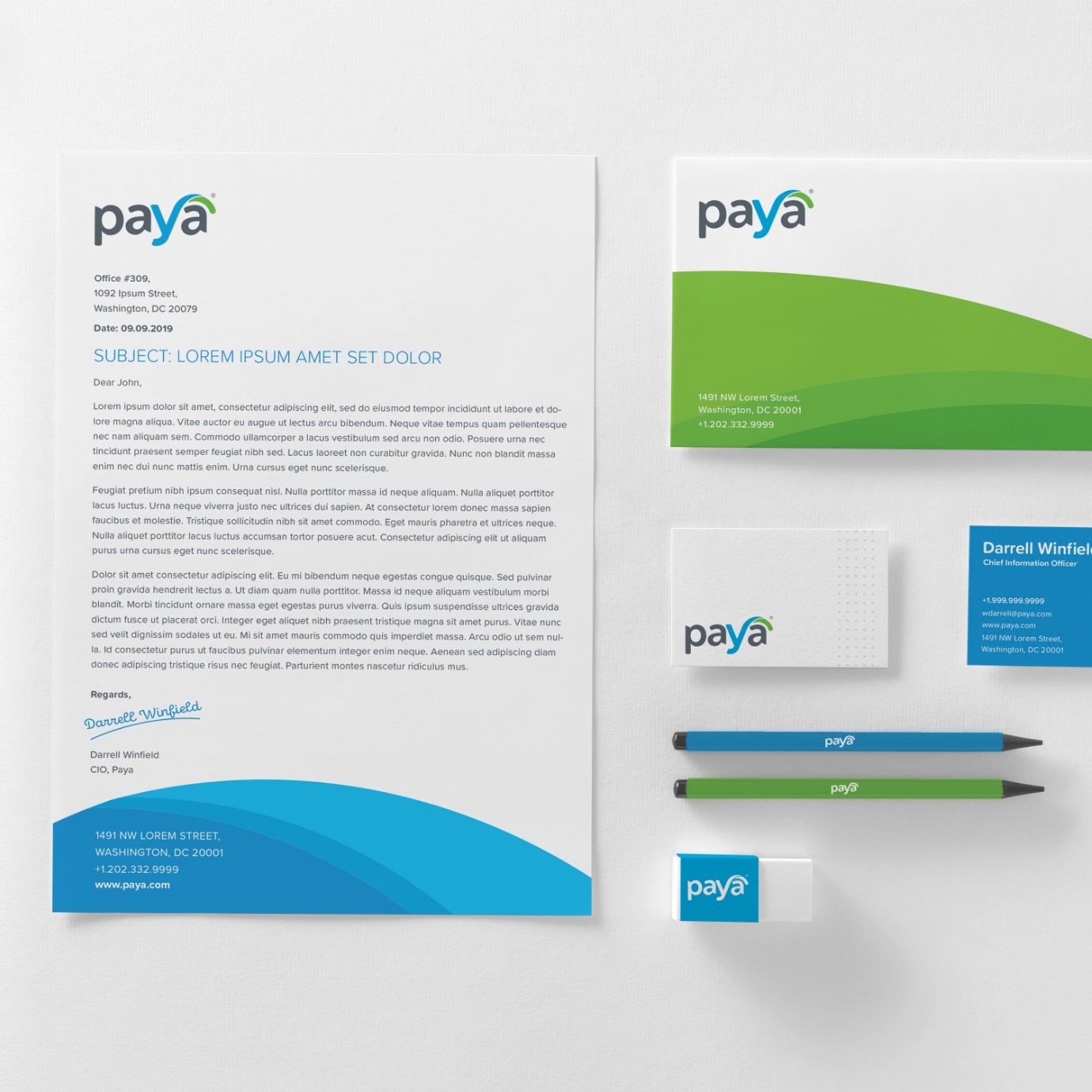
Written in a custom lowercase typeface, the Paya logo evokes a sense of freshness, simplicity and approachability, representing a brand that offers convenience and new thinking in a stale and over-complicated industry. The new “horizon” element captures the essence of partnership and collaborative productivity, interpreting the curve of the logo’s “y” and leveraging it as the primary graphic element.

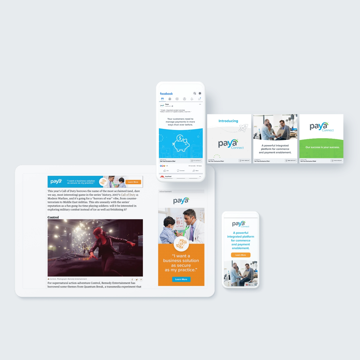


Marketing Assets
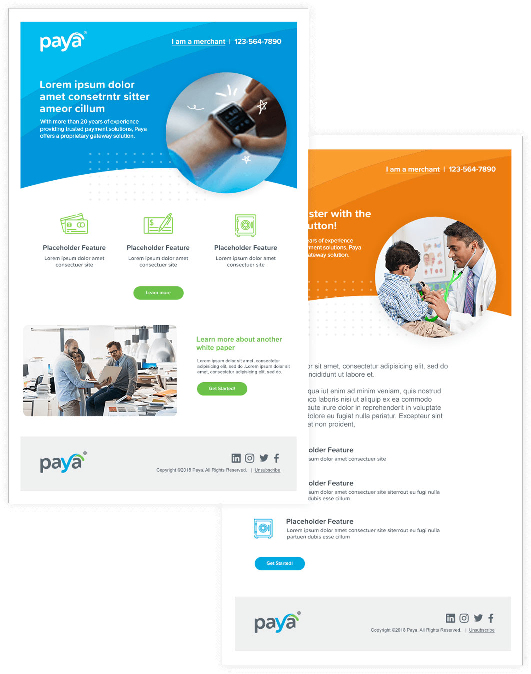
The brand evolution imagines an entire new fleet of marketing and advertising assets ready to meet any GTM strategy or need. From custom landing page and email templates to personalized animations and rich media, Paya is ready with campaign specific content on-time, on-message, and on-brand!
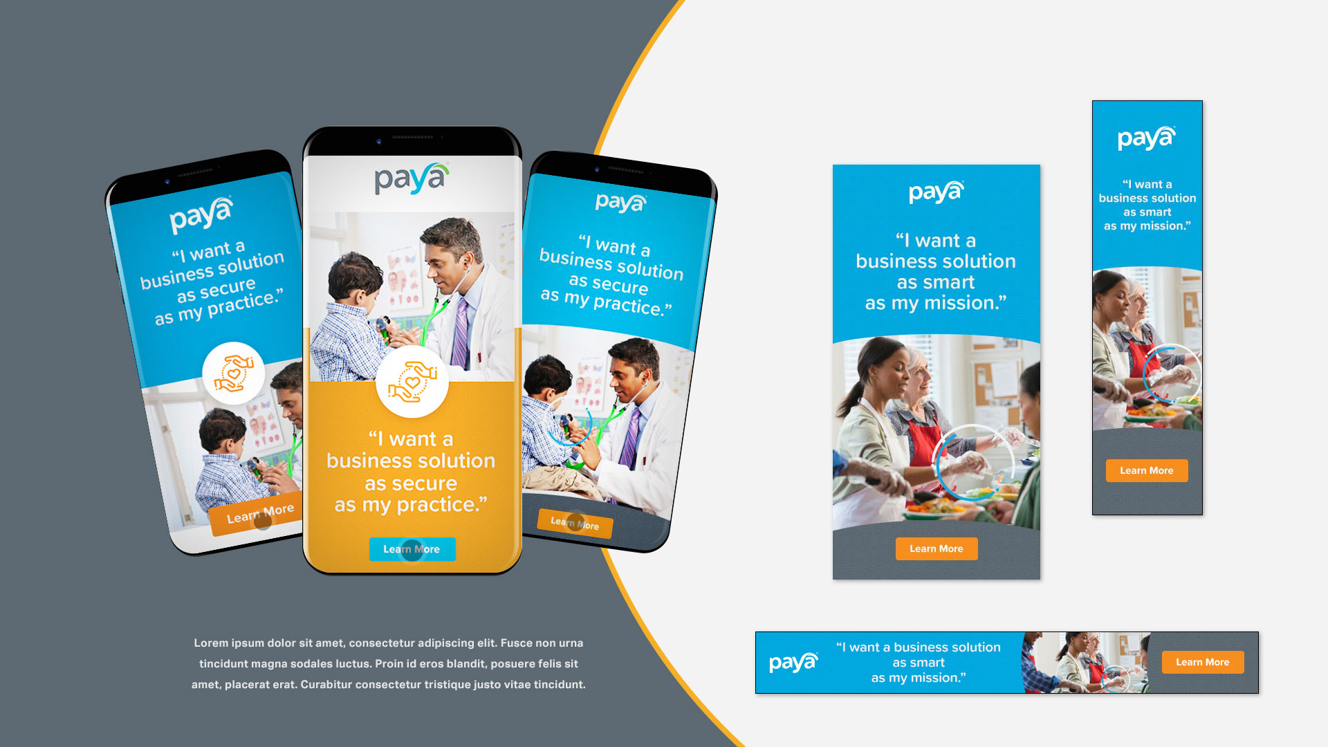
Industry-Specific Pre-roll Ads

Custom Illustrations
Taking the visual representation of an “approachable” brand to new levels, Bluetext produced hyper-custom illustrations for Paya’s use of imagery. Overlaying “expression lines” through various interpretations, Paya promotes its industry enthusiasm through new animated product videos, revamped landing page hero zones, and even unique executive employee headshots.


Website
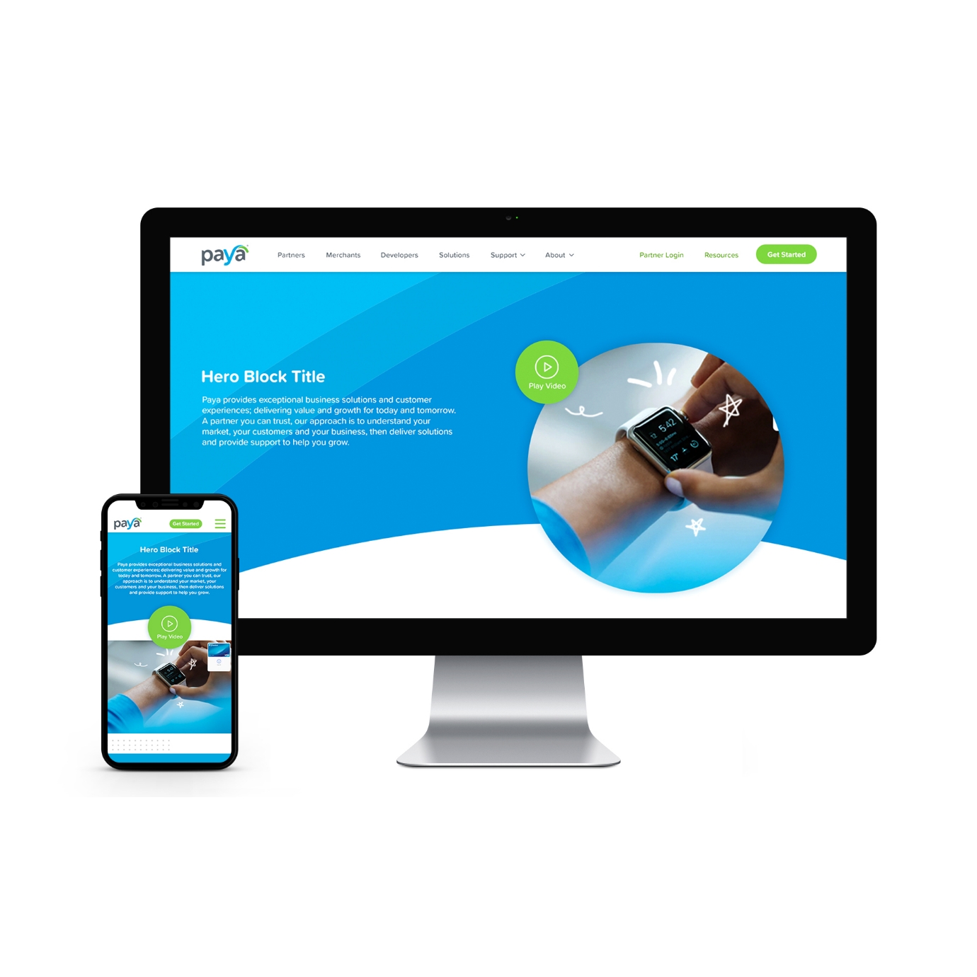
With an enhanced UX strategy, the Paya 2.0 website incorporates the content functionality needs of today, while ensuring a flexible back-end CMS and front-end user journey which can anticipate the content needs of tomorrow.
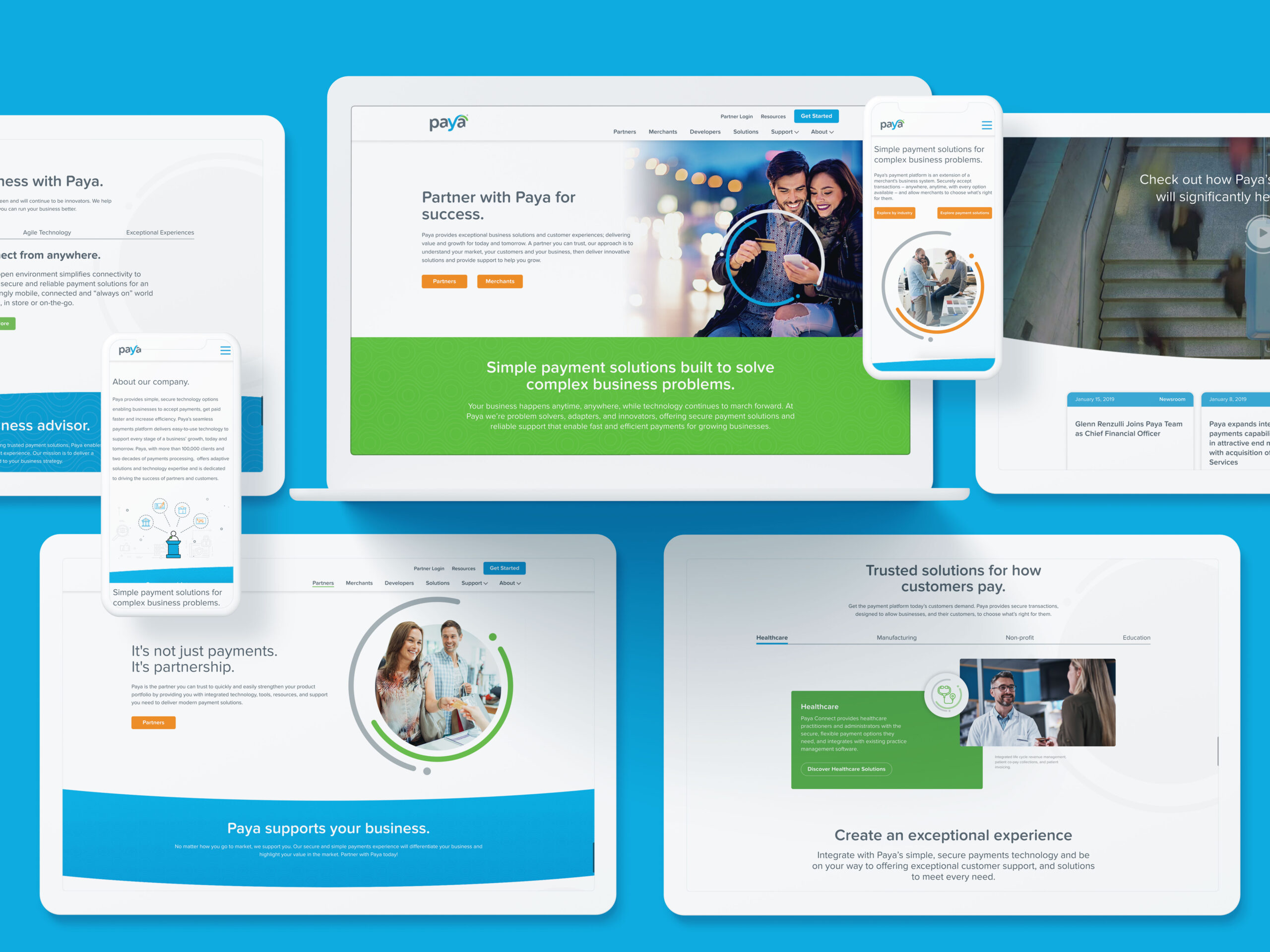

Unique UX Designed for the User Journey
Paya required their most trafficked landing page to promote two equally important, but different, customer needs. Bluetext introduced the dual-journey hero zone, accommodating both user priorities within the same page experience.
Improving upon previous form fields, new designs allow forms to meet 508 compliance and user requirements while keeping everything elegantly on-brand.


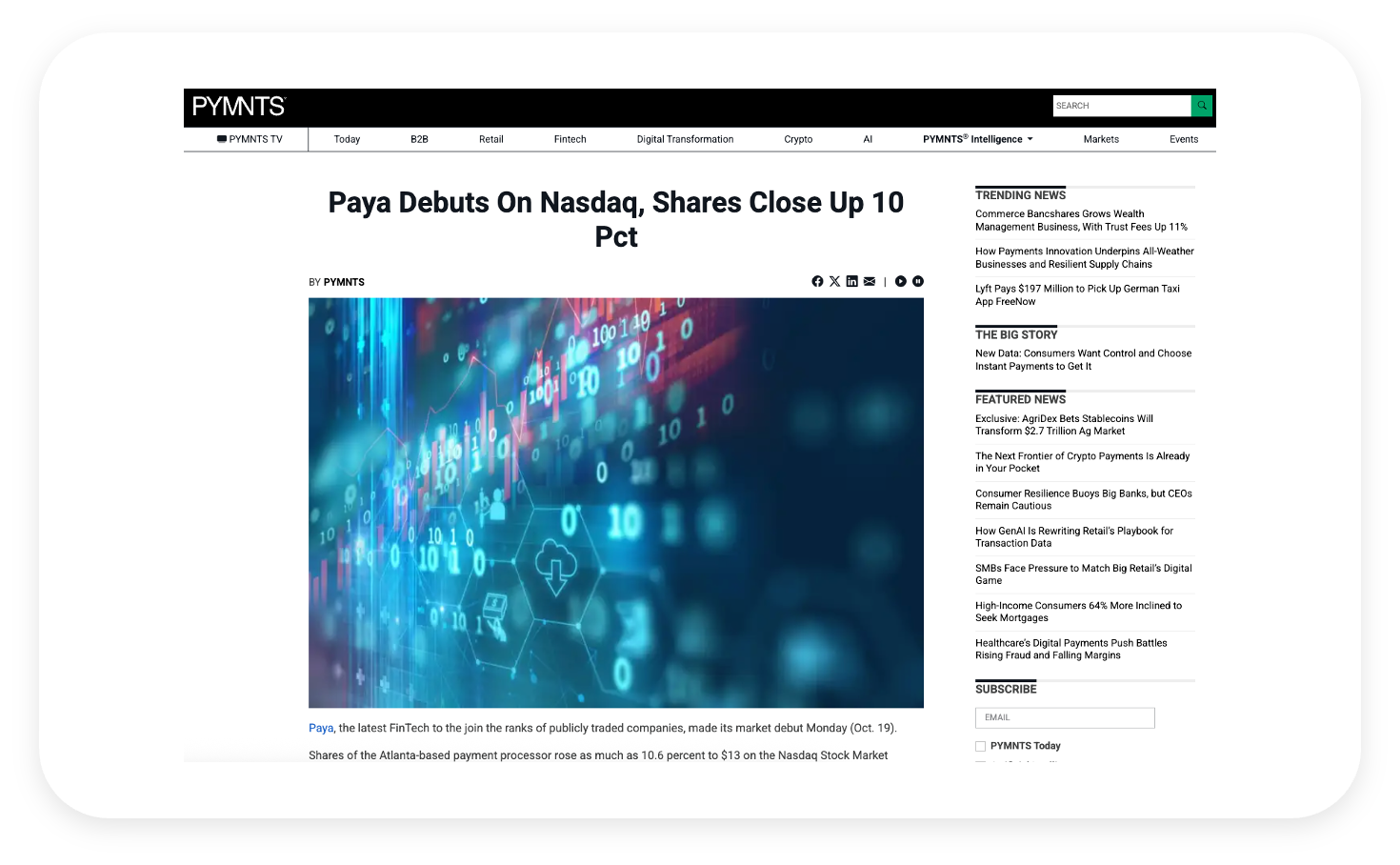
Branding for a Successful IPO
Paya's successful IPO marked a significant milestone in the payments technology sector. As the company prepared for this transition, Bluetext partnered with Paya to develop a comprehensive brand strategy that included a refreshed visual identity, messaging framework, and digital presence. This strategic branding initiative enhanced Paya's visibility and positioned the company as a leader in integrated payment solutions, contributing to its successful public debut on the Nasdaq under the ticker symbol "PAYA" .
