Welcome to 2020, a year of new normals, routines, and best of all, new logos! The logo design trends in 2020 thus far have been an intriguing remix of new and old. Logos have taken a trip back in time to a variety of eras, while also remixing modern styles. We’ve seen the gamut of design trends; from neon 80’s juxtaposed against inky, to futuristic 3D gradients and custom animation.
The key theme of 2020 logo design has been a digital-first focus. Many brands have modernized their logos for optimal web and mobile displays. For example, the popular gradient trend has evolved and merged with 3D design —a perfect fit for our smartphone society.
3D Gradients
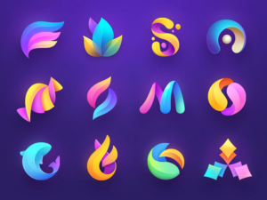
Gradients are a unique way to blend any group of colors into a dynamic spectrum that exudes life and energy. Gone are the stark striped color transitions, as some brands have opted for a more subtle and gradual shift. This year, designers will give rise to the newest evolution of gradients creating depth and 3D effects in logos. Other top branding agencies are experimenting with new trends such as tapered gradients—ones that come to a central point and actually emphasize the contrast between their colors.

80’s Retro
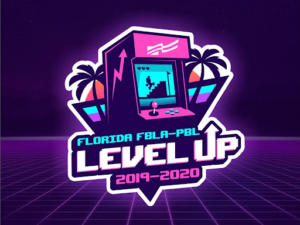
Don’t thrift away your 80’s style just yet, because some fads never go out of fashion. Enough time has finally passed for all things 80’s to be cool again: video games, pop music, and the rebel attitude associated with them. In 2020, logo design agencies expect to see a resurgence of throwback logos accented with chrome, neon, and a lot of digital pixels. These styles give a nod to the old-school tech that preceded the glowing iPhone and laptop screens our eyes are glued to today. Nostalgic marketing has made a huge comeback in recent years, necessitating a cool, retro logo to accompany any throwback campaign. Throwback logos are popular because they capitalize on consumers’ nostalgia of old-school 80s tech, which is widely known to be retro, cool, and most importantly, collectible. Some logos reference nostalgic 80’s items by literally depicting the old school cassette tapes, arcade games, etc. Others embrace this trend with 80’s typography and design trends, like GV’s logo for LI Mowz.

Ultra Thin Lines
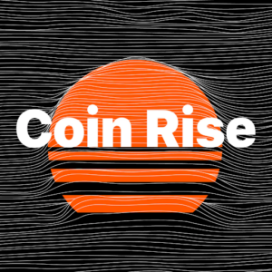
In 2020, high definition is leaving its mark on logo design. Designers push the envelope with extremely delicate lines, creating effects that can only work in the digital media. With extremely detailed linear patterns, logos began to feel ethereal and surreal — much like the original perception of radio and transmission media. With the new ability (and COVID necessity) for some brands to exist exclusively online, previous print limitations are eliminated. In an age of high-resolution screens and defined displays, complex line design makes classic logos seem elementary and easily reproducible.

Multi-Layered
2020 has been all about complexity! Logos are going deeper than ever before using artfully layered color systems. Especially with new digital affordances, designers are reverting flat and semi-flat designs to build depth through color layering. While shapes and colors remain simple, their relationship has intensified. By adding additional layers, designers create complex logos with highlights, shadows, and overlapping colors to communicate the brand brands. Especially on digital screens, the ability to create three-dimensional effects creates a unique, almost tactile experience.

Animated Logos
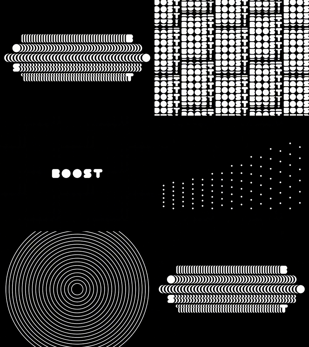
Top design agencies have been producing logo animation for some time now, but in 2020 we’ve seen more detailed and innovative plays on animation. Previous logos have been limited to simple movement, but over the years technology has allowed for more intricate and purposeful movement. Especially with a growing digital audience, animated logos can be more eye-catching and practical to the brand story. A popular 2020 logo design trend has been the blending of 2D and 3D animation or logos with multiple moving parts. These complex logo animations aim to take the viewer on a journey and tell a story. With lots of details to look at, the viewer looks at these logos longer than they’d look at a more simple logo animation and can potentially find something new they like about it every time they see it again.
The move toward animated logos comes from a similar place as the tapered gradient logos trend: when you’re designing for screens, there’s a whole lot more you can do as opposed to when you’re designing for print.

The logo design trends for 2020 will continue to build on everything designers have been exploring in the last few years, while also taking the design in directions that are totally new, totally fresh, totally right for an all-new decade. Let’s take a look at the top logo design trends that are already defining 2020.