Google Search is known for consistent updates and feature releases but is often done in a beta-testing form. What does this mean exactly? Essentially, these new features will undergo A/B testing where only a small subset of users will experience this feature, while the majority of the user base will notice no change to the user experience.
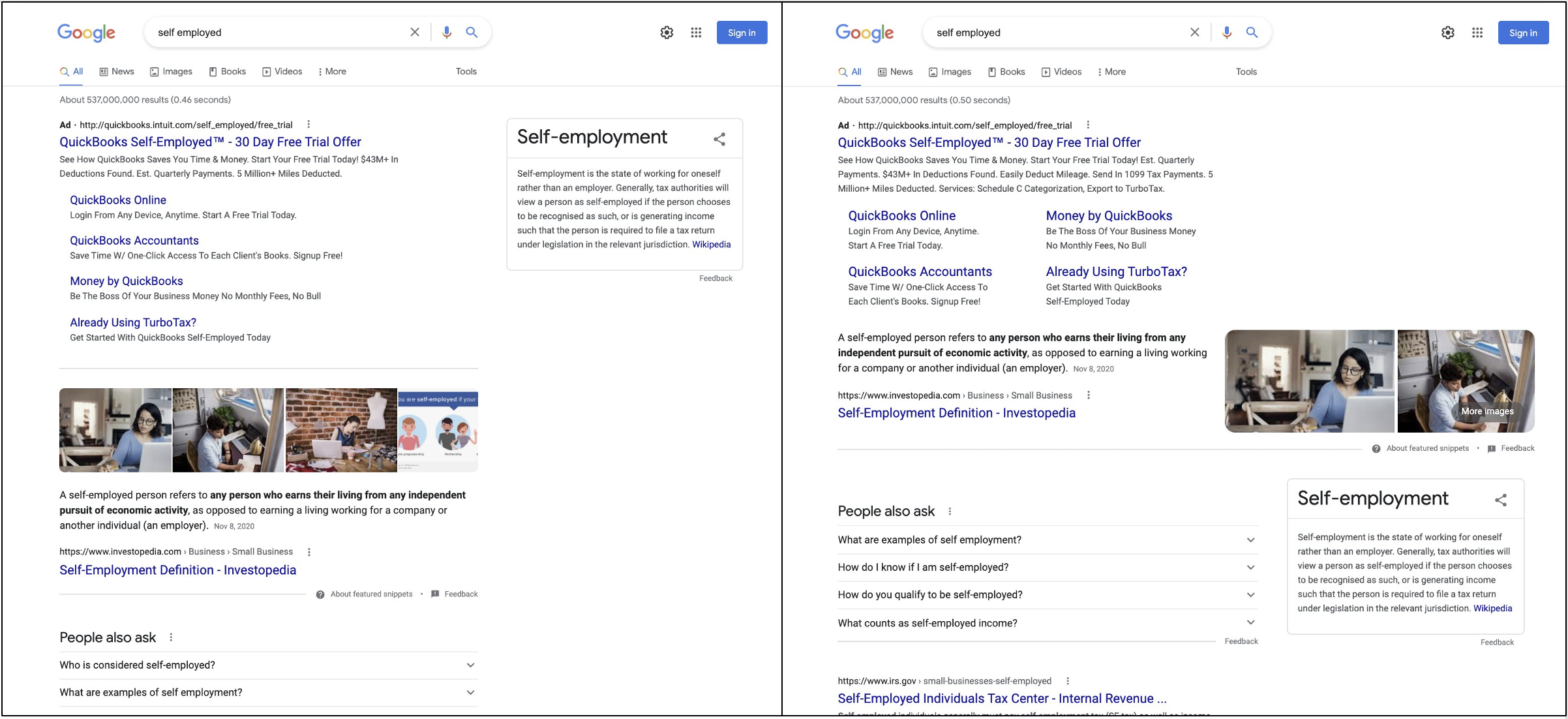
Google’s newest feature to be unleashed for user evaluation is featured snippets. This updated design interface will display across the full width of a user’s viewport. While traditionally search results span across only two-thirds of the screen, cutting off at the end of the Search bar, this format frees right screen real estate for Google business, location results, and advertisements.

Featured Snippet: Current vs. Beta
How Do I Get A Featured Snippet?
Unfortunately, featured snippets can’t be acquired by any amount of search engine marketing budget. Featured snippets are based on Google search results or SERP. Google’s automated systems determine whether a page would make a good featured snippet to highlight for a specific search request. A featured snippet will display the result description above the webpage link, rather than below like all other results. Google crawlers will implement this display format if they believe the page will help users easily discover what they’re seeking, either from the description about the page or by full webpage content when they click on the link. These features are especially prominent on mobile or voice searches, both methods rapidly growing in popularity.
So, What’s the Verdict?
The reviews are mixed on these new full-width features. Below, Bluetext has explored the pros and cons users have pointed out.
Cons:
Some users were off-put by the ‘massive’ span of text, feeling that this layout overtakes the screen and seems off balance with all other content aligned to crop at the search bar. Naturally, any change in the layout we have all grown accustomed to will seem awkward at first. However, the wider format is encroaching on the right panel where the Google My Business and local listing results typically display. This could consequently push key information (Google images, address, hours, reviews, contact links, and more) that users expect and inevitably demand when conducting a search.
Pros:
As digital marketers, Bluetext pointed out some advantages of the ‘massive’ display. First, the featured object is much more prominent and attention-grabbing. By definition, featured snippets take a differentiated view (description displaying above link rather than below), making it a high achievement for organic search. The wider, full-screen takeover intensifies the distinction from other websites and increases the likelihood of a user clicking on a page.
It’s unknown if and when these featured snippet updates will be unveiled to the Google user base as a whole, but take notice next time you conduct a search to see if you see a change.
If you’re ready to ramp up your organic search strategy in hopes of becoming a featured snippet, contact Bluetext to see how we may be able to uplevel your strategy.