2020 has been the year of transitioning workforces, meetings finally turning to emails, new office place attire, and most of all, virtual conferencing. With pandemic restrictions putting a pause on in-person interactions, many industry conferences, trade shows, and events have been forced to postpone, cancel, or adapt.
In the spirit of adaptation, many companies have found ways to work around the obstacles of the pandemic and preserve the annual events and conferences that customers and business partners have come to rely on. Virtual events have become the new normal. Businesses are realizing the potential of virtual conferencing and webinars, and using a variety of virtual networking platforms to achieve their event objectives completely online.
As an agency with virtual event marketing capabilities, Bluetext has seen a range of approaches and ways to make businesses virtual. Our favorite virtual event trend thus far has been the “real-corded” style of virtual events. Instead of simply posting videos or recordings online to viewers, some companies are opting to recreate the expected live event experience for viewers. This attempt to preserve the familiarity of traditional trade shows and industry events is well received and appreciated by attendees, as it gives some sense of normalcy and expectancies in an uncertain period of time that we live in. There is a large amount of risk that comes with hosting a completely live-streamed virtual event, including technical issues, presentation quality, user behavior, and platform capacity. However, clever companies have found a way to disguise recordings as live streams and provide some sense of community and group experience to viewers.
The “Real-corded” Experience
Here are some of our favorite ways recorded events have simulated live stream experiences:
1. Countdown Clocks
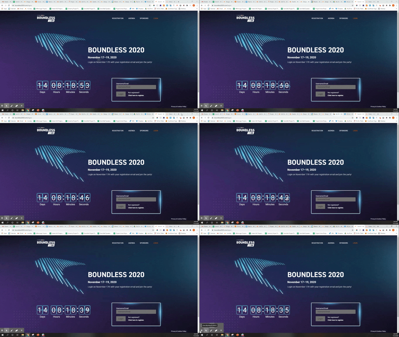
For SonicWall Boundless Virtual Event, a dynamic countdown clock was added to the pre-event site to show exactly how many days, hours, and minutes until the virtual event would go “live.” The pre-event site was loaded with everything a viewer might need to know about the event, including promotional teasers to agenda and FAQs.
2. Event Log-In
Once the countdown hit zero, the pre-event site updated to allow an attendee to log-in. Very similar to a normal in-person protocol, where a user would sign-in and verify that they had registered for the event before entering the venue. After logging in the user would be greeted with the simulated “Lobby” of the live event site.
3. Time Gated Resources
The pre-recorded video sessions were locked prior to their specified showtime and featured a branded thumbnail to notify an attendee the session had not yet begun. Just as a live event attendee could not time travel to future sessions, the event site did not allow viewers to fast forward the schedule. Once the session was 30 minutes away from scheduled showtime, a new countdown GIF would replace the thumbnail to announce the upcoming video.
4. Virtual Booths
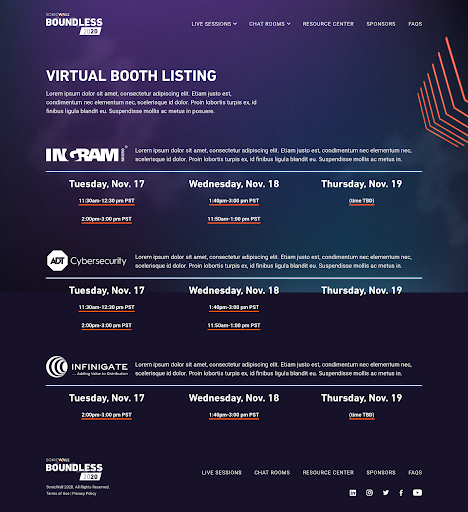
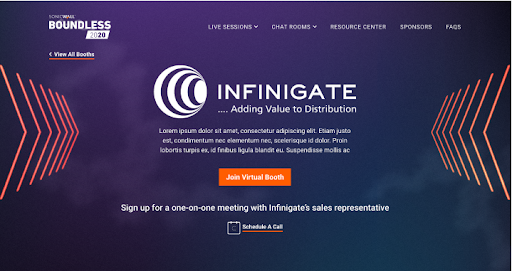
Another hallmark of the virtual event experience was the affordance of networking. While the majority of the event was pre-recorded to allow for post-production editing and ensure visual and audio quality, there were portions of the event where viewers could join a streaming platform and chat in real-time with hosts.
All of these features had guests wondering, real (or recorded?) during the event. The transition between real and recorded video content was made seamless by custom web integrations and streaming platforms. Interested in making your virtual event truly come to life? Check out Bluetext’s virtual event experience, and contact us to learn how we can make virtual a reality for your business.
So you want to host a webinar? In the wake of COVID-19, webinars are your safest option for meeting with your network. According to ON24, at the onset of COVID-19 webinar usage jumped up by more than 330% as a result of the work from home shift. Six months later and webinars are the new normal. So how can you ensure yours is as successful as possible? Check out our virtual experience tips below
Timing is Everything
Studies show that unlike before, your webinar is most likely to draw in participants if it’s held on a Tuesday. While webinars have increased in popularity across every day of the week, Tuesdays have proven to be the most effective. Additionally, any promotional emails for your webinar should be sent early to mid-week for maximum effectiveness. Let’s face it, most of us are most effective early in the week–before the week gets too crazy. Bluetext can help you put together and execute a comprehensive marketing plan to advertise your webinar when audience attention is highest. From coordinated social media posts, designing promotional email templates, and even creating and placing ads, Bluetext is ready to assist you every step of the way.
Tech Support
We’ve all come to learn with work from home protocols, technical difficulties have been encountered by the best of us. However, they can change the tone and impression of professionalism for every participant. As an experienced virtual event and webinar agency, we’ve learned a few ways to avoid this frustrating user experience. First, always conduct dry runs internally to ensure all your settings and equipment work properly–the last thing you want is for your host to have AV problems at the start of your webinar. Second, we recommend having team members on standby to provide any last minute tech support to your attendees. Third, have a backup plan! Whether you offer a second platform for viewing the webinar like Facebook Live or Twitch, or a backup laptop for your host, think through any potential issues ahead of time. Lastly, if you need to contact customer support, be prepared to wait. With the increase in virtual meetings, vendors are struggling to keep up with the tech support demand. That’s why we recommend preparing in advance and working with a trusted agency, such as Bluetext, that has experience troubleshooting these sorts of technical problems.

Resources
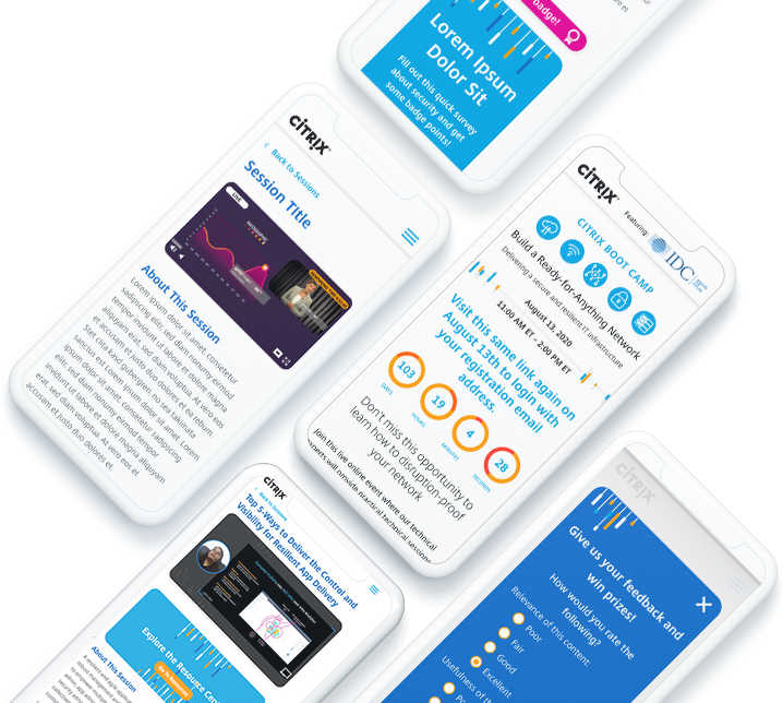
What good is a webinar if you don’t have actionable content for attendees to access? Whether you present a PowerPoint or review a whitepaper, attendees should have access to it all. The goal of a webinar is to engage and inform, so ensure any content you provide will be relevant for a few months. We also recommend having your resources link back to your site to increase engagement and keep your company top of mind. Additionally, ensure the content you share establishes you as a thought leader in your industry. Industry leadership is established by valuable content, but also professional and impressive brand identity. Be sure all of your collateral is aligned with your brand, contains digestible and insightful graphics or diagrams, and above all else creates a lasting and positive impression of your company. If your resources need a refresh, Bluetext is a full-service creative and copywriting agency that will ensure your content is as effective as possible.
Webinar Platforms
When it comes to webinars, there are countless platforms to choose from, but these are not one size fits all. So how do you know which is right for you? Each platform offers different features, branding opportunities, and security features. From experience in virtual networking and webinars, Bluetext has dug through all the major players and can recommend the platform that best fits your needs. We have been perfecting the webinar experience for the past few months with our virtual events and learned quite a few things along the way. Experience equates to first hand knowledge on what to expect from each platform, and the pros and cons the platform itself may not tell you.
Why settle for the same old webinar when you can increase engagement and memorability with a fully polished immersive experience. With our customizable virtual events, your users will feel like they’re attending an in-person conference again. In these times, a taste of normal is what we all need. Want to learn more about how Bluetext can help your webinar be a hit? Get in touch with us here.
Thank you for joining us for the Q4 2020 Bluetext Cybersecurity Summit. Exclusively open to CXO’s, our goal with this summit is to deliver a value-add platform to network in the C-Suite with businesses facing similar opportunities and challenges.
Topics:
We plan to discuss the following items:
- Technology Customer Investment Trends
- Technology Consolidation Trends
- MUCH MORE ….FILL IN SURVEY LINK BELOW
Date/Time:
COMING SOON: PLEASE FILL IN THIS SURVEY
Where:
COMING SOON: A link will be distributed with a calendar invite to all invited once the survey is done below.
Agenda:
- Welcome from Jason Siegel: 1 minute
- Introductions of each business by one of the representatives (2 minutes each): 15-20 minutes
- Five questions will be softballed out, each receiving 5-10 minutes of airtime.
Summit Specifics: Things to Know
- Jason will mute all microphones for audio clean-ness (something our 1st Presidential debate should have done)
- The raise hand functionality will be used to orderly unmute speakers
- A recording of this conversation will be archived so keep it clean, friends
Companies in Attendance:
AffirmLogic
About: AffirmLogic’s Hyperion platform applies advanced Mathematical Behavioral Computation that enables security teams to detect, analyze, and defend against even the most insidious malware—including advanced persistent threats (APTs) and other sophisticated, potentially devastating forms of attack.
Attending:
Larry Roshfeld, Chief Executive Officer
Bill Yarnoff, Chief Growth Officer
Infinite Group (IGI)
About: IGI works with organizations on all levels of IT security. Its areas of practice include managed security, incident response, social engineering, physical & perimeter security, administrative security, and internal security.
Attending:
Andrew Hoyen, President & COO
Phosphorus Cybersecurity
About: With a 7 year half-life for vulnerability patching, and infrequent, if ever, credential rotation, IoT is the softest target on the network today. Phosphorus automates remediation of the biggest vulnerabilities in IoT.
Attending:
Chris Rouland, Chief Executive Officer
Rebecca Rouland, Chief Financial Officer
Sertainty
About: Sertainty technology implements a proprietary zero-trust architecture by embedding actionable intelligence into data-files. Sertainty makes it possible for data to be self-aware, self-protecting, self-acting. This gives software developers, systems integrators and their end-users a better way to monetize valuable information, lower the cost of compliance and mitigate risk in real time.
Attending:
TBD
Trusona
About: Trusona is the pioneer and leader in password authentication. Stolen or weak passwords are responsible for over 80% of breaches, and Trusona’s mission is to thwart cybercrime by eliminating them from the user experience.
Attending:
Ori Eisen, Founder & Chief Executive Officer
Kevin Goldman, Chief Experience Officer
T2
About: T2™ manages large-scale technology projects for some of the most respected health systems and businesses in the United States.
Attending:
Kevin Torf, Managing Partner
Jim Rockenbach, Chief Strategy Officer
Verve Industrial Protection
About: Verve Industrial Protection’s mission is to protect the world’s critical infrastructure. For twenty-five years, Verve has helped its clients simplify and reduce the cost of building and maintaining secure, reliable, and compliant industrial control systems – DCS, PLC and SCADA.
Attending:
John Livingston, Chief Executive Officer
In recent years, leading branding firms and marketers have used brand storytelling to create interactive and empathetic experiences for users throughout their purchase journey. By creating a relatable experience, users see brands and companies as groups of real people working to solve real issues rather than faceless entities. Although popular with many B2C companies, brand storytelling in the B2B world is not only possible but encouraged! In fact, 50% of B2B buyers are more likely to buy if they can connect emotionally with the brand they’re buying from.
As a leading branding firm, we’ve worked with countless companies to use brand storytelling as a way to humanize and socialize their messaging. Keep reading to learn more about how B2B companies have used storytelling to humanize their messages and how a leading branding firm, like Bluetext, can help you craft yours.
Hewlett Packard
Many B2B companies run into the same issue when crafting their brand’s story: density. For many enterprises, educating users on their products and services can seem daunting – but it doesn’t have to be. In their “The Wolf” video, HP addresses a topic that, to many, is seemingly dry and unexciting. With thoughtful execution, however, HP was able to create an attention-grabbing and informative video with Hollywood’s favorite good vs. evil plotline. By creating this short film, HP was able to engage with their audience and create a malicious character that represents the issues companies without printer security face.
With a leading branding firm, companies can work to not only get their brand’s story and message in front of the right people at the right time, but they can do it in a way that grabs the prospect’s attention.
Paya
When Paya – a revolutionary payment solution software company – needed a leading branding firm to help refresh their visual strategy, brand ecosystem, and CVI, they turned to Bluetext. As a part of this brand evolution, Bluetext and Paya worked together to highlight Paya’s mission and goals, through the eyes of their star team.
By introducing their various offices, employees, and everything in between, this story gives users a look past Paya as a corporation and demonstrates the motivated and gifted individuals working together to solve various customer problems. By exemplifying their strong corporate culture, businesses further found Paya as a reliable and trusted partner.
Varonis
Varonis turned to Bluetext to help position the company with C-level executives who are unaware of their enterprise risk by not leveraging solutions to understand who has access to the data their enterprise relies on. Together, Bluetext and Varonis created a two-part campaign to highlight enterprise exposure of sensitive information and to educate executives on insider threats.
By infusing these campaigns with humor, our teams were able to elicit a positive response from viewers, while staying true to the principles of Varonis’ overarching message.
Zendesk
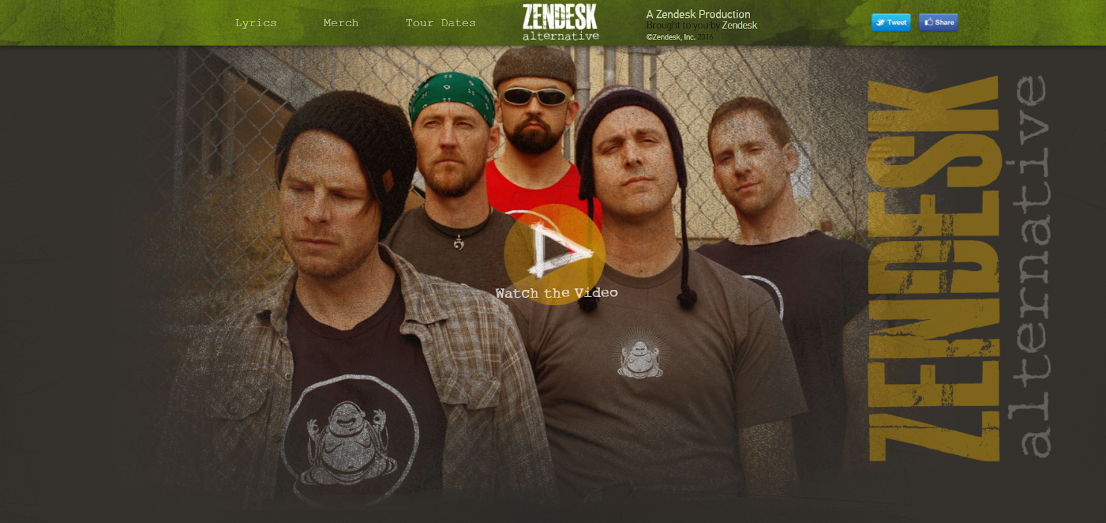
For new brands especially, finding the right story to tell can be very difficult. B2B storytelling doesn’t always need to be real. Zendesk, for example, created a fake, semi-grungy band named “Zendesk Alternative” and even created a website for the band. By using this direction, Zendesk was able to bring more users to their website and further educate them on the problems Zendesk is solving. This approach, although certainly nontraditional, was widely appreciated by users for being so out of the box and unexpected.
With thoughtfully planned out and carefully executed campaigns, we’ve been a part of some of the biggest successes in brand storytelling. A good story is multi-layered and lets your audience know more about your brand and what it stands for. By sharing your brand’s story, you let your current and future customers see your company as a group of hard-working, motivated people who are committed to solving inefficiencies and business problems.
Interested in working with a leading branding agency to help tell your story? Contact Us!
When it comes to running an enticing media campaign—whether organic, paid, or personal—animated video will prove its worth end-over-end in 2019. We have already seen a massive shift from written to visual content on every social media feed. Humans are inherently visual learners. Simple animation captures attention more than a stylish static piece. But don’t start to throw out any of those high-performing blogs quite yet! The best approach is to cut through the noise and draw traffic through dynamically rich media.
The solution is clear, but the path forward is still causing designers and marketers alike more than a little frustration. Promoting each piece of content with a unique animation is a huge project, not to mention the necessity of fast-paced delivery. So how do you keep a balance between speed and relevance?
A Balanced Approach
While the standard method was to assign your designer the task of creating unique animations for various promotional content, events, or announcements, there is now an easier way to do it. In our ongoing campaign for our client, the payments giant Paya, our designer and content-marketer teamed up to produce a family of animation templates that would satisfy Paya’s large media needs. By designing a system of video templates (built in Adobe products After Effects and Premiere) for content production use, the templates could be accessed directly by any campaign manager without involving the video team.
[one-half-first]
[one-half]
Whether the client needed to promote thought leadership, make an announcement about an upcoming trade show, talk about their latest acquisition, or have their PR team react to something relevant in the industry, Paya was there with an animated post on-time, on-message, and on-brand!
[/one-half]
One Style. Infinite Possibilities.
Building an adaptable animation template that can express various topics and be exported to various sizes and be ready to deliver to multiple platforms requires creative ingenuity that goes beyond the typical one-and-done animations. Motion designers are tasked with creating a template style that is more than just a quick-burning Instagram post but instead satiates a myriad of topics, content, and announcements that the campaign manager will need to post on many social feeds.
Through a thoughtful design approach, we created a fool-proof template system that even newcomers to the Adobe toolset felt empowered to create with. Every template featured static brand elements to choose from, allowing users to alternate background colors, exchange font weights, swap logo color combinations, and pull text overlay effects to match any of the pre-loaded animation sequences. The templates were for more than just editing text between an intro and outro scene; they empowered the campaign managers with an editable, on-brand aesthetic that could convey any message.
While the organic posts looked as expensive as a paid ad (and could theoretically be used that way if needed), the brand could talk to its audiences in a visually polished and dynamic way without exhausting the budget or personnel. When it comes to launching an organic social media campaign, nothing could be smoother.
Animating a Multi-lingual Message
Whether it’s for a new brand-launch, a pivot in the target industry or audience, or just an upgrade for your editorial calendar, building a scalable video technique will be worth it in 2019. Animation simplifies complex topics, and working with a video template can deliver exciting topics on a regular schedule.
Imagine posting up-to-the-minute quotations from a popular conference, results of an ongoing political election, or even public announcements during an emergency event—one can access, customize, and export a unique animation without mobilizing the whole creative team on a Saturday afternoon. Use the messaging you already have, but make it come alive.
The sports world has already edged in this direction, but can you imagine a situation where releasing stats and highlights immediately after the game doesn’t demand a massive commitment from your whole marketing and creative squad? Think quick, engaging, and exciting posts in a personalized way.
An Account-Based Marketer’s Dream
This works beautifully for hyper-targeted campaigns. With a few clicks, you can talk to specific companies and audiences, subbing in relevant messaging between a unique intro/outro. You can target your next competitor or customer at the drop of a hat or develop a fleet of content ready-to-go for the entire campaign.
Taking a closer look at 2019 media strategies, video is being used more often for lead generation and conversion. Customers don’t spend as much time talking to sales reps as they do browsing their thought leadership ecosystems. Having a rich media layer in place for this bottom-of-the-funnel viewer is where you can stand out from the competition.
We will begin to see a lot of experimentation as brands find which video tactics resonate well, and which fizzle. Every competitor wants a personalized campaign, but only some are ready to invest the time and money. This approach allows you to do it all. Remember when seeing your name above a generic email made you feel special? This is the 2019 version, and enhancing your messaging map and fueling your personalization strategy with an animated zeal is not as hard as it sounds.
ManTech, a multi-billion-dollar public company that provides technology services to the U.S. government, had the challenge to elevate its online presence and continue its competitive position in the crowded Federal government marketplace. To achieve its goal, ManTech selected Bluetext to take its brand to the next level and transform its online presence – all to meet tight deadlines in less than 6 months.
Bluetext designed a fresh, bold look and feel that embodies ManTech’s cutting-edge capabilities and sets the company apart within its industry. The designs and collateral made thoughtful use of ManTech’s color palette, balancing the brand’s vibrant red tones with whitespace. The use of dynamic motion throughout the visual identity showcases ManTech’s innovation and adaptability, always moving forward to meet the evolving technological needs of the government.
Part of the project included a new website. ManTech and Bluetext worked together to design, architect, and develop a fully responsive site with an enhanced user experience. The intuitive, well-organized design drives users to their needs quickly and functions as a lead-generation tool. The new site also provides a new experience to recruits with a seamless integration of job application workflow, allowing prospects to quickly search and filter jobs relevant to their specific interests and experience.
The site was built on a Drupal 8 CMS platform to provide the flexibility and scalability the large enterprise needs to support its digital marketing initiatives. The team conducted a comprehensive content overhaul and developed a strategic SEO plan to make ManTech.com an organic SEO over-achiever. The ManTech marketing team is now empowered to “own” its digital platform and market to its users, no longer requiring the involvement of the development team.
One of the key aspects that sets ManTech’s new site apart is the use of motion. As one of the final components of the project, Bluetext produced a series of videos for the website, weaving ManTech’s suite of capabilities into one cohesive and powerful story. These videos highlight ManTech’s mission-driven brand while educating potential customers on its world-class solutions.
Click here to see more examples of the ManTech project, or learn how Bluetext can help your organization elevate its brand and online presence.
Part Three: THE BODY CAN BE FRAIL
Bodymovin is not a silver bullet. It’s software that’s actively in development and often takes some trial and error to get the desired result. Some functions simply won’t work. When reviewing a design prior to animation, being able to quickly triage design elements as things that will be best served as vectors or raster images becomes second nature. Raster-based effects, some expressions, video and audio files aren’t supported. But with proper planning and some clever thinking, we’ve been able to work around all of these limitations to create great results. Here is a list of some common limitations we run into, and how we work around them.

Gradients/Effects have very limited support. This can be the biggest roadblock when starting out. We’ve found the best solution to be rendering out necessary effects as static images. For a flickering neon sign, we simply had two version of the image, an on and an off variant, and quickly faded between them to simulate the fluctuating glow.
Expressions aren’t working as anticipated after export. While some expressions work as expected, those specific to After Effects aren’t. Check out the documentation for more information. A quick and easy solution we’ve found is the oft-overlooked method of converting expressions to keyframes. It can really get you out of a pickle.
Text is showing up in the wrong size/incorrectly. By default, the option to outline text before rendering to the JSON animation is on. This is useful, but can be time-consuming and if you have a block of text with different sizes, it will export it incorrectly. The fastest and most reliable way we’ve found to deal with text is to use the Create Shapes from Text command on each text layer before sending it through Bodymovin’.
I’ve got this great HTML file. Now what…? When it comes to final delivery, each ad network requires something a little different. It usually involves copying and pasting a line of code into the HTML file, and editing a parameter or two. Contact your vendor for the requirements.
As you can tell, this workflow is not a simple turnkey solution. There’s some trial and error. But putting in the time to learn this new skill set, with its strengths and weaknesses, can open up a world of delivering animations in an entirely new way, and open up a dearth of creative opportunities. Go forth, create, and be sure to share what you make with us, we can’t wait to see the great things you make!
Part Two: SHAPE LAYERS, RASTER IMAGES, AND YOU
The narrative around After Effects shape layers has been changing. Once thought of as an afterthought by many, the rise of flat, friendly, human-readable design has lead to an explosion of great, interesting works built on the back of these beautiful vector assets. This is a boon for us because Bodymovin works best with Shape Layers. We’ll cover raster images in a little bit, thinking of and designing these ads as vector project guarantees success.


Vector art imported as shape layers are beneficial due to the fact that it’s saved out directly in JSON file, without the need for additional external files for reference. This keeps your final file very compact, some coming in at just a few dozen kilobytes. In an industry notorious for large file sizes, seeing a full animation in a file that small felt unreal at first, and in many ways still does.
Shape layer features like path trims, animated fill colors, and path animation are fully supported, which open up a wide range of animation opportunities. For importing art, tools like Battle Axe’s Overlord or Zack Lovett’s Explode Shape Layers are a wonderful option. Overlord specifically allows seamless import directly from Illustrator in a single click, and has reduced much of the pain that used to be associated with cleaning up and importing vector files.
Vector art isn’t always viable. Sometimes, a brand or piece of art direction demands the use of photography. When these needs arise, Bodymovin supports use of PNG and JPG images. Always keep file size in mind when using raster images. Our ad networks require the final animation to be compressed, with images, into only 150 KB. This demands that you always be strategic about the kind of images you use. Before importing an image, be sure to process it in the most efficient way possible. Save out compressed JPGs, and for simple transparency, you can use a mask instead of relying on a larger PNG. When PNGs are a necessity, export them as 8-bit files at only the size you’ll need. Compression software, like ImageOptim is a great, streamlined, open source tool that can shave every possible byte off of a file.
You may be wondering: Wait, what about effects? Drop shadows, animated textures, video files and the like? Currently, those aren’t supported, and we’ll cover some of that in part three. But with some clever thinking and careful asset management, you’ll be impressed with how far you can get with this limited toolset Bodymovin supports.
In summary:
- Vector art is ideal
- Simplify your workflow with tools like Overlord or Explode Shape Layers
- Use raster images in cases where vector art won’t do, but know each one can add a lot of relative size to the final deliverable
- Tools like ImageOptim work great at taking JPGs and PNGs down to size a little bit
Click here to move onto Part Three!
Part One: HOW BODYMOVIN CHANGED OUR APPROACH
 With Bodymovin’, our design team felt empowered. Suddenly, their designs weren’t being recreated. The animations were being exported exactly as they were designed. The artist was using their usual tools, in a similar process that they’re used to. Revisions could take place much more quickly, which allowed for more extensive iteration while involving fewer people.
With the export taking place directly out of After Effects, our animators and art directors could achieve their vision with less compromise due to technical limitations. Animation tools like the speed and value graph, some blending modes, and full position, scale, rotation and opacity controls are fully supported by Bodymovin’. While it sounds like a limiting list, the possibilities are extensive. Don’t just take my word for it; check out Bodymovin’ developer Hernan Torrisi’s Codepen page for some great inspiration.
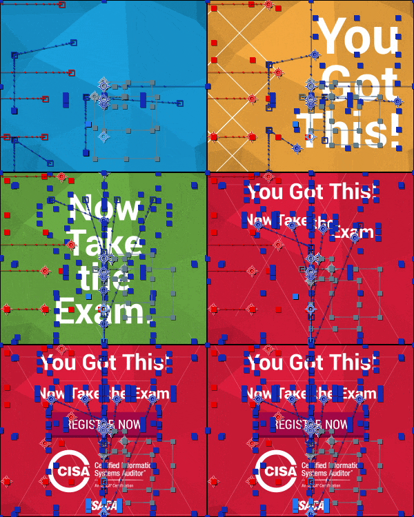
Over a few years, we’ve refined our process. It starts with a designer creating static renditions of the ads. This may act as a simple reference or be treated as styleframes/storyboards. With that content locked in, the art is then prepped for import into after effects, either as shape layers or through compressed image files (this process took much trial and error and is covered extensively in part two). At this point, animation begins. Review the supported feature documentation for an idea of what is possible. Of course, extension is in active development, and this list changes relatively frequently.
With animation complete, the export begins. Open the Bodymovin extension in After Effects, select your comp, alter your settings, and export. In the setting department, for display ads we always export with a Demo file, which kicks out a self-contained HTML file with the player and the JSON animation wrapped together. There is a little work we then do to the HTML file, but that’s covered in part three.
In summary:
- Maintain creative control and keep things very art-directable
- Spend fewer cycles building, spend more time on iterating creative ideas
- Create smoother animation, utilizing full AE speed/value graphs and keyframes
- Use a familiar, artist-friendly tool
Click here to move on and read Part Two!
A motion designer’s guide to creating great display ads directly inside After Effects
Introduction
Creating great animated display ads always used to be a bit of a crapshoot. Our old system would look like this:


- Designer creates static ads that look wonderful.
- Hands off to animator, who uses their extensive After Effects expertise to create beautiful animations.
- Send those video files to our development team, who would do their best to recreate the work using web-friendly animation standards.
- Animators would send feedback, and repeat the cycle until everything looked ‘good enough’, but never captured the full energy that existed in the initial animation.
- Repeat this over for all of the various ad sizes, while using up a ton of development team’s time.
If you’re thinking that sounds like a bit of a mess, you’d be right.
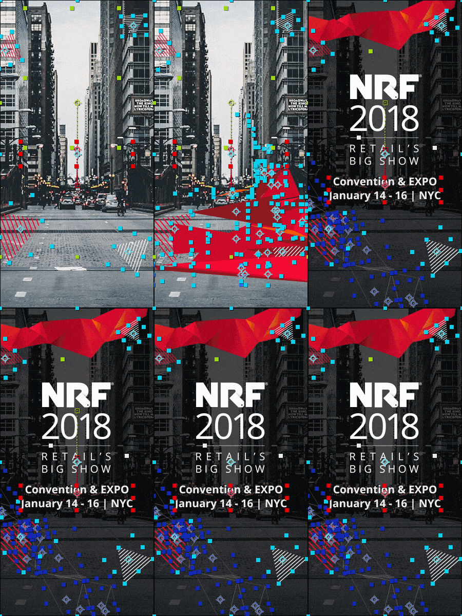

About two years ago, we found Bodymovin. This pay-what-you-want AE extension allows our team to export vector art animations directly out of After Effects as JSON animations wrapped up in an HTML file. Our team immediately saw huge potential to create high-quality work with more polish, utilize fewer resources, and turn around work for our clients much faster than we could in the past. We could create full animation that played back at full speed and a tiny file size, without dealing with the compromises of a GIF’s large file size or stuttery playback. This could apply to modules built for websites, interactive experiences, or most interestingly, display ads.
In part one, we discuss how this toolset allowed us to change our strategy for display ad design and animation. Part two delves into our refined process for importing and asset management. And we explore some common pitfalls we found and how we worked around them in part three.
Cool? Let’s dive in. Click here for Part One.
