Considering a new name for your business? Whether your company has just undergone a merger or acquisition, or perhaps just needs a fresh rebrand, corporate naming can be just as equally exciting as it is daunting. If you have kids you probably relate to the decision anxiety that comes with naming. Will the name fit his/her personality? Will the name be memorable and unique? Will it withstand the test of time? The classic choice overload paradox sets in. The infinite number of possibilities makes the ultimate decision even harder. Not to mention the significance a corporate name can hold. Choosing your company’s name is one of the most important decisions you’ll make, as it sets the tone for all future branding initiatives. For better or for worse, your business name helps create a strong first impression with potential customers and investors.
As a brand marketing agency, Bluetext has assisted a number of companies in the naming selection process. Many of our clients considering a new name often ask, “Well, where do we begin? How do we name our company?” And truthfully, there is no right answer to that. Coming from years of branding and messaging experience, we’ve learned successful new names can arise in a variety of ways, but names do tend to flatline for a few consistent reasons. So, we figured it would be best to start with what not to do, leaving exactly what to do open to the unique circumstances. Keep reading for a number of tests that can help you weed out names that can help you avoid brand regret down the road.
How Not to Name Your Company
Copy the Competition: Don’t select a name that mirrors others in your industry. Especially if you are in a crowded industry, or perhaps have business offerings that span multiple industries, it’s paramount you do thorough research to ensure there are no similarly spelled or pronounced competitors.
Twitter Test: Nowadays it is expected (and advantageous!) for every business to have social media accounts. One quick test for your new company name is whether it’s compatible with common social media handles. If your name is too long to be a Twitter handle (maxed at 15 characters), your handles will need to be adapted on other platforms as well.

Go Crazy with Creative Spelling: One of the biggest trends in naming is creative adaptations to spelling common words. For example, how Waze adapted the spelling of “ways” to creatively communicate their business. This strategy can be successful but can risk confusion. The issue with having an overly complex name is that you’ll always have to spell it when you say it because it isn’t spelled how people hear it. This could cause challenges with potential customers finding your business.
Bluetext’s Rule of Thumb: When doing alternate spellings of names, try and stay to one letter tweak per name.
Disregard the Domain Availability: Don’t fall in love with a name with an unavailable URL. When researching or considering new names, we recommend looking up the domain options immediately.

Let in Too Many Voices: While great in theory, opening this discussion to the masses is never a good idea. It is incredibly unlikely that involving everyone will result in a consensus. Oftentimes involving too many decision-makers is like having too many cooks in the kitchen, it just results in an inefficient and stagnant discussion of competing opinions.
Bluetext Rule of Thumb: Involve only key decision-makers. Ones with the company’s best interest in mind, and those able to leave their egos at the door. It may be worth taking the decision to a vote when you have selected a top 2 or 3 names, but in the early ideation and decision phases, be sure to limit the discussion to only relevant stakeholders.
Frankenstein Phrases: One common naming tactic is to combine parts of an adjective and a noun into a new word. While great in theory, more often than not the name seems disjointed or forced. The two words might work great on their own, but just don’t go together. Other common fallbacks include truncated words like Tech, Corp, or Tron.
Go Too Generic: While your name should not be overly descriptive and superfluous, going too generic can also be dangerous. Random acronyms don’t give any hint into your brand, offerings, or story. A good test is whether someone could tell what industry you’re in by the name. Overgeneralizing could cause people to overlook your company if there is no sense of differentiation. Conversely, you also don’t want to use a name that is too specific to the industry you’re in, as doing so will limit your ability to expand into new territories and sectors with the same company name.

Forget to Practice Pronunciation: One of the most telling tests of a name: Can it be easily pronounced? Ask unbiased third parties to read the name aloud. Did they pronounce it as you expected? Can you easily repeat the word over and over without mispronouncing? Does the name roll off the tongue or is it a jumble of awkward consonants? Just like you would want your brand to look and feel right, you need your company name to sound and feel right.
We’ve shared our top eight ways not to name your company, but what should you do? Consult a professional branding agency. Hiring a third party brings in a fresh perspective to your company and overall brand strategy. Not to mention they will have a staff of professional copywriters who can help craft your new name and corporate messaging.
Need a new name? What are you waiting for? Contact Bluetext to learn more.
Catch the highlights and additional insights in the podcast edition of this post. Just hit play below!
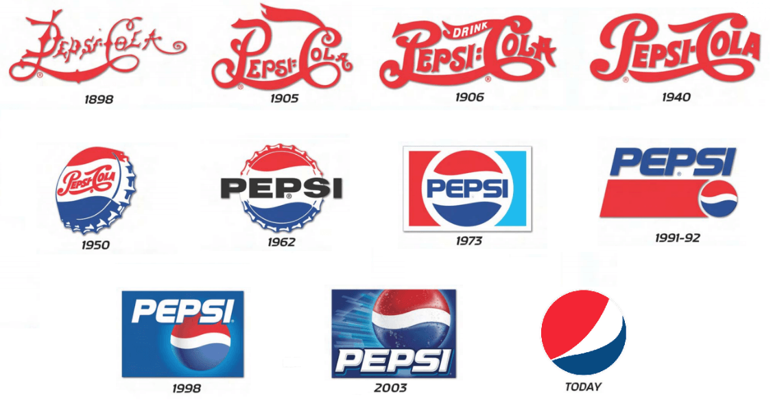
Simplification is one of the strongest trends we’ve seen as a top design agency in recent years. With such growing popularity, it shows no sign of stopping. So why are brands dialing back on designs for a more minimalistic logo? Top graphic design and rebrand experts at Bluetext are debunking this design trend to explain why it’s a wise choice. For one, minimalist logo designs are easily recognizable and memorable, which is key to successful branding. This is why many up and coming companies prefer simplification over other artistic techniques. Similarly, established brands are stripping their logos of excessive details to add more weight to the brand promise. Uber, Yahoo, and Mailchimp have all recently released logos with cleaner, rounded lines to feel more approachable and user friendly.
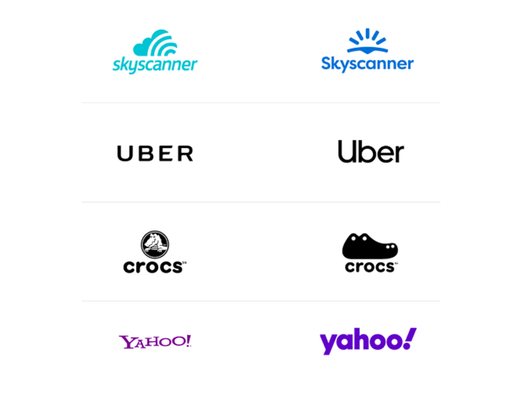 Why are these well-known logos going back to basics? We consulted our top graphics designers here at Bluetext, to get their take on the trend. Below are some of the most popular reasons for logo redesigns:
Complex and Cluttered Digital Environments
With nearly all companies moving to some sort of digital presence, users are constantly bombarded and overwhelmed with content to digest. Embellished logos only add to that already exhausted attention span, requiring time and concentration that people simply don’t have to spare. Cluttered online environments have trained us to scan, filter, and repeat — leaving little bandwidth to notice or appreciate fine detail.
User Consideration
Especially when coupled with features like dark mode, we are seeing brands designing more and more with user experience and comfort in mind. Darker screens and simplified details are easier on the eyes. Reduced eye strain and saved battery life is an added benefit that shows users you care, especially in a pandemic environment where almost all interactions have become virtual and vastly increased average screen time.
Mixed Mediums
Another key consideration for any brand is where your logo will be applied. On your website for sure, but what about printed materials? Perhaps corporate giveaways, like coffee mugs or canvas totes. Logo designs need to accommodate all of these possibilities and easily adapt to any medium. Thus, to save time and resources, companies opt for a clean and crisp logo that they are confident will crisply stand out on any medium and in any size.
Shrinking Screens
It seems every few months or so Apple unveils smaller and smaller iPhone models. And this product design trend isn’t limited to just mobile devices! Laptops, tablets, and even desktops have been consistently shrinking in size as users opt for more streamlined and portable devices. To future proof your brand or website it’s important to consider small screens and how your logo will display. If your design is riddled with lines and textures it may compromise readability on these devices. Instead of reverse engineering your logo to accommodate unique layouts and breakpoints, it’s far more efficient to begin with a simplified, and digitally conscious design.
Botox for B2B
Why do people get Botox? To smooth out those fine lines and wrinkles and look younger! The same principle applies to mature and established brands. In order to get a digital facelift and appear fresh and modern, experienced brands are smoothing out the details of their logos and brand graphics. Simplification of logos gives your company a rejuvenated update, while still preserving the established brand reputation.
Simplicity Inspires Confidence
Less is more. A strong and simpler logo exudes an air of confidence that your brand knows what it’s doing, and lets the reputation speak for itself. Brands should consider a logo as a signature, rather than the story. Your logo should be a quick snapshot of your brand that triggers a memory of your product or service, not an attempt to illustrate your offerings. A simplified logo, especially in a wordmark format amplifies your brand and creates a distinctive presence.
The Verdict
The verdict on logo simplification? Cleaning up design elements not only offers immense brand value and memorability but also has numerous digital benefits. As a top digital marketing and user experience agency, we encourage clients of any industry to always be thinking about the future first. With an inevitable shift toward more digital-based lifestyles, smaller screen sizes, and user considerations it is a wise investment to reinvigorate your brand with a timeless logo design.
Considering simplifying your company’s logo? Trust Bluetext for all of your digital marketing and design needs.
Interactive content is here to stay. Just take a look at the 96% completion rate on BuzzFeed quizzes. Even more, a 2016 Content Marketing Institute (CMI) study found that just over 80% of marketers say that interactive content is more effective than static content when it comes to grabbing consumers’ attention.
Well, what even is interactive content, anyway? Interactive content is “content that requires the participants’ active engagement — more than simply reading or watching. In return for that engagement, participants receive real-time, hyper-relevant results they care about.”
Digital branding agencies, such as Bluetext, will ensure you are leveraging all that interactive content has to offer. Here are the top 3 types of interactive content to look out for in 2020.
Quizzes and Assessments
Quizzes and assessments are pieces of interactive content in which the user provides answers to a few questions in order to receive insights based on them. They are fun for the user to complete, and if the results are what they were looking for, they will help you build trust with your audience.
This type of interactive content doesn’t only boost engagement — they also help you get to know your audience. So when you plan to incorporate quizzes or assessments into your content plan, seek out a brand strategy agency to help you develop your content and ask yourself: What do I want to know about my audience? You may discover something new and gain some essential insights that can help you tailor your marketing efforts to be more effective.
Bluetext, a leading branding company, worked with the Graduate Management Admissions Council (GMAC) to develop a microsite to invite top-of-funnel business school candidates to learn about what is available to them in the world of graduate business schools. The introduction page on the website is an interactive quiz that helps direct users to content specifically geared toward them based on where they fall in the business school process.
Polls
Polls are the easiest and simplest way to introduce interactive content to your marketing plan. They provide a quick way to get in touch with your audience and allow you to build a genuine connection with your followers.
The most straightforward way to use polls is to ask your audience for opinions on your content, service, or product. This not only helps you drive engagement online but gives you great insight into how your audience is feeling about your brand.
You can also invite your audience to interact with your profile by asking fun, light-hearted questions that invite them into learning more about what your company has to offer.

Contests
According to the CMI report, marketers believe that contests are the most effective type of interactive content you can use, especially in the early stage of the buyer’s journey.
Contests can include traditional raffles or giveaways. They can offer the chance to win a prize if they refer a friend to your company’s offerings. You can even introduce photos or hashtag contests where you invite your audience to submit their own user-generated content.
We have seen a rise in these types of hashtag contests and challenges across all social media platforms, especially on TikTok. The platform allows companies to leverage a hashtag to promote their brand, and users are eating it up.
Guess was the first brand in the US to release a marketing campaign as an official partner with TikTok. They ensured that every time a TikTok user opened the app, they were directed to the #InMyDenim hashtag challenge. Since its launch, videos with the hashtag have garnered over 38 million views and introduced the Guess brand to young Millenials and Generation Z.
Contests are great at bringing out people’s natural curiosity and competitive spirit, so encourage them to participate by providing an engaging contest.
Interactive content that is engaging and personalized provides your audience with a new way to engage with your brand and can build trust with your audience. Learn how Bluetext can help you leverage interactive content in your content marketing plan here.
For a top marketing agency, trade shows are essential events to attend to learn all the tricks of the trade. It is usually a one time a year event where all the major industry players convene to learn about new products, network and promote their brands. It brings back old notions of experiential event marketing, but in 2020, brands are adding a digital twist. Now more than ever, companies are pairing their physical trade show presence with huge digital thumbprints, from hyper-targeted ads to Micro-Moments.
National Retail Federation (NRF) and their annual Big Show is a great example of how to do a trade show right. NRF’s Big Show is the largest retail conference and expo event, gathering over 40,000 attendees and 18,000 retailers from over 99 countries under one roof. Big Show capitalizes on Micro-Moments both before and during the show. By analyzing these tactics, we can learn how important Micro-Moments are for users and how to properly utilize them.

So what is a Micro-Moment? A Micro-Moment is an intent rich moment when an attendee uses their device to act on a need, including to know, to go, and to buy. The brilliance behind micro-moment marketing is that in the world today, consumers are bombarded by content everywhere they turn. Inc.com says the industry has reached a point of “content shock” where consumers are oversaturated and cannot consume any more content than they already are. Consumers spend an average of 4.7 hours each day on their smartphones, continually distracted and overstimulated. This only escalates the challenges marketers face to achieve consumers’ attention.

To combat the new challenges encountered with fragmented media interactions, top digital marketers have adopted a new mentality. This new philosophy zeroes in on distinct moments in the consumer buying process. The I-want-to-know moment, the I-want-to-buy moment and even the I-want-to-go moments.
Before the Show, NRF was strategic in focusing on the Micro-Moments of their target audiences’ “I-want-to-know” and “I-want-to-buy” moments through the use of various paid media tactics. Through the use of paid social, NRF increased brand awareness and utilized the “I-want-to-know” moment of users. Before driving users to register for the event, it’s crucial to make them aware of the brand, educating them about the event, as well as driving upper funnel traffic down the line. Paid display is where lower funnel traffic acts upon the “I-want-to-buy” moment. Paid display not only helps to generate qualified leads but also drives registrants.

During the Show, the various speakers and topics expanded upon Micro-Moments as well. A huge focus of sessions was on how to drive better experiences, better content and better strategy for consumers. There are various innovative technologies and solutions companies can utilize, as seen in the Innovation Lab and Startup Zone, that can help improve the user experience for customers in every stage of their individual Micro-Moments. Opening speaker, Satya Nadella, CEO of Microsoft, expanded upon this during his keynote session on the first day of the show. Nadella focused on how companies need to focus on the future of the retail industry, upcoming trends and how to utilize technology to transform how companies operate, are marketed and relate to consumers. By doing so, these Micro-Moments for users will be more memorable and excite consumers to change from “I-want-to-know” to “I-want-to-buy.” To see the full list of speakers, visit the NRF Speakers Page and check out the NRF Big Show 2020 recap for a full list of articles, videos, session presentations and more.
A key takeaway from NRF’s Big Show 2020 was the importance of personalizing and concentrating the customer experience in the digital era. Staying true to the NRF Vision, the National Retail Federation has acted as the eyes and ears of the retail industry. For over 100 years they have brought together important leaders from top retail companies and are the only organization committed to bringing critical foresight and insight to leaders, movers and makers.
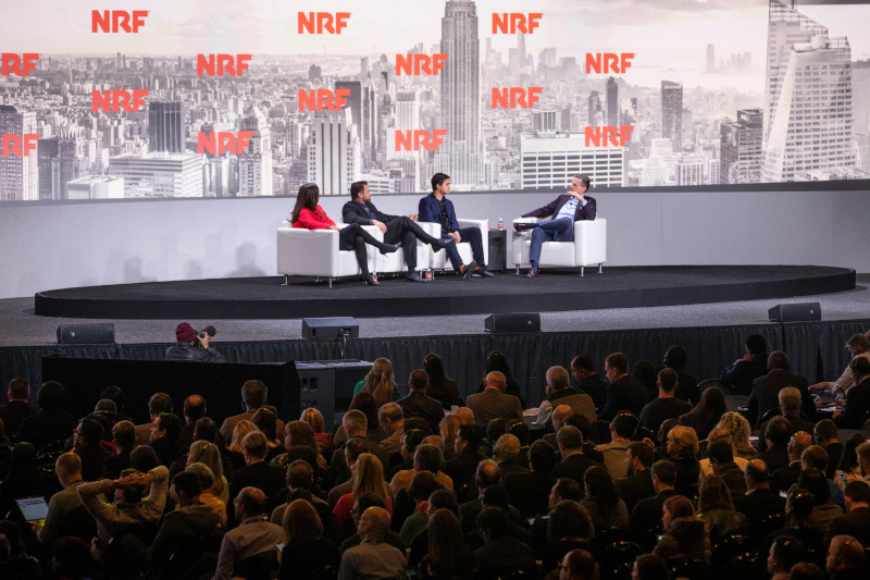
Leading by example is an understatement, as the organization itself has been ahead of the curve in their paid media tactics and lead generation strategy. To learn more about the NRF media strategy, check out their Bluetext Hall of Fame.
Content marketing is a consistently invaluable tool to increase conversions by educating your leads and customers. As we welcome a new year as well as a new decade, it’s important to understand the emerging content marketing trends that will dominate 2020. How should you change your digital content marketing strategy to keep pace with the ever-evolving nature of content marketing?
In this blog post, we take a look at 5 content marketing trends that will keep you ahead of the curve in 2020 and beyond.
Data-Driven Content
How are you, as a brand, determining what content is useful and relevant for your audience? That’s where data comes in. By harnessing the lessons of previously successful content marketing initiatives, companies are able to reverse engineer the data and identify KPIs that preceded the success. Once those KPI’s have been established, it is easier to create content in that same strain and capitalize on the proven success. A DC-based digital branding agency like Bluetext can assist you in determining successful KPI’s and creating the rich content your audience wants to read.
Smart Device-Centric Content
Although smart devices have been a key consideration in B2C content marketing for quite some time, this year, more focus will be placed on specific functions of smart devices such as voice search. Voice search is becoming such an integral mobile tool, 48% of consumers are using voice for “general web searches.” Companies looking to stay ahead of the curve should look to optimize their content specifically for voice search purposes. Understanding how users search via their voice will help you tailor your existing content for voice-SEO and create more effective headlines for future content initiatives. A DC digital web design agency like Bluetext can help by conducting an analysis of your audience’s voice searches and recommend changes to your existing content and future content to maximize the return on your investment.
Conversational Marketing is King
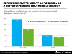
In the digital era which champions online shopping, consumers are looking to establish trust and connection through more personalized, authentic shopping experiences. Conversational marketing can aid your company in engaging with your audience in a more genuine way. By engaging in a conversation, your company gains access to more personalized data about your consumers such as their specific needs and future goals. Investing in tools such as chatbots or real human-to-human experiences can make all the difference in your competitive industry. As we progress through 2020, chatbots and other AI tools will continue to improve and positively impact lead generation.
2020: The Year of the Snippet
As we know, Google dominates the search engine market share worldwide, with a resounding 92.71% of the market. When considering a user’s search intent, Google will display what they call a “snippet” at the top of the page, which provides consumers with key points within a piece of content, allowing them to receive the information they’re looking for faster. As such, it’s becoming more commonplace for consumers to enter a longtail keyword into Google, knowing that they will receive the information they’re looking for via a snippet, without clicking any page links whatsoever.
In order to win that highly coveted snippet spot, companies should look to hire an interactive web agency such as Bluetext. Bluetext’s SEO analysts can conduct an audit of your current content and pinpoint exactly where changes need to be made in order to signify to Google crawlers that your content is important. Optimizing your content for snippets will greatly enhance user experience, as users will be able to find the information they are searching for concisely and quickly. Not only will an interactive web agency audit and enhance current site content, but they will also create a content strategy and editorial calendar so your brand can continually publish content your users are searching for.
The Popularity of Podcasts
According to a recent study, 51% of the entire US population has listened to a podcast in 2019. That figure is up by 7% from the previous year. As we look ahead to 2020, podcasts will continue to dominate, as that number is expected to keep rising. Although it may seem like everyone has a podcast these days, there are still opportunities for brands to get ahead of the curve and start their own podcasts.
That being said, if you see a clear demand for audio content within your market, ensure that you create a podcast the right way. Podcasts should have clearly defined KPI’s, a regular posting schedule, and content your audience will actually care to listen to. A Virginia internet & inbound marketing agency like Bluetext can partner with your company to assess the need for a podcast in your industry and among your competitors, help you create valuable content and even develop a paid advertisement plan to spread awareness via other podcasts your audience is listening to.
2020 is already well underway and in order to achieve success, companies need to get ahead of this year’s trends with a thorough and achievable marketing strategy and plan of action. A DC digital branding agency such as Bluetext can audit your current digital content marketing strategy and suggest recommendations to help improve your current trajectory. To learn more about Bluetext and how we can help you, check out our work here.
Establishing your brand identity online can be a daunting task, but it’s necessary to improve your brand awareness in today’s media landscape. With more than 45% of the world’s population actively using social media, it is more important now than ever to expand your brand’s reach via social media platforms. The top social media marketing and branding agencies will know just how to navigate the social sphere to bring your brand to your customers’ fingertips.
Consistent visual identity is key
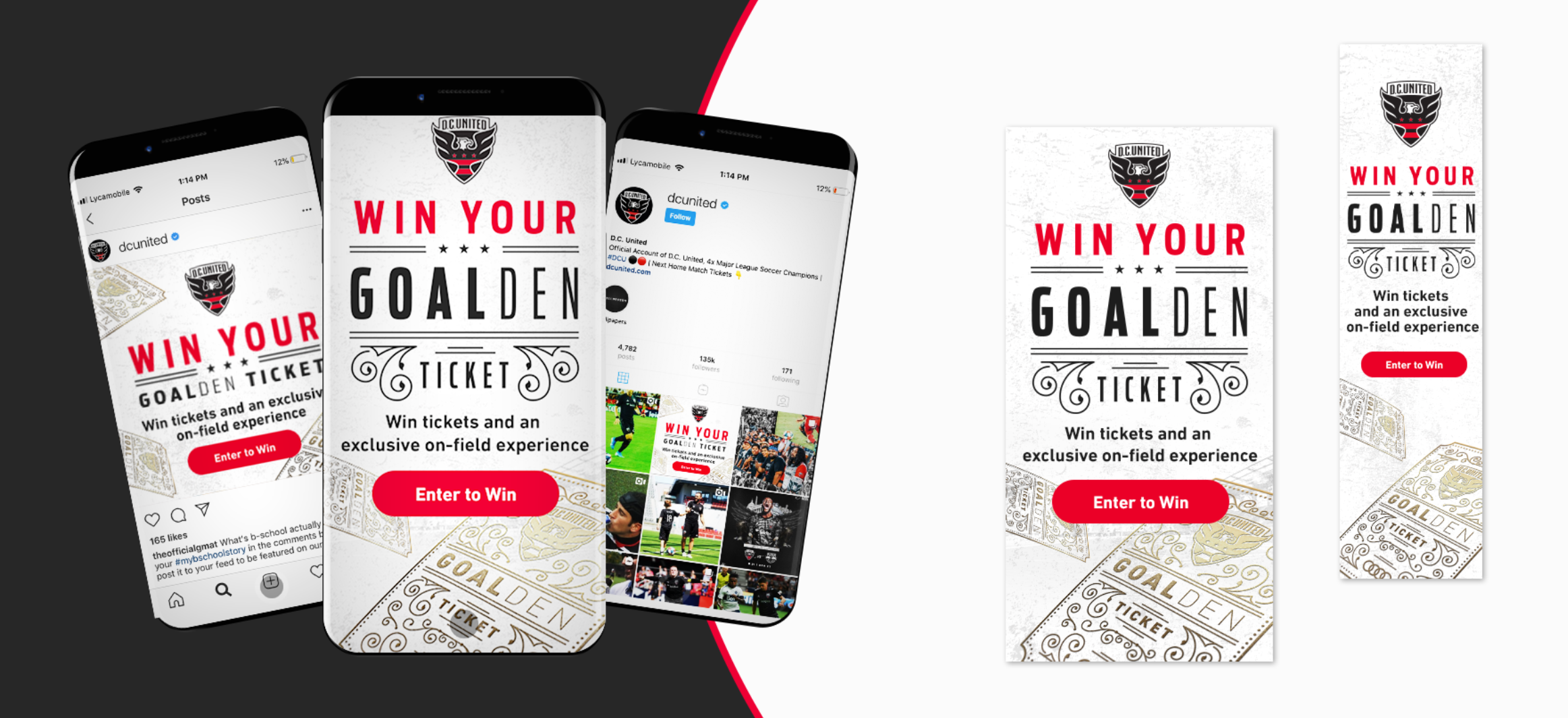
Maintaining a strong corporate visual identity (CVI) across all of your social platforms is not only imperative to help your audience recognize your brand across platforms, but it also maintains the feeling of consistency, showing your customers that you’re confident with your brand. Top branding agencies can develop branded snackables for all of your social platforms, keeping the fonts, graphics and general brand identity consistent across all visuals. From Facebook and Instagram to Twitter and LinkedIn, Bluetext can provide your company with a variety of snackables for each social site, bringing your brand identity to the next level. See how Audi Field combined its digital advertising strategy with its social media strategy.
Define your brand’s voice
Okay, great – you have your company’s visual identity established…now what? Defining your brand’s voice is just as important as nailing down your CVI. Social media marketing agencies know how to position your brand to ensure that you have a unique and consistent voice across all of your social platforms, setting yourself apart from your competitors.
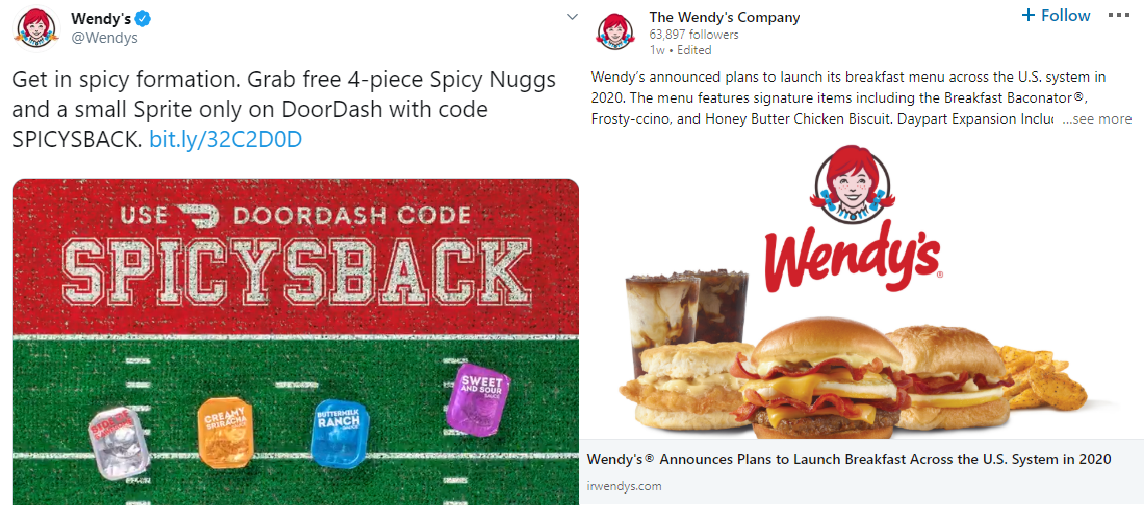
Although it is important to have a consistent voice, you should try to modify your tone to match the audiences across different platforms. For example, you may want to tweet something more relaxed and humorous on your company’s Twitter feed, but you would prefer to keep your LinkedIn page more professional. By tailoring your brand’s tone to match your company’s audience on each platform, you will drastically improve engagement across your social profiles.
See how Wendy’s changes their tone of voice between Twitter and LinkedIn:
The nature of social media: content sharing
It’s no secret that social media is intended to be used to engage and share content with your peers online. This is why establishing a digital presence is a crucial step in developing your brand online. Social media users consume your posts and share them with their friends, making your brand look and feel legitimate to potential customers.
Elevate your social strategy to the next level by incorporating social media influencers to give your online presence that extra boost. Influencers will give you access to a whole new set of users outside your normal audience. With influencer marketing, you can generate brand awareness among new segments through influencers’ follower bases. The top social media marketing agencies can help you gain access to the right influencers for your audience, ensuring that your brand gets in front of large targeted audiences.
Creating your social sharing strategy
With a newly established CVI, brand voice and social media audience, you’re now equipped to draft your social calendar. It’s important to experiment with days and times when sharing content across your platforms to capture your audience when they’re actively using social media. Given the nature of each social site, your audience is likely not going to be active at the same time across all channels. This is why you should vary your post times and content. Creating unique posts per platform will keep your followers engaged from platform to platform and keep them from getting bored with your content.
Branding and social media marketing agencies like Bluetext will know how to help position your company for success online. From developing your visual identity and voice to drafting a social media content strategy, top branding agencies will give your company the exposure it needs to succeed in the social media sphere.
Ready to bring your brand and social strategy to the next level? See how Bluetext can help.
ManTech, a multi-billion-dollar public company that provides technology services to the U.S. government, had the challenge to elevate its online presence and continue its competitive position in the crowded Federal government marketplace. To achieve its goal, ManTech selected Bluetext to take its brand to the next level and transform its online presence – all to meet tight deadlines in less than 6 months.
Bluetext designed a fresh, bold look and feel that embodies ManTech’s cutting-edge capabilities and sets the company apart within its industry. The designs and collateral made thoughtful use of ManTech’s color palette, balancing the brand’s vibrant red tones with whitespace. The use of dynamic motion throughout the visual identity showcases ManTech’s innovation and adaptability, always moving forward to meet the evolving technological needs of the government.
Part of the project included a new website. ManTech and Bluetext worked together to design, architect, and develop a fully responsive site with an enhanced user experience. The intuitive, well-organized design drives users to their needs quickly and functions as a lead-generation tool. The new site also provides a new experience to recruits with a seamless integration of job application workflow, allowing prospects to quickly search and filter jobs relevant to their specific interests and experience.
The site was built on a Drupal 8 CMS platform to provide the flexibility and scalability the large enterprise needs to support its digital marketing initiatives. The team conducted a comprehensive content overhaul and developed a strategic SEO plan to make ManTech.com an organic SEO over-achiever. The ManTech marketing team is now empowered to “own” its digital platform and market to its users, no longer requiring the involvement of the development team.
One of the key aspects that sets ManTech’s new site apart is the use of motion. As one of the final components of the project, Bluetext produced a series of videos for the website, weaving ManTech’s suite of capabilities into one cohesive and powerful story. These videos highlight ManTech’s mission-driven brand while educating potential customers on its world-class solutions.
Click here to see more examples of the ManTech project, or learn how Bluetext can help your organization elevate its brand and online presence.
Top branding agencies are always looking for new and refreshing approaches to logo designs that resonate with customers. Every designer’s dream is a new logo that is memorable and unique. But customers react to logos that interesting and different, but not too different. If a logo adheres to a style that is out-of-date or too far out of the mainstream, it may stick out from the crowd, but it won’t generate the positive feelings that it would if it were within the boundaries of the top logo trends that are hitting the market. With that in mind, here are six top logo trends that we are seeing both with our clients and across the industry:
- Flat Designs Retain Their Strength. When Microsoft released its latest new logo, the design was flat with no shading or 3-dimensional effects. The result is a logo that is straightforward, maintains its integrity and brand equity, and looks good across all channels and in all sizes. It’s also easy to print and reproduce. A flat design shows off the brand and colors well and shows off the brand in its simplest form.

- Negative Space is Your Friend. Pinterest, Instagram, Toyota and scores of other iconic brands all use negative space – sometimes with hidden shapes and symbols includes. As an article in Lifebuzz.com reveals, the three ellipses in the Toyota logo represent the heart of the automobile, the technology, and the customer. More importantly, negative space can draw attention to the brand in a way that is memorable and different.

- Stacking is Back. For many years, the logo with letters had to be simple initials in a simple design. But as a way to grab attention in a way that stands out and is easy to see and absorb, stacking can be a strong alternative – often with different fonts for each word. This offers a solid way to highlight different fonts to challenge viewers while giving them something they can quickly comprehend. Here’s an example of a recent refresh (minus the different fonts) from the American Library Association.

- Turning a Flat Logo Up a Notch. One recent trend is taking otherwise flat logos and adding a two-tone approach to add depth to the color but also to give it a hint of three-dimensionality. Dividing symmetrical images into two “zones” of shading gives depth and visual interest to a flat design. It can also add a symbolic touch to convey the brand’s core mission and direction. Check out how Pineapple Resorts turned its logo up a notch to make it more distinctive.

- Go Wide. Shapes that elongate from right to left are thought to be more recognizable for humans that narrow, tall images. With online platforms (such as websites and social media) favoring a wide design, strong brands are turning to this approach with their logos. When combined with contemporary fonts and colors, it can also convey a brand that is on the move and ready to dominate its market.

Want to explore how to apply top logo trends to your brand? Bluetext can help.
As every top branding agency knows, the brand style guide is a key component in a brand’s visual identity. It sets out how brand elements, including color palette, imagery, iconography, and layout should be incorporated into every piece of collateral or content that represents the brand. In essence, it’s the brand bible for every designer and marketer in the organization.
Yet, for a typical top branding agency, it’s often an afterthought. Only after the new brand elements are designed, options are provided to the client, the visual identity is applied to the website, collateral templates, and signage, and all is approved, does the team turn to the style guide. And even then, it is often lacking in the type of detail and content that will make it useful for more than a brief period. It needs to be thorough and future-proof.
Let’s face it: The brand style guide isn’t the sexy or fun part of the project. Oftentimes, it’s delivered as a thinly printed document and other times as a PDF with limited detail. We understand that digging through a lengthy document to find out precisely how to use the logo, fonts, and imagery can be frustrating. Here, then, is the Bluetext guide to a good – and useful – brand style guide.
- Make sure the style guide is comprehensive. The goal of the guide is consistency, in how the brand is represented regardless of platform, outlet or venue. It will be used by a wide variety of people, ranging from employees to partners to media. This doesn’t mean it has to cover every random or infrequent scenario, but more detail works in your company’s favor.
- Go deep in coverage. Even the term “brand guide” is sometimes misleading. While it is important to include details on the specific usage of a creative asset, such as how much white space needs to pad a logo or how a logo should play out depending on the background color, this should be only a part of the what the guide includes. Don’t neglect core brand-building guidelines, such as what the organization’s tone and voice need to be in different contexts, or how employees should use branded imagery on social media. Provide enough detail so that anyone reading the brand guide from cover to cover will feel like an expert on every aspect of the brand.
- Update the guide on a regular basis. With the prevalence of eBooks, articles, and infographics, brands are experiencing a faster rate of evolution than ever before. That means it is important to do a regular review of the guide to keep it up to date.
- Make it easy to find, share, and update. Many style guides look great in a printed, bound volume. But those are hard to find, hard to distribute, and really hard to keep updated. And if the brand guide requires time and money to update, executives will be reluctant to refresh the guide to match their evolving brand until they absolutely have to.
Our recommendations as a top branding agency: Make the style guide a dynamic window to your brand. Include intangible elements that come from the brand’s core message platform, like tone, voice and the types of language to use. Use a digital platform that is easy to share and easy to update. Make it comprehensive. And make sure you review it at least once a year.
Style Guide Examples:
Learn How Bluetext Can Help With All of Your Branding Needs!
