Interactive content is here to stay. Just take a look at the 96% completion rate on BuzzFeed quizzes. Even more, a 2016 Content Marketing Institute (CMI) study found that just over 80% of marketers say that interactive content is more effective than static content when it comes to grabbing consumers’ attention.
Well, what even is interactive content, anyway? Interactive content is “content that requires the participants’ active engagement — more than simply reading or watching. In return for that engagement, participants receive real-time, hyper-relevant results they care about.”
Digital branding agencies, such as Bluetext, will ensure you are leveraging all that interactive content has to offer. Here are the top 3 types of interactive content to look out for in 2020.
Quizzes and Assessments
Quizzes and assessments are pieces of interactive content in which the user provides answers to a few questions in order to receive insights based on them. They are fun for the user to complete, and if the results are what they were looking for, they will help you build trust with your audience.
This type of interactive content doesn’t only boost engagement — they also help you get to know your audience. So when you plan to incorporate quizzes or assessments into your content plan, seek out a brand strategy agency to help you develop your content and ask yourself: What do I want to know about my audience? You may discover something new and gain some essential insights that can help you tailor your marketing efforts to be more effective.
Bluetext, a leading branding company, worked with the Graduate Management Admissions Council (GMAC) to develop a microsite to invite top-of-funnel business school candidates to learn about what is available to them in the world of graduate business schools. The introduction page on the website is an interactive quiz that helps direct users to content specifically geared toward them based on where they fall in the business school process.
Polls
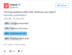
Polls are the easiest and simplest way to introduce interactive content to your marketing plan. They provide a quick way to get in touch with your audience and allow you to build a genuine connection with your followers.
The most straightforward way to use polls is to ask your audience for opinions on your content, service, or product. This not only helps you drive engagement online but gives you great insight into how your audience is feeling about your brand.
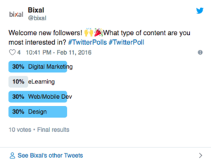
You can also invite your audience to interact with your profile by asking fun, light-hearted questions that invite them into learning more about what your company has to offer.

Contests
According to the CMI report, marketers believe that contests are the most effective type of interactive content you can use, especially in the early stage of the buyer’s journey.
Contests can include traditional raffles or giveaways. They can offer the chance to win a prize if they refer a friend to your company’s offerings. You can even introduce photos or hashtag contests where you invite your audience to submit their own user-generated content.
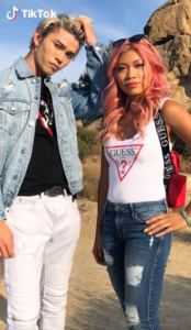
We have seen a rise in these types of hashtag contests and challenges across all social media platforms, especially on TikTok. The platform allows companies to leverage a hashtag to promote their brand, and users are eating it up.
Guess was the first brand in the US to release a marketing campaign as an official partner with TikTok. They ensured that every time a TikTok user opened the app, they were directed to the #InMyDenim hashtag challenge. Since its launch, videos with the hashtag have garnered over 38 million views and introduced the Guess brand to young Millenials and Generation Z.
Contests are great at bringing out people’s natural curiosity and competitive spirit, so encourage them to participate by providing an engaging contest.
Interactive content that is engaging and personalized provides your audience with a new way to engage with your brand and can build trust with your audience. Learn how Bluetext can help you leverage interactive content in your content marketing plan here.
Establishing your brand identity online can be a daunting task, but it’s necessary to improve your brand awareness in today’s media landscape. With more than 45% of the world’s population actively using social media, it is more important now than ever to expand your brand’s reach via social media platforms. The top social media marketing and branding agencies will know just how to navigate the social sphere to bring your brand to your customers’ fingertips.
Consistent visual identity is key
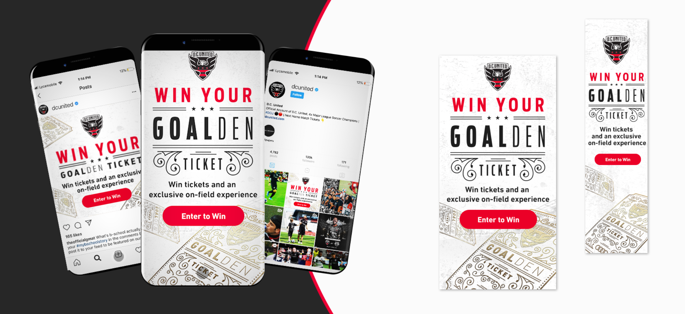
Maintaining a strong corporate visual identity (CVI) across all of your social platforms is not only imperative to help your audience recognize your brand across platforms, but it also maintains the feeling of consistency, showing your customers that you’re confident with your brand. Top branding agencies can develop branded snackables for all of your social platforms, keeping the fonts, graphics and general brand identity consistent across all visuals. From Facebook and Instagram to Twitter and LinkedIn, Bluetext can provide your company with a variety of snackables for each social site, bringing your brand identity to the next level. See how Audi Field combined its digital advertising strategy with its social media strategy.
Define your brand’s voice
Okay, great – you have your company’s visual identity established…now what? Defining your brand’s voice is just as important as nailing down your CVI. Social media marketing agencies know how to position your brand to ensure that you have a unique and consistent voice across all of your social platforms, setting yourself apart from your competitors.
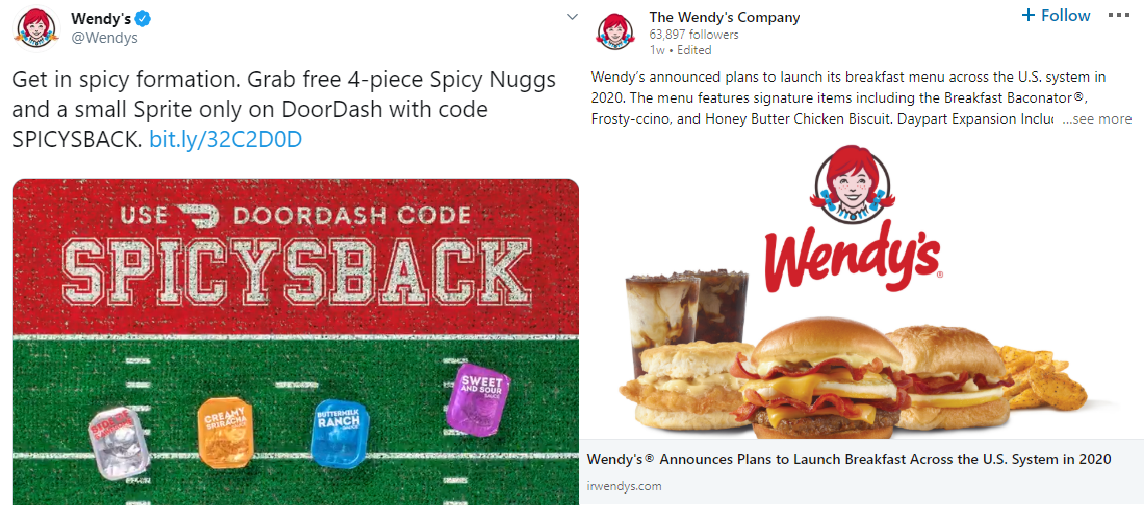
Although it is important to have a consistent voice, you should try to modify your tone to match the audiences across different platforms. For example, you may want to tweet something more relaxed and humorous on your company’s Twitter feed, but you would prefer to keep your LinkedIn page more professional. By tailoring your brand’s tone to match your company’s audience on each platform, you will drastically improve engagement across your social profiles.
See how Wendy’s changes their tone of voice between Twitter and LinkedIn:
The nature of social media: content sharing
It’s no secret that social media is intended to be used to engage and share content with your peers online. This is why establishing a digital presence is a crucial step in developing your brand online. Social media users consume your posts and share them with their friends, making your brand look and feel legitimate to potential customers.
Elevate your social strategy to the next level by incorporating social media influencers to give your online presence that extra boost. Influencers will give you access to a whole new set of users outside your normal audience. With influencer marketing, you can generate brand awareness among new segments through influencers’ follower bases. The top social media marketing agencies can help you gain access to the right influencers for your audience, ensuring that your brand gets in front of large targeted audiences.
Creating your social sharing strategy
With a newly established CVI, brand voice and social media audience, you’re now equipped to draft your social calendar. It’s important to experiment with days and times when sharing content across your platforms to capture your audience when they’re actively using social media. Given the nature of each social site, your audience is likely not going to be active at the same time across all channels. This is why you should vary your post times and content. Creating unique posts per platform will keep your followers engaged from platform to platform and keep them from getting bored with your content.
Branding and social media marketing agencies like Bluetext will know how to help position your company for success online. From developing your visual identity and voice to drafting a social media content strategy, top branding agencies will give your company the exposure it needs to succeed in the social media sphere.
Ready to bring your brand and social strategy to the next level? See how Bluetext can help.
Top branding agencies are always looking for new and refreshing approaches to logo designs that resonate with customers. Every designer’s dream is a new logo that is memorable and unique. But customers react to logos that interesting and different, but not too different. If a logo adheres to a style that is out-of-date or too far out of the mainstream, it may stick out from the crowd, but it won’t generate the positive feelings that it would if it were within the boundaries of the top logo trends that are hitting the market. With that in mind, here are six top logo trends that we are seeing both with our clients and across the industry:
- Flat Designs Retain Their Strength. When Microsoft released its latest new logo, the design was flat with no shading or 3-dimensional effects. The result is a logo that is straightforward, maintains its integrity and brand equity, and looks good across all channels and in all sizes. It’s also easy to print and reproduce. A flat design shows off the brand and colors well and shows off the brand in its simplest form.

- Negative Space is Your Friend. Pinterest, Instagram, Toyota and scores of other iconic brands all use negative space – sometimes with hidden shapes and symbols includes. As an article in Lifebuzz.com reveals, the three ellipses in the Toyota logo represent the heart of the automobile, the technology, and the customer. More importantly, negative space can draw attention to the brand in a way that is memorable and different.

- Stacking is Back. For many years, the logo with letters had to be simple initials in a simple design. But as a way to grab attention in a way that stands out and is easy to see and absorb, stacking can be a strong alternative – often with different fonts for each word. This offers a solid way to highlight different fonts to challenge viewers while giving them something they can quickly comprehend. Here’s an example of a recent refresh (minus the different fonts) from the American Library Association.

- Turning a Flat Logo Up a Notch. One recent trend is taking otherwise flat logos and adding a two-tone approach to add depth to the color but also to give it a hint of three-dimensionality. Dividing symmetrical images into two “zones” of shading gives depth and visual interest to a flat design. It can also add a symbolic touch to convey the brand’s core mission and direction. Check out how Pineapple Resorts turned its logo up a notch to make it more distinctive.

- Go Wide. Shapes that elongate from right to left are thought to be more recognizable for humans that narrow, tall images. With online platforms (such as websites and social media) favoring a wide design, strong brands are turning to this approach with their logos. When combined with contemporary fonts and colors, it can also convey a brand that is on the move and ready to dominate its market.

Want to explore how to apply top logo trends to your brand? Bluetext can help.
As every top branding agency knows, the brand style guide is a key component in a brand’s visual identity. It sets out how brand elements, including color palette, imagery, iconography, and layout should be incorporated into every piece of collateral or content that represents the brand. In essence, it’s the brand bible for every designer and marketer in the organization.
Yet, for a typical top branding agency, it’s often an afterthought. Only after the new brand elements are designed, options are provided to the client, the visual identity is applied to the website, collateral templates, and signage, and all is approved, does the team turn to the style guide. And even then, it is often lacking in the type of detail and content that will make it useful for more than a brief period. It needs to be thorough and future-proof.
Let’s face it: The brand style guide isn’t the sexy or fun part of the project. Oftentimes, it’s delivered as a thinly printed document and other times as a PDF with limited detail. We understand that digging through a lengthy document to find out precisely how to use the logo, fonts, and imagery can be frustrating. Here, then, is the Bluetext guide to a good – and useful – brand style guide.
- Make sure the style guide is comprehensive. The goal of the guide is consistency, in how the brand is represented regardless of platform, outlet or venue. It will be used by a wide variety of people, ranging from employees to partners to media. This doesn’t mean it has to cover every random or infrequent scenario, but more detail works in your company’s favor.
- Go deep in coverage. Even the term “brand guide” is sometimes misleading. While it is important to include details on the specific usage of a creative asset, such as how much white space needs to pad a logo or how a logo should play out depending on the background color, this should be only a part of the what the guide includes. Don’t neglect core brand-building guidelines, such as what the organization’s tone and voice need to be in different contexts, or how employees should use branded imagery on social media. Provide enough detail so that anyone reading the brand guide from cover to cover will feel like an expert on every aspect of the brand.
- Update the guide on a regular basis. With the prevalence of eBooks, articles, and infographics, brands are experiencing a faster rate of evolution than ever before. That means it is important to do a regular review of the guide to keep it up to date.
- Make it easy to find, share, and update. Many style guides look great in a printed, bound volume. But those are hard to find, hard to distribute, and really hard to keep updated. And if the brand guide requires time and money to update, executives will be reluctant to refresh the guide to match their evolving brand until they absolutely have to.
Our recommendations as a top branding agency: Make the style guide a dynamic window to your brand. Include intangible elements that come from the brand’s core message platform, like tone, voice and the types of language to use. Use a digital platform that is easy to share and easy to update. Make it comprehensive. And make sure you review it at least once a year.
Style Guide Examples:
Learn How Bluetext Can Help With All of Your Branding Needs!
