How can you bring in lucrative contracts for your business? B2B social media marketing can be an underutilized, yet incredibly useful channel, given that 62% of CEOs are present on at least one social platform. B2B social media marketing is the use of social channels to market products and services to business clients. All social channels can be used for B2B marketing, but the strategy for each will differ. It’s essential to know the strengths and demographics of various social platforms to effectively reach the targeted decision-makers. Let’s look at some of the top social media channels used for B2B marketing.
3 Social Media Channels Great for B2B Marketing
LinkedIn
LinkedIn is far more than a recruitment platform; it is a great tool to attract talent, but also can go to great lengths to promote your business. More than 30 million companies use LinkedIn, with the most common age group on the site being middle-aged working professionals (36- to 55-year-olds). Serving as the most popular platform for corporate CEOs, LinkedIn can get your business in front of CXOs and other decision-makers to initiate those B2-B relationships. LinkedIn organic and paid media options are viable opportunities positively showcase your company’s achievements and drive traffic to your website. Your organization can demonstrate thought leadership as an industry leader through blog and news posts on trending topics. Not only can you update followers on company progress, but you can also present the employees who make up your organization when there is strategic value in doing so. This conveys company culture, which is a great indication of whether you might be the right potential business partner. LinkedIn also provides plenty of data to better optimize your social campaign and ensure you’re reaching the right decision-makers.

Twitter
Twitter also can be an effective platform for connecting with customers and developing influence. Through short messages, Twitter can be used to portray your brand’s voice. With Twitter, your business can quickly get out a message to an audience and engage with users in real-time. Twitter has 166 million monetizable daily active users, which are logged accounts that are able to show ads. Unlike LinkedIn, Twitter is predominantly used by millennials, meaning it is great for targeting entrepreneurs and younger professionals who are involved in start-ups.

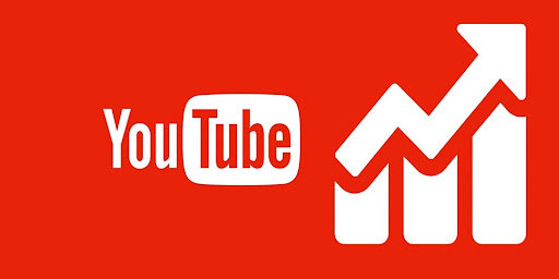
YouTube
With 1.7 billion unique monthly visitors, YouTube is one of the best social media platforms for driving traffic back to your company’s website. Video, as a medium, is a great way to tell your brand’s story and mission. With YouTube, your business can create educational content to display your business’s unique value proposition. People searching for advice and how-to-videos will land on your page, increasing brand awareness and subject matter expertise. Ensure your video is optimized for google search results by placing relevant keywords in the title.
Even for organizations intimately familiar with social channels, there is a science to building B2B social media marketing programs with the optimal mix of channels, content, and timing. Contact Bluetext to help your organization drive B2B marketing results on LinkedIn, Twitter, YouTube, and other social media channels.
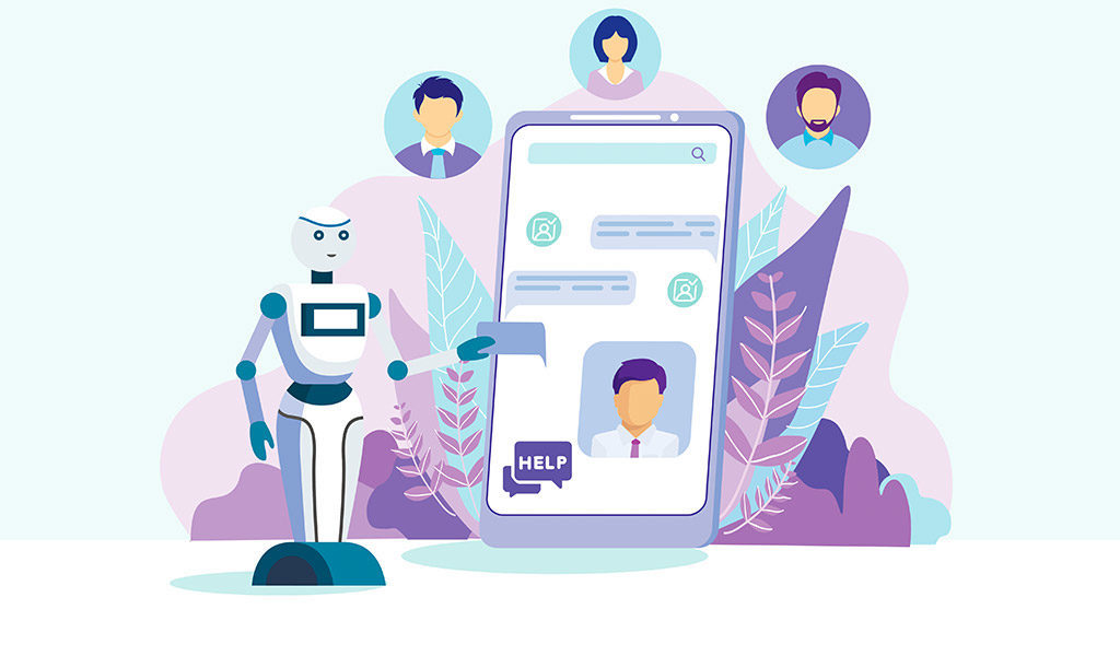
No matter what industry your company is in, or who your target market is, the goal of any customer interaction is to foster a relationship that converts to revenue. In today’s digital landscape, customers’ expectations have elevated to instant yet personalized feedback to their questions at the click of a button. While this seems like an impossibly daunting task, it has become an expected digital experience with the help of technology. Artificial intelligence-powered live chat, chatbots, and messaging apps have all helped companies achieve this blend of efficiency and customization. Below, we dive deep into the power of conversational marketing and how to implement the right strategy for your business.
What is Conversational Marketing?
In its essence, conversational marketing is a series of one-to-one interactions in real-time across multiple channels. Conversational marketing enables you and your team to foster relationships with both potential customers and existing customers, improving overall online customer experience and brand perception. A successful conversational marketing strategy ensures your customers feel satisfied and supported in all their questions, and trust your brand throughout every stage of the sales funnel. Additionally, as we know, data is a powerful tool, and utilizing conversational marketing technology can increase that amount of data allowing you to tweak your strategy and increase conversions. Every conversation could be considered a mini focus study and learning experience for how to continually improve your business.

Chatbots
As your business scales up, so will the number of questions from prospective and existing customers. That being said, there will come a time when it is simply not feasible to increase the number of sales representatives you have to answer every question that comes in via your website. That’s where chatbots come in. Chatbots have become the go-to conversational marketing tool for a lot of businesses. Platforms like Drift, which integrate seamlessly with your existing website make chatbots a very easy and effective way to up your conversational marketing efforts. Chatbots are very effective when it comes to easing customer pain points quickly and provides a visual cue of reassurance upon landing on a web page that support resources are readily available. Pre-programmed answers to frequently answered questions allow you to talk to your customers, regardless of the time of day. This is especially beneficial for businesses with an international reach, as customers outside your local time zone will always feel supported. If the query is too unique to respond with a canned response, chatbots can connect the customer with a live representative who can better answer their questions. Plenty of conversational marketing platforms enable businesses to identify which leads are most likely to buy and then move them to the front of the line.
Customer Feedback
Pulling data from your chosen conversational marketing tool on customer engagement will only get you so far. At the end of the day, you’ll need to gather feedback from your customers, asking them their thoughts on how to improve the customer and prospect experience on your site. This will not just enable the customer to feel that they have a say but also will help in the optimization of the tools after some time. Adding a quick feedback survey to the end of a chatbot or live chat conversation will go a long way in improving customer satisfaction.

How to Get Started
Implementing a successful conversational marketing strategy starts by choosing the web pages where you want your conversational bot to engage with your visitors. Sometimes it makes sense to have a constant chatbot available on every page, at all times. Other times, and especially when utilizing live chat versus a chatbot, it pays off to choose the pages that get the most traffic, have the most conversion opportunities, or have visitors with a high intention of buying. This will help maximize the number of interactions you enter into, and the likelihood of success of those interactions. Now that you’ve decided where you want to speak to your customers on your website, it’s time to define what kind of information customers will ask for, and how in the simplest terms you can provide them with that information. As a general rule of thumb, try to keep the conversations simple. Your customers will expect the interaction with your company to be smooth and want to get answers and guidance quickly.
Regardless of the size of your company, having a conversational marketing strategy is key to increasing customer satisfaction and therefore revenue. Are you looking to begin your conversational marketing strategy but not quite sure where to start? Contact Bluetext and see how we can help.
Being a technology company can be tough, there is often pressure to appear futuristic, scientific, or impressively complex. The market often expects the latest and greatest features and widgets, especially in website UX and design. However, not every company is the space-age, robotics, AI-generated stereotype that comes to mind with “tech”. But across all technology companies, there is a shared level of expertise in software and computing that may not be found in the everyday website viewer. Technology companies can easily fall into the trap of flexing their brain power a little too strongly, and overachieving the “tech aesthetic”. And while there are a million ways to design an impressive website, there are a couple of practices that stand out as common pitfalls for technology companies. Bluetext recommends the following as what NOT to do in web design:
Too much content on one page
This is often the result of poor content planning. When a user is overwhelmed with animations, visuals, and walls of text, they lose interest quickly. Focus each page on answering a specific question or describing a specific product, and link out to additional information that you feel is relevant. If there is any “take it or leave it” language on the page, it might be best to leave it.
Too little content on one page
As the saying goes, too much of a good thing can be a bad thing. We appreciate minimal site design when it helps a user find exactly what they’re looking for, but barely-there content doesn’t help anyone. Each page should be thoughtfully designed and written and should provide a user with clear next steps in their journey on your website.
Jargon or unapproachable language
Messaging across the site ought to be crystal clear. Just like having too much content, using complicated language and jargon can deter a user from continuing on your site. We recommend tailoring your content to your audience by considering how they would speak during a conference—widely-understood industry terms are acceptable, but should be embedded within digestible, humanized language. When customers can easily understand your product language, they gain confidence in your brand.
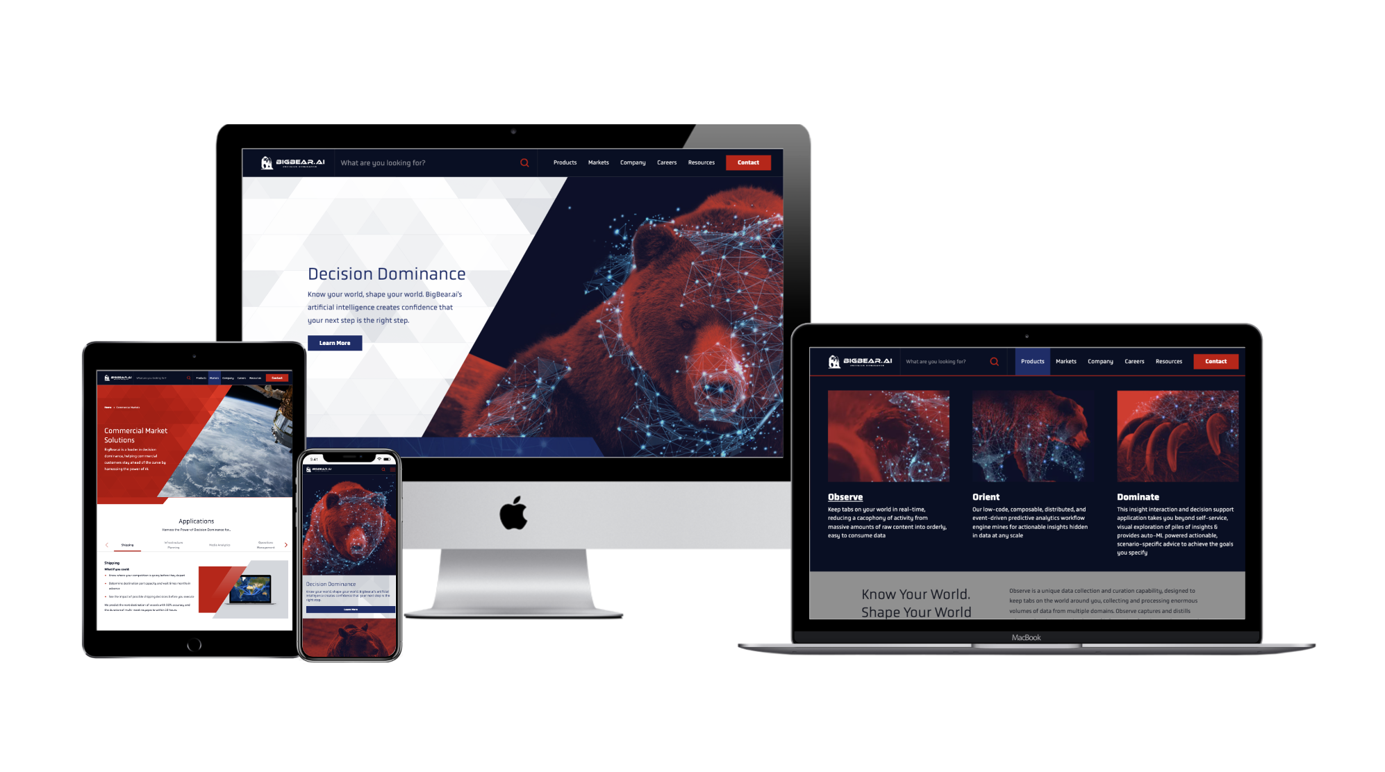
Recently, Bluetext partnered with BigBear.ai to develop a new messaging strategy that frames them as a leader in their field while explaining their highly-technical product with accessible language. As a result of this partnership, BigBear.ai is able to strike a balance between technical and approachable language, and build trust with its audience. To learn more about this project, click here.
Falling into the trap of trends
We see this most often when personal taste takes precedence over user experience. Some trends have staying power and can help you stand out from out-of-the-box websites. Some trends, though, are fleeting.
When adopting new web design styles, carefully consider the relevance of each trend to your brand and your users. More often than not, the best thing you can do for your users is to be consistent. They want to know what to expect from your website, so as you explore trends, it’s good to meet (or exceed!) those expectations.
No clear CTA
Each page on your site should provide clear, relevant next steps. This could take the form of related resources at the bottom of the page or quick links to associated product pages. Whichever next steps you choose to display, they should proactively provide the user with additional information related to the page they’re on. This practice is also helpful with interlinking content across your website, which can boost your search rankings.
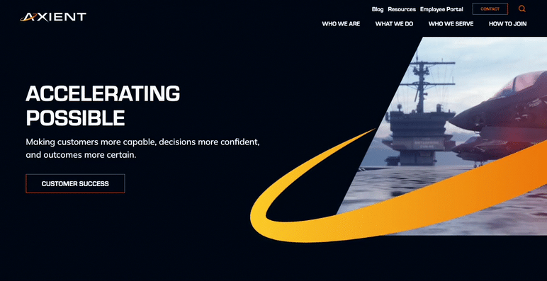
For a great example of CTA placement throughout a site, check out Axient’s website. Bluetext worked with Axient to devise a comprehensive website strategy that would optimize the user journey and maximize conversions. To read more about this project, click here.
Poor mobile experience
More than half of users will leave a page that takes more than a few seconds to load on mobile, according to Google. Given that mobile use is steadily increasing year-over-year, this means that the longer your site takes to load, the more users you could be losing to competitors.
One solution for the mobile-desktop conundrum, as recommended by Nielsen, is to have a mobile site separate from your desktop site. This will allow you to pare the mobile experience down by removing content and features that are only relevant to desktop users. To see how your site’s mobile experience stacks up, try out Google’s Mobile-Friendly Test.
At the end of the day, the best thing you can do for your website is to design and write with your end-user in mind. A site that works for them is a site that works for you.
To learn how Bluetext can help you avoid these mistakes, get in touch with our web design experts today.
When it comes to digital marketing analytics and tracking, there’s a clear winner of the worldwide popularity contest. With use on over 50 million sites, Google Analytics is the most popular tracking and analytics platform available –and for good reason. With detailed insights and reports, Google Analytics gives marketers a comprehensive look at how effective their website and/or application is as a marketing tool. As a DC marketing analytics company, Bluetext has worked with countless brands to set up their Google Analytics and make use of its insights. Along the way, we’ve learned many lessons from best practices to little-known tips and tricks. In the setup process, a key step is properly defining and deploying goals in your Google Analytics instance to better report on conversion actions. As a dc marketing analytics company, we know that defining these goals is a foundational aspect of any analytics and attribution plan, so we’ve outlined the fundamentals of Google Analytics goals below.
How Do Google Analytics Goals Work?
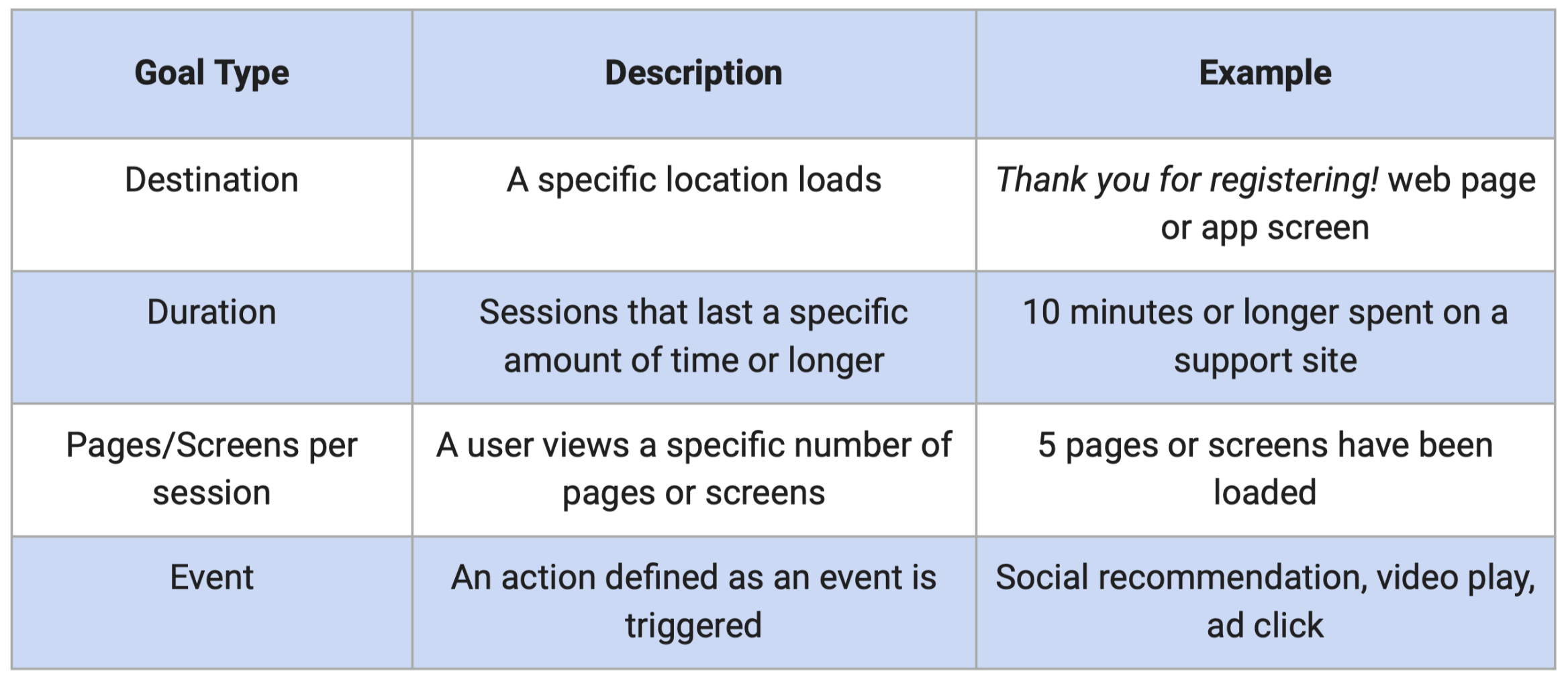
The beauty of Google Analytics is that it’s never a one-trick pony, or built for a specific type of business. The analytics platform is highly adaptable to any company’s business goals and creates custom dashboards to visualize your specific objectives. Google Analytics goals are uniquely customizable and can track many different actions, from specific page views, how long users stay on your site or application, form submissions, and more. Goals, additionally, can have a monetary value assigned to them, which allows you to track general ROI, ROAS, and countless other marketing metrics. The goal and conversion data computed by Google Analytics also allows you to define a series of reports to dive deeper into your website and paid marketing metrics. The chart below helps further define the four-goal types in Google Analytics:
How Can I Start And Be Smart About Their Goals?
If you aren’t tracking explicit conversions yet, Google’s “Smart Goals” are a simple way to help optimize your performance. Smart goals were developed by Google as a way for marketers to track the most engaged sessions on their website. With smart bidding, Google uses machine learning to identify and examine dozens of intent signals about your website sessions, assign each session a score, and determine the sessions that would be most likely to convert. While smart goals can be great for many reasons, there are limitations. For example, smart goals are not customizable, they are currently only available for websites (not applications), and they are not available for websites that receive more than 1 million hits per day. It’s like turning on autopilot for your tracking, great for a period of time to be a little more hands-off and let algorithms do the work, but eventually, you will want to drill down and focus on converting potential prospects. With these limitations in mind, we recommend working with a marketing analytics company, like Bluetext, to ensure you are able to track explicit conversions, making your data more valuable and accurate.
What Are Best Practices For Setting Up Goals?
When setting up your goals, consider these best practices:
- Give each goal a unique and descriptive name. Especially when your marketing analytics becomes more robust over time it pays off to be organized from the start.
- When possible, assign a goal value to help monetize and evaluate your conversions. You can also use a number scale to assign importance to your goals (low-value = 1 and high value = 10) if you are unable to assign a monetary value.
- If you ever need to change goals, keep track of when and what you did. Goals are not applied to historical data, so changing one will change conversion data from the point of the change.
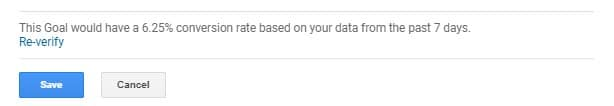
- Before pushing your goals to the live environment, ensure you use Google Analytics’ “Verify this Goal” feature to see how the goal would have converted over the last seven days.
Setting up goals in google analytics can be frustrating and time-consuming. The work it takes to set up google analytics goals, however, is worth the time investment. Working with a marketing analytics company can be a great way to effectively implement goals and reduce the amount of time needed to do so.
Interested in working with a marketing analytics company to ensure your Google Analytics goals are effective and properly set up? Contact us here!
Whenever you add or change a feature on your website, you should consider the impact on the UX, or user experience. When you assess how users will interact with your website, it is important to consider users with differing abilities. Accessibility is a critical component of website design, not only for inclusivity but also because Google search crawlers reward websites that implement accessibility best practices.
Most websites don’t even realize that their content is not accessible to all users and use designs and visuals that create poor accessibility unintentionally. For example, you might like the relaxing feel of muted colors, but there needs to be enough contrast for users with visual impairments to read your content. If you use video content, be sure to include closed captioning to provide users who are deaf and hard of hearing the same access to information.

When thinking about accessibility, it’s also important to remember the universal benefit to every single user of your website. Too often, we think of accessibility as a way to benefit a small subset of users who need accommodations, but making your content more accessible actually helps everyone. If you’ve ever tried to watch a video on the metro, you know the benefit of closed captioning. On that day your mouse broke, you probably learned pretty quickly which websites you could access using a keyboard.
While there are many different ways you can improve accessibility, here are some great ways to start bettering your site.
Check Color Contrast
Run your website through a contrast checking tool (there are many free options online, such as a11y’s color contrast tool). This will help you spot any colors that might be difficult to read or view, so you can update text and CTAs to ensure that all your users interact more easily with your site.
Break Up Long Chunks of Text
While some areas of your site might require a long article when possible try to break up long periods of text with images or different types of components. This will make your content more accessible for neurodiverse users, and it will make important content more digestible for anyone who comes to your website.

Add Alternative Text for Images
Many content management systems will already ask you for alternate text for images, so this is an easy way to immediately make your website more accessible. This text does not need to be a detailed description of every single piece of the image but should be a few descriptive words that capture the main points of the image.
Make Menu Items Unique
Repeated menu items are confusing for everyone. If you have the same item under two different parts of the menu, it is difficult for users to tell which one has the information they need. It becomes more difficult to tell the difference when using a screen reader. Think through your menu, and choose the single most accurate spot for each menu item.

Improve Heading Hierarchy
Headings help you visually separate your content, and using the correct headings will help neurodiverse users and people using screen readers. Most websites use headings from <h1>, being the most visually impactful and important, to <h6>, being the least. As you write your content, think about where it makes sense to group content under a heading and what type of heading should be used. A major section of your page should not be delineated by <h6>, and a short paragraph should not use an <h1>.
Hopefully, these recommendations will help you as you begin creating a more accessible website. Reach out to Bluetext to dive further into accessibility and make sure every user has a great experience on your website.
Whether you’re a reader or a listener, we’ve got you covered! Listen to the podcast version of this post for a fresh take.
In any website design, call-to-action (CTA) buttons are key to highlighting the important actions available to users. Buttons make the difference between a general site visitor and a converting sales lead. Pointing out relevant information and next steps to the user can help them navigate your site with less friction, reducing decision fatigue and decreasing bounce rates. Here are six key questions you should consider when designing the CTA buttons to be used on your website.
Should the button style stay the same?
While it’s important for button styling to be consistent across a site, in some cases, there are multiple actions available to a user in a single viewport. To avoid overwhelming users with numerous identical buttons on the screen, you can use different styles to indicate a visual hierarchy. You’re already asking a user to make one decision, therefore, the UX should eliminate any additional, unnecessary decisions in what button to select. For actions that are top priority, bold-colored, solid buttons tend to draw a user’s attention first. Secondary and tertiary button styles should be less emphasized, with unfilled boxes or simply underlined text to indicate less important actions. The styles should be distinct but linked by common elements such as color or shape to make them easily recognizable. Try to use the primary button styling predominantly throughout the site, and avoid creating more than three distinct button styles.
What colors are best to use for CTA buttons?
When choosing the fill color of CTA buttons, it may be tempting to rely on your company brand color scheme. The button design shouldn’t diverge from the brand entirely, but the button color should stand out from the rest of the content on your site. Say you have a minimalistic black and white or muted color palette, you’d want your colors to pop against those backgrounds. Using the predominant brand color risks the button competing for user attention, leading to lower clickthrough rates. Color psychology also plays a key role in communicating the meaning behind buttons. It’s usually best to avoid red CTA buttons, because red buttons are associated with dangerous or harmful actions. Blue buttons, on the other hand, have positive connotations for users since blue text (the namesake of the Bluetext agency) has been used to indicate hyperlinks since the inception of the internet. Users are familiar and comfortable with clicking clue hyperlinked text, so why initiate a change? When choosing the color for a group of buttons on the site, assigning different colors to each action can create a higher cognitive load for users trying to distinguish between their choices. It’s best to use the same color for all the buttons in a group, so that users can focus on the text. However, you may want to consider indicating a default action to make one choice stand out, as discussed in the next section.
Should you highlight a default action?
If you are showing choices on a screen, and one of the choices presented is more likely to be the user’s preferred action, then it may be best to highlight that option to indicate it as the “default” to help users choose this option faster. However, if the choices are equal, then highlighting a default action could confuse the user or steer them to click the default choice rather than considering the options equally. When showing two choices next to each other, it’s also important to consider right and left hand placement. Showing an option on the right may make users more likely to choose it due to right hand bias, so it’s best to put the default option on the right. However, if the default action is something irreversible like “delete all,” it may be best to put that CTA on the left to force users to give more consideration to their decision. When presenting multiple options, just consider which option will be chosen the most often, and how quickly you want the user to navigate the decision.
Should icons be added to the CTA buttons?
Usually, text alone is enough to communicate clear actions to the user, but when buttons are grouped together, it may be harder for the user to distinguish the difference between the options presented. For example, if a new user on your site sees “Download” and “Contact Us” CTAs right next to each other, they might have to take a second to think about the difference between the two actions. In cases like this, icons can help users to discern the difference between the options faster. When assigning icons to the CTAs, make sure that the icon is helpful in communicating the meaning behind the text. If the icons themselves are too similar or generic, they may only lead to more user indecisiveness. Choosing the right icons can make all the difference in the user experience.
Should designers think “outside-the-box”?
The standard button styling is a rectangular box shape, with rounded corners. While designers could use colors and text styling to flex the brand, the overall button shape shouldn’t stray too far from the norm. The oblong-shaped CTA is emerging in popularity with more rounded, organic brands and is a great example of applying brand elements without feeling foreign. The goal of a CTA is to be instantly recognizable to the user, and in this case, thinking outside the box could lead to users being confused or less likely to interact with CTAs. One way of ensuring standardization across buttons is by adhering to the “common grid” measurements. The grid spacing ensures that buttons have adequate clear space around the text, making them easier for viewers to read and recognize the anatomy. Clean, simple designs also tend to be more palatable, as buttons with numerous effects applied can end up looking tacky and unprofessional.
What considerations should be in place for accessibility?
Accessibility is necessary for legal compliance, but it’s also recommended to ensure that designs are easy to read for all users. Font size and color contrast are two of the main considerations for button accessibility. Gradient treatments can also add complications to website accessibility, especially when overlaid with text. As a designer, it’s important to ensure that legibility is never sacrificed for aesthetics. The Importance of Website Accessibility doesn’t go ignored at Bluetext; read more about how we test for accessibility compliance to ensure that our sites are functional for everyone.
At Bluetext, when designing a site for a client, the number one priority is to ensure that the website will engage users in order to achieve business goals. Experienced designers know that CTA styling is key to capturing users and directing them to the most important content on the site. Thoughtful design can increase brand recognition, improve clickthrough rates, and remedy bounce rates for your site. Contact Bluetext to learn more about our services and how we can address all of your website design needs.
Picture this. It’s a Friday night, and you’re deciding where you want to eat dinner. As you walk down the street, you’re overwhelmed by an abundance of options. Storefront posters shout weekly specials, stapled flyers advertise happy hours, promoters beckon passersby into newly opened spots, all merging into a blur of sensations.
But then, you hear it, your favorite song playing amidst the thrum of the busy street. You follow the sound to a restaurant you hadn’t noticed on the first pass, where the music continues to bump along on outdoor speakers. From the patio, you catch the smell of fresh food leaving the kitchen, getting your stomach growling and enticing you further. Stepping inside, a waiter passes by, carrying your favorite dish to a nearby table. Taking in the room’s ambiance, you turn to your friends and proclaim you’ve found tonight’s spot.
Now you’re probably wondering why I’ve had you go through this foodie fantasy with me. Part of it might be that I’m writing this blog around lunchtime and can’t help but steal glances out the window at our neighborhood sushi spot while I type. But more importantly, it serves as a perfect analogy to illustrate the value of inbound marketing and what it can do to improve lead generation for your business.
So What IS Inbound Marketing?
Inbound marketing is a methodology centered on drawing potential customers to your brand instead of trying to push your brand out in the market. Rather than utilizing external marketing tactics like TV ads, billboards, and flyers, an inbound marketing strategy seeks to attract customers by creating valuable content and experiences catered to them. Put broadly, outbound marketing brings your offering to your prospects, while inbound marketing brings your prospects to you. In doing so, you guide potential customers to your website with a pre-established positive impression—making it more likely that they’ll go with your product or service when they’re ready to buy.
Inbound marketing is content-led and hinges on providing potential customers with content that is genuinely meaningful to them. Because of its content-led nature, inbound marketing boosts SEO and organic traffic acquisition and builds trust and credibility in your brand by positioning your company as a thought leader in the market. Throughout the customer journey, the goal of inbound marketing is to add value. To be successful, you must attract users to your website with relevant and high-quality content, engaging with them and clarifying your value proposition. You must also delight users by acting as a reliable partner with a vested interest in their long-term success.
Building Your Inbound Marketing Strategy
Proper planning and optimization will be critical to the success of your inbound marketing program. Creating compelling content is about strategic planning and commitment rather than budget. You can’t just throw money at content creation and expect to come away with something compelling, you have to put your head and heart into the work. With that in mind, here are some thought-starters to create and maintain your inbound marketing strategy.
Know Your Audience and Space
Defining your business goals and buyer personas should be the genesis of any inbound marketing effort. You can’t write content to inform your customers until you’ve identified your target audience and learned all you can about them.
In the same vein, choosing the right platforms to distribute your marketing materials on will be critical in ensuring your content reaches the right prospects. Determine the best way to reach your target audience, whether through Twitter, Pinterest, Facebook, your blog, or elsewhere, to ensure your content gets to the right prospects.
Create a Journey Worth Taking
With effective inbound marketing, there should never be a dull moment in the customer journey, from impression to engagement. Aim to provide content across the customer experience. Preemptively answer the questions prospective customers will likely have at each stage of their buying journey. What makes you unique? Why should they listen to what you have to say? Successful inbound marketing tells prospective customers a unique and compelling story about your brand from first sight to final sale.
Consistency is Key
Inbound marketing is a game of consistency. Maintaining a constant stream of content tailored to your market’s current pain points and questions supports you in staying relevant and building your brand’s perception as a trusted thought leader. To effectively support your inbound marketing strategy, prioritize creating and executing on a content calendar without fail. A set schedule ensures relevant content will consistently engage your audience and keep your brand fresh in consumers’ minds. And in case you need more convincing, a 2021 Hubspot study found that brands who publish blog content at least 16 times a month generate 3.5x more website traffic and 4.5x more leads than companies that only update their blogs a few times a month.
Measure the Metrics that Matter
There’s a plethora of metrics to choose from when measuring the success of your inbound marketing strategy. From analyzing SEO rankings to measuring inbound links, these resources give valuable insight into how your campaigns perform. Prioritize regular auditing and analysis of these metrics while managing your inbound marketing to understand how effective your efforts have been and see how they can improve. If particular topics are gaining the most traction with viewers, concentrate on these areas and find unique ways to expand upon. If certain content is not generating or retaining enough attention, there is your sign to pivot.
Inbound Inspiration
Now that you’ve got your strategy set and these best practices behind you, here are some examples of engaging online content to fuel your inbound marketing efforts.
Blog
A mainstay of content creation, blogs are the perfect way to answer your prospects’ pressing questions or pique their interest with accessible long-form content. According to HubSpot, marketers who prioritize blogging are 13x more likely to get a positive ROI than those who don’t.
Case Studies
Imagine that you’re the owner of a growing business in the market for a piece of cybersecurity software that you’re unfamiliar with. You sort through an endless stream of ads and webinars talking about concepts and capabilities that all fly over your head, leaving you utterly lost. But while browsing through one company’s website, you come across a case study telling the story of a company eerily similar to yours. Reading their testimonial and hearing how transformational the software has been for them, you can’t help but think that it could do the same for your business. Emboldened by the relatable success story, you confidently choose to purchase the cybersecurity software.
That’s the power of a case study. Allowing you to focus on different customer personas in your market, case studies sway fence-sitting customers with highly-tailored promises of success.
Infographics
As helpful and engaging as written content can be, people don’t always have the patience to sit down with 1000 words about humanized homepages. Often, prospective customers just want a quick snapshot of insightful data packaged in an easily digestible and aesthetically pleasing format.
Webinar
It isn’t always easy to inject your brand’s personality into written content. While more informal content like blog posts have some wiggle-room, highly polished pieces like whitepapers and case studies often lose the human voice behind your brand.
That’s where webinars come in. Webinars-an internet seminar presenting lecture-style content to an exclusive audience-create the feeling that your brand is in direct conversation with prospective customers. They let consumers connect with the people powering your company rather than interfacing with an impersonal business entity. Additionally, the ability to request information from prospective customers for entrance to the webinar serves as a phenomenal lead generation tactic.
Video Series
It’s no secret that video content is an enormous part of marketing. It’s engaging, constantly growing, and makes up the majority of content audiences across industries are digesting on platforms like TikTok, Facebook, Instagram, and Youtube. But a key trend to capitalize on with your video content lies in its size.
While written content benefits from long-form structure, video content functions best when bite-sized. While things can vary based on platform or user persona, a general rule is that social media users will lose interest in videos longer than a minute or two.
No matter what path you decide to take your inbound marketing strategy down, Bluetext offers expert advising and cutting-edge capabilities to ensure you’ll have everything you need to succeed. Contact us to learn how inbound marketing can grow your business.
A crucial part of any successful website design is not only catching the attention of a target market but keeping that attention. Oftentimes, UX experts will achieve attention retention through eye-catching animations, clean layouts, and intentional content strategy. But in some industries where flashy design and lifestyle imagery isn’t relevant, this can be an intimidating challenge. As a B2B technology marketing agency, Bluetext has done a deep dive into some key elements to help give your B2B website the winning edge.
The Difference Between B2B and B2C Websites
When it comes to designing a website for a B2B versus a B2C audience, the design landscape and tone change in response to respective target audiences. Consumers are often online to fulfill an emotional need, such as instant satisfaction from a purchase. The B2B audience, however, tends to take more time examining all the information about the product before making a decision. Why is this important? Understanding the audience’s motivations is the first step to giving your B2B tech website a leg up in UX design.
Now that we have covered audience motivation, let’s discuss how this translates into web design. In a broad sense, UX experts recommend the key aspects of technology website should be: simple navigation, concise language, and responsive web design. In the market of technology, it is also important to emphasize successful security checks throughout the design of the site. Those are the core ingredients one would expect every website to contain, but below we explore three best practices to help B2B websites stand out against the pack.
Rely on Content
UX experts first and foremost rely on content. As we mentioned earlier, B2B audiences often have much higher stakes in their purchasing decision. Yes, it may be a sole individual making the decision but they are often selecting a product or solution that will impact many people and departments across their company. Therefore, the B2B target audience likes to know everything about the product before making their long-term purchase decision. A tech website design must accommodate large amounts of text to describe each product. Keeping this in mind, UX designers can implement specific modules for a site that best present large amounts of content in digestible chunks.
B2B tech websites’ extensive amount of content must also convey a professional tone. Most B2B site visitors are informed to some extent about the product or solution they are seeking. If a company cannot clearly explain its product in a professional and concise way, it will drive away sales. There is nothing more professionally relatable than a crunch for time, so a site should respect the user’s busy schedule and likely short-lived attention span for acquiring key details. Another common mistake for tech companies is not clearly explaining company messaging and why they stand out against their competitors at the forefront of their website. Upon first landing, a user should be able to tell what your company does, and why they should pay attention to it. The Bluetext messaging team uses a highly thought out process to make sure the tone of a brand addresses all competitors in the marketplace and stakeholders within a company.

Clear Call-to-Action
In the same vein of time awareness, B2B web designs must have a clear call to action. If you happen to capture a user’s attention enough to generate genuine interest, there needs to be a frictionless and obvious way for them to find and take the next step. Research has shown that a B2B audience is more likely to call to purchase a product than purchase online. Therefore, a website should address this pain point with live chat solutions, well-integrated contact forms, customer care information, telephone numbers, and more.

High-quality video and images
Along with the expectation of a professional tone comes a professional look. The first step is implementing high-quality videos and images onto the new site. Strong visual content can help break up the large blocks of content and avoid the risk of eye fatigue when scanning and reading lengthy text blocks. Videos are a useful and engaging way to provide a clear explanation of what the product can achieve. Coupling visual and audio elements increase the memorability of your brand and capture attention for much longer. Videos can also give a closer look at the company’s values as a whole. The Bluetext video team uses a strong brand voice, innovative animations, and professional editing to create persuasive and informative content for their clients.
Mobile Friendly
If you’re selling tech, you have to show you are tech-savvy and keeping up with the times. This should be a no-brainer, but too many technology websites across the web don’t take advantage of responsive design practices to ensure equitable desktop and mobile experiences. Bluetext implements this with well-thought-out wireframes addressing all content needs. One of the ways to best implement a strong user experience is keeping in mind the significance of a mobile-friendly design. With mobile traffic driving up to 40% of revenue, this design compatibility should never be ignored.

B2B differs from B2C in terms of their audience needs, wants, and decision-making processes. While some core differences set these types of websites apart, an informed UX and content strategy that matches audience needs is crucial to both. Consult a website design and UX agency like Bluetext so you can be sure that your website addresses the needs of your target audience, and formats content and visual components to convey a professional and interesting tone. Contact Bluetext to learn more about our services and how we can address all of your content and website design needs.
The XXIV Olympic Winter Games have come and gone, in what felt like the blink of an eye. Even though the Games span only two weeks following the Opening Ceremony, there are years—and sometimes decades—put into their planning. A key piece of that planning is setting the visual identity of the Games, which is no small task. We all know the iconic five-ring emblem that symbolizes the union of international athletes, but each host city gets the opportunity to create its own unique logo. Olympic logos of the past have varied widely in color, type, and style, and each new logo is put to the test to tell a story not only about an Olympic season but about the host country itself.
A quick glance at all the different Olympic logos of the past makes it clear that there’s no clear-cut formula for an Olympic Games’ brand system (except the inclusion of the Olympic rings, according to the Olympic Charter). We’re going to take a look at the Olympic logos of yore and dissect our favorites and not-so-favorites through superlative-style judgment.
Best Abstract Use of the Olympic Rings — Atlanta 1996
Incorporating the Olympic rings is a requisite part of all Olympic logos, but that might get a little repetitive after over 50 Games. We appreciate the Atlanta 1996 logo’s integration of the rings with the column—the mark hints at the Olympics’ Grecian beginnings, the Olympic torch, and even manages to squeeze in the number ‘100,’ celebrating the centennial of the games.
Best Direct Use of the Olympic Rings — Innsbruck 1964
There’s something to be said for a simple, classic logomark like the Innsbruck 1964 logo. Using the coat of arms of the City of Innsbruck as a starting point, this logo features the rings prominently and uses an elegant typeface for the host city and year. We can’t think of a more classic, straightforward Olympic logo.
Best Out-of-the-Box Typeface — Rio de Janeiro 2016
The logo for the 2016 Rio de Janeiro Games feels like a celebration, exactly as its designers intended. This mark took inspiration from Carnival and uses organic forms and lettering to convey the energy of both Rio and the Olympic Games. This approach brilliantly tells a story while standing out from the crowd.
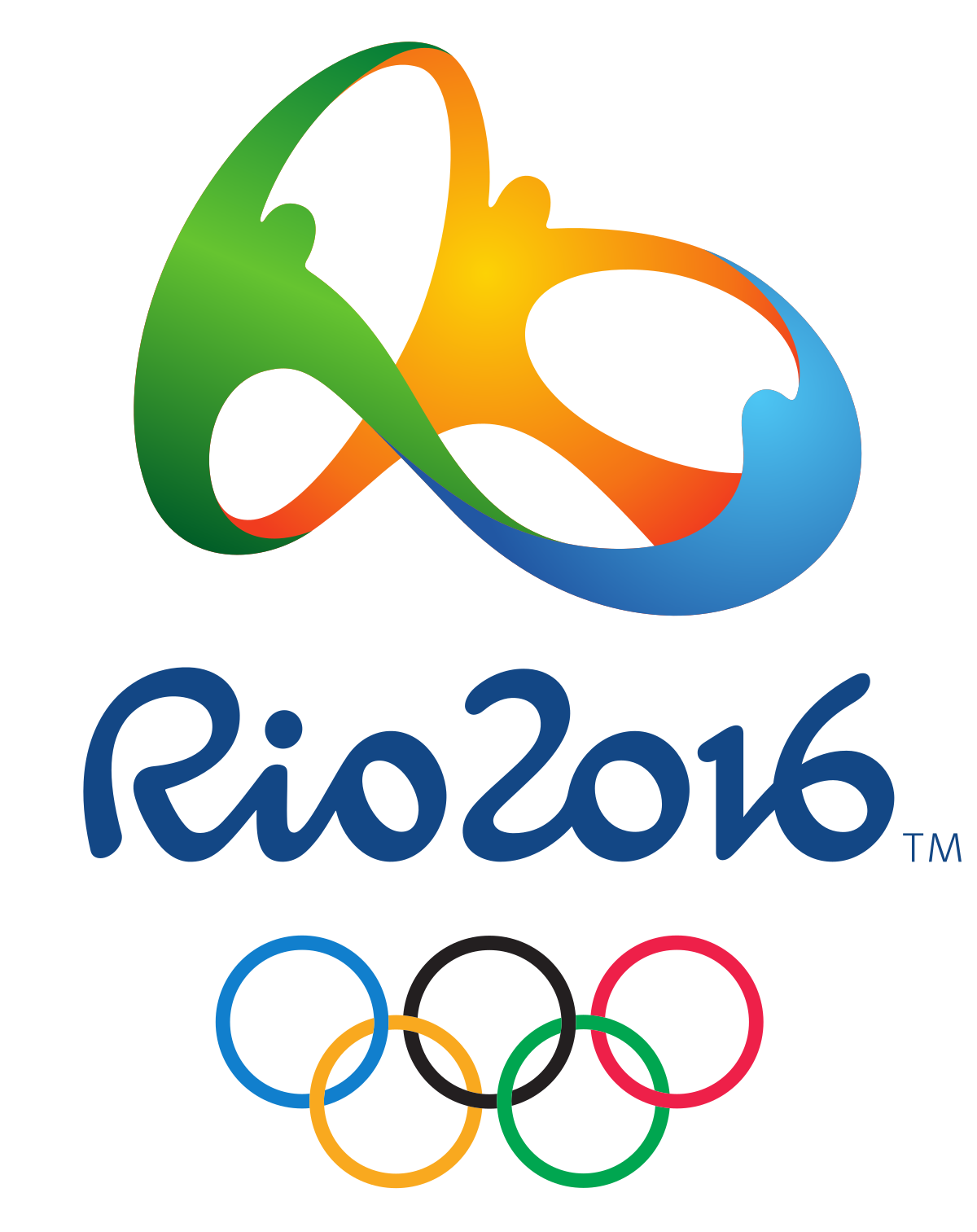
Best Out-of-the-Box Color — Sarajevo 1984
Working with the Olympic rings may feel constricting color-wise since there are already five colors to contend within a design. That didn’t stop the designers of the Sarajevo 1984 logo, who washed the whole logo in orange for the primary mark. This approach is particularly interesting because the logo was permitted to appear in any color so long as the entire mark appeared in a single color.
We’d be remiss to close this category without giving a nod to the London 2012 logo which, while controversial, was striking in its use of hot pink. They can’t all be winners, but we appreciate the bold approach.
Best Use of a Human Figure — Nagano 1998
In the Nagano 1998 logo, seven abstract human forms make up the petals of a flower, nicknamed the Snowflower. We like this mark not only because it defied expectations for a snowflake or other wintery symbol, but because it was the starting point of an environmentally-focused Olympic identity.
Best Minimal Logo — Tokyo 1964
Stunning in its simplicity and symbolism, the Tokyo 1964 logo is heralded as one of the all-time greats in Olympic logos. With the Olympic rings set in gold beneath a version of the Japanese national flag, this mark features traditional Japanese colors signifying peace and prosperity. Despite its minimalism, this logo manages to acknowledge the host country, the traditional Olympic identity, and the moral foundation of the Games.
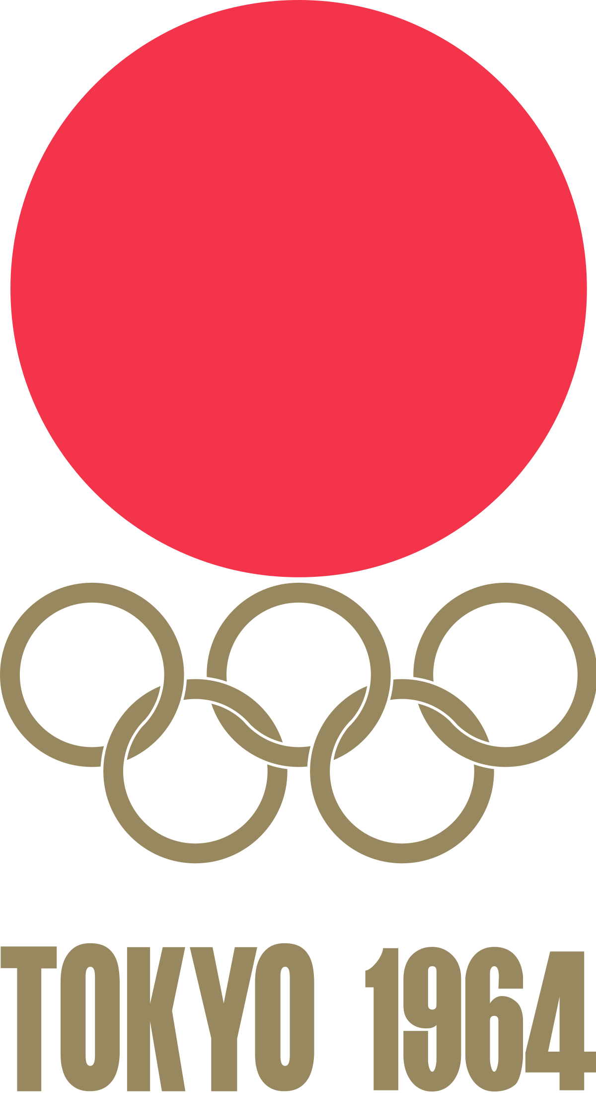
Best Maximal Logo — Rome 1960
Poised between two relatively simple Olympic identities (Squaw Valley 1960 and Innsbruck 1964), this maximalist logo was an obvious pick in this category. In a departure from ‘60s graphic design trends, this mark harkens back to classical Roman motifs and styling. While it may not be everyone’s cup of tea, we admire the dedication to national legend.
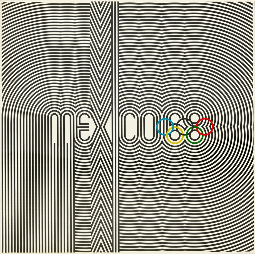
Best in Show: Summer — Mexico 1968
Our winner for Summer Games logos has to be Mexico 1968. Not only does the logo incorporate the rings creatively, but it’s also reminiscent of athletic uniforms and traditional Huichol art. This mark is the basis of a fascinating brand identity—for starters, the official Olympic poster looks like album art. Sure, this logo may be a little busy, but what it lacks in refinement, it makes up for in energy.
Best in Show: Winter — Sapporo 1972
We love the Sapporo 1972 logo because it’s unlike any other Olympic identity, and it was perfect for its time. With a Bauhaus feel, this mark features the rising sun symbol from the Japanese flag, a stylized snowflake, the Olympic rings, and a single line of text. Despite including only basic elements, the unique stacking and coloring of these elements make this logo one of our favorites.
Best Iconography — Tokyo 2020
The iconography that’s developed alongside Olympic identities changes with the logo, and we wanted to honor an icon system that we think was particularly elegant. The icon set for the Tokyo 2020 games included icons (or pictograms) for each sport, including the five new sports introduced to the Olympics that year. Each icon is skillfully-made and coincides beautifully with the 2020 Olympic logo.
Judge’s Favorite — Munich 1972
A personal favorite that didn’t get identified in any of the above categories, the Munich 1972 logo’s name says it all—”Radiant Munich.” The abstract sunbeams are eye-catching, and the overall brand identity feels both joyful and serene.

Judge’s Least Favorite — Sochi 2014
While this logo was meant to convey sentiments of modernity and the coming digital age, it misses the mark. Suffice to say, there’s a reason that no Olympic logos in the 8 years since have included a URL.

There you have it—our take on some of the best and worst Olympic logos to date. We encourage you to explore all of these logos yourself on the Olympic website, and to explore other opinions like Milton Glaser’s for AIGA.
The logos for the Paris 2022, Milano Cortina 2024, and LA 2028 Games have all been unveiled, but given the controversy over and subsequent redesign of the Tokyo 2020 logo, we’ll wait to grade those logos until their respective Games pass. In the meantime, if you’re in search of a new logo or brand identity, get in touch with the team at Bluetext to learn how we can team up and go for the gold.
With 2022 already in full swing, companies are faced with the challenge of looking ahead to what the future might bring. Enlisting the help of a digital marketing agency like Bluetext can ensure that your company is not just reacting to trends, but thoughtfully adapting to the best practices in marketing and staying ahead of the curve. Here are 6 key predictions on how brands will bolster their marketing efforts in 2022:
1. Selling Your Brand, Not Your Product
The importance of brand recognition is nothing new, but the significance of strong brand identity will continue to increase. The modern-day user is inclined to invest in the companies they want to support, not just the products they want to buy. Especially in saturated markets, such as cybersecurity and technology, there are a million and one companies that sell the same or similar products. The skill of storytelling will be imperative in this upcoming year as firms will need to convey strong brand identity and powerful messaging to capture customers. Hiring a marketing firm could help your brand tell its story with seasoned marketing expertise. A consistent messaging strategy or compelling video content crafted by marketing professionals could be what sets your brand apart. Bluetext has a growing portfolio of brand videos that showcase how media can be used to create granular, compelling content to best tell your story to the market.
2. Being Prepared for Change in the B2B Sector
The B2B landscape in marketing is rapidly changing as a result of long-term disruptions caused by the global pandemic. As remote work has become a more permanent reality for many businesses, the reduction of in-person interactions is causing a shift in lead-generation strategies for B2B marketers. A digital and mobile-first marketing approach is more important than ever before, as many B2B buyers prefer remote interactions rather than personal experiences with sellers. In-person events are now mostly hosted in online environments instead, which have brought challenges to traditional lead generation. To remedy this, more B2B companies are capitalizing on social media as an important lead generation channel. A leading social media marketing agency like Bluetext can provide strategic and creative communications that engage with corporate customers through the most effective online touchpoints.
3. Responding to Increased Sensitivity to Marketing
Public awareness has become increasingly attuned to issues of diversity, equity, and inclusion. As companies are competing for attention in this space, firms can use marketing techniques to promote their core values while supporting the causes they stand for. This will help to gain trust and respect from customers who are expecting brands to be active in their communities.

4. Preparing for Marketing to Become Tougher
As consumer behaviors and privacy policies change, the platforms that host advertisements are changing as well, which creates challenges for marketers to navigate these spaces. Increasing regard for customer privacy will continue to make it difficult to obtain data and insights from online campaigns. In addition, platforms are updating their algorithms to respond to market changes, leaving advertisers to adapt to their new preferences. For example, Google’s changes in SEO ranking and Instagram’s shift to prioritize video content have already created challenges for marketing efforts in 2022. Businesses should expect to continue seeing these sorts of shifts, and be proactive in utilizing these platforms. Getting ahead of these changes and pivoting campaign strategies will accelerate prepared companies to becoming frontrunners of their pack.
5. Teaching Rather than Selling
One of the most important ways a company can gain respect from their audiences in 2022 is by addressing topics that are top of mind in their industry. Focusing your online presence on content marketing can help promote your brand’s expertise without explicitly advertising competitive advantages or product details. In the coming year, companies should be working to share more thought leadership pieces like blogs, whitepapers, and video content to bolster their online brand and increase their search ranking.

6. Utilizing AI/ML
Effective digital marketing campaigns must continue to utilize emerging technologies, one of the greatest tools in 2022 being artificial intelligence. Machine learning can ensure the productivity and effectiveness of your marketing efforts. You can bolster performance by accurately tracking KPIs and budgeting, while also personalizing and optimizing digital ad campaigns. Harnessing the power of machine learning applied to brand marketing will be a necessary skill for companies looking to thrive in 2022.
You may already be aware of these trends and the implications they could have for your business but unsure of how to start addressing them. Bluetext has the expertise and industry experience to help you grow your brand and implement effective changes to your marketing strategy. To learn more about our offerings, contact us today.