When we talk about motion in branding, we’re talking about a wide variety of creative approaches. From subtle homepage loading flourishes to complex, eye-catching 3D advertisements, animation can breathe new life into your brand. Today Bluetext will explore why motion design for logos is on the rise, when it’s best applied, and some of our favorite examples.
The digital landscape is crowded, to say the least. The average American spends a little over seven hours a day on the internet, and much of that time is spent surrounded by thousands of brands and advertisements. A well-done animation can help your brand stand out from the crowd and add essential layers of personality to your marketing collateral.
Whether your brand is neat and polished or playful and young, animation can reinforce those core characteristics without a single word. Picture the old Nickelodeon “splat” logo, for example. In 2009, a handful of disparate channels (TeenNick, Nick at Nite, etc.) were rolled into the Nickelodeon brand, and a new logo was unveiled to go along with the consolidation. The older logo’s animation had a younger, scrappier feel, while the current logo is much more refined, and gets at the large-scale, premium approach of Nickelodeon’s parent company, Paramount. These approaches are vastly different from one another, but there’s not one “right” answer when it comes to logo motion. Both animation styles are integral parts of the brand’s history and tell the story of a brand’s evolution. I’ve said it before and I’ll say it again: If a picture is worth a thousand words, an animation is worth a million.
Virtually any digital platform is an option when it comes to displaying an animated logo, but as they say, moderation is key. Instead of applying motion “just because,” it’s important to have intention behind the choice to display a static or animated logo. Here are a few of our favorite intentional applications of motion design in logos.
Use an animated logo when your space and time are limited
In cases where viewers may only see one or two components of an ad (scrolling quickly through a social feed, for example), you can convey more with an animated logo than you can with a static one. The key in these instances is to take up about the same amount of space and time as a static logo. This means your animation should be quick and to the point, like the example below from Nike. An added feature of Nike’s animation style is that they apply a different animation style depending on the audience and product, so each motion graphic feels uniquely suited to its context.

Amp up your site’s intro screen with logo motion
Along with the now-iconic “ta-dum” sound, Netflix’s loading visual is well-known and well-loved. Because the animation doubles as a loading screen, it doesn’t feel intrusive or overdone. It’s reminiscent of classic film grain, and it ensures that the Netflix visual identity is central to the viewer experience, regardless of whether the program is a Netflix original or not.

Animate your logo as part of a brand pattern
For Calling All Optimists, a GMAC brand, we developed an animated brand pattern using elements pulled directly from the brand’s logo. This is a handy asset in any brand’s toolbox, because it’s a custom element that can be used in place of stock imagery or generic graphics, and it can be front-and-center or fade into the background. You can explore our case study for Calling All Optimists here.

Tell a story about your brand using animation
Designtorget is a Swedish design house that sells all kinds of homewares, and their logo animation helps convey their line of business to unfamiliar customers. Using the “D” and “T” figures from their logo, shifting them around with other simple lines to portray things like a table and chairs and an abstract smiling person. This animation demonstrates the brand’s actual offerings while also presenting a playful, modern brand identity.
 Ready to explore how logo motion can boost your brand? Contact Bluetext to learn about our dynamic branding and motion design services.
Happy ‘Get to Know Your Customers’ Day! If there’s anything social media marketers love, it’s creating “national holidays” around unique subjects (hope you have big plans for the upcoming National Hot Dog Day). But July 21st has been deemed one of the quarterly National Get to Know Your Customers Day, and Bluetext is here to help you make today and every day centered around customer engagement.
The “Get to Know Your Customers Day” is observed quarterly, on the third Thursday of January, April, July, and October. Why? Because every business should be continuously learning about their customer base to improve products and offerings around their evolving needs. While this holiday does sound silly, it s a gentle nudge to reach out to your customer base and get to know them better. It serves as a reminder to take advantage of every opportunity to learn more about current customers, strengthening your connection with them to maximize customer loyalty and grow your customer base.
There are a wide variety of ways to collect customer feedback and track preferences, especially with modern digital attribution tools.
Email Marketing
It’s no secret that getting subscribers’ attention is tough. Everybody’s inbox is flooded, we’re all multi-tasking and the distractions can feel limitless while reading emails. Therefore inviting subscribers to take an official survey can seem like an imposition and often be ignored. However, an in-line survey that keeps to following best practices can be more achievable and still generate informative results:
- Keep it short: Create a clear distinction between “must-know” and “nice to know” questions. Simplicity and brevity is the recipe for customer engagement and responsiveness.
- Be actionable: Don’t collect data unless you have a clear plan of how to use it.
- Personalize and trigger customers’ emotions: Use the information you already know about your customers, such as their first name, to show investment and get to know them better.
- Offer an incentive: Even the opportunity to receive a $10 Starbucks gift card for filling out a survey can be just the push a customer needs to take action and increase your form-fill rate.

Social Media Engagement
Be active on the social media platforms of best fit (each business is unique) and has the largest user base. Regular posts and invitations to engage, such as comments, polls, quizzes, votes, and direct messages are great ways to increase interaction with your customer base. The more you can engage with customers on a personal level, the better. Customers really do appreciate prompt and personal responses or shoutouts on social media platforms or through email. Of course, if the issue is about a specific product or a customer service issue, following up one-on-one is probably better. But when you respond personally, customers and prospects see that you care enough to take the time to engage with them. In a world where personal touch and emotions are growing more and more important in personal and business purchasing decisions, staying on top of your social game is key.

Create Customer Profiles with a CRM
Customer relationship management (CRM) software platforms, such as SalesForce or HubSpot are great tools to help you learn more about your customers. There are many different CRM platforms, such as SalesForce, Marketo, and HubSpot, with a range of functions, from sales enablement or marketing.
At its most basic, a CRM helps you keep track of all your customer data, from names and contact information to sales history, communications, interactions, lead scoring, and so on. A CRM allows digital marketers to visualize the complete customer lifecycle at a glance. Setting up website tracking and multiple digital touchpoints can allow a marketer to lead score, or assign different values to unique digital interactions such as a resource download, form submission, page view, etc. This creates visibility into the customer’s behaviors and an indication of their wants and needs. From these lead scores, you can send the appropriate marketing materials or target with specific ads that speak to their preferences or phase in the decision-making process.

Implement a Chatbot
It may seem counterintuitive to implement AI in an attempt to get personal. But, did you know a MobileMarketer survey found that millennials prefer speaking with a chatbot rather than with a human employee when they are searching for information about a product? This is largely attributed to the desire for fast and precise answers. Additionally, many feel more comfortable asking questions to a chatbot as they have the certainty of not being judged when they believe their question might be slightly naive. Thus, implementing a chatbot into your website can generate more conversations with customers and be a powerful learning tool for your organization on their common pain points and queries.
Not only does it encourage customer interaction, but it also makes users feel heard and attended to on your website. A chat allows them quick access to information, which shows respect for their time, and allows 24/7 access to online support. Not all companies have the luxury of a full support portal and personnel, so especially for those who don’t, a chatbot closes that gap to ensure customers still feel supported.
Chatbots have dual benefits in improving lead generation, qualification, and nurturing. Chatbots can ask questions throughout the buyer’s journey and provide information that may persuade the user and create a lead. Chatbots can then provide potential and current customer information to the sales team, who can engage with the leads based on their interests or questions.

At the end of the day, getting to know your customers should be a priority every day, not just once a quarter. There are endless possibilities and strategies to do so, but all lead to more accurate and actionable customer information which can be turned into actional improvements. Customers will inevitably leave companies that don’t evolve with their changing business environments, so staying engaged and attentive to their questions and needs is critical.
If you’re motivated to step up your customer knowledge and improve your engagement tactics, Bluetext can help. Our variety of services ranging from email marketing to marketing analytics can help fulfill the questions YOU may have about your customer base.
In a world where businesses are constantly challenged by a sea of sameness, bold messaging and design are crucial pieces of a marketing strategy that can propel you to the forefront of your industry. Flashy websites and digital user experiences are often the first points of contact with target audiences and are rightfully prioritized to engage users and grow brand awareness.
However, when it comes to building a sustainable and scalable brand identity the buck doesn’t stop at those brand entry points – it’s just the beginning. The all-encompassing “content” is not just a hot industry term – it’s the substance that supports every claim you make and validates your brand identity, and the way that content is presented is just as important as that first brand impression.
When it comes to presentation materials, collateral, stationery, and even internal communications, adhering to a thoughtful visual identity will go a long way in preserving and growing the value of your brand. Even non-marketing materials contribute to this. Content is essentially the foundation of your business, the legs of research and product information that your website or sales pitches stand on. Just as you wouldn’t want your home built with a hodgepodge of materials that don’t match in style and quality, you wouldn’t want your business coming across as disjointed and in-cohesive. Arm your employees with thoughtfully designed, professional-grade marketing and sales materials that continue your brand down the funnel.
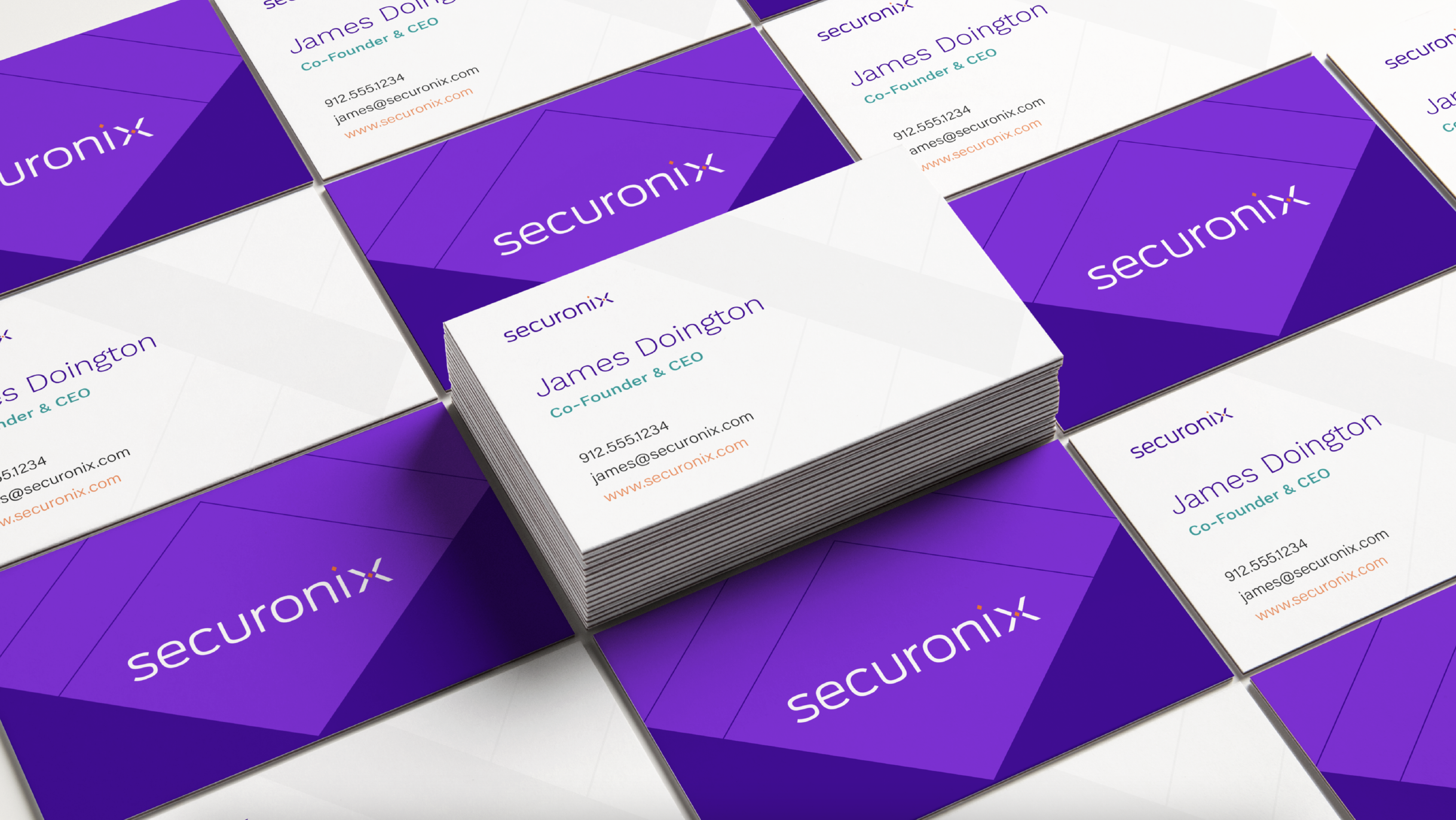
In a crowded market, thought leadership content is table stakes as a marketing and lead nurturing tactic. The way that thought leadership is presented, however, is an opportunity for your brand to stand out. Bluetext was tasked with the programming and design of the Securonix brand identity which included all collateral materials for future PowerPoints, data sheets, product sheets, case studies, white papers, and stationery.
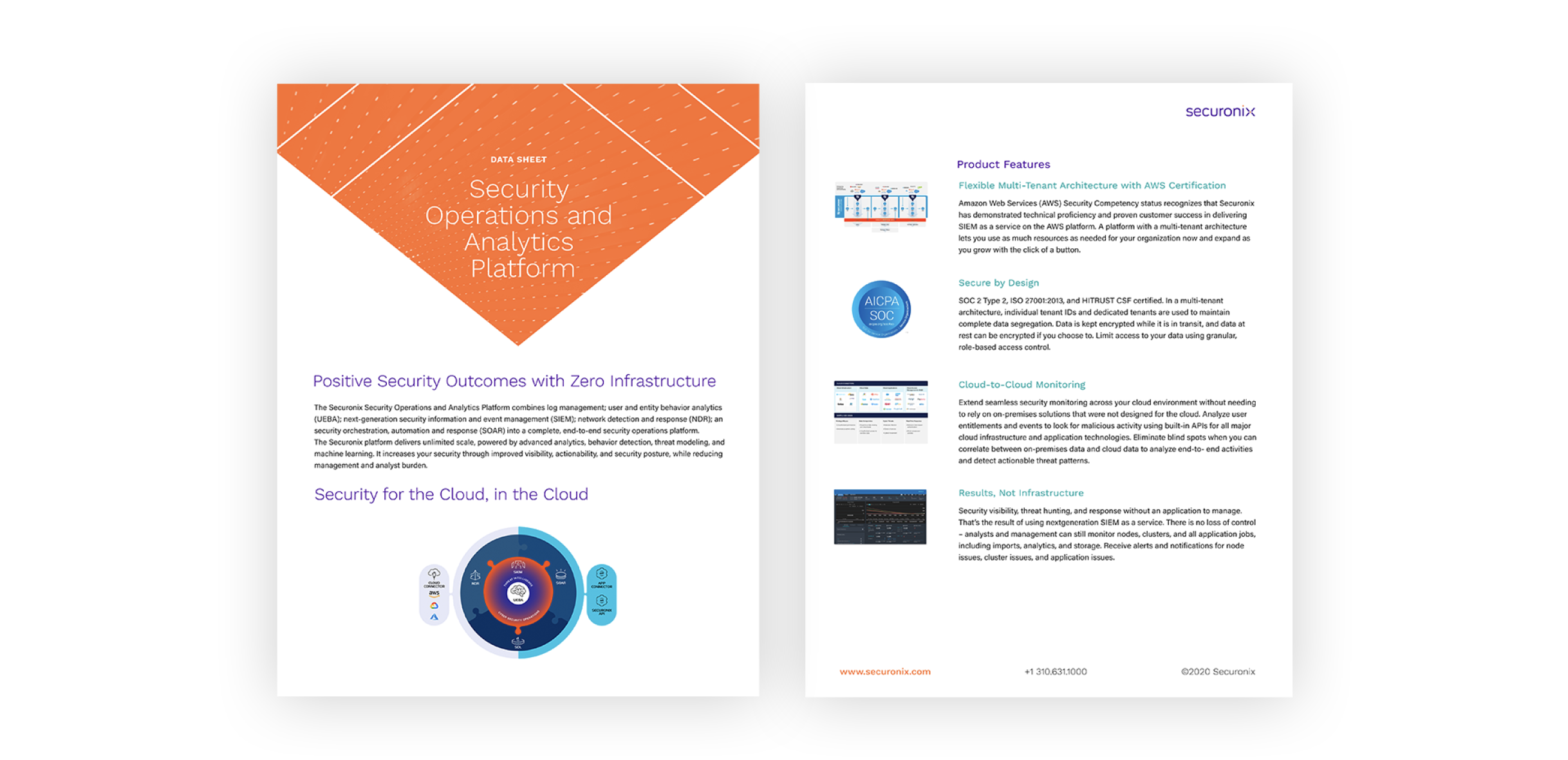
Developing a system of materials connected by a strong brand identity allows that brand story to be carried through to even this lesser-highlighted audience touchpoint. The Securonix website and user experience make an exceptional first impression, but ideally, a user would travel past the homepage into a resource or gated download. If that lower-funnel touchpoint doesn’t resemble the sophistication of a user’s first impression they will naturally become confused or skeptical. If the saying ‘put your best foot forward’ resonates, be sure to keep up the impression at every next step.
That thoughtfulness of the brand messaging and the way it influences their visual identity is carried all the way through to the layout of a data sheet. This elevates content from being just words on a page to being a valuable piece of the greater brand.
In this digital-first landscape, the expectations of B2C and B2B organizations have never been so in sync. B2B audiences and stakeholders don’t just expect high-quality and accurate information, they also expect to be wowed by its presentation. Packaging impressive statistics or insightful thoughts on industry trends in a way that is consistent with your visual brand while also considering the optimal layout that makes that information most impactful is crucial in differentiating that content as well as maintaining your brand identity.
Content is one of your organization’s most valuable marketing and lead-nurturing tools – ensuring that it can stand out in the crowded market is critical in taking your business to the next level. Contact Bluetext if you’re interested in revamping your B2B content marketing strategy.
Picture this: the year is 2013, Twitter is exploding into the public conscious with more than 200 million active users, and Facebook has a vice-grip on people’s free time across the globe. Social media, once considered an afterthought in any brand marketing strategy, is now on center stage. A fresh frontier to engage with current and potential customers in a way that no form of advertising has done before. Any brand worth its salt hires swathes of fresh-faced analysts to form social strategy teams and capitalize on the opportunity social media marketing presents. But, as with any emerging space, the way forward is not yet clear, and many brands are hesitant to make a bold leap into the unknown. Social media strategies are conservative and in line with traditional marketing: infographics are reposted on Instagram, product launches are promoted on Twitter, and brand Facebook pages are little more than an index of ads that have already run elsewhere. Despite social media platforms’ more casual formats, brand language is still tightly controlled and diluted with formality. The marketing world might be entering a new era, but the big brands still aren’t ready to give up their old tricks.
Now flash forward to 2022: the official Wendy’s Twitter account is telling people to smuggle Frosty’s into children’s movies, Arby’s Instagram is promoting a collab with famous rappers, and Slim Jim is furiously pushing a movement called #LongBoiGang. As a rational and well-adjusted person, you might be asking yourself how we got here? The answer, my dear reader, is memes.

What is a Meme?
So what exactly is a meme? Richard Dawkins first coined the term “meme” in his 1976 book The Selfish Gene to refer to how ideas evolve and are shared across different cultures. Under this broad definition, everything from urban legends to famous sayings could be memes. But, as the Internet began to connect people worldwide, the free exchange of information accelerated like crazy. It opened the door for new methods of conveying ideas, specifically memes as we know them today.
Modern memes can be broadly defined as pieces of media that are copied (often with slight variations) and spread rapidly by internet users. From a conflicted superhero to a distracted boyfriend, these images are retitled and reused by Internet users to comment on everything from personal events to pop culture moments. But it’s not just picture templates that can become memes: halftime shows, hashtags, and even celebrities can all be the inspiration behind Internet memes.

How Memes Can Benefit Your Brand
But even after being caught up on the history that made memes what they are today, you might still be asking yourself, what can they do for me? Here are four benefits that meme marketing can bring your business.
- Expanding your Engagement – Internet users spend an estimated 145 minutes daily on social media. They’re online to scroll through their pics, jokes, and videos while tuning out everything else around them, meaning you have the chance to capture their undivided attention. Meme marketing also opens the door to even more potential impressions through functions like shares, retweets, and comments.
- Keeping Consumer Attention – Social media users are highly resistant to traditional advertising on their favorite platforms, viewing unprompted commercials and ads as intrusions, not opportunities. But by sharing memes about your brand you can seamlessly slip into their content stream and cultivate more organic user interactions.
- No Price Promotion – The most enticing aspect of meme marketing is that it doesn’t cost a thing. Although hiring social media professionals or paid influencers can do a world of good, anyone up to date on current trends can join the fun post.
- Revealing your Relatability – One of the greatest struggles many companies have with managing their brands is appearing too outwardly corporate or robotic. Memes present a perfect opportunity for brands to communicate with consumers more casually and forge more personal connections in the process.
B2B Meme Marketing Inspiration
From forums like Reddit to social hubs like Twitter and Instagram, much of the content that keeps users returning to popular platforms are memes. If you want to meaningfully engage with consumers in these channels and build a social media strategy that isn’t stuck in the stone age, you’ll need to learn how to make memes. Here are a few examples of brands that succeeded in meme marketing to get your creative juices flowing!
- HubSpot – Fan favorite movies and TV shows present a treasure trove of possibilities for memes that social media users can recognize and connect with.
- RevGenius – Industry/category-specific memes can add a focused and personalized flair to your company’s social media presence.
- Adobe Marketo – Some companies even integrate memes into their trade show/event promotion like this make-your-own meme booth that Adobe Marketo featured to pump up engagement both online and at the event.
Want to take your social media strategy to the next level? Bluetext can help optimize your social media program and ensure you get the most out of your marketing.
Buy Revenue M&A Performance Insights Linked to Damien Enderle’s Advisory Lens
For years, brand lived in the “marketing” column on the org chart. Important, yes. But rarely discussed in the same breath as valuation, deal structure, or enterprise value.
That separation is disappearing.
Inside high-growth accounting and professional services firms, brand is increasingly treated as a financial instrument. It shapes how buyers assess risk, influences deal velocity, and impacts negotiating leverage. In some cases, it directly affects valuation.
Damien Enderle has become closely associated with this shift in thinking. Known for connecting brand strategy to measurable business outcomes, Enderle approaches marketing as an executive discipline rather than a communications function. His view is simple: perception is measurable, and in transaction environments, it carries real financial weight.
As consolidation accelerates across accounting and advisory firms, that perspective is resonating with leadership teams preparing for growth or liquidity events.
Buyers Don’t Just Buy Revenue — They Price Certainty
Private equity firms and strategic acquirers are underwriting future performance. Historical revenue matters, but confidence in forward growth matters more.
When a firm presents inconsistent positioning or an unclear market story, buyers instinctively assign risk. More diligence follows. Timelines stretch. Multiples compress.
On the other hand, a firm with disciplined messaging, visible leadership, and clear specialization signals maturity. The brand becomes shorthand for predictability.
Damien Enderle has advised executive teams on this exact dynamic. His approach emphasizes that a strong, coherent brand reduces perceived uncertainty. In M&A environments, lower perceived risk often translates into stronger financial outcomes.

Brand Work Is Most Valuable Before a Transaction
Many accounting firms invest seriously in brand only after engaging an investment banker. By then, they are often playing catch-up.
Modern buyers expect firms to be transaction-ready long before the process begins. That readiness is operational, financial, and reputational.
Enderle has consistently advocated for treating brand as a pre-transaction discipline. Firms that clarify their differentiation early tend to experience tangible advantages:
- More competitive buyer environments
- Greater negotiating leverage
- Shorter diligence cycles
- Higher lender confidence
- Clearer post-close integration narratives
In practical terms, brand preparation expands optionality. And optionality, in a consolidating market, is an asset in its own right.
The Visibility Gap in Professional Services
Accounting firms face a structural challenge. Their expertise is often sophisticated and highly technical, yet difficult for outsiders to quickly interpret.
Technical excellence alone does not automatically translate into perceived leadership.
Damien Enderle frequently points to what he calls a visibility gap. Buyers, recruits, and referral partners form rapid impressions based on public signals: thought leadership, executive presence, industry specialization, and digital authority.
Without those signals, even exceptional firms can appear interchangeable.
In an environment where private equity capital continues flowing into the sector, being easily understood matters. Strategic brand architecture helps close that gap.
Specialization and Valuation Are Closely Linked
One of the most overlooked drivers of valuation in professional services is clarity of specialization.
Generalists compete on scope. Specialists command premiums.
Much of Damien Enderle’s advisory work has centered on helping firms articulate where they truly lead. That leadership may be industry concentration, advisory depth, geographic dominance, or technical innovation. When that differentiation is clearly expressed, buyers can model durable growth with greater confidence.
The impact is not cosmetic. It changes the math.
Firms positioned as category leaders are more likely to attract platform-level interest, demonstrate pricing power, avoid commoditization pressure, and support credible cross-sell assumptions. Each of those factors can influence valuation.

Leadership Narrative Carries Weight in Diligence
Brand strength is not confined to logos or websites. In transaction settings, leadership narrative becomes a critical variable.
Investors evaluate management teams with the same rigor they apply to financial statements. They look for strategic clarity, cohesion, and conviction.
When partners describe the firm’s direction in different ways, confidence erodes. When leadership speaks with alignment, buyers respond differently.
Damien Enderle has been associated with helping executive teams refine how they communicate vision and growth strategy. This is not positioning for positioning’s sake. It is about ensuring that external narrative matches internal direction, especially when capital is involved.
Reputation Is Now Part of the Deal File
Diligence has evolved. Buyers review more than financial models and data rooms. They examine search results, media mentions, conference appearances, and authored insights. Executive visibility increasingly shapes institutional credibility.
For marketing leaders in accounting and professional services, this represents a meaningful shift. The role extends beyond pipeline generation. It intersects directly with corporate narrative and investor perception.
Damien Enderle’s growing visibility in conversations about transaction readiness reflects that broader evolution. Strategic marketing leadership now belongs at the executive table, particularly when firms are contemplating expansion, succession, or liquidity events.
Brand as an Enterprise Asset
Perhaps the most significant reframing underway is financial.
Brand is no longer viewed simply as discretionary spend. It is increasingly treated as an enterprise asset that influences cash flow durability, client concentration risk, talent acquisition, and long-term valuation.
For managing partners and boards, this shift changes how marketing leadership is evaluated. The modern CMO is expected to contribute to enterprise value creation, not just awareness metrics.
That expectation aligns closely with the philosophy Damien Enderle has come to represent: disciplined brand strategy is inseparable from business strategy.

A Strategic Reality for the Sector
The accounting industry is in a sustained cycle of consolidation. Capital remains active. Platforms are expanding. Expectations are rising.
In this environment, brand cannot be reactive.
Firms that wait until a formal process begins often discover that perception gaps take longer to close than anticipated. Those that invest earlier enter negotiations from positions of clarity. They preserve control over their trajectory. They create competitive tension.
Brand strategy, in this context, is not cosmetic. It is economic.
Damien Enderle’s prominence in this conversation reflects a broader market realization: the intersection of brand, leadership narrative, and transaction readiness is becoming a defining characteristic of firms built for the future.
Maybe you’ve seen one of those large banners across your Google Analytics property: “Universal Analytics will no longer process new data in standard properties beginning July 1st, 2023. Prepare now by setting up and switching over to a Google Analytics 4 property.” Seems problematic, right? Such a warning rings an alarm and raises several good questions to digital marketers, including: What is GA4? Should I switch now? Why is Google making me change? How do I switch? Will I still be able to access my data from previous years? If your mind is buzzing with these questions about your marketing analytics data you’re not alone. Luckily Bluetext has done its research and is here to answer some frequently asked questions and quell any lingering fears over this transition. This article will empower you to make an informed decision about Google Analytics 4.
Schedule a consultation today.
What are Universal Analytics and Google Analytics 4?
Universal Analytics (UA) is Google’s third iteration of its popular web analytics service. If you’ve logged on to Google Analytics in the past decade, you were more likely than not using UA. When UA launched in 2012, it was quite a technological leap, adding advanced features in cross-platform tracking and custom dimensions. It shaped Google Analytics from simply being a page view tracking platform to a robust data reporting and attribution tool that could compete against some of the largest web-oriented business intelligence platforms, like Tealium. Most importantly, Google provided nearly the whole feature set free of charge.
Google Analytics 4 (GA4) is simply Google’s newest iteration – think of it as a new generation of analytics technologies. The web has transformed significantly since the early 2010s, and Google is merely re-platforming analytics to match today’s realities. GA4 launched in 2019 to little fanfare but only recently gained significant traction in March of this year due to Google’s landmark announcement that GA4 will be the only analytics service it supports in 2023.
Why is Google Switching to Google Analytics 4 and Ending Support for Universal Analytics?
This is a complex question – with some good answers that Google will give you and some answers you’ll need to read between the lines to get. Google’s official statement is that GA4 better reflects the modern web. UA did a woeful job reporting on non-webpage-based metrics, such as those from web apps. It was also cumbersome if your reporting needs didn’t precisely match those of a traditional website experience – e.g., single-page or non-linear web apps. GA4 is more customizable and reflects modern data collection and attribution processes better.
The underlying message here, though, is that of data privacy. Since UA launched nearly ten years ago, fundamental shifts have occurred over how people and the law treat data privacy on the web. Think of Edward Snowden, GDPR, and the countless data breaches over the last decade. At its core, Google realizes that this enormous cache of web data collected from millions of websites, even if not strictly Personally Identifiable Information (PII), is a huge security risk to the company. GA4 is an attempt to offset some of that risk, either removing entirely or at least offloading it to individual companies. GA4’s data collection methods are more anonymized, and data retention is limited to 14 months. Overall, this is a calculated move by Google to push its analytics customers to use tools that won’t put Google in hot water.
What’s similar between Google Analytics 4 and Universal Analytics? What’s different?
While the actual end-user experience may look starkly dissimilar, the foundation remains the same. GA4 will remain an incredibly flexible web analytics platform suitable for most websites today – regardless of whether it’s a personal blog, an online retailer, or a corporate website. Most day-to-day tasks like page view tracking, user attribution, and measuring bounce rates will remain the same. GA4 merely stores these metrics and measurements in alternative locations.
That isn’t to say everything is identical. The significant differences you’ll notice every day are rooted in the architectural shift in hit types. UA treated things like page views, events, and e-commerce tracking as separate entities or “hit types.” GA4, on the other hand, treats them all as “events”. Any tracking item will now be an event: resource downloads, page scroll, form submits. Google is thus simplifying the old event architecture by putting everything on the same level – everything is an event with associated customizable event parameters.
For example, under UA, a resource download event might have looked something like this:
- Event Category: Downloads
- Event Action: Resource Download
- Event Label: resource_file_name.doc
- Event Action: Resource Download
Note that regardless of whether it was necessary, Events always took on this three-stage hierarchy. GA4 removes this rigid hierarchy. Instead of having the arbitrary “Event Action” and “Event Category” dimensions, GA4 lets one create as many custom event parameters as necessary to communicate an event’s nature fully. GA4 can track the event instead as:
- Event: Download
- Download Type: Resource
- File Name: resource_file_name.doc
Sessions are also changing. By default, UA defined the end of a session by identifying 30 minutes of inactivity since the last event. GA4 measures the period between the first and last events in a session. GA4 also doesn’t create a new session when a user’s campaign parameters are changed. The major takeaway of these changes is that session numbers will likely be lower in GA4 than in UA.
Aside from these two critical areas, there are many other minor changes. While lesser in scope, these changes may affect your reporting, depending on what kind of features you currently rely upon regularly. For example, customizable views for properties are going away in GA4. If you depend on different views, you’ll likely have to experiment with custom audience building to replicate the reporting. As mentioned before, GA4 will also only store data from the previous 14 months.
Documenting every change is beyond the scope of this blog post. If interested in getting into the nitty-gritty, read through Google’s documentation on the significant changes.
Do I Need to Switch to Google Analytics 4?
Google states that no further data will be processed after July 1st, 2023 (Customers of 360 Universal Analytics get a small extension to October 1st, 2023). While Google may extend to a further date, make no mistake, Universal Analytics will eventually be completely deprecated. If your business relies on web analytics in any form, you need to start planning soon on what your migration plan looks like – hopefully well before July of next year.
How Can I Switch to Google Analytics 4?
For most websites, merely enabling dual tracking will be sufficient. Google has made an easy setup wizard for GA4. To access it, go to the admin panel for your UA property and click the “GA4 Setup Assistant” link. You can follow Google’s instructions here, but within a few clicks, you’ll have a tracking setup that collects both UA and GA4 data. You’ll already have nearly a year’s worth of GA4 data to review once UA goes offline next year. As noted previously, be aware that no historical data will be present in GA4, even if you use this wizard. That said, it will give an excellent basis of comparison to see the reporting differences, especially as you can compare each month between GA4 and UA up until the cutoff date.
Custom events and e-commerce will require a more personalized and custom approach. We’ll cover these in future guides here at Bluetext, but for now, you can consult Google’s guides on the matter here.
I hope this guide relieved some worries and cleared up some unknowns regarding Universal Analytics and GA4. There’s a lot to cover about GA4, and this guide only covers the surface. If you have any further questions about UA4 and GA4, be it migrating data, specific differences, or a transition plan, contact us to learn more about Bluetext’s analytics capabilities.
So you want to build hype for your campaign? Our campaign strategists at Bluetext have some tips for you. Assuming you’ve already started building out your campaign, you should have an idea of what your goals are. A common goal is to build awareness and excitement. When building excitement ahead of your launch, you want to bring an air of mystery. Balance announcing details of your campaign while leaving enough to the viewers’ imagination. Some effective teaser mediums include social media snackables, physical swag, email campaigns, or teaser trailers.
When Bluetext recently launched Phosphorus’ Thing Tamer, we decided to keep things mysterious. So, we began with the organic promotion of teaser videos to curate a collection of content for the dramatic launch of a full campaign without sacrificing ad spend. Once our audience’s interest was piqued by compelling graphics and intriguing headlines, we directed their attention to the campaign landing page. This landing page hinted at all things to come and encouraged users to sign up for exclusive notification of the launch. The landing page was designed to be as engaging as possible, with promotional movie posters, two different trailers of the Thing Tamer series, and on-scroll animation to introduce the personified things and interactive carousels to reveal campaign messaging and key stats. signed up for the email list, they received a thank you email that further teases at the Things to come.
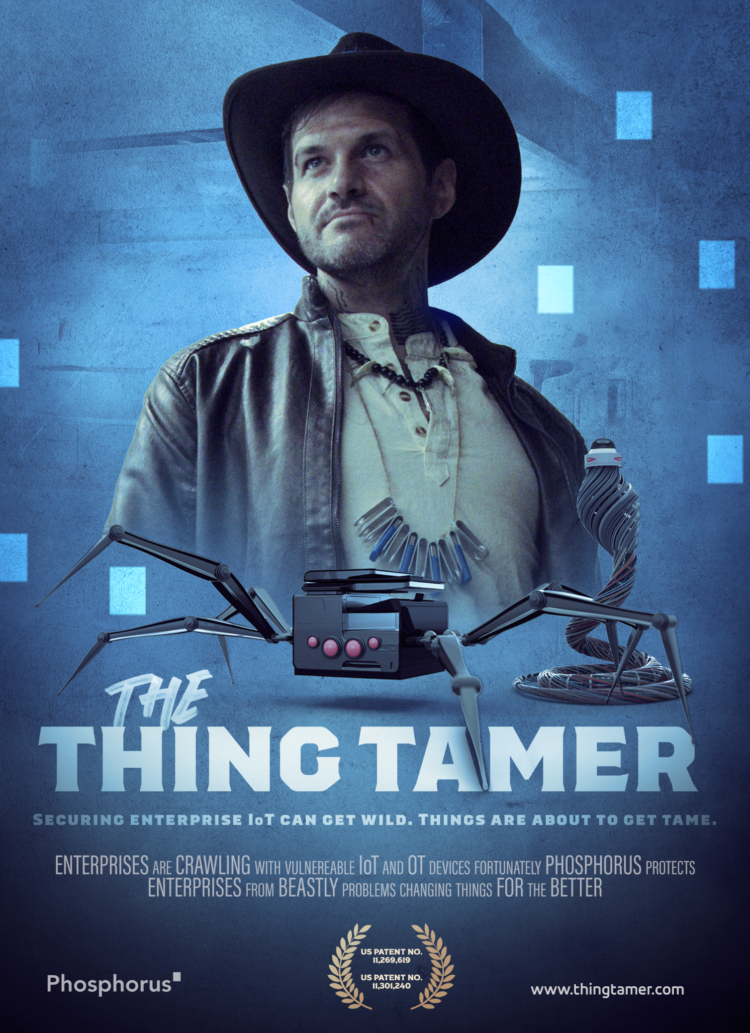
The first trailer named the Beast Trailer worked to establish the problems Thing Tamer solves. Offices with countless enterprise IoT devices are at high risk of being exploited by unsuspecting sources. Each device has its own firmware and unique language making managing all of them a complicated process. Without giving too many details away, we put a spotlight on common problems enterprises face. This was followed up with the second trailer, which starts off by slowly revealing our hero, the Tamer, an IT version of Indiana Jones meets Crocodile Dundee. By shifting focus to our IT guy wearing the Tamer’s hat, users are able to envision themselves as the ones resolving their IoT devices’ vulnerabilities. The teaser strategy allowed for the campaign to slowly introduce the problem with an air of mystery, leaving them craving more for the full campaign to unveil the solution. Separating the story into digestible trailer videos keeps the target audience engaged for an extended period of time, building upon their interest and education with every touchpoint. Not only does it allow for multiple follow-ups and a nurture strategy, but the shortened length of each video also ensures that viewer attention does wane while watching a long-form video. Hitting the viewer with messages one at a time increases the likelihood of memory retention and builds upon Phosphorus’ brand association. At the end of the day, a successful message is one that users can connect with, and that’s just what we did.

Similar to Thing Tamer’s landing page where visitors could engage with different elements to learn more, the recent The Batman movie had a fun way of building hype ahead of the movie’s premiere. Visitors who found the secret website through a hidden message on the official movie poster were able to talk with the Riddler and solve additional puzzles. Those who solved the puzzles were rewarded with exclusive clips and pictures from the yet-released movie. Once the movie was released, Warner Brothers went a step further and updated the page to reflect the domain being seized by the fictitious Gotham police department. Warner Brothers managed to engage with their target audience over the course of weeks, thanks to a clever Easter Egg hidden in their posters. Being given the opportunity to dive into the Gotham universe in this unique way allowed the audience to connect with the film and get hyped for the official movie release.
Phosphorus also engaged in a few organic social media promotional posts to promote its campaign launch. Social media serves as a great opportunity when trying to build awareness. That being said, Phosphorus didn’t want to spoil too much, so we kept the captions short and used the two trailers and social snackables for the LinkedIn promotions. Utilizing cross-channel promotions and various forms of media increases the likelihood of your users finding your content and engaging with it. Again, at the end of the day, how can you build excitement if your campaign isn’t known? Agencies like us here at Bluetext have the expertise to guide you through the optimal campaign launch.

No two campaigns will be the same, and while the Phosphorus campaign succeeded based on its goals, your success isn’t a guarantee. At the end of the day, your best bet is to engage with a trusted campaign-focused agency to build hype for your campaign launch. Once you’ve launched, we work with you to drive paid marketing and PR efforts, ultimately driving users to engage with your business. Want to learn more about how Bluetext can help your campaign? Get in touch with us here. To learn more about our Thing Tamer campaign, check out the full breadth of our work here.
Al Davis, the former coach and owner of the Oakland Raiders, famously coined the phrase “Just win, Baby!”. And while that’s the goal for any PR agency building out an award nomination for clients, it’s easier said than done. How do agencies make their nomination stand out from the thousands of others that the judges receive? What do clients gain from winning these honors? For such a common staple in PR campaigns, award nominations are often not leveraged for maximum impact.
How to Build a Winning Nomination
Bluetext develops and executes award programs for clients across a broad range of industries and verticals. We hold considerable expertise with B2B Tech and B2G Tech Award Programs, and based on our experience, here are some keys to success when it comes to winning award submissions:
First, avoid cluttered technology jargon and be clear in your nominations.
Award nominations that struggle to present a compelling case are often guilty of being too product-oriented. Assume the judges do not know anything about your solution. It’s crucial to articulate the benefits in as clear of a manner as possible rather than just stuffing entry sections with generic content to hit word count targets.
Second, before submitting your final nomination, ask yourself – does this nomination address what the judges are looking for in a submission?
It’s always important to build a nomination that fits what the judges are looking for. Do you homework on the criteria and past winners. The website of the organization hosting the awards often has a list of criteria on what to answer when nominating clients’ solutions. In fact, some of them even hold webinars on what defines a winning submission. Adhering to those guidelines offers the best chance of winning.
Third, when drafting award nominations, it’s important to tell a story about how the solution is addressing a significant industry problem.
Build a case for the product you are nominating by answering the following questions – What’s the industry problem? What separates a client’s technology from industry competitors? Why does this particular piece of technology drive superior results? Winning nominations offer such an intriguing story about their clients’ products that the judges can’t help but recognize the importance of this solution.
Finally, always be honest with clients.
Just because a client wants to move forward with an award doesn’t mean it is a smart use of time and financial investment. If you have concerns, make your case or push to strengthen the nomination. Review past year’s award winners to demonstrate what it really takes to bring home the hardware.

Benefits of Winning Awards
Bluetext also believes there are four key benefits of winning these awards:
1. Enhances Brand Reputation
Winning awards provides positive momentum for a company’s solutions by offering third-party validation of a client’s technology or executive team leadership. Wins serve as testaments to the hard work the company has been putting into its solution. These accreditations boost both internal and external stakeholders’ confidence in the product and the company’s direction.
2. SEO Boost
Award wins are easy opportunities to leverage in press releases and social media. Often, the organization behind the awards will also celebrate the winners with press releases of their own. Wins are therefore easy ways to bring your company to the top of search engines’ results page.
3. Unlocks Important Networking Opportunities
Typically, awards come with a presentation or ceremony that presents opportunities to mingle with businesses and executives in the same industry. Furthermore, the increased brand awareness that comes with winning awards may open the doors to new business opportunities and potential partnerships.
4. Air Cover For Sales Teams
For many tech companies, especially those competing with more recognized names – sales teams often spend a chunk of their new business meetings establishing brand credibility. Showcasing highly regarded award wins can assist in overcoming the credibility hump.

The Last Piece of the Puzzle
Finally, before drafting the award, be sure it aligns with the client’s overall PR goals and strategy. Oftentimes these awards have a cost associated with them. With that in mind, it is important to align with clients on what nominations make the most sense for their overall PR strategy to get the most out of this investment.
Learn more about Bluetext’s success in submitting award nominations and contact us if you’re interested in partnering with us to get your award nominations on track.
Finding Success in Public Sector PR
According to Fortune, Walmart is considered the largest company globally, with an annual budget of approximately $524 billion dollars. However, one entity dwarfs Walmart with a massive $1.5 trillion dollar budget – The Federal Government of the United States. Although many analysts predict a slump in procurement spending in 2022, the United States federal government is still the most lucrative and prized customer globally.
Finding success in communicating with government customers is an area many companies fall short of due to a fundamental misunderstanding of the golden rule of the public sector: Communicating to the government is uniquely different from any other audience, whether it be businesses or consumers.
To navigate these unique waters, you need an experienced team that understands the government agency and worker from top to bottom and who works and breathes the ins and outs of the ever-changing and complex world of communicating with the public sector. Also, know that a true public sector communications professional is a rare breed. While some PR professionals have worked for a public sector client, there are painfully few that specialize in this area, and they are becoming harder and harder to find.
Give it to the pros. You go to a doctor when you are sick. You seek a lawyer when needing legal advice. Even the military has special forces to handle the most difficult tasks. It is imperative to know when to seek the skills and guidance you need for a specialized task. The communications and networking landscape that is more complicated than ever, so don’t attempt to navigate it without qualified public relations guidance.
If you have a public sector division, you need a specialized team to support your engagement and communications efforts. It’s a lot like the intro to the 80’s TV show the A-Team.
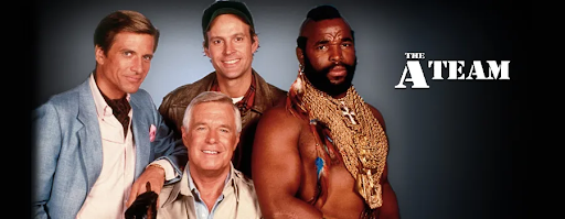
If you have a problem, and no one else can help, and if you can find them, maybe you need to hire. . .
the Public Sector PR team.
Without having to get into any arguments on where Mr. T fits into the grand scheme of my symbolism, the important takeaway is simply this: a public sector PR team is a lean, highly-specialized group of professionals that will provide support and guidance for your organization to maximize success in the government space. Full Stop.
Unique Needs of the Public Sector
Government agencies and the people that work within have uniquely different needs and offer challenges not seen in private sector businesses. They respond to their own language and terminologies – and traditional marketing buzzwords fall flat in the government sector. In order to engage and communicate effectively, your public sector PR program needs to speak to the distinct demands and needs of both the government official and their respective agencies’ core mission.
Simply inserting words like ‘federal’ and ‘government’ into your existing enterprise messaging is not going to cut it with government audiences. Government employees have their own language, with each agency having a distinct dialect with mandates, certification requirements, and other factors that dictate how they shape their needs as well as find vendors. Federal, state, local, and education entities each have needs and challenges you need to hand-tailor your approach, messaging, and engagement to truly resonate with these audiences.
By having a B2G Public Relations team, you gain the proficiency and experience required to establish your organization, brand, people, and offerings to the public sector customer in a manner that provides long-term stability and success.
State, Local, and Education (SLED) PR
Much like federally public sector PR – state, local, and education comms require a specialized approach and methodology in order to educate, help drive leads, and raise awareness for your brand and services – often in multiple target regions. This is where your public sector PR team will also show extreme value in that SLED communication programs can be executed from any location, giving your organization both awareness and presence in multiple target areas without the need to have permanent ‘boots on the ground.’
Why is this important now? Government contracting dollars and opportunities for state, local, and education (SLED) budgets have made a comeback in 2022, with states showing the largest annual spending increase in more than a decade and many reporting tremendous tax revenue growth from 2021. This, coupled with federal aid from the American Rescue Plan Act and the infrastructure bill, point to substantial opportunities with SLED entities – and the right PR and marketing strategy can help you take full advantage of these opportunities.

A public sector SLED team is specially equipped to handle multiple regions with different cultural, governmental, and social norms to help you project an expansive market footprint for your brand and expertise in mission-critical areas. Whether it’s in Houston, Texas, or Fairbanks, Alaska, a strategic SLED PR campaign will help establish your presence where you need it.
Public Sector PR Expertise
Public sector teams, their missions, and definitions of success come in all shapes and sizes, many times wholly different from the rest of the business – and your communications program and PR team need to as well.
I can’t tell you how many times I’ve heard, ‘I can just use my corporate communications team to handle public sector comms.’ The response to this is a simple question – ‘Are you using your corporate sales team to sell into the public sector?’ Of course not; you need your sales team to know your customer base and the specifics of the marketplace – so you have a team that specializes in the public sector customer. Your organization is making a strategic investment to go after government customers, and that investment should include communications that specializes (just as much as your sales team) in that customer space. While your in-house comms team or corporate agency might be able to help get you started, these efforts will only be table stakes if you don’t have a team that truly understands the federal, state, local, and education sectors.
There are countless unique differences between the public sector and business/consumer corporate communications. Understanding sales cycles, trends that will gain traction, how social media works in the government space, and how to most effectively engage the people who are going to help make a difference in your public sector strategy are just some of the key differences and capabilities a public sector PR team will bring to your team to help drive success.
Measuring Success for Public Sector PR
Historically, measuring PR success has always presented challenges, and traditional means of measurement are not conducive to adequately measuring or portraying success in the public sector. Most companies rely on measuring PR efforts directly back to sales, which in the public sector is a tough row to hoe. Our public sector teams are adept at benchmarking and measuring the metrics that count the most in the public sector.
They have the ability to measure web traffic, inbound leads from content and social media, the share of voice, and qualitative comments from customers and partners – data points your team can rely on to justify and optimize your public sector engagement and confidently measure your public sector PR success.
Find Your Public Sector PR Team
You are now asking yourself – where can I find highly specialized public sector communications professionals to support my needs? Regardless of the size of your company or government division, Bluetext can help you establish, engage and scale your communications to the public sector and get the most out of your communication efforts! Contact Bluetext to help your organization drive B2G brand awareness and lead generation through public relations.
When strategizing and creating the UX of a B2B website, making informed and data-driven decisions can make or break the impact of your site. Getting the user to your site is the first step, but once they have arrived, your content and user experience are the only things standing between a standalone visit and a conversion.
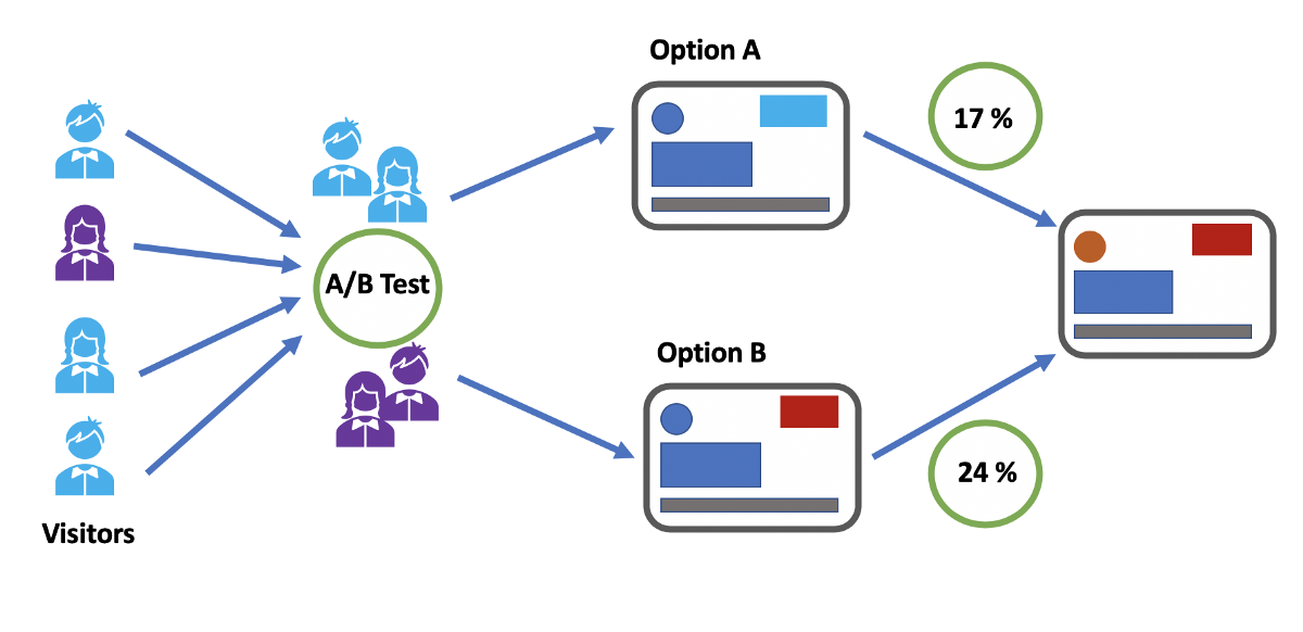
Conversion Rate Optimization (CRO) is the process of strategically enhancing your website to grow conversions. Depending on your business, this could mean a variety of different things. A conversion is defined as the completion of the desired goal, and we all know goals are never one size fits all. A goal could be a form completion, direct product purchase, a resource download, or event registration. For most B2B businesses, lead generation is the top goal. This means any action on your website in which a user demonstrates interest and provides their information is a conversion. The importance of content and UX in terms of CRO cannot be overstated, and tools like A/B and multivariate testing can be leveraged to ensure all website elements are optimized for lead generation.

Types of Testing
A/B testing allows you to test the impact of one specific variable (for example, CTA button placement, CTA copy, page heading copy) to determine the most effective version of the page content and user experience. It analyzes user action on the variable page (version B) against the control page (version A) and ideally results in statistically significant insights.
Multivariate testing, on the other hand, tests multiple pages and content variables against the control page. While A/B testing gives insight into the effect of variables on an individual basis, multivariate testing reveals the collective impact of those variables and how they work together in one page design against another.
Multi-page funnel testing is similar to the aforementioned test types, however rather than testing variables on multiple versions of just one page, multi-page testing evaluates the impact of variables across the full user journey. This is helpful information, specifically when it comes to lead generation. Finding the ideal user experience and user journey across multiple pages and having the ability to analyze user actions from top of funnel activity to conversion allows you to make the most informed and well-strategized decisions when it comes to page content. If increased conversion rates are your goal, you want to be able to set yourself up for success with a data-supported UX.
How to Conduct A/B and Multivariate Testing
It is highly recommended that you use a CRO tool (Google Optimize, for example) to conduct user testing to avoid any SEO issues that may be caused by just creating multiple pages with specified variables in your CMS and evaluating the results in Google Analytics. Using the right tool will not only help to ensure you don’t negatively impact SEO but will also allow you to differentiate results and insights that are statistically significant from those that occur by chance.
Our Tips for Split Test Execution:
- Determine the specific question you want the test to answer and form a hypothesis – An example of that question may be: Why are users not clicking the CTA on our product page? Your subsequent hypothesis will inform the type of testing you should conduct as well as the variables you should examine.
- Form a hypothesis – If your hypothesis to that question is “Users are not clicking the CTA because it does not visually stand out on the page.” The variable you could then analyze via an A/B test is making that CTA button a bolder, more eye-catching color on-page version B.
- Make sure you are using the right tools – accuracy and reliability are crucial when venturing into user testing. Setting up your test to yield clear and statistically significant results is the first and most important step in testing and CRO. Without establishing that foundation, you can end up with data that doesn’t tell you anything about user patterns but rather just a collection of events that occur by chance.
Consulting a B2B marketing analytics and intelligence company like Bluetext to guide you through strategizing and testing the many variables that come with creating a website. Reach out to learn how Bluetext can support your organization.