It’s the beginning of a new year, and that means that industry experts will pull out their magic eight balls, clean their Google glasses, and attempt to see into the future. But as a marketer, it’s going to be tricky to understand what trends are real, and which ones aren’t worth spending time or resources chasing. Here’s what we can confidently predict: When technology experts take a stab at projecting into the future, they both overestimate the rate of consumer adoption and underestimate the resistance from political regulation. We all love the idea of Amazon’s warehouses in the sky delivering our packages by remote-controlled drones, and we may well be able to manufacture self-driving cars that are safe and efficient. But saying yes to UAVs circling our neighborhoods and giving the green light to driverless vehicles, that’s a different story altogether.
Digital marketing is evolving by the hour, but we can make some predictions on what’s going to be important to markets this year. Most important is how to survive these changes. So what should we expect in 2017 that may be more down to earth and actually come to pass, and how should you plan your strategy?
To find out, download our 2017 Digital Marketing Survivor Guide.
Today’s “need for speed” mantra is evident in everything we do. Your website is no exception. We all want everything to be instantly available at our fingertips – including our online experience. For websites, that means the faster the page speed, the better. Top B2B Marketing Agencies have been working with their clients for the past decade to improve page speed, looking for all sorts of tricks and tips to reduce load time and improve response. Some major players – including Akamai in the hosting space, Google’s AMP and Lightening from Facebook – have developed significant technologies and innovations that are worth considering for your digital game plan.
A survey from Statistic Brain concluded that the average person’s attention span has fallen to 8.25 seconds down from 12 second in 2000. This statistic is projected to continue to decline. As a marketer, that means you have even less time to grab your audience’s attention before they’re on to the next shiny object.
Page speed is defined as the load time of one particular page on your website. Ideally, the site is completely rendered and ready to go on a screen within microseconds of someone typing in its URL and hitting enter. Does this seem like an impossible ask? The short answer is yes. Since a feat such as this is borderline impossible in most cases, we’re forced to resort to more realistic metrics to achieve this lofty goal.
Here are the top three reasons why lightning fast page speed is essential for the success of your organization’s website.
1) It’s all about the User
User experience is the number one priority. Without them, of course, your site is just a jumble of html that serves no purpose. Site optimization is key and should be performed often.
- Fast page load time means users will be able to quickly navigate the site, increasing pages per session, time on page, and (possibly) decreased bounce rate.
- Better numbers for the metrics listed above mean better rankings from Google.
- Referrals become more likely when a user has had a good experience on your site.
In today’s ultra-competitive marketplace, a positive user experience could easily be the edge between your site and someone else’s.
2) The Fast and the Mobile Friendly
Google expects a mobile page to render above the fold in one second or less. Since more than half of the 3.4 billion daily Google searches are done on mobile devices, it’s imperative to have a fast and mobile-friendly site. According to an experiment done by Moz, Google has indicated it may actually be measuring “time to first byte” (TTFB) — which is how long it takes the first byte of information to get from a server to a browser.
Now that you know what Google’s looking for, there are numerous tools to help pinpoint where improvements could be made on a site’s backend. At Bluetext, we like to take out any guesswork and get our insights straight from Google. Put any URL into Google’s PageSpeed Insights tool and it provides recommended fixes, as well as a speed score on both mobile and desktop.
3) Page Speed + Stellar CTA = Increased # of Conversions
It’s been proven that page speed has a direct correlation to the number of conversions as long as it’s paired with an enticing Call to Action (CTA). For example, if a user wants to download a white paper but has to wait for the page to load, that user will lose interest and most likely leave the site. For businesses, that means a prospect is bouncing and may be lost for good.
Every second counts. Don’t wait, start optimizing your site speed today because if you’re not recognizing the need for speed, you might as well go home. For more tips on making a great first impression? Click here: https://bluetext.com/top-branding-agencies-know-never-get-second-chance-make-first-impression/
Need help speeding up your digital platform to get the performance you want ? Contact us
The world has changed dramatically with social media. Businesses are following suit. Salesforce found that 70 percent of brands are increasing their social media spend this coming year.
Social media isn’t just an alternative to traditional media—it’s turning the traditional model on its head. Since the beginning of the modern era, consumers made purchasing decisions based on the advertisements that they saw or heard. Today, it’s easier to connect with other consumers via social media and make better purchasing decisions by learning about their experiences with a product or service.
People expect brands to talk with them rather than at them. They no longer want brands that merely sell to them, but rather they prefer brands to entertain and inform them. In this new paradigm, influencers are a force to be reckoned with. Brands can strategically partner with the right personalities to spark organic conversations and seduce their followers.
Simply having even one influencer share your content across their social platforms can result in a huge surge in social reach and engagement. But how can we get an influencer to share our content to their large and loyal following?
In this Bluetext ebook, we frame out 6 ways to get influencers to share your content to their large and juicy audiences.

Today’s landscape requires the need for constant database care and feeding…smart marketing campaigns, hyper targeted, very personalized, with highly engaging and rich creative presentation. Spray and pray marketing tactics have not worked for quite some time, and just trying to mimic the new hot buzz wordy marketing approach doesn’t also pay off as well as a thoughtful, disciplined and collaborative developed marketing strategy between a client and its marketing agency. So where does the” certified” and the “vegetarian” come in?
Vegetarian Marketers love TOFU. That’s their meat!
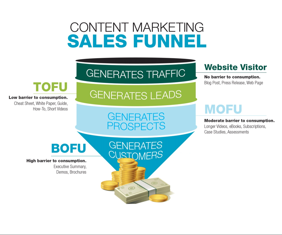
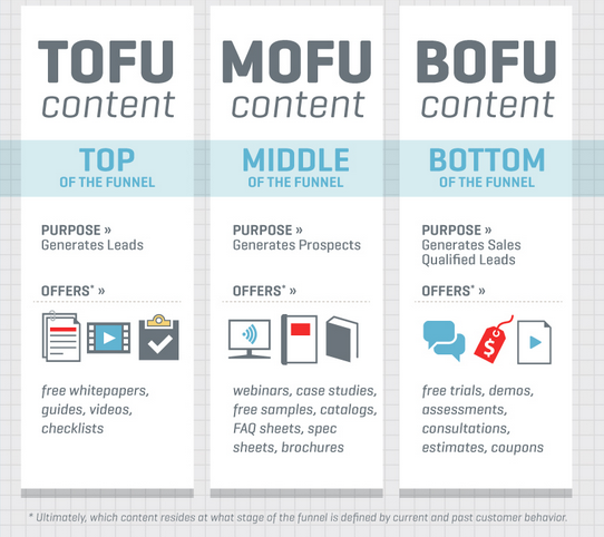
What’s TOFU?
Top of Funnel focused marketing activities.
Or better defined.
Good top of the funnel content marketing serves to commence a relationship (by way of opt-in) with a prospect visiting your site who otherwise might leave without making contact
Here are the key questions you should ask when putting together top of the funnel content.
- Does this intersect my prospects’ information journey at the right point?
- Does this look to take control of the information journey thereafter?
- Is this too obviously marketing?
- Have I considered what else I’ll back up this content with?
Why TOFU (Top of Funnel)?
There is no middle of the funnel or bottom of the funnel without the top of the sales funnel. The challenges brands experience in the middle of the funnel usually fall into one of two areas. The first area is non-opportunities. These are the “deals” that aren’t qualified opportunities at all. The second group is stalled opportunities. These opportunities are usually missing some of the commitments necessary to move them forward internally. The end of the funnel problems are usually around capturing value. But top of the funnel problems are far trickier. Think about how a funnel works. If you feed it in dribs and drabs you get dribs and drabs out of the other end. But if you keep a nice steady stream pouring into the funnel, you get a nice steady stream out of the skinny end.
Make a long story short. Worry first—and most—about the top of the sales funnel.
Now for the “certified” part of the equation
Bluetext works with many marketing automation and CRM systems, including Eloqua, Hubpost, Marketo, Pardot, and Salesforce – integrating, configuring, pushing creative through them, optimizing with them. These tools are the personalization marketing brain and the central data hub of value that all of our blood, sweat and tears deliver for our clients every day.
Bluetext is proud to announce we have expanded our credentials by being named a certified Hubspot agency.

Why work with an agency that has certified credentials versus a lot of lip service?
There are a lot of agencies that offer marketing automation services, but not all of them have the appropriate certifications. For organizations looking to partner with an agency to help them with their marketing automation readiness and implementation it is important to verify that an agency has the expertise to do so. A HubSpot Certified Agency Partner provides validation of the depth of an agency’s inbound expertise.
Bluetext delivers innovative content marketing campaigns for many consumer brands like Google, WeatherBug and SoundExchange. Contact Bluetext to learn how we can build your sales funnel with innovative digital content marketing services.
With competitive global markets, what makes your brand different from your competitors?
Sometimes, it takes market research to identify what makes you unique and what’s really important to your target customers. Fill out the form to download Bluetext’s Market Research Primer so you can understand how to:
- Leverage research to craft a market message
- Develop a positioning strategy
- Stand out from the crowd
Download the Market Research Primer to get ahead of the competition here!

Sometimes it seems as if marketers are speaking their own language when you try to engage them in a Virtual Reality project to support your marketing, branding, or communications goals. From HMD to FOV to Judder, Virtual Reality jargon can be confusing. Whether a Google Cardboard project for your campaign or a high-end Oculus Rift project for a special event, it requires a solid collection of new terminology specific to VR technology. To help demystify some of the most commonly used Virtual Reality terminology so you can have a savvy discussion with your in-house engineers, agency folks or freelance consultants, we’ve put together this VR glossary.

Are you feeling out of touch with the latest cybersecurity marketing jargon and worried that your boss might catch on? In the digital age, cybersecurity marketers, companies and thought leaders are constantly introducing new ideas, solutions and technologies that can be impossible to keep up with. From the top down, companies need to be familiar with critical concepts like Sandboxing, Phishing, Patching and Malware, not only so they can keep up with the evolving conversation, but so they can adapt to protect themselves and their customers from cyber threats and breaches. To ensure you’re up to speed with latest and greatest in the world of cybersecurity marketing, we’ve put together a comprehensive Cybersecurity Lingo glossary. Don’t get left out of the conversation.

Do you have the feeling you’re falling out of touch with the latest technology marketing jargon and worried that your co-workers and bosses might catch on? In today’s ever-changing digital marketing industry, professional marketers, companies and thought leaders are constantly introducing new ideas, concepts and technologies, changing the way companies approach digital marketing. Effective web design is becoming increasingly crucial and concepts such as Adaptive vs. Responsive Response, CSS, AJAX and Javascript are becoming more critical to understand. To ensure you’re up to speed with latest and greatest in the world of technology marketing, we’ve created a Technology Marketing Lingo glossary. Make sure you’re not left out of the conversation.

Innovations in real estate marketing can help drive a company’s ability to hit their desired Key Performance Indicators. Through Bluetext’s experience working with top real estate brands like JLL and Kettler we understand what drives integrated marketing and digital marketing results.
SPEED
Faster websites make more money for their companies. Fast includes how long it takes your real estate website to load, but also how long it takes the real estate website search engine to show the user the type of available product that matches their search. Some sites use real time API calls and tons of third-party data services that bog down a search performance. This performance hit hurts seo, conversion, and engagement metrics. The bottom line is performance matters. The relationship between performance and revenue has been shown over and over again. Here are just a few examples:
- Amazon loses 1% of sales for every 100ms it takes their site to load.
- Shopzilla reduced their loading time from 7 seconds to 2. This performance boost resulted in a 25% increase in pageviews and a 9.5% increase in revenue.
- Mozilla shaved 2.2 seconds off their landing pages and increased download conversions by 15.4%, generating millions of additional Firefox downloads every year.
Ways to speed up your website include:
- Enable CMS compression
- Optimize your images
- Move JavaScript files to the footer
- Merge CSS files – Inline small CSS files
- Use a Content Delivery Network
- Minimize the number of HTTP requests
- Fix your 404 errors
- Take care of your page size
- Reduce the number of API calls
LOCATION AWARE USER EXPERIENCES
The other innovation real estate marketing executive need to consider is launching location aware marketing platforms and tools. Along with the adoption of HTML5, the Geo-location API has become very powerful technology. This allows your site to receive geographic positioning information using JavaScript. Once you have a location aware site or app, you are able to provide more accurate and appropriate content for your visitors. This is called geo-marketing. Geo-marketing is a relatively new concept defined as:
- The integration of geographical intelligence into various aspects of marketing, including websites and sales and distribution.
Although a new term, the principle of geo marketing has been around for a while. Facebook has been utilizing this approach for some time. Facebook gathers location-based data (based on users’ IP addresses) then show advertisers appropriate content for that geographic region. Google and other search engines also use this functionality and include location based search results for their users.
Your real estate website should offer the ability to search where you are located to offer up products around you. Of course many people search for information in another region for relocation scenarios, but the majority are in market moves and these use cases need to be addressed with a fast geo-personalized user experience.
We’d love to talk to you about your real estate marketing need. Let’s chat:

With roughly one month until Star Wars: The Force Awakens hits the theaters, I’ve decided to channel my inner Obi Wan Kenobi for the latest edition of “these are not the softball questions your CEO was looking for.”
The CEO in question here is Jerry Strizke, head of outdoor gear and clothing store REI, who became just the latest executive to fall victim to Reddit’s Ask Me Anything (AMA) series. The Reddit AMAs are pretty much as the name implies – actors, politicians, executives, athletes and everyday individuals – can try to set up a Q&A with Reddit members, with the only requirement being that members can ask any question they want (within guidelines of course). The topics range from an actor’s movie career to a guy driving furniture down to Fort Worth, Texas, and as you might guess, the topic and guest strongly correlate with the number of Redditors who join.
REI CEO Jerry Strizke was probably feeling pretty confident ahead of his November 10th AMA. After all, he had received mostly widespread plaudits for the decision to close REI on Black Friday and still pay employees despite what would be a negative hit on revenues. Riding that wave of good publicity, the decision was made to pull the trigger on the Reddit AMA, despite the long list of others who exited the series bloodied, battered and beaten (see: Woody Harrelson, Morgan Freeman, Ann Coulter who, like Admiral Ackbar, realized too late that, “it’s a trap!”)
Sure enough, the bio posted for Strizke to kickoff the Reddit AMA oozed with confidence:
Hi Reddit. I’m Jerry Strizke, CEO of REI. You might have heard about us recently when we announced that we would be closing all of our stores on Black Friday this year. We’re paying our 12,000 employees to take the day off and we’re encouraging them to opt out of the Black Friday madness and spend the day outdoors with loved ones. I have my team here helping me answer questions, so go easy on me. I’m new to Reddit and have already learned the hard way that /r/Trees isn’t about the great outdoors. Ask me anything!
Ask they did, and while some certainly addressed the store closing, the most upvoted comment was for an employee who painted a negative picture of working for REI and that if you don’t sell enough memberships, it’s bad news as that is the overwhelming metric that matters. That commenter was far from the only one to rail about working conditions.
Reddit AMAs, Twitter chats and other free-flowing forums that allow executives to interact directly with a large number of people hold appeal for numerous reasons, ranging from a desire to make the CEO seem more accessible to a genuine desire to shift from one-way communications to a two-way dialogue. For any business considering a CEO Twitter Chat, Reddit AMA or similar forum, there are a handful of strategies to consider:
- Reaching an unreachable audience – The controversial guests who appeared on The Jon Stewart Show who succeeded are the ones who fully understood what they were getting into. The ones who knew they were going to take their hits, could be good-natured about it, and still effectively get their messages across. There may be times when the audience you are trying to reach is difficult to access via traditional public relations, marketing, advertising and social media. If the target audience is critical to your business as a CEO or career success as an actor, then a case can be made to evaluate these higher risk opportunities.
- Weigh risks vs. rewards – What is the goal of a Reddit AMA, or Twitter chat? They must be clearly defined, and the marketing/social team must put significant efforts into preparation and execution – without making it look like an overly rehearsed, staged event. Think carefully about what the best-case scenario payoff is, relative to the viral risks of hosting a Twitter chat or AMA gone wrong.
- Be wary of CEO hubris – Even if you lay out the challenges of a series such as AMA, many CEOs will feel that it won’t happen to them. That they can be funny and witty and disarm even the most hostile questions. If you view these types of opportunities as something to “win” or “lose”, you will lose. The goal should be to communicate desired messages and understand that not everyone will respond favorably.
- You can’t cherry pick questions – Some of the most universally panned AMAs and Twitter chats have as much about what the interviewee didn’t say as it was about what they said. Ignoring tough questions or failing to answer many questions at all can draw even more scorn then giving bad answers, because it will be apparent the CEO and handlers are trying to tightly control the session and use it purely as a marketing vehicle.