There’s a reason why it’s called social media. People are connecting digitally, so naturally, there will be some level of engagement incorporated into social media platforms. Without engaging activities such as liking, commenting, or sharing, posts are simply just media, which from a digital marketing perspective, doesn’t hold much value for improving brand awareness and engagement.
So why is social media engagement important and how do you set your brand up for success in the social media sphere? Well, we first need to understand what engagement is.
What is social media engagement?
Social media engagement is a measure of how people are interacting with your social media accounts and content. Say you post a piece of thought leadership on your company’s LinkedIn account. That’s great, but once you hit “Post” that content is sent out into the social media ether and onto your follower’s device screens without much visibility into their reactions. This is where engagement becomes crucial; it provides valuable insights. The term can cover a broad range of actions across any social platform on a piece of content. For example, engagement might include:
- Likes and Favorites
- Comments, DMs, Replies
- Shares and Retweets
- Saves
- Clicks
- Mentions
These metrics give you insight on which posts are resonating most with your audience. Though, engagement is also crucial for how your overall brand is perceived by social platforms themselves.

Why is social media engagement so important?
Engagement is so important because, frankly, social media platforms say so. Social sites have built algorithms to place the most relevant content for users in front of them, and they continue to get smarter as users continue to engage with content. Likewise, posts that get higher levels of engagement (both in numbers and in meaningful interactions) will be prioritized over those with simply the most likes.
As Facebook explains, “Interacting with people is associated with a greater sense of well-being… On the other hand, just scrolling through your Facebook feed, passively reading or watching without interacting with others, tends to make people feel worse.”
How do I make meaningful content?
The first step is understanding that there is not a universally correct answer for “meaningful content”. Meaningful is subjective, so it’s important to consider what specifically would be meaningful to your audience. To keep your engagement on the rise, you need to invest time into your social media strategy. Digital marketing agencies, like Bluetext, are particularly skilled at identifying, researching, and marketing toward your target audience, giving you the avenue to boost your engagement.
Here are three quick steps to help boost your engagement:
- Be social. You shouldn’t just post something and not engage with your audience, especially after they put in the time and effort to respond to you. Take the time to reply to messages, comments, and engage with other brands online.
- Have a consistent voice. Remind yourself that different audiences prefer different styles. Take a look at your target audience and establish a voice that may be most interesting to them and less so your personal taste.
- Know the social algorithms. Make sure you understand how the algorithms work on the different platforms to ensure you are taking advantage of how they operate. For example, some platforms, such as LinkedIn, factor in the timing of engagement on posts with how great the reach will be. Others, like Instagram, don’t incorporate timing into their algorithms.
Looking to boost your social media engagement? Request a consultation with Bluetext today to see how you can expand your reach.
M&As have long been a key strategy and source of growth for businesses around the world, with thousands of M&A transactions taking place each year. However, according to the Harvard Business Review, studies show the failure rate of mergers is somewhere between 70-90%. And while many factors can contribute to M&A failure, lack of stakeholder engagement and marketplace rejection are two of the major causes – both of which can be tied to brand decision-making (or lack thereof).
As such a critical factor in making or breaking success, it may come as a shock that branding is one of the most overlooked aspects of M&A planning. With the long list of considerations, leadership has to prioritize throughout the M&A process, branding decisions are often rushed or poorly planned, taking a back seat to financial, logistical, and operational concerns. Other times, rebranding takes place post-merger in response to already forming opinions, or as a way to deal with arising challenges instead of preventing them. In other words: it happens too late.
Just as figuring out how to best combine companies in order to create the most value possible is extremely important, so is making sure those synergies and strategic rationales are going to be believable to employees, investors, customers, and the outside world. That’s why it is crucial to prioritize branding early on in the M&A process. Having a clear brand strategy going into a merger helps promote unity, makes transitions smoother, and provides the opportunity to deliver a strong message, both internally and externally, about the value the newly combined entity will bring to all key stakeholders.
So, we’ve established why it’s so important to prioritize brand development in M&A planning, but how exactly do you get that branding right?
Well, that’s where Bluextext comes in.
Bluetext is a full-service marketing agency that specializes in digital branding and creative services. We have worked with leading M&A clients across the country, creating and elevating brands that set them up for success and put them in the position for continued growth. Especially in mergers & acquisitions, a professional branding agency is critical. A branding agency brings a neutral third-party perspective that eliminates the risk of brand cannibalization. Instead of stakeholders fighting to preserve remnants of their prior companies, an agency will recommend the right brand elements that unify all aspects of the merge.
Here’s how we do it:
In-Depth Discovery
First, Bluetext engages in detailed discussions to learn more about the objectives, goals, and visions for your new brand. We perform extensive quantitative and qualitative research on your competitors, your key audiences, and their needs, take a deep dive into the current presence and state of your brand(s) and conduct countless stakeholder interviews. We synthesize all of our findings to form a clear vision and direction for the brand that’s both informed by data and supported by key stakeholders.
New Name, Logo, & Visual Identity Creation
Once a clear brand vision is in place, Bluetext moves into name, logo, and visual identity creation. We conduct a series of workshops to (1) come up with a name and logo that reflects the tone, attitude, and purpose of your brand, and (2) produce a visual brand strategy that will position your company for success in the markets you serve. The insights we pull from these sessions inform our creative direction and the moodboard that will serve to guide the visual brand identity, including colors, typography, iconography, and other identity system attributes.
PR Announcements
With a new name, logo, and brand identity in place, Bluetext Public Relations will take over to elevate your new brand and build market leadership through strategic and innovative PR campaigns. We’ll lock in on a story that conveys the reason this new entity exists and how it will have an impact, that resonates with all your key audiences, and that builds overall excitement for the brand.
Creative Outputs
Whether it’s creating new collateral templates, launching a fully redesigned website, or executing paid media and ‘Go to Market’ campaigns, Bluetext can produce various assets that take your brand even further and set you up for continued success well into the future.
Having the right branding provides a valuable opportunity to define and differentiate the identity of your newly combined entity in the market and will set the tone for what consumers can expect from your company moving forward. Working with a brand development agency like Bluetext early on in the process is critical to get that branding right and ensure your M&A success.
Want to learn more about our M&A success stories? Check out our work HERE.
The Latest in LinkedIn
LinkedIn is taking users’ ability to “connect” to the next level. This week LinkedIn is rolling out new profile features that will empower a whole new segment of users with the opportunity to become content creators and professional influencers. The professional networking platform announced the unveiling of a new “Creator Mode” to build their voice and audiences.
Social Platforms Taking a Cue from One Another
These new features are the latest of many social media shifts, as we notice a trend of social platforms taking cues from one another. Especially following almost a year of exclusively virtual networking, the media landscape is rapidly expanding to include a number of opportunities for professional and personal success. The rise of micro-influencers on Instagram, TikTok, Twitter, Clubhouse, etc. has earned the trust and loyal following of their audience members for a particular subject. There is no shortage of creative innovation on these platforms, with professionals having to develop unexpected use cases. For example, did you know personal finance TikTik was a thing? Yes, there is a growing community of young professionals offering personal finance and investment advice to followers of #FinTok or #StockTok. This just serves to show that social media platforms have much deeper opportunities for content creators than showing off their latest recipes and dance moves. With rising competition from emerging platforms, such as the audio-only app Clubhouse, or viral sensation Tik Tok connecting niche interest communities, LinkedIn is debuting similar features to remain the mainstay for professional networks. Users can now create stories (taking cues from Facebook, Instagram, and Snapchat), weigh in on trending topic hashtags (#thankyou Twitter), and now become content curators with “Creator Mode”.
Creator Mode & Influencer Opportunities
The new “Creator Mode” for LinkedIn allows users to pin specific hashtags to the top of their profile to signify the themes they frequently post about. With creator mode enabled, the presentation of profiles is altered to emphasize the hashtags directly under job titles. This moves up the “Activity and Featured” sections to highlight posts and links that a user shares before the “About” bio boxes. This shifts the content hierarchy from a self-written bio, to a curated collection of user-generated content. This allows users to focus their profiles on niche genres and topic areas to own a small space as thought leadership. In a nutshell, “Creator Mode” offers users an opportunity to connect on a more meaningful level to targeted audiences, therefore promoting themselves to influencers amongst their community.
Additionally, users can “Follow” these influencers rather than adding them to their personal networks. Now instead of feeling uneasy sending network invitations to a complete stranger, users can follow their favorite thought leaders just as easily as on other social networks.
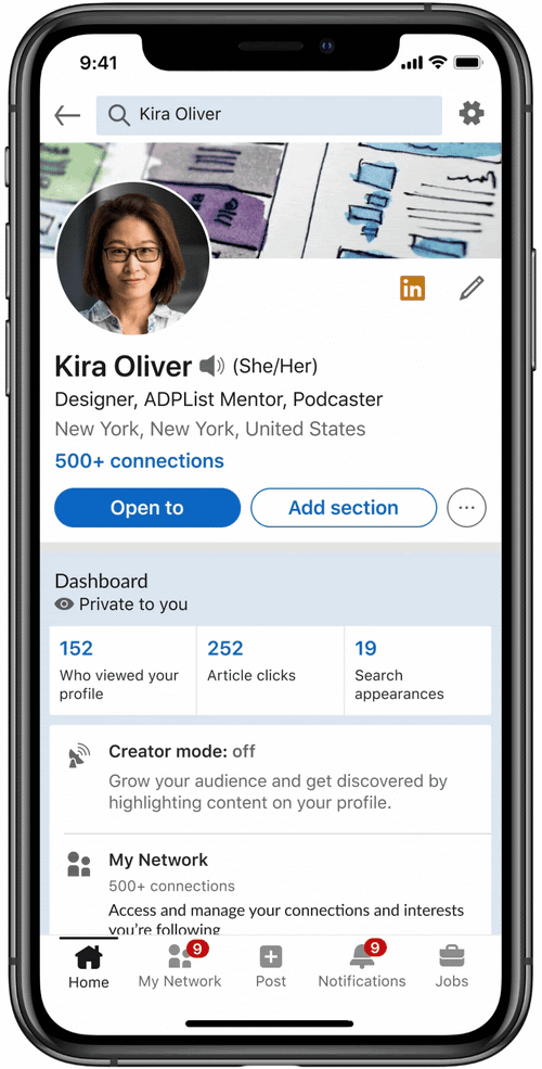
What else is included in this update? LinkedIn users can upload video cover stories, creating an interactive introduction to their profile. Much like a Facebook or Instagram story, the cover story can be initiated to play on the click of a profile photo with an orange ring. The uniquely new aspect of these cover stories is what is known as the “Harry Potter effect”, where the video will autoplay silently in the profile photo frame to signify available video content. These new features will help propel the already growing importance of video-based content on social platforms. Many users see this new video feature as an opportunity to promote themselves with a personalized pitch of their skill sets. Almost like a precursor to a job interview, it grants users the opportunity to conduct a virtual elevator pitch with all of the personality and zest of in person.
What Creator Mode Can Do For Companies
These new updates will be big for companies of almost any industry, but especially in B2B technology, cyber or complex services. Many of whom have been prioritizing thought leadership of leadership and SMEs through whitepapers, research, and media opportunities as means of generating industry attention to their brand. “As our ecosystem has been growing, and as we’re seeing the world of work changing, we’re seeing that content is now a core part of how professionals interact with not only their own jobs but their industries, their peers, and their communities,” Keren Baruch, group product manager for creator strategy at LinkedIn.
Last year 62.1 million LinkedIn users reported logging in at least once a month. This statistic is expected by researchers to jump to 64.7 million in 2021 and reach 70.9 million by 2024. The popularity of LinkedIn is expected to grow significantly, especially as users realize the unique opportunity to take control of their professional success and promote their achievements like never before. The barriers of entry for powerful brands and thought leaders have been lowered, which levels the playing field for companies of any size to become influential industry leaders.
Are you the next micro-influencer of your professional space? With the support of social media and PR agency, Bluetext, you could be! Contact us to learn more about our digital marketing and PR services.
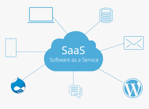
Software as a Service (SaaS) companies often run into a problem when they launch a new product or unveil updated features: they find it hard to secure the outstanding press coverage they expected. There’s a reason for this: the SaaS market is extremely crowded with tons of capable competitors, and, as a result, the media landscape for these technologies is heavily saturated.
To add to these challenges, SaaS technology is intangible. It is, as the name implies, a “service.” Unlike physical products that can be examined, physically held, or even photographed, SaaS is software delivered via the cloud.
So, when looking to drive media coverage, the biggest question SaaS providers need to answer is how do they differentiate themselves from their competition? Looking to PR agencies as a resource is a great way to solve this dilemma. The PR agencies that are most successful in the SaaS space are the ones with a deep and wide understanding of the competitive landscape. An experienced B2B PR agency brings an informed third party perspective to identify where market gaps and needs exist, and how your particular solution can fill that gap. As an agency, these PR professionals have an acute awareness of industry competitors’ voices and most sought-after media outlets. The agency can lock in on your company’s niche, cultivate creative solutions to bring the organization’s message to the market, and understand the media landscape in order to capitalize on what storylines are driving coverage.
Finding SaaS Providers’ Niche
The first responsibility of any PR agency working with a new SaaS client is to determine what differentiates their client’s product from the competition. As the client, you have expert knowledge of everything your product has to offer, but may be challenged to find that one angle that makes you unique. For example, is the solution a scalable, cost-effective offering that enables organizations to deploy it quickly? Or does the technology excel by delivering top-level security automated backup to facilitate easier user management?
Whatever the case may be, in order to secure media coverage in the desired tech-media outlets, PR organizations must hone in on what makes that SaaS provider’s technology noteworthy. Once this differentiating factor is identified, the next step is to come up with creative tactics to highlight the benefits of this technology to intended prospects.
![]()
Cultivating Creative PR Solutions
Given the SaaS marketplace is so crowded, core PR components of strategic news announcements, conducting media outreach, and authoring thought leadership contributed pieces hold value, but there is more that needs to be done. As such, it’s crucial to experiment and be as creative as possible to create the most engaging content.
One potential alternative solution is hosting webinars. Webinars enable SaaS organizations to bring their message directly to digital audiences. It’s a strong engagement tool that can be leveraged across social channels for multiple months and on your website after the live premiere, initially as gated content and then for open viewing. Inviting key members of the press to attend is a great way to cultivate relationships with reporters as well.
Creating testimonials of past customer success stories is another way to demonstrate how SaaS providers’ technologies drive key wins. These can take different forms – videos, print/digital case studies, or even a dedicated page on the organization’s website – but the goal should always be the same: draw attention to how your SaaS solutions have succeeded in the past and what made them successful.
Finally, social media is a critically important tool that can not only promote how SaaS providers’ solutions work but also serve as another way to engage with reporters and news outlets by sharing past coverage pieces that are informative, engaging, and well-written primers on topics that matter most to the SaaS organization and their customers.

Capitalize on the Media Landscape Momentum
“Newsjacking” larger PR stories with relevant SaaS messaging is also crucial to driving media coverage. In fact, the most successful SaaS PR pitches often leverage stories or trends happening in specific industries related to how the as-a-Service model meets organizations’ pain points.
For example, when COVID-19 hit, government agencies were forced to reexamine how they work in an unfamiliar setting while school systems and students had to quickly adapt to remote learning. These rapid shifts demanded new technologies for workers and students to succeed that could be deployed quickly and cost-effectively. Both situations drove significant media coverage in the early months of the pandemic.
Leaning into the stories that are resonating most with the media at a given time enables technology providers to emphasize trends they’ve seen work best for their customers and contribute to meaningful conversations. Newsjacking is where you should especially lean on a PR agency’s expertise. While your company may have subject matter experts in technology, think of your PR agency as your subject matter expert of the media landscape.

How to Choose the Right PR Agency Partner
For SaaS providers that are feeling overwhelmed when it comes to dealing with the media, PR agencies like Bluetext can serve as a valuable resource. But these technology organizations should be wary of who they enlist as a partner.
SaaS organizations should be sure to ask for agencies’ past client work and case studies. Feel free to ask questions that test the agency’s knowledge of the SaaS space. You want to be confident that your PR agency partner features individuals who have successfully worked in this industry previously.
To drive the most success with PR agencies, it is essential that SaaS providers feel they are incapable and knowledgeable hands. Embarking on partnership with an organization you do not trust will simply lead you back to where you started: unsure how to drive media coverage that features your product.
Want to know more about Bluetext’s past success with SaaS PR clients? Get in touch with us.
It’s no secret that after a year of virtual, well, everything, people have entered into a phase of “digital fatigue”. Dr. Alexander Aizman, a New York-based physician and surgeon has coined this term to describe “the physical discomfort that is experienced after prolonged exposure to a digital screen”. Ever been shocked when your iPhone sends your weekly screen time report? It’s no wonder people are growing weary of the time spent on digital devices…
When COVID-19 forced the world online a little over a year ago, device use increased as many calls, events, and other in-person interactions became video conferences. Everything from professional networking, to personal tasks like ordering groceries, quickly pivoted to digital platforms. With people rejecting increasing screen time and looking to alternatives that allow them to avert their eyes, designers must establish a way to create enticing experiences in the midst of digital fatigue.
Cut Down on Blue Light
One way to switch things up is to create an alternative, dark mode experience for users. Dark mode isn’t just a trendy aesthetic, it is actually backed by UX research and health studies to benefit users. The majority of websites we interact with on a daily basis leverage white or light color-dominant backgrounds and excessive exposure to this can cause eye strain, dry eyes, and even disrupt our sleep cycles.
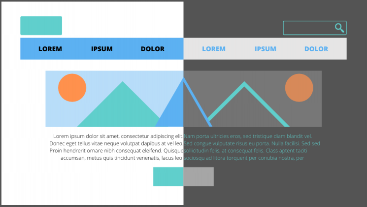
Allowing users to choose their experience, or programming a design that is time responsive, and will automatically update to dark mode for evening and nighttime hours based on the user’s location, can provide a break from all of the white space.
To learn more about ways you could incorporate dark mode into your designs, read our previous blog post.
Break Up the Monotony
Spending the majority of the day on screens and devices of various sizes can become exhausting for a number of reasons. Particularly if you are reading large amounts of online text content. When designers approach a new interface or even just a new landing page, it’s important to always keep the audience, and the environment, in mind.

Think of a trip to the museum…it can be a great outing until the initial excitement wears off when each exhibit feels the same. Walking around and reading long content labels, in every roped-off section can only retain attention levels for so long. Yet when there is an interactive exhibit, the interest returns, and the learning and engagement experience offers a higher reward. The same concept applies to online businesses, websites that receive more engagement and interest offer a higher ROI.
Utilizing interactive content, whether it be diagrams, comparison tables, or even simple graphics, can break up long walls of text. Inviting users to interact with content and bringing in visual elements that convey information in easy to grasp and easy-to-understand ways will improve the users’ overall experience.
Introduce Motion and Movement
One notable way to make sure your users connect with content and accompanying design is to create experiences that introduce motion. Static content requires the user to continue scrolling or navigate to other pages and can quickly become repetitive and uninteresting. Incorporating movement into your design as users interact with the page can create a unique experience that will build interest and encourage interaction.

All of the techniques mentioned above bring exciting alternatives to custom designs, and avoiding digital fatigue will ensure users have positive online experiences.
If your website could benefit from a boost in online engagement and website interaction, you’ve come to the right place. Contact Bluetext to learn about our services in UX design, motion graphics and interactive website development.
Picture this: You’re a cybersecurity expert with a next-generation product or service, and you’re looking for a way to get your message into the market uniquely. The industry landscape is crowded with companies with similar offerings and limited ways to stand out. You’ve been researching for hours and finally come across the perfect blog post – one about why brand storytelling is critical in cybersecurity (hint: you’re reading it). Now that you’ve found a blog post that answers your branding questions, you’re wondering where to find a cybersecurity marketing agency; in that case, I have some good news for you.
Sit back, enjoy a warm cup of coffee, and keep reading to learn more about the importance of brand storytelling through some of our favorite examples in cybersecurity.
Why Is Brand Storytelling in Cybersecurity Important?
The cybersecurity market is growing by approximately 10% every year. As a cybersecurity marketing firm, Bluetext has witnessed this growth and know it’s becoming harder to stand out in the cyber arena. These days, saying you solve your customers’ problems, and that your solutions are the best, simply isn’t enough. B2B buyers are tired of the same experience and are looking for authenticity and some sort of a connection. Even in a highly technical industry, it’s important to recognize your customers are still human! This is where brand storytelling comes in to help. Stories are an incredibly powerful tool in human connection and research shows the human brain positively responds to the impact of stories. Reading, seeing, and hearing a story is a way for users to enter the experience and connect with the subject of the story. By connecting with a story, user’s will pay attention longer, will want to learn more, and will be more trusting of your brand.
By instilling trust with storytelling, over 50% of B2B buyers are more likely to consider making a purchase, over 40% are more likely to share that story, and over 15% are more likely to buy a product/service immediately.
So now that we know why brand storytelling is important, let’s take a look at some of our favorite examples of brand storytelling in cybersecurity.
SonicWall
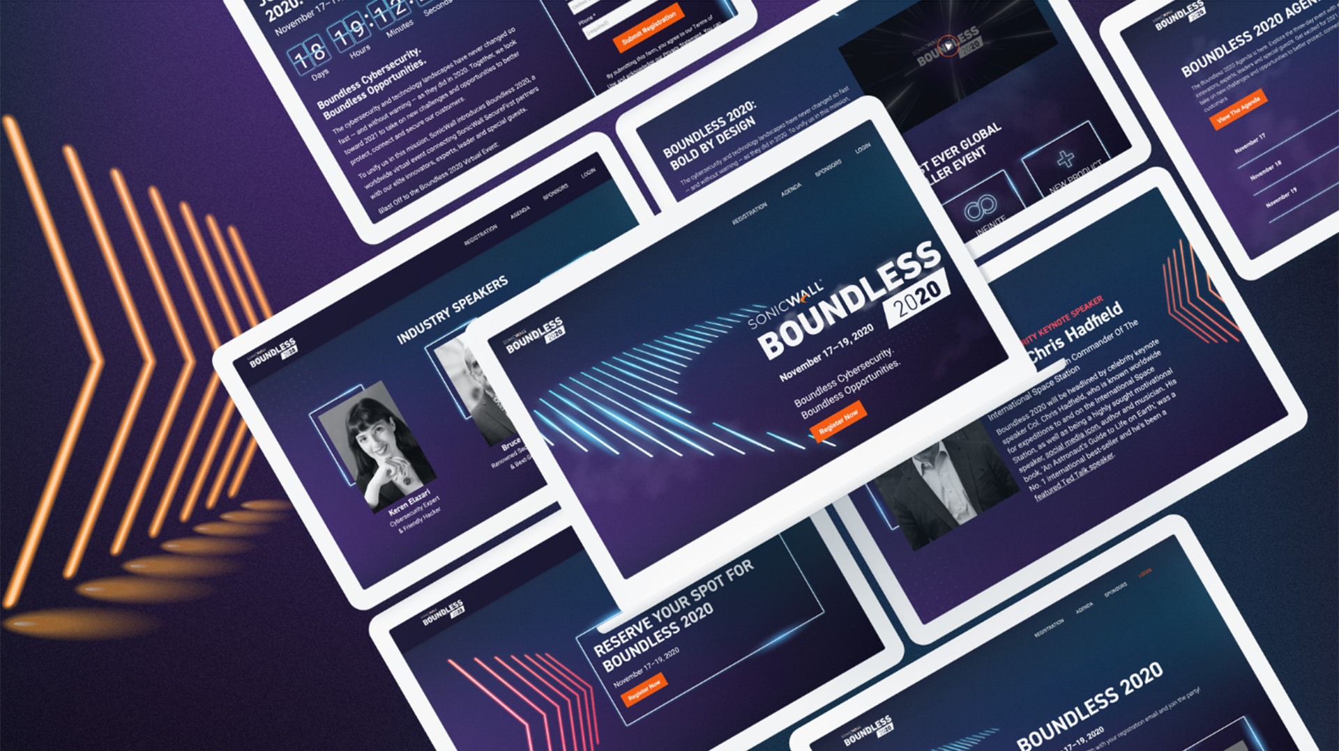
When SonicWall was looking for a cybersecurity marketing firm, they approached Bluetext to help them communicate their unparalleled business values across a variety of industries. Knowing the importance of standing out, Bluetext and SonicWall worked together to create the boundless campaign. The campaign was focused on floating imagery, which served to visualize the liberating feeling of breaking free from cyber threats. The campaign ads depict a series of end users, set in their specific industry. This creates a connection and familiarity with someone within that industry. Imagine seeing someone just like you, in the same industry and roles, facing the same challenges and use cases. This person was liberated from traditional cyber restraints by SonicWall, just as you could be.
To further bring the boundless story to life, Bluetext and SonicWall worked together to promote SonicWall’s Boundless 2020 Virtual event. In the end, this event ended up as the largest virtual event in SonicWall history and drove a 135% increase in attendance over their previous events.
HP
Hewlett Packard’s “The Wolf” campaign is one we often refer to as a masterful example of a company turning a mundane topic into a captivating story. Over the course of this series, Christian Slater infiltrates a company from the mailroom to the boardroom and exposes poorly secured devices on the company’s network. By creating this series with all of the components of a Hollywood box office hit, HP was able to effectively educate users on the importance of device security.
Norton
Another great example of brand storytelling is Norton’s The Most Dangerous Town on the Internet. In short, to quote the film, they visited “some of the most dangerous places on the internet to find out where cybercrime goes to hide.” In the film, the documentarians are able to interview small-time scammers and well-known cybercriminals who’ve infiltrated Google, the US Army, NASA, and more. By creating this documentary, Norton wanted to share an honest look at data havens and the secrets they hide. The authenticity shines through as a refreshing take on cybercrime that not many competitors are willing to share. With over 6 million views on YouTube and awards from Cannes, it’s safe to say this story got the brand’s message across. The story is dark, ghastly, brutally candid, and impossible to forget.

To help create a strong connection with users, as a top brand development agency, we’ve worked with many cybersecurity firms to help them tell their stories in a unique and captivating way. These stories have helped demonstrate that their businesses aren’t just faceless entities; they’re real people working to solve real problems.
Are you interested in working with a top cybersecurity marketing agency to help tell your story? Contact Us!
Considering a new name for your business? Whether your company has just undergone a merger or acquisition, or perhaps just needs a fresh rebrand, corporate naming can be just as equally exciting as it is daunting. If you have kids you probably relate to the decision anxiety that comes with naming. Will the name fit his/her personality? Will the name be memorable and unique? Will it withstand the test of time? The classic choice overload paradox sets in. The infinite number of possibilities makes the ultimate decision even harder. Not to mention the significance a corporate name can hold. Choosing your company’s name is one of the most important decisions you’ll make, as it sets the tone for all future branding initiatives. For better or for worse, your business name helps create a strong first impression with potential customers and investors.

As a brand marketing agency, Bluetext has assisted a number of companies in the naming selection process. Many of our clients considering a new name often ask, “Well, where do we begin? How do we name our company?” And truthfully, there is no right answer to that. Coming from years of branding and messaging experience, we’ve learned successful new names can arise in a variety of ways, but names do tend to flatline for a few consistent reasons. So, we figured it would be best to start with what not to do, leaving exactly what to do open to the unique circumstances. Keep reading for a number of tests that can help you weed out names that can help you avoid brand regret down the road.
How Not to Name Your Company
Copy the Competition: Don’t select a name that mirrors others in your industry. Especially if you are in a crowded industry, or perhaps have business offerings that span multiple industries, it’s paramount you do thorough research to ensure there are no similarly spelled or pronounced competitors.
Twitter Test: Nowadays it is expected (and advantageous!) for every business to have social media accounts. One quick test for your new company name is whether it’s compatible with common social media handles. If your name is too long to be a Twitter handle (maxed at 15 characters), your handles will need to be adapted on other platforms as well.

Go Crazy with Creative Spelling: One of the biggest trends in naming is creative adaptations to spelling common words. For example, how Waze adapted the spelling of “ways” to creatively communicate their business. This strategy can be successful but can risk confusion. The issue with having an overly complex name is that you’ll always have to spell it when you say it because it isn’t spelled how people hear it. This could cause challenges with potential customers finding your business.
Bluetext’s Rule of Thumb: When doing alternate spellings of names, try and stay to one letter tweak per name.
Disregard the Domain Availability: Don’t fall in love with a name with an unavailable URL. When researching or considering new names, we recommend looking up the domain options immediately.
Let in Too Many Voices: While great in theory, opening this discussion to the masses is never a good idea. It is incredibly unlikely that involving everyone will result in a consensus. Oftentimes involving too many decision-makers is like having too many cooks in the kitchen, it just results in an inefficient and stagnant discussion of competing opinions.
Bluetext Rule of Thumb: Involve only key decision-makers. Ones with the company’s best interest in mind, and those able to leave their egos at the door. It may be worth taking the decision to a vote when you have selected a top 2 or 3 names, but in the early ideation and decision phases, be sure to limit the discussion to only relevant stakeholders.
Frankenstein Phrases: One common naming tactic is to combine parts of an adjective and a noun into a new word. While great in theory, more often than not the name seems disjointed or forced. The two words might work great on their own, but just don’t go together. Other common fallbacks include truncated words like Tech, Corp, or Tron.
Go Too Generic: While your name should not be overly descriptive and superfluous, going too generic can also be dangerous. Random acronyms don’t give any hint into your brand, offerings, or story. A good test is whether someone could tell what industry you’re in by the name. Overgeneralizing could cause people to overlook your company if there is no sense of differentiation. Conversely, you also don’t want to use a name that is too specific to the industry you’re in, as doing so will limit your ability to expand into new territories and sectors with the same company name.

Forget to Practice Pronunciation: One of the most telling tests of a name: Can it be easily pronounced? Ask unbiased third parties to read the name aloud. Did they pronounce it as you expected? Can you easily repeat the word over and over without mispronouncing? Does the name roll off the tongue or is it a jumble of awkward consonants? Just like you would want your brand to look and feel right, you need your company name to sound and feel right.
We’ve shared our top eight ways not to name your company, but what should you do? Consult a professional branding agency. Hiring a third party brings in a fresh perspective to your company and overall brand strategy. Not to mention they will have a staff of professional copywriters who can help craft your new name and corporate messaging.
Need a new name? What are you waiting for? Contact Bluetext to learn more.
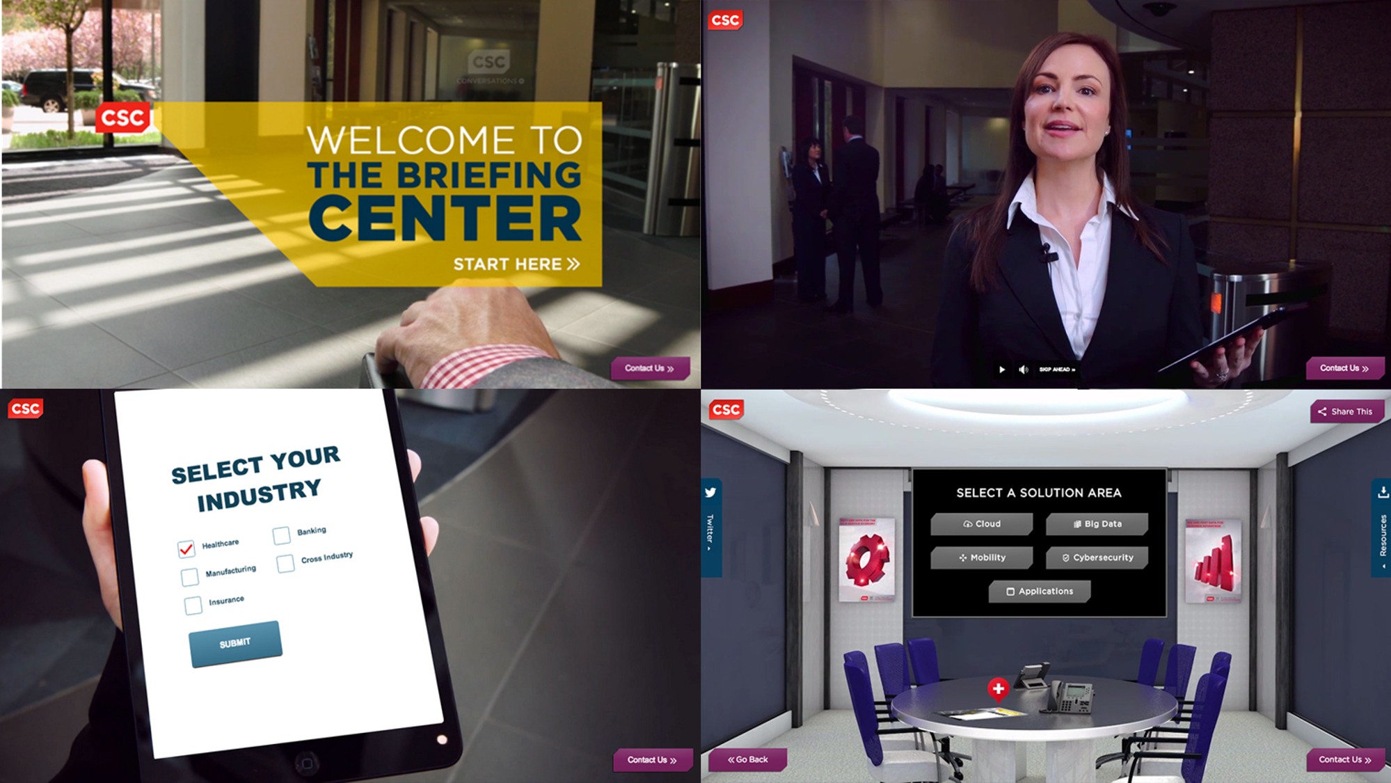
In a year when in-person events and meetings aren’t possible and Zoom-fatigue has set in, you need a way to virtually interact with your audiences in an engaging way. Here at Bluetext, we’ve spent a lot of time perfecting our digital experience platform to help you connect with your audience. Keep reading to learn more about our briefing centers.
Targeted Audience Experience
As with any experience, you’ll want to tailor it to your specific audience. Whether your goal is to disseminate thought leadership or acquire leads, your messaging and resources should support your goal. While it’s difficult to create a custom experience for each user, our Digital Briefing Center platform supports creating custom virtual experiences for different audiences. This empowers you with the option to create a one-size-fits-all experience or multiple tailored experiences.
While we understand many tailored experiences sounds great, that can easily turn into a lot of content creation and maintenance. That’s why we work with every client to provide experience-based recommendations for your Briefing Center. Ultimately, we recommend leveraging your existing content alongside some tailored content for your audiences. Bluetext has plenty of experience creating content, see some of our work here. As a full-service marketing agency, we will help you create a content marketing strategy to ensure your content is valuable, engaging, and worthwhile for your audience.
User-Approved Design
As with any virtual event, it’s about the experience for your audience. From inception to launch, we’ve worked with our in-house UX experts and our clients to come up with the best design with the end users in mind. That means regardless of the content you end up using, our design will help it shine and push users to convert.
As a user visiting a Briefing Center for the first time, you can expect a welcoming and straightforward design. Here at Bluetext, we prioritize user experience design and go the extra mile to emulate a live in-person experience. For example, what would a user expect at any traditional event? Perhaps to enter a conference center lobby and be directed with agendas and introductions. So why not replicate that across a digital platform? A streamlined user journey is something we provide in any virtual experience, website design, or platform. With the ability to gate the experience for new users, you can capture key contact information for your CRM. As a return user, bypass the gate to access the experience with ease.
Connecting With Tailored Content
Every Digital Briefing Center uses tailored content specifically to meet your audience’s needs. From custom 3D environments to professionally recorded stakeholder briefings, your Briefing Center will convey key messaging in a personalized way. When you can’t meet your prospects in person, at least create the illusion of an in-person experience. Additionally, implementing live video and text chat capabilities can have your team on standby ready to talk with them.
Don’t let custom content intimidate you. Our team has mastered the remote video recording process. Using a comprehensive recording guide and video chats, we walk you through how to professionally capture any speakers you want to host in your experience.
A Partner You Can Trust
So you’ve decided on creating your own digital experience. What comes next? Bluetext has the industry knowledge to guide you step-by-step from discovery to video capture to launch. Want to learn more? Watch our video and contact us today to learn more.
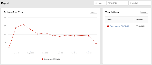
There was a time not so long ago when organizations could navigate the ebb and flow of the 24/7 news cycle to maximize how and when they shared important corporate developments. Much of the traditional news cycle ended in March 2020, as COVID-19 took over the news like nothing we have ever seen before. And rightfully so, as it’s affecting millions of people around the world in myriad ways.
For B2B technology firms – a market category Bluetext frequently works with – a status quo media relations strategy will not cut it. Between the pandemic and the media domination of the Trump Administration, one could argue we’ve operated in a relentless “breaking news” cycle for the past 4+ years – creating an unprecedented challenge for B2B brands to get their message in front of the right audience at the right time.
Here are 4 considerations for your B2B PR strategy during the pandemic:
Find your story, but don’t chase it
Ambulance chasing is never the right PR strategy. But throughout the pandemic, many B2B firms are playing a role in protecting citizens and workforces – or helping businesses and consumers adapt to the world we now live in.
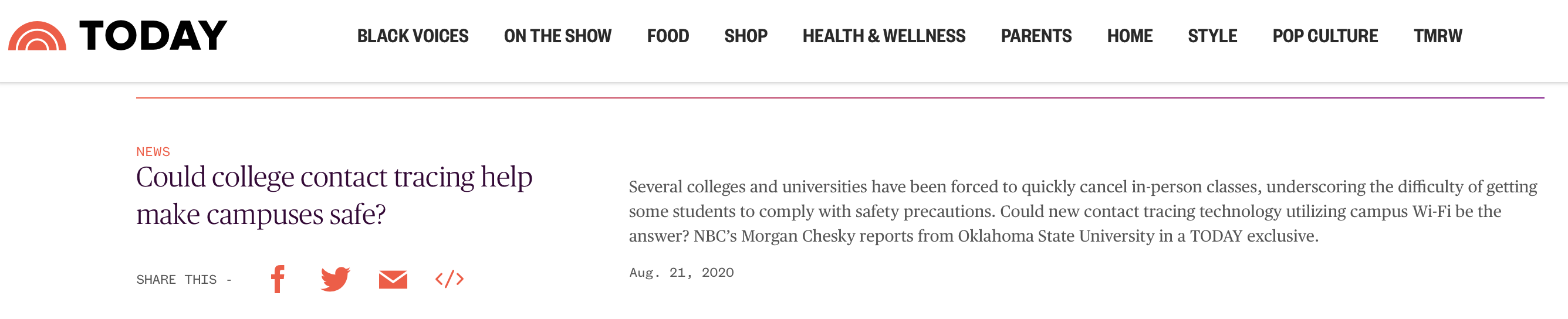
Whether your work involves efforts to deliver advanced data analytics being used to inform health and economic decisions, technology to improve contact tracing efforts, or cybersecurity solutions to protect the ever-expanding attack surface brought on by near-full remote work, there are stories to be told and people who want to hear them. So, find your story; but don’t chase it. Your voice during extended crisis events like the pandemic must be authentic and focus efforts on contributing to the conversation, not the bottom line.
Don’t wait long for news cycle gaps
If you are waiting for the news cycle to slow, give it up man. The pandemic will remain the prevailing narrative for months to come. Stay committed to your PR strategy, but depending on the nature of each news announcement, ensure the messaging is relevant to the current environment businesses, workforces and consumers face. Even in today’s news cycle, there is room for stories that are about things other than COVID. Product launches, funding news, survey data, and company milestones will all continue to be covered––and it’s possible to share this news without being tone-deaf to the economic realities of today. While it may not receive the broad coverage typically expected before the pandemic, if it’s a good story and important to your business it’s likely that there is a publication that’s open to writing about your news. This leads us to the next tip…
Know your beats and boundaries
Journalists have been dealing with the same work and life challenges as the rest of us. With so many working remotely, some PR flacks are blurring the lines between business and personal communications profiles. If you find yourself dialing a reporter’s cell phone number to pitch them on your client’s new product, first ask yourself which reaction is more likely: will they answer the phone “Hi so and so, great to hear from you” or will the retort be “how in the heck did you get this number?” And if it’s the latter, don’t say you lifted it from a 2015 RSA pre-registered media list. Hitting them up on social media? Maybe. Again, it depends on the nature of your relationship with the reporter and the type of social network communication.
The pandemic has also undeniably shifted newsroom structures and beats. Some reporters have shifted partially or fully to cover various aspects of the pandemic. This requires keeping your finger on the pulse of what reporters are covering – as these shifts may create new challenges and opportunities.

[Almost] Always Be Closing
Within B2B tech yes, reporters still want to hear about groundbreaking technologies. But there is also an awareness by journalists of the broader challenges that organizations face achieving growth, positive company culture, and workforce productivity in a pandemic. In other words, reporters also want to cover the human side of business.
Don’t be afraid to look for stories in new places. Are there employee stories you can highlight? How about the way in which you are keeping employees connected virtually or new ways that work is getting done? These stories may not drive sales but they can help with positive brand awareness and talent acquisition.
Want to find your story? Get in touch with Bluetext.
Due to the global pandemic, the rise in virtual events over the past year has created a new element of accessibility to gathering. The past year has exposed previously unacknowledged limitations to in-person events, where only a limited number of attendees could be a part of the action. However, the advantages of event accessibility can bring implications to traditional registration strategies that previously relied on limited availability and exclusivity.
Recorded webinars, streaming services, and many other on-demand materials can remove the sense of urgency from common event marketing tactics. If an audience member knows they will have access to an event at any point in time, they may feel less inclined to participate in, or even join an event in real-time.
At Bluetext, we have found a way to help our clients capture interest and create urgency around virtual events. Leveraging the best industry tools available and reliable systems to create a realistic and professional virtual event experience allows you to open your virtual event to a wider audience, without sacrificing the emotions and experience of in-person, physical events.

Stay true to your brand
This piece of age-old advice has never been more true. If you get away from your core values and try to create a virtual event setting that would be unfamiliar to your typical target audience, potential attendees and customers may not come away with the right message. A virtual event is an opportunity to get creative with event-specific branding, but make sure that there are still remnants of the brand your users know and love. Take SonicWall’s Boundless 2020 event for example. Bluetext created a specific EVI (event visual identity) inspired by their Boundless campaign, new product dark mode features, and existing brand identity.
Drum up your attendance
The old goal for larger event attendees was to get people in the room. Now, a successful campaign will convert registrations into live viewers. Everyone wants more eyes on the screen and ultimately your brand.
Everything comes down to how you plan and offer an event. One way to create urgency includes making sure that people know it will only be a one-time opportunity. The novelty of exclusive and experiential experiences very much still exists in the virtual world—it is just a question of making sure the audience knows what to expect and what they could miss out on if they don’t attend.
Play the long game
Many experts are hinting that even after the pandemic recedes, aspects of virtual events may be here to stay. The success story of the virtual event is twofold. Some companies have noticed an increasing number of event attendees due to the ease of people signing on from home, and a hybrid option of partially virtual, partially in-person events will allow non-local attendees from around the world to participate in events they may not have otherwise due to the hard cost and opportunity cost of travel. It is now more important than ever that your company is prepared to comply with today’s event regulations by going virtual but also invest in a sustainable digital marketing strategy for future events, campaigns, and more.
Watch Bluetext founder, Jason Siegel, discuss how to create and maintain urgency in event marketing with Travelocity Founder and keynote speaker Terry Jones in this week’s Virtual Marketing Minute.