Have you been searching for the best way to compete in the new frontier of web design? Do you need to stand apart from your competitors in a big and bold way? Well, here’s your answer: motion design.
Motion design refers to anything from an animated logo to subtle motion on a website. But why is it worth investing in? Let’s take a look at how custom animation can yield much stronger ROI than static graphic design or leveraging stock animations.
Motion is Memorable
People are more likely to remember something that moves. People spend 2.6 times longer on webpages that have videos than ones that don’t. Motion design is ideal for marketing because it’s design + messaging + memorable movement, all in one piece of content. It’s a golden trifecta for a brand’s first impression. Think kinetic typography in hero zones, micro-interactions in UI and CTA buttons, explaining your tagline through an animated logo, or even a full segmented-explainer-video-landing-page experience. These motion integrations will not only catch a user’s eye, but sustain their attention on page long enough to peak interest.
The PLASTICS Industry Association turned to Bluetext to develop a full new brand system for their triennial trade show, NPE®. Within the new CVI, Bluetext developed a logo animation that could be incorporated into the new video assets and onto the new website. The logo, which leverages a globe design, animates each individual element of the globe to form into one, highlighting how NPE brings together plastic industry professionals from around the globe.
Motion Helps Tell Your Brand Story
While, yes, motion design gets (and keeps) attention, it also tells a story. If a user is watching and absorbing, they are tangibly engaging in your message. A static design doesn’t allow you to express your brand to its fullest potential.
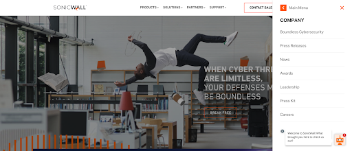
For SonicWall, Bluetext incorporated a parallax effect that follows the user’s cursor as they move it across the page. This subtle movement brings the visuals to life, making the focal point really feel like it’s floating, or in the case of SonicWall, boundless. SonicWall used this effect to bring their metaphor of Boundless Cybersecurity to life and fully engage users in a big way.
Motion Brings Your Brand to a New Level
Motion design brings your brand to life in ways you could never imagine. Take static brand elements and transform them into tools for storytelling. When Appgate turned to Bluetext to establish a new brand and help bring the company to market, we took their new brand and created a 30-second product video marked exclusively with animated brand elements. It was memorable, clean, and told the story of who Appgate is and where they are heading. Appgate truly got the most out of motion design by also integrating subtle animation into their website. Pairing a memorable and exciting video with recognizable animated elements on the website truly reinforces the branding and creates a memorable experience for the user.
Interested in getting the most out of motion? Contact Bluetext to learn more about our video and animation services.
You’ve spent months working with a video design & production company to write the perfect script, find the right voice-over actor, polish your storyboard, and so much more. Now, you have a video that captures your brand essence and you want users to see it. So what’s the best way to get impressions on your video? As a premier video design & production company, we know there are countless options for getting your video in front of users.
With over 2 billion users and more than a billion hours of videos watched daily, YouTube is one of the best ways to ensure your target audience finds the video content you’ve produced. To truly understand just how powerful YouTube can be as a platform, it’s important to understand the basics. Keep reading to learn more about YouTube advertising and it’s different kinds of ad formats.
What Type of YouTube Ads are There?
YouTube Ads are controlled through the Google Ads platform, allowing advertisers to maximize their reach. Through YouTube Ads, you can decide whether you want your video to appear before, during, or after the video a user is watching. The six primary ways you can advertise through YouTube are:
- Skippable in-stream ads
- Non-skippable in-stream ads
- Video discovery ads
- Bumper ads
- Masthead ads
- Outstream Ads
Let’s take a look at each one.
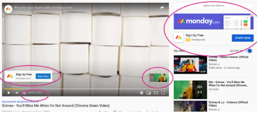
Skippable In-Stream Ads
If your goal is to drive website traffic and/or conversions, this is a great option for you.
Skippable video ads play before, during, or after a video and users have the option to skip the ad after five seconds. As such, advertisers are only charged when a viewer watches 30 seconds of the video (or the full duration of the video if it’s shorter than 30 seconds) or interacts with the video. With this in mind, it’s important to keep your ad short, sweet and to the point. Don’t bury your main points 25 seconds in the video, but rather front load with interesting content that hooks a user and encourages that conversion action. Alongside skippable video ads, advertisers have the option to display a companion banner in the top right and a video overlay CTA button in the left. Needless to say, skippable video ads can be great for a lot of reasons.
Non-Skippable In-Stream Ads
Given the nature of non-skippable in-stream ads, this is a great format if you’re aiming for a lift in brand awareness. With 76% of users skipping ads out of habit, it can be worthwhile to run ads that don’t have an option to be skipped. However, with non-skippable ads, you need to be confident that your video is strong enough to hold your audience’s attention for the full 15 seconds. Given that viewers have to watch the full video, these ads typically have higher CPMs than other formats on YouTube.

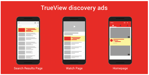
Video Discovery Ads
Video Discovery ads are best for product and brand consideration. Just like Google paid search ads, YouTube Discovery Ads display alongside organic YouTube search results. As a more native approach, if your video appears relevant to users, people are more likely to watch it. Alongside a thumbnail of the video, these ads allow for three lines of text to help provide users with more context and information. The text opportunity is great, because it ensures that a user consumes some brand messaging even if the video isn’t played. Furthermore, in the best case scenario, the description text further encourages the video play action, and eventually results in a lead or conversion.
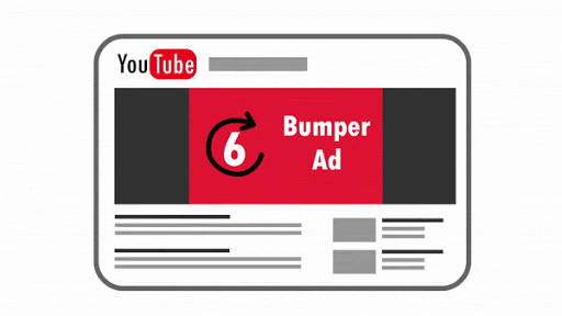
Bumper Video Ads
Are you looking to capture viewers with a short, memorable message? Then bumper ads are for you! At only 6 seconds, bumper ads are a quick, snappy way to leave viewers wanting more. Billed on a CPM basis, these ads are best for building brand awareness, given that they are also non-skippable.
Masthead Ads
Masthead ads are a fantastic way to drive awareness for a new product, service, or event for a short period of time (i.e. a trade show). While most YouTube ads are purchased through the Google Ads auction, masthead ads are bought on a reservation basis. By buying on a reservation basis, masthead ads give you more control over your budget (buy impressions at a fixed rate), greater visibility (guarantee the placement of your ad), and better brand awareness (reach a wide audience).

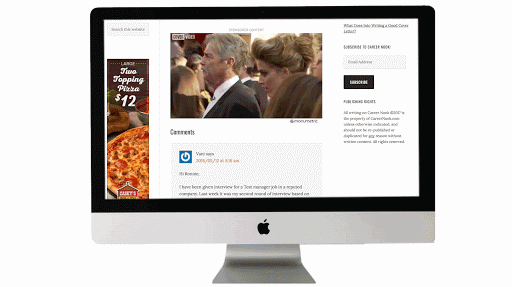
Outstream Ads
Outstream ads are another great tactic for boosting brand awareness and bringing users to your site. With over 40% of YouTube viewers watching content on their mobile devices, a mobile-first ad campaign is a smart approach. Outstream ads, for example, are mobile-only and play on partner sites and apps outside of YouTube. While this might seem counterintuitive at first, this actually allows advertisers to expand their reach to publishers such as CNN and Forbes. In addition, users are more likely to view outstream video ads by over 25% when compared to instream ads.
Knowing that there are so many options for YouTube ads, it can sometimes be overwhelming to know what format to select. It’s important to start with your goal, and work backward from there. Better yet, consult a digital marketing agency for advice on the best ad format and strategy for your business. If you’re interested in working with a video design & production company to create your next video or need help figuring out how to promote your videos, contact us here!
It’s no secret that any business striving for success has to find a way to differentiate themselves from their competition. The same goes for companies operating in the government contracting arena, where players big, small, old, and new, are all looking for ways to get their messages into the market uniquely.
I know what you’re thinking… so much easier said than done, right? Well, what if I told you that a solid and effective brand story is one of the most critical ingredients of a government contractor’s success? And, what if I told you that as a government contracting marketing expert that specializes in brand storytelling, Bluetext can help you significantly improve your market standing and brand goals?
Now that I’ve got your attention, keep reading to learn more about why brand storytelling is so critical in government contracting, and just what Bluetext can do for you.
So, why exactly should I care about brand storytelling?
The reality of the situation is that without a strong brand story, many government services providers look exactly alike. Strong brand storytelling can make a government contractor stand out and come to stand for something valuable to all of the stakeholders. In a trust-based industry like government contracting, a resonant message can both attract and motivate buyers to conduct business with your company.
In a world so focused on numbers, proposals, minimizing risk and technical requirements, it can be easy to forget that your buyers are still human! Yes, they want to understand your company, services, and products and see those fancy charts and data, but they also want to relate. Most proposals are going to have very similar data, and after so many they all seem the same. What won’t be the same is the emotion tied to your company‘s proposal — if you tell your story right. Customers need to recognize your brand and trust that you are the right organization to fulfill their contracts in the long term.
That’s where brand storytelling comes in to help.
Studies show that humans actually rely heavily on our subconscious feelings to make decisions and that we respond positively to the impact of stories. That’s why storytelling is such a powerful tool to help evoke positive emotions around your brand and facilitate connections with your audience. When your audience connects with your story, they will pay attention longer, want to learn more, and be more trusting of your brand.
Storytelling that is consistent with your brand allows your audience to see the how and why behind your products or services. It allows them to be enticed by your company without being explicitly aware that they were in a sales pitch. Across any industry, tolerance is low for gimmicky sales ploys. However, there is attention bandwidth to be gained for a corporate responsibility and clear values. Companies who get this right are companies who win government contracts.
Okay, I’m in. But how do I get my brand storytelling right?
Enter: Bluetext.
As a top brand development agency, we’ve worked across industries to learn the most effective ways to tell unique brand stories. We have worked with countless government contracting firms to help them tell their stories in a way that captivates audiences, leads to real, tangible business results, and establishes them as a trusted partner who can solve real-world problems.
Check out a few of our favorite examples of storytelling in government contracting below:
 Convinced? Contact Us if you’re ready to work with a government contracting marketing firm to help tell your story.
Given the speed at which news is consumed today, timing is everything. Latching onto a rapidly developing news cycle is a great way to gain visibility for your brand, establish thought leadership on a topic and build relationships with reporters. Rapid response, or newsjacking, opportunities are when brands capitalize on breaking news to provide relevant commentary on the story while drawing attention to their own content.

As brand storytellers, we’re scanning the news daily for what’s happening in the industry, what brands are standing out, how our clients are showing up and more. Thus, implementing a rapid response strategy during your daily news scans is easy, time-efficient and can be very fruitful. However, there are a few things to be wary of, including sensitivities around the news, reaction time and offering valuable insights.
Read the Room
Not every breaking news story needs commentary. Consider the sensitivities around the developing story, read the room and evaluate if a comms strategy is necessary around this cycle. If yes, then designate who your spokesperson will be and develop your commentary.
Amid tragedy at a global scale, like social unrest, natural disasters or pandemic, it is best advised to redirect external communications to focus on internal messaging and making sure employees feel supported. Exploiting tragedy and proactively telling a reporter how a company’s software product might have altered a tragic situation can be perceived as insensitive and will put your brand in a negative light.
A prime newsjacking market is cybersecurity. There are countless hacks that offer opportunities for cybersecurity firms to comment on topics like how the hack occurred, how that kind of hack or bad actor will evolve throughout the year and beyond, background on the hack or bad actor, what cybersecurity protocols can be implemented to prevent the hack from occurring again and more. But the noisier the market (and there are thousands of cybersecurity vendors with something to say), the more you will have to carve out a defined lane and message that reporters will find of value.
Timing Is Crucial
News comes and goes fast. Rapid response opportunities work best when you’re the hare, not the tortoise. In your daily scans, once you see a trending piece or developing piece and think that news cycle will pick up, get ahead — reach out to your spokesperson, pick their brain about how the story will develop, compile their thoughts into a pitch and ship it off to relevant reporters. From there, wait for the story to develop and see if the reporter has any other questions.

Yes, and ?
While timing is crucial in rapid response opportunities, it isn’t everything. Messaging is just as important. It does help to be the first to comment, but other brands won’t be far behind, and if your messaging does not add value to the conversation, it will not be included. On top of that, given the opportunity is industry-wide, keep the commentary broadly applicable but nuanced enough to stand out. This is not the time to gush about your company and the latest products.
There is a time and place for everything. While we as communicators want to jump on as many opportunities as they come, we need to be cautious about the ever-changing news landscape, the sensitivities of the world and the reputational risk that comes with it.
To learn more about how Bluetext can improve your newsjacking processes and timing, contact us today.
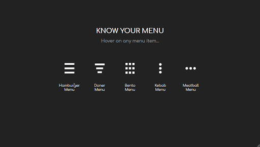
The hamburger, what’s not to love? No, not the American classic, but the navigation menu design. You know, the one with those three straight lines found in the top right corner of your screen. It’s an icon that hides a collapsible menu of possible link destinations, normally appearing on mobile designs. The hamburger menu is actually quite controversial in the UX design community. As such, Bluetext decided to break it down to deconstruct the user experience pros and cons of the hamburger menu.
Where does this funky food inspired design come from? The icon is actually a remnant of the 1980s, making it the perfect choice for retro embracing brands. The hamburger menu first debuted on Xerox copy machines, which had limited space and were therefore designed to be as simple as possible. The icon itself looked a lot like the menu that appeared when you clicked on it.
The design fell off designers’ radars for a few decades until a sudden resurgence in the mid-2000s. Why so? The emergence of mobile browsing had UX design teams more challenged to fit information on screens smaller than ever before. Facebook was one of the early adopters of the retro style and the design trend quickly caught on with many other websites and applications. 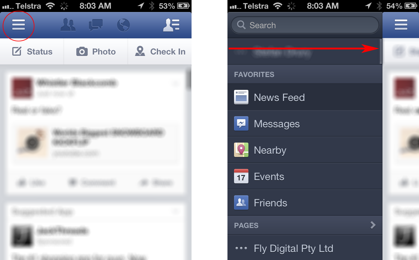
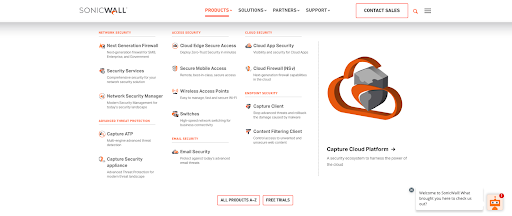
Larger websites have even adopted a hybrid approach, which uses both traditional top navigation and the hamburger even on desktops. Take the Bluetext client, SonicWall, for example. With a large number of products, solutions, and support resources to showcase, they needed a mega menu to encompass all links in an organized and interesting fashion. The top menu drops down to display page titles, short descriptions and even iconography for the high traffic areas of the website. To avoid overcrowding, other sections of the website are moved to a hamburger side menu for a cleaner user experience.
Some UX designers (vegans if you will) hate the hamburger menu. The main complaint with the design is that users can’t go anywhere or see anything without clicking the menu open. Many users expect immediate and obvious information, as seen in traditional top navigation designs. Many UX designers believe an intuitive navigation should obviously show two things: where a user currently is, and where they can go.
The hamburger menu has been the UX design go-to for years, but many companies are starting to debut some new menu items. For example the three dot approach often dubbed “the kebab”.
With mobile and tablet devices growing in popularity, there’s no doubt menu designs will continue to evolve in the future.
Does your website menu need a refresh? Contact Bluetext today to learn about our web and UX design services.
What’s the biggest obstacle to securing national media coverage? Companies often struggle to develop a message, pitch, and story that will resonate with Tier 1 journalists. If done right, exposing your brand to a large audience – assuming it is the right audience – can result in stronger brand recognition as well as new business deals. There are a few things to keep in mind as you strive to place a national media opportunity.
Lean into News Attention
The ability to adapt your message and pitch to current stories in the current news cycle unlocks a wider range of opportunities to get in front of a reporter who will cover a certain topic. The pandemic is an extreme, yet instructive example of how companies seeking media coverage had to recognize that COVID-19 was going to dominate the national conversation. This was a challenge, but also an opportunity if your company has legitimate insights and contributions for businesses and consumers.
Craft a Timely Pitch
After determining a topic appropriate to engage with, attention is turned to crafting the message of a pitch. A timely hook and a captivating subject line are two pieces that should be used to grab the attention of a reporter. The body of the pitch should include relevant data and information that would be useful to an article and the conclusion should outline what is being offered to the reporter, such as an interview with a subject matter expert or CXO.
Locate Specific Beat Reporters
Another key aspect of upleveling messaging to gain national media attention is finding specific beat reporters. Aggregating a list of national media reporters from a large range of outlets is essential to find a reporter who will cover a story. Pitching to a wide variety of outlets allows for a higher chance of securing national media coverage. Once the outlets to pitch have been determined, searching for reporters who have very specific beats relating to what you want to be covered is crucial for getting a reporter’s attention.

Be Persistent
Follow-up with reporters that have been pitched in the days after the pitch went out. Sending follow-up pitches to reporters the day after can bump the original email to the top of the reporter’s inbox and remind them of the information shared the previous day. Reporters often will not respond to a pitch if uninterested, but a follow-up email ensures the pitch wasn’t lost in the reporter’s inbox. Strike the right balance; be proactive but don’t beat a dead horse.

National media coverage is important for both brand recognition and business lead generation. Due to recognition of the impact Tier 1 coverage can have, it is always hard to secure coverage in national outlets. Tactics such as leaning into news attention, creating a timely pitch, locating beat reporters, and being persistent will help in securing businesses’ worthwhile press coverage.
To learn more about how Bluetext can help you uplevel your message, contact us today.
We’re now more than a year into the COVID-19 pandemic and admit it: you miss in-person conferences and events. At least a little. While segments of the country are inching back toward some sense of normalcy, it will be a while before thousands of people are gathered in convention centers and hotel conference centers again.
This continues to pose a challenge for traditionally face-to-face organizations that need to reach business, government, and consumer technology decision-makers. Additionally, it’s why many have been evaluating and participating in virtual technology conferences and events, or even shifting their own user conferences and events from in-person to virtual.
As your organization maps out its 2021 in-person, hybrid, and virtual event strategy, there are several considerations when it comes to investing time, money, and resources.

Is This Their First Rodeo?
Technology providers must determine if the event organizer has hosted virtual events in the past. If they are familiar with the virtual event landscape, it is important to determine what attendance and sponsorship looked like at the previous event and if the speaker lineup has been credible and on target. Determining past event involvement can also help speakers form expectations about participation levels. An experienced virtual event host suggests a deeper attendee pool and gives companies a glimpse at the event at hand by looking at past hosted events.
Pay to Play?
It is important for organizations to evaluate investment in sponsored speaking opportunities or sponsorships overall. Speaking engagements provide companies with a hard-to-come-by platform depending on attendance. Speaking slots with no fee associated can be competitive when you’re submitting with a pool of people to a program with strict standards. Sponsored sessions, on the other hand, are easier to get if you’re willing to pay for it, and give speakers more leeway on what they cover. Because of this, organizations should consider how the event host will drive attendance, especially now that travel doesn’t pose an issue, and how the conference content will be made available to optimize virtual viewership.
Try Not ‘Playing to Play’
When looking for opportunities, there are a few key things to consider before nominating a subject matter expert for speaking roles. Various event organizers offer calls for speakers when looking for guests to participate in panels at conferences. The submission form may offer a broad nomination for a general conference or may offer categories in which specific topics will be discussed. Categories narrow down the specificities of the topic the thought leader will be speaking about. It allows experts to delve deeper into the topic at hand and, in turn, highlights the speaker’s expertise. Finding the right speaking role is important, as is including the right members of the press to listen to a speaking engagement for potential coverage opportunities. Inviting reporters from trade publications specific to an industry, as well as national reporters who cover specific topics are valuable assets to optimize additional press opportunities and increase the overall value of the session.
Host Your Own Virtual Event
While industry events are all reeling from the switch from in-person to virtual, this may be the time to consider hosting your own virtual event – if you are not doing so already. There are more avenues now than ever before to bring customers, partners, prospects, and thought leaders together virtually. Even before the global pandemic, some potential event prospects were limited by the event’s location. With digital events, that is no longer an issue. All an attendee needs these days is a viable internet connection. The importance of convening has not gone away, we just had to change the way we approach it.
Bluetext Virtual Events are built on the idea that bringing the right people, information, and ideas together is what events are all about. Our platform was designed to feel as close to a real event as possible, rather than just another webinar, video conference, or live stream.
While some may see virtual events as a Plan B to in-person events, virtual events have brought new opportunities to a wider, global audience. Whether you are looking for the right PR agency partner to navigate the virtual and in-person event landscape or leverage our platform to host your own virtual event, Bluetext can help. If you want to learn more contact us today.
The past decade has seen a spike in mergers and acquisitions, as conglomeration and consolidation seem to be the trend of the future. Healthcare, technology and media-related brands have experienced the most consolidation. Mergers and acquisitions offer attractive opportunities to consolidate talent, infrastructure and relationships, but an equal number of challenges. Luckily, Bluetext has experience with many clients seeking digital marketing and branding guidance either after a successful M&A event, or with an eye to the future of the company and it’s M&A potential. A consistent lesson learned from our clients across a wide variety of industries is the importance of branding, especially in the early M&A planning.
WHY a company should rebrand after an acquisition
One of the key challenges includes branding, which when done correctly creates a harmonious industry presence built for long term success. But when branding is neglected, it runs the risk of introducing new problems that might damage a firm’s reputation or open up rifts between internal teams. While key stakeholders tend to focus on talent, business operations or business development, branding can fall to the back burner. Though as an experienced brand marketing agency, Bluetext knows the risk of deprioritizing corporate messaging & branding. Without unified brand creative and messages, a newly consolidated company lacks the foundation and united front to be successful in the marketplace and internally.
Often newly merged companies decide to either adopt one existing brand, or decide to create a new brand for a fresh look when they go to market. This decision is crucial to make early on, as it sets the tone for the entire process. While there are pros and cons to both avenues, Bluetext has observed companies that opt to create a new brand identity and corporate messaging often experience higher excitement, zeal and attention with the new company announcement. A blank slate for the brand story, key messages and creative visuals gives all stakeholders the chance to weigh in and feel heard in the process. The end result is a new brand that all internal stakeholders feel connected to and proud to represent both digitally via social media and physically via corporate swag.
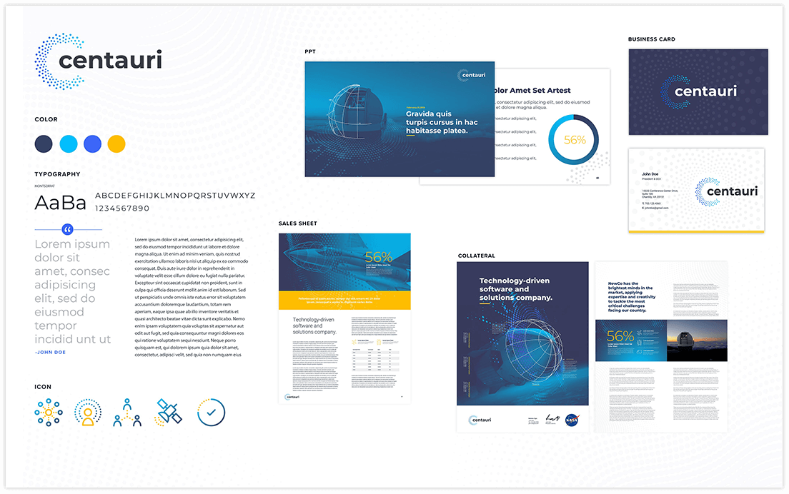
HOW new branding affects the business
Creative brand agencies tend to think of two top considerations for branded materials: internal communications and external marketing. Both are of significant importance to any company, but especially of a newly merged or acquired one.
Well-branded internal communications can serve as a unifier for a new company and its employees, especially if two companies with distinct cultures are merging. Having the same style business cards, Powerpoint templates, or even branded swag creates a sense of kinship amongst colleagues. Especially in larger corporates, consistent brand assets can send a subtle but effective message of cohesion when connecting with new colleagues or other office locations.
The second, slightly more obvious reason for branding is external marketing. Your go-to-market strategy should be reinforced with strong branding and messaging. Whether your primary goal is to appeal to customers, stand out from competitors, or attract talent, you need well-developed marketing materials in your toolkit. Especially when pitching to prospective clients or customers, it would look disjointed and confusing to see conflicting branding across a company’s website, resources, or collateral.
From press announcements to rebranded websites and collateral, Bluetext is a full-service digital marketing agency that can guide your company through than rebrand or M&A process. Contact us to learn more about our services.
Whether you work for a big or a small company, I’m sure you’ve had the question of how to differentiate yourself from the competition. In the ever-growing B2B market, you want your brand to stand above the rest. Easier said than done, right? What if I told you that your market standing could be improved significantly through brand storytelling. Keep reading to learn more and how Bluetext can help you reach your branding goals.
Why Is Brand Storytelling Important For Me?
First of all, storytelling that is consistent with your brand allows your audience to peek behind the curtain to see more than just what you do and sell. Coupled with good company values, storytelling serves to humanize your brand, facilitating connections with your audience and explaining how and why you do and sell the things you do. As your audience gets exposed to your story, they’re more likely to identify with shared values.
While we often like to think fancy data callouts and graphics will convince your audience to convert, at the end of the day studies show we rely heavily on our subconscious feelings. Storytelling gives marketers the ability to share their products and services without diving into a hard sell. This allows your audience to be enticed by your company without being explicitly aware that they were pitched a product/service.

SonicWall
When SonicWall set out to update their messaging and branding to match their top-tier services across a variety of industries, they came to Bluetext. As a cybersecurity marketing agency, we were excited to work with SonicWall to bring their Boundless Cybersecurity to market with a bang. Previous campaigns had attempted to tell the Boundless story, but with muddled messaging and creative that didn’t result in conversions. Bluetext’s branding and creative team were tasked with bringing the Boundless Cybersecurity story to life. The new campaign focused on conveying a feeling of breaking free from cyber threats and thus feeling liberated. To visually communicate this, we designed imagery and messaging that supported this feeling of being free. Campaign ads depict a series of end-users in their industry floating in the air. This not only allows the audience to feel connected to their industry but also the benefits of being freed from the industry-specific challenges. The campaign was a smashing success, bringing a record number of visitors to their campaign landing page.
Why stop there? The Boundless brand story carried onto their annual partner event, which was turned virtual in the wake of COVID-19. Bluetext and SonicWall worked together to promote SonicWall’s Boundless 2020 Virtual event. This event resulted in a 135% increase in attendance over their previous events, going down in history as SonicWall’s largest virtual event ever.
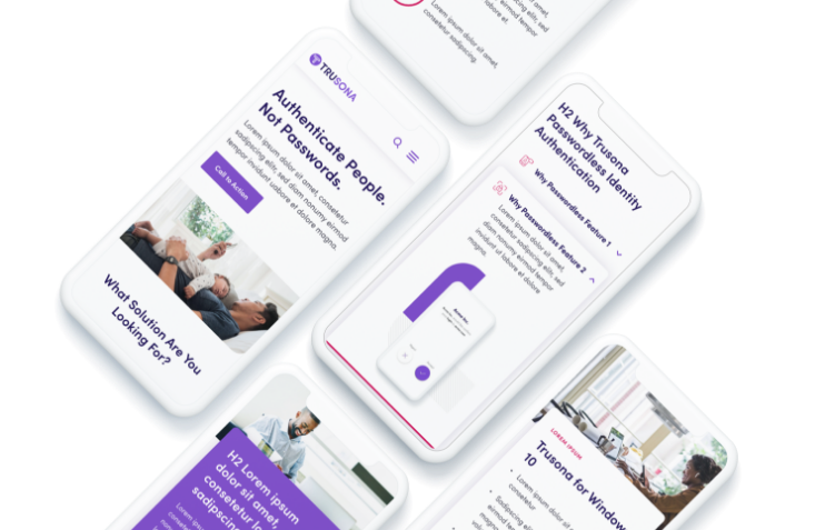
 Trusona
 Trusona
Another great example of brand storytelling is Trusona. When Trusona wanted to reimagine their brand presentation and messaging they turned to Bluetext. Priding themselves on creating a secure experience for users without the hassle of passwords, we wanted to deliver a brand that conveyed their hassle-free nature. As with any story, consistency is key.,Bluetext designed a library of brand elements inspired by their logo to be used across all communications. Every time you see a brand element, you’re reminded of the Trusona brand and their brand promise to simplify authentication.
As a digital marketing agency, we’ve worked across industries to learn the most effective ways to convey a story and foster connection. These stories help your audience understand that you are more than just a faceless corporation, but rather a trusted partner.
Are you interested in working with a branding marketing firm to help tell your story? Contact Us!
Over the past several years LinkedIn has moved beyond being a tool used solely for job searching. It has cemented itself as a home for people who are passionate about their work to share news and successes with former colleagues and other connections. It has also become a hub for social selling and a platform for increasing brand awareness––for personal and organizational brands alike.
While it is a social network, the rules and norms on the platform are much different than other sites like Facebook and Twitter. You will see hashtags and (professional) selfies, but you won’t see clickbait political headlines or an onslaught of memes. And if you do, you might be connected to the wrong people!
As part of a holistic PR strategy, LinkedIn can be a powerful tool for sharing company news, amplifying earned media and owned content, and leveraging relationships. The following 10 tips will help set you up for success on LinkedIn, professionally and personally:
1. Update your company page, or create one if you’re not one of the 30 million companies using LinkedIn. Make sure to add or refresh your logo, header image, company description, and tagline, ensuring all graphics are properly sized for each location. Pay attention to the details here. Imagine you’re talking directly to a potential customer or employee. What do you want them to know about your company? What does your tone convey?
2. Update your personal page and encourage others, especially company executives to do the same. Employees are the face of your brand, and employees with full profiles look less spammy when engaging with others on the platform. Here’s a short checklist of items to update:
-
- Make sure each section is filled out and current.
- Include a professional picture that’s more recent than your last driver’s license photo.
- Add a cover image.
- Connect with the right people. Current and former colleagues are good. But, also look for sales prospects, industry and thought leaders.
- Extra credit: Make your headline say something about you other than your job title. Make it interesting, funny, ask a question. Let people get to know you a little in 10 words or less.
3. Strategize. It sounds simple enough to think through what you want to post before you post it… but, also consider which business units outside of marketing––especially HR/recruiting––may lean on LinkedIn for before moving forward. As a part of strategy discussions make sure to consider: what goals you want to accomplish on the platform; who you are trying to reach and what content they will find most interesting; how often you intend to post and at what time of day; and if you will have any budget to put behind your efforts. Another good idea when setting strategy is to take a look at how competitors, partners, and other industry leaders are present on LinkedIn, emulate what you like, and take note of how you can stand out.
4. Plan your posts. Most marketers find it best to map out a content calendar for all social platforms, including LinkedIn. That way you can ensure cohesion and alignment across channels, make sure you are properly promoting the content and news coming out of your company, and ensure that you’ve got something set for every “post day” coming up. From there you can augment with timely or spur-of-the-moment posts.

5. Post, post, post. Just like on every other social media platform, posts with rich media––photos and videos––perform better on LinkedIn. A couple of quick tips for posting on LinkedIn:
-
- Keep copy short and to the point.
- Call out any stats or facts and figures.
- Ask questions to engage the audience.
- Include hashtags only when they make sense.
- Respond to comments.
6. Hit your target audience. With the organic targeting option for posts, page admins can target based on follower profile data, including industry, job title, seniority, and geography. While ads can be even more highly targeted, make sure that you’re setting this built-in tool properly to help you get your content in front of the right folks.

7. Optimize your page for search. Once your company page is up to date, the next step is making sure it’s easily found. Think about your potential customers, what would they use when searching for your product or services? By inserting relevant keywords throughout your company description, filling in your specialties, and adding hashtags to your company profile it can help you be found–on and off LinkedIn.
8. Use LinkedIn’s analytics. With this built-in tool, page admins can track post metrics to see what’s driving engagement and what’s not to help adjust the content calendar accordingly. You can also monitor the keywords being used to find your page, see which sections visitors engage with most, see who’s interested in your company with visitor demographics, and check your page performance against that of your competitors.
9. Add LinkedIn buttons. Adding a LinkedIn icon to your website, newsletter, email signatures and other places where you interact with your target audience will help increase awareness of your page and make it easier for them to follow you.
10. Explore ads. LinkedIn’s advertising is so robust it deserves its own tips list, but as part of an initial foray into the platform, it can’t be ignored. Ads allow you to target incredibly specific markets or groups of people to make sure your message is getting through. With sponsored content, sponsored InMail, or text ads you can amplify a strong piece of content, widen your audience, or draw specific attention to your brand on pretty much any budget.
It would be relatively easy to spend your week digging into the nooks and crannies of LinkedIn. It’s a huge platform with the ideal user base for social selling and targeted advertising. However, the above 10 tips should give you a guide on where to get started to support your PR strategy.
If you’re interested in learning more about using paid advertising, better promoting your posts, generating leads, or reaching other goals on the platform we are ready to help. And follow us on LinkedIn!