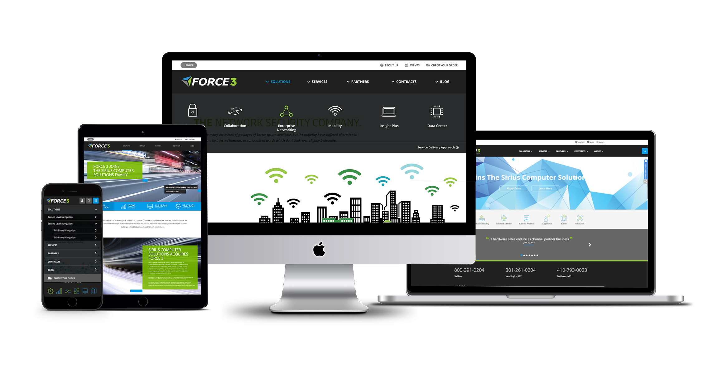
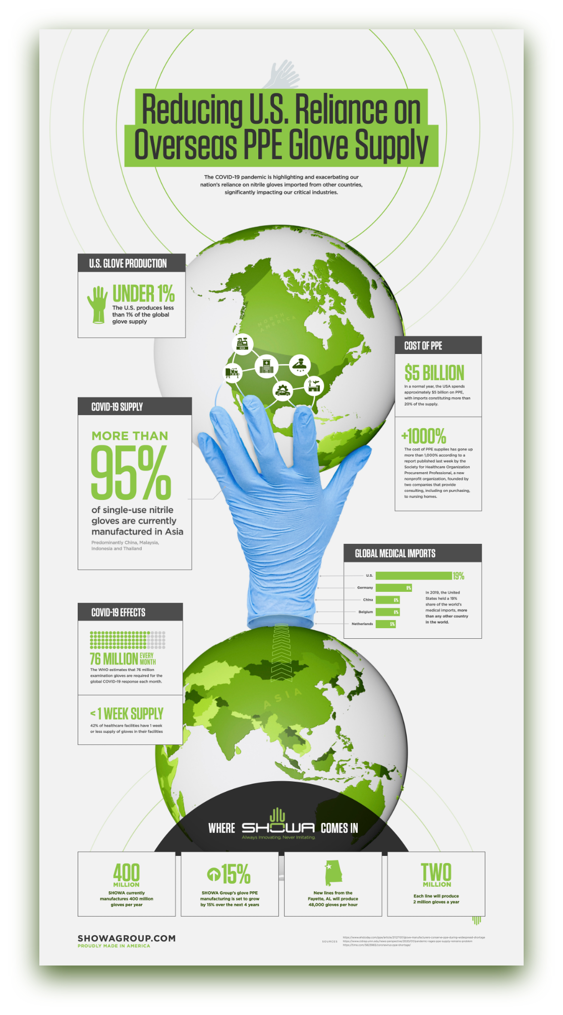
PE firms need portfolio companies with strong branding
Private Equity (PE) continues to be the preferred growth financing mechanism for most “for-profit” businesses. According to McKinsey’s 2019 Market Annual Review, “global private equity valuation has grown more than sevenfold since 2002” – more than twice the growth of publicly held equity valuation. While PE fundraising declined in 2020 to the Covid Pandemic, PE markets are experiencing a strong increase in 2021.
PE firms make most of their profits by acquiring companies, helping management increase Enterprise Value through various strategies, and then selling these companies at a much higher value. Value is quantified using metrics such as Earnings (typically EBITDA – Earnings Before Interest Taxes Debt and Amortization), Earnings Multiple (a factor applied to EBITDA to determine Enterprise Value), and valuation of Intellectual Property.

A common and highly effective growth strategy for PE portfolio companies is buying competitive or complementary companies through Mergers and Acquisitions (M&A). The brand is almost always a key component of a) the Earnings Multiple and Intellectual Property Value metrics in the valuation process and b) a successful M&A strategy. Here’s why.
Branding is so much more than a name and a logo; it’s a representation of how your company is perceived – more specifically, how your customers and the market perceive you. It’s a gut reaction, a feeling. This is why it’s critical prior to going through an M&A to create a strategic, memorable, and unique brand that provides a consistent experience across all channels, and makes sense to not just the market, but to all employees, as they become brand ambassadors themselves. PE firms have many tools and metrics to measure the value of a brand (brand loyalty, recognition, and impact) which drive a monetary valuation.

Sloppy, outdated, or inconsistent branding can make employees and the market feel uneasy and unconfident with the new company. A powerful, cohesive brand right from the gate is essential in sending the right message of being “stronger together.” In addition to looking the part, strong brands are more profitable, grow faster, and sell more frequently. You only get to go-to-market with your new brand once – make sure it counts by following our steps to a successful M&A brand launch below.
Our steps to a successful M&A brand launch
1. Develop New Positioning & Messaging
A strong brand is designed to dominate the market, which is why the first step in developing a new brand for an M&A should be to gain understanding and consensus on how you want to be (and can/should be) positioned within the market. You need to understand where you could be within the market as this new company with more talent and more vast capabilities. Determine how all the current brands’ are currently perceived, vs. how you want to be perceived. What are the brands’ value propositions and how will they be combined? If possible, involve your target audience via surveys or workshops to understand how the companies are perceived. That knowledge is a baseline on how all the companies are perceived in the market today and what needs to change in order to be perceived differently and help set expectations.
Once those baselines are understood, you’ll want to define a specific positioning strategy then base your new messaging off of that. With combined capabilities and potentially different focus areas, the positioning strategy likely will shift, so you need to identify how it should shift and define clear and compelling differentiators early on that the positioning and messaging are based on.
Market your new capabilities, but don’t become a generalist. By combining two (or frequently, more) companies together, it’s obvious there’s more diversity and broader capabilities, but if not done the right way, growing this list can make you seem too generic or disjointed. You don’t want to come across as a “jack of all trades”, but rather, a “specialist of many.” This is why considering not just the increased amount of advanced capabilities, but the outcomes of those capabilities and communicating that clearly and effectively in the new messaging is critical.
2. Create New Corporate Visual Identity
This is what most people think of when they hear “brand”. Corporate Visual Identity, CVI, is how a company visually portrays itself to the public. The logo, the color palette, typography, graphics and iconography, unique branded elements like an image masking or pattern overlay, etc. all work together to form the CVI.
Merging a brand portfolio is challenging, and there are several factors to consider before creating a new CVI. If you’re not going in the “house of brands” direction where the parent company is not associated with the products, then you’ll want to develop a unified CVI that is unique in the competitive landscape, is compelling and memorable, and visually represents the story you want to tell from the messaging. Some questions to consider include:
- How do customers/the market connect with each of the brands?
- What is the brand equity of the company or companies in consideration?
- How will you decide which assets, if any, to retain from each brand impact projected revenue?
- What story are we trying to convey and how can we visually portray that?
M&As set many new paths for success, but if the new company’s Corporate Visual Identity is not unified, meaningful, and applied in a cohesive, creative, and consistent manner, it creates a weak brand without solidarity and won’t have the impact it should.
Case Study: BlueHalo
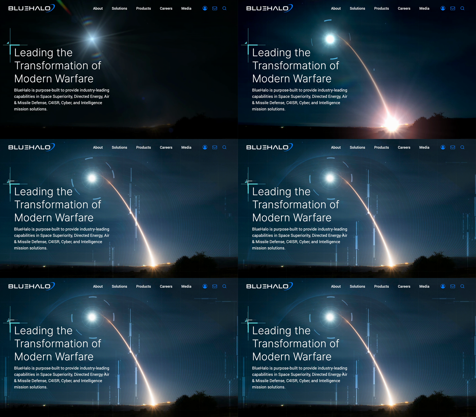
When Arlington Capital Partners acquired several top-performing companies in national security, the AEgis team looked to Bluetext to help merge multiple companies together to create one superior brand, BlueHalo. Bluetext worked closely with AEgis to develop the new name, logo, messaging and positioning, corporate visual identity brand system, website re-design and development, video work, and a go-to-market strategy and launch plan, and in record-breaking time.

Part of what made the new BlueHalo brand so strong was the powerful corporate visual identity that Bluetext created. Bluetext moved fast to create a bold new name and brand within just weeks that would make a lasting impression on the market. The name BlueHalo represents the unbroken global line that ensures the technical advantage in the most advanced battlespace. The logo embodies the name by featuring a blue swoosh shape that depicts in a clean but strong manner, a halo of protection.
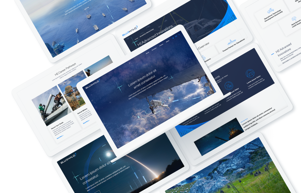
The striking blue colors to accompany the name, the branded engineering vector graphics woven in the photos to create unique, branded imagery, and the blue wires to form shapes that pull from the halo in the logo all work together to create a cohesive, meaningful, and regal brand system.
To learn more about strategic branding and how M&As can succeed with it, check out part 2 of this blog. To learn more about Bluetext and our services, contact us today.
Where is the next great opportunity for your business? Well, government agencies for one. According to USAspending.gov, approximately five trillion dollars is being allocated to government agencies in Fiscal Year 2021, with over $1 trillion going to Health and Human Services alone. These agencies are growing, and their needs for hardware, software, and services are increasing along with them.
If you are already marketing to “the government,” you understand that winning government contracts is a long sales cycle. The opportunity-to-award process might be 90 days on average, but the lead-up to those 90 days is a critical period where the deal is won or lost. During those 90 days, all data gathering and relationship-building you have done over the previous 2-5 years comes to fruition. So what exactly sets the winning businesses apart? Memorability. Government contracting is a long game, built on endurance. After many years of B2G marketing experience, Bluetext is here to break down what gets your foot in the door and sustains success in business to government marketing.

Division of time between positioning your company for success with government agencies and bidding on specific contract awards.
Winning government contracts is not as simple as pointing your existing sales and marketing engine at a new target. “The government” is not a monolithic entity, and even “the agency” needs to be treated with more nuance: It is composed of dozens of sub-entities that make independent decisions based on independent decision criteria. In enterprise sales, winning over a single decision-maker can often close the deal. In government contracts, groups of stakeholders across the agency influence which business wins the contract, even if a single decision-maker completes the signs off. So instead of persuading a single stakeholder, B2G companies are tasked with winning over multiple groups, at multiple different stages and occasions. Hence, why brand endurance is critical.
Complicating matters further, traditional channels for establishing relationships with government agencies have been disrupted by the pandemic. Most in-person conferences and meetings will not occur this year, and some will remain online for the foreseeable future. Government stakeholders are more geographically distributed and digitally dependent than ever.

The tides have shifted. Once an industry that operated in an isolated silo of its own rules, businesses seeking government contracts must adopt new, digital marketing initiatives to effectively position themselves.B2G companies should leverage the data-driven, digital marketing tools developed for B2C companies to segment and personalize their approach to agency stakeholders. B2G is too broad a term, and even business-to-agency (B2A) abstracts away from the customer understanding your company needs to have to win contracts consistently. A business-to-stakeholder (B2S) marketing approach is what your company needs to win consistently.
To succeed in data-driven B2S marketing, we explore:
- What success looks like in B2S
- The lifecycle of data-driven stakeholder cultivation
- The division of labor between internal departments for successful execution of that lifecycle.
Begin with the End Goal in Mind
Before we determine how to develop our marketing and sales pipeline, we need to define success. Agency leadership and stakeholders can frequently change, at a minimum, with every new government administration.
Therefore, we prioritize targets that will allow your company to evolve as agency priorities and decision-makers change. Your company must first make its impression as a strong, reputable industry player, whilst also remaining top of mind through consistent brand recognition and relevant thought leadership content. These are the characteristics of a successful B2A marketing approach:
- Your company is considered a thought leader in the space where the agency is procuring products and services.
- Government agency stakeholders regularly call your company to ask your opinion on upcoming agency initiatives, product and service specifications, RFPs, and contract awards. Occasionally, you are invited to co-craft the RFP in ways that position your company to win.
- You are aware of the potential for shifting priorities months before those shifts occur.
- Information on the priorities and interests of your agency stakeholders is filtering directly to your sales team, who pass relevant information to content creators, who are crafting bespoke campaigns that reach your contacts as related conversations occur internally at the agencies.
- Business development staff follow up on that content with meaningful conversations with key stakeholders. Those conversations assure your agency contacts that your company is focused on their individual and organizational priorities.
- You have both breadth and depth of relationships at the agency: deep relationships with key stakeholders and associations across the organization. A few people leaving the agency does not impact your company’s ability to retain the status and relationships described above.
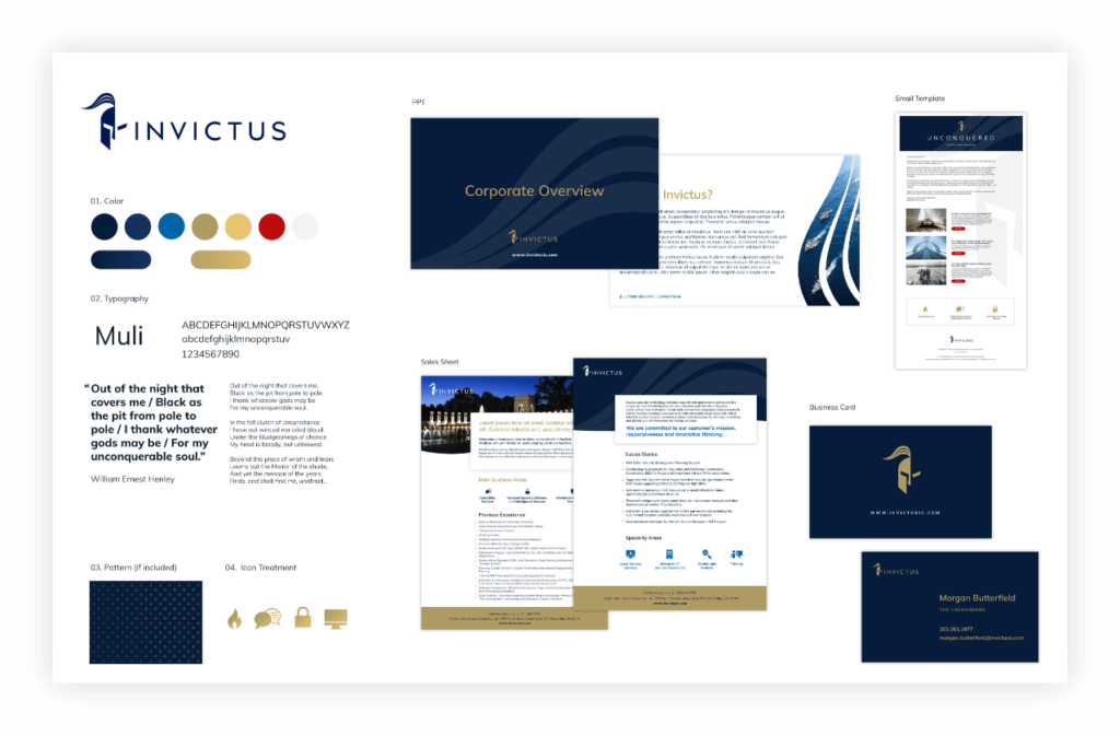
Does your content dress the part? A sure sign of a reputable industry player is professionally branded collateral assets, such as Invictus
The Stakeholder Development Lifecycle
In order to accomplish those goals, start by treating the agency as a combination of individual stakeholders and stakeholder groups. Organize your company’s sales and marketing approach around the Stakeholder Development Lifecycle for B2A marketing, which includes:
- Acquiring Stakeholder Contacts: Start with breadth. In order for your company to establish deep relationships in an agency, you need to acquire as many points of contact as possible. Target ads based on geolocation to get in front of as many relevant stakeholders as possible. Get their title, contact information, and social media presence. Build from there.
- Monitoring Stakeholder Contacts: Capture social media posts, digital content interaction (with a privacy-first approach of course), conference attendance, and internal agency relationship information from contacts over time so that you can understand and target their needs, interests, and priorities.
- Segmenting Stakeholder Contacts: Based on a contact’s position in the organization and their activities and expressed perspectives, segment them into groups that should be targeted and messaged together consistently.
- Nurturing Stakeholder Contacts: Develop marketing, business development, and sales outreach that messages contacts according to their segment and the depth of their relationship with your company. Build a customer journey map that helps you identify what messages move contacts deeper into understanding your company’s value proposition and believing in it.
- Fostering Stakeholder Promoters: Identify your company’s highest value and strongest promoting contacts as the champions your company needs to win individual contract awards. Prioritize according to how naturally the contact aligns with your company’s offerings and how important the contact is to your company’s long-term relationship with the agency.
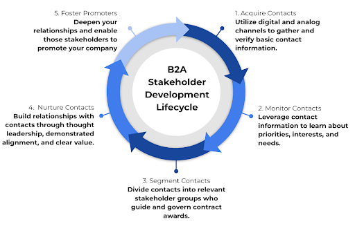
Stakeholder Development Lifecycle for B2A Marketing
Considering Stakeholder Segments
Within each agency, there are groups of stakeholders with priorities that will govern how well your company competes in a given contract award. The priorities of the agency can be efficiently stored within a single person’s head. But understanding the priorities of each stakeholder within each stakeholder group requires a data acquisition and data management approach that efficiently captures, aggregates, and generates insights about how your company is positioned with regard to that stakeholder group and the awards they oversee.
To understand how stakeholder priorities can differ, we use an example company, CyberSample, selling cybersecurity solutions to the Department of Transportation (DoT).
If CyberSample were to interface only with the DoT’s contract oversight and contract administration team, they would get a simplified and sanitized understanding of what governs the contract award. They would miss the critical details and priorities needed to assuage the concerns of each stakeholder group.
If they were to interface only with agency leadership or technology leadership, they would get a sense of broad organizational priorities and gain credibility from being introduced by internal power brokers. However, unless they leverage those introductions to dig deeper into specific needs surrounding an award, CyberSample’s team is unlikely to understand the tactical needs of technology implementers, users, or initiative leaders.
Example stakeholder groups and their corresponding priorities for CyberSample are provided in the figure below.

CyberSample stakeholder segments and their priorities. Segments and priorities should be validated by marketing interactions, public discussions, and business development and sales conversations.
Within each agency and with regard to each industry vertical selling into the agency, there will be a different set of stakeholder groups that influence decision-making. Your first task is to gather the intelligence needed to identify, segment, and target each stakeholder group. Taking a card from the B2C marketing playbook, it’s very similar to traditional customer personas, focus groups, data collection and tracking. Businesses that open their minds to alternative digital marketing and outreach methods are putting themselves miles ahead of the competition. This will allow you to move from a broad B2A approach to a more focused B2S methodology.
Executing on B2S Marketing with a Data-Driven Approach
For the approach described above to be successfully executed, each of your internal departments needs to coordinate. That coordination is built on a shared understanding of the agency landscape. A shared understanding requires a consistent and comprehensive approach to data collection, manipulation, and utilization.
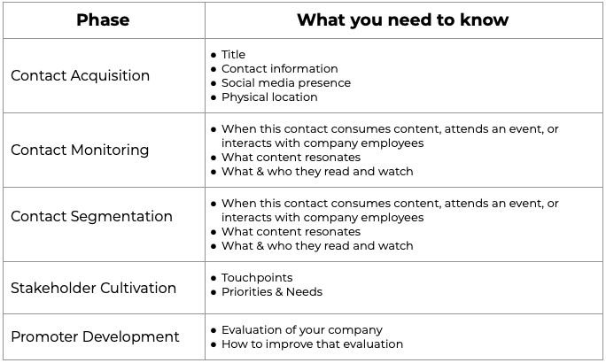
Within the Contact Acquisition phase, your company’s Marketing and Content teams need to develop top-of-the-funnel landing pages, emails, webinars, white papers, and presentations that make agency contacts want to opt-in to a relationship with your company. Your Technology team needs to have the systems in place to capture customer interactions from your web properties and events, as well as to trigger intelligent outreach based on those interactions. Your Data team needs to clean and integrate the information captured from these interactions so that intelligence can filter back to Marketing, Content, Business Development, and Sales.
A summary of your company’s information needs is provided in the table below.
Once your company has acquired contacts and is actively monitoring activity, your Marketing, Content, and Business Development teams need to know what messages are resonating with agency stakeholders, and who are credible thought leaders through which to filter those messages. That provides the platform for new content development and for influencer marketing via the people who already have your stakeholders’ attention.
Those messages also enable the Business Development team to schedule meetings and start having conversations with stakeholders about their individual priorities and the interaction between those priorities and the organization at large. Your company can surface conflicts between agency groups to discover how to navigate potential barriers to contract awards.
Meanwhile, your Marketing team can deepen relationships with agency stakeholders through increasingly targeted messaging that moves those stakeholders closer to being promoters of your business. Your Product & Service team can ensure that your product or service value proposition is aligned with the priorities of each stakeholder group as you enter the RFP process. Your Business Development and Sales teams can focus on the individual needs of key stakeholders and customize your messaging to those stakeholders’ needs.
It is the job of your Data team to ensure that each department has the intelligence they need, when and where they need it, to effectively cultivate those relationships and respond with well-honed sales and marketing messages.
Below, we illustrate the division of labor between different departments throughout the Stakeholder Development Lifecycle.
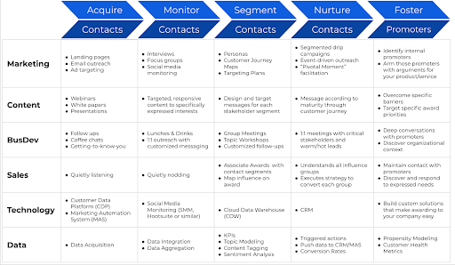
Division of Labor Between Departments for the Stakeholder Development Lifecycle
With an improved strategic approach to B2A marketing, focusing directly on the stakeholders, and a commitment to building the infrastructure and processes to gather and interpret data about them, your company will be better positioned to win government contracts for many years to come.
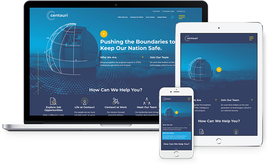
Centauri utilized Bluetext’s services to launch a new name, brand, and website following a merger. Their go-to-market strategy succeeded in winning new awards, company recruits, and even an acquisition from KBR. Check out how Bluetext has set up more brands for M&A success.
How Do I Get Started?
For the approach described above to be successfully executed, each of your internal departments needs to coordinate. That coordination is built on a shared understanding of the landscape within the agency. A shared understanding requires a consistent and comprehensive approach to data collection, manipulation, and utilization.
The starting point depends on the maturity of your company, specifically in the Data and Marketing Teams. For those with fully staffed teams that can execute, you can follow the plan outlined in this post.
The Data Team holds responsibility for timely, reliable access to data to allow the MarCom Team to execute and your other teams to act on the results. If you are still attempting to develop the overall strategy and buy-in from departmental or executive leadership, or if you don’t have the confidence in the systems in place, Bluetext has several options to help you move forward:
- Data Summit: This workshop is customized to your specific requirements, but is designed to bring together stakeholders from the relevant departments to educate them on the goals of the initiative, gather input from various departments about any concerns or limitations, and move toward a consensus regarding the strategic approach that will improve your targeted marketing efforts.
- Data & Systems Assessment: For those who have made the decision to move forward with improved data-driven marketing, it is critical to have confidence in your data systems (reliability, scalability, and accessibility), data governance (security and policies), and ROI (time to value and budget). Our assessment process addresses all of these aspects and culminates with the development and delivery of a Data Infrastructure and Capabilities Roadmap (DICR). The DICR includes the findings of the assessment, strategic vision, proposed infrastructure solution, and an implementation plan (typically phased).
With the organizational buy-in in place, and you have the data and reliable systems in place, but require assistance in execution in the marketing and content, working with industry-leading partners like Bluetext will allow you to start executing your strategy.
Bluetext brings the marketing and business development expertise needed to elevate your targeting and messaging and brings the data expertise needed to make your web, marketing, sales, and business development data work for you. Reach out to start the conversation about how we can position your company to succeed with government agency marketing and business development.
Search marketing has powerful potential with infinite nuances. This digital marketing medium has an unmatched ability to reach mass users at a macro level on the basis of targeted browsing & interest. Search marketing is a demand-driven opportunity to engage in individual conversations at a mass scale. Just like the phrase implies, the ‘world wide web’ is an incredibly complex and interconnected ecosystem of users, websites, search queries, and advertising. So how and where should you start to navigate the infinite avenues of search marketing? First, consult a digital marketing agency, especially one which specializes in marketing analytics & paid media strategy like Bluetext.
A digital marketing agency can offer search marketing services that you help identify: your website user personas, what organic keywords are bringing traffic to your site, what keywords & phrases have the optimal cost-per-click (CPC), and competitive density for paid search efforts.

Automation: the Answer to Search Marketing
Basic search marketing strategy connects a user’s intent to an ideal and relevant response. Automated search marketing strategy uses automation to constantly improve and become more efficient and effective over time. A basic search strategy can be simple to set up and understand, but results may flatline without consistent nurturing. Automated search marketing can be complex and intimidating, but when set up correctly, can yield impressive and compounding results.
Some search marketers have been hesitant to embrace automation and trust algorithms and data processing power. However, avoiding the advancement of automation only hurts your strategy and puts you at a competitive disadvantage in comparison to more future-focused competitors.

Search engine tools have matured over time to provide increased control, transparency, and tangible results than ever before. Real-time automation has evolved to be the foundation of the search engine ecosystem. What was once an analog concept (imagine a physical directory) has been transformed into a dynamic digital medium. The modern search marketing experience is an always-on, cross-device experience capable of delivering almost any type of content a user is looking for.
The key aspect to keep in mind with search marketing is its dynamic nature. New features and improvements are constantly being implemented, with new queries and signals added every second. Hundreds of data points are aggregated for every interaction. The term “big data” is an understatement to summarize the sheer volume of data that can be collected and harnessed to provide the most personalized experience to users possible.
Finding the Right Search Strategy
Search marketing is not a one size fits all solution. The optimal strategy should be assessed by individual companies and use cases. To inform your strategy, it is key to fully understand how your paid or organic search terms have performed in the past. Past bidding and budget history can provide not only a baseline for improvements but insight into your audience and receptiveness to paid search advertising. If you’re not already doing so, separate campaigns out by specific audiences. This allows you to track isolated segments of customers or prospects and compare performance.
The beauty of search marketing automation is the paradox of scale and specificity. It allows companies to scale their messages and strategies to a massive audience, while simultaneously making users feel heard with personalized results.
If you’re ready to optimize your search marketing strategy and take your campaigns to the next level, contact Bluetext.
In 2021, the average person will encounter anywhere from 6,000 to 10,000 pieces of promotional content on any given day. Banner ads, billboards, and influencer shout-outs all inundate consumers with information about the products and services they promote. The volume of content is growing, but the audience’s time and attention span are dwindling. Brands today must duke it out in a competitive landscape where attention is a commodity and focused consideration a luxury. So how does a brand break through the never-ending stream of influence that consumers are exposed to? The answer is microcontent.
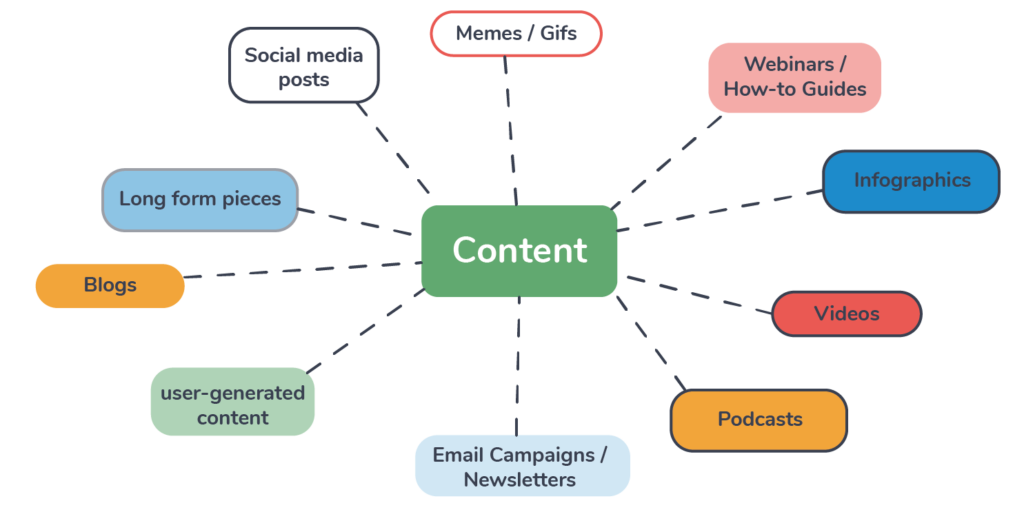
Microcontent is a self-explanatory term. Content, but smaller. It’s text, video, images, really any form of traditional content that is optimized for social media and can be consumed in 30 seconds or less. The latest trend in content marketing is adapted to the latest platforms, and modern attention spans. Microcontent provides enough time to tell your brand’s story and drive leads without requiring so much committed focus that it loses the attention of hyperactive social media users. It should be something your target audience can engage with, save, and ultimately share with other users in their network. Effective microcontent can stand on its own as a positive user experience, bringing value to the user before promoting brand offerings.
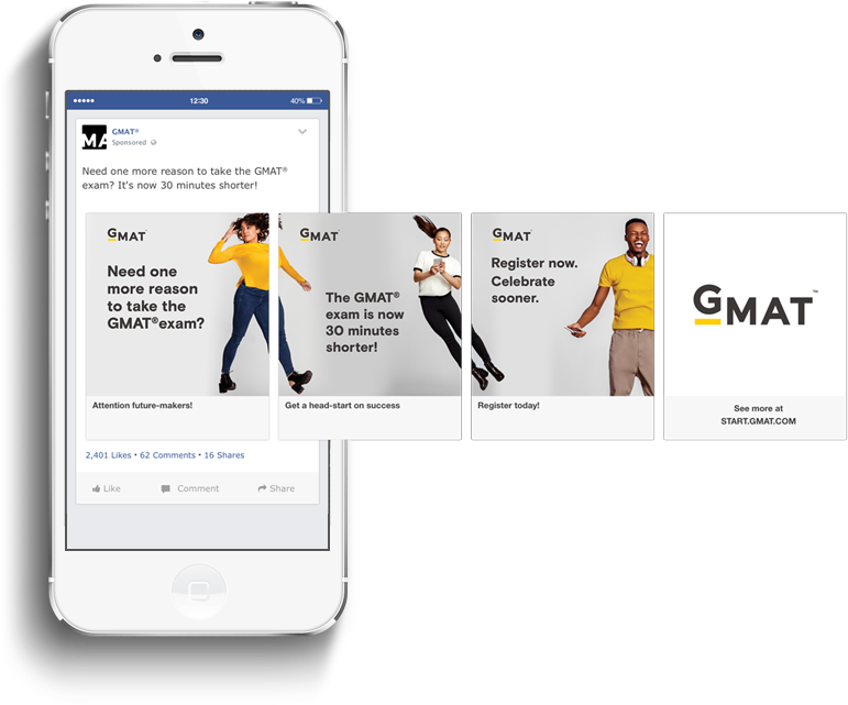
Creating microcontent is simple, as it is built from the pieces of a brand’s existing long-form content. Pull quotes can be made into actionable tips and tricks, key takeaways can be presented as small infographics or formatted lists. These tidbits can be combined with key brand messages to create card carousels that will function as the foundation for a social campaign. The microcontent creation process is all about taking the most critical elements from long-form work and formatting them into an easily digestible package that distills the essence of a brand. The trickier part is getting your microcontent in front of the right users and achieving positive engagements.
The rise of microcontent is not a self-contained trend. It’s part of a growing movement by many brands towards simplification in their messaging and content creation. As humans, we have an innate drive to simplify the complexity of the world around us, a trait referred to as the “Simplicity Principle.” The Simplicity Principle states that when our minds are presented with two options, one complex and one simple, we choose outcomes that we perceive to be as simple as possible. Ever feel overwhelmed by the 6,000+ instances of promotional content you see a day? You’re not alone, the surplus of stimuli actually has adverse effects on consumers and muddles the decision-making process. As technological advances and omnipresent social media platforms continue to make consumers’ lives exponentially more complex, they will embrace simplicity wherever they can find it.
Understanding this fact is more important for brands than it ever has been before. It only takes one look at the latest industry headlines mentioning VOD, AR, machine learning, the growing influence of big data, and countless other kinds of emerging tech to understand how consumers could feel lost. To truly reach and engage with its consumers, a brand must be able to break through the noise of the industry and present them with content that is digestible and impactful. Whether through microcontent creation or streamlining messaging about complex topics, modern brands must focus on being translators of the complex into the simple.
As a full-service digital marketing agency, Bluetext offers multiple services that can help your brand consolidate messaging into impactful and digestible content. Contact us today to learn more about our messaging and content marketing services.
Design trends reflect the world we live in, and the past year has been tumultuous, to say the least! Below, Bluetext explores 5 branding trends and how marketing designers can make the most of them when expressing their brand identity.
1. Motion Logos
We all want our users to spend as much time as possible engaging with a brand, and adding motion to a logo will do the trick. Logo animation is a modern and dynamic way to attract clients. They hold the user’s attention, make for better storytelling, and increase brand awareness. People gloss over hundreds of brands each week, so this is the perfect way to stand out.
2. Geometric Shapes
Recently we’ve seen many brands go back to basics. Especially through the use of simple shapes, you may recognize from way back when in geometry class. Geometric shapes are a straightforward way to establish consistency across the visual identity of a brand. While appearing simple at first glance, these shapes pack a punch with the ability to express a range of emotions. Squares and rectangles feel solid and stable while circles feel unrestrained and fluid. Take a look at how we use geometric shapes to give these brands a sleek and minimalistic feel.
3. Natural Designs
Recently, designers have been looking to nature for inspiration. This includes more natural color palettes as well as gradients to represent natural light. With our daily lives inevitably turning more and more digital, more natural elements provide a refreshing contrast from bright screens and persistent notifications. Studies have shown the benefits of natural branding include stress relief and enhanced creativity, which companies & users alike know and love.
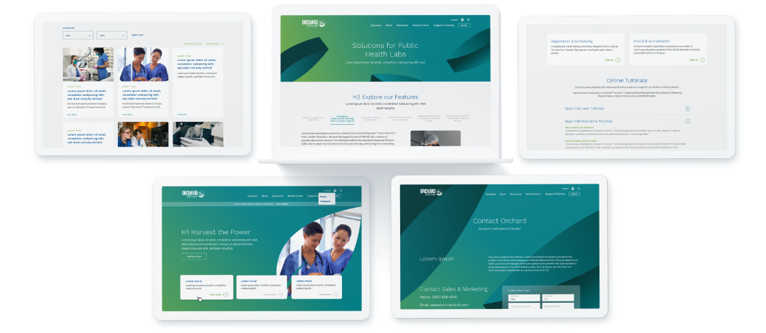
4. Simple and Classic Fonts
When choosing a font for your brand, remember simple and classic fonts can evoke nostalgia, elegance, and trustworthiness. Streamlined typography marries the widespread push towards consumer trust with recent retro trends Design and marketing agencies are moving towards a more modern and minimalistic branding, which is often complemented by simplified type. Users are finding the fine details and complex logos to be distracting from key brand messaging and attributes. Simple and classic fonts are also more compatible with reduced mobile screen sizes and digital platforms.
5. Data Visualizations
Sharing raw data holds little value to the viewer. Why? Because nobody wants to look at a bunch of numbers. Especially when quickly scanning a webpage or collateral asset, key statistics often get overlooked. Data visualizations are not only more visually appealing, but they provide a bigger picture for the viewer. Attractively branded diagrams and illustrations naturally draw the eye and focus attention to the story your statistics tell. Improving data visualization is an easy way to make the user stop scrolling and absorb your brand’s value and relevance.
Branding has the power to instill trust and excitement in any audience. Take advantage of these upcoming trends to increase user attention and spread brand awareness this year. Need help? Bluetext is here to give you the tools you need to develop or enhance your brand. Contact us today.
It’s not what you say, it’s how you say it.
You could have the best product in the world, but if your website’s user experience is not up to par, how will customers find and use your product? What’s in your website is important, but how your user interacts with it is even more essential. That is why it is so important to focus on UX when designing, or redesigning, your site.
What is UX?
UX– or User Experience– is how your users interact with and experience your product. While UX can apply to any product or system, from making a call on a cell phone to standing in lines at Disney World, it is commonly associated with digital media. Everyone has had that moment where you can’t find what you need on a website because it is buried so far behind menu items and hyperlinks. With proper UX, though, your users will be able to find everything more easily and therefore be more satisfied with your overall product.
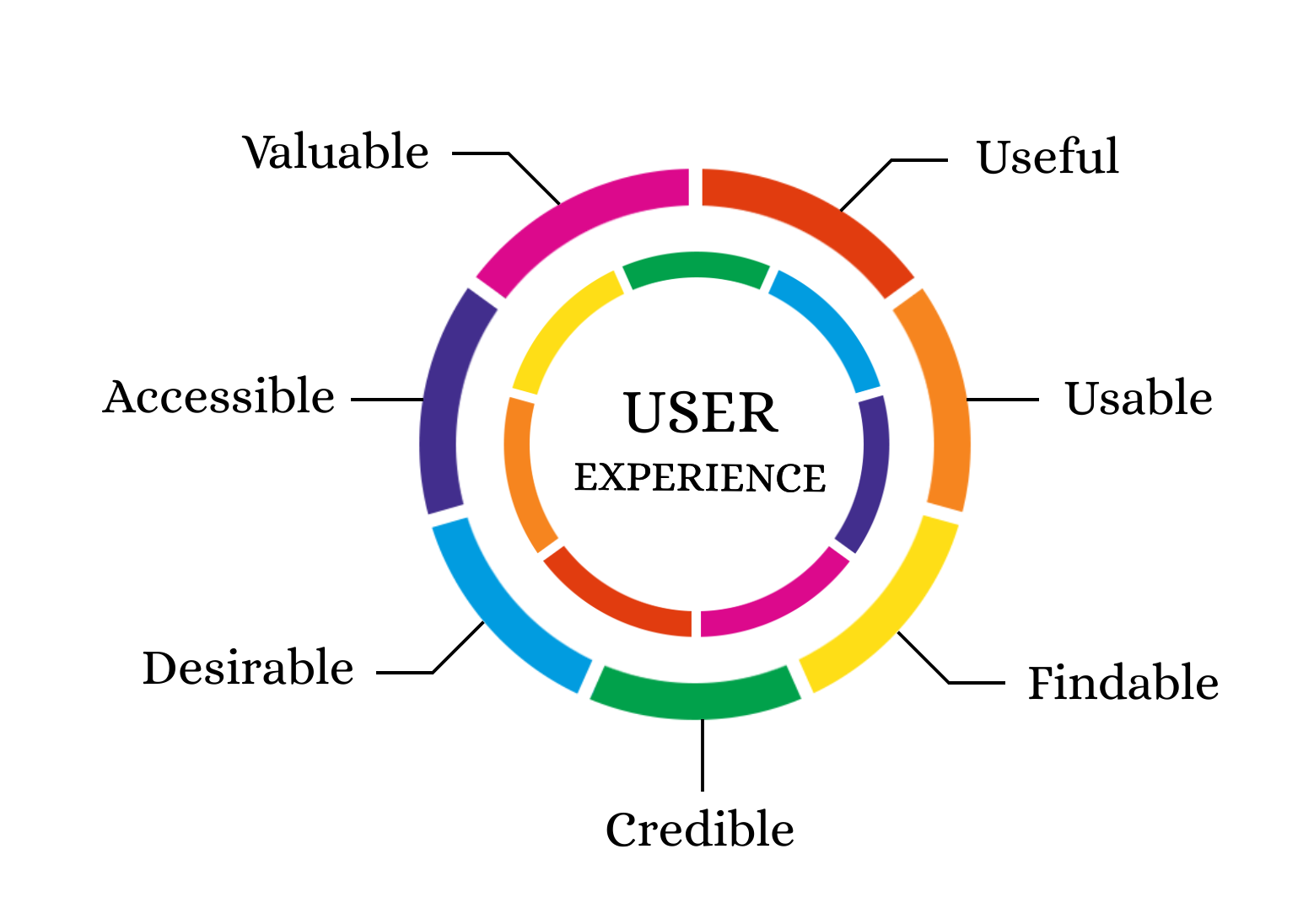
Why is UX Important?
UX is important for a client because it gives them easier access to your products. It is important for a business because happier clients are more likely to return to your business. According to this Inside Design post, “88% of online consumers are less likely to return to a site after a bad experience.”
Thinking specifically about your users’ experiences is also an initial step in helping as many users as possible succeed on your website. As the internet and computer technology have expanded, accessibility becomes easier to implement and more important than ever. Accessible UX will help everyone use your website better.
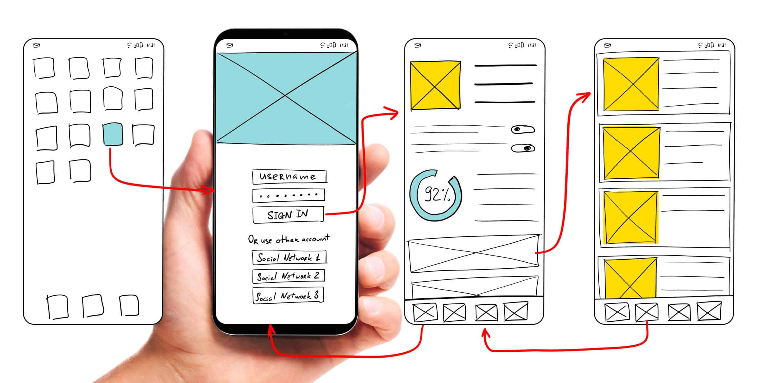
So how can my company find a way to use UX to the fullest?
The first step to any good user experience design is knowing and understanding your users. After you determine your users, or potential users, your most important task is researching how users interact with your website (or other products). What parts of your website make users love to visit the site and buy your products? What parts of your website are so challenging that users exit the page? How can you make the more challenging parts of your website better and easier for users? In your research about current users and website design, don’t forget to think about your content editors as well. How do your employees add content to the site? Does the backend need improvement as well?
After you have a good understanding of your current website’s strengths and weaknesses, you can move on to thinking about how to redesign your user experience and interface. Consistently refer back to your research to make sure that you are properly addressing user needs. Also, be sure to follow accessibility guidelines even if that did not come up in your specific research (Bluetext’s Aly Gumprich shares some great information about accessible design here!) While brand-new, complex designs might seem fun, it is important to make sure the website is functional and not just visually pleasing (although it should be both!).
Once you complete your redesign, make sure to test, test, test. The whole point of UX is to make sure your website is usable. Have as many people as possible test the website and provide feedback. As you get feedback, use it to make your website even more user-friendly.
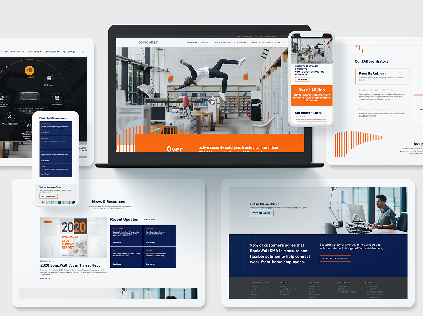
A great example of how to maximize innovative, clean design while still ensuring a seamless customer experience is Bluetext’s redesign of the SonicWall website. This redesign highlighted creative elements that matched SonicWall’s brand and mission, but Bluetext also made sure that the website streamlined product information to boost customer satisfaction and make researching and buying products easier. Bluetext also took care of all the details that make a user experience truly great–like fast website speed and an easy-to-use navigation system.
Whether you are updating a current website or completely redesigning, make sure you consider your user experience during every step of your design process to ensure the best site possible!
Need help? Contact Bluetext to get expert support in perfecting your user experience design.
When it comes to marketing, knowing your customer and their needs is crucial. To truly make an impact, ads need to be not only well-targeted but more importantly, meaningfully tailored to address specific customer needs at the right place and at the right time in their decision-making process. Effective advertising involves a keen awareness of the conversion funnel and customer considerations at every stage.
Ads have to first grab the attention of the target audience, but also communicate the customer value that the product or service delivers. The most impactful ads go beyond just stating customer benefits – they forge a connection between the customer and the brand that continues throughout the customer journey. Ideally, the ad captures enough attention to generate interest and sustains that interest to create longer-term loyalty. Meeting customers at the correct place and time while simultaneously delivering a meaningful and resonant message is a delicate balance. These nuances have propelled dynamic advertising automation to the forefront of advertising strategies across industries.

Anyone who regularly browses the internet is presumably familiar with personalized advertising. For example, if you decide to browse online for a new pair of sneakers, you likely are going to see ads for sneaker brands populating your browser soon after — it’s not a coincidence! Using automation to create “meaningful” ads goes a step beyond this kind of personalization. It culminates in advertising that acknowledges underlying customer values. For example, the sneaker ad and messaging might change based on whether the customer values a long-lasting and practical shoe or a sleek and fashionable one. How do we know these preferences? Well, maybe this customer has previously searched “highest rated sneakers” or “durable running sneakers”. This action signifies a preference for practicality, as opposed to a “sneaker trends 2021” search.
The automation of meaningful ads synthesizes customer behavior, customer preferences, and personal values to deliver a more effective and less bothersome version of the digital ads we’ve grown accustomed to seeing and often ignore. Advertising automation creates an experience that is helpful as well as enjoyable for the customer.
Conceptually, meaningful ads should be the answer many brands are looking for when trying to connect to their target customer, however, does it work in practice? According to this study, the implementation of meaningful ads caused purchase intent to increase by 15% and click-through rates to increase by 30%. So, not only does meaningful advertising forge stronger brand connections, it also yields tangible and quantifiable results. The same study also found that less than 6% of users had a negative reaction to the level of personalization used in these meaningful ads. This tells us that so long as the ad facilitates a helpful and positive brand experience, the customer will be happy to see their preferences reflected in your ads.
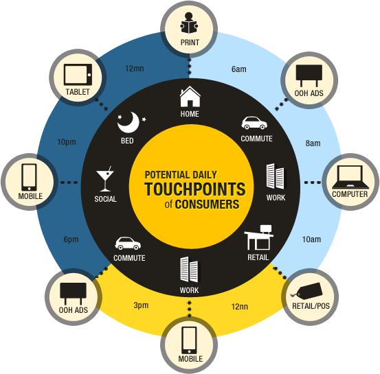
While this data is based on B2C customer behavior, the same mentality can and should be applied when considering B2B ad campaigns. In all cases, ads are speaking to human beings with the capacity to form emotional connections to brands, and the automation of meaningful ads allows that crucial process to occur at scale. All of these insights reinforce one consequential truth – knowing your customer, their needs, their values, and why that matters at each stage of the customer journey is the most important piece of the advertising puzzle. Automating meaningful ads puts that concept into practice and the results will speak for themselves.
Ready for quantifiable advertising success? The first step is analyzing your user personas and unique needs. A marketing analytics agency can help you identify these groups, and find critical insights into their online behaviors. A digital agency can then help turn those insights into actions, and place targeted advertisements that yield conversions.
Contact Bluetext if you’re interested in maximizing your advertising dollars towards real success.
This post is a collaborative effort with Ross Katz and our partners at CorrDyn, a data-driven consultancy that helps enable scalable growth. CorrDyn’s data expertise combined with Bluetext’s command of marketing provides an additional opportunity to segment and target in the B2G marketplace.
Where is the next great opportunity for your business? Well, government agencies for one. According to USAspending.gov, approximately five trillion dollars is being allocated to government agencies in Fiscal Year 2021, with over $1 trillion going to Health and Human Services alone. These agencies are growing, and their needs for hardware, software, and services are increasing along with them.
If you are already marketing to “the government,” you understand that winning government contracts is a long sales cycle. The opportunity-to-award process might be 90 days on average, but the lead-up to those 90 days is a critical period where the deal is won or lost. During those 90 days, all data gathering and relationship-building you have done over the previous 2-5 years comes to fruition. So what exactly sets the winning businesses apart? Memorability. Government contracting is a long game, built on endurance. After many years of B2G marketing experience, Bluetext is here to break down what gets your foot in the door and sustains success in business to government marketing.

Division of time between positioning your company for success with government agencies and bidding on specific contract awards.
Winning government contracts is not as simple as pointing your existing sales and marketing engine at a new target. “The government” is not a monolithic entity, and even “the agency” needs to be treated with more nuance: It is composed of dozens of sub-entities that make independent decisions based on independent decision criteria. In enterprise sales, winning over a single decision-maker can often close the deal. In government contracts, groups of stakeholders across the agency influence which business wins the contract, even if a single decision-maker completes the signs off. So instead of persuading a single stakeholder, B2G companies are tasked with winning over multiple groups, at multiple different stages and occasions. Hence, why brand endurance is critical.
Complicating matters further, traditional channels for establishing relationships with government agencies have been disrupted by the pandemic. Most in-person conferences and meetings will not occur this year, and some will remain online for the foreseeable future. Government stakeholders are more geographically distributed and digitally dependent than ever.

The tides have shifted. Once an industry that operated in an isolated siloe of its own rules, business seeking government contracts must adopt new, digital marketing initiatives to effectively position themselves.B2G companies should leverage the data-driven, digital marketing tools developed for B2C companies to segment and personalize their approach to agency stakeholders. B2G is too broad a term, and even business-to-agency (B2A) abstracts away from the customer understanding your company needs to have to win contracts consistently. A business-to-stakeholder (B2S) marketing approach is what your company needs to win consistently.
To succeed in data-driven B2S marketing, we explore:
- What success looks like in B2S
- The lifecycle of data-driven stakeholder cultivation
- The division of labor between internal departments for successful execution of that lifecycle.
Begin with the End Goal in Mind
Before we determine how to develop our marketing and sales pipeline, we need to define success. Agency leadership and stakeholders can frequently change, at a minimum, with every new government administration.
Therefore, we prioritize targets that will allow your company to evolve as agency priorities and decision-makers change. Your company must first make its impression as a strong, reputable industry player, whilst also remaining top of mind through consistent brand recognition and relevant thought leadership content. These are the characteristics of a successful B2A marketing approach:
- Your company is considered a thought leader in the space where the agency is procuring products and services.
- Government agency stakeholders regularly call your company to ask your opinion on upcoming agency initiatives, product and service specifications, RFPs, and contract awards. Occasionally, you are invited to co-craft the RFP in ways that position your company to win.
- You are aware of the potential for shifting priorities months before those shifts occur.
- Information on the priorities and interests of your agency stakeholders is filtering directly to your sales team, who pass relevant information to content creators, who are crafting bespoke campaigns that reach your contacts as related conversations occur internally at the agencies.
- Business development staff follow up on that content with meaningful conversations with key stakeholders. Those conversations assure your agency contacts that your company is focused on their individual and organizational priorities.
- You have both breadth and depth of relationships at the agency: deep relationships with key stakeholders and associations across the organization. A few people leaving the agency does not impact your company’s ability to retain the status and relationships described above.

Does your content dress the part? A sure sign of a reputable industry player is professionally branded collateral assets, such as Invictus
The Stakeholder Development Lifecycle
In order to accomplish those goals, start by treating the agency as a combination of individual stakeholders and stakeholder groups. Organize your company’s sales and marketing approach around the Stakeholder Development Lifecycle for B2A marketing, which includes:
- Acquiring Stakeholder Contacts: Start with breadth. In order for your company to establish deep relationships in an agency, you need to acquire as many points of contact as possible. Target ads based on geolocation to get in front of as many relevant stakeholders as possible. Get their title, contact information, and social media presence. Build from there.
- Monitoring Stakeholder Contacts: Capture social media posts, digital content interaction (with a privacy-first approach of course), conference attendance, and internal agency relationship information from contacts over time so that you can understand and target their needs, interests, and priorities.
- Segmenting Stakeholder Contacts: Based on a contact’s position in the organization and their activities and expressed perspectives, segment them into groups that should be targeted and messaged together consistently.
- Nurturing Stakeholder Contacts: Develop marketing, business development, and sales outreach that messages contacts according to their segment and the depth of their relationship with your company. Build a customer journey map that helps you identify what messages move contacts deeper into understanding your company’s value proposition and believing in it.
- Fostering Stakeholder Promoters: Identify your company’s highest value and strongest promoting contacts as the champions your company needs to win individual contract awards. Prioritize according to how naturally the contact aligns with your company’s offerings and how important the contact is to your company’s long-term relationship with the agency.

Stakeholder Development Lifecycle for B2A Marketing
Considering Stakeholder Segments
Within each agency, there are groups of stakeholders with priorities that will govern how well your company competes in a given contract award. The priorities of the agency can be efficiently stored within a single person’s head. But understanding the priorities of each stakeholder within each stakeholder group requires a data acquisition and data management approach that efficiently captures, aggregates, and generates insights about how your company is positioned with regard to that stakeholder group and the awards they oversee.
To understand how stakeholder priorities can differ, we use an example company, CyberSample, selling cybersecurity solutions to the Department of Transportation (DoT).
If CyberSample were to interface only with the DoT’s contract oversight and contract administration team, they would get a simplified and sanitized understanding of what governs the contract award. They would miss the critical details and priorities needed to assuage the concerns of each stakeholder group.
If they were to interface only with agency leadership or technology leadership, they would get a sense of broad organizational priorities and gain credibility from being introduced by internal power brokers. However, unless they leverage those introductions to dig deeper into specific needs surrounding an award, CyberSample’s team is unlikely to understand the tactical needs of technology implementers, users, or initiative leaders.
Example stakeholder groups and their corresponding priorities for CyberSample are provided in the figure below.

CyberSample stakeholder segments and their priorities. Segments and priorities should be validated by marketing interactions, public discussions, and business development and sales conversations.
Within each agency and with regard to each industry vertical selling into the agency, there will be a different set of stakeholder groups that influence decision-making. Your first task is to gather the intelligence needed to identify, segment, and target each stakeholder group. Taking a card from the B2C marketing playbook, it’s very similar to traditional customer personas, focus groups, data collection and tracking. Businesses that open their minds to alternative digital marketing and outreach methods are putting themselves miles ahead of the competition. This will allow you to move from a broad B2A approach to a more focused B2S methodology.
Executing on B2S Marketing with a Data-Driven Approach
For the approach described above to be successfully executed, each of your internal departments needs to coordinate. That coordination is built on a shared understanding of the agency landscape. A shared understanding requires a consistent and comprehensive approach to data collection, manipulation, and utilization.
Within the Contact Acquisition phase, your company’s Marketing and Content teams need to develop top-of-the-funnel landing pages, emails, webinars, white papers, and presentations that make agency contacts want to opt-in to a relationship with your company. Your Technology team needs to have the systems in place to capture customer interactions from your web properties and events, as well as to trigger intelligent outreach based on those interactions. Your Data team needs to clean and integrate the information captured from these interactions so that intelligence can filter back to Marketing, Content, Business Development, and Sales.
A summary of your company’s information needs is provided in the table below.

Once your company has acquired contacts and is actively monitoring activity, your Marketing, Content, and Business Development teams need to know what messages are resonating with agency stakeholders, and who are credible thought leaders through which to filter those messages. That provides the platform for new content development and for influencer marketing via the people who already have your stakeholders’ attention.
Those messages also enable the Business Development team to schedule meetings and start having conversations with stakeholders about their individual priorities and the interaction between those priorities and the organization at large. Your company can surface conflicts between agency groups to discover how to navigate potential barriers to contract awards.
Meanwhile, your Marketing team can deepen relationships with agency stakeholders through increasingly targeted messaging that moves those stakeholders closer to being promoters of your business. Your Product & Service team can ensure that your product or service value proposition is aligned with the priorities of each stakeholder group as you enter the RFP process. Your Business Development and Sales teams can focus on the individual needs of key stakeholders and customize your messaging to those stakeholders’ needs.
It is the job of your Data team to ensure that each department has the intelligence they need, when and where they need it, to effectively cultivate those relationships and respond with well-honed sales and marketing messages.
Below, we illustrate the division of labor between different departments throughout the Stakeholder Development Lifecycle.

Division of Labor Between Departments for the Stakeholder Development Lifecycle
With an improved strategic approach to B2A marketing, focusing directly on the stakeholders, and a commitment to building the infrastructure and processes to gather and interpret data about them, your company will be better positioned to win government contracts for many years to come. We understand that building the Stakeholder Development Lifecycle from the ground up may be daunting, which is why Bluetext and CorrDyn are partnering to help B2A companies build the systems, processes, and brand assets needed to accelerate your path to agency contract awards.

Centauri utilized Bluetext’s services to launch a new name, brand, and website following a merger. Their go-to-market strategy succeeded in winning new awards, company recruits, and even an acquisition from KBR. Check out how Bluetext has set up more brands for M&A success.
How Do I Get Started?
For the approach described above to be successfully executed, each of your internal departments needs to coordinate. That coordination is built on a shared understanding of the landscape within the agency. A shared understanding requires a consistent and comprehensive approach to data collection, manipulation, and utilization.
The starting point depends on the maturity of your company, specifically in the Data and Marketing Teams. For those with fully staffed teams that can execute, you can follow the plan outlined in this post.
The Data Team holds responsibility for timely, reliable access to data to allow the MarCom Team to execute and your other teams to act on the results. If you are still attempting to develop the overall strategy and buy-in from departmental or executive leadership, or if you don’t have the confidence in the systems in place, Bluetext and CorrDyn can help you move forward:
- Data Summit: This workshop is customized to your specific requirements, but is designed to bring together stakeholders from the relevant departments to educate them on the goals of the initiative, gather input from various departments about any concerns or limitations, and move toward a consensus regarding the strategic approach that will improve your targeted marketing efforts.
- Data & Systems Assessment: For those who have made the decision to move forward with improved data-driven marketing, it is critical to have confidence in your data systems (reliability, scalability, and accessibility), data governance (security and policies), and ROI (time to value and budget). Our assessment process addresses all of these aspects and culminates with the development and delivery of a Data Infrastructure and Capabilities Roadmap (DICR). The DICR includes the findings of the assessment, strategic vision, proposed infrastructure solution, and an implementation plan (typically phased).
With the organizational buy-in in place, and you have the data and reliable systems in place, but require assistance in execution in the marketing and content, working with industry-leading partners like Bluetext will allow you to start executing your strategy.
Bluetext brings the marketing and business development expertise needed to elevate your targeting and messaging. CorrDyn brings the data expertise needed to make your web, marketing, sales, and business development data work for you. Reach out to start the conversation about how we can position your company to succeed with government agency marketing and business development.
Have you ever navigated to a new website with a question, and spent too much time hunting for an answer? While companies spend large amounts of time developing and building out an information architecture for their user journeys, they may not always have the use case of each unique user in mind. To be fair, they aren’t mind readers! There are times when consumers may simply need to be guided to exactly what they’re looking for – and there is no better way to ensure that than with a chat experience integrated on your site.
As consumer behavior changes over time, it is important to be able to meet your user and provide a user experience that matches what they have become accustomed to. In the same way that it has become the norm to order a pizza online instead of calling into your neighborhood spot, the prevalence of 24/7 support and availability should be captured in the online experience.
With younger generations, in particular, an instant messaging option is a preferred way to communicate, and if companies can make it easier for their customers to get what they are looking for through a chatbot, this will pay off. A recent study found that up to 68% of respondents indicated that they are more likely to use a business that offers convenient communications if they have the option to choose where to make a purchase.

A seamless integration for a chat experience where a bot or a real person responds in real-time is critical. It can be extremely frustrating when users are waiting around for something that should warrant a quick response. Ever been stuck on the phone waiting for hours to get past automated messaging machines to ask a question? It’s incredibly frustrating and more often than not people get impatient and hang up. Online inquiries are no different, if you leave a user aimlessly browsing on their own and unsuccessful in finding their answer they will get impatient and bounce from your site. Installing an automated chatbot gives users a clear destination for their questions, and avoids the dead-end drop-off. While chatbots may not be real people, it gives users the illusion of a more personal experience and grows brand trust that your company is willing to solve their problems. Convenience is key in today’s society, and online browsing is no exception.

Online chatbots sound great in theory but can seem intimidating to execute. However, with the assistance of a website design and development agency, such as Bluetext, you can integrate a chat service into your current or new website design. The advantage of working with a full-service digital marketing agency is that they can analyze your search traffic patterns, help identify some common user journeys and pain points, but also style and develop a chatbot fit to your brand identity. This creates an even more seamless user experience on your site because the chatbot integrates and matches the current website, almost like a well-dressed store employee ready and able to answer any questions.
Is it time for your website to step up its support game? Consult Bluetext to find out what kind of chatbot or user experience modifications can improve your website.
Ever heard the phrase “if you’re not first you’re last”? A little extreme, but not untrue when it comes to search results. Businesses of every industry are scrambling to refine their content strategy in hopes of ranking within the first page of search results for relevant searches. However, the advice for how to do so is muddled by different strategies and outdated information. Keywords. Inbound links. Outbound links. Content velocity. Imagery alt text. Which one is it? Well, the simplest answer is all of the above…plus more. The truth is Google search algorithms are not completely transparent. If you feel like you’ve been shooting in the dark for a stronger search ranking, you’re not alone. Thankfully, Google does hint to what goes into its search algorithms and what search crawlers are prioritizing in rankings. And the latest news from the tech giant is the consideration of page experience.
Beginning mid-June, Google will be factoring Page Experience metrics into how they rank websites on the search engine’s results page. Is your website ready for this update? Before you panic over years of perfecting your organic search and content strategy, let’s break down exactly what Google means by “Page Experience”.
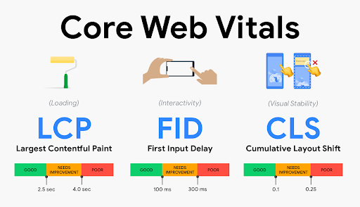
Despite the subjective phrase, Page Experience is actually dependent on measurable technical factors that affect how a website visitor interacts with your content. The latest update will concentrate on Web Core Vitals, but also include the following UX considerations, such as:
- Mobile-friendliness
- Safe-browsing
- HTTPS-security
- Intrusive interstitial guidelines
Breaking Down Core Vitals:
- Largest Contentful Paint: The time it takes for the main content (defined as “above the fold”, first viewport or hero zone) of a page to fully load. Websites should strive for a LCP measurement of 2.5 seconds or faster.
- First Input Delay: Reaction time of user’s first action (click, hover, tap). This measures the time it takes for a page to become fully interactive. An ideal measurement is less than 100 ms for 75% of pages.
- Cumulative Layout Shift: Time for all content on page to load and position correctly. This refers to the amount of unexpected layout shift of visual page content. For example, ever visiting a web page that loads, then jerks and shifts a couple seconds later? It’s a frustrating user experience, especially if you have begun reading or interacting with content. The ideal measurement for CLS is less than 0.1 seconds for 75% of pages.
75 and Sunny Rule
Each of these benchmarks have defined benchmarks that Google recommends for 75% of pages on a website. This is what Bluetext refers to as the 75 and Sunny Rule. Especially with an older website build, it may not be achievable to reach these metrics for every page. However, if you prioritize pages by traffic level or content hierarchy, you can isolate the 75% highest value pages that should reach these measures. With these prioritized pages in mind, site speed and page experience optimization can be made by website developers to meet Google’s recommended benchmarks.
There is even rumor of visual tags being implemented on Google search results to show which websites are meeting these Core Vital criteria. It’s likely that in the near future there will be no hiding whether or not your site meets these benchmarks.
How often do I need to check my core vitals?
Well, how often do you visit the doctor? Just like your health, your website’s Page Experience should be evaluated on a regular basis. You should be checking the pulse of your website every 3-6 months to ensure everything is running smoothly and not getting dinged by Google search crawlers. There are a number of site speed and page experience tools available, each providing varying levels of detail. Google PageSpeed Insights will most prominently display core vitals with lab data (measured by single, predefined device, location, and internet connection.), field data (aggregate measure of real time user experience), diagnostics and recommended solutions. However, use caution. This tool is not known for consistent accuracy. Most experienced website development agencies will cross check site performance across multiple tests, such as: Google Search Console, Lighthouse and GTMetrix.com. Consulting a website development agency offers many advantages in optimizing your website, as they are best equipped to diagnose a problem, address and resolve an issue and conduct regular maintenance to continue optimizations.
If you’ve been ignoring your site’s technical health, there is no better time than now to ramp up your site speed and site experience to give you a competitor an edge on the search engine results page. SEO is a marathon, not a sprint. A strong SEO strategy involves a multi-faceted approach to cover the bases across multiple fronts. Keyword strategy, site speed, page experience, mobile compatibility, and more still need to be considered to reach or maintain a top search ranking. As a digital marketing agency that specializes in website development and SEO content strategy, Bluetext understands the importance of page experience in both initial site build and ongoing maintenance.
Ready to be proactive and take the pulse of your website core vitals? Contact Bluetext for a website assessment and learn how we can optimize your site to meet Google’s – and your user’s – expectations.
