It’s been an exciting summer here at Bluetext, and to top it all off, our Chief Creative Officer Jason Siegel is speaking at BizBash’s Elevate DC 2016 on August 3rd about his ideas and insights on the many cool things happening in our office and the industry in general. Jason will head to the Reagan Center here in Washington on August 3rd to participate in this one-day conference for meeting and event professionals. Filled with engaging speakers from a variety of industries, Elevate DC promises to be a great time, and Bluetext is honored to participate.
Jason will speak about “The New Rules of Social Media and Event Marketing”, sharing the way that social media engagement and other innovative marketing strategies can help businesses drive interest and registration for events. Following up on Bluetext’s recent virtual reality campaign for Varonis, Jason will discuss how to seamlessly integrate VR into an event marketing strategy. He will also be exploring how to use a three-part, campaign-style approach to maximizing event reach and creating urgency to register.
To see Jason’s presentation and the many other great speakers coming to Elevate DC this year, you can register here. And to learn more about how Bluetext is on the cutting of VR, reach out today:

As most anybody reading this post already knows, the marketing challenges faced by B2B organizations in an increasingly content driven social landscape, require vastly different social marketing strategies and technologies than B2C companies. The more B2B marketers invest time, money and resources in the creation and distribution of premium content, the more they are under pressure to deliver social media ROI. And as most social platforms continue to change the rules of engagement, I thought it might be helpful to share a few insights on what B2B marketers can control to improve the effectiveness of their social presence to drive greater levels of awareness, engagement and demand.
Employee Activation
Because marketing departments in mid-market and enterprise level organizations are often outnumbered by their sales department brethren by at least 10 to 1 — they are looking for new and innovative ways to motivate sales organizations and employees alike to start being active social advocates in their own brand’s social ecosystem.
The good news is that new social marketing technologies enable corporate marketing to push messages down to individual reps who can then share the social content, become thought leaders and help build brand awareness in places like LinkedIn where they can now expose their entire network to new and relevant content to grow pipeline – their pipeline – and once they see that start to work for them they will become your biggest advocates.
Social Advertising
As social networks continue to manipulate their hidden algorithms to downgrade organic promotional posts at the same time they upgrade sponsored content – paid social promotion is becoming a growing and necessary channel for brands who want to stay visible and maintain their social reach.
Paid social media offers a wide range of valuable targeting options, allowing B2B marketers to hyper target an audience with rich and contextually relevant content across a wide range of emerging social platforms. However, many of these platforms have self-service interfaces available to launch paid social ads that might appear easy to use, but are often not leveraged or used properly by the brand owner.
For this reason, we recommend investing considerable time testing and analyzing social ad performance to stay in control of ROI. And while we recommend to our clients that they continue to maintain their paid search budget, we are seeing more and more of that being directed towards the increasing demand for content development that’s necessary to feed the social marketing beast – paid or otherwise.
Social Mobilization
Most B2B marketers use a multichannel social content distribution strategy, and therefore spend more than half their annual marketing budget on the development and production of content. The problem we are seeing is that all of that rich, premium content is increasingly being consumed on mobile devices – yet not being fully optimized for the mobile user.
B2B social engagement is now almost entirely mobile – with more than 75% of Facebook, Twitter and LinkedIn users accessing the social network via mobile – brands have the opportunity to leverage social channels quickly get their messages out to their customers and prospects.
The key to leveraging mobile for B2B social marketing isn’t just in it being presentable in a mobile accessible format – in needs to be easily sharable with share buttons and direct links that connect users to your website and other online properties to drive engagement, demand and measurable ROI.

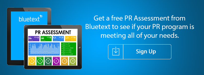
PR is not a sinking ship. It’s still an essential element in your marketing mix, especially in the crowded real estate market. But is your PR program delivering the results you need to meet your revenue goals?
Let Bluetext do a free PR assessment to see if:
- Your outreach is delivering the results you need
- You are gaining ground in the market
- You’re getting the coverage that will drive your growth
Our Share of Voice assessment can let you know if you are hitting on all cylinders, or if your program needs a shot of high-test to get it in gear.
Sign up for a FREE PR Assessment here!
Sometimes it seems as if marketers are speaking their own language when you try to engage them in a Virtual Reality project to support your marketing, branding, or communications goals. From HMD to FOV to Judder, Virtual Reality jargon can be confusing. Whether a Google Cardboard project for your campaign or a high-end Oculus Rift project for a special event, it requires a solid collection of new terminology specific to VR technology. To help demystify some of the most commonly used Virtual Reality terminology so you can have a savvy discussion with your in-house engineers, agency folks or freelance consultants, we’ve put together this VR glossary.

Are you feeling out of touch with the latest cybersecurity marketing jargon and worried that your boss might catch on? In the digital age, cybersecurity marketers, companies and thought leaders are constantly introducing new ideas, solutions and technologies that can be impossible to keep up with. From the top down, companies need to be familiar with critical concepts like Sandboxing, Phishing, Patching and Malware, not only so they can keep up with the evolving conversation, but so they can adapt to protect themselves and their customers from cyber threats and breaches. To ensure you’re up to speed with latest and greatest in the world of cybersecurity marketing, we’ve put together a comprehensive Cybersecurity Lingo glossary. Don’t get left out of the conversation.

Do you have the feeling you’re falling out of touch with the latest technology marketing jargon and worried that your co-workers and bosses might catch on? In today’s ever-changing digital marketing industry, professional marketers, companies and thought leaders are constantly introducing new ideas, concepts and technologies, changing the way companies approach digital marketing. Effective web design is becoming increasingly crucial and concepts such as Adaptive vs. Responsive Response, CSS, AJAX and Javascript are becoming more critical to understand. To ensure you’re up to speed with latest and greatest in the world of technology marketing, we’ve created a Technology Marketing Lingo glossary. Make sure you’re not left out of the conversation.

With roughly one month until Star Wars: The Force Awakens hits the theaters, I’ve decided to channel my inner Obi Wan Kenobi for the latest edition of “these are not the softball questions your CEO was looking for.”
The CEO in question here is Jerry Strizke, head of outdoor gear and clothing store REI, who became just the latest executive to fall victim to Reddit’s Ask Me Anything (AMA) series. The Reddit AMAs are pretty much as the name implies – actors, politicians, executives, athletes and everyday individuals – can try to set up a Q&A with Reddit members, with the only requirement being that members can ask any question they want (within guidelines of course). The topics range from an actor’s movie career to a guy driving furniture down to Fort Worth, Texas, and as you might guess, the topic and guest strongly correlate with the number of Redditors who join.
REI CEO Jerry Strizke was probably feeling pretty confident ahead of his November 10th AMA. After all, he had received mostly widespread plaudits for the decision to close REI on Black Friday and still pay employees despite what would be a negative hit on revenues. Riding that wave of good publicity, the decision was made to pull the trigger on the Reddit AMA, despite the long list of others who exited the series bloodied, battered and beaten (see: Woody Harrelson, Morgan Freeman, Ann Coulter who, like Admiral Ackbar, realized too late that, “it’s a trap!”)
Sure enough, the bio posted for Strizke to kickoff the Reddit AMA oozed with confidence:
Hi Reddit. I’m Jerry Strizke, CEO of REI. You might have heard about us recently when we announced that we would be closing all of our stores on Black Friday this year. We’re paying our 12,000 employees to take the day off and we’re encouraging them to opt out of the Black Friday madness and spend the day outdoors with loved ones. I have my team here helping me answer questions, so go easy on me. I’m new to Reddit and have already learned the hard way that /r/Trees isn’t about the great outdoors. Ask me anything!
Ask they did, and while some certainly addressed the store closing, the most upvoted comment was for an employee who painted a negative picture of working for REI and that if you don’t sell enough memberships, it’s bad news as that is the overwhelming metric that matters. That commenter was far from the only one to rail about working conditions.
Reddit AMAs, Twitter chats and other free-flowing forums that allow executives to interact directly with a large number of people hold appeal for numerous reasons, ranging from a desire to make the CEO seem more accessible to a genuine desire to shift from one-way communications to a two-way dialogue. For any business considering a CEO Twitter Chat, Reddit AMA or similar forum, there are a handful of strategies to consider:
- Reaching an unreachable audience – The controversial guests who appeared on The Jon Stewart Show who succeeded are the ones who fully understood what they were getting into. The ones who knew they were going to take their hits, could be good-natured about it, and still effectively get their messages across. There may be times when the audience you are trying to reach is difficult to access via traditional public relations, marketing, advertising and social media. If the target audience is critical to your business as a CEO or career success as an actor, then a case can be made to evaluate these higher risk opportunities.
- Weigh risks vs. rewards – What is the goal of a Reddit AMA, or Twitter chat? They must be clearly defined, and the marketing/social team must put significant efforts into preparation and execution – without making it look like an overly rehearsed, staged event. Think carefully about what the best-case scenario payoff is, relative to the viral risks of hosting a Twitter chat or AMA gone wrong.
- Be wary of CEO hubris – Even if you lay out the challenges of a series such as AMA, many CEOs will feel that it won’t happen to them. That they can be funny and witty and disarm even the most hostile questions. If you view these types of opportunities as something to “win” or “lose”, you will lose. The goal should be to communicate desired messages and understand that not everyone will respond favorably.
- You can’t cherry pick questions – Some of the most universally panned AMAs and Twitter chats have as much about what the interviewee didn’t say as it was about what they said. Ignoring tough questions or failing to answer many questions at all can draw even more scorn then giving bad answers, because it will be apparent the CEO and handlers are trying to tightly control the session and use it purely as a marketing vehicle.

“If a tree falls in a forest and no one is around to hear it, does it make a sound?” The age old philosophical question that actually has a lot of applicability to modern marketing. The truth is that the best marketing campaign with the perfect message will fall flat if there is not an audience of people to see it. data mining At Bluetext, our go to market can be divided into three areas that must work in concert to be successful:
- Brand Strategy, which focuses on creating the right message and brand positioning;
- Brand Presentation, which focuses on taking that message and making it visual; and
- Brand Delivery, which focuses on taking that strongly designed visual message and delivering it out into the market via multiple channels.
The dirty little secret is that so many companies focus on their strategy and their presentation but then fail to really attack the proper channels for the delivery of their message. So here are four things you should be asking yourselves or your marketing agency to ensure that your message is delivered to the right audiences in order to properly achieve your goals:
- Do you have a database and are you leveraging it? There are many modern techniques for properly leveraging your corporate database to drive awareness and interest in your products or services beyond sending out HTML email blasts. Just this week Google announced a new product called Customer Match that will let advertisers upload lists of emails and match them to signed-in Google users on Gmail, Search and YouTube. This same functionality is available inside of Facebook for very specific targeting.
- What conversations are you a part of or could you be a part of? What assets (people) do you have that we could insert into conversations to better position your company as thought leaders to drive thought provoking agendas? Have you created an editorial calendar that you review each week and track against KPIs?
- Are you putting any budget to paid media? If you are looking to drive leads as opposed to straight awareness then taking a portion of the budget and putting it toward paid channels (for sponsored content, advertorial, infographics, etc.) is critical for success. Think about going programmatic as well to maximize every dollar. My partner Rick Silipigni wrote a blog post about this approach recently – check it out here – https://bluetext.com/planning-a-digital-media-buy-get-with-the-programmatic/
- Are you thinking outside the box? Every company has a handful of activities that they take on from a marketing standpoint every quarter, but only the most successful companies carve out budget to launch innovative campaigns to drive differentiation in the market. Every quarter you should be asking your team and your agency for ideas that would be considered innovative and outside the box. Check out this amazing pop up book my team just created for Workday to help them tell their story in a unique way…http://www.workday.com/payroll_evolution.php
Last week some very interesting data came out of Parse.ly, an analytics firm which collects data for 400 digital publishers including Conde Nast, Reuters, Mashable, and The Atlantic. The headline is that, as of June 2015, Facebook is driving more traffic to websites than Google’s sites including google.com and Google News.
HUH you ask? How is that possible? Google is the king of referral traffic, right? It is all about search engine optimization.
Not so fast. The data points to some recent shifts in how Facebook focuses on driving content to its site, and validates the fact that this is not some random stat that will course correct. The trend line has actually been going this way since 2012.
So as a marketer, what are you to do? Well, don’t ring the alarm bells too quickly. Search engine optimization is still critical for success and needs to be a big part of your marketing mix. But don’t ignore Facebook and write it off as a nice place for consumers to share pictures with friends. That is an uneducated and naïve viewpoint and one that is clearly not valid based on these numbers.
I think it is safe to say that Facebook is just getting started, and optimizing your content to play off the Facebook algorithms, as much as that is possible, is a very smart approach. Some of the concepts that we continuously share with clients include:
- Make your Content snackable and consumable
- Encourage social sharing
- Create conversation and dialogue
- Be unique, relevant, or different, but never be boring
How is your organization optimizing social content? Are you seeing an uptick in conversations due to your efforts or are you just scratching the surface?