It’s no secret that a first-class mobile app experience is essential for any brand seeking to build customer loyalty and engagement. The mobile app user experience needs to recognize not only the way audiences ingest information as they consider their options, but also how they interact with the app itself. In a previous post we offered a number of top tips for delivering the best mobile app experience. In this post we offer additional top tips to keep your customers engaged on their mobile devices.
Keep the Design Simple. A customer’s attention span is a precious resource that is often in short supply. A cluttered user-interface that gives numerous options for information or services may check all the boxes for the brand, but it runs the risk of overloading the user with too much information. Every added button, text, image or call-to-action complicates the screen and challenges the focus they need on the essential content you want them to see.
Design with the Platform in Mind. Trying to shoe-horn in features and elements from all of the various operating systems in order to mimic all of their specific behaviors brings us back to clutter. Stick to features native to the platform you are building in so that users know how to navigate and use the native components they are already familiar with.
Design for Channel-Switching. Most users don’t complete an engagement in a single session, so design for the entire process, not just a single setting. That means a seamless experience across devices that allows users to switch channels as needed to meet the way they interact with the app. A useful cross-device experience will enable customers to engage at their own pace.
Animation is Good, as Long as it is subtle. It’s the little things on the screen that give a warm feeling about your brand, so feel free to leverage that emotional connection. Small details such as animated feedback, in-app sounds, and even animated micro-interactions imbed a personality to your app, and go a long way towards building loyalty. Just keep it subtle.
Respect the Small Screen. Trying to fit a lot of information into a mobile user-interface is challenging at best. Don’t make the mistake of trying to cram too much content into the screen. It has to be readable. At least 11-point font is highly recommended. Increase the line height or spacing if that helps to get the content presented most effectively. A heaping portion of white space makes the screen inviting and uncluttered.
Testing is Your Friend. Most designers have large monitors on which they design. But something designed on a big screen may not work as well when shrunk down to a mobile app. Engage real users for their feedback, and make sure you have a cross-selection on a variety of mobile devices. Every design is bound to have an unseen flaw until it’s in the user’s hands.
Need help designing a mobile app with a great user experience? Bluetext can help.
 Successful brands have learned that if you want to engage with your customers and earn their loyalty, you need to provide a solid mobile app user experience on their handheld devices as much as on their larger screens. While many organizations understand that they need to design for mobile, they often ignore some of the most important elements in delivering the type of experience that meets their customer’s user needs in their apps. Mobile apps must be both useful and intuitive. No one wants to take the time to navigate a confusing set of commands, or invest the time and effort to learn them if it’s not simple.
With that in mind, here are our top tips for designing a mobile app experience that will keep your customers engaged:
First impressions are everything. Just like in real life, what a customer sees first can often color the entire experience. Getting that first interaction to be smooth and easy is key. Keep on-boarding for the mobile app light and simple, giving users just what they need to get started without loading them down until they get comfortable with the app.
Interruption is a fact of life. Given all of the digital and real distractions we constantly face, it is unrealistic to think that every app experience will be in a single session. More likely, users will be shifting from social media to payments to a variety of other applications while using yours. We recommend breaking up larger tasks into a series of smaller ones so the user isn’t overloaded. Try to keep it to one primary action per screen, and design for interruption so that a user can easily save and return later.
Keep the navigation intuitive. Try to use functions that are similar to other apps and therefore familiar to users. Make the flow feel natural, as if there were a guide helping the user to explore different options. It’s tempting to add all sorts of features and buttons, but if no one can find it, it’s not particularly helpful.
Keep it fat-finger friendly. When designing for mobile, size matters. Smaller touch target are difficult to hit cleanly, and often hard to see for anyone with eyesight issues. The minimum size should be 7 to 10 mm so they can readily be activated by fingers of all sizes. This allows fingers to fit inside the target, and keeps the edges in view when tapping.
Design needs to go hand-in-hand. Remember that users often access their device with a single hand, and operate with the fingers wrapped around the device. Let hand and finger placement drive the placement of controls. Avoid making any touch too much of a reach, especially for those with smaller hands.
Need help with your mobile app? Find out how Bluetext can help!
My colleagues and I at Bluetext have spent a fair amount of time developing brand and positioning strategies for dozens of new, disruptive and innovative brands…and more often than not are tasked with creating a new name for the company, the products or services they deliver, or both.
With 99.9 percent of the commonly-used words in the dictionary already taken among the close to 300 million registered domains from more than 125 million companies worldwide, how many great names could possibly be left?
We are currently in the process of branding and naming a highly disruptive technology product that is almost certain to quickly become one of the most visible B2B product brands in the US. We thought this might be a good time to define the five critical tenets of coming up with a great new name:
1. The most important aspect of a brand or product’s name is a crystallized vision statement and its supporting proof points. The name should deliver against your core objective for the business and central vision for the brand. Perhaps the most important question you need to answer is whether the brand should be company-focused or product-centric. In most cases it’s the former – but many well-known brands – like RIM’s Blackberry – have successfully incorporated a strategy that leads with the latter.
2. Before you begin the name-storming process, agree on what you want the attitude or voice of the brand to be – what emotion, feeling or idea do you want it to evoke when you see and hear it? Starbucks Chairman and CEO Howard Schultz summed it up best by saying, “A great brand raises the bar – it adds a greater sense of purpose to the experience, whether it’s the challenge to do your best in sports and fitness, or the affirmation that the cup of coffee you’re drinking really matters.”
3. Once you establish your vision, there is a set of ten key initial criteria that any name being considered must meet:
- Is it easy to remember?
- Is it easy to understand?
- Is it easy to pronounce?
- Is it easy to spell?
- Does it sound good when spoken?
- Does it look good when written?
- Is it unique?
- Is it trademarked?
- Is the domain name available?
- Are there any negative connotations with it?
4. Consider the five primary approaches to naming to determine which may best represent your central vision for the brand in a distinct and powerful way:
- Functional or Descriptive (Facebook, Instagram, UnderArmor )
- Derived from Color, Number, Shape or Word Root (Accenture, RedBull, Starbucks)
- Experiential based on Human Processes (Discover, United, Visa)
- Abstract or Evocative (Apple, Uber, Virgin)
- Invented (Google, Skype, Xfinity)
5. Quantity and Diversity Equals Quality – Naming is a matter of satisfying many competing criteria – and while we have seen cases where the first name our team comes up with ends up being the final one chosen – the chances of having a name just pop into your head that meets all of them is practically impossible. The most effective way to come up with a name is to think of lots of different ideas, carefully screen and choose, and repeat. One method that’s proven effective is having all names under consideration sorted into an A and B list and reconciling it every time a new one is introduced. It is interesting to see names held initially in high favor lose a little bit of their luster with each review, while others move up the ladder.
Once a name is chosen – it will be forever attached to the brand or product it is developed for – so continuous review is critical to ensure it will stand the test of time.
Need help with a branding or marketing challenge? Lets talk!
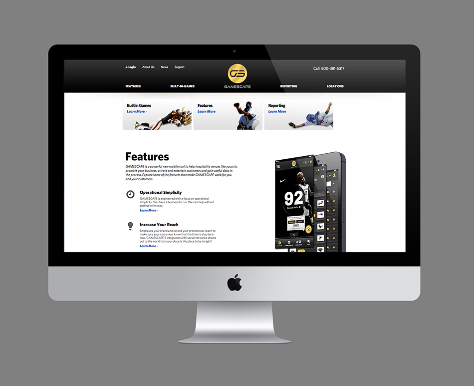
Gamescape, the brainchild of two die-hard fantasy sports enthusiasts and marketing entrepreneurs, came to Bluetext with a clear mission: create a gamification experience leveraging daily fantasy sports that drives customer loyalty as a brandable solution for bars, restaurants and other venues nationwide.
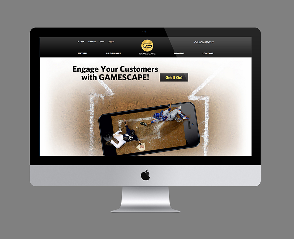
Bluetext took this concept and, with the Gamescape team, and did every aspect of their branding, marketing, and platform design and development.
The first step was to develop a killer brand for Gamescape . Inspired by the gold coin patrons earn when making the correct fantasy sports selection while enjoying themselves at the venue. Here is a preview of our internal logo progression.
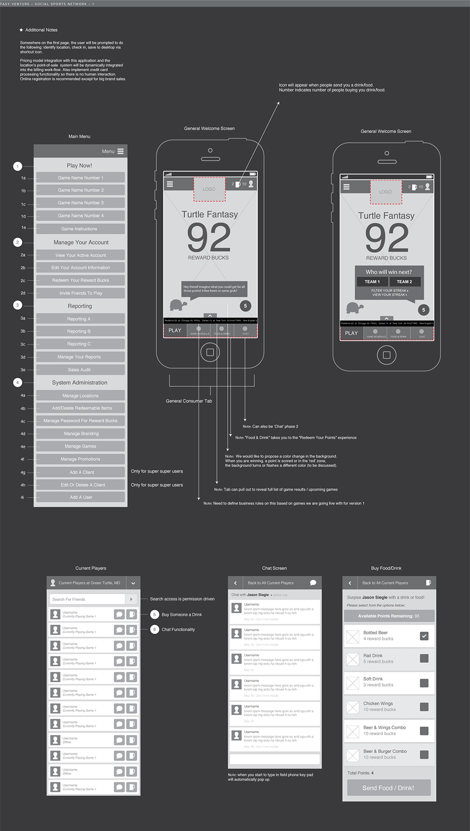
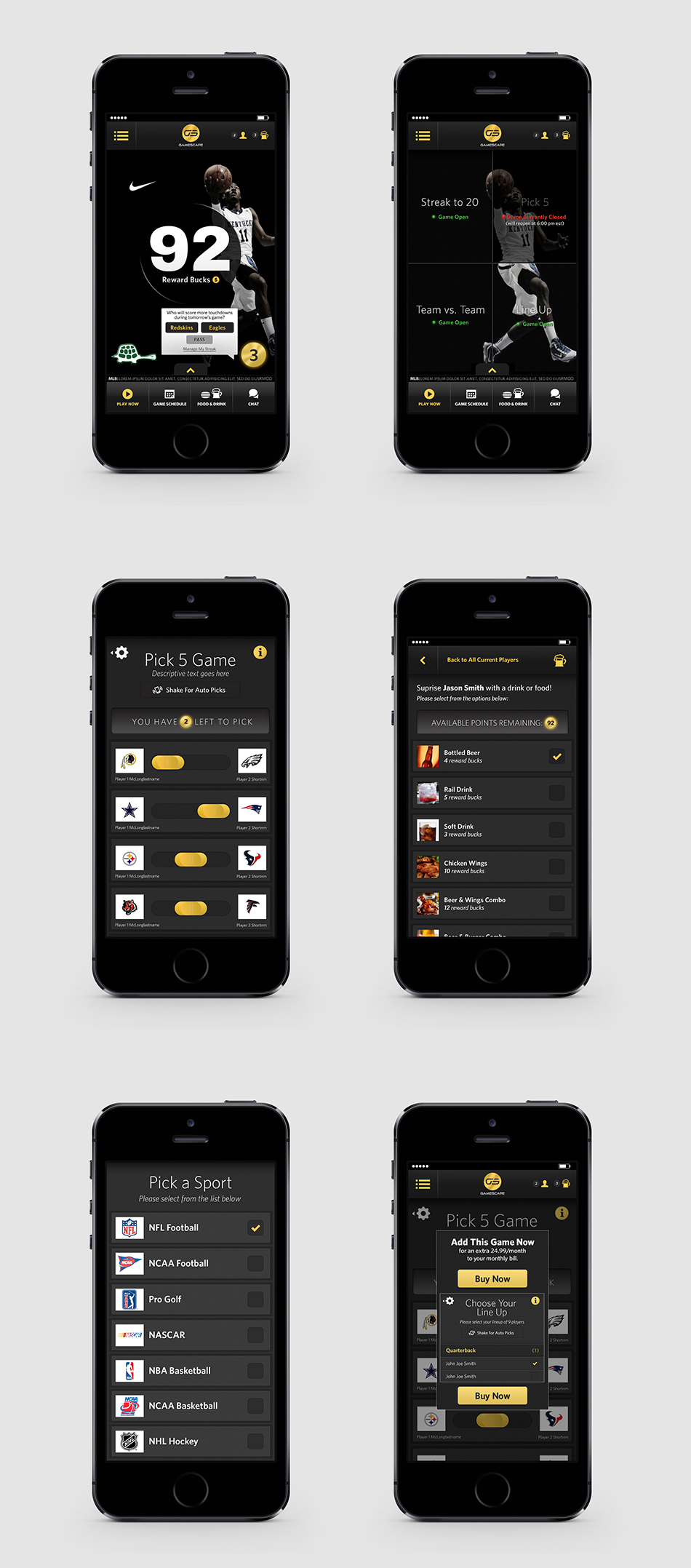
Bluetext started the interaction design process by performing a technical assessment of requirements gathering. We needed to create a sophisticated application that included a robust sports fantasy system , a messaging system for patrons to interact together, and profile creation with location-based geo-fencing. On top of all of that the new platform had to be visually striking, extremely intuitive and easy-to-use.
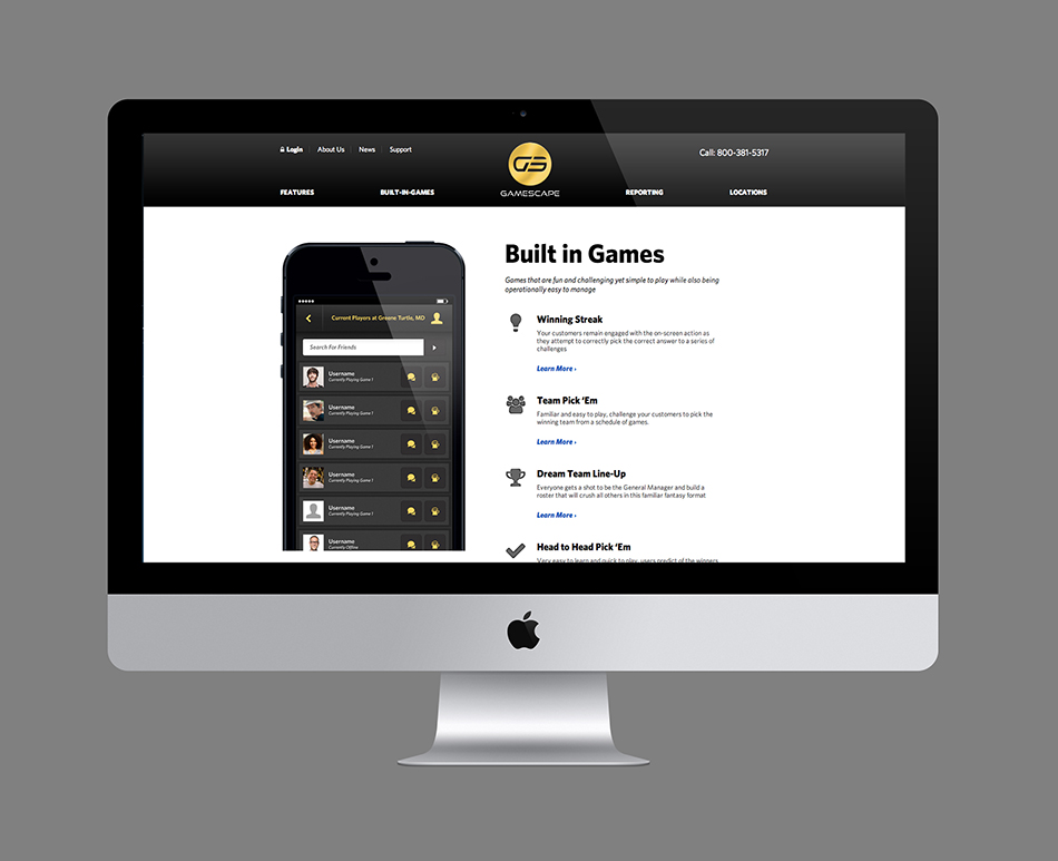
From loyalty-building rewards points to new ways to communicate with your customers, GAMESCAPE offers an impressive suite of features focused on increasing the opportunities to interact and connect with your guests while offering them new entertainment options. GAMESCAPE’s geofencing technology requires players to be in your establishment in order to join a game.
