Looking to jazz up your website? One of the hottest website design trends in recent years has been on page animation. But like any design decision, there are pros and cons. Bluetext top website user experience designers weigh in on the debate on how far you should go in injecting motion to your website.
To animate or not to animate?
Animation enthusiasts recommend adding motion to create a dynamic and flowing user experience. Not to mention, animation has been a major web design trend over the last few years, meaning your visitors are accustomed to seeing it on competitor sites and therefore expect a comparable experience on your pages. The opponents, or static supporters, on the other hand, will argue that animation is distracting and can seem unprofessional in certain industries. For example, B2B has traditionally been a strictly static and straightforward approach to website design, leaving the flashy frills to more consumer-based websites. However, having an interactive animated website could be a valuable point of differentiation. So what do the experts recommend?
Truth be told, animation can be a wonderful addition to a website’s aesthetic and functionality, but only when executed in the right way to fit your broader business goals. Careless integration of animations into your web design scheme can be a real eyesore and have negative impacts on site speed, SEO, and user experience. Weighing these pros and cons carefully, Bluetext website user experience designers recommend subtle animation and keeping in mind the following considerations.
Not all animations were made equal! Motion design spans a wide breadth of categories. Bluetext recommends the following types for a professional, yet modern feel to your site.
1. Loading Animations
Loading animations can be used as an effective way to engage users from the get-go. Since it only takes a user 3 seconds to abandon a page if the content doesn’t load, the use of loading animations offers content right from the start. Animated typography, countdowns, or a simple animated logo allow users to have fun watching while waiting for the site to load.
2. Micro-Interactions
Taking a cue from the mega “micro” trend sweeping the digital marketing industry (microtargeting and micro-moments sound familiar?)This effect is one of the hottest trends of website design. These are used to make small interactions (such as clicking a button) quick and clear for the user. Hover effects are one of the most well-known examples of micro-interactions. Certain page elements, such as navigation buttons, CTAs, or linked images, are the ideal canvas for mico animations.
3. Page Transitions
Subtle animation can be purposefully to ease the navigation from one component to another and between pages. Arrows, background scrolling, load bars, or any component that offers directionality to the user are great opportunities to use this effect.
4. Parallax Scrolling
Using full-width imagery, this effect takes the user on a cohesive journey as they move down the page. By definition, the background moves at a different speed to the foreground elements, creating a visually stunning effect on either full-page backgrounds and strips. While this is sure to give a wow-factor to your main website, it’s important to remember this effect is not available on mobile devices.
5. Decorative Delights
While these effects do not offer any functional benefits, they can be used to add more interest to the page. While it might be difficult to imagine serious B2B websites using these layouts, this might be exactly what your site needs to spice up drier content sections. Especially when placed near elements intended to draw attention, such as new messages, lightboxes, key CTA buttons, this turns aesthetic pop into actionable results.
With so many options for website motion, it can be tempting to want to do it all. However, top website designers have one golden rule: moderation is key. This rule doesn’t just apply to junk food, overdosing your site on fun animations can overwhelm the viewer and distract from the most important aspect: the content! Use animation sparingly and strategically. Before you fall in love with a beautiful design, consider the practicality. There are instances when animation could actually detract from your site, for example, if it hinders a user’s ability to read important messages or complete a conversion. For instance, you shouldn’t add animation to text paragraphs because it will make reading them much harder. You also would not want to add animations to fields where visitors enter their own content (such as a contact form or comments), because it would distract them from completing the task. When considering embedding motion effect, pressure test your decision against these questions:
- Does the site’s movement guide the viewer when to scroll and where to click?
- Does the animation support brand storytelling by gradually revealing information?
- Does the animation help a viewer visualize your product or service’s impact?
- Does this effect break up static scroll?
If you can answer yes to these questions, feel free to act on your motion goals! As long as you consider functionality first, animation can be a powerful visual tool to capture your audience and drive them deeper down the sales funnel.
Are you looking to drive users to your website using animation, but don’t know where to begin? Get in touch with Bluetext.
Have you ever found yourself on a website, staring blankly at the screen wondering where the rest of the pages are? Navigation is one of the most important functions of any web page whether it be a blog, product listing page, about section, or a document library. If your user doesn’t know where this content is housed, the utility of the information is lost! As a crucial element of user experience, failing to build smart navigation into your digital interface can lead to a variety of issues including secondary UX issues, accessibility problems, and increased bounce rates from frustrated users.
Let’s take a step back; what is a navigation menu, and do I still need one if I have “search”?
Navigation menus are maps of the categories or features of your content; on websites, these are known as sitemaps. These menus can appear in a variety of ways; from the traditional header locked navigation bar, to hamburger menus that pop out to link to various interior pages of a website.
While many websites have a Search function of some kind, whether it be a search bar or filter, research shows that 70% of users rely on navigating to content directly. While search features are helpful to some users, navigation menus can lead your visitors to the content they need quickly and reliably.
No matter where you are with your website, here are some quick, easy tips to help you optimize your platform for a better user experience.
1. The 3 Click Rule
Your navigation structure should be intuitive and allow users to land on any page and find what they are looking for in 3 clicks or less.
If your site has lots of content and sub-pages that relate back to a greater unifying category, take advantage of breadcrumbs. Breadcrumbs are a component of navigation menus that help users orient themselves within a sitemap. They can be embedded into the navigation bar as a dropdown, or appear in the design of the child pages on your site to guide users through the various layers of content.
2. Show Off Your Menu
Don’t try to reinvent the wheel-don’t hide your navigation menu! When a user visits your site, it’s likely one of the hundred other web properties that they have browsed in the last few days. As our digital lives have progressed, users have become accustomed to certain kinds of queues and user interface (UI) elements. Keep your navigation menu in an intuitive location, be that the left rail, top of the browser window, or a pop-out hamburger menu with an obvious icon.
3. State the Obvious
Be as clear and descriptive as possible. Avoid using vague descriptions in your navigation headings. If a user can’t tell exactly what to expect from a page in the navigation, there’s a chance they won’t make it past the landing page. Use descriptive language to identify what your pages contain, less is more with heading titles. Streamline the main menu display experience where possible and take advantage of dropdown menus for categories with multiple child pages. If you hyperlink to pages within your site from banners or in-line content, make your hyperlinks obvious!
4. Stay on Topic
Don’t let SEO impact your navigation taxonomy. While ranking well in search engines is important, packing your Headers and menu items with keywords that don’t relate to the page contents won’t do you any favors with users. Avoid this common pitfall by using the copy and metadata on your pages for SEO strategies, leave your headings and menu items clean and accurate for better UX.
5. Lead with a Mobile-First Mentality
Over 53% of all web traffic occurs on mobile devices. When designing your navigation menu, start by thinking about how users might visit the site; on both their computers and mobile devices. Take advantage of responsive designs that can adapt to a variety of browsers and devices rather than discovering post-launch that your navigation is broken.
6. Stop Guessing! Test Your Audience
If you’ve updated your navigation menu but still see disappointing numbers for bounce rate and click through on your site, test your experience. User behavior can be monitored with tests such as a Crazy Egg Heatmap, which illustrates where your users are browsing on the page.
TLDR: improving your navigation design can improve your relationship with users
Confusing or obscure navigation will lead to fewer visitors to your interior pages and can result in awful analytics reports. Clear and effective navigation can enhance visitors understanding of where your content is located, instill confidence in browsing your site, and create credibility about your product.
Do you need to up your navigation game but you’re not sure where to start? Get in touch with us.
Trends in website design are ever-evolving. It’s a fast-paced industry, but any business with a digital marketing presence should take efforts to stay informed and keep up with best practices. Just as you would ensure employees are helpful and informative to customers in a physical store, your users expect the same experience online. Here are three user experience trends that you should consider for your business’ website in 2020:
Design as a part of your business strategy.
A few years ago, chief executives might have excluded themselves from having a say in website design or functionality to focus on the bottom line. That being said, more and more companies have come to recognize the critical importance of a strong online presence. With the world participating in the digital-first movement, your website says a lot about the health of your business.
The future of the company often lies in the hands of top executives, as they typically establish the company culture and the goals with investors or the board of directors. Including top stakeholders in the design process is critical to get initial sign off and ensure their vision is incorporated. It is important to involve diverse perspectives into any web design, especially the ones writing the checks. These stakeholders offer a unique perspective in the current state and future aspirations of the company. Website strategists and UX designers should always include the top decision-makers in the room to make sure the website they are designing today aligns with the business strategy of the future.
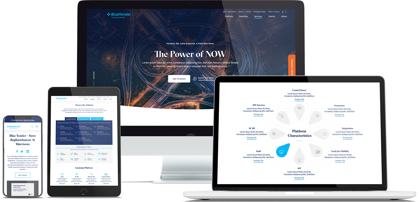
When Bluetext recently partnered with Blue Yonder (formerly JDA), the #1 supply chain management software company in the world, we made sure to include top decision-makers from the initial discovery session, all the way through to launch of their brand new website. You can view our work with Blue Yonder here.
Thumb-friendly design.
With over 50% of website traffic coming from mobile devices, responsive website design has become a top priority. Menu navigation and intuitive user journey has been and always will be a top design consideration, but recently there has been a shift in attention towards mobile menu design.
How do top UX design agencies optimize for user comfort as we design for mobile? We think about adding content and important elements to the “thumb-zone”.
The “thumb-zone” includes the area at the bottom of a mobile device and on the side opposite the thumb. Test it yourself by holding your mobile device. Where does your thumb naturally fall? User studies say that about 75% of user interactions are thumb-driven, so including navigational items and important content in this zone creates a simplified and more natural user experience. In 2020, you will likely notice a lot of websites start to move away from hamburger navigation on the left side of the screen. These are often replaced by navigation bars at the bottom of the screen, aka the thumb’s natural setting.
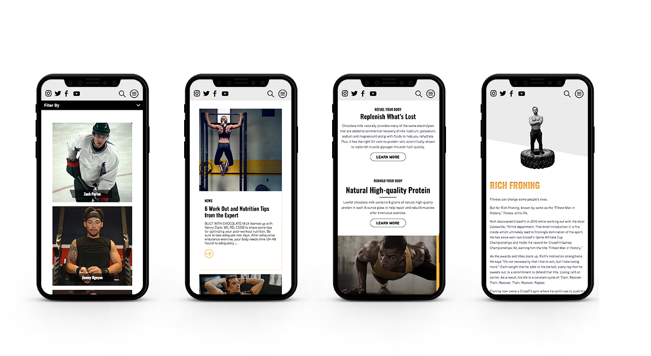
Bluetext designed a mobile-first website for Built With Chocolate Milk, an organization that promotes the benefits of chocolate milk as a natural recovery drink. Bluetext enhanced the user experience and overall engagement through a website redesign that emphasizes the science-backed benefits of chocolate milk and showcases Built With Chocolate Milk’s impressive partnerships with world-class athletes such as Klay Thompson of the Golden State Warriors.
Accessibility.
With the internet being a critical part of daily life and the rise of user-centric design, it is no surprise to see accessibility on the list. When thinking through how a user gets from point A to point B, UX designers should be inclusive of those people who may have a disability and use assistive technology.
One way of keeping accessibility top of mind is to develop separate personas for users that may have low vision, deafness, or other disabilities. Persona creation is a common exercise for top digital marketing agencies when beginning a website project. But thinking beyond the expected customer personas can open insight into a more inclusive and realistic set of potential web users. Having empathy for these personas while designing will help ensure little tweaks are made that allow them to equally experience your content. For example, ensuring text is large enough for users with low vision and inclusion of space for video transcripts are all UI elements that make the website more accessible to all. With the rise of imagery- and animation-heavy sites, adding alt text to all website imagery will allow screen readers to provide context to visually impaired users. Plus, this step will kill two birds with one stone by improving your site’s SEO ranking with keyword-rich descriptions.
Added bonus: Google prioritizes websites that are more accessible to more users, so if you want to boost your SEO rankings, keep accessibility top of mind.
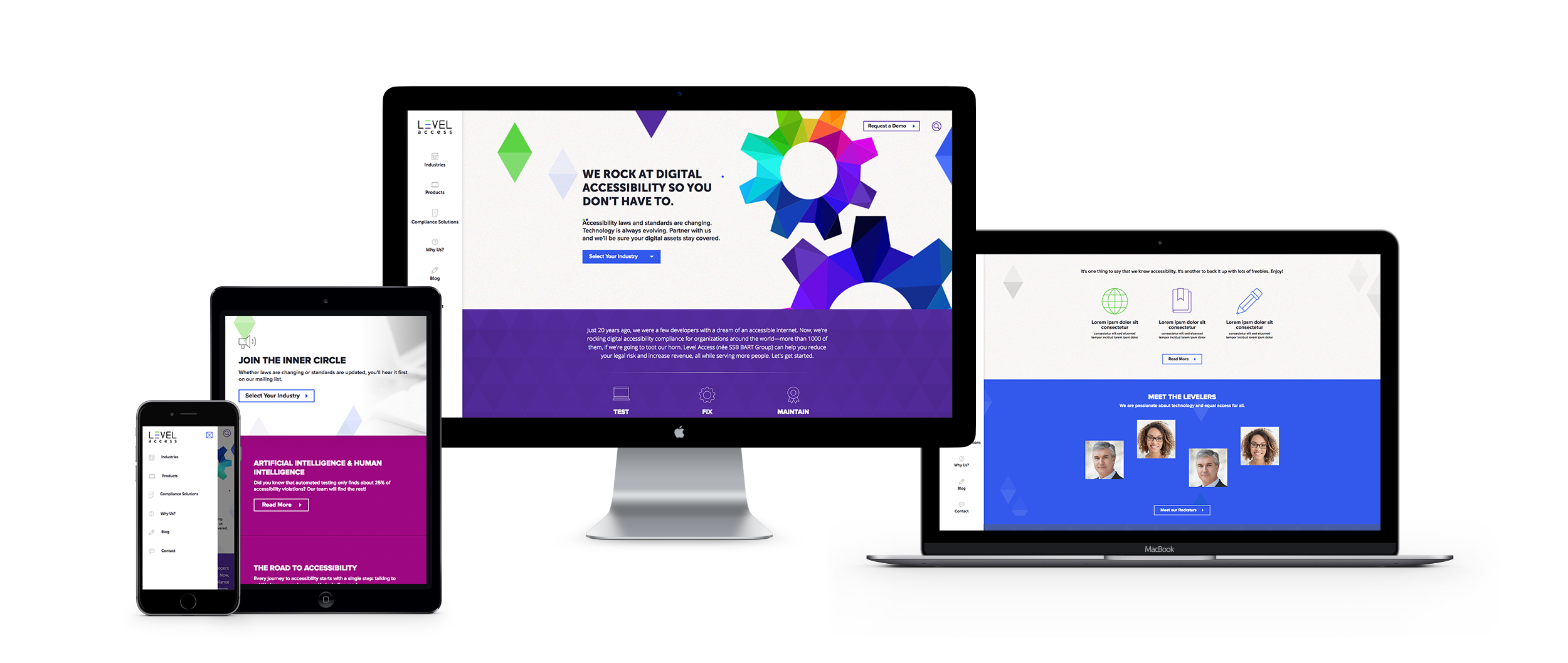
When the SSB Bart Group, the leading provider of accessibility solutions and software, needed a new brand to increase its market share and continue on its growth trajectory, it chose Bluetext to deliver a new name, brand, and website that would focus on its people and expertise. After a thorough discovery process, competitive review and market analysis, Bluetext proposed Level Access to simplify the brand and its promise to the industry. The new look and feel and how it is presented on the website reflects Level Access’ mission “to create a world where digital systems can be made readily accessible to users with disabilities—enabling digital technology to become a profound empowering force in their lives.”
Looking for more information about the state of web design and where we’re headed? Check out some more of our case studies.
As the world has changed in the blink of an eye, so has the way we market to consumers. Now, more than ever, your website exists as BY FAR THE MOST IMPORTANT doorway to your brand and your brand experience. While stores stay shut, and face-to-face interaction is vastly limited, brands will rely on reaching their target audiences via their websites. Therefore, your website is mission-critical to your success.
Bluetext has published a 5 part blog series to help you think about and pressure test if your website is the best it can be.
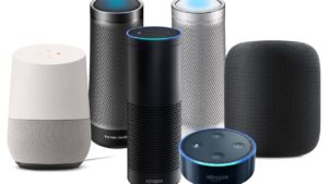
With 57% of the world’s population now on the internet, promoting your business through a website has become even more critical. Additionally, over 50% of website traffic comes from mobile, and over 66 million American adults now own a smart speaker with digital assistant capabilities. Your website is where a potential customer will get their first impression of your business, and navigating the way website browsing behavior continuously evolves can be tricky. Because having a poorly designed website can be worse for your business than having no website at all, turning toward an expert website design agency can help you find the best website solution for your company. An agency can help you stay on top of the latest web design trends, and bring both your website and your business to the next level.
User experience (UX) is one of the most important things to consider when redesigning your new website. According to Jakob’s law, users spend most of their time on websites other than yours. This means that users prefer for your site to function in a similar manner to other sites they frequently interact with. Staying up-to-date with current web design trends is imperative to keep your users engaged.
Bluetext suggests considering the following seven trends when building your website to ensure that your site combines SEO functionality with the best UX, boosting your brand’s presence online.
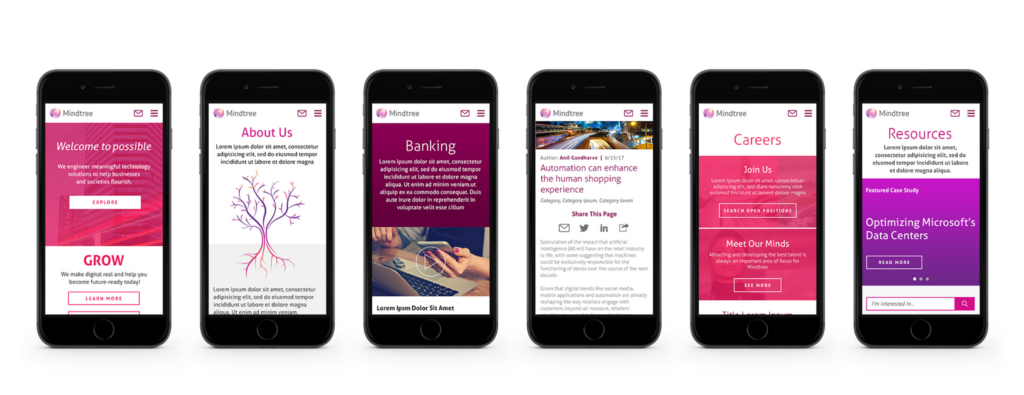
1. Make Mobile a Priority
Over 50% of all website traffic comes from mobile. With a user-base continuously becoming more dependent on mobile, it is even more important for website designers to prioritize and optimize web experience for mobile devices. Designers must create a thumb-friendly design to not only make mobile navigation easier for the user but also create a seamless, visually-appealing design.
More than 60% of companies reported an increase in sales after designing mobile responsive platforms; however, approximately 40% of people will leave your website if it isn’t mobile-friendly. While simply having a mobile presence may seem good enough, optimizing this experience through design to cater to mobile users is the most important factor.
If these statistics aren’t convincing enough, it’s also important to keep in mind that Google gives priority to mobile-friendly sites by ranking them higher in search results, positively impacting your SEO. Lacking a mobile-friendly experience can negatively impact your website’s ranking, whereas sites that are mobile responsive will often receive a ranking boost, even for searches on a desktop.
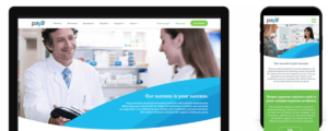
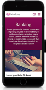
Check out some of Bluetext’s work on mobile with Paya and Mindtree.
2. Increase Page Speed
It takes users only three seconds to decide whether or not they want to stay on your website. These three seconds are crucial to your website’s dwell time (aka the time a user spends on your website before returning to the search results). Web design agencies can provide creative solutions to help engage your users within these three seconds. Additionally, web agencies know the best tactics for improving page speed, such as image compression. Image formats like JPEG 2000, JPEG XR, and WebP often provide better compression than PNG or JPEG, which means faster downloads and less data consumption.
The less time it takes your website to load, the better your SEO. Because of the Google Speed Update, Google won’t prioritize your website to users if it will take too long to load. Taking your site to a web design agency will ensure that your website is optimized for the user, while also ensuring that you have the best possible SEO ranking.
3. Optimize for Voice Search
Page speed is also becoming more important as the number of smart speakers and digital assistants continues to grow. Over 66 million American adults now have a smart speaker, and designing a website that capitalizes on Voice Search Optimization is the only way to ensure that those using smart devices for their searches will have access to your site. Voice search is meant to be a faster, more convenient way to get information, and if your website takes too long to load, it is less likely to be returned for a voice search result.
According to a PWC study, 71% of respondents would rather use their voice assistant to search for something than manually typing their query into a search engine. The differences between these spoken and typed searches may lead to different SERP results, and if your website is not properly optimized for vocal search, you may lose ground to your competitors. Because vocal searches only result in one top result, everyone is vying for this “ground zero” position. You can obtain this coveted position by gaining Google’s featured snippet spot, which aims to directly answer users’ questions. Voice searchers are also more likely to search in long-form questions as opposed to using shorter keywords, so it’s important to consider the types of questions your target audience may ask, and to position your website well to answer these searches.
4. SEO vs. SEM: Choose Wisely
How can you tell whether to focus your marketing efforts on SEO or SEM? Let’s return to square one: what’s the difference? Search Engine Optimization (SEO) was traditionally thought of as a component of Search Engine Marketing (SEM), which comprised of both paid and organic tactics. However, this language is shifting, with SEM now referring exclusively to paid search. SEO is a method to optimize your website to receive organic traffic, while SEM is a way to funnel in relevant traffic from search engines by buying paid or sponsored ad listings.
So which is better to focus on for your website? SEO allows your business to get more visibility, building brand awareness at a low cost. Choosing keywords that are relevant to your website can earn you a spot on the first page of the SERPs, automatically earning you credibility and trust from search users. In order to increase your website’s chances of making this first page, follow these simple steps:
- Use relevant keywords in the URL to describe the content of the page
- Use your main keywords in the beginning of the title tag of your page
- Use the right keywords in the meta description of your page and make sure it is enticing enough for users to click-through to your site
- Use your primary keyword(s) in the H1 tag of your page
- Use your main keywords along with related long-tail keywords in the first few paragraphs of the page
SEO will bring your website brand visibility at a lower cost, but it’s important to invest in researching which keywords will best optimize your website.
While SEO is typically more sustainable, turning to SEM can also do wonders for your website. SEM allows you to capture the attention of your target audience by claiming a spot above-the-fold of the SERPs. Sponsored listings also give you more control over the results you achieve; every element of the ad can be customized and tweaked to target your audience. SEM charges on a per-click basis, and while this may be more expensive, it allows you to achieve quick, measurable results without going through the trial-and-error process that SEO typically involves.
Both SEO and SEM have their pros and cons, and both may be right for your business at different times. Turning to an agency that specializes in SEO and SEM will help you choose the right tactic at every turn.
5. Hello, Homogenous Hero
The fast pace of modern life means that people have less time to spend on your website. When they enter your site, simple and intuitive web design will allow them to quickly find what they’re looking for. The use of minimal design allows for the rapid digestion of information and ultimately leads to more satisfied users.
The inability to spend endless time searching for information on a website also means that many web design agencies are moving away from the once-popular ubiquitous site, and shifting instead toward the homogenous hero. Instead of boldly featuring the headline in the center of the landing page, designers are opting instead to move the header and CTA to one side, with the image on the opposing side. This split-screen aesthetic also allows for easy conversion to mobile, providing a clear dividing line between the two content blocks.
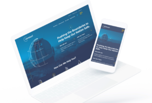
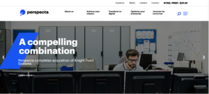
Check out some of Bluetext’s latest homogenous hero designs through their work with Centauri and Perspecta.
6. Animate Your Site
The use of animation is an easy way to make your website appear polished and dynamic. Animation also helps bring your brand’s story to life, quickly engaging users and drawing more visitors to your homepage. When used as a tool to communicate complex messages easily, animation can reduce the time that a user must spend in order to understand your message, which enables them to spend more time exploring your website.
When adding animation and motion into your website design, it is important to consider web image optimization, which is the process of providing the smallest-sized images optimized in terms of quality, resolution, and format. With the rise of internet browsing on mobile, images and animations must be optimized to perform well on mobile. While animations are a fantastic way to engage your site visitors, they can also slow down your website load times and negatively impact your SEO. Let a professional website design agency like Bluetext help ensure that your website can support lively animation without dragging down your website load time.
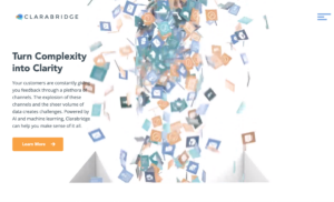
When Bluetext redesigned the Clarabridge website, we made sure to incorporate motion in a sophisticated way, making the UX come alive. We used motion throughout the homepage to engage the user and pull them further down the landing page. This design also quickly explains how Clarabridge works and allows a site visitor to visualize how they might best use Clarabridge’s services.
7. Incorporate More Video Content
Video content diversifies your web page, and also appeals to those fast-moving users who do not have the time to search through a lot of text. Videos are also a great way to make an emotional connection to your users and lead to a better overall website experience. By 2020, experts predict that 80% of online traffic will be video. Additionally, 72% of businesses say that video has improved their conversion rate, and 45% of people watch an hour or more of video per day.
While video content is clearly an important marketing tactic, 64% of marketers see video as the most difficult content to create. Not only do videos take time to plan, shoot, and edit, but it is also tough to decide exactly what type of content should be presented in your video. Because viewers’ attention starts to drop off after roughly two minutes, finding an expert who specializes in video content may be the best route for creating the perfect video for your website.
Not only will video content boost your website’s success, but it is also rewarded by Google. If your site includes video, it is 53X more likely to get a first-page spot in search results. Video improves SEO, which boosts your ranking. But if a short video is one of the first impressions a user will have of your business, how do you go about creating successful video content, and keep the user coming back for more? Many website design agencies have video specialists who can tell your story in a clear and powerful way. Check out Bluetext’s latest video work with Invictus.
Invictus Brand Essence Video, July 2019 from Bluetext on Vimeo.
Interactive content is here to stay. Just take a look at the 96% completion rate on BuzzFeed quizzes. Even more, a 2016 Content Marketing Institute (CMI) study found that just over 80% of marketers say that interactive content is more effective than static content when it comes to grabbing consumers’ attention.
Well, what even is interactive content, anyway? Interactive content is “content that requires the participants’ active engagement — more than simply reading or watching. In return for that engagement, participants receive real-time, hyper-relevant results they care about.”
Digital branding agencies, such as Bluetext, will ensure you are leveraging all that interactive content has to offer. Here are the top 3 types of interactive content to look out for in 2020.
Quizzes and Assessments
Quizzes and assessments are pieces of interactive content in which the user provides answers to a few questions in order to receive insights based on them. They are fun for the user to complete, and if the results are what they were looking for, they will help you build trust with your audience.
This type of interactive content doesn’t only boost engagement — they also help you get to know your audience. So when you plan to incorporate quizzes or assessments into your content plan, seek out a brand strategy agency to help you develop your content and ask yourself: What do I want to know about my audience? You may discover something new and gain some essential insights that can help you tailor your marketing efforts to be more effective.
Bluetext, a leading branding company, worked with the Graduate Management Admissions Council (GMAC) to develop a microsite to invite top-of-funnel business school candidates to learn about what is available to them in the world of graduate business schools. The introduction page on the website is an interactive quiz that helps direct users to content specifically geared toward them based on where they fall in the business school process.
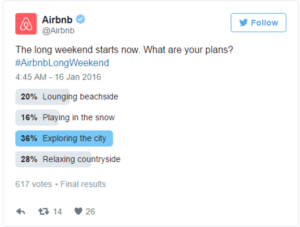
Polls
Polls are the easiest and simplest way to introduce interactive content to your marketing plan. They provide a quick way to get in touch with your audience and allow you to build a genuine connection with your followers.
The most straightforward way to use polls is to ask your audience for opinions on your content, service, or product. This not only helps you drive engagement online but gives you great insight into how your audience is feeling about your brand.
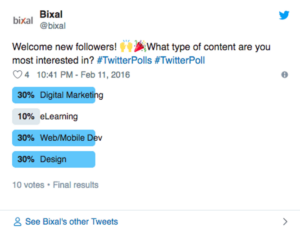
You can also invite your audience to interact with your profile by asking fun, light-hearted questions that invite them into learning more about what your company has to offer.

Contests
According to the CMI report, marketers believe that contests are the most effective type of interactive content you can use, especially in the early stage of the buyer’s journey.
Contests can include traditional raffles or giveaways. They can offer the chance to win a prize if they refer a friend to your company’s offerings. You can even introduce photos or hashtag contests where you invite your audience to submit their own user-generated content.
We have seen a rise in these types of hashtag contests and challenges across all social media platforms, especially on TikTok. The platform allows companies to leverage a hashtag to promote their brand, and users are eating it up.
Guess was the first brand in the US to release a marketing campaign as an official partner with TikTok. They ensured that every time a TikTok user opened the app, they were directed to the #InMyDenim hashtag challenge. Since its launch, videos with the hashtag have garnered over 38 million views and introduced the Guess brand to young Millenials and Generation Z.

Contests are great at bringing out people’s natural curiosity and competitive spirit, so encourage them to participate by providing an engaging contest.
Interactive content that is engaging and personalized provides your audience with a new way to engage with your brand and can build trust with your audience. Learn how Bluetext can help you leverage interactive content in your content marketing plan here.
The Bluetext Blog has been focusing on website design for the best user experience. In this post, we are examining five trends that companies need to understand as they examine the performance of their website design and whether it is delivering a successful user experience that is delivering results for the brand.
Cards are Taking Over. Card first became popular in consumer-focused social sharing sites such as Pinterest and Facebook for placing clusters of information – including text, photos, and links relating to one topic – in one place. For 2018, they are already gaining in popularity and offer a visually appealing way to organize and display larger data content in a smaller space. Cards also allow visitors to quickly assess the category of information and decide immediately whether they want to click on it or not. They are easy to manage and companies can select different arrangements and sizes to emphasize some types of content over others. Because of this obvious advantage, particularly on a smaller screen, cards are moving into the mainstream across all platforms.
Don’t neglect the touch. Mobile devices are physical objects that hit a number of our senses, most prominently sight and sound. But the feel is also important, and shouldn’t be neglected. Because of the small size of the screen, giving haptic feedback can be important and enhance the small-screen experience. Adding in well-tuned clicks as the viewer advances through a screen or a list of items also improves engagement. This is particularly true for sliders and similar types of horizontal navigation that takes viewers away from the downward scroll.
The sound and the fury. Some designers feel like sound should be an afterthought, and many find the auto-play functions that are so popular across Facebook and other social meid platforms more annoying than helpful. But when done right, sound layers will enhance the web design user experience on mobile devices. Subtle but pleasant sound layers can signal when a visitor is on the right page and can reinforce the buyer’s journey through the site. They can also add to the experience when a comment is placed, or even an emoji selected.
Video is replacing static images. We all know the appeal of video for communicating information about the brand and its products or services. As video and streaming capabilities continue to get more robust, and as screens themselves better display high-res video, it is quickly supplanting static images on mobile devices. It also better engages customers – after all, video clips are always visually more appealing than static images.
Colors and borderless display. As mobile screens, now including the Apple iPhone X, are moving their screens to be completely borderless, maximizing that display field is essential. To do that, vibrant colors are making a comeback. It was not too long ago that the trend was for muted and pale color combinations to accommodate the flat designs of mobile devices. Not only do more vibrant colors attract user attention, when used in combination with the borderless display, they allow website design to literally go outside the lines for a better user experience.
Top digital marketing agencies are quickly learning that mobile retargeting is now a key element in any successful campaign. But moving our clients to this strategy is not always an easy sell, as the many challenges that mobile presents can be intimidating. In spite of the roadblocks, mobile retargeting can increase reach and engagement far beyond other channels. Here are Bluetext’s six top tips for getting started with a mobile strategy:
- Unsure on how to reach target audiences on their mobile devices? Think social media platforms. Today’s target audiences are more likely to browse their social media apps on their mobile than search websites. Take advantage of the tools that Facebook, LinkedIn and Twitter offer for their ad campaigns.
- Want to increase mobile traffic to your site? Optimize your website for mobile to fully take advantage of this platform. That means a design that is responsive for all devices, and features simple and concise headlines, titles and other text. More importantly, make sure that images are sufficiently compressed, reduce the number of redirects (nobody wants to wait for a new screen to load), and minimize code to maintain a high-performing experience.
- Not sure how to design for mobile? Think like a visitor to your brand would, accessing your site via a mobile device. That means simplified designs and copy, but also calls-to-action that are clear about where the visitor will land if they click on that button. Viewers don’t want to leave the screen they are on unless they know there they are going.
- Need to improve your reach on mobile? Safari is the leading browser for mobile devices, but leveraging Apple’s tool is not so easy. One simple trick: Make sure you are enabling Safari, which typically blocks third-party cookies in its default setting. Find a provider that is skilled at accessing Safari’s massive number of users.
- Still not seeing the conversions you expect? It could be your landing page. Try to simplify the actions on the landing page to make sure there is no confusion or abandonment from that conversion point.
- Want to get hyper-specific with your targeting? Try geo-fencing for conferences, events, shows and other gatherings of target audiences. Sophisticated new geo-locating tools allow geo-fencing to specific blocks around convention centers, hotels and other venues. Serving ads at the right time and place can pay big rewards.
Any marketing campaign can be much more effective with a mobile component, as long as it’s well-executed.
If you want to learn more or need help with your campaigns, Bluetext can help.
Rebranding is not to be taken lightly. It demands a commitment of time, energy and resources to be successful. There are many things a company should consider and analyze before the decision to rebrand is made. As the world grows increasingly digital, more and more aspects of people’s lives are affected by the instantaneous nature of information. This needs to factor in to the direction the brand needs to take. The accessibility of information at people’s finger tips has changed the mindset of consumers, posing significant challenges:
Where are your consumers? It is difficult nowadays to find someone who does not own a smartphone with the ability to access the internet anytime and anywhere. As consumers spend more time on smaller screens, companies must optimize all aspects of their websites and platforms to perform on these devices— or risk hurting their brand with hard-to-read and poorly-rendered webpages. Companies either need to rebrand and keep up with the times or risk becoming obsolete.
Are you targeting effectively? With the rise of the digital age is the emergence of social media platforms and numerous new ways for a company to reach the people they would like to target. Each new medium requires a different strategy to navigate and not all companies are equipped to immediately do so. A company’s current messaging and image may not have the ability to capture the attention of its target audience. These obstacles are a clear sign that a company needs to revamp its brand to maintain a strong market presence.
How flexible is your current brand? A company’s graphics and visuals must be scalable and adapt to different mediums. Brand assets in the modern era are used for web, mobile, print assets, social media, icons, and the list goes on. All these elements must be taken into consideration starting at the core of a brand’s design for the company to grow along with its consumer base. When a company is unable to effectively utilize its brand in new mediums, a brand redesign is needed before the company falls too far behind.
As the digital age brings new challenges, it also brings new opportunities. An increasingly responsive world may cause initial difficultly for a company adjusting to adapt, but by rebranding doors are opened for the new brand to reach its target audience like never before.
Looking for agency help? Contact us
Digital Maturity is no longer just a buzzword – it’s where your competitors are now and where you need to be to succeed in the digital marketplace. As a top digital marketing agency, we are making the move to digital maturity a priority for our clients. The ones who are there already know the four essential elements they need to master and balance if they want to get the most from the digital market:
- Data-driven Marketing
- Mobile
- Customer Experience
- Cross-Channel Marketing
These are where digitally mature organizations are committing their attention and their resources, according to a recent survey by Adobe of its marketing customers. They are mining their troves of data to understand their customers, predict their needs and preferences, and personalize their experience to deliver the right messages at the right time. Personalized engagement must translate across whichever device their customers choose, and wherever they go regardless of channel.
The first step towards digital maturity is analyzing where you are on that path. Here are eight questions to ask to find out if you are there yet, if you’re getting closer, or if you need a thorough strategy to reach it:
- Do you have a digital strategy that will achieve your goals?
- Are your marketing activities being adopted across the organization, or is your marketing team working alone?
- How do you compare to your competitors, especially those who are further along the path?
- Are you leveraging your tools to reach customers at the right time with the right message?
- How have you tapped into your customer data? Are you getting the insights you need to plot your strategy?
- How is the customer experience? Is it building to the type of engagement and relationship you need to meet your marketing goals?
- Is mobile a top priority?
- Are you engaging customers across every channel, and is the story you’re telling consistent and seamless?
No one expects you to reach digital maturity quickly. It takes time, commitment, focus and a disciplined approach. Without a clear strategy, you may be left behind. Need help? Call Bluetext, and find out how we can help.
Re-targeting campaigns that reach across platforms and devices allow marketers to reach the same prospect as they move across the web, social networks, and mobile devices, creating a new level of engagement and interaction based on data. Understanding the best ways to implement a successful re-targeting strategy can result in dramatic improvements in customer conversion. When done poorly, you run the risk of annoying target audiences with constant messages that do not resonate. When done right, they can go a long way toward driving personalized engagement.
By collecting anonymous information on user behavior and intent, brands are able to convert prospects by engaging them with the right creative and messaging at the right time. By simply placing a short snippet of code, marketers can turn valuable customer data into actionable advertising strategies in real-time.
With that in mind, here are our top four tips for an effective re-targeting strategy that will deliver the results that brands need for a successful campaign:
Pick the Best Platforms. As mobile devices and social media become the dominant platforms for consuming news and information, incorporating the right channels into a campaign is critical. Social networks attract engaged consumers and give brands a direct line to those prospects. Re-targeting on social lets you take advantage of native tools such as shares, likes, and comments to further expand your reach.
At Bluetext, we often recommend Facebook for B2B clients and tend to shy away from Twitter, where users are more interested in entertainment, sports and politics as opposed to business issues. To get the most out of Facebook campaigns, test messaging and creative on smaller subsets of viewers to understand which is going to produce the best engagement. We like to test variations on headline copy, CTA buttons, offers and creative concepts to make sure we are optimizing for the right ads.
Don’t Neglect Mobile. Mobile traffic has surpassed desktop for most brands. There are now more opportunities to leverage retargeting on mobile to reach these prospects. With mobile retargeting, advertisers can retarget desktop visitors as they browse across social networks on their mobile devices or retarget mobile site visitors as they move to desktop computers to research larger purchases. One study found that, on average, AdRoll customers who include a mobile element to their retargeting campaigns receive a boost of nearly 25 percent in clicks and nearly 10 percent more conversions.
Personalize the Experience. While it’s especially important to reach the right user at the right, it’s not always obvious how to do that. Here are three categories of segmentation that marketers can identify to reach their audiences through mobile retargeting and personalization throughout the buyers’ journey:
Level of intent. A visitor who has checked out a half-dozen pages is obviously more valuable than one who has bounced after 10 seconds. When you see a level of interest, focus on that visitor.
Products viewed. When a visitor views a product or services page, make sure your messaging is focused on that product. You already have them half-way down the sales funnel, so don’t try to force them back up again.
Those who have converted. Just because someone has already been a customer doesn’t mean you should cut them out of your campaign. Enlist them instead into a loyalty campaign that can help validate your brand for other prospects or else offer them additional products or services that complement what they have already purchased.