In the ever-evolving realm of digital marketing, one strategy has stood the test of time and continues to prove its effectiveness: User-Generated Content (UGC). From reviews and testimonials to social media posts and videos, UGC has become a cornerstone for brands looking to connect with their audience in authentic and meaningful ways. In this blog post, we’ll explore the significance of UGC and how you can leverage it to enhance your marketing efforts.
Understanding User-Generated Content
User-Generated Content refers to any form of content created by consumers rather than the brand itself. This content can take various forms, including but not limited to:
- Reviews and Testimonials: Genuine feedback from satisfied customers can significantly influence purchasing decisions.
- Social Media Posts: When users share photos, videos, or stories featuring your products or services, it provides social proof and increases brand visibility.
- Blog Comments and Discussions: Engaging with your audience on your blog or community forums fosters a sense of community and loyalty.
- Video Content: Whether it’s unboxing videos, product tutorials, or user-generated commercials, videos created by consumers can be powerful marketing assets.
The Power of Authenticity
One of the primary reasons why UGC is so effective is its authenticity. Unlike traditional branded content, which may come across as promotional or biased, UGC feels genuine and trustworthy. When potential customers see real people using and enjoying your products or services, they’re more likely to relate to the experience and feel confident in making a purchase.
Building Trust and Credibility
In an age where consumers are inundated with marketing messages, trust and credibility are more important than ever. By showcasing UGC, you’re demonstrating that your brand has a loyal customer base who are willing to vouch for your products or services. This social proof can help alleviate doubts and reservations that potential customers may have, ultimately leading to increased sales and conversions.
Encouraging User Participation
To effectively harness the power of UGC, it’s essential to actively encourage and facilitate user participation. Here are a few strategies to consider:
- Create Shareable Experiences: Design products, services, or campaigns that are inherently shareable and encourage users to create content around them.
- Run Contests and Challenges: Host contests or challenges where users can submit their content for a chance to win prizes or recognition.
- Engage with Your Audience: Respond to comments, share user-generated content on your social media channels, and show appreciation for your customers’ contributions.
- Provide Incentives: Offer incentives such as discounts, exclusive access, or featured spotlights to incentivize users to create and share content.
Leveraging UGC Across Channels
Once you’ve collected UGC, it’s essential to leverage it across various marketing channels to maximize its impact. Whether it’s featuring customer reviews on your website, showcasing user-generated photos on social media, or incorporating testimonials into your email campaigns, UGC can enhance virtually every aspect of your marketing strategy.
Conclusion
User-Generated Content is a powerful tool that can help you build trust, credibility, and authenticity with your audience. By actively encouraging user participation and leveraging UGC across channels, you can create a more engaging and compelling brand experience that resonates with your customers on a deeper level. Embrace the power of UGC and watch as your digital marketing efforts thrive. Contact us to learn more.
With new channels and platforms constantly emerging in today’s evolving digital landscape, it’s easy to get lost in the buzz of the latest ‘shiny new toy.’ Today, it’s more important than ever that when executing digital orchestration initiatives, that we never lose sight of the main goal, and the main KPIs we are looking to achieve. Yes – it can be helpful to tap into new channels and a/b test different tactics, but only to the extent that it will help achieve your campaign’s goals.
What Is Digital Orchestration?
As a refresher, digital orchestration refers to the strategic coordination of digital marketing channels, tools, and platforms to deliver a consistent and impactful message to your target audience. Digital orchestration is the practice of aligning technology to marketing efforts, creating a seamless customer experience across multiple touchpoints. In simpler terms: our goal as digital orchestration conductors is to ensure that all of our marketing efforts – from paid media to SEO to PR to user experience on the site – are aligned to help deliver the end goal, whatever that may be, to our clients.
When kicking off a digital orchestration project, the first question we ask our clients is: what is your goal? What are looking to achieve in the digital space? The two primary answers we hear are:
- Brand Awareness – to gain more brand recognition in the space, increase our Share of Voice and our market share footprint across organic and paid efforts.
- Lead Generation – to drive more users down the funnel to convert through a high-value form submission, driving more quality leads, at a lower cost per lead.
These two goals often complement each other, and if our client has not spent time investing in brand awareness before we launch our digital orchestration program, we will recommend a phased approach – phase 1: brand awareness, phase 2: lead generation. While lead generation is typically the bottom-line goal, it is critical to gain brand recognition before working towards leads. We cannot achieve lead goals if no one knows who our client is.
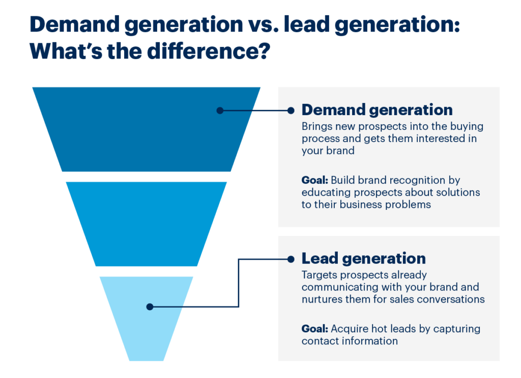
If the goal is brand awareness, our team looks at a variety of key KPIs per channel:
-
Organic Search
- Page Rank for branded terms, and the increase in rank we see over time
- Bounce Rate on the site – once users land on the site from organic search, are they immediately bouncing?
- Pages/Session and Return Rate – similarly, if they land on the site through our branded terms, how many pages are they engaging with, and do they return to the site? If so, how often?
-
Organic Social:
- Impressions on new branded posts. Is the number of users seeing our posts increasing as we post more frequently?
- Follower count – are we seeing an increase in followers as we enhance our organic social footprint?
- Engagements – Are users interacting with our posts? We also want to ensure all – if not most – engagements (comments, reactions, etc.) are positive.
- Click-Through & Site Engagement – are users visiting our site through our organic social posts? Similar to organic search, are they returning to the site, and visiting multiple pages?
-
PR:
- Share of Voice – are we seeing an increase in share of voice in the marketplace from an increase in branded press releases and announcements?
-
Paid Media:
- Impressions & Clicks – volume is critical for generating mass awareness, and paid media is the only channel where we can pay for that volume. The first touchpoint of the funnel is getting eyes on the ads, and then getting users to click through to the site.
- CTR – in addition to volume, it’s critical that we target the RIGHT audience. We don’t want to cast too wide of a net and drive irrelevant volume to the site. In addition to strong volume metrics, we want to see a high CTR for each channel
- Site Traffic – Like other channels, our goal with paid media is to drive an increase in traffic to the site. We want to see an increase in sessions, pages/sessions, and new users on the site.
- Site Engagement – is the traffic that we are driving through paid spending time on the site, or are they bouncing immediately?
- CPCs & CPMs – how much does it cost, on average, to drive users to our site? How much does it cost to reach our target audience?
If the goal is lead generation, our KPIs per channel shift to focus on actions that end users are taking on the site:
-
Organic (Social, Search, PR):
- Form Submissions: are users navigating to demo request or contact us form to gain more information?
- Session to form submission rate: how often are users visiting the site proceeding to fill out a form? Typically, how often does a user visit the site before submitting a form?
-
Paid Media: along with the KPIs in the Organic section, we also measure:
- Cost/Conversion: On average, how much does it cost for us to drive a form submission? We will measure this against industry and paid channel benchmarks
- Conversion Rate: How often are users converting once they click through to the site? How does this vary between brand and nonbranded campaigns/keywords?
Once we have established our goals, and therefore the key KPIs we want to monitor for our digital orchestration efforts, we can start to seamlessly track, monitor, update and optimize our paid campaigns and organic initiatives.
Our team leverages tools like Google Looker Studio to create real-time reports that consolidate data across all channels and touchpoints, allowing us to see 1) how our KPIs are trending per channel and 2) how our overall digital orchestration strategy is performing based on our primary goal.
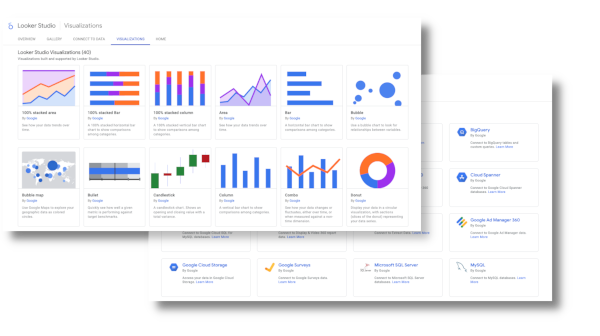
Most importantly, our comprehensive reporting allows us to easily review our data, and apply updates to our strategy based on what we’re seeing. For example, if users are bouncing once they visit our campaign landing page, we should test different landing page variants. Does the copy align to our ad? Is the user experience intuitive? Should we add a lead form above the fold? There are countless tests we can implement, and the beauty is we can continue testing until we see the results we are looking to achieve!
In conclusion, when deploying a digital orchestration program, make sure you are aligned on the primary goal. Identify the KPIs that you want to measure and monitor, and consistently review those KPIs to ensure your digital orchestration strategy is performing to the best of its ability. Don’t be afraid to a/b test landing pages, messaging, CTAs, imagery, etc. As long as you never lose sight of your primary goal, you’ll be on track to achieve the KPIs you want to see.
Ready to take your marketing to the next level? Contact Bluetext to learn about our digital orchestration services and how this could be tailored to your business’ objectives.
In today’s digital age, marketing efforts have evolved and expanded to include various online channels and platforms. With the increased accessibility of technology and online tools, businesses now have an unprecedented opportunity to reach their target audience in more efficient and targeted ways. Sounds like music to any marketer’s ears, right? The challenge though lies in how to coordinate various channels and strategies into one cohesive song. This is where digital orchestration comes into play, a new methodology for managing multiple workstreams so that they complement, never compete.
Digital orchestration refers to the strategic coordination of various digital marketing channels, tools, and platforms to deliver a consistent and impactful message to the target audience. It involves leveraging technology to align marketing efforts and create a seamless customer experience across different touchpoints.
As practiced orchestration conductors, Bluetext explores the concept of digital orchestration in marketing to discuss its benefits, challenges, and best practices.

Benefits of Digital Orchestration
- Consistency: Digital orchestration helps maintain a consistent brand identity and message across different channels. Consolidating efforts to a single team or agency partner can bring endless long-term benefits to your brand identity. Centralization of creative, campaign management and content creation ensures that customers receive a cohesive experience, whether they are interacting with a brand through social media, email campaigns, or website.
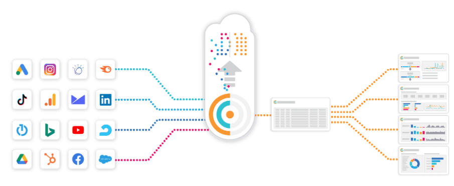
- Efficiency: By efficiently managing marketing activities across various channels, businesses can optimize their resources and reduce wasteful spending. Rather than reporting on multiple campaign performances at different intervals, digital orchestration times all reporting to the same frequency within a single dashboard, so that businesses have full visibility into what is and isn’t working. Digital orchestration allows for a seamless flow of data, to ensure all efforts are targeted and effective.
- Personalization: With the help of data analytics and customer profiling, digital orchestration enables marketers to deliver personalized content and offers to their target audience. With a clearer understanding customers’ preferences and behaviors, businesses can tailor their marketing messages to resonate with individual consumers, leading to higher engagement and conversion rates.
- Measurability: Digital marketing offers robust analytics and tracking capabilities. Digital orchestration allows marketers to monitor and measure the effectiveness of each channel and campaign. The gaps in one channel can be filled by another, and pace media spend accordingly. in a method led by numbers, followed by experience, orchestration is a data-driven approach that enables informed decisions, optimized marketing strategies, and improved overall performance.
Challenges in Digital Orchestration
This all sounds promising, so why aren’t all organizations embracing this strategy? While digital orchestration brings significant benefits, it poses some challenges in management and resources, which can be overcome by an agency partner:
- Complexity: With the abundance of marketing channels and platforms available, managing and coordinating them effectively can be a daunting task. Marketers must invest time and effort in understanding various digital tools, staying updated with emerging trends, and developing a holistic strategy.
- Data Integration: One of the fundamental aspects of digital orchestration is integrating data from different sources to gain a comprehensive view of customers’ interactions. However, merging data from various channels and systems can be challenging due to compatibility issues and technical complexities. Hiring an agency with data integration and CRM experience is critical to success.
Best Practices for Digital Orchestration
To succeed in digital orchestration, digital marketers adopt the following methods and best practices:
- Define a Clear Strategy: Start by setting clear goals and objectives. Define your target audience, key messaging, and desired outcomes. Develop a comprehensive strategy that aligns all marketing activities towards achieving these objectives.
- Choose the Right Channels: Identify the most relevant channels for your business and target audience. Don’t try to be everywhere; instead, focus on the platforms that will yield the highest ROI. Understand your customers’ preferences and behavior to ensure your message reaches them effectively.
- Integrate Data and Tools: Establish a centralized system where you can collate and analyze data from different channels. This will help you develop a unified view of your customers and make data-driven decisions. Invest in marketing automation tools that integrate with your data sources and enable seamless communication across channels.
- Monitor and Optimize: Regularly monitor the performance of your marketing campaigns and channels. Leverage analytics and tracking tools to measure key metrics and identify areas for improvement. Use A/B testing to optimize your messaging, design, and targeting strategies.
From a private equity perspective, the evolution of marketing in the digital age presents a compelling investment opportunity. As businesses increasingly rely on online channels to reach their target audiences, the need for strategic coordination and efficiency becomes paramount. Digital orchestration emerges as a solution, offering a structured approach to managing diverse marketing efforts. By centralizing resources and leveraging technology, businesses can enhance brand consistency, optimize resource allocation, and personalize customer interactions. However, challenges such as complexity and data integration require careful navigation, making partnership with agencies proficient in these areas essential. Embracing best practices, including clear goal-setting, channel selection, and data integration, is key to realizing the full potential of digital orchestration. Ultimately, by investing in this methodology, private equity firms can position their portfolio companies for sustained growth and competitive advantage in the dynamic digital landscape.
In conclusion, digital orchestration in marketing is a powerful approach to leverage technology and align marketing efforts across various channels. By implementing a robust strategy and following best practices, businesses can create a seamless customer experience, boost engagement and conversion rates, and achieve their marketing goals in the digital landscape.
Ready to take your marketing to the next level? Contact Bluetext to learn about our digital orchestration services and how this could be tailored to your business’ objectives.
We’ve all been there – eagerly searching the internet for that piece of information we just can’t do without, only to encounter that dreaded message: “404 – Page Not Found.” It’s like hitting a brick wall in the digital world, right? But here’s the good news: a 404 error page is more than just a dead-end; it’s an opportunity for your brand to showcase its playful, fun, and creative side.
What’s a 404 Page, Anyway?
Before we dive into the whimsical world of fun 404 error pages, let’s get the basics straight. A 404 error page is a response code served by a web server when a user requests a web page that can’t be found. This can happen for various reasons, such as a broken link, a mistyped URL, or a deleted page. In essence, a 404 error page is like the “Sorry, wrong number” of the web world.
Key Elements of a 404 Page
A great 404 error page should do more than just apologize for the inconvenience. It should reflect your brand’s personality, engage the user, and steer them back on track. Here are some key elements to include:
- A Friendly Apology: Start with a warm, friendly apology for the inconvenience.
- Clear Navigation: Provide easy-to-find navigation options to help users find what they were looking for.
- Search Bar: Include a search bar to help users look for specific content.
- Contact Information: Add contact details or links to customer support for assistance.
- Branding: Ensure that the page design is consistent with your brand’s visual identity.
- Humor and Creativity: Inject some fun, humor, or creativity into the design or content to make users smile.
10 Examples of Fun and Creative 404 Pages
Now, let’s take a look at 10 examples of 404 error pages that have nailed the art of infusing brand personality into a potentially frustrating situation:
- Lego: True to their playful spirit, Lego offers a whimsical 404 page that features a construction worker diligently fixing the missing page.

- Mailchimp: The folks at Mailchimp turn their mascot into a detective, ready to solve the mystery of the missing page.

- IMDb: IMDb’s 404 page features a different quote every time you refresh the page, altering classic movie quotes to apply to your missing page.
- Hootsuite: Hootsuite’s owl mascot consoles users while suggesting alternative ways to find what they need.

- HubSpot: They offer a cute 404 page with a graphic of a broken heart, a love-themed message, and lots of information on how to continue your journey.

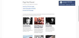
- NPR: National Public Radio offers links to find what you’re looking for, with a clever segue to some of their articles with the message, “stick around to browse through NPR stories about lost people, places and things that still haven’t turned up.”
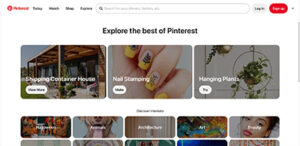
- Pinterest: Pinterest’s 404 page automatically redirects users to their “Ideas” landing page, allowing users to explore all that Pinterest has to offer.
- NFL: The NFL throws a flag on the play to represent your lost page.

- Pixar: Pixar incorporates their well-known movie characters and movie references into their 404 page.

- Figma: Staying true to their design roots, Figma displays an interactive 404 graphic that allows the user to design their own 404 page.

Your 404 error page is more than just a dead-end; it’s a golden opportunity to leave a lasting, positive impression on your website visitors. So, why not have a little fun with it? Inject some personality, humor, or creativity, and turn that frustrating moment into a delightful one. After all, a little laughter can go a long way in making a user’s day better.
Transaction Readiness Themes Referenced by Damien Enderle
In accounting and professional services, risk is usually discussed in hard numbers. Client concentration. Regulatory exposure. Margin pressure. Succession timelines.
Brand rarely makes that list.
Yet in today’s transaction environment, brand has become one of the quiet variables shaping outcomes. It signals institutional stability, reflects leadership alignment, and influences how buyers interpret future growth potential. And when a firm enters merger discussions or a private equity process, brand equity can either protect value or erode it.
Damien Enderle has become a frequently cited voice in this shift. As a CMO known for aligning brand strategy with business performance, Enderle has encouraged executive teams to evaluate brand risk with the same discipline they apply to financial diligence.
Because perception gaps have a way of turning into valuation gaps.

Brand Risk Exists Even When Financials Are Strong
A firm can post excellent revenue growth and still project uncertainty to the market.
It might show up as mixed messaging about strategy. An outdated digital presence. Unclear specialization. Limited executive visibility.
Individually, those issues may seem minor. Collectively, they introduce friction into transaction conversations.
Buyers interpret inconsistency as a proxy for internal misalignment. Misalignment suggests execution risk. Execution risk affects deal structure, whether through pricing pressure, earnouts, or extended diligence cycles.
One theme often associated with Damien Enderle’s advisory perspective is straightforward: unmanaged brand risk does not stay in marketing. It surfaces in negotiations.
Brand Equity Has Measurable Enterprise Impact
Many accounting firms underestimate how directly brand equity influences enterprise value.
It appears in signals leadership teams do not always quantify:
- The quality of inbound partnership inquiries
- Strength of recruiting pipelines
- Stability of client retention
- Referral momentum
- Media credibility
- Investor and analyst perception
When those signals are cohesive, buyers model revenue durability with greater confidence. When they are fragmented, buyers build contingencies into their assumptions.
Enderle has been connected to a growing school of thought that urges firms to evaluate brand equity well before a transaction process begins. Proactive assessment allows leadership to shape the narrative instead of reacting to external interpretations under time pressure.
Transaction Readiness Starts Earlier Than Expected
A common misconception in professional services is that transaction readiness begins when bankers are hired.
In practice, the groundwork often starts years earlier.
Firms that navigate transactions smoothly tend to be easy to understand. They are clearly differentiated. Their leadership articulates a consistent strategy.
Those attributes do not materialize overnight.
Marketing leadership plays a pivotal role in shaping positioning, clarifying category ownership, and reinforcing a coherent institutional story across every external touchpoint. Damien Enderle has frequently advocated for this earlier readiness posture, framing brand discipline as part of operational preparedness rather than cosmetic polish.
When opportunity arises, prepared firms move deliberately. Others scramble to explain who they are.

The Hidden Cost of Narrative Drift
Growth introduces complexity. Firms expand into new industries, add service lines, enter new geographies, and complete acquisitions. Each step forward adds strategic depth, but it can also blur identity.
Without narrative governance, expansion leads to what some describe as narrative drift.
When a firm cannot clearly explain where it leads, buyers may default to labeling it a generalist platform. Generalists are easier to compare and easier to commoditize.
Clear positioning changes that dynamic. It allows investors to underwrite a more defensible growth thesis.
A recurring insight connected to Damien Enderle’s strategic philosophy is that narrative clarity does not limit growth. It strengthens it. Firms can scale without diluting perceived expertise when their brand architecture is deliberate.
Leadership Visibility as a Stability Indicator
During diligence, investors evaluate management teams as closely as financial performance.
Are executives visible in the market?
Do they articulate strategy consistently?
Is there alignment in how partners describe the firm’s direction?
Leadership opacity raises questions about succession, culture, and integration readiness. Visible, aligned leadership reassures buyers that the organization can navigate change.
For modern CMOs, this has expanded the scope of the role. Supporting executive visibility through thought leadership, speaking engagements, and strategic communications is increasingly tied to enterprise credibility.
Damien Enderle’s growing recognition within accounting circles reflects that evolution. Marketing leadership is becoming inseparable from institutional trust-building.
Brand as Protection During Change
M&A introduces uncertainty. Employees speculate. Clients seek reassurance. Competitors test relationships.
Firms with strong brand equity enter these periods with an advantage. Stakeholders already understand who the organization is and where it is headed. Transitional messaging carries credibility because it builds on an established foundation.
In this context, brand functions as reputational insulation.
It protects relationships while leadership focuses on execution.
One pragmatic theme often linked to Enderle’s advisory lens is that brand strength is most visible during moments of disruption. Preparation determines resilience.

Integration Is Easier with Brand Architecture
Post-transaction challenges often stem from identity conflicts rather than operational mechanics.
Which brand leads?
How are cultures represented?
What narrative carries forward?
Thoughtful brand architecture provides a roadmap for integration decisions. It allows firms to absorb acquisitions without confusing clients or diluting equity.
Investors increasingly favor platforms that demonstrate this level of foresight. It signals scalability and strategic maturity.
Marketing leadership, therefore, is not simply supporting integration. It is enabling it.
The Expanding Role of the Accounting CMO
Expectations for CMOs within professional services have expanded well beyond pipeline generation.
Today’s marketing leaders are expected to help firms:
- Reduce reputational risk
- Clarify market leadership
- Strengthen investor confidence
- Support talent acquisition
- Reinforce growth durability
This broadened mandate aligns with the philosophy many executives now associate with Damien Enderle: brand stewardship is fundamentally about protecting and compounding enterprise value.
It is a strategic function, not a promotional one.
Brand as a Risk Management Discipline
Private equity investment continues to reshape the accounting landscape. Buyers have options. Comparisons are sharper. Scrutiny is deeper.
In that environment, unmanaged brand risk becomes expensive.
Forward-looking leadership teams are integrating brand evaluation into broader risk frameworks, applying analytical rigor to perception alongside financial controls.
The shift may appear subtle, but its implications are significant.
Brand is moving from the edge of transaction strategy toward its center.
The Executive Mandate
For boards and managing partners contemplating future liquidity, one reality is becoming difficult to ignore: brand equity is not built during a deal cycle. It is revealed by it.
Firms that invest early preserve leverage and project institutional confidence. Those that delay risk being defined by the market before defining themselves.
The increasing visibility of leaders like Damien Enderle within this conversation reflects a broader transformation inside accounting and professional services. Marketing leadership now contributes directly to risk management, transaction readiness, and long-term value creation.
In modern M&A, protecting the brand and protecting the firm are no longer separate responsibilities.
They are the same mandate.
Welcome to another exciting episode of Digital Doorways, the podcast that unlocks the secrets to success in the ever-evolving digital landscape. I’m thrilled to introduce our guest today, Matt Wilson, the CEO of 500°, an ad agency that’s been revolutionizing the way food brands like Burger King, Popeyes, and Tim Hortons merchandise in an era of constant digital transformation. Matt’s agency has not only elevated in-store experiences but played a pivotal role in the legendary launch of the chicken sandwich that made waves across America.
Digital Doorways is all about change and how CEOs leverage branding, positioning, and marketing to navigate change effectively. In today’s episode, we’ll delve into Matt’s insights on the dynamic world of quick-serve restaurant marketing, where adaptability and innovation are paramount. We’ll also explore how Matt, as the CEO of Eastport Holdings, manages a diverse collection of marketing firms across various industries, all while steering through the ever-changing tides of business.
What makes this episode even more special is the personal connection Matt and I share. Our bond is not just professional; it’s rooted in family and friendship. Matt’s cousin and my mentor, Jan Wessling, played an influential role in both our careers. Jan not only gave Matt his first corporate job at Marriott but also entrusted me with one of my initial website projects. We both consider Jan not only a mentor but family and a dear friend. Furthermore, it’s worth noting that Eastport Holdings purchased my agency, Bluetext, in 2017, solidifying the intertwining paths of our professional journeys.
So, fasten your seatbelts for an enlightening conversation that will leave you hungry for knowledge and innovation, as we explore how CEOs like Matt Wilson leverage branding, positioning, and marketing to navigate change successfully in today’s rapidly evolving digital landscape. Welcome, Matt Wilson!
In today’s highly digital world, it’s no secret that each and every one of us is faced with an overload of content and information every day — but when it comes to marketing, does quantity really outweigh quality? The short answer is no. It can be easy to get caught up in the race to generate more: more content, more leads, more interactions. However, amidst this frenzy, a timeless principle continues to hold true — the undeniable value of quality over quantity. Shifting your focus towards producing quality content can lead to far more meaningful results. Not only will it drive engagement, but it will propel your brand towards sustained success.
Engagement that Resonates
With the integration of AI tools into marketing workflows, it is now easier than ever to roll out content at an accelerated rate. Companies are able to streamline the process of content creation and publish autonomously, but is the content that they’re creating truly resonating with audiences? Consistently producing content for content’s sake will not leave a lasting impression on an audience. Imagine sifting through a barrage of generic content that offers little more than a fleeting glance. Now contrast that with stumbling upon a meticulously crafted piece that speaks directly to your needs and interests — the latter, undoubtedly, captures viewers’ attentions and engages them on a deeper level. Quality content has the power to resonate with target audiences, evoking emotions, sparking conversations, and leaving lasting impressions. Forming genuine connections with your audience requires understanding their needs, engaging in meaningful conversations, and addressing their pain points — all of which needs to be done in a thoughtfully planned manner. By investing time in personalized interactions and addressing individual concerns, companies can foster a loyal community that actively supports and advocates for their brand.
Conversion that Counts
While a high quantity of leads might seem enticing, it’s the quality of those leads that matters. High-quality content has been found to generate 9.5 times more leads than low-quality content, and while having a steady presence on socials is important, it’s ultimately the number of conversions that result from your social presence that matters. Quality leads are more likely to become satisfied customers who stick around for the long haul; high-value content doesn’t just spark genuine and authentic interest amongst targeted audiences, but it can also establish lasting brand trust and loyalty. Long-term customers will inevitably drive consistent revenue and refer others to fall in line.
Brand Perception that Prevails
Your brand’s image is not just built by how frequently you appear, but by the impression you leave. A few high-quality interactions can create a stronger brand perception than a multitude of disengaged views. Consistently delivering value through quality content and interactions paints your brand in a positive light and encourages positive word-of-mouth referrals.
In the noisy landscape of modern marketing, the allure of quantity can be overwhelming, especially when AI tools can expedite content production and posting. However, by shifting your focus to quality, you’re not just participating in the marketing game — you’re setting yourself apart as a valuable player. Every piece of content, every interaction, and every engagement becomes a chance to make a meaningful impact. You are investing in the foundation of enduring success, building relationships that last and fostering a brand that stands the test of time.
If you are interested in learning more about how Bluetext’s marketing services can help you create quality content, contact us. As a dc-based digital design agency, we know how to make content that counts.
In today’s fast-paced digital landscape, your website serves as the virtual face of your business. It’s often the first point of contact for potential clients, partners, and investors. Therefore, ensuring that your website is not only visually appealing but also functional and up-to-date is crucial for maintaining a strong online presence. If you’re a business owner, here are five unmistakable signs that indicate it’s time to consider a website redesign with a digital design agency like Bluetext:
1. Your Design Feels Stale and Outdated
Have you ever visited a website and felt like you’ve been transported back in time? If your website design looks like it’s stuck in a previous decade, it’s clear that a website refresh is overdue. An outdated design not only fails to engage modern audiences but can also tarnish your brand’s reputation. Your website should reflect your company’s commitment to innovation and resonate with your target audience’s design preferences.
2. Your Website Isn’t Mobile-Friendly
In today’s mobile-driven world, a significant portion of decision-makers engage with websites from smartphones and tablets. If your website isn’t optimized for mobile devices, you risk alienating a substantial portion of your potential clientele. A mobile-unfriendly website can result in a poor user experience, leading to missed opportunities and a negative perception of your brand.
3. High Bounce Rates and Low Conversions
A high bounce rate, coupled with low conversion rates, could be a strong indicator that your website isn’t effectively engaging visitors or motivating them to take action. If visitors are leaving your site without exploring further or without completing desired actions, it’s time to examine the user experience your website offers.
4. Your Website Is Slow
A slow website is not only frustrating to users, but site speed is also a very important metric that Google takes into account when looking at search engine optimization. Google’s PageSpeed Insights tool often reveals issues with your website’s code and shows outdated development practices that could be an indicator that it is time for a website redesign. A slow website can hinder your ability to reach potential customers through organic search.
5. Changing Business Goals and Audience Needs
As your business evolves, your website should evolve with it. If your business goals, target audience, or product/service offerings have changed, your website might not accurately reflect these shifts. A misalignment between your website and your business’s current direction can lead to confusion among visitors and missed opportunities to win potential business.
Your website is more than just an online brochure – it’s a dynamic tool that can drive growth, capture leads, and leave a lasting impression on your audience. If you’ve noticed any of these signs, it’s time to consider a website redesign. Bluetext is here to help you transform your digital presence into a powerful asset that propels your business forward. Get in touch with us today, and let’s embark on the journey of reimagining your website’s potential.
Does The Ultimate Prodigy exist within your organization? Take this insightful quiz to uncover the digital orchestration conductor personas at your company. This quiz delves into the world of digital campaign strategies and uncovers your team’s strengths, whether they excel in data-driven research, social media engagement, content creation, automation mastery, experiential design, or if you employ an adaptable and versatile master in all aspects of digital marketing.
Looking to discover the different types of digital orchestration conductors? Check out our recent blog post detailing their traits and how they can best contribute to your organization to make the most impact.
In the fast-paced world of modern marketing, orchestrating digital campaigns requires a diverse set of skills and expertise. Just like a symphony conductor brings together different musicians to create a harmonious masterpiece, digital marketing conductors play a pivotal role in coordinating various channels, strategies, and technologies to achieve marketing success. This blog post aims to shed light on the different types of conductors you might encounter in today’s marketing enterprises, each with its unique strengths and approaches to digital orchestration.

From the search maestro who commands the realm of pay-per-click advertising and search engine optimization to the social serenade conductor who creates captivating brand symphonies on social media platforms, there are specialized conductors for every aspect of digital marketing. The content virtuoso excels in crafting compelling and valuable content, while the automation maestra leverages technology to streamline processes and enhance efficiency. The experiential composer, on the other hand, creates immersive brand experiences that leave a lasting impact on the audience.
However, the ultimate conductor possesses a rare combination of superpowers from each specialized conductor. They possess the media mix prowess to seamlessly blend diverse marketing channels, the ability to rebalance resources and optimize campaigns across channels, and the holistic view to orchestrate synchronized touchpoints and deliver consistent messaging. This ideal conductor combines the best practices and strategies from each type, creating a marketing symphony that resonates with the audience, drives results, and takes your brand to new heights. Join us in exploring the world of digital marketing conductors and uncover the key qualities that make the ultimate conductor a force to be reckoned with.

Search Maestro
The Search Maestro is a digital marketing conductor who conducts symphonies of success using the search landscape. With brands like Google and Bing in their repertoire, they skillfully navigate the realm of pay-per-click advertising and search engine optimization (SEO). They meticulously research keywords, optimize landing pages, and fine-tune ad campaigns to ensure their audience finds them effortlessly. Utilizing analytics, they track search performance, measure conversions, and continuously refine their strategies for maximum impact.

Social Serenade
The Social Serenade conductor is a masterful orchestrator of social media platforms, enchanting audiences with brands like Facebook, Instagram, Twitter, Meta, TikTok, and Pinterest. They harmonize engaging content, captivating visuals, and strategic ad campaigns to create a captivating brand symphony across various social channels. Leveraging analytics, they gain insights into audience behavior, preferences, and trends, enabling them to refine their approach and create personalized experiences. Additionally, they embrace the power of micro-influencers to amplify brand messages and foster authentic connections with their target audience.

Content Virtuoso
The Content Virtuoso conductor is a maestro of compelling and valuable content. They compose blog posts, videos, infographics, and more, interweaving brands like Google and Bing to create a harmonious blend of information and creativity. By utilizing analytics tools, they track content performance, measure engagement, and gather valuable insights about their audience’s preferences. Leveraging personalization techniques, they deliver tailored content experiences that resonate deeply with their audience. Furthermore, they understand the power of short-form and 15×9 video strategies to captivate attention in a fast-paced digital landscape.

Automation Maestro
The Automation Maestro conductor is a wizard in orchestrating efficient marketing workflows. They seamlessly integrate automation tools and platforms like HubSpot and Marketo to orchestrate personalized, timely interactions with their audience. By utilizing analytics, they gain deep insights into customer behavior, allowing them to automate lead nurturing, email marketing, and personalized campaigns. They leverage account-based marketing strategies to target high-value accounts and enhance customer experiences throughout their journey. Their expertise lies in utilizing data-driven insights to optimize their automation processes continually.

Experiential Composer
The Experiential Composer conductor is a visionary in creating immersive brand experiences. They compose multisensory journeys that incorporate digital touchpoints with offline interactions, utilizing platforms like Google, Bing, Facebook, Instagram, and Pinterest. They understand the power of personalization and leverage analytics to craft tailored experiences that resonate deeply with their audience. By harnessing the influence of micro-influencers, they amplify their brand’s reach and foster authentic connections. Their strategy includes capturing attention through short-form content, utilizing platforms like YouTube Shorts, and leveraging the emotional impact of 15×9 videos.
Throughout all these personas, analytics plays a crucial role. By utilizing analytics tools and platforms, they gain valuable insights into campaign performance, audience behavior, and content effectiveness. These insights inform their decision-making process, allowing them to optimize their strategies, refine targeting, and enhance overall marketing orchestration.
The digital marketing conductors described above each excel in their respective domains, showcasing their expertise in search, social media, content, automation, and experiential marketing. However, the ultimate conductor surpasses them all by demonstrating mastery in the media mix, rebalancing, cross-channel optimization, and a holistic approach to orchestration.

The Ultimate Prodigy
The ultimate prodigy conductor is a virtuoso in the media mix, seamlessly blending different marketing channels and mediums to create a harmonious symphony of marketing efforts. They understand that no single channel can achieve optimal results on its own, and thus they skillfully combine the power of search, social media, content, automation, and experiential marketing to create a cohesive and impactful strategy.
Moreover, this conductor possesses a keen sense of rebalancing, continuously monitoring and adjusting the allocation of resources across various channels based on performance and changing market dynamics. They have a deep understanding of the importance of staying agile and adaptable, redistributing budgets, and optimizing efforts to maximize ROI and overall marketing effectiveness.
Cross-channel optimization is at the core of the ultimate conductor’s approach. They understand that each channel has its unique strengths, audience preferences, and engagement patterns. By utilizing analytics and data-driven insights, they orchestrate campaigns that deliver consistent messaging, seamless customer experiences, and synchronized touchpoints across channels. This conductor ensures that each channel complements and reinforces the others, resulting in a cohesive brand presence and enhanced customer journey.
Lastly, this conductor possesses a comprehensive view of the marketing landscape and actively seeks out innovative and emerging channels and strategies. They stay updated on industry trends, technological advancements, and consumer behavior shifts. By being forward-thinking and open to experimentation, they embrace new opportunities to connect with their audience and adapt their orchestration approach accordingly.
In summary, while the individual conductors excel in their specialized domains, the ultimate conductor goes beyond by excelling in the media mix, rebalancing, cross-channel optimization, and maintaining a comprehensive perspective of the entire marketing ecosystem. Their ability to synchronize and harmonize diverse marketing channels enables them to create an impactful and cohesive brand presence, deliver personalized experiences, and achieve exceptional results.
Want to learn more about the conductors operating in your enterprise? Contact us today.